Science Fiction Classics
Sofía Jacqueline


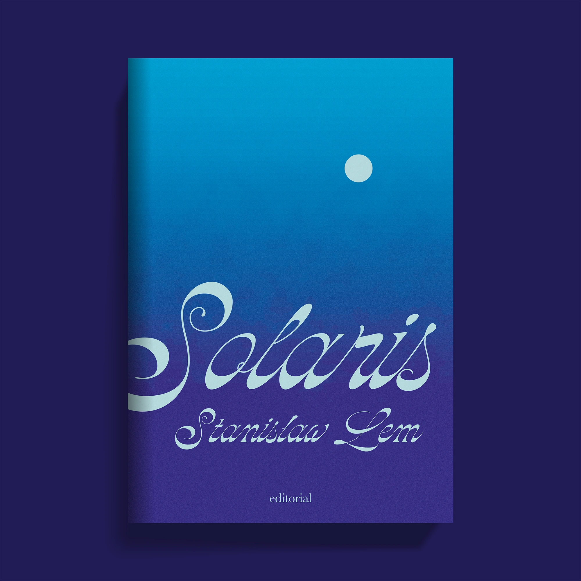
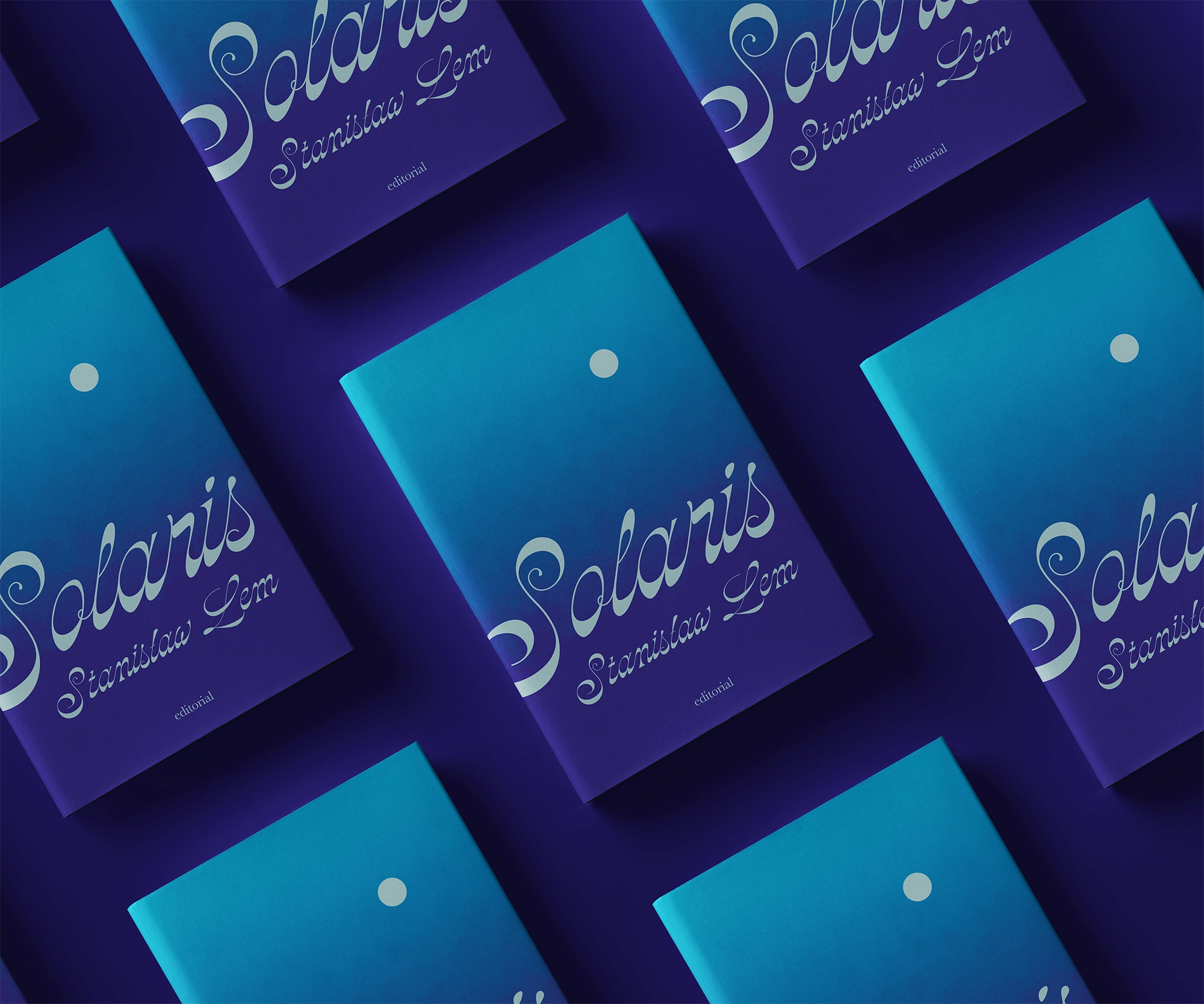
For this project, the challenge was to design a series of four science fiction book covers that would be part of the same collection. The covers had to be exclusively typographic, which involved carefully selecting and arranging the fonts. The goal was to capture the unique spirit of each selected work while maintaining a cohesive visual aesthetic that unified the four covers, achieving a balance between the individuality of each book and the overall harmony of the collection.
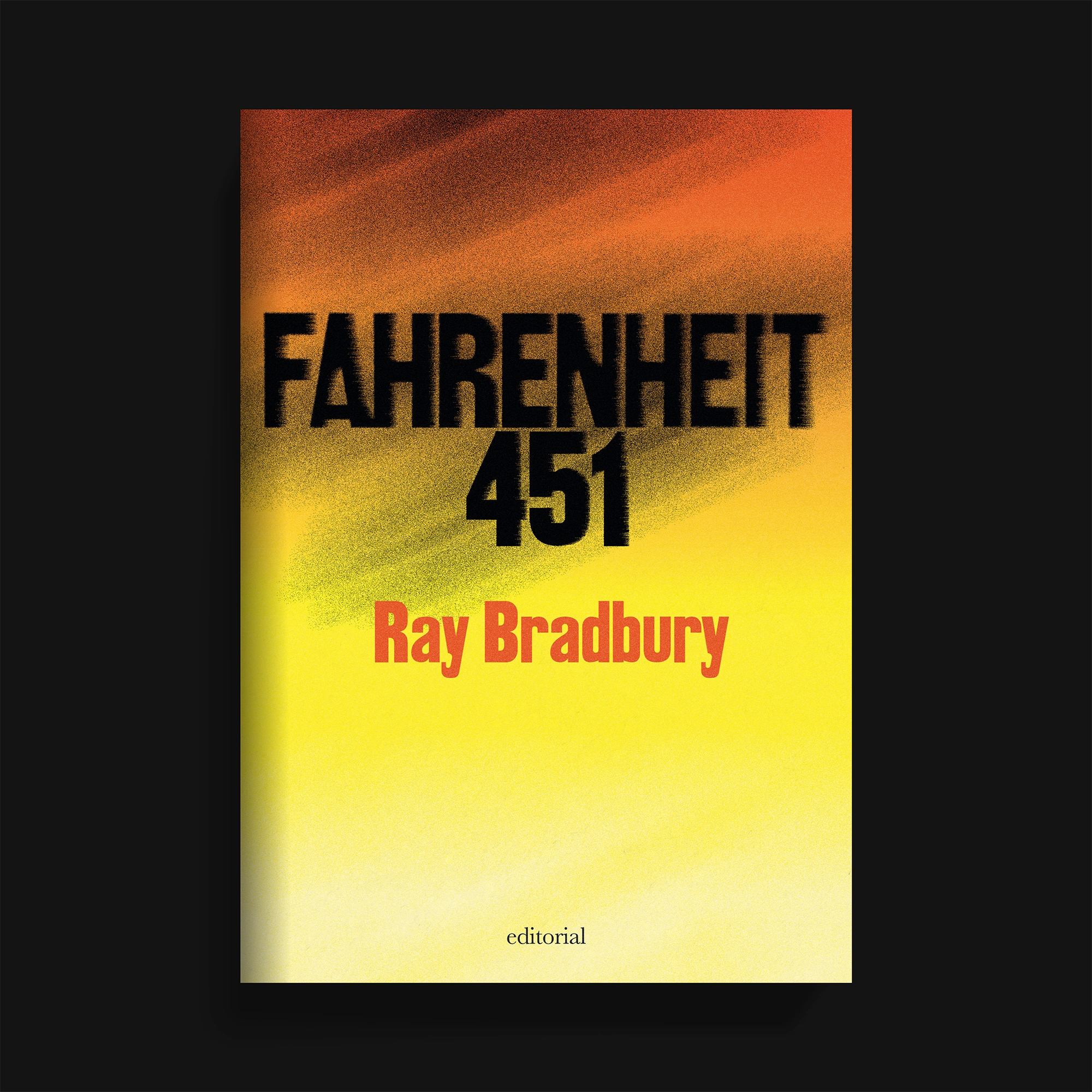
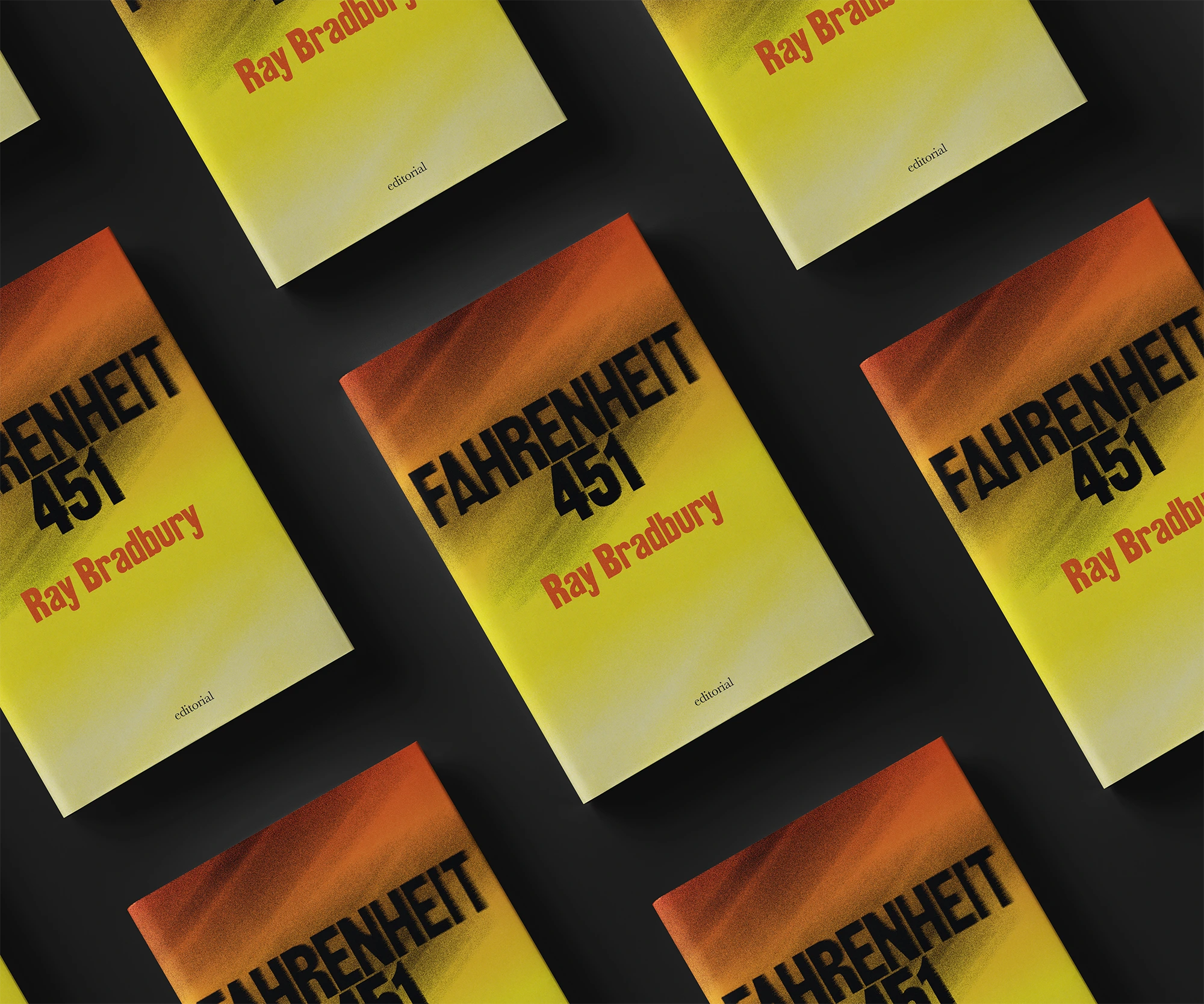
To ensure each cover reflected the essence of its respective novel, I selected typefaces tailored to the themes and contexts of the books. I implemented a common visual code using flat colors for the text, gradient backgrounds, and subtle textures that would not overwhelm the design. This approach helped strengthen the visual cohesion of the collection, resulting in a unified aesthetic that conveys the mystery and atmosphere of the novels, while also respecting the particular identity of each one.


Like this project
Posted Feb 4, 2025
Designed four typographic sci-fi book covers, balancing unique identities with a cohesive aesthetic through tailored fonts, colors, and subtle textures.

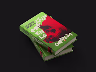
Animal Farm — Rebelión en la granja
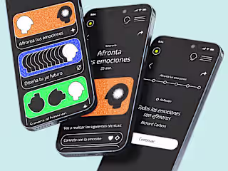
Influyo — Self-management kit

Visual identity ― Margenus

Visual Identity ― GL Law Firm