
Peachy Pop — Brand Identity & Packaging Design
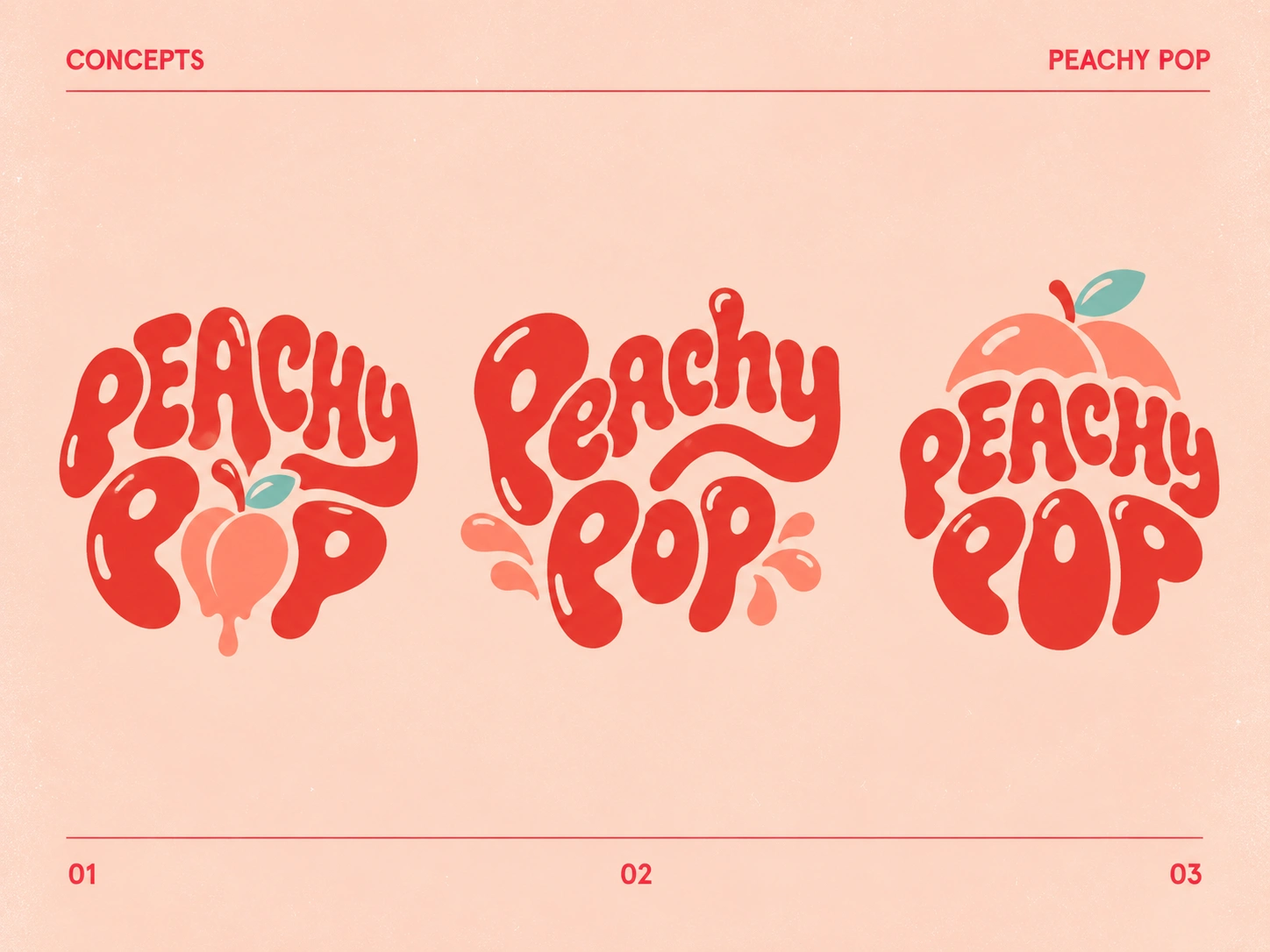
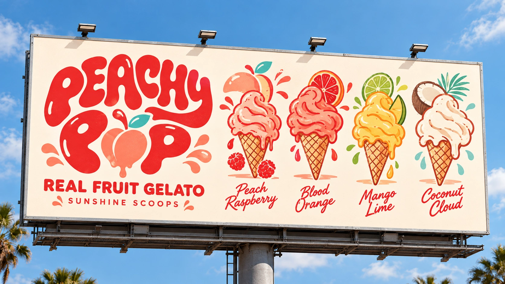
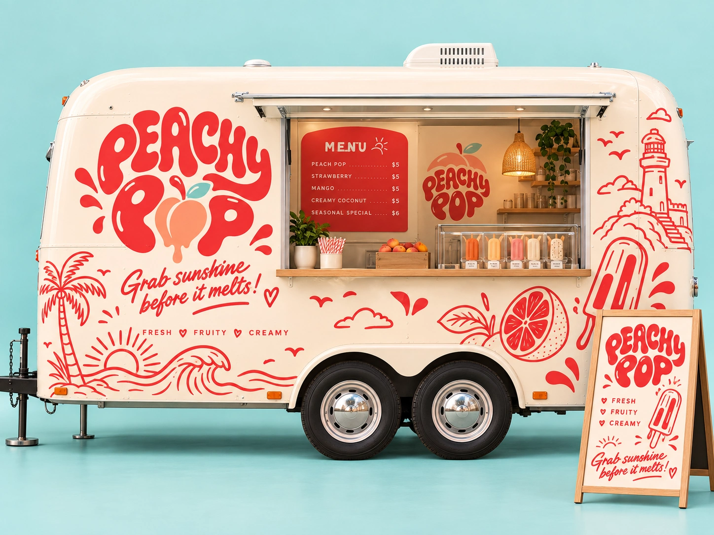
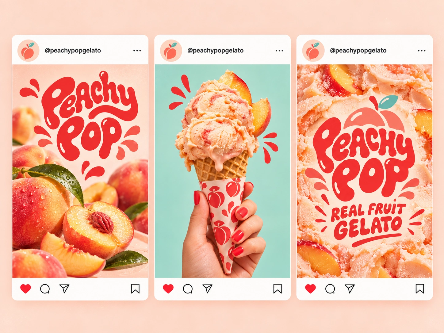
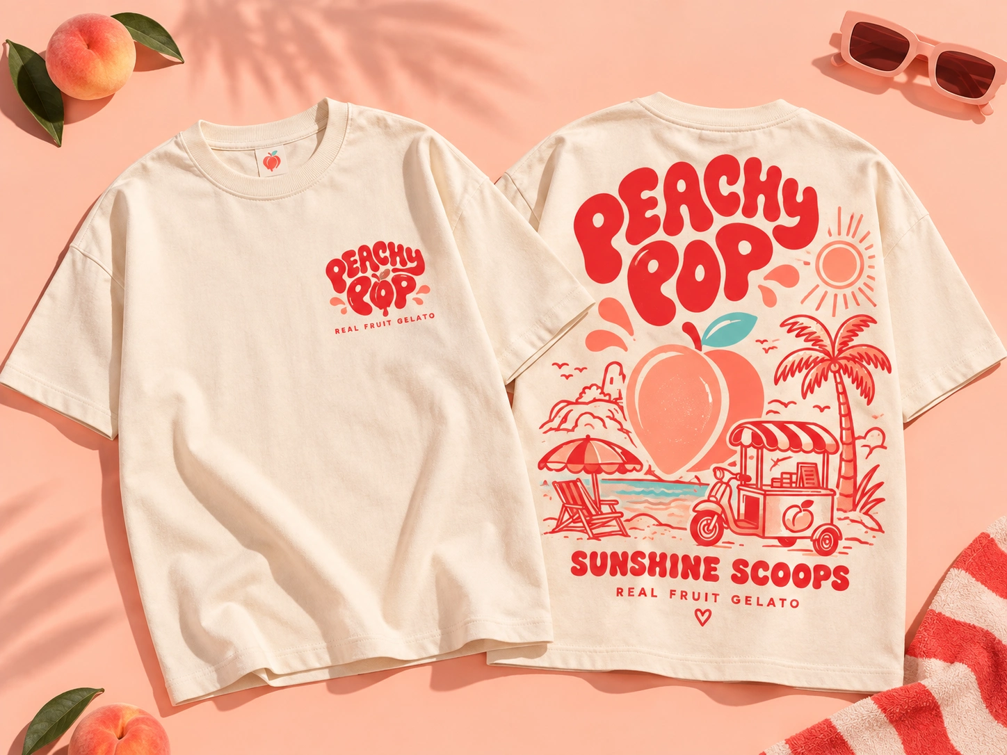
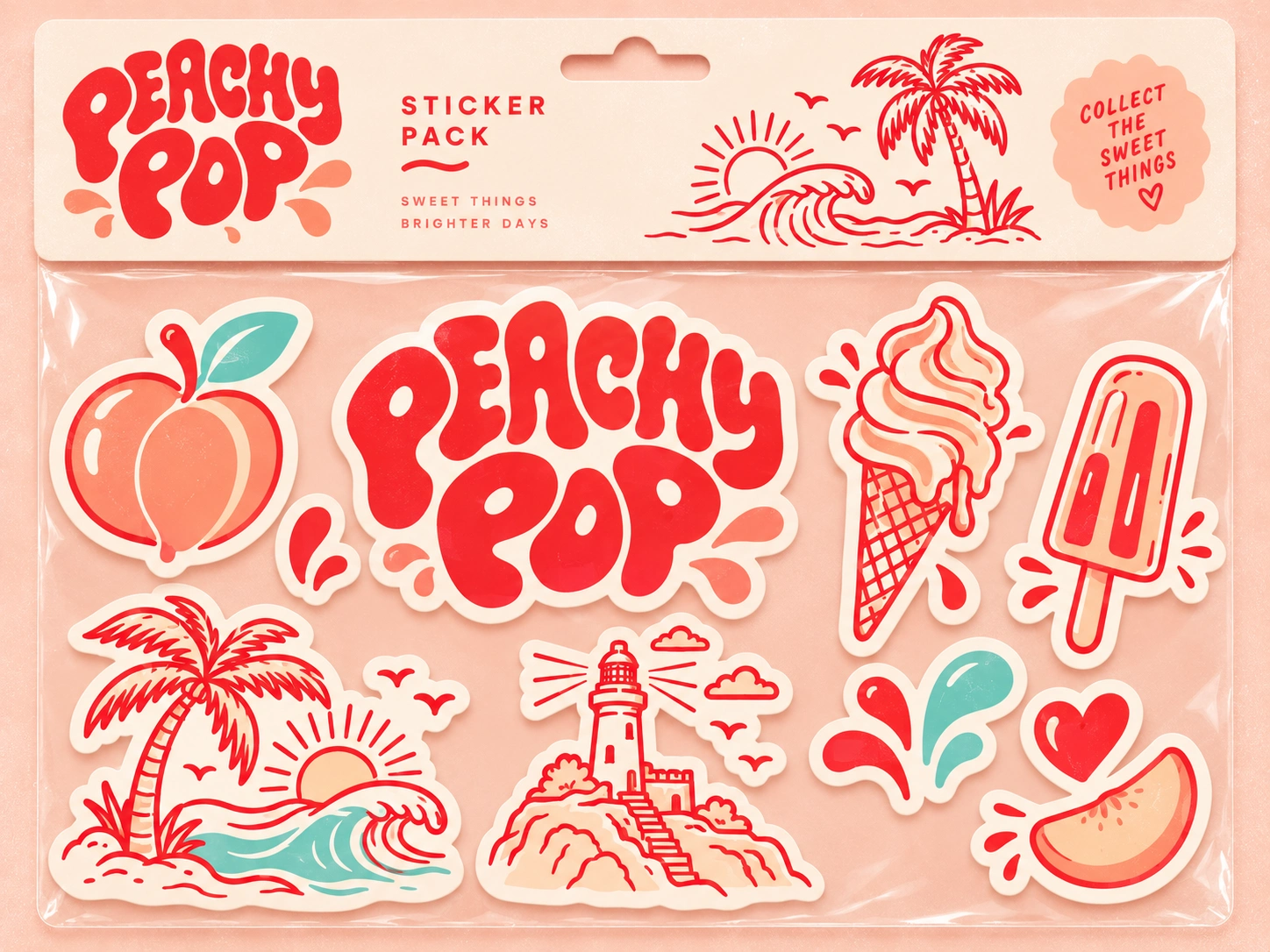
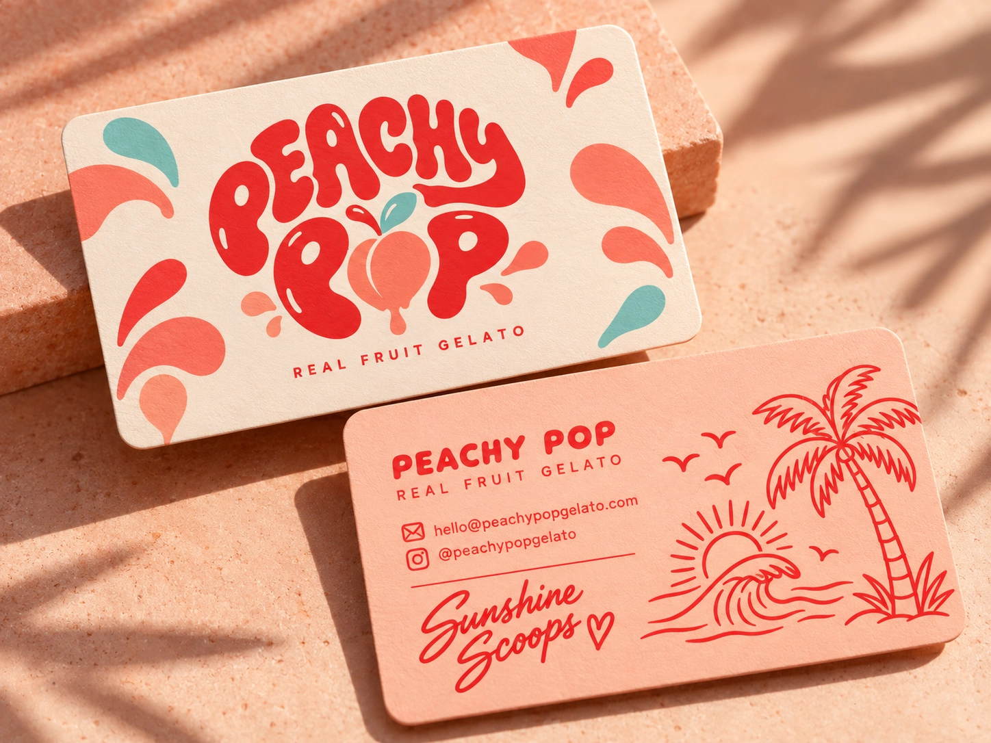
Peachy Pop is a playful, sun-soaked brand identity created to capture the refreshing joy of real fruit gelato. The visual direction blends retro-inspired typography, tropical illustrations, and a warm peach-and-red color palette to create a brand that feels youthful, energetic, and instantly memorable.
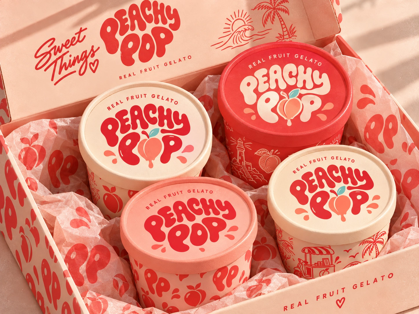
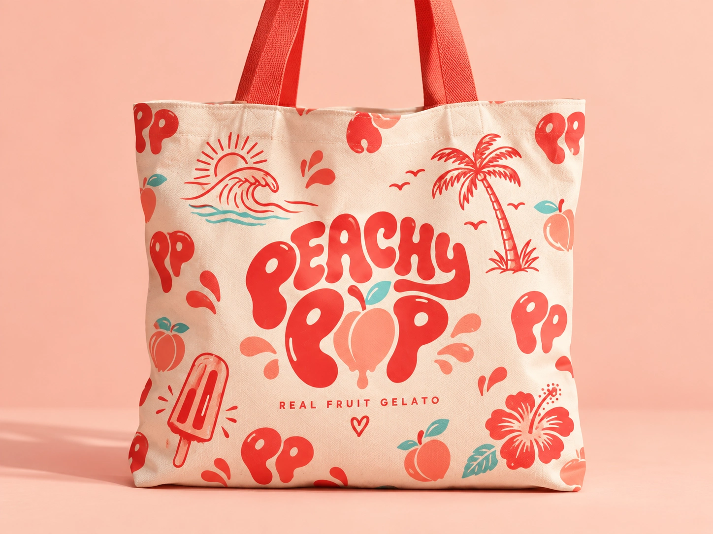
The identity revolves around a bold, fluid wordmark paired with a peach-inspired graphic element, giving the brand a friendly and distinctive personality. Throughout the packaging system, hand-drawn illustrations of palm trees, ocean waves, sunshine, fruit, and coastal scenery build a cheerful summer atmosphere and transform every touchpoint into part of the Peachy Pop experience.
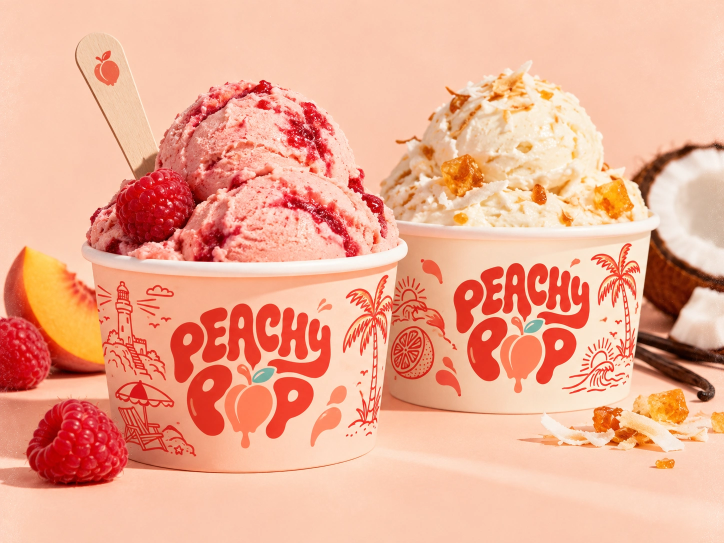
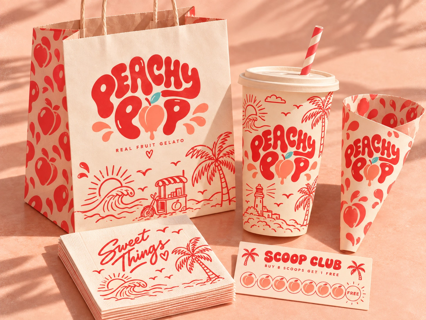
The packaging was designed as a cohesive visual family across shopping bags, takeaway cups, gelato sleeves, napkins, and loyalty cards. Repeating fruit patterns and expressive line artwork help maintain strong recognition while allowing each piece to have its own character.
Rather than creating packaging that simply carries a product, the goal was to build a complete visual experience — bright, nostalgic, refreshing, and full of personality.
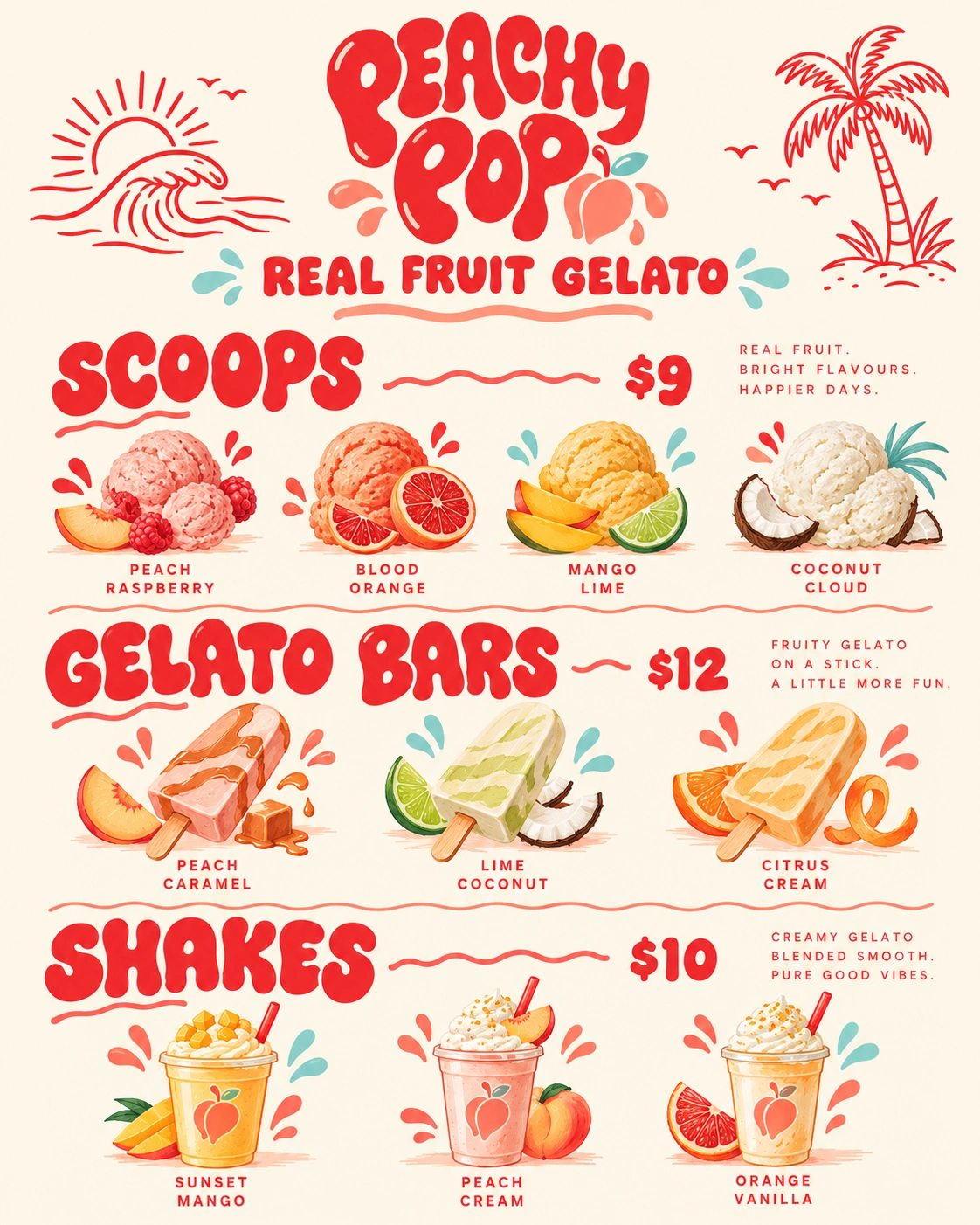
Creative Direction: Retro Tropical / Playful / Youthful
Project Scope: Brand Identity, Logo Design, Illustration, Packaging Design & Visual System
Brand Personality: Fresh • Fun • Vibrant • Friendly • Summery
Peachy Pop is designed to feel like summer in your hands. 🍑☀️🌴
My Role:
Brand Identity Designer & Packaging Designer — responsible for the overall creative direction, logo development, visual identity, illustration style, color palette, typography, packaging design, and the application of the brand across multiple touchpoints.
2 likes · 5 views · Sep 29, 2026
Developed Peachy Pop's playful and vibrant brand identity and packaging, tropical illustrations that feels youthful and instantly memorable.


