Bikeways Brand Identity
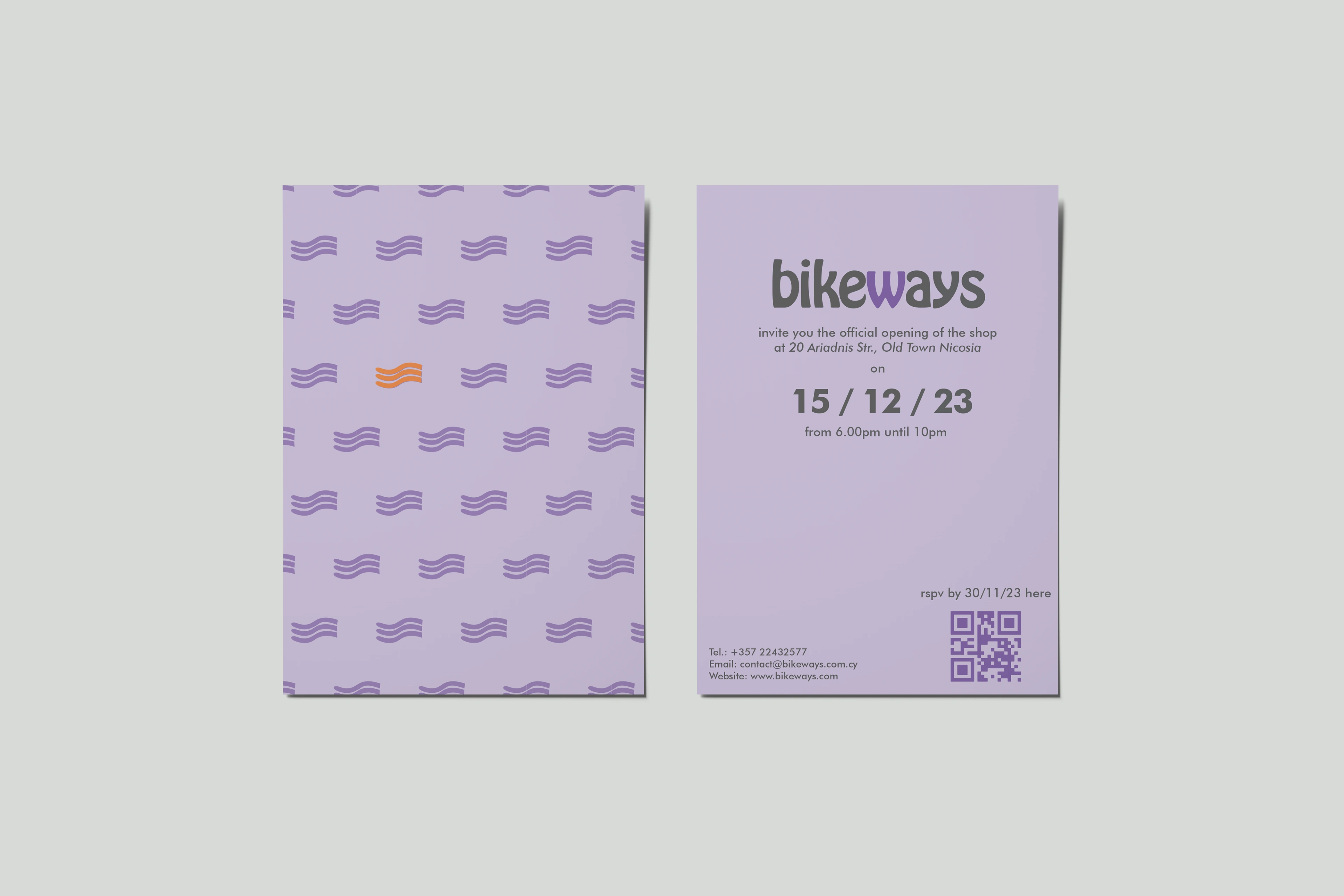
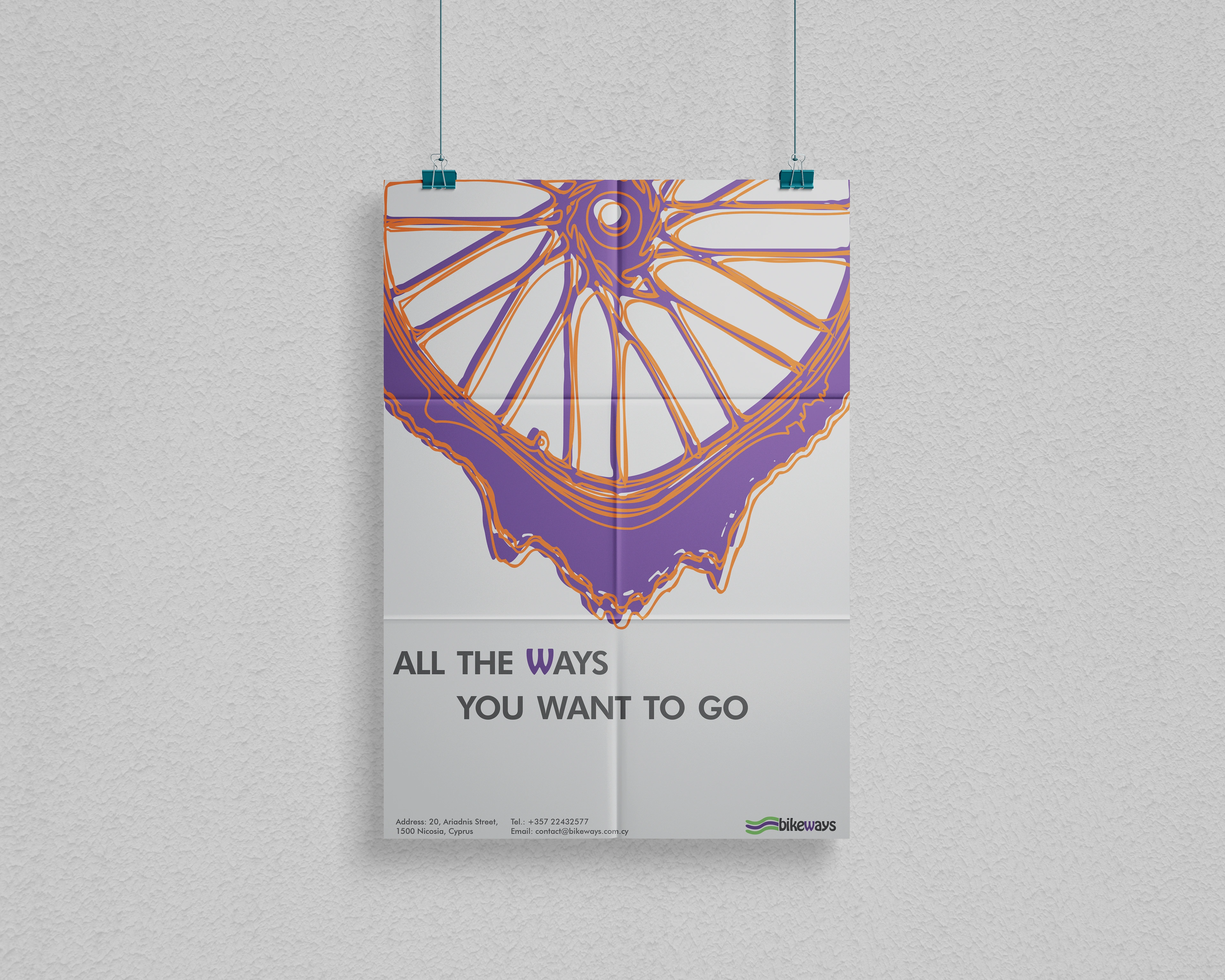

Bikeways is a new eco-friendly bikeshop in the heart of Nicosia, Cyprus. It aims to promote sustainable ways of transport through bike rentals.
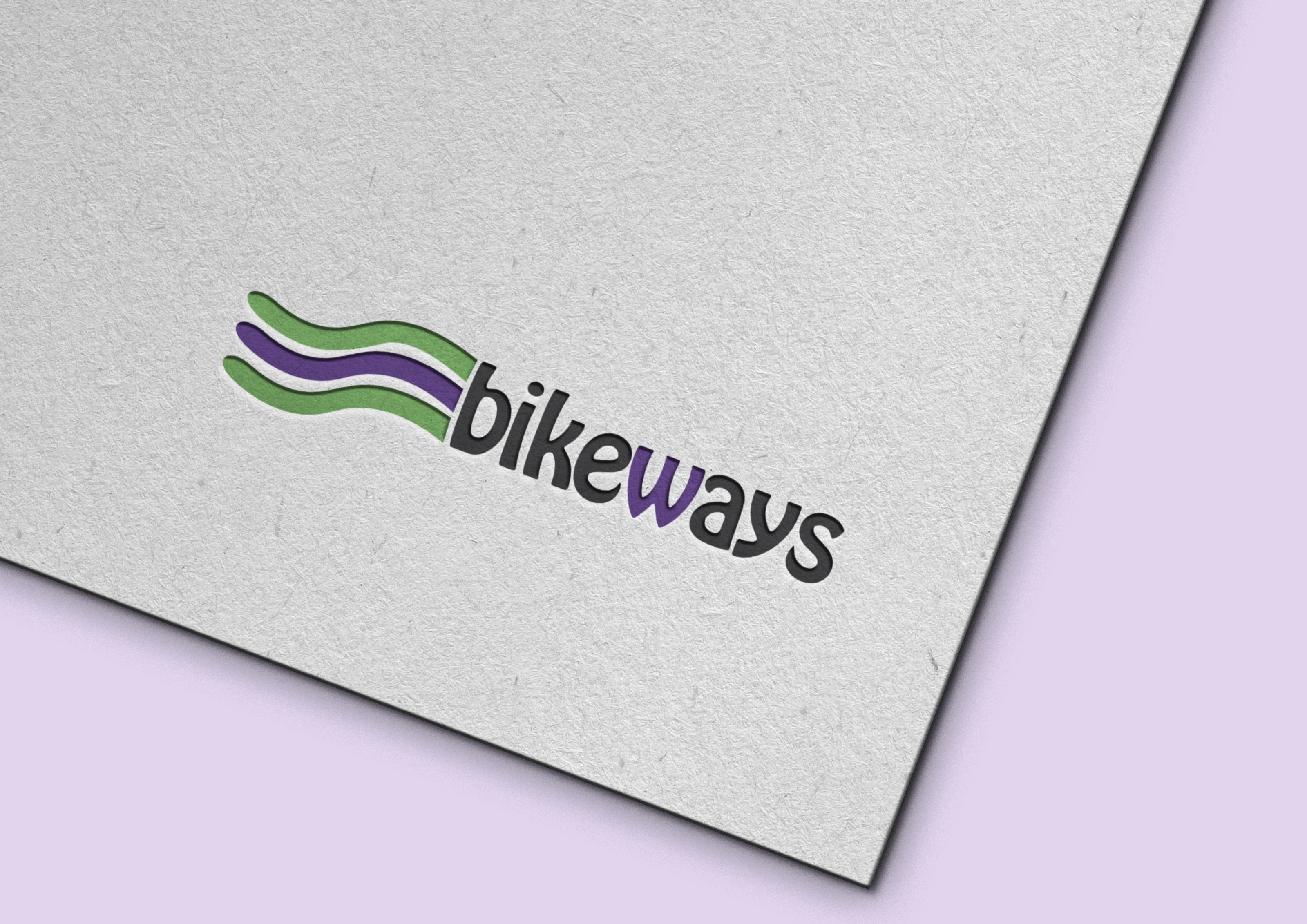
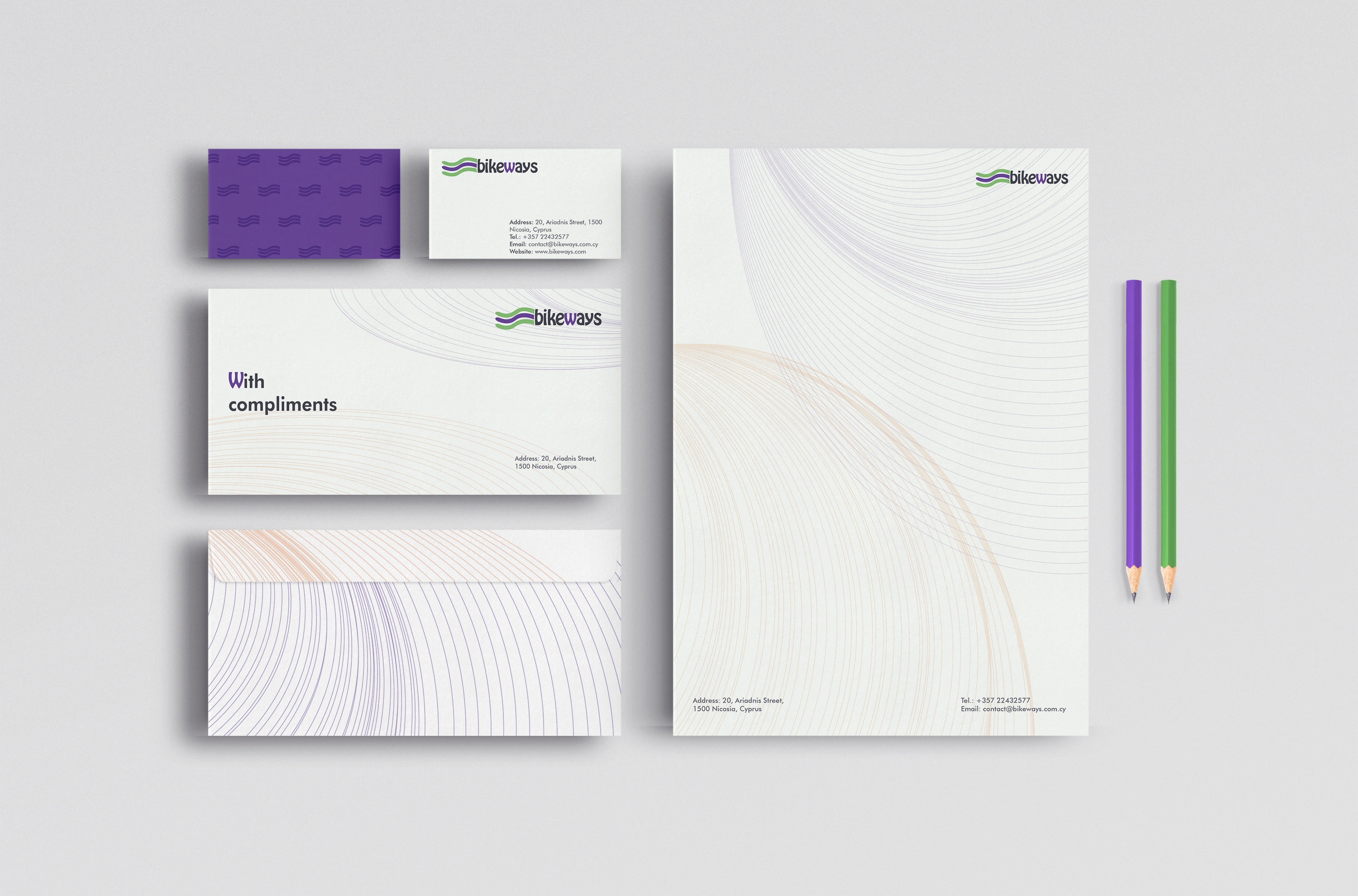
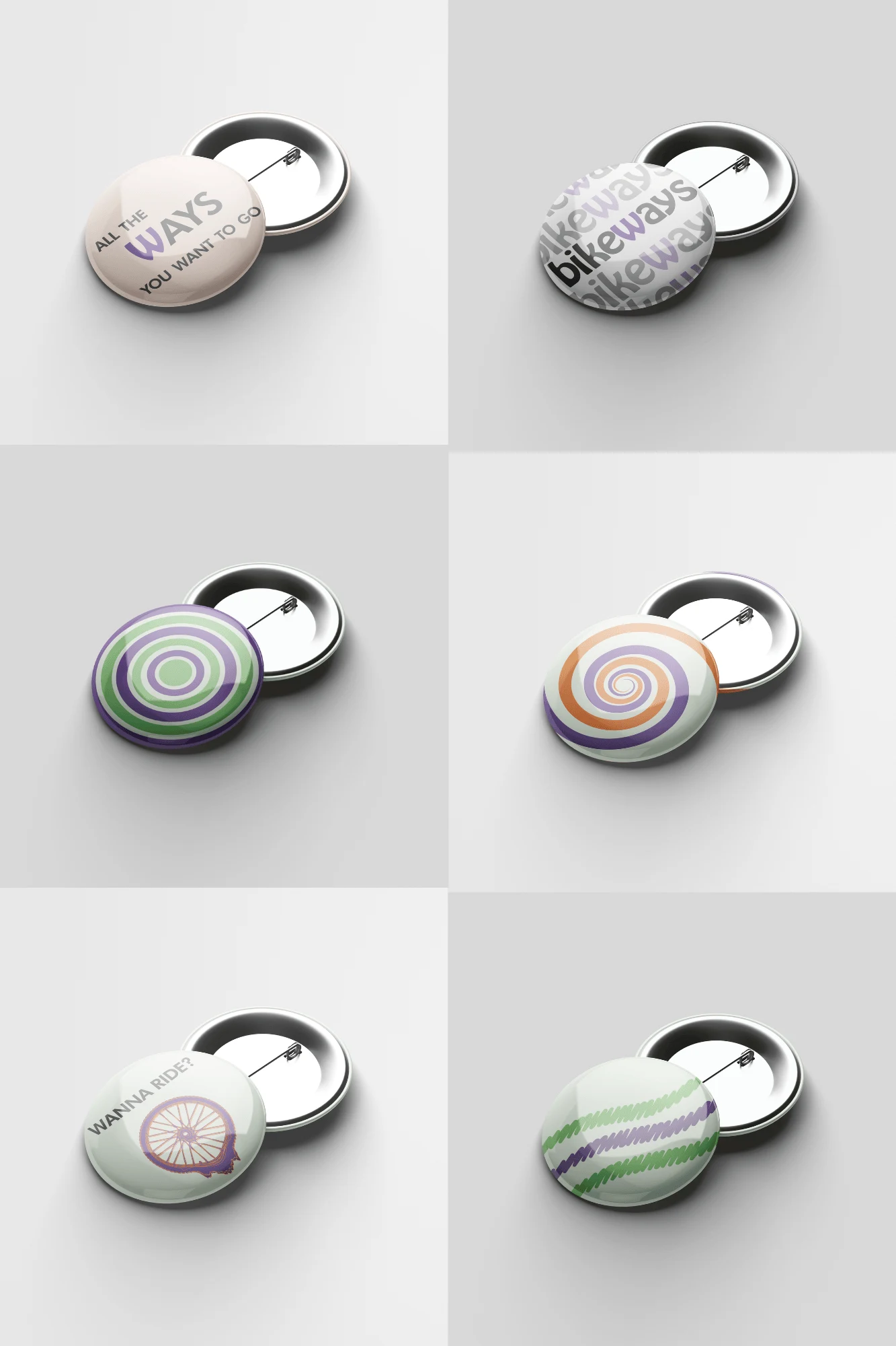
The design of the bike shop is meant to attract young, open-minded people, such as artists, musicians, hipsters, and teenagers, and to introduce them to a new, more efficient, and eco-friendly means of transport. Inspiration for my designs is the 60-s Psychedelic movement for its bright colours and flowing shapes. The reason for my inspiration is because I wanted to attract attention with beautiful, bright colours, to show the uniqueness of the shop, and to portray it in an approachable and friendly way. The green color in the symbol shows the eco-friendly side of the shop, and the purple and, as a secondary color, orange show that the shop is unique, fun, and approachable.
The symbol presenting the shop shows repetition, well known to psychedelia and to bikers as well—the repetitive movement of the bike and the process of cycling. It is also associated with the roads connecting Nicosia and, moreover, the bike lanes leading to the shop.
The typeface used communicates the era of inspiration as well as the identity I have chosen for the shop: friendly, bubbly, welcoming, and fun. The letter “W” is highlighted in purple to make a stronger connection between the name of the shop and the symbol colour-wise, as well as to accentuate the word "ways," again one of the main meanings of the symbol.
Like this project
Posted Jun 19, 2024
Graphic Design,Branding,Adobe Illustrator
Likes
0
Views
12
