Swiggy UX Case Study
Ankit Deshwal
Project Overview- Swiggy is a popular food delivery platform based in India, connecting users with a wide range of restaurants and eateries through their website and app. With a seamless ordering process, real-time order tracking, and a vast selection of dining options, Swiggy provides convenience and satisfaction to customers across multiple cities.

Problem Statement- Users of the Swiggy app struggle to locate order details after placing an order, resulting in poor user experience and potential frustration.
Hypothesis- By redesigning the order details section in the Swiggy app, we can provide users with a clear and intuitive interface that enables them to easily access and review their order information.
Design Process (Atomic Research)
Atomic UX Research is a methodology that emphasizes conducting quick, focused research activities in a structured manner. It involves breaking down the research process into smaller "atomic" components to gain insights and make informed design decisions efficiently.
Target Audience
Food Enthusiasts: People who enjoy trying out different cuisines and exploring new food options without the hassle of cooking or dining out.
Busy Professionals: Individuals who lead busy lives and prefer the convenience of ordering food online, saving them time and effort.
Students: Students who may be busy with studies or prefer the ease of ordering food to their doorstep during their hectic schedules.
Families and Home-makers: Individuals who prefer the convenience of ordering food for their families or for occasions when they don't have the time or means to cook.
Office-goers: Professionals who order meals for lunch or dinner at their workplace, looking for a quick and hassle-free option.
User Surveys
The user survey was done to check how many people actually check the items in the cart after they order and if they have been through the same problem as I did.
19 users took the survey and the data is according to that number only.
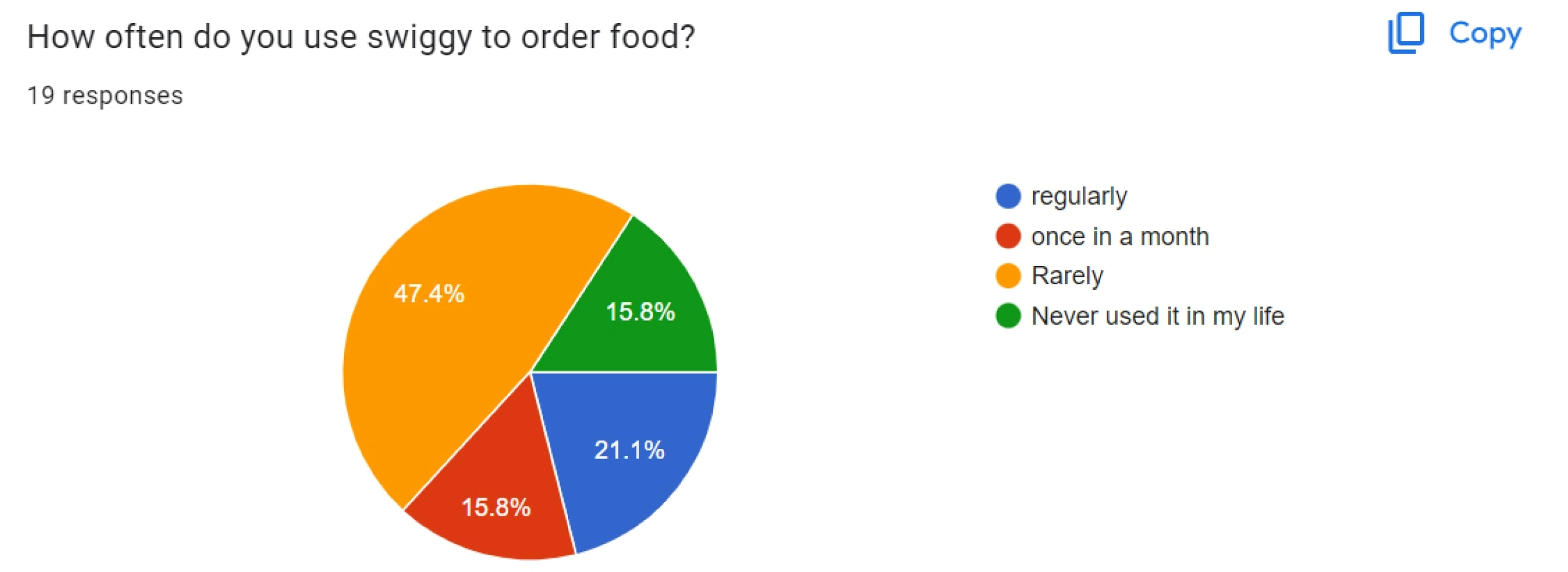
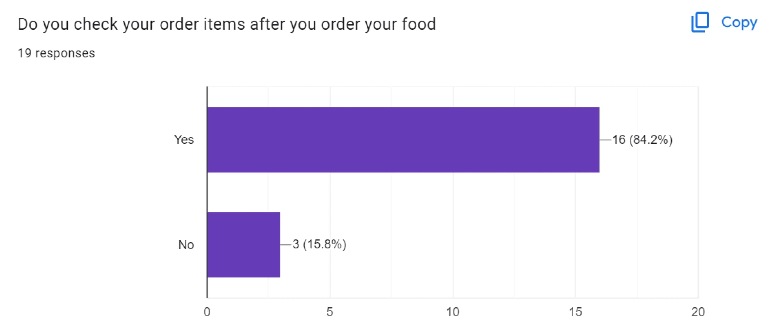
Survey Result
Users have mentioned other problems such as delayed orders, less time to cancel orders and etc.
The main problem was that people were facing problems after placing the order. People mentioned that they were also not able to find the receipt after ordering the items.
Interview Insights
I took 5 Interviews with people from different backgrounds such as designers, bankers, and developers.
5 out of 5 users were not able to find the way to look for the receipt.
The text to enter the receipt in the KEBAB menu is written as “info”. Which the users suggested should be something like a receipt or order details.
5 out of 5 users wanted a new way to reach the ordered items instead of going to the KEBAB menu.
UI Design
The UI designs are samples of different methods we can have for entering the list of the ordered items. The best one will be chosen from the user interviews and A/B testing.
A total of 5 samples were made for testing with users through interviews and A/B testing was done with 5 People.
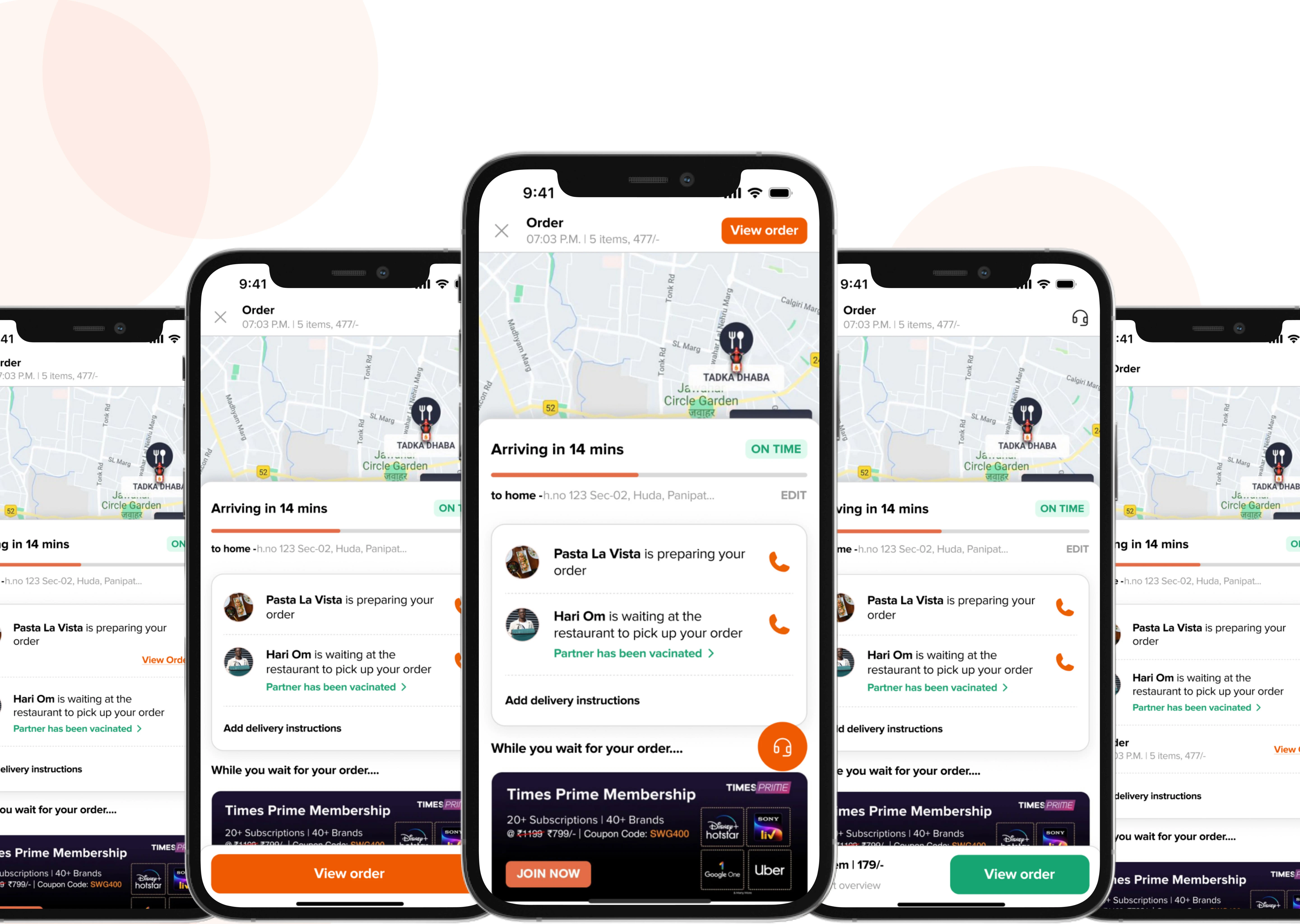
All 5 designs
User Feedback
3 users liked “sample 3”, 1 chose “sample 5” and one of them choose “sample 4”.
Sample 2 is clear and intuitive. Users find it more appealing in terms of user experience and visuals as well.
The elimination method was really helpful in finding the best and worst outcomes.
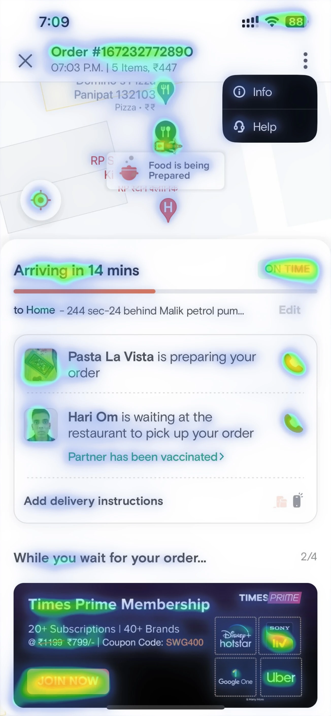
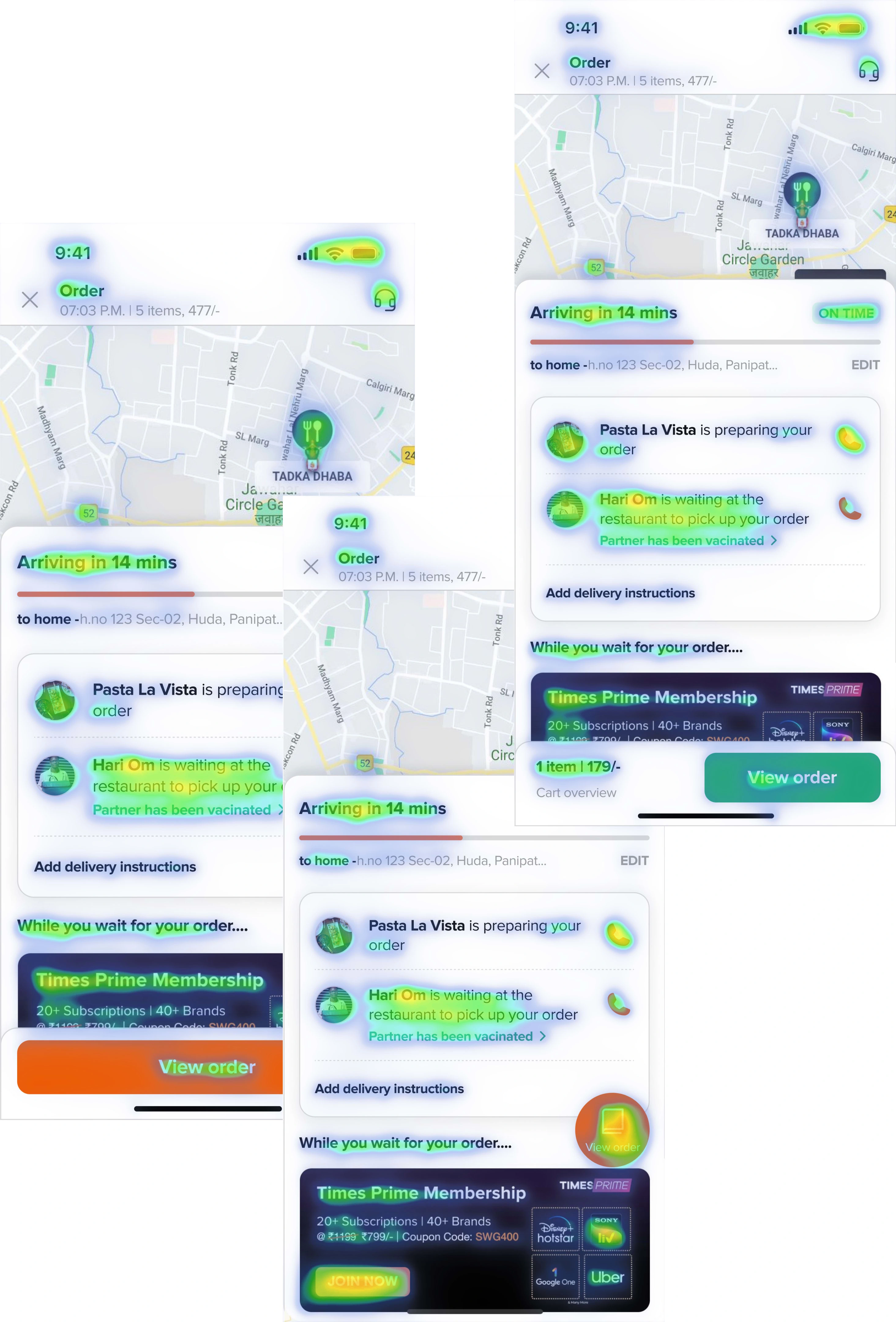
Heat Map Analysis
I used a heat map to track the best position for the CTA. It helped in tracking which design will suit most in real life.
Current Design Feedback
The KEBAB menu is the least visible and is at a place where people will look the least.
The center of attraction is the time for delivery. Which in my opinion is best for the user to directly look at after opening the screen.
The important elements such as the restaurant's name and the delivery person's name are highlighted.
Updated Design Feedback
Sample 1 has good visibility but is in an awkward position because of the ads in the background. According to business and brand points of view, we cannot hide the ads part
Sample 2 has good visibility but lacks details of the order.
Outcome of the project
The HYPOTHESIS of the project was proven right and hence the user experience research helped in improving the user experience after ordering the food.
My Learnings
Atomic research is a fast and effective way to solve a problem by breaking it down into atomic pieces.
How to do quick UX research drills which are having time constraints.
How to do qualitative research more effectively.
How to find small problems in a mature product and solve them.
Like this project
Posted Feb 7, 2024
Users of the Swiggy app struggle to locate order details after placing an order, resulting in a poor user experience and potential frustration.
Likes
0
Views
612