Enrollment Flow - Solar Energy
Summary:
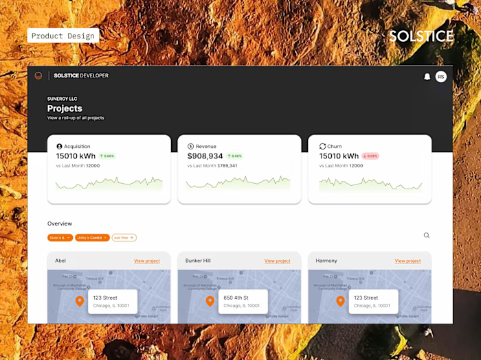
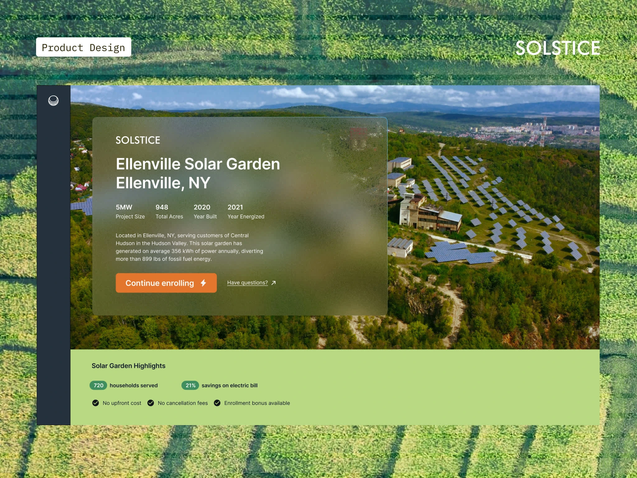
Solstice, was founded on the central belief that every American household should have access to affordable renewable energy. With recent changes to the IRA (Inflation Reduction Act ) and ITC, these government programs created more opportunities to fund these solar projects and serve low-to-middle income communities in the process.
Solstice brought me in to lead and evolve design on their consumer enrollment flow. Our key goal was to increase user literacy and simplify a complex enrollment process, making users feel empowered in their choice to switch to a clean energy alternative.
Consumer Enrollment Flow:
The problem is easy, connect individuals to nearby solar farms. The way to get an individual qualified for a solar farm is hard.
For the consumer enrollment flow, my product manager and I kicked off by running a design sprint with our key internal stakeholders who most consistently interfaced with the end customer. We found a key pain point was community solar is hard to understand and the program requirements varied between states and even projects. As a result, the team was receiving an overwhelming amount of incoming calls to determine if they fit the program requirements.
From there, I iterated on ways to best address this issue, resolving to focus on three key changes:
1) Break up long workflows and set expectations for what’s ahead
No matter how streamlined Solstice’s interface could be, enrolling to any government subsidized program is still a long, multi-step process.
I gave a lot of consideration to the user journey as a whole—including checkpoints or milestones along the way that help break up a long workflow into more manageable sections, having a "homebase" which gives a 30,000 ft view of all milestones, the ability to choose starting points for tasks, and take breaks instead of one long signup form with no end in sight.
2 ) Keep the user focused on one task at a time
With so many fields to complete, the process can easily overwhelm. There are hundreds of places one could start, creating a daunting choice paradox that inevitably results in inaction.
To combat this paralysis, I designed a prescriptive flow that focuses the user’s attention on one step at a time.
3) Empower and educate along every step of the way
An FAQ sidebar component on each page are seamlessly integrated into each page alongside relevant steps in the return process, making them highly contextual, easy to find, and just and easy to ignore if you don’t need them.
⬇️ Static shots of implemented screens ⬇️
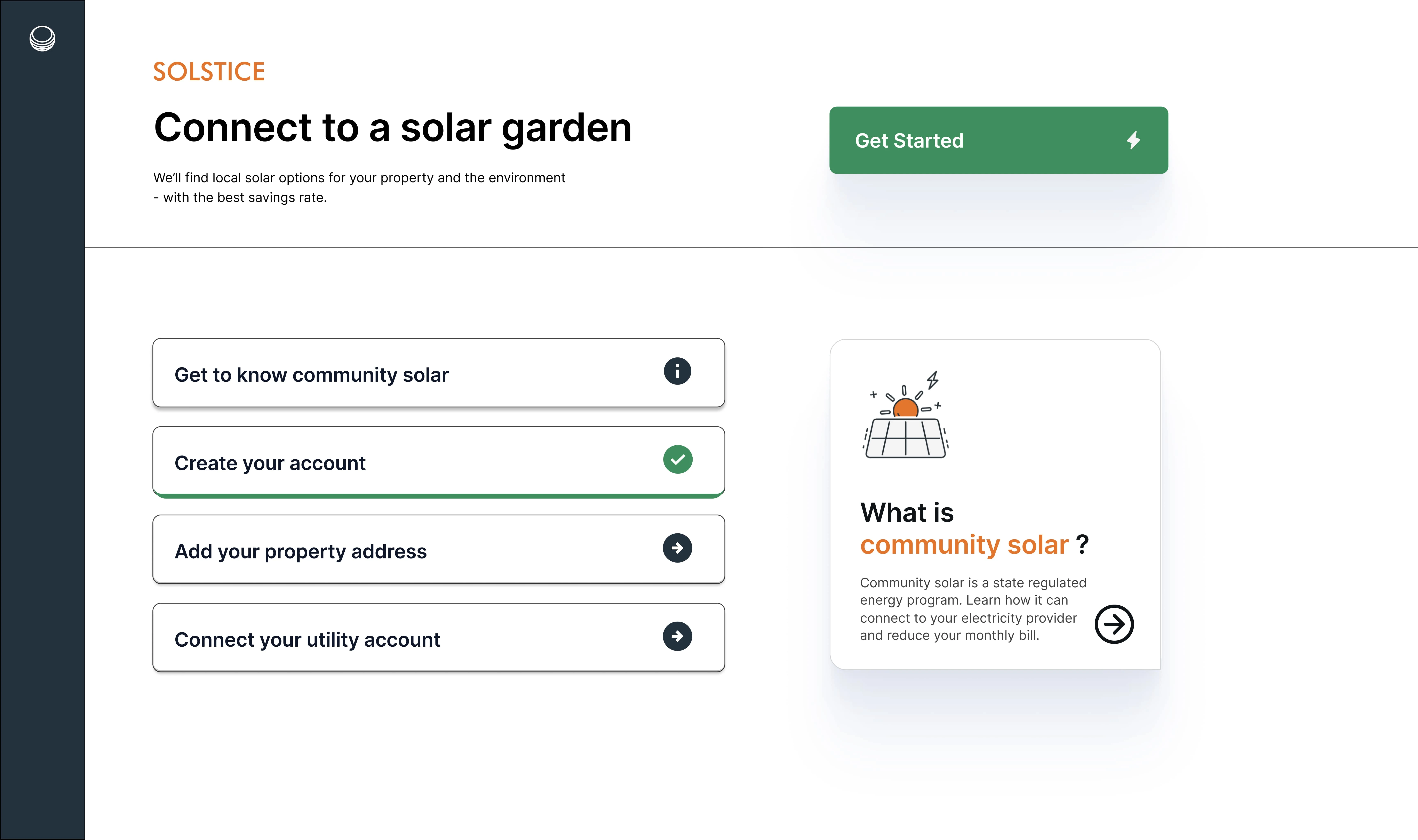
"Homebase" portal for enrollment flow
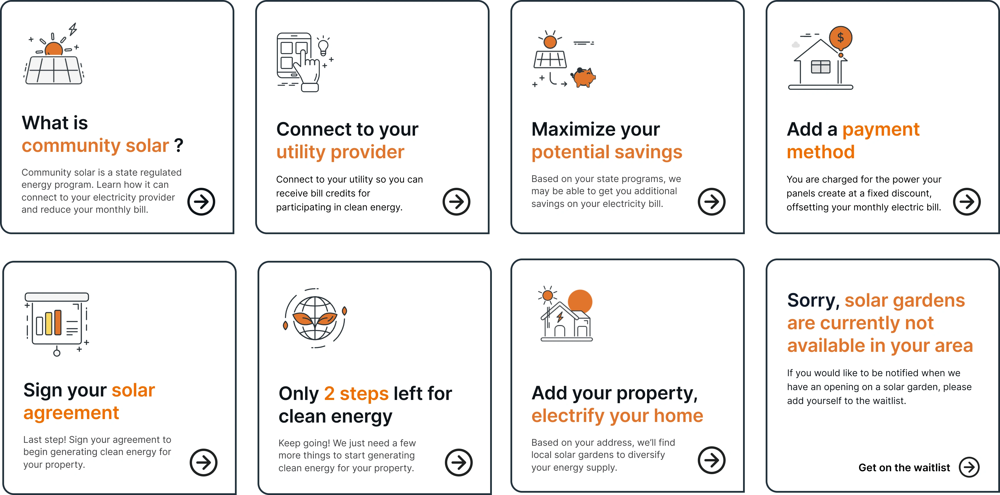
Action Preview components for each step of enrollment
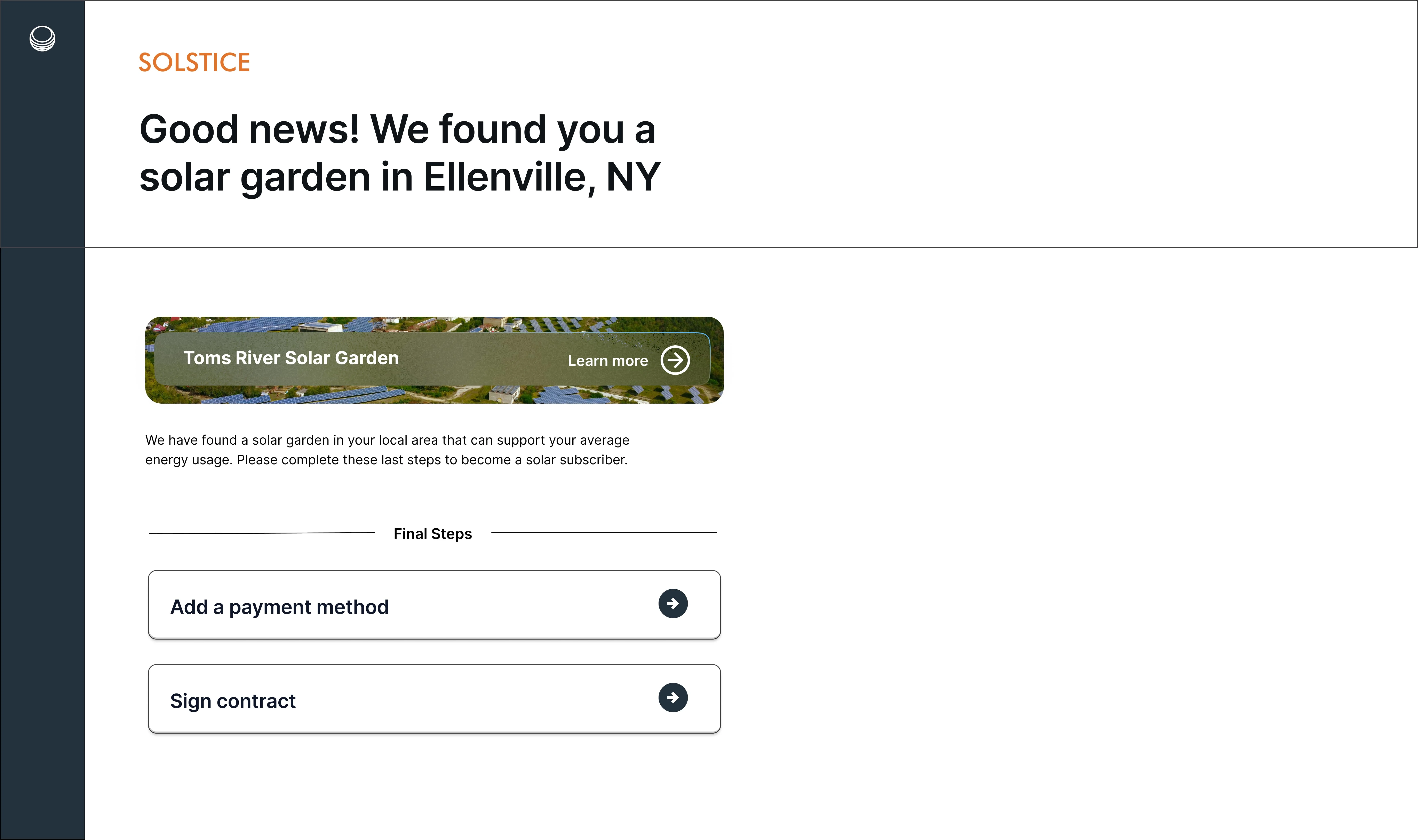
Solar Farm Match page - User can learn more about their solar farm and complete enrollment
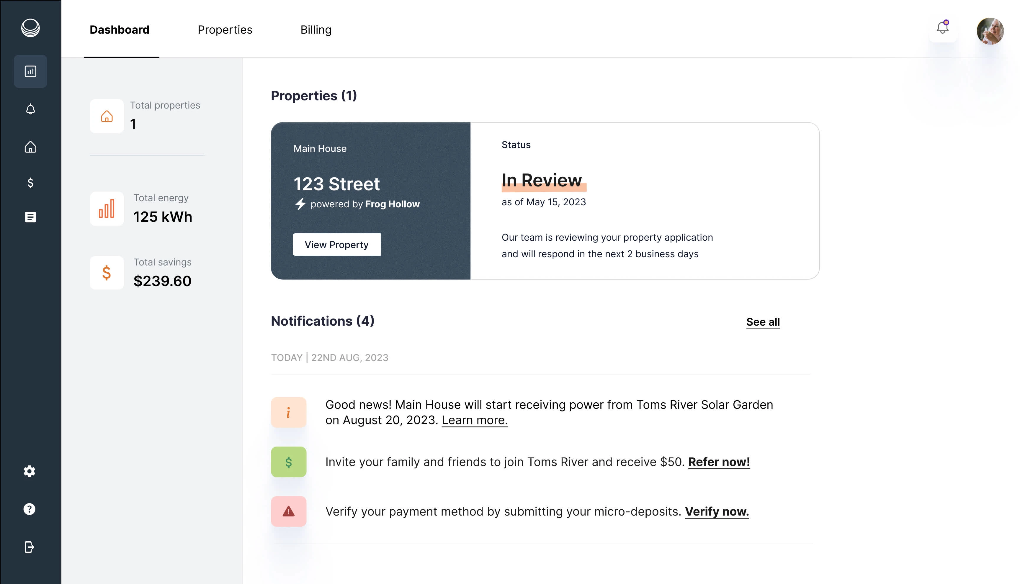
Customer Dashboard - Post Enrollment
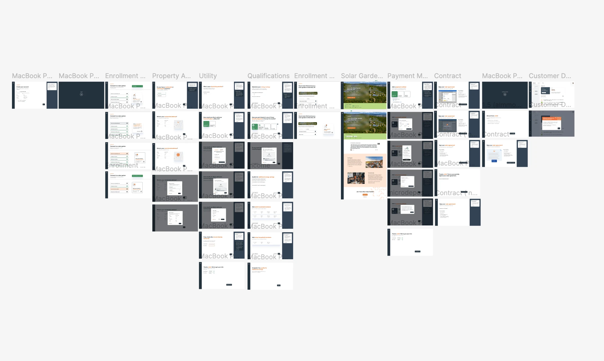
Figma file screens of entire enrollment flow
Like this project
Posted Apr 2, 2025
Increase user literacy and simplify a complex enrollment process, making users feel empowered in their choice to switch to a clean energy alternative.

