
AirFly - Flight Booking Website UI Design
AirFly. Because booking flights shouldn't feel like filing taxes.
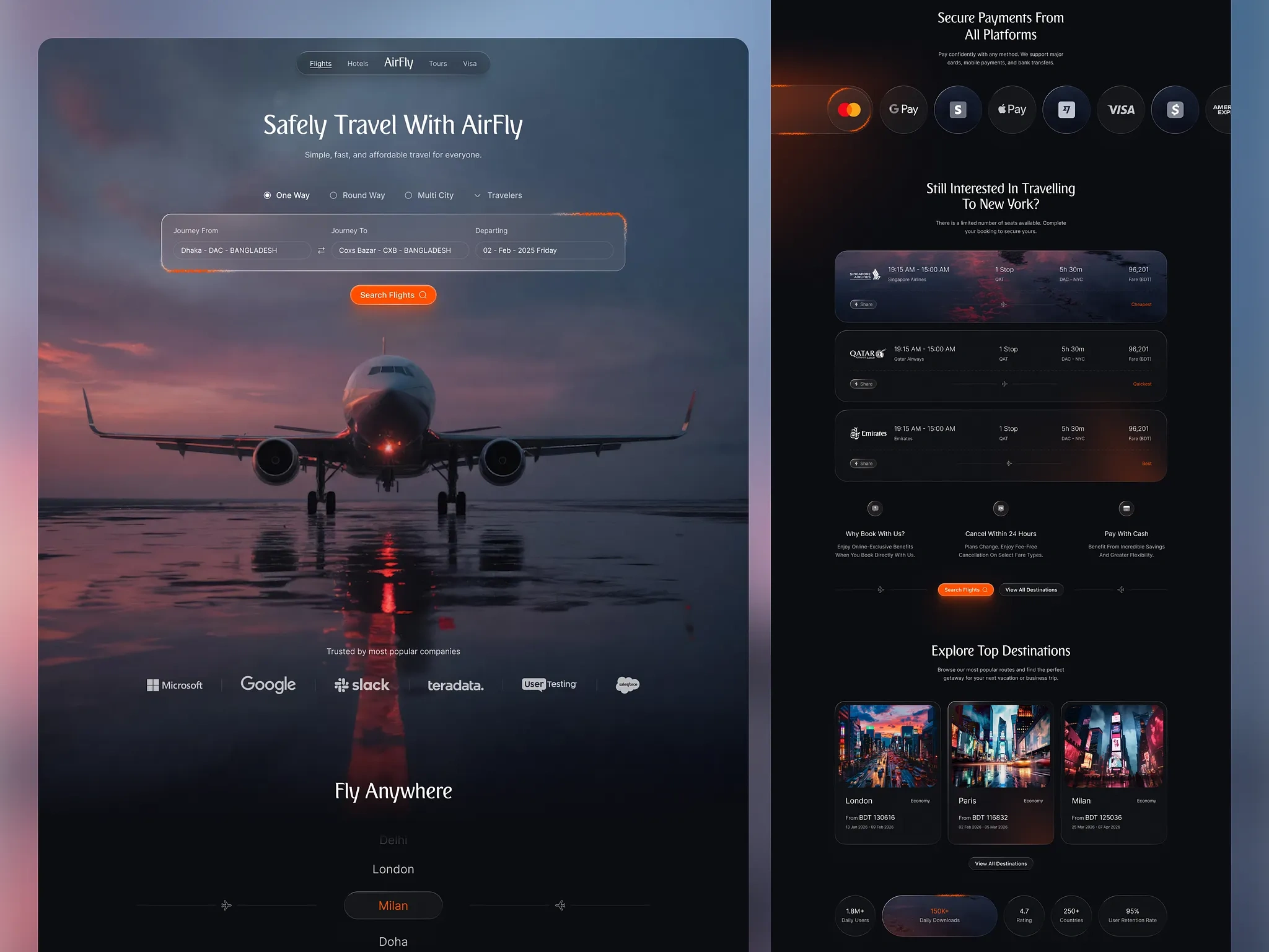
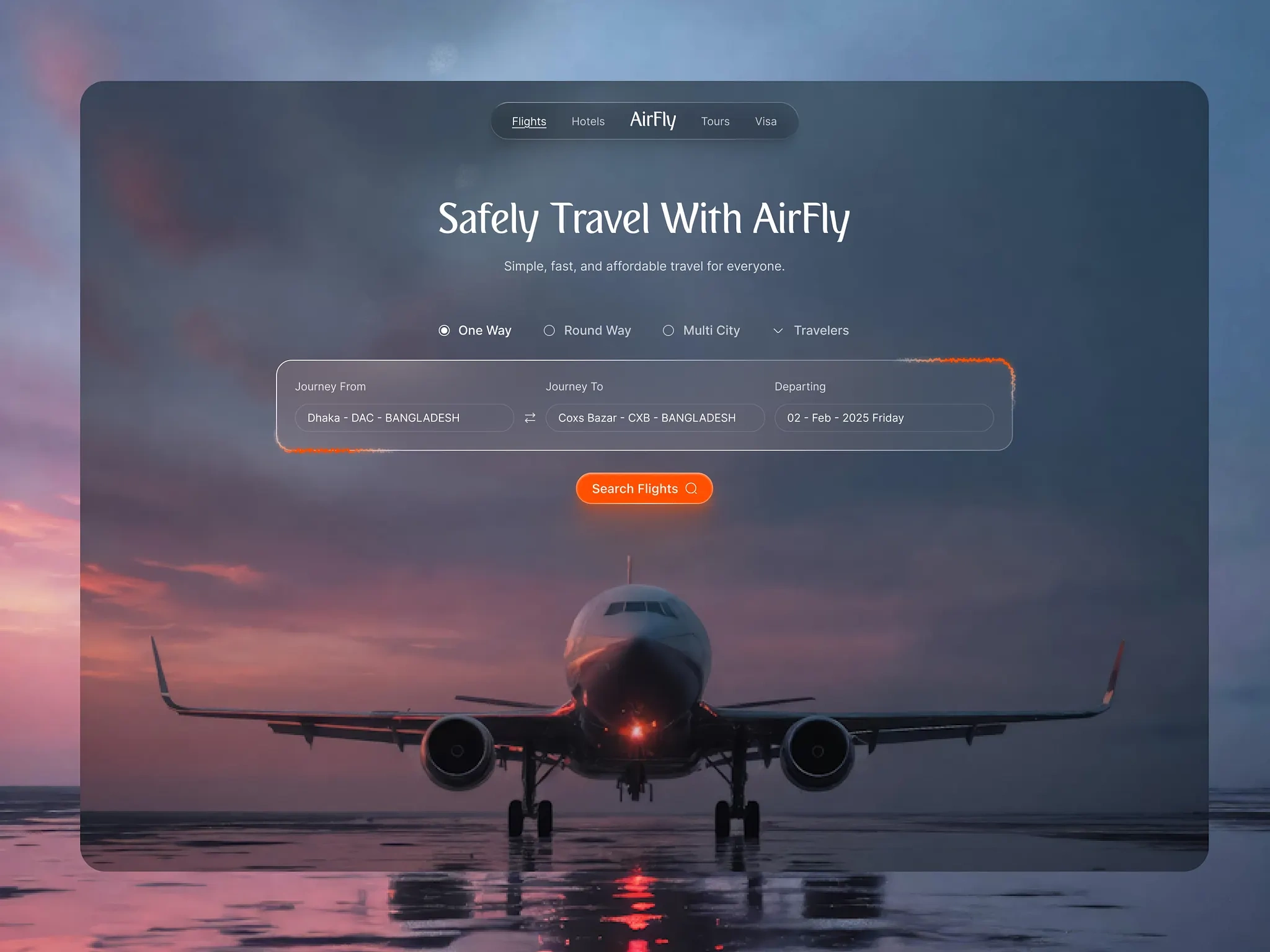
A flight booking experience that actually slaps. Dark mode? Obviously. Glowing orange CTAs? You bet. A cinematic hero that makes you want to quit your job and book a one-way ticket? That's the whole point.
What went into this:
A glassmorphic search widget that makes "One Way / Round Trip / Multi City" feel less like a form and more like a vibe check
"Glow-UX" deep darks so the important stuff (the Search button, the prices) pops like it has its own spotlight
Serif headlines for that editorial, luxury-travel-magazine energy
A retargeting section that whispers "psst... still thinking about New York?" without being creepy about it
Trust badges, payment icons, and a marquee strip that says "yes, real companies use this"
0 likes · 10 views · Apr 27, 2026
AirFly - Flight Booking Website UI Design AirFly. Because booking flights shouldn't feel like filing taxes. A flight booking experience that actually slaps...


