Rodeo Drive Empty State Illustrations
Petar Avramoski
Rodeo Drive - Empty State Illustrations
Rodeo Drive, a SaaS project management platform, lacked an authentic and cohesive illustration style for its empty states. This gap affected the brand’s visual identity, leaving certain areas of the product feeling generic and disconnected from the company’s personality.
The Challenge
In user interfaces, empty states can feel cold and discouraging. Rodeo Drive’s team recognized that these states are critical moments in the user journey: when data is missing or when features haven’t yet been utilized, users are vulnerable to confusion or disengagement. Our challenge was to transform these potentially frustrating moments into calm and inviting opportunities for exploration.
The Approach
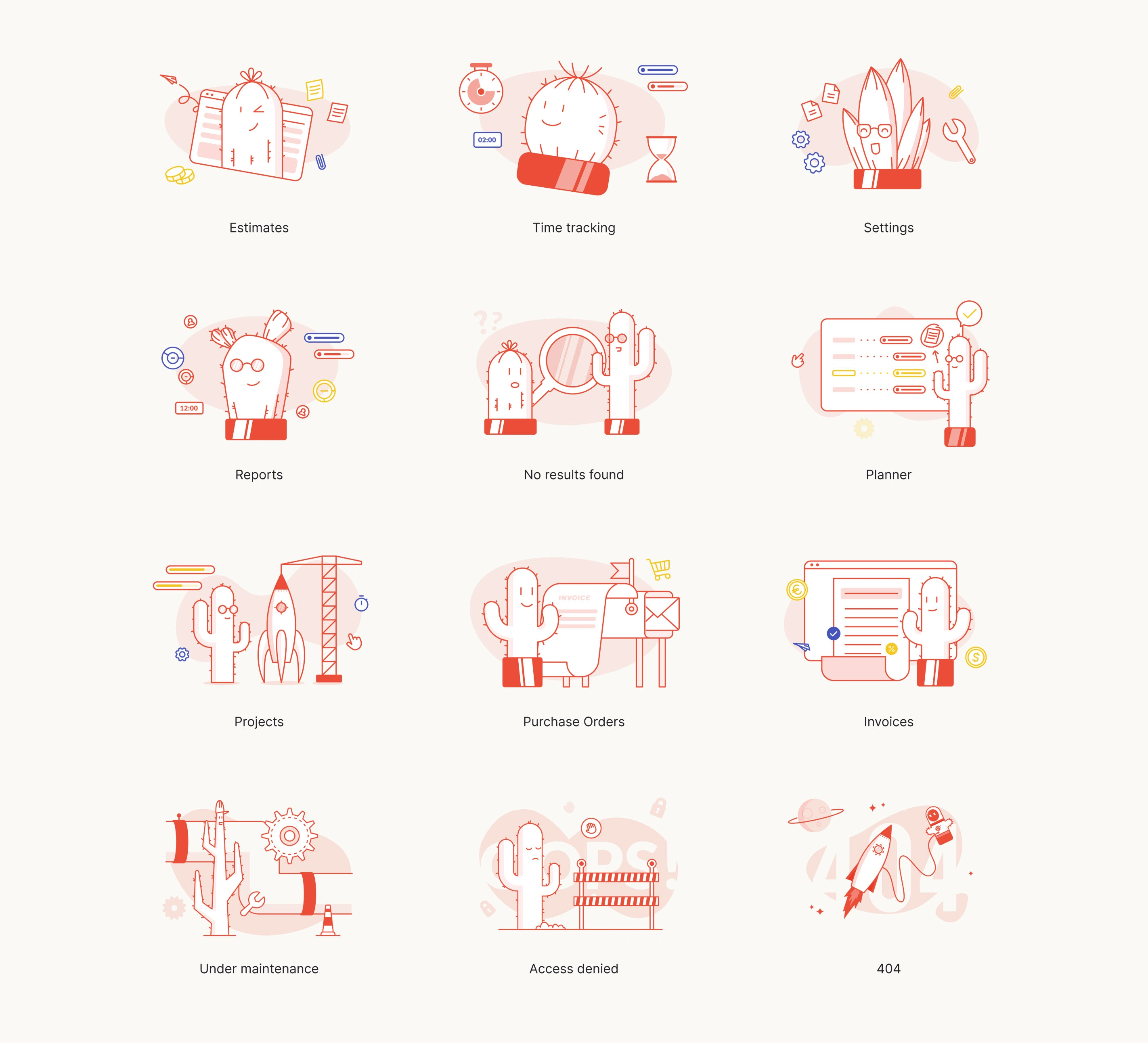
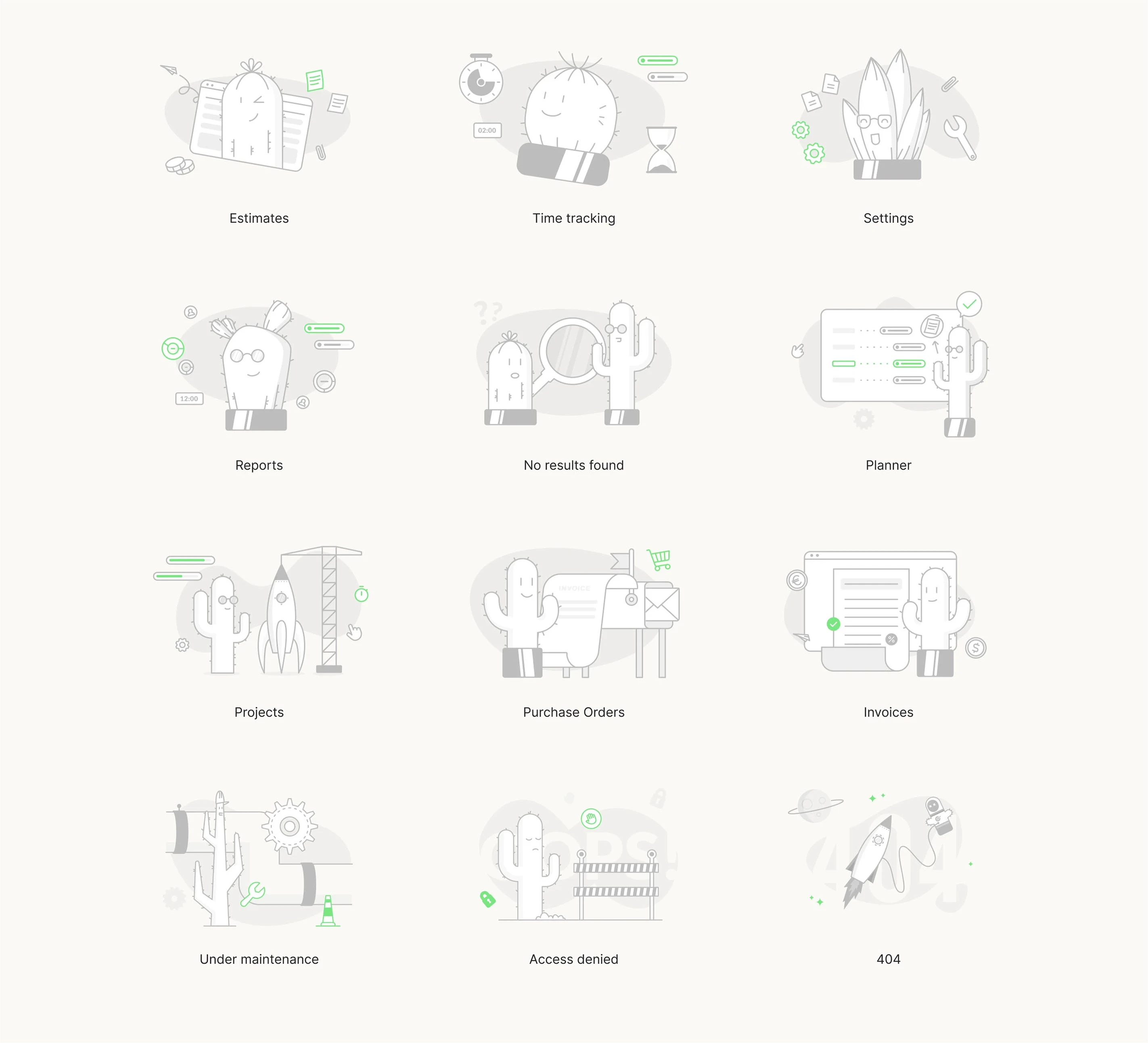
At the heart of the concept is a charming cactus character with simple, minimal expressions, reflecting the brand’s approachable yet professional tone. Working closely with the marketing and product teams, I hand-sketched ideas, refined them into a consistent style, and developed a color palette that could adapt to two distinct user scenarios:
Each illustration set was designed to:
✅ Maintain brand consistency with Rodeo Drive’s playful visual style.
✅ Reduce user anxiety by softening the “empty” experience.
✅ Encourage engagement by prompting further exploration.
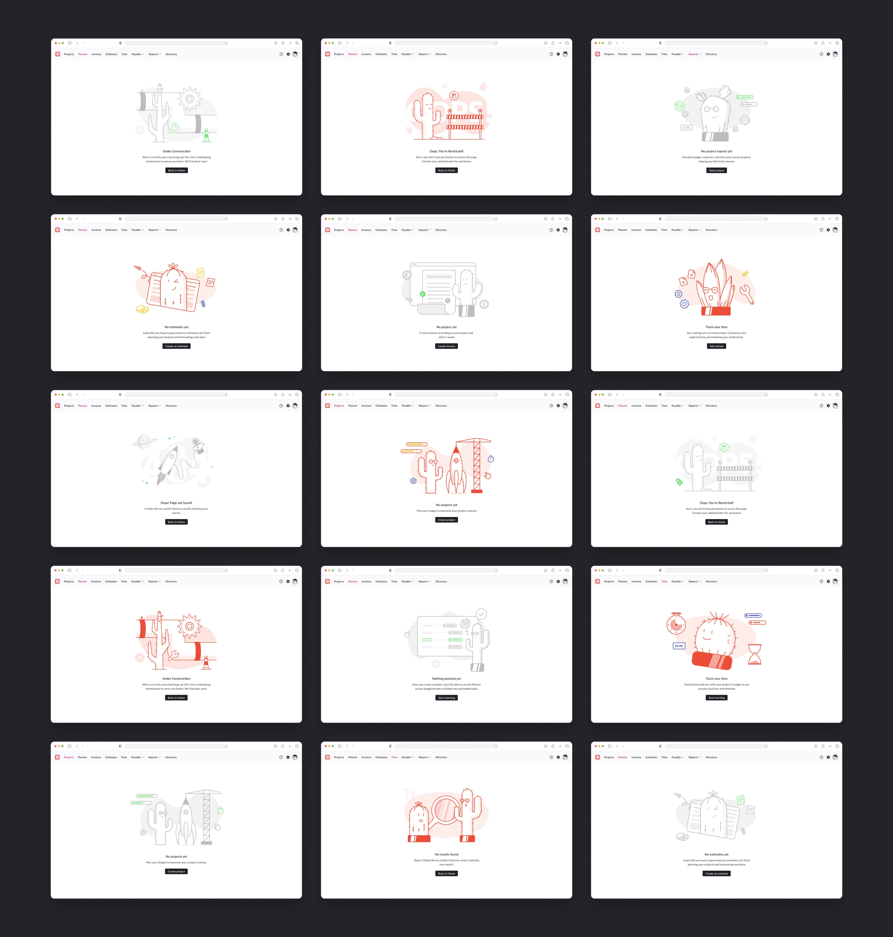
Use Case 1 – Colored Illustrations for New User Activation:
These vibrant illustrations greet new users, highlight the platform’s functionality, and guide them to start their first projects confidently. The red and orange color palette conveys warmth and energy, encouraging exploration.
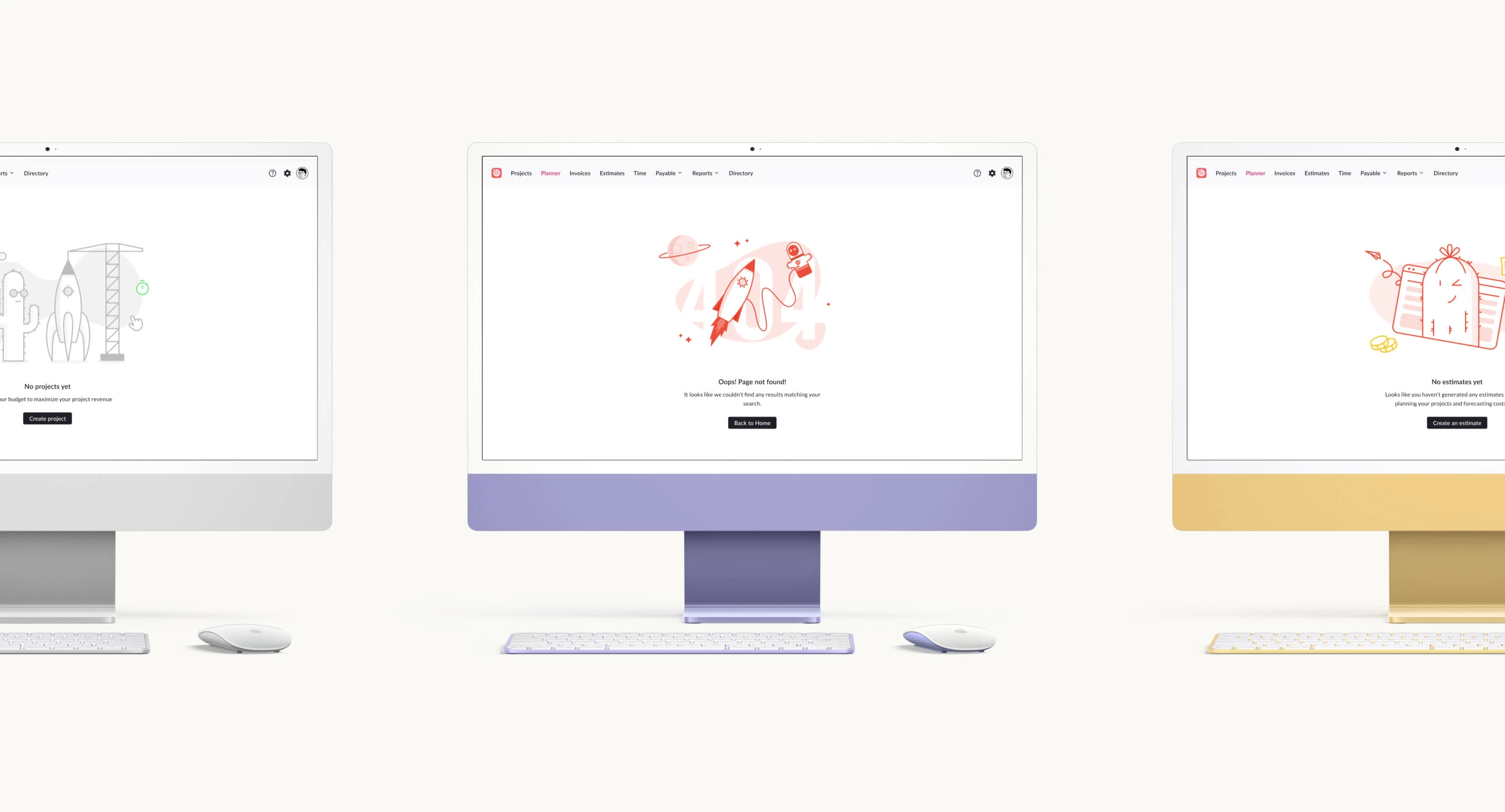
Use Case 2 – Gray/Neutral Illustrations for Active Users:
For active users encountering empty pages (due to deletion, maintenance, or restricted access), neutral illustrations offer a friendly visual cue, signalling that while data may be missing, the platform is still operational and reliable.
The Outcome
The final suite includes 12 illustration sets in two styles (neutral and colored), tailored for specific user journeys. They create a cohesive visual language that balances brand personality with user reassurance. By replacing empty states with these delightful illustrations, Rodeo Drive significantly improved the user experience, turning potential friction points into engaging and memorable interactions.
Impact
✨ Improved onboarding experience for new users, encouraging project creation and platform exploration.
✨ Reduced user anxiety in empty states, fostering trust and confidence in the platform’s reliability.
✨ Consistent visual identity that reinforces Rodeo Drive’s playful, accessible brand tone.
Explore More
Enjoyed this case study? Check out more projects and creative work like this on my website: www.petaravramoski.com
Like this project
Posted Aug 14, 2025
Designed unique illustrations for Rodeo Drive's empty states, enhancing brand identity and user experience.
Likes
1
Views
6
Clients
Rodeo Software