Playful Branding In Health & Wellness
Matt Thomas
Rythm Supplements - Brand Design
The wellness industry is flooded with serious, clinical brands that can feel intimidating or, frankly, a bit boring. Long-time health enthusiasts are tired of the same old thing and newcomers are often put off by all the unnecessary language.
Rythm Supplements wanted to change that & make wellness not just something you do, but something you actually enjoy.
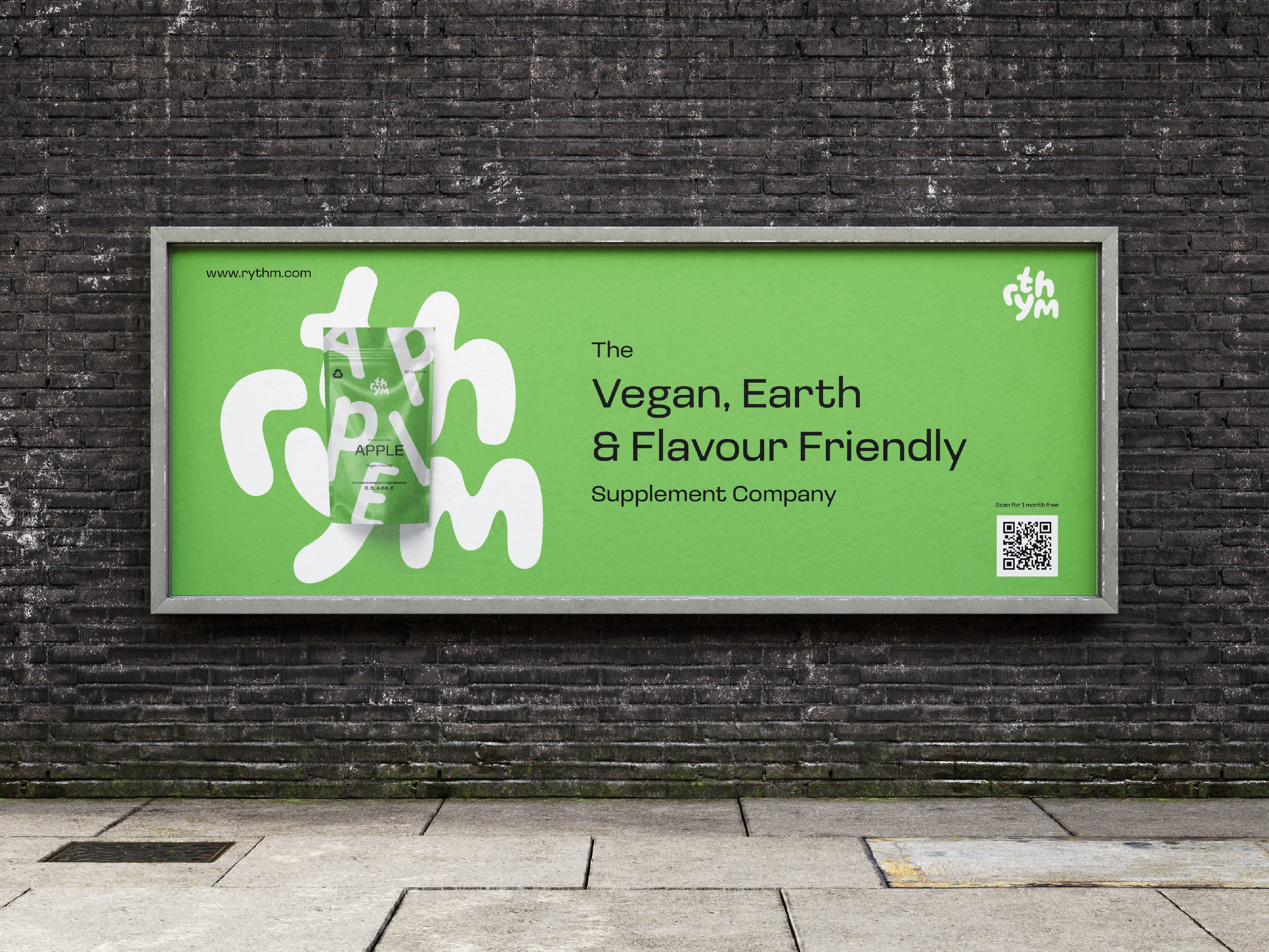
Wellness can and should be fun. By adding bold, delicious flavours to their supplements, Rtyhm turned something people typically endure into something they can look forward to. Whether a wellness pro or just starting out, they make it easy to enjoy your wellness journey.
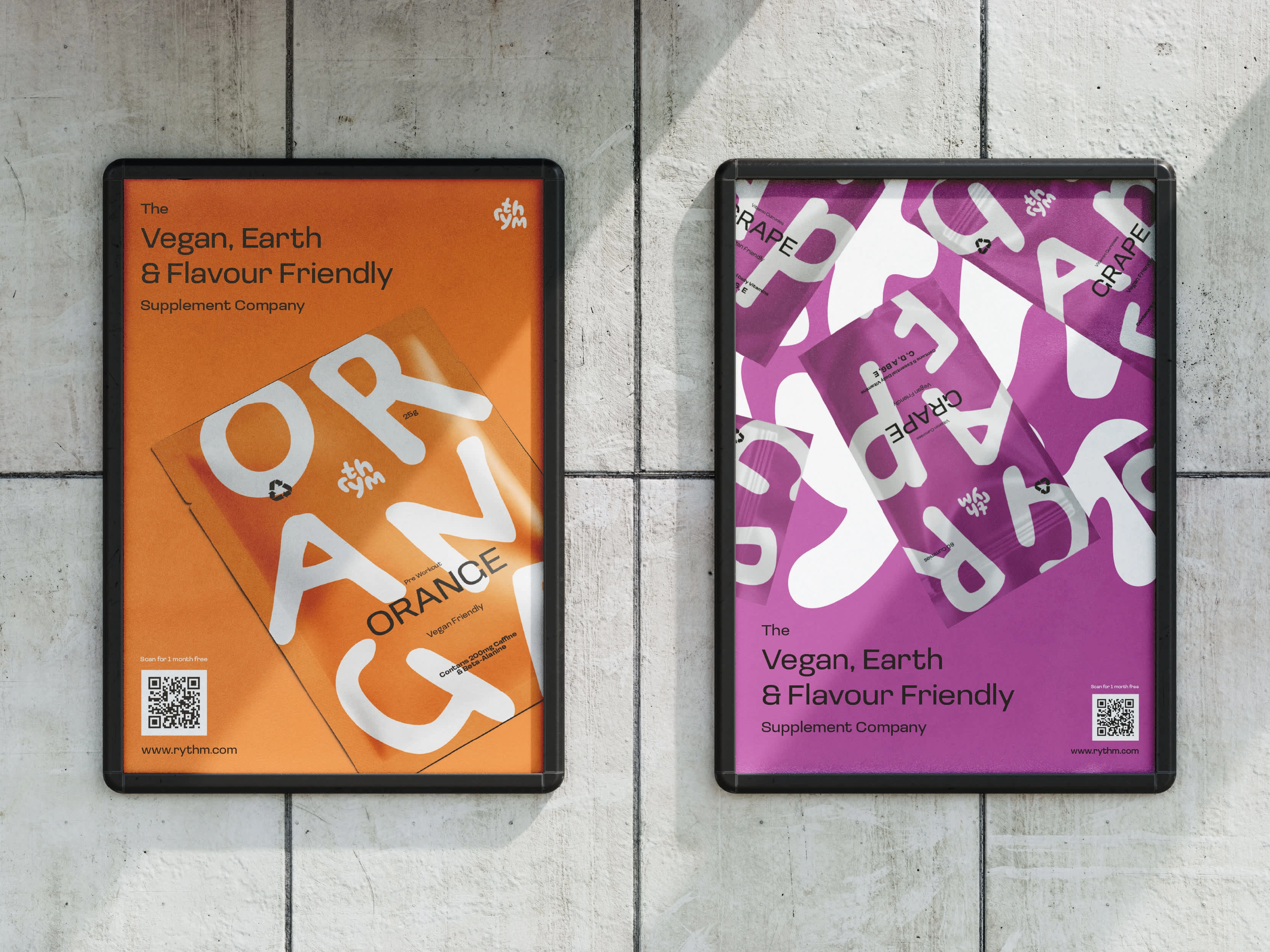
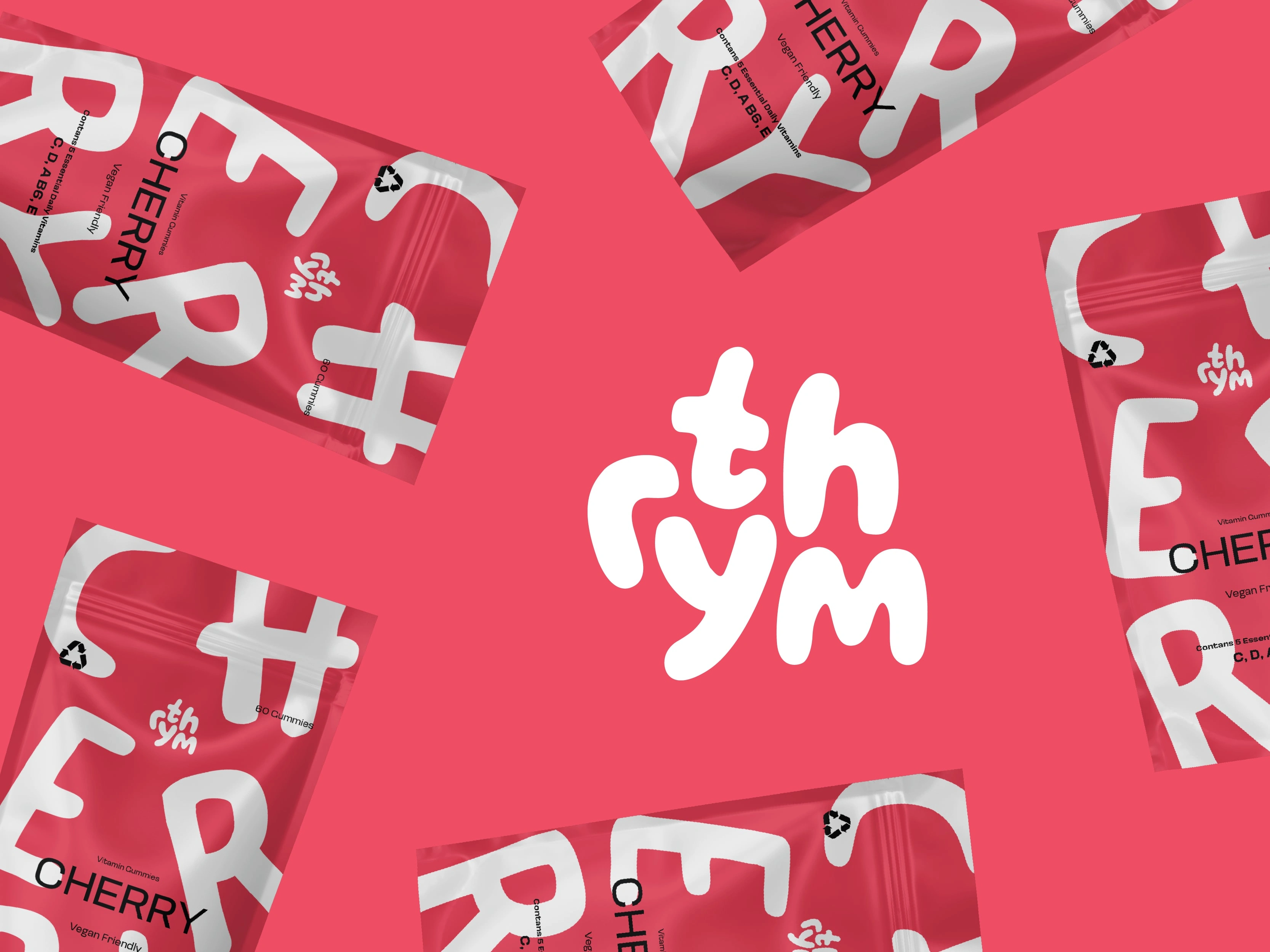
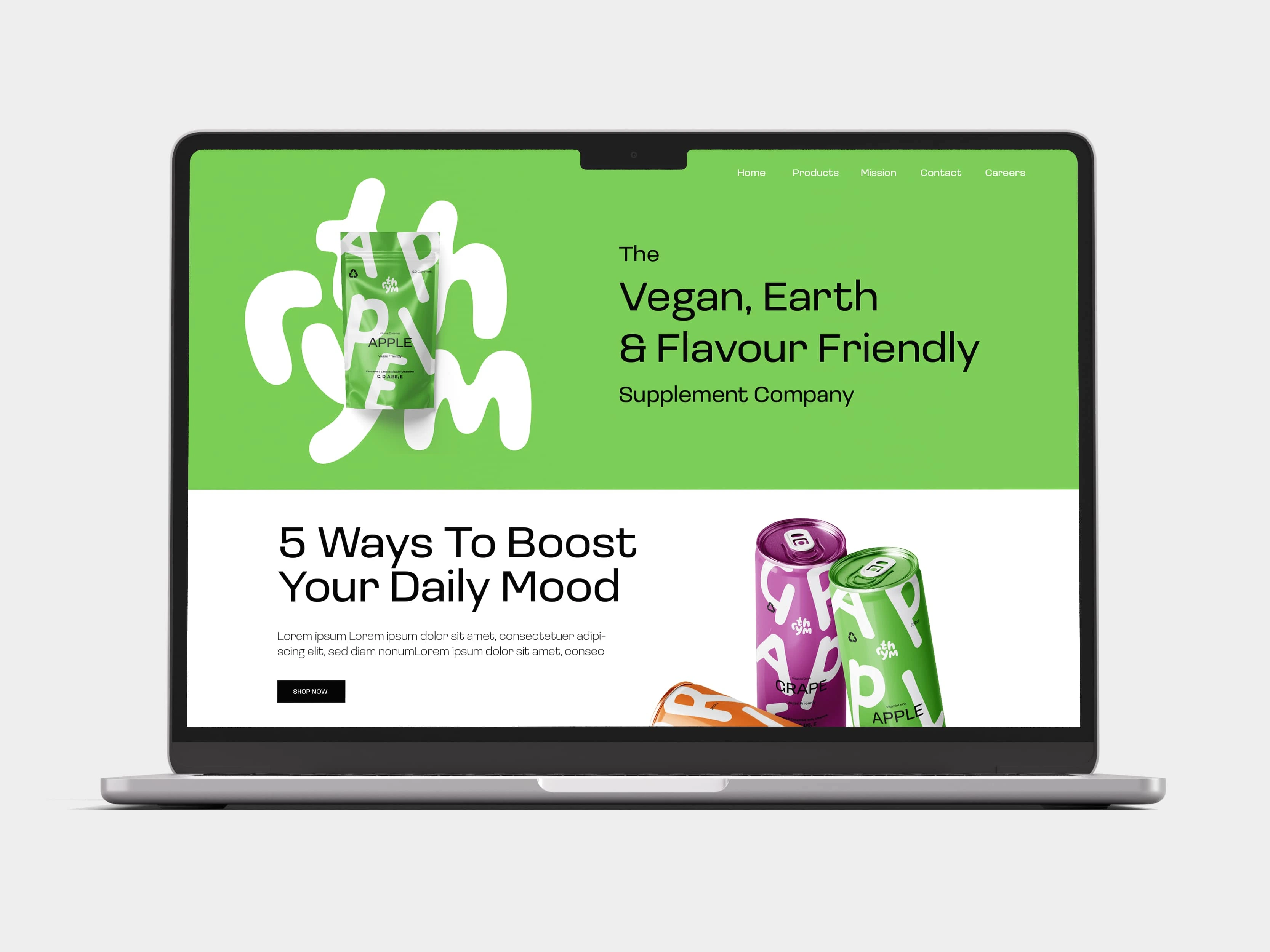
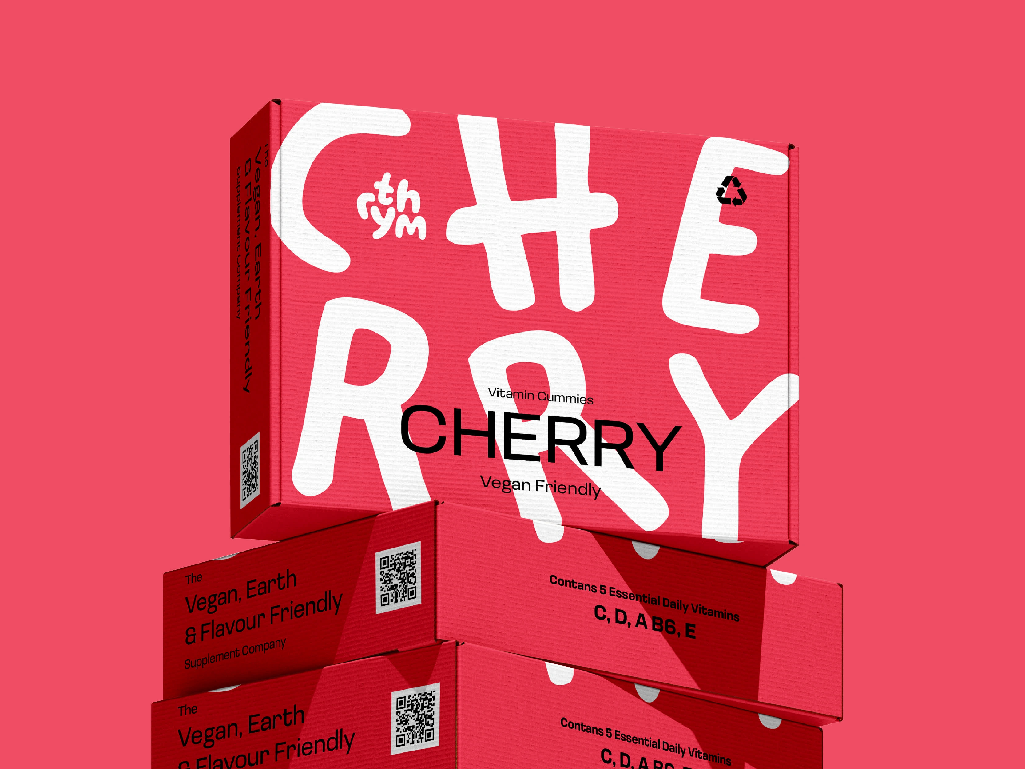
The logo is full of energy, just like the products Rythm offers. As a wordmark, it’s easy to recognise, and the square shape makes it super flexible across all platforms. It ensures the logo stays consistent and familiar, by fitting in, no matter where it’s needed to.
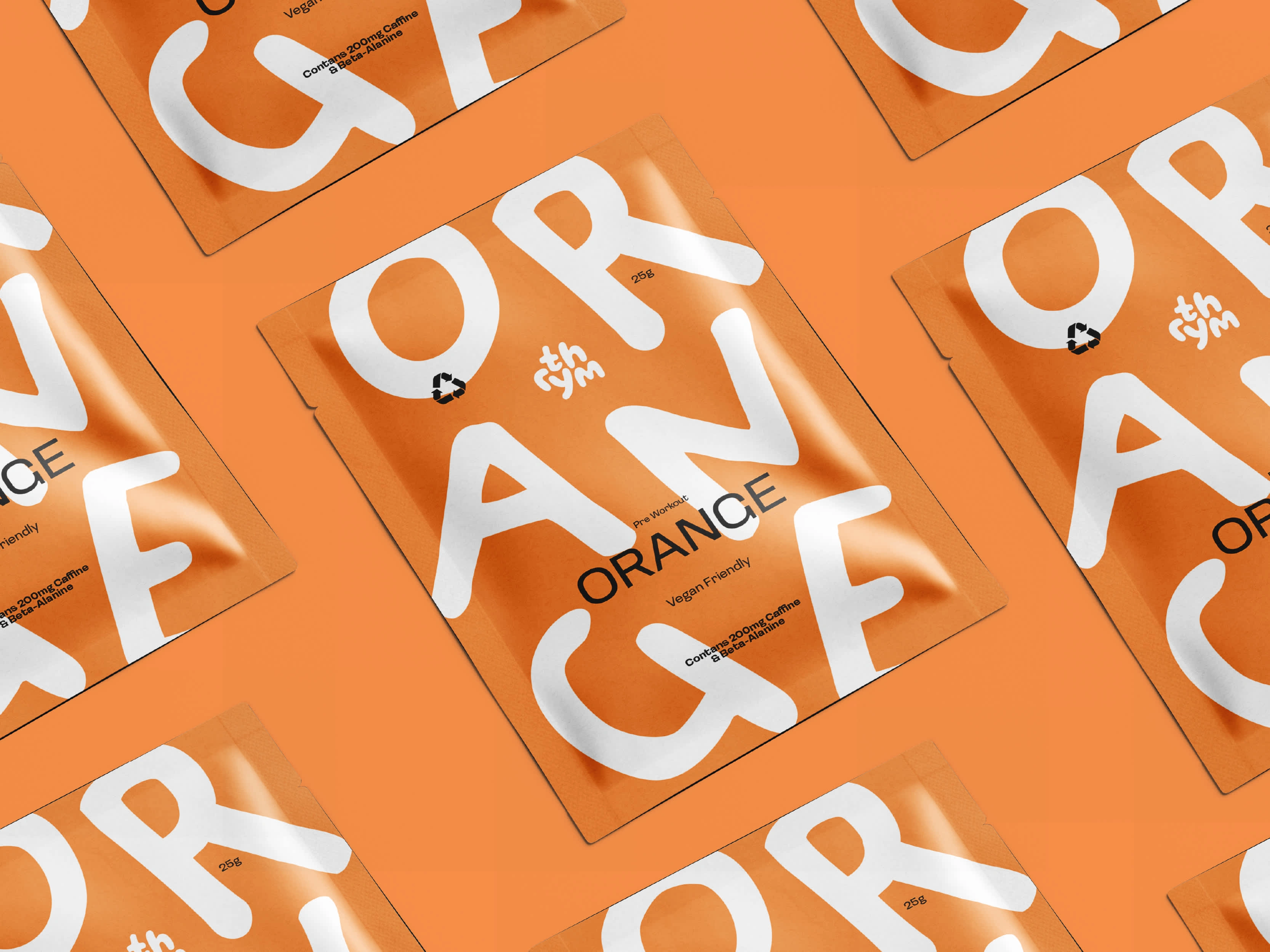
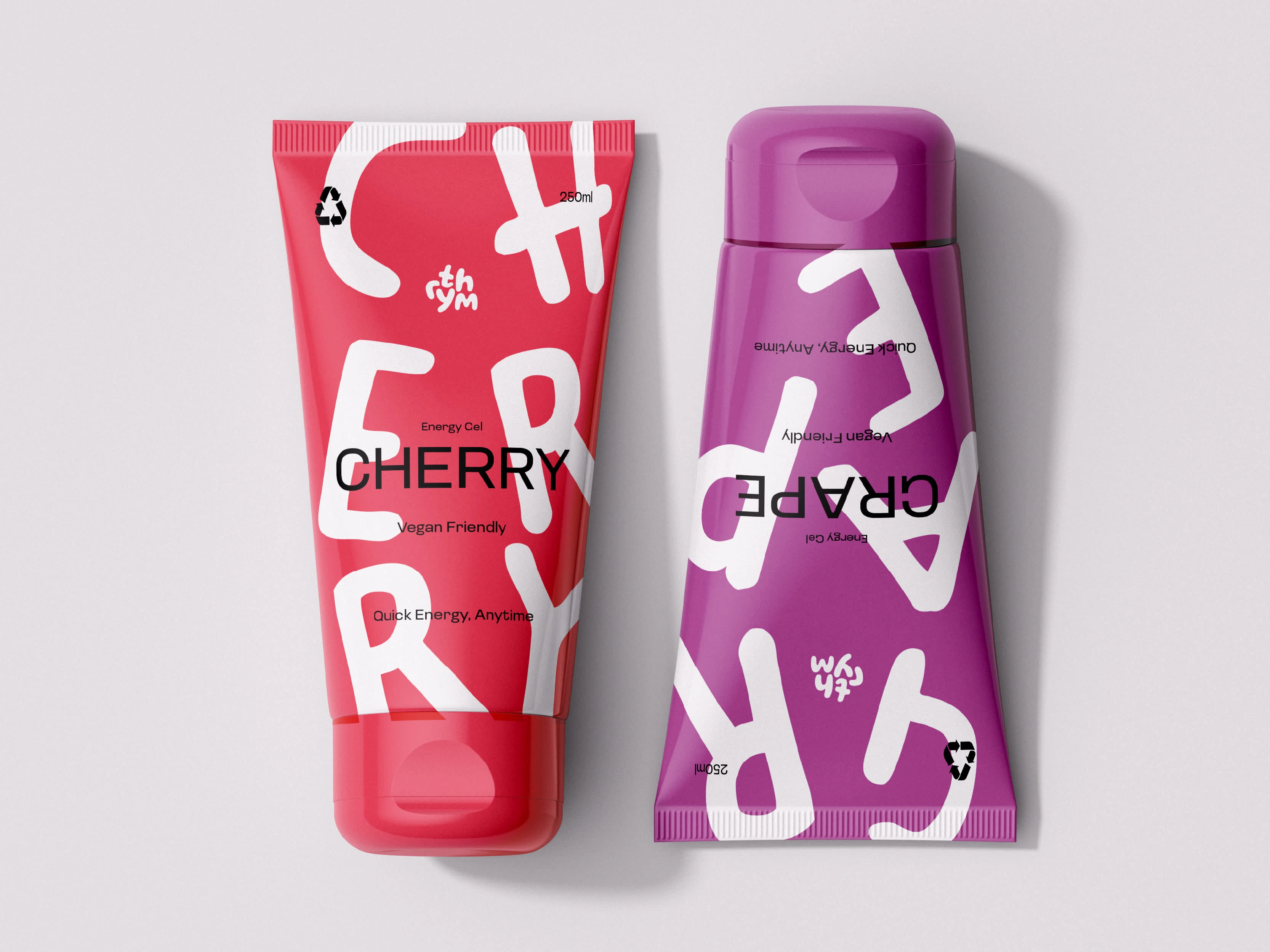
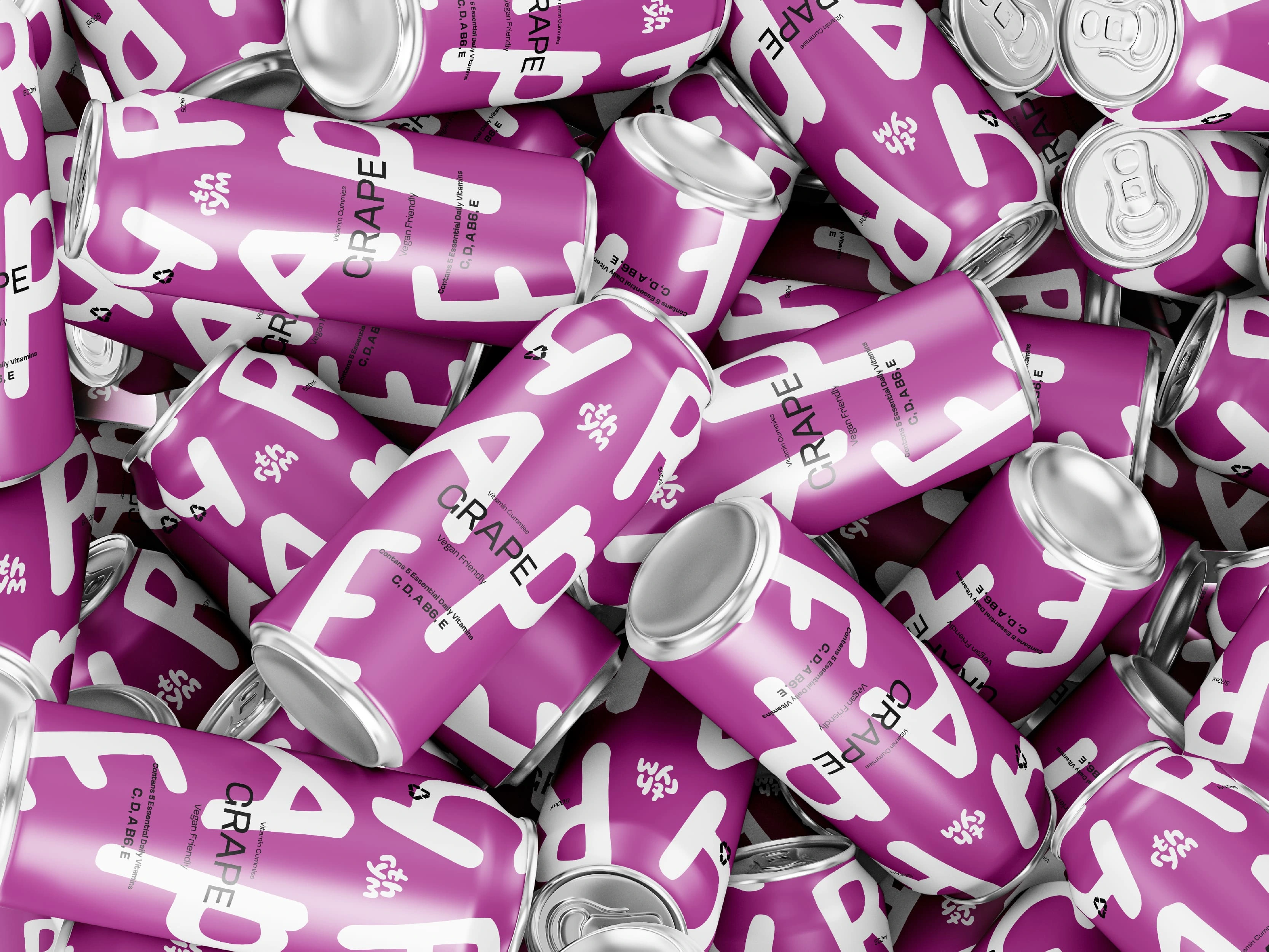
Rythm needed to stand out in the market, without losing its credibility. I matched each product’s flavour to its colour, so customers can easily spot what they’re after. Bright, bold colours make the products jump out, while the playful scaled typography keeps it light and approachable. All the essential info is easy to find and read, so the brand still feels trustworthy & knowledgable in an industry where that is paramount.
Rythm now is fresh & approachable, with a vibe that speaks to health newbies and long-time users alike. It’s a brand people can connect with on a personal level and one they trust for their wellness journey. This induces brand loyalty making it easy to retain & gain customers in a large cramped market.
Like this project
Posted Feb 27, 2025
A bold & playful brand identity designed to disrupt the clinical based health & wellness industry brands & encourage new starters on their health journeys