SUPER SEED | Brand Identity
ruthia yang
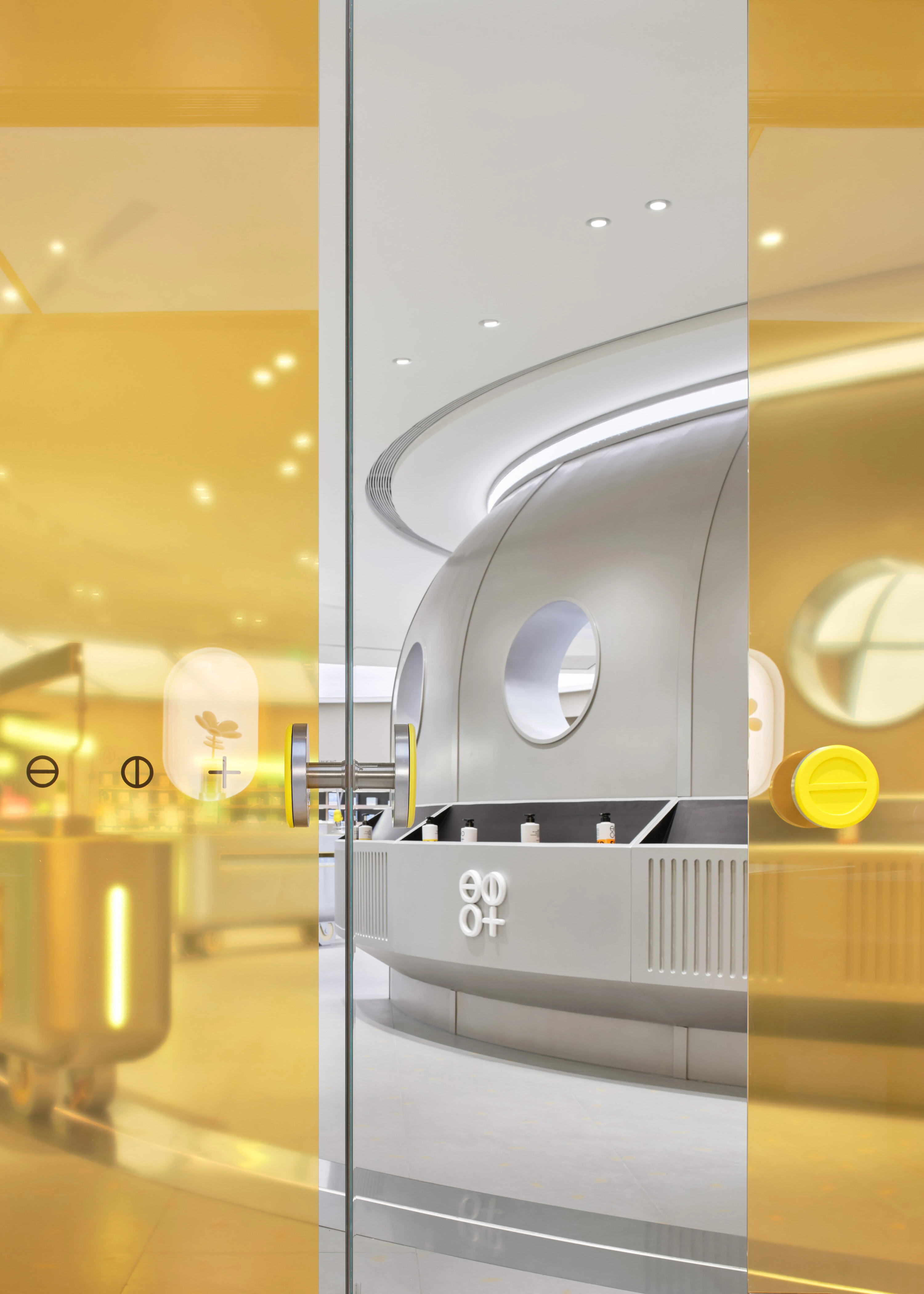
The Challenge
SUPER SEED is a new-generation genderless personal care brand built on organic, minimal-ingredient formulations. The challenge was to create a visual identity that felt both natural and forward — breaking the stereotype that organic products are conservative or niche.
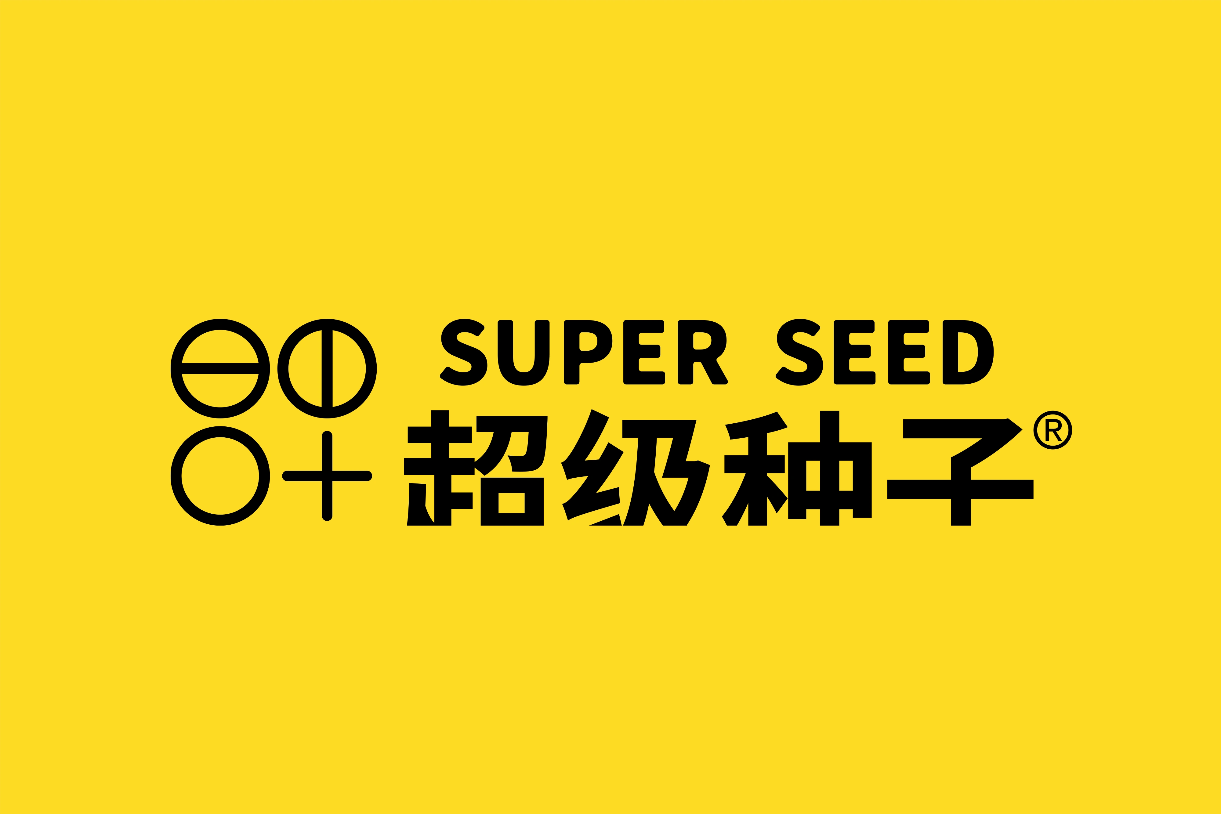
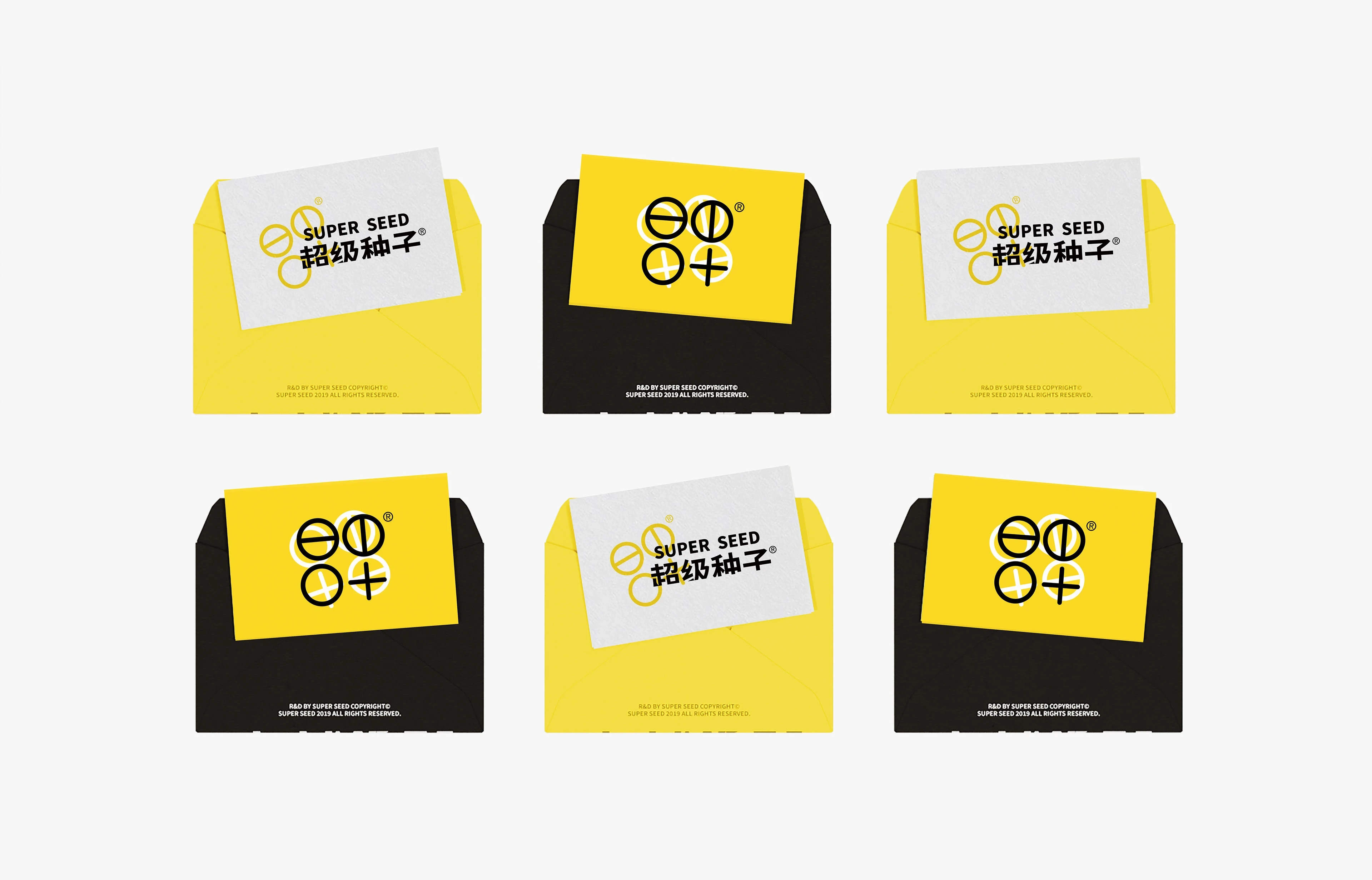
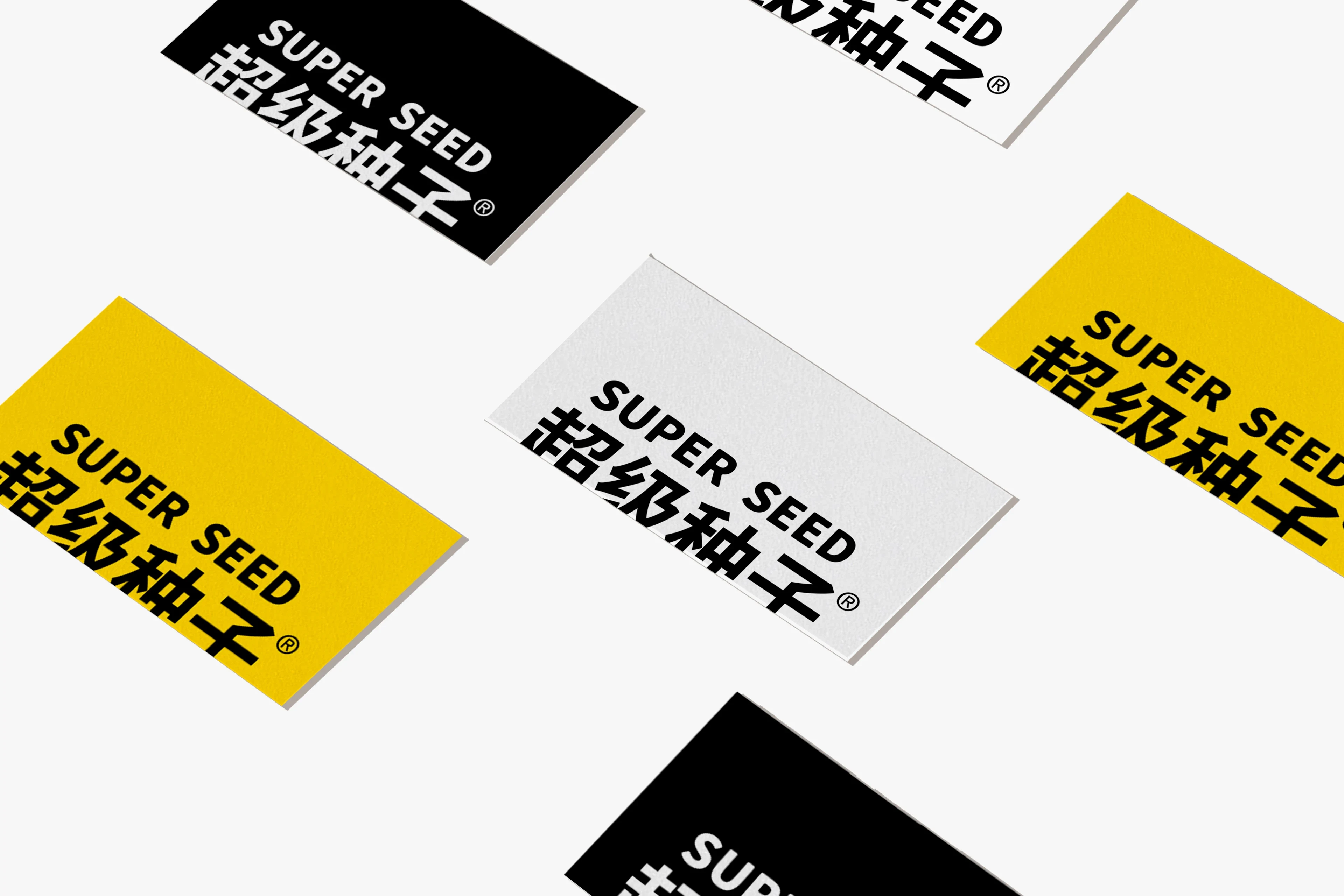
logo
My Approach
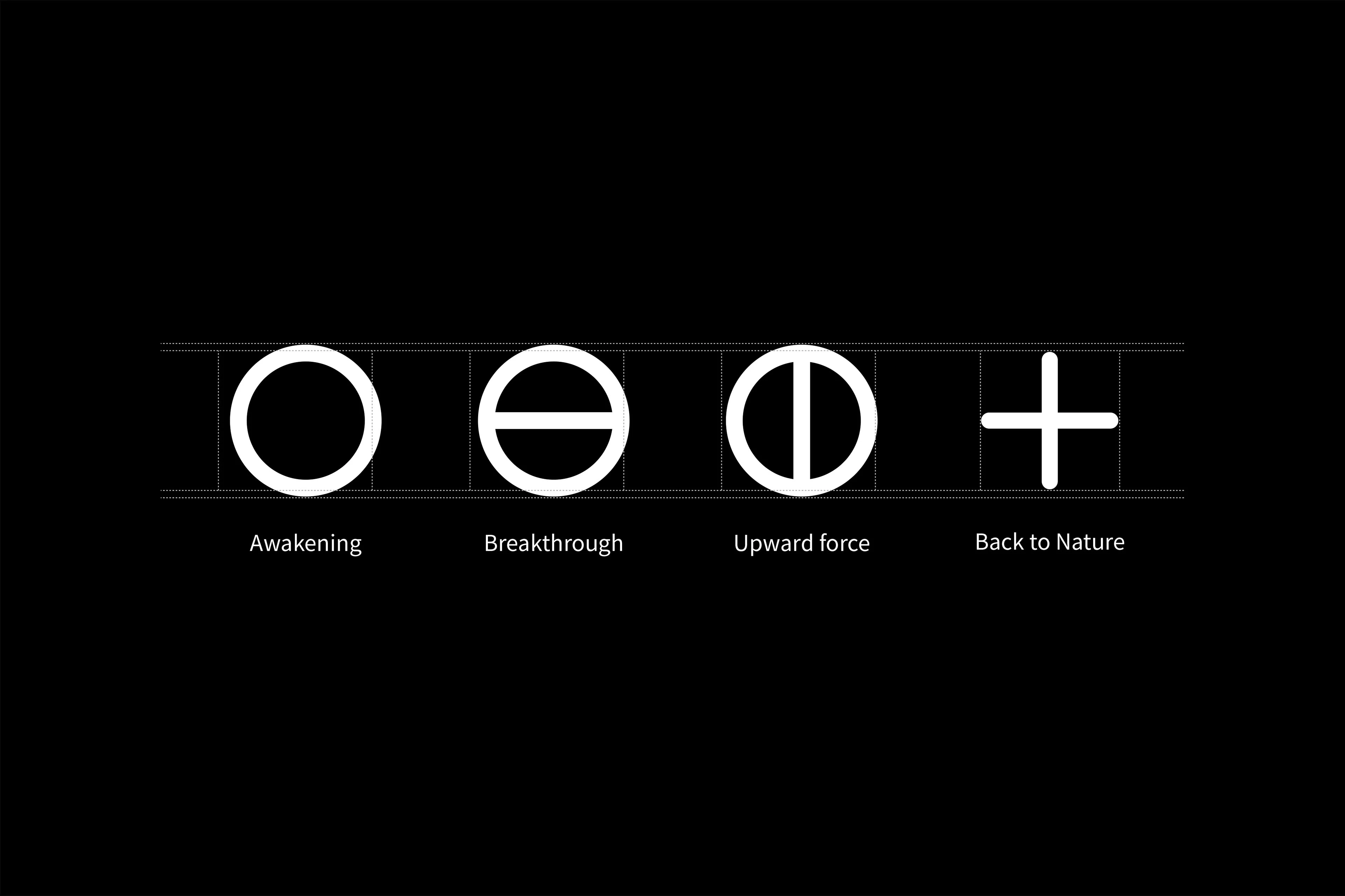
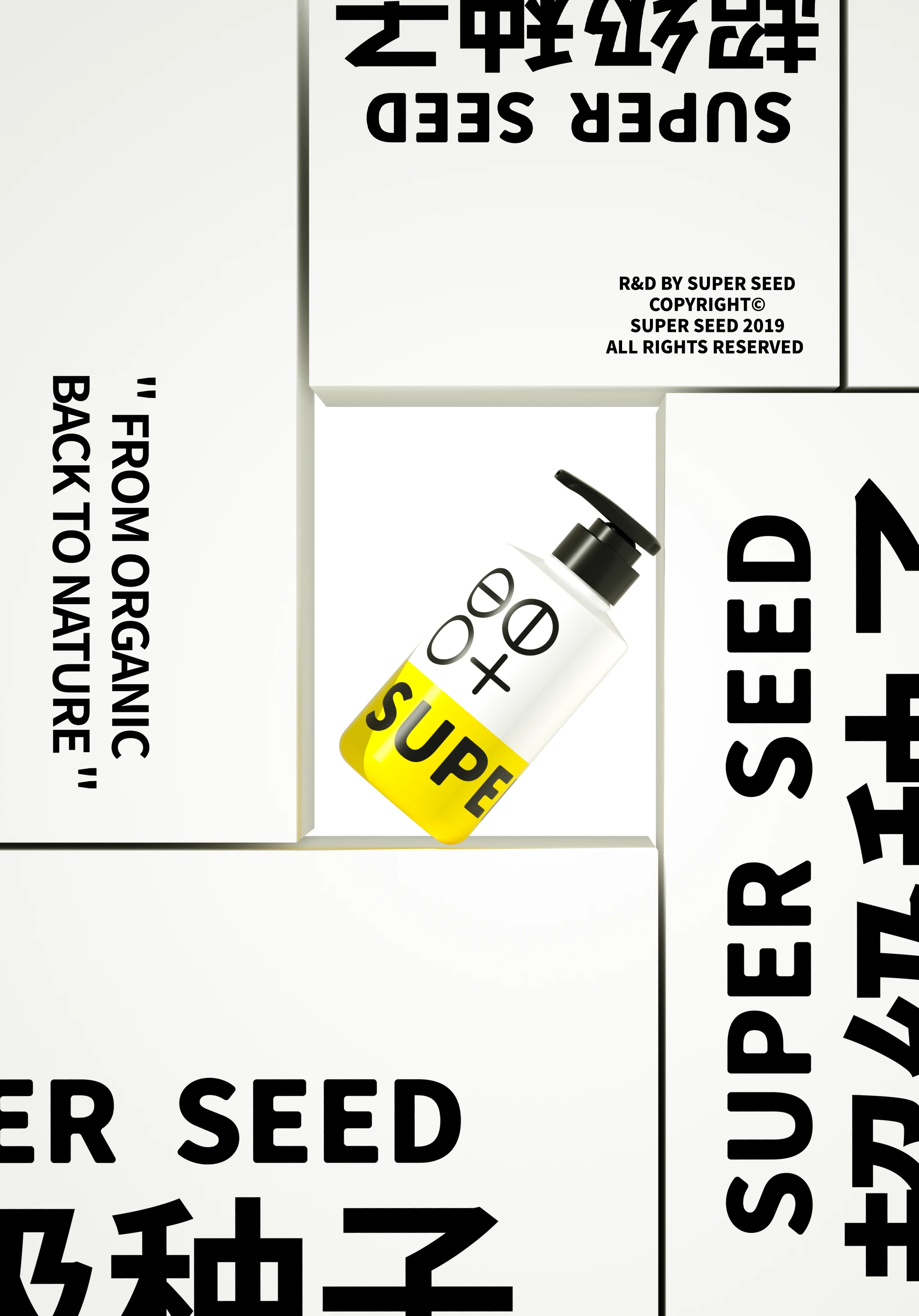
The brand symbol abstracts the life cycle of a seed — growth, return, and regeneration — representing the brand's core belief that what comes from nature returns to nature. The visual system uses clean, bold geometry to communicate this philosophy without losing attitude, giving the brand flexibility across product lines while maintaining a strong identity.
Outcome
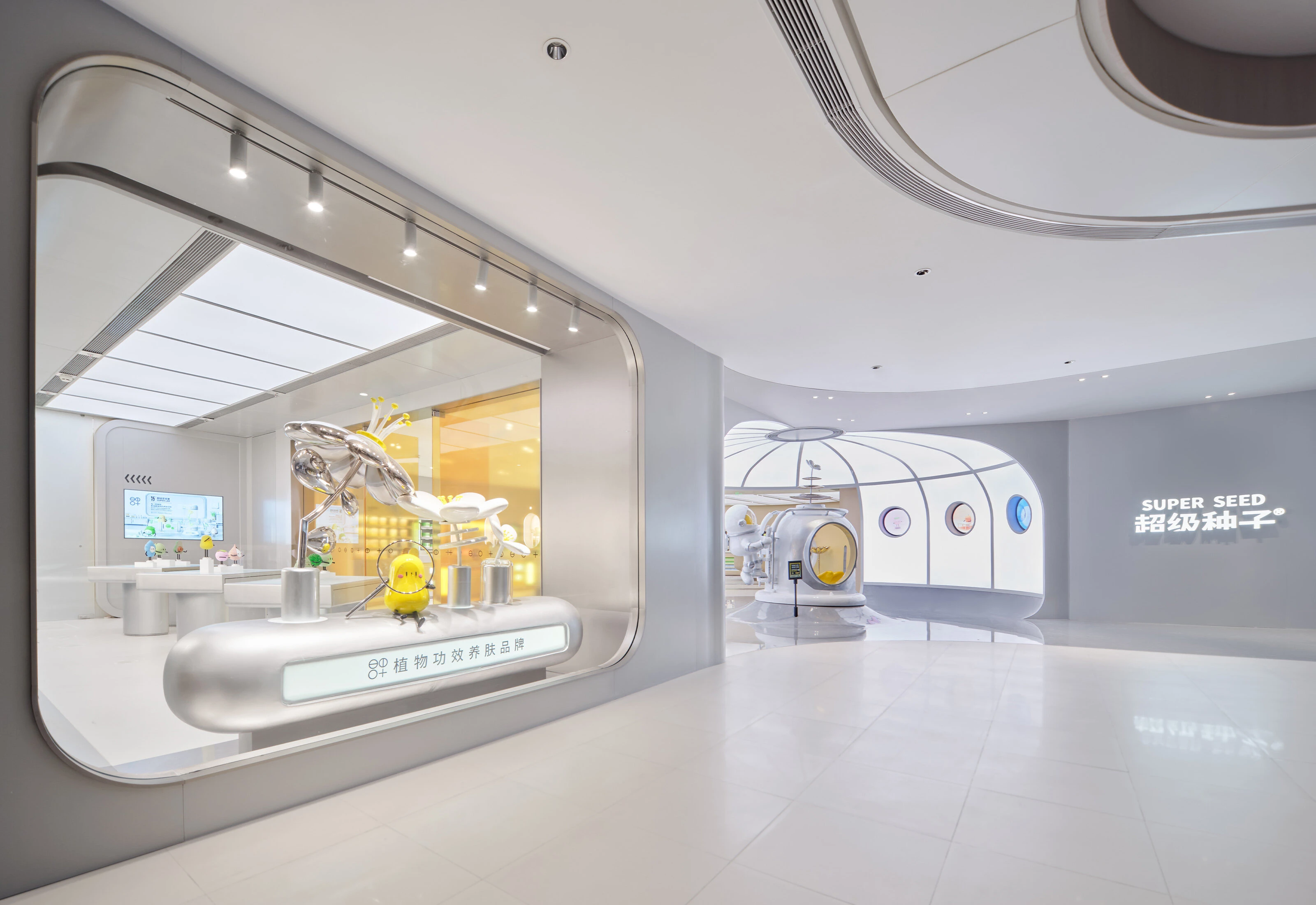
Delivered a complete visual system from 0 to 1 — logo, color palette, typography, packaging, and spatial design. The brand launched across 2 physical retail locations and supported the company's fundraising through Series B.


Like this project
Posted Jun 8, 2026
Built SUPER SEED's brand identity from 0→1. Core symbol draws from plant life cycles —every ending seeds a new beginning. Logo, color system, visual guidelines.