Nimble Links: Analytics Redesign
Angie Vella
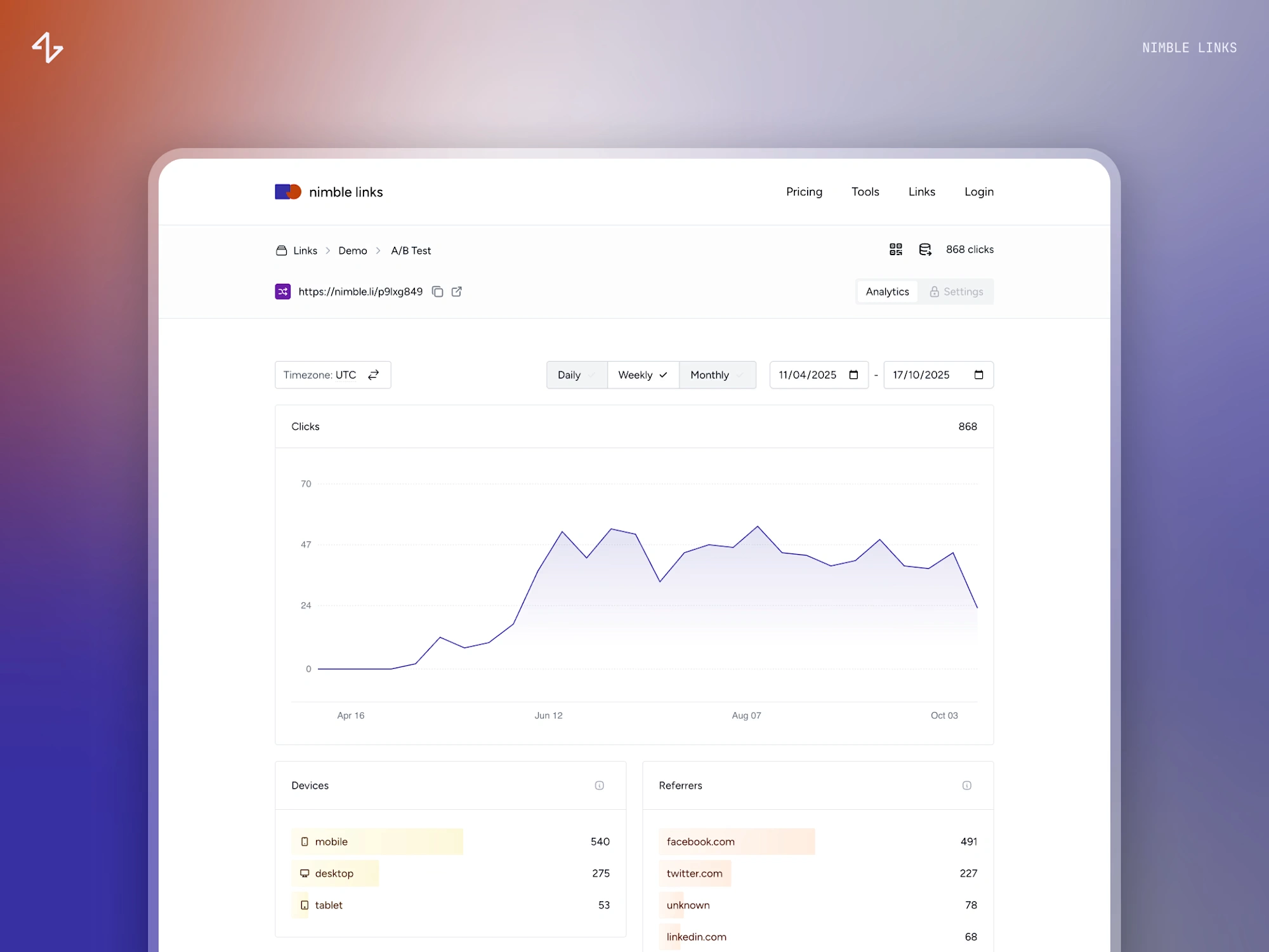
Worked directly with the founder to redesign the analytics experience for Nimble Links — a smart links platform for running experiments, campaigns, and redirects.
The existing page had the right data but needed a rethink in how it surfaced. Performance and privacy were hard constraints throughout: the platform's speed is non-negotiable, and the analytics had to work without tracker cookies or fingerprinting — so every design decision had to respect both.
I studied analytics patterns across tools like Fathom, Plausible, Substack, and Vercel, then walked through the existing page with the founder to identify what to keep and what to drop. Several rounds of UI exploration followed before landing on a design that balanced clarity, performance, and the product's existing visual language. Countries became a world map with the list as a secondary view; referrers and destinations now sit side by side for comparison; each data type carries its own color drawn from Tailwind's defaults.
Like this project
Posted Apr 27, 2026
Redesign the analytics experience for Nimble Links — a smart links platform for running experiments, campaigns, and redirects.