Solar Power Phone Case | iPowerUp | Charge Anywhere
Rob Gemmell
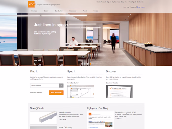
iPowerUp | Brand, Website, Strategy, Design, and Messaging for a smart solar phone case company
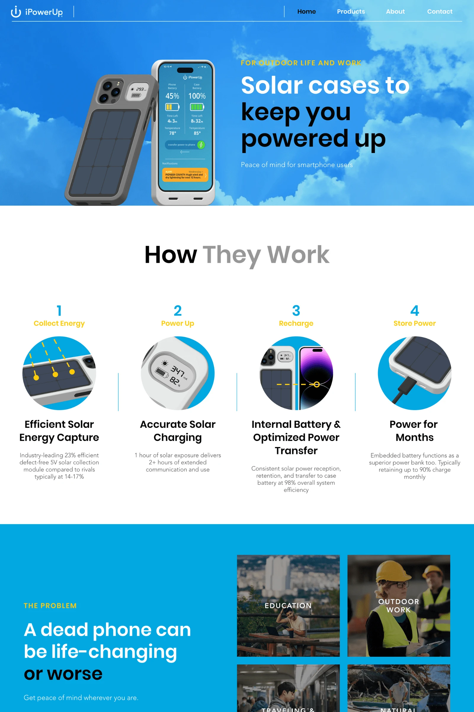
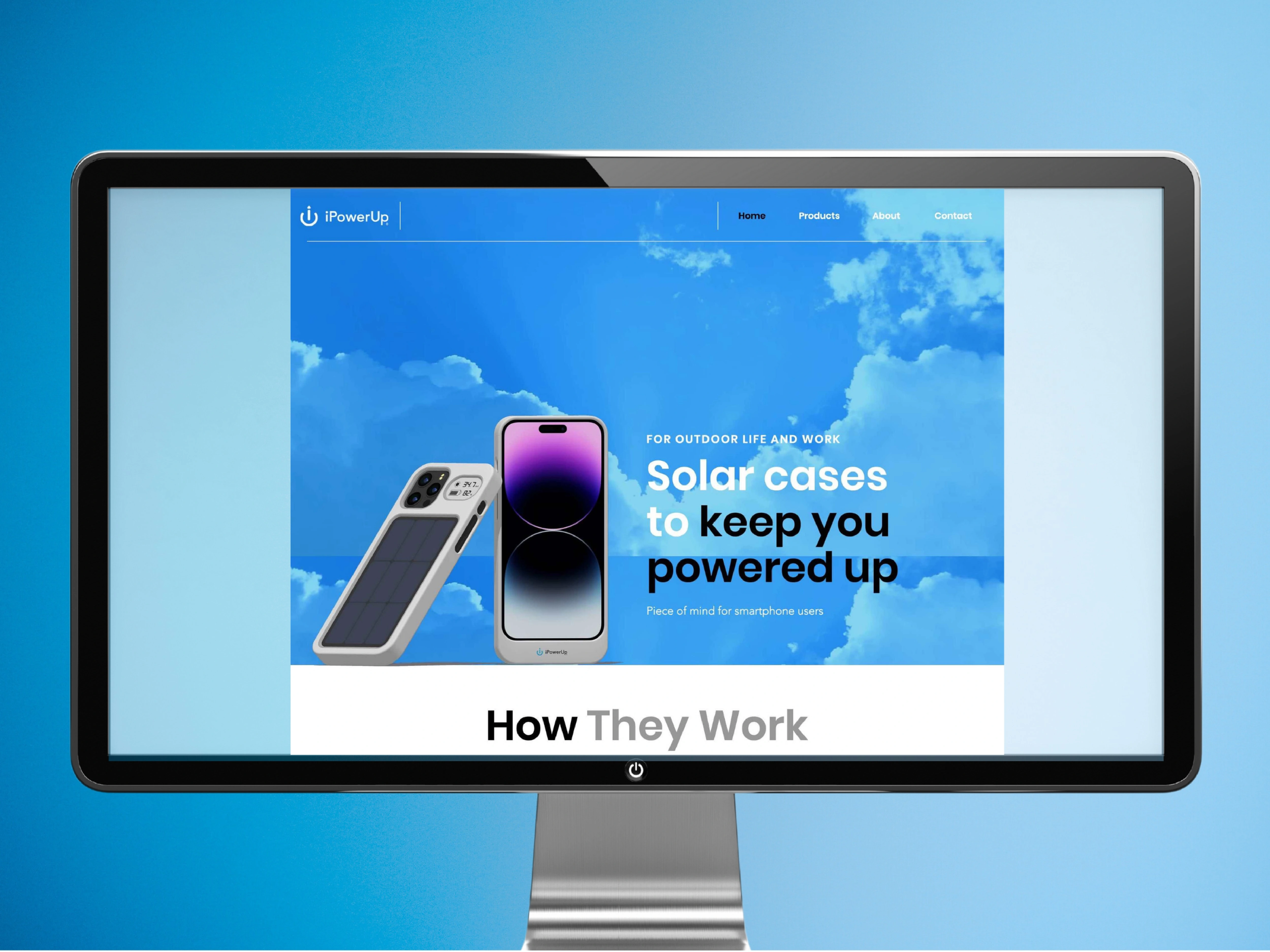
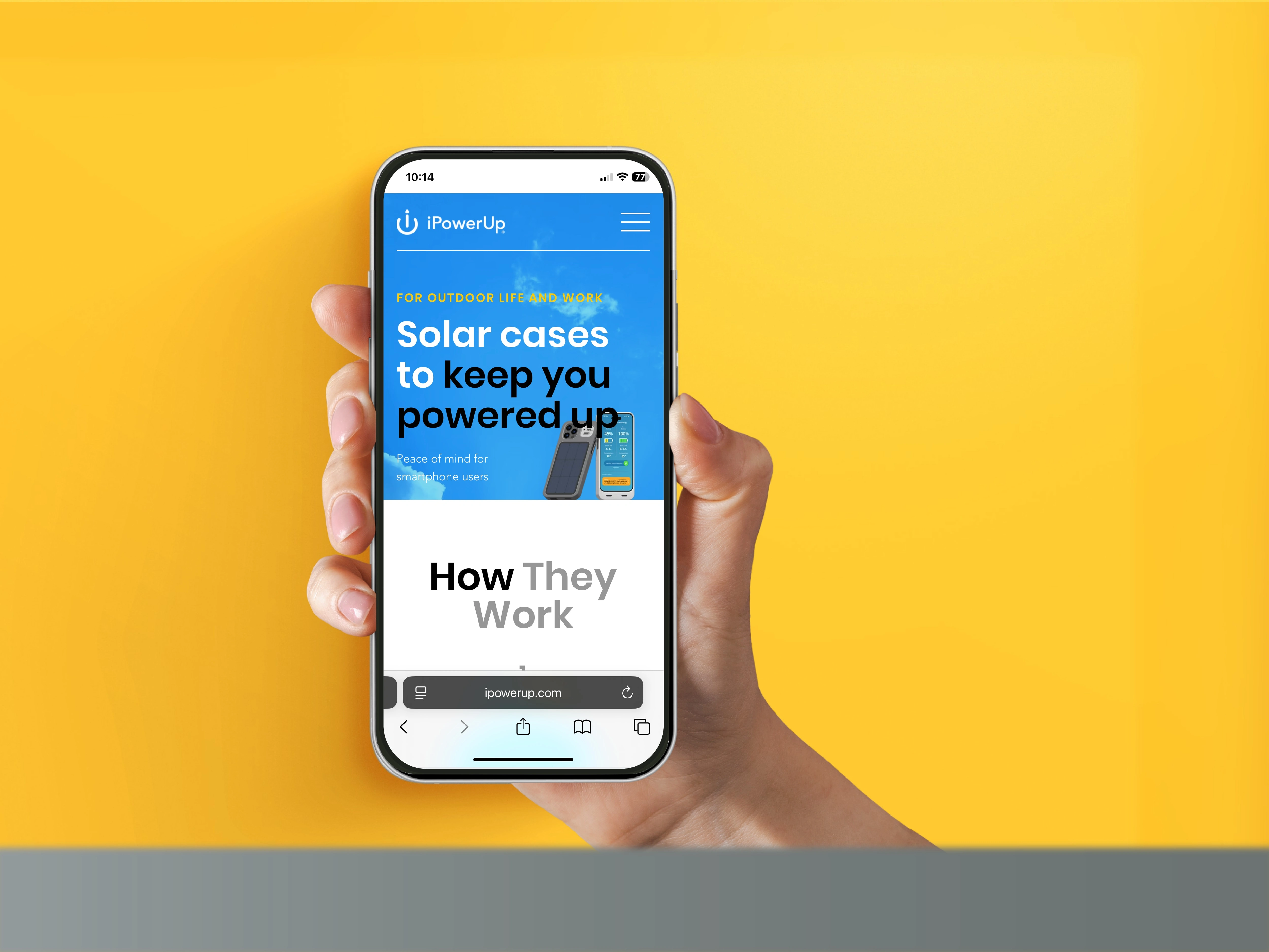
A start-up home page that paints a picture of worry-free phone batteries, how that happens, and why it's so important.
Website Product page
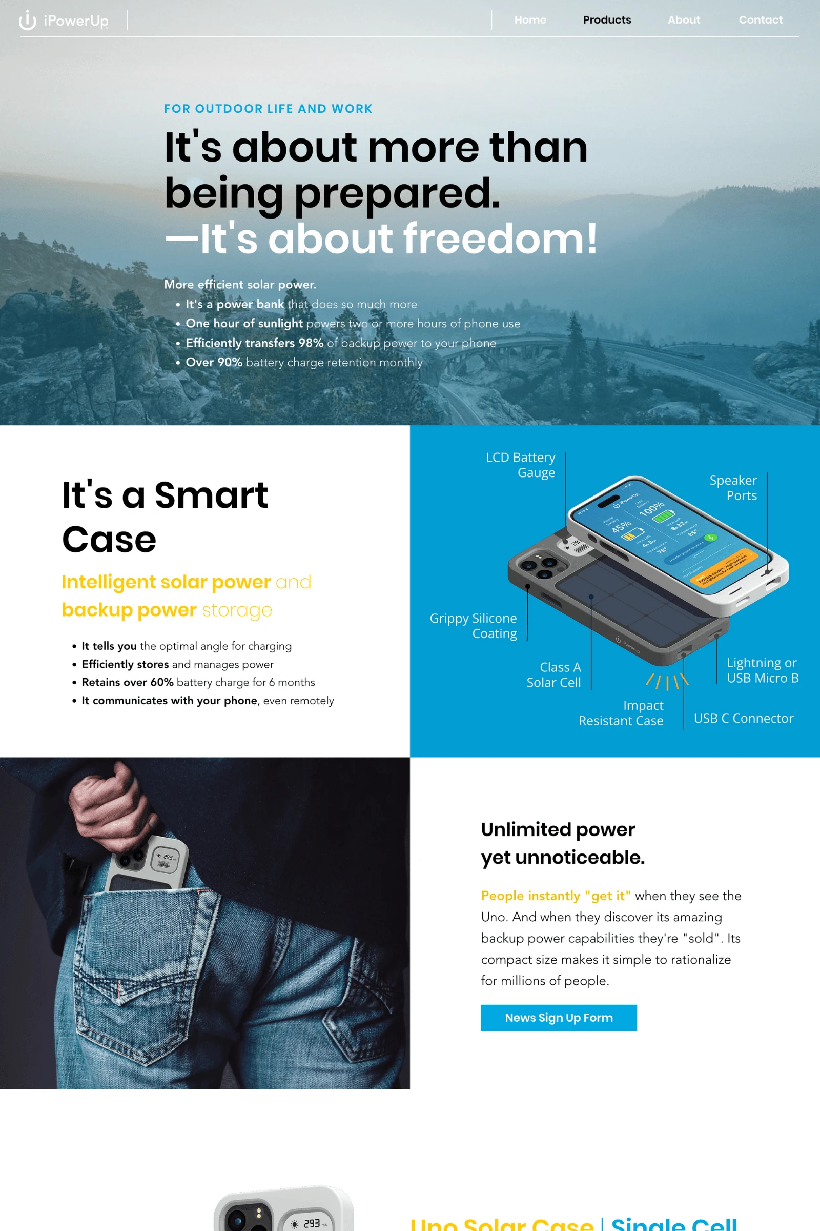
The page tells a story about the new products, beginning with a substantial pain-killing benefit before diving into details.
Brand Identity Design | 01
The new and updated logo for iPowerUp. The combined "i", On/Off icon, and arrowhead literally symbolize "iPowerUp".
Brand Identity Design | 02
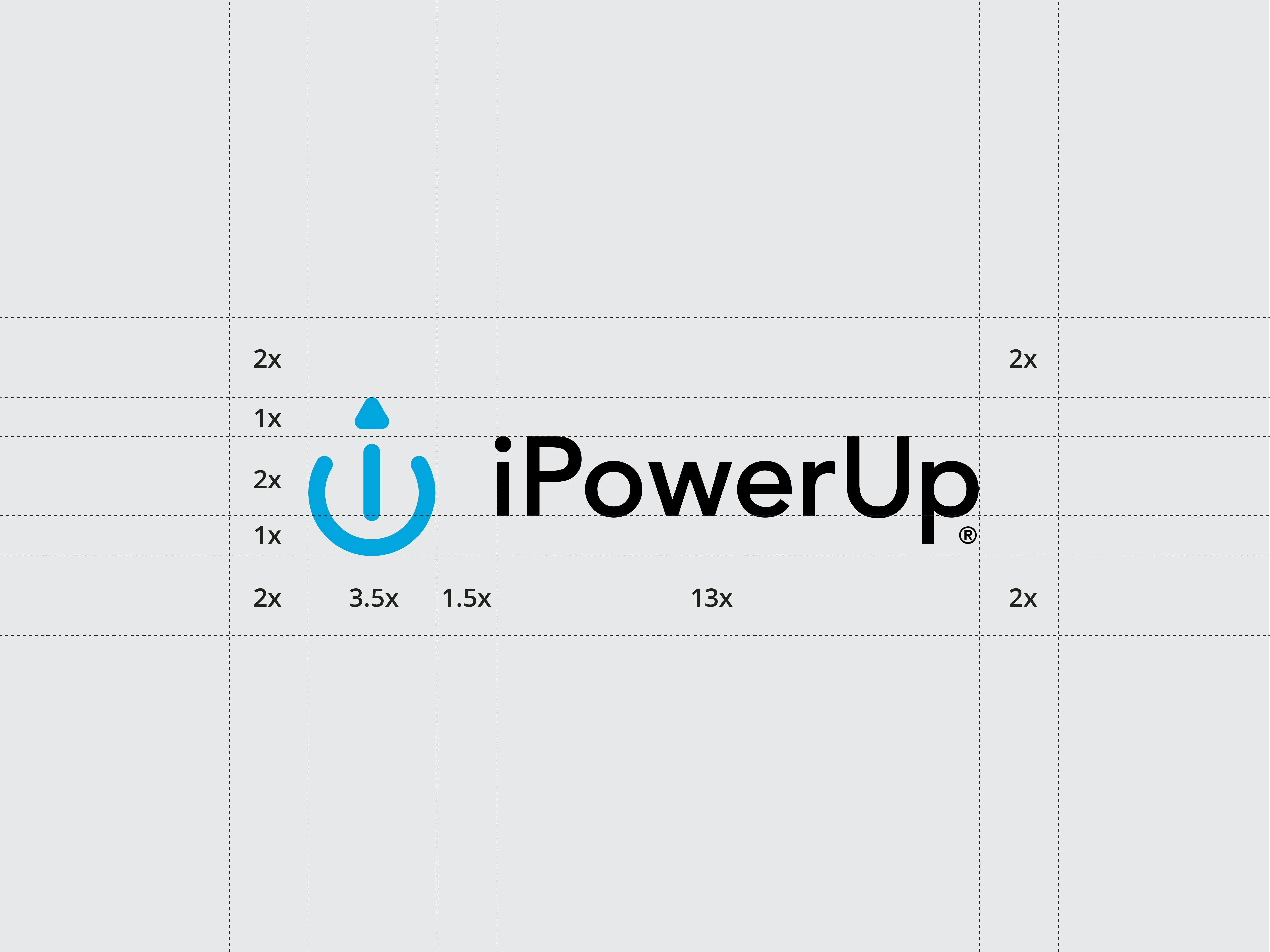
The mark and text are sized and spaced for easy repreduction and legibility in very small digital contexts as well as large media and outdoor signage uses.
Brand Identity Design | 03
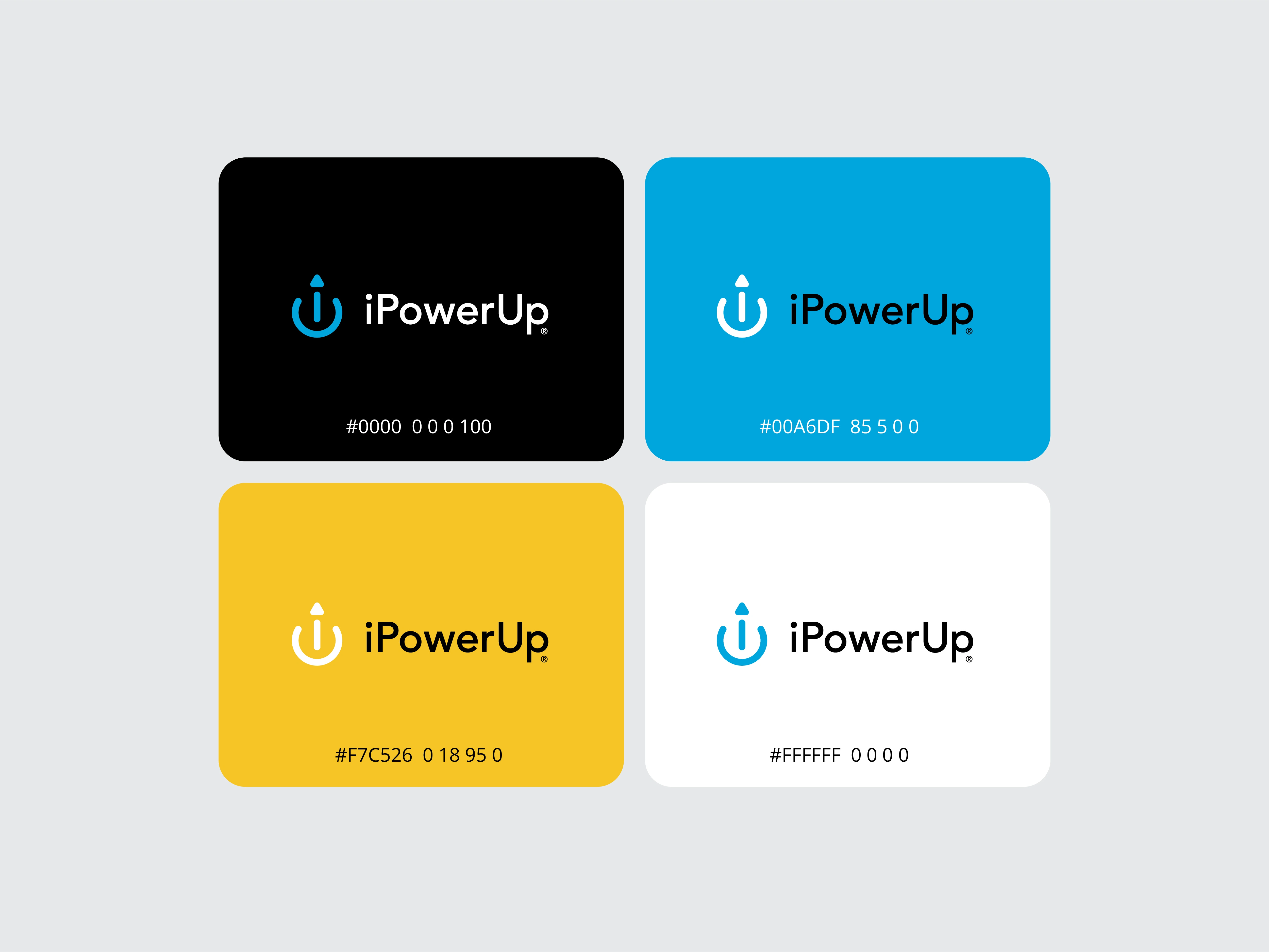
The color palette mix evokes both, product's storage of (blue) electricity, captured from (yellow) sunlight to provide user's peace-of-mind (white) day, or (black) night!
Brand Identity Design | 04
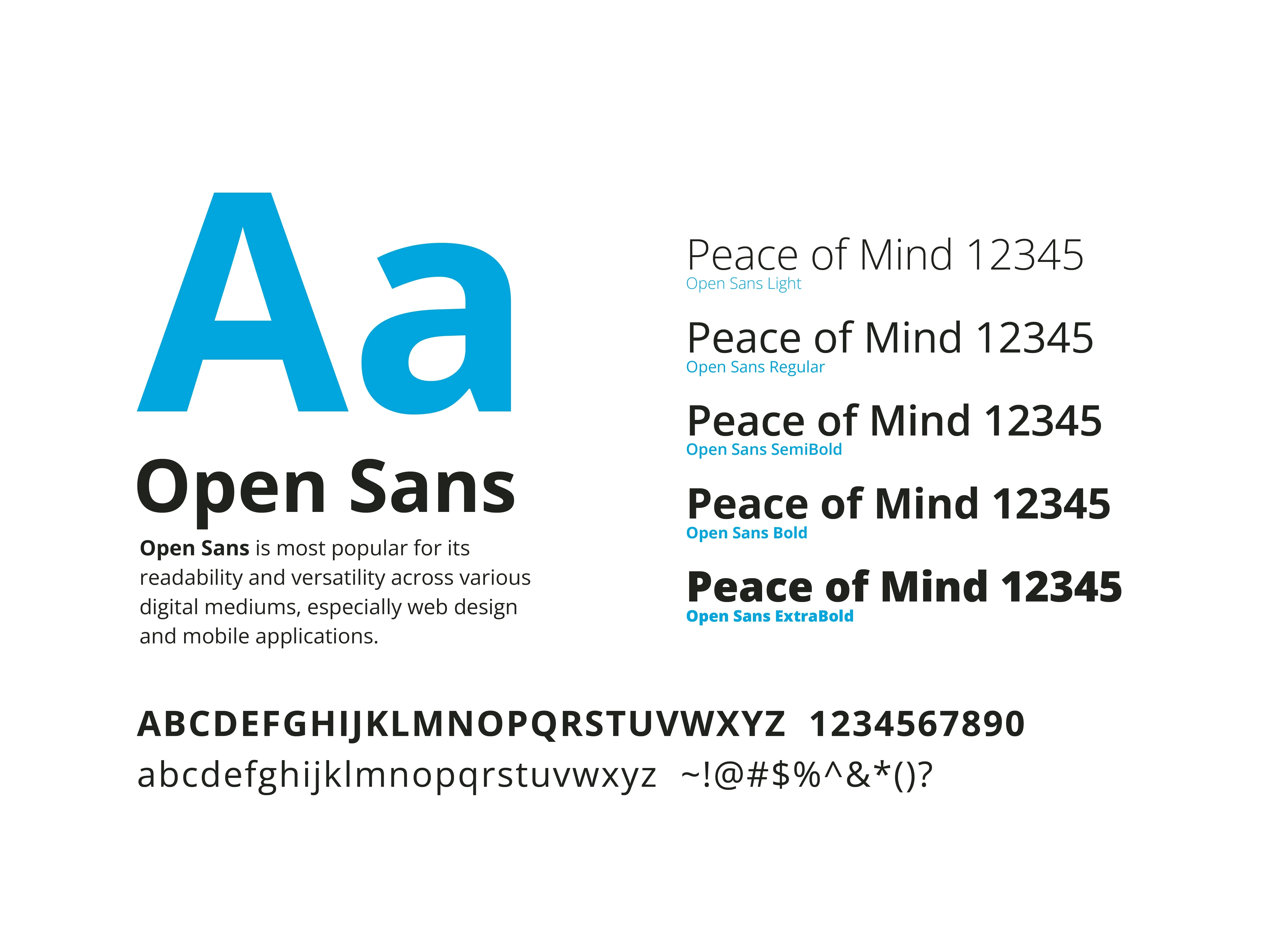
A timeless and contenporary international font was selected for it's broad range of weights and online accessibility worldwide.
Brand Identity Design | 05
The identity is designed to be used in multiple color combinations to accommodate a broad range of contexts, sometimes without distracting form the messaging.
Brand Identity Design | 06
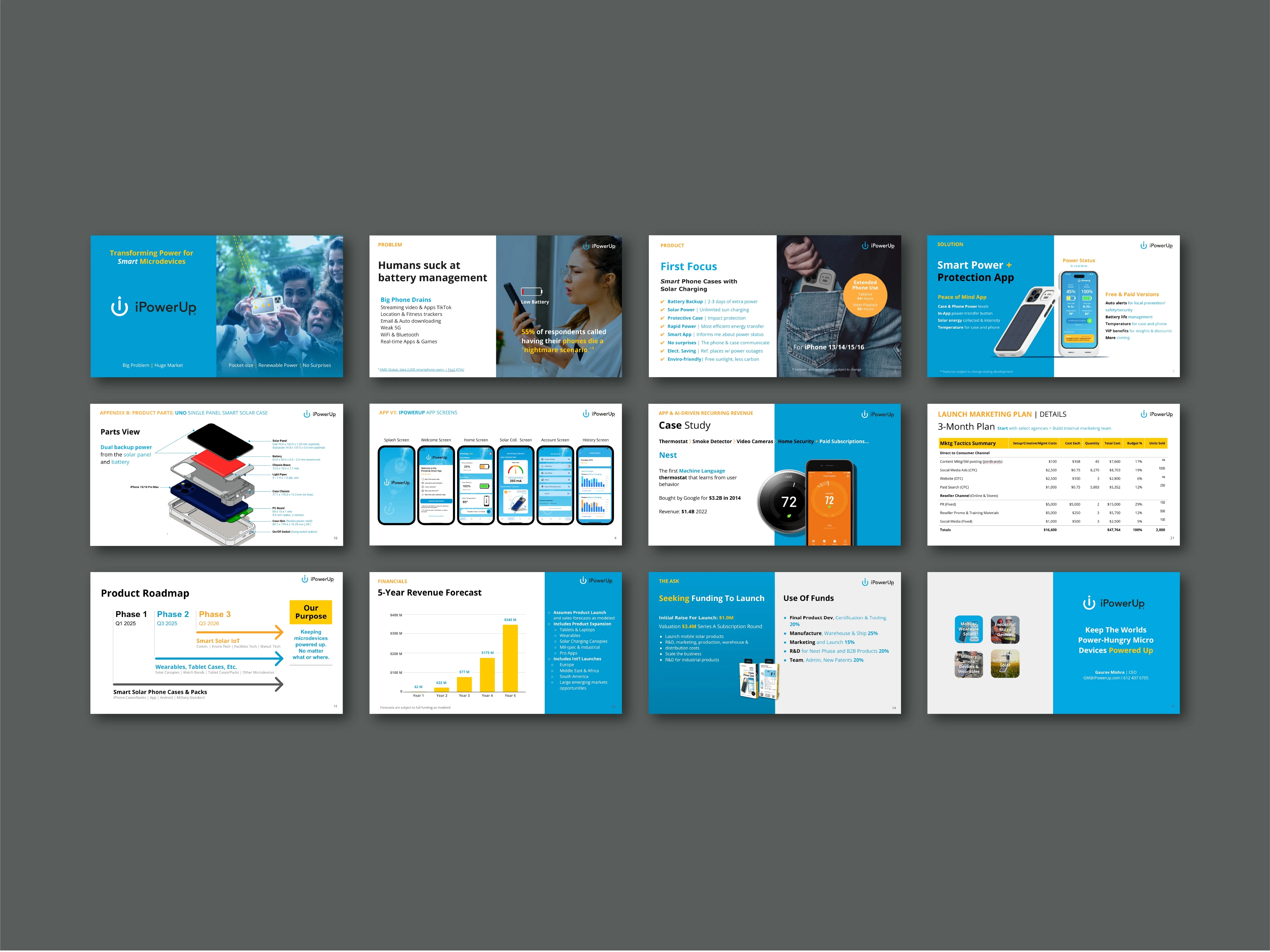
As a tech startup iPowerUp needed investor presentations that made memorable impressions of the company, and it's ability to establish an iconic brand.
Brand Identity Design | 07
Brand strategy allowed for reformatting at many scales while maintaining the brand personality.
Brand Identity Design | 08
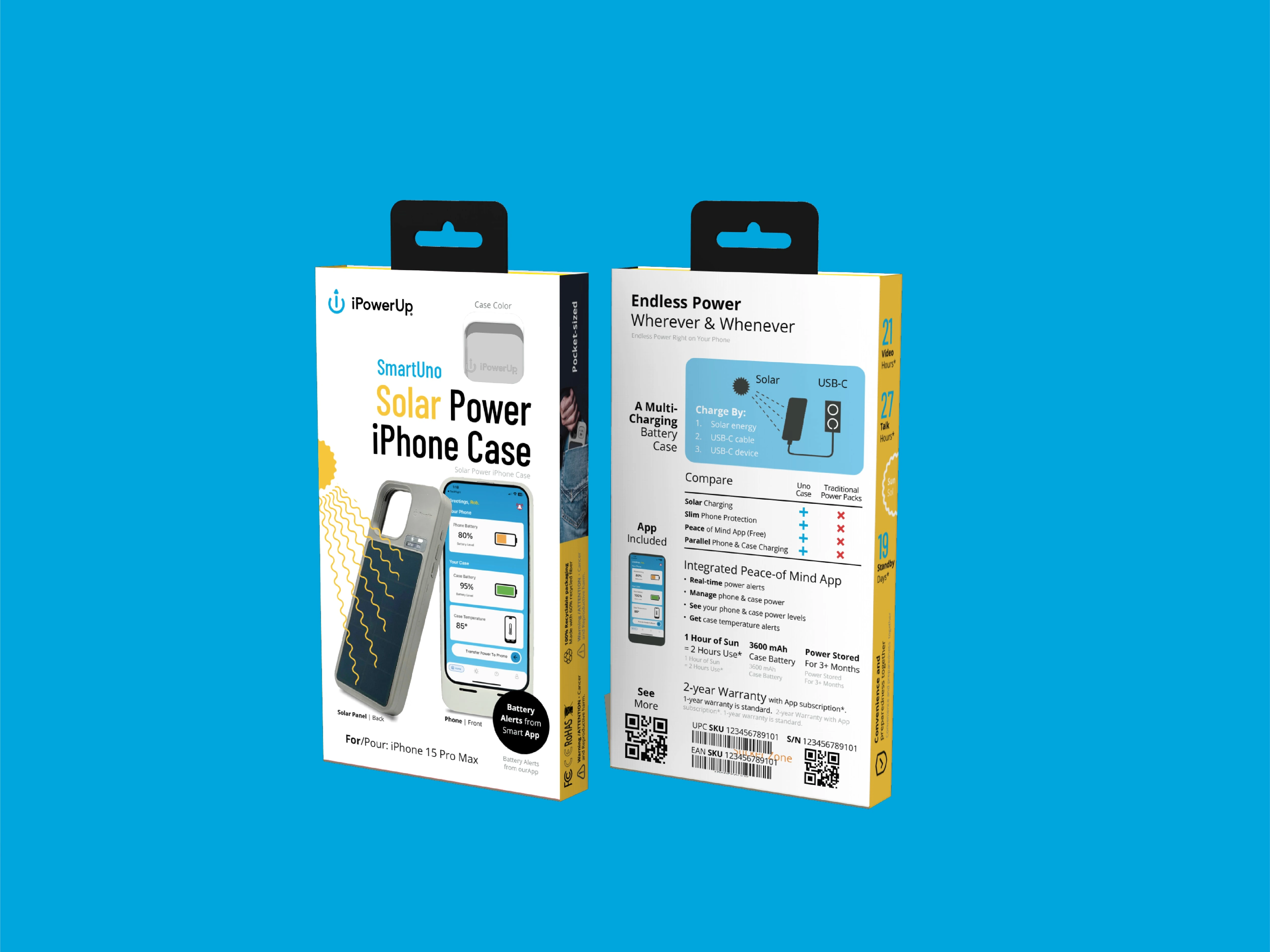
The brand strategy is designed to enable a level of creativity in special contexts such as consumer retail packaging design.
Brand Identity Design | 09
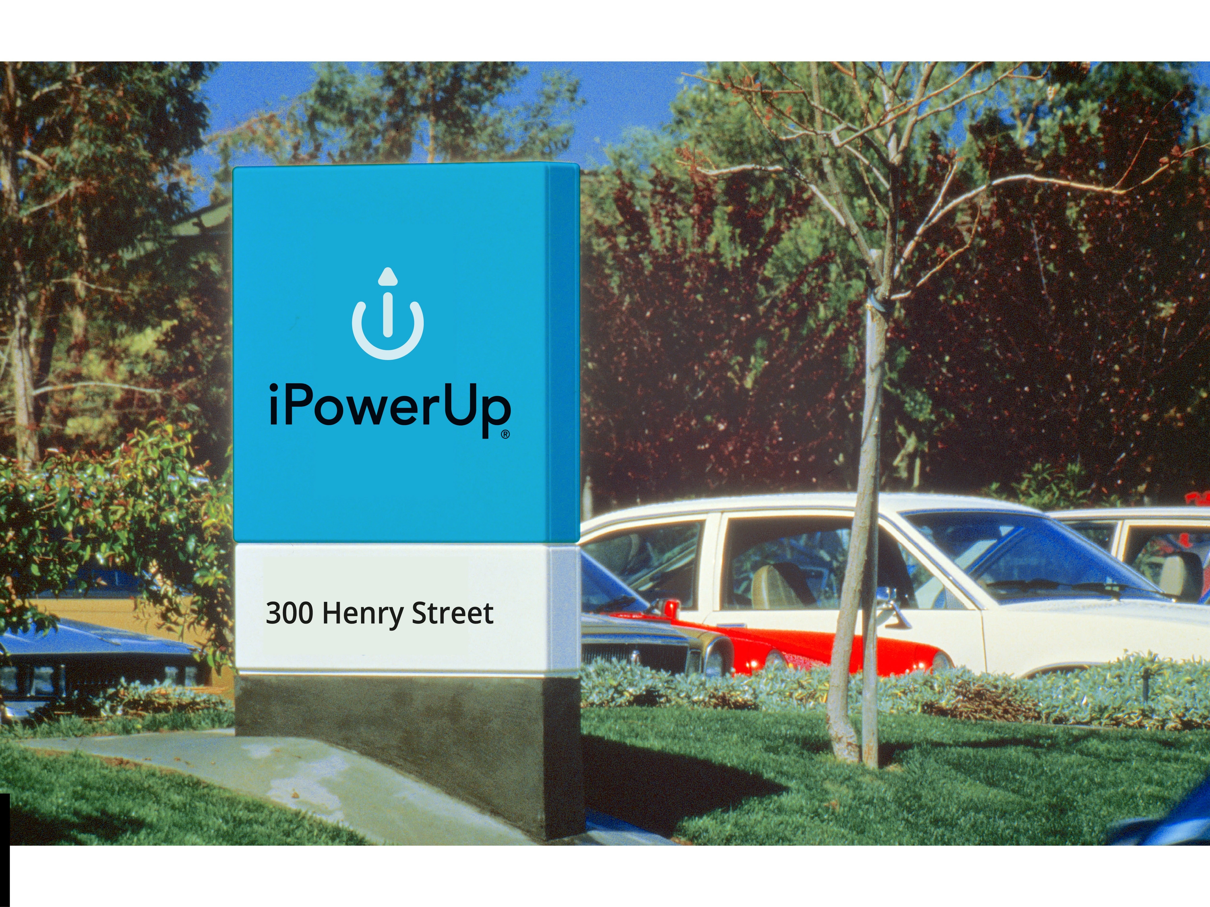
Outdoor opaque and iluminated sign design applications were also designed for in anticipation of unusual and demanding situations.
Like this project
Posted Nov 11, 2024
A business restart for a true pain-killer product and brand. iPowerUp's new brand and website attract thousands of organic visitors.
Likes
1
Views
18
Timeline
Aug 1, 2023 - Ongoing
Clients
iPowerUp