AI Video Workflow Guide for Contra University
Tanner Notch
Verified
Contra University Animation
Contra - AI Video Workflow for Freelancers video for Contra University YouTube channel
For the Contra University AI tools breakdown, the goal was to move beyond generic tool overviews and build a strategic decision framework for working freelancers: how to select between three popular generative AI models; Runway, Veo 3, and Flora, based on the actual job in front of you, the budget, and the polish bar required.
Working from months of hands-on client production using all three tools, I structured the video around real working decisions — cost-benefit per tool, when each one wins or fails, and where AI tools still lose to traditional production. The goal wasn't to crown a winner but to give freelancers a usable decision framework they could apply immediately to client work.
1. Pre-Production: Script Development & Reference Prep
The script needed to do two things at once: serve as a credible technical breakdown for working freelancers and stay tight enough to hold attention across a 3-5 minute runtime. Rather than building a comprehensive tool review, I structured the script around a single strategic question, which tool fits which job? — and let every section serve that frame.
The decision framework drove the script architecture. Three tool sections (Runway, Veo 3, Flora), each broken into the same structure: best use cases, pros, cons, and the specific scenarios where I'd choose that tool over the others. A comparison table that visualized the tradeoffs across all three. A dedicated section on where AI fails entirely, and the honest boundary where freelancers should skip AI tools in favor of stock footage or traditional production. The opening hook ("I've tested every major AI video tool for client work — here's when to use each, and when they all fail") was deliberately blunt, positioning the video as a working tool rather than a polished marketing piece.
On the reference prep side, I pulled screen recordings from recent client engagements where I'd actually used each tool: Runway shots from the SHRED AI Sizzle pipeline, Veo 3 work from the CPE brand series, Flora outputs from brand exploration sessions. Using real client work as the visual evidence kept the framework grounded in actual production rather than theoretical demonstration. Built reference notes for which moments in the script each clip would support, then organized everything in clear folders so the production day was about execution, not asset hunting.
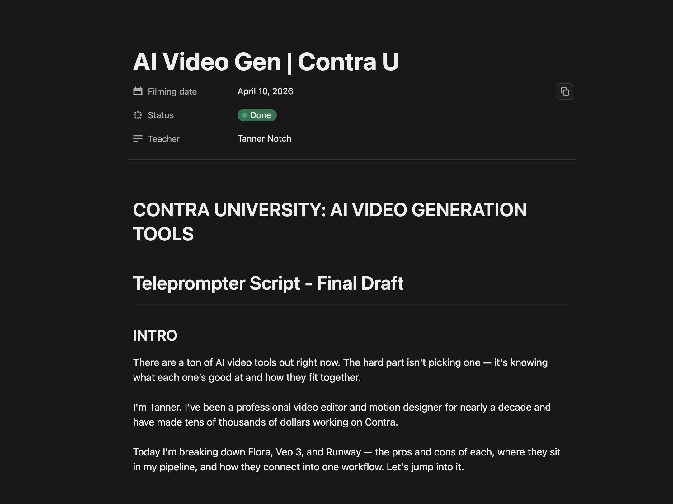
Final Video Script
2. Production: On-Camera Performance at Contra's Office
Production was a single-day shoot at Contra's office set, located in the Domino Sugar Factory in Williamsburg, Brooklyn.
Working with Alex Ginsberg from Contra's team handling the technical setup, we ran the shoot in a traditional two camera talking head format. The framing kept the energy direct and instructional. The Contra team handled lighting and camera setup, which let me focus entirely on performance and script delivery rather than juggling production logistics.
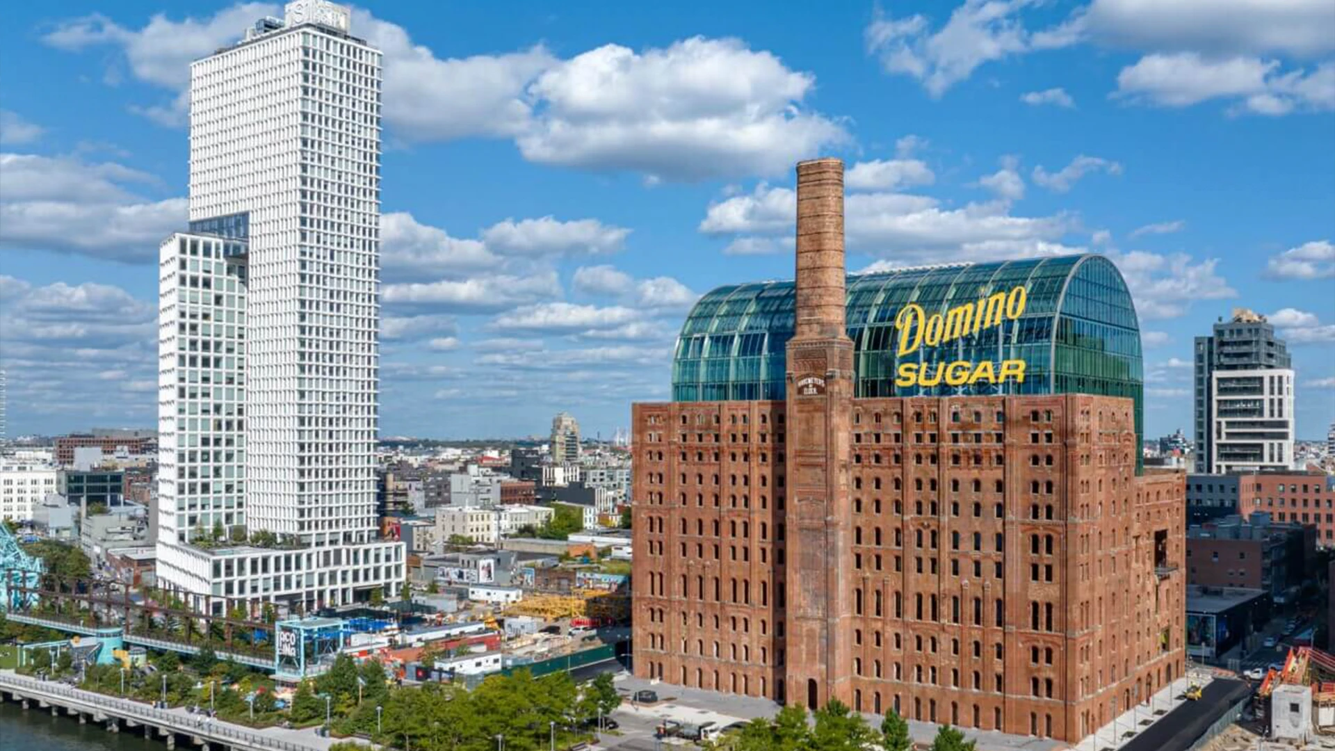
the Domino Sugar Factor, where Contra's NYC office is located.
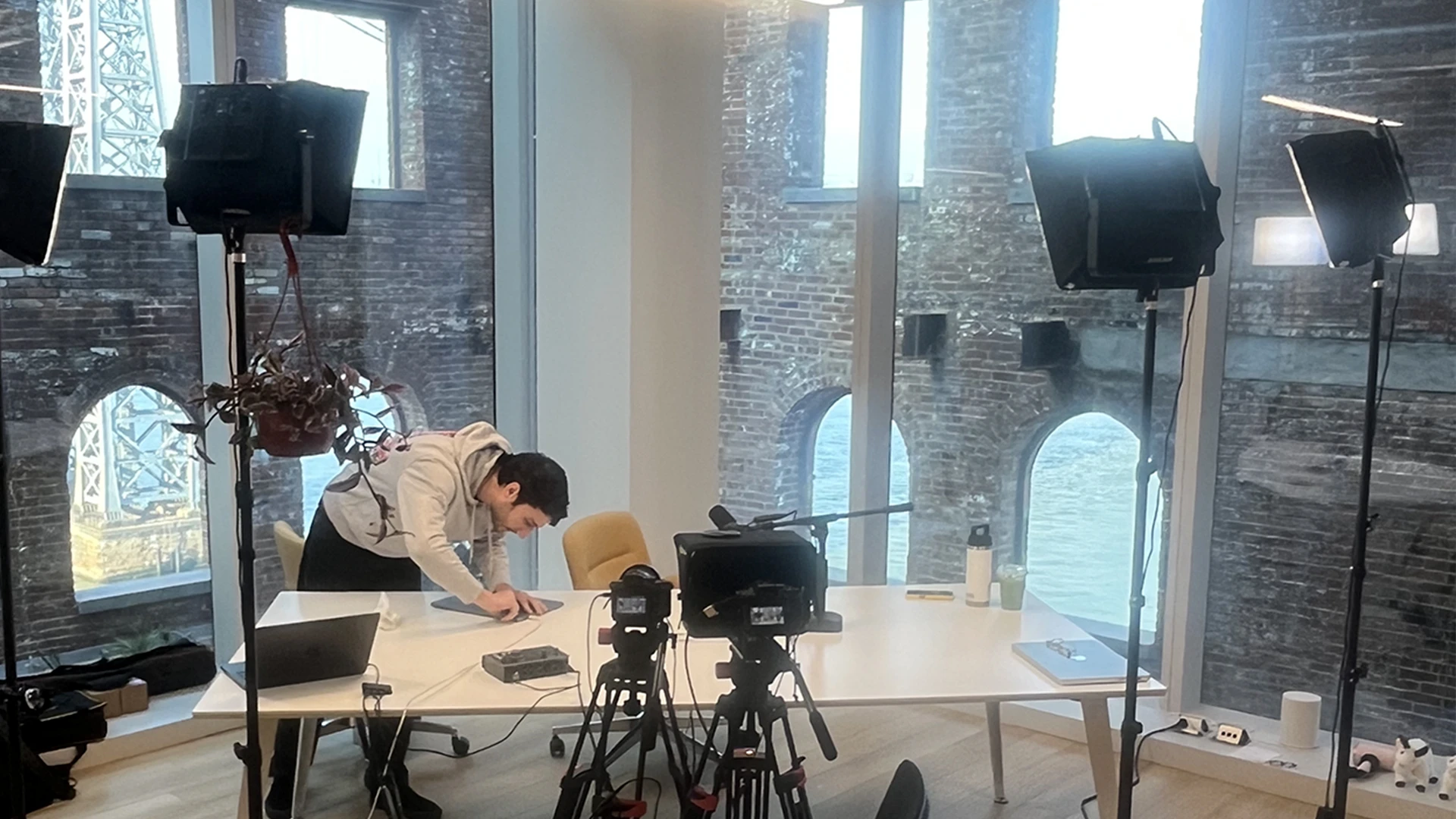
The video set at the Contra NYC
Recording the on-camera segments required several passes per script section to land the right rhythm. The video's value depends on credibility: sounding like a freelancer working through real decisions, not performing for camera. Took multiple takes on the hook segments specifically; opening lines that need to stop the scroll have a higher bar than middle-of-script transitions. Captured everything to camera in clean takes, with intentional pauses between thoughts to give the edit clean cut points to work from later.
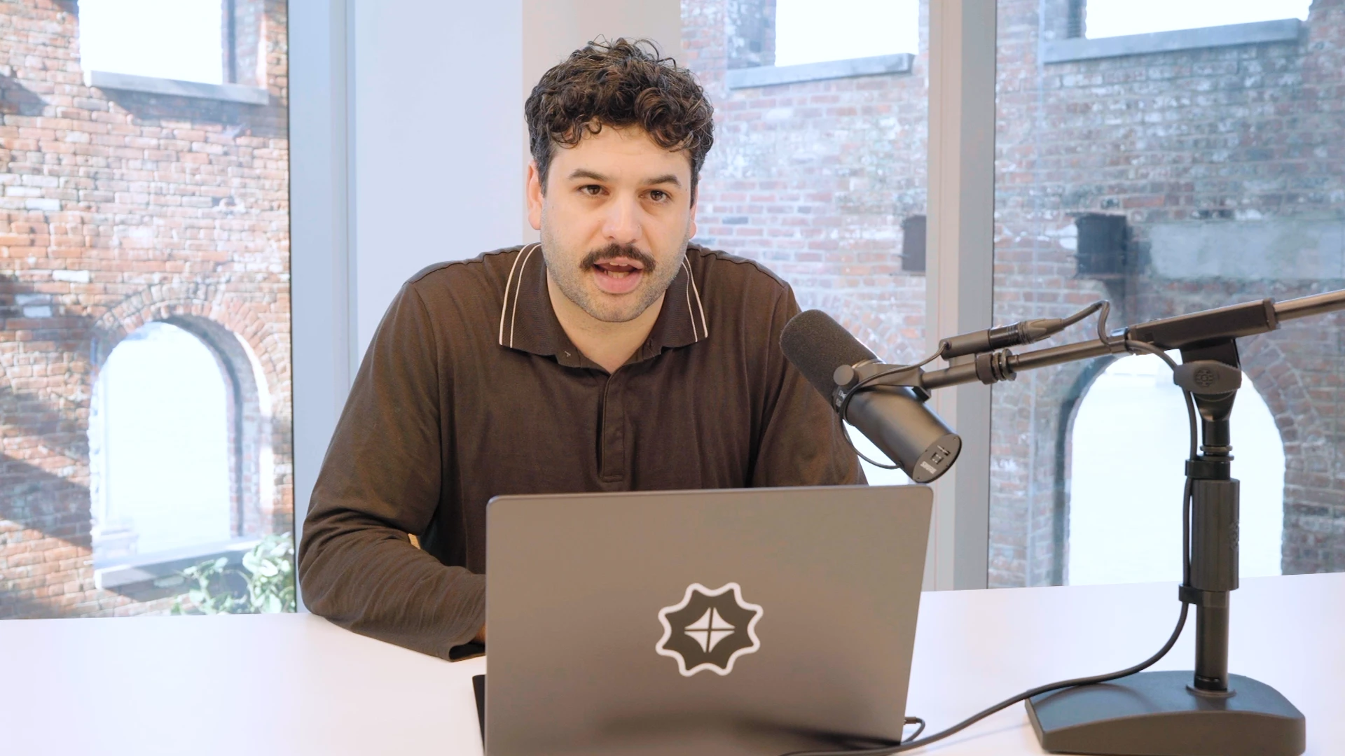
BTS still of me from the Production.
3. Post-Production 1 — Edit: Cut Structure & Screen Recording Integration
Premiere Pro for the assembly edit. The structure was already locked from the script, so the edit was about pacing, rhythm, and intercutting talking head with screen recording footage to maintain visual interest across the 4-minute runtime.
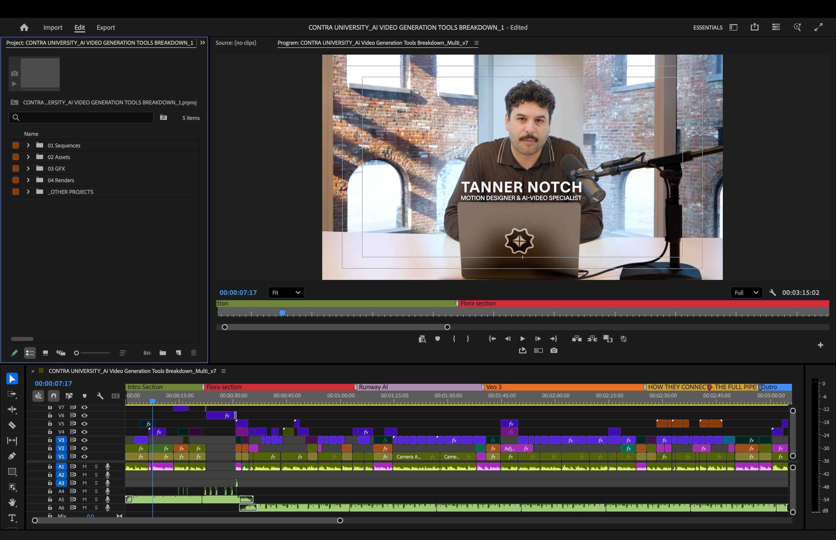
The Premiere Pro project.
Each tool section followed a consistent rhythm: opening claim on camera, screen recording demonstrating the tool in use, return to camera for the strategic takeaway. The pattern gave the video a predictable structure that helped the viewer track the framework while the visual variety kept it from getting static.
Intro from the Finished Video.
Screen recordings were the workhorse of the visual storytelling. For each tool, I layered real generation footage from client work — Runway camera moves on the SHRED gym scenes, Veo 3 generations from the CPE character work, Flora animation previews — directly under the relevant script beats. The screen recordings weren't tutorial walkthroughs of the tool interfaces, they were the actual outputs and workflow moments that supported the strategic claims being made on camera.
Cut points landed deliberately. Hard cuts on emphasis beats, softer cross-dissolves between scenes when the topic shifted. Resisted the temptation to over-edit with quick cuts and visual effects, the framework itself is the value, and clean editing serves it better than visual maximalism.
Screen Recorded section.
4. Post-Production 2 — Motion Design: Animations & Captioning
After Effects for the motion design work. Two distinct layers: dynamic animations for the comparison frameworks and tool callouts, and captioning throughout the full video for accessibility and platform optimization.
Opening "Scroll" Animation from the final video.
The comparison table animation was the centerpiece graphic. Designed a clean grid showing the three tools (Runway, Veo 3, Flora) across the key decision criteria (client polish, experimental work, budget projects, rapid prototyping, web animation). Animated the cells in sequence as I walked through each comparison point, with checkmarks and X marks revealing in sync with the voiceover. The graphic needed to be instantly readable for viewers scrubbing the video, so kept the typography heavy and the color palette restrained: brand-true greens for positives, muted reds for negatives, neutral grays for context.
Tool name callouts appeared with each section transition — RUNWAY, VEO 3, FLORA — animated to feel like clean chapter markers rather than decorative flourishes. The animations stayed restrained throughout; the goal was to support the strategic content, not compete with it.
Captions ran throughout the full video. For Contra University specifically, captions are non-negotiable: short-form vertical content gets watched without sound more often than not, and accessibility is a real requirement. Built the caption styling to match the Contra brand language — clean sans-serif, high contrast against the talking head footage, paced to match natural speech rhythm rather than line-by-line dumping of dialogue.
Sample Title animation from the final video.
5. Finishing: Sound Design, Color, & Final Polish
Sound design was the layer that pulled the video together. Light background music underneath the talking head segments — instrumental, low-energy, more texture than melody — to give the video atmosphere without competing with the spoken content. Subtle SFX on key animation moments (table reveal, tool callouts, section transitions) to anchor the motion design in audio cues. Audio ducking on the music whenever I spoke, so the voice always sat clean and forward in the mix.
Color correction in Premiere. The talking head footage from the Contra set had clean exposure and white balance from the start, but applied a light grade across the full video to unify the color temperature between talking head and screen recordings. Pushed contrast slightly, lifted the blacks just enough to keep the image from feeling flat, and held the saturation in check to keep the look professional rather than punchy.
Color Correction "before & after"
Final polish pass for pacing, transition timing, and audio levels across the entire cut. Watched the full video several times at full size, several times at vertical phone size, and once with no audio to make sure the captions and motion design carried the content for muted playback. Exported to 16x9, 1920x1080 for Contra's platform requirements.
Contra Labs animation
Closing Reflection
The Contra University breakdown was a chance to translate working knowledge into a usable framework for other freelancers. Building it required threading a real line: technical enough to be credible, accessible enough to be useful, opinionated enough to be worth watching. The combination of script discipline, clean production, and restrained motion design let the strategic content carry the weight, which is the right hierarchy for educational content.
Working alongside Contra's team also surfaced the broader value of producing for Contra University specifically: a creator-friendly production environment, a clear audience of working freelancers, and built-in distribution to a community, actively looking for this kind of grounded, decision-focused content.
Excited to keep producing in this format and refining how strategic frameworks get translated into video that freelancers can actually use!
Contra Logo
Like this project
Posted Jun 5, 2026
Produced a Contra University breakdown on AI video tools: a strategic framework for freelancers on when to use Runway, Veo 3, and Flora on client work.
Likes
0
Views
49
Timeline
Apr 8, 2026 - Ongoing
Clients
Contra