
Vestra is a residential construction firm outside Amsterdam with nine years of solid, disciplined work. But almost no visibility. Good execution wasn't the problem. Perception was.
Challenge
Every tender Vestra submitted looked like every other contractor's tender. A generic logo, a template deck, a PDF that got skimmed once and set aside. Developers weren't comparing build quality, they were comparing brand presence, and Vestra had none. The firm was losing bids to companies with weaker portfolios simply because they looked more established.
Process
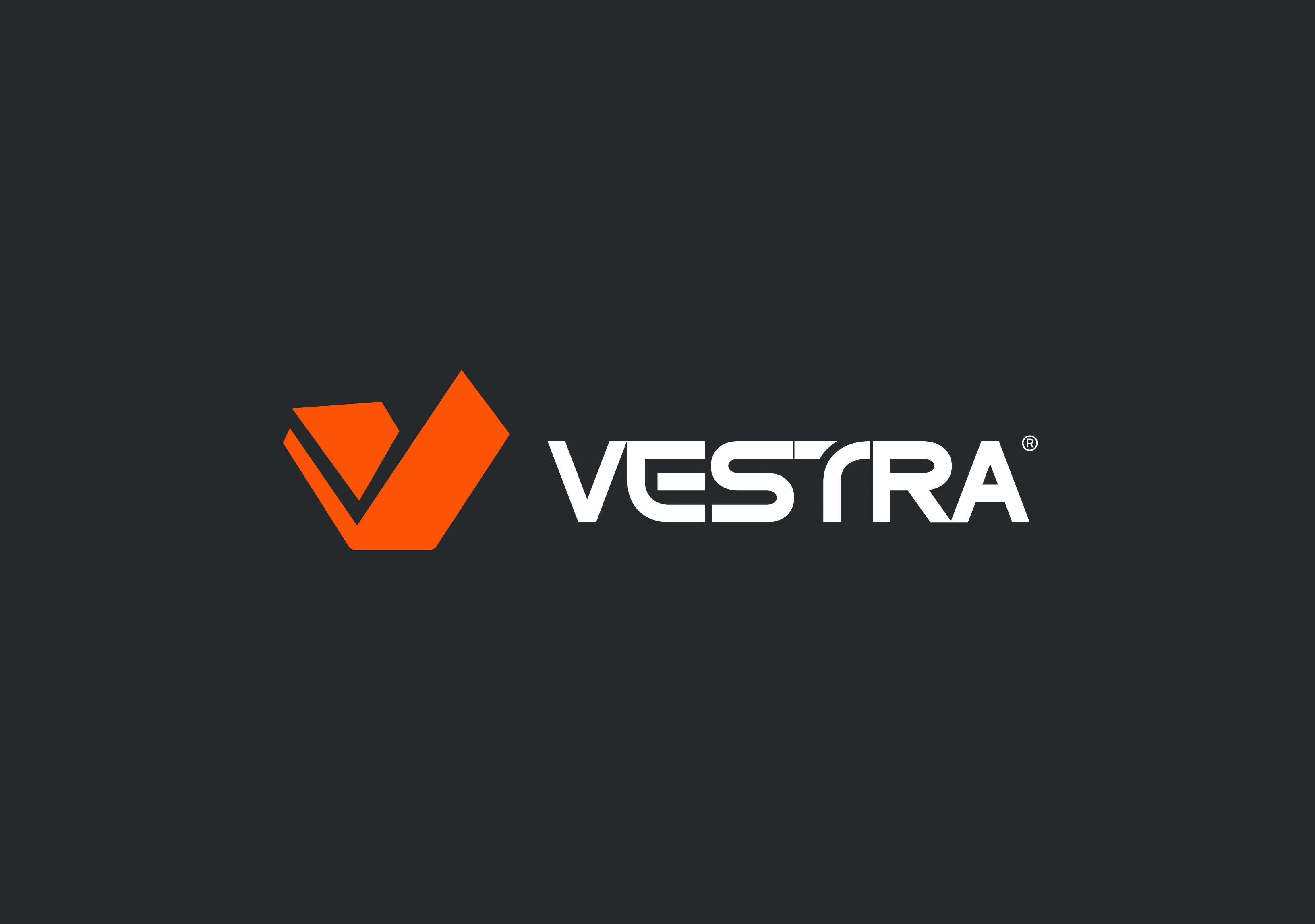
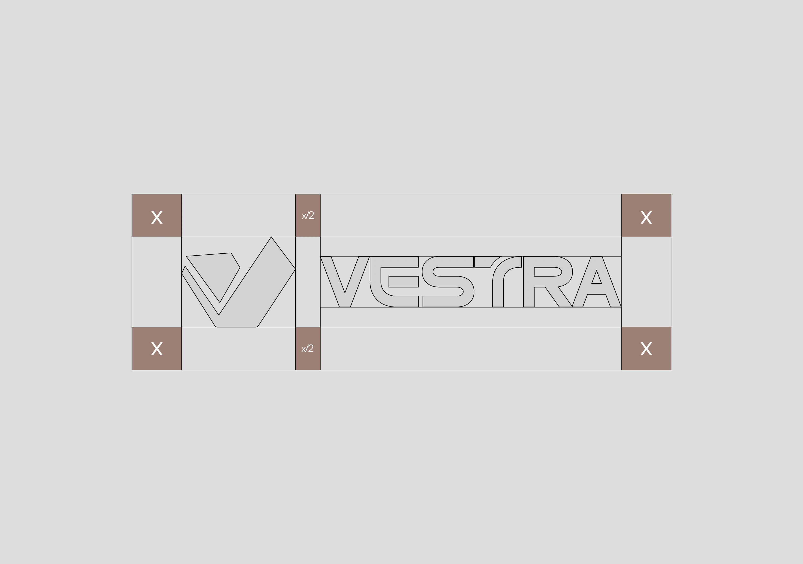
The starting point was the company name itself. We built the mark as an extension of the initial "V" shaped and angled to read as architectural form rather than typography. Every fold in the mark had to hold up as a structural line, not just a stylistic one.
Solution
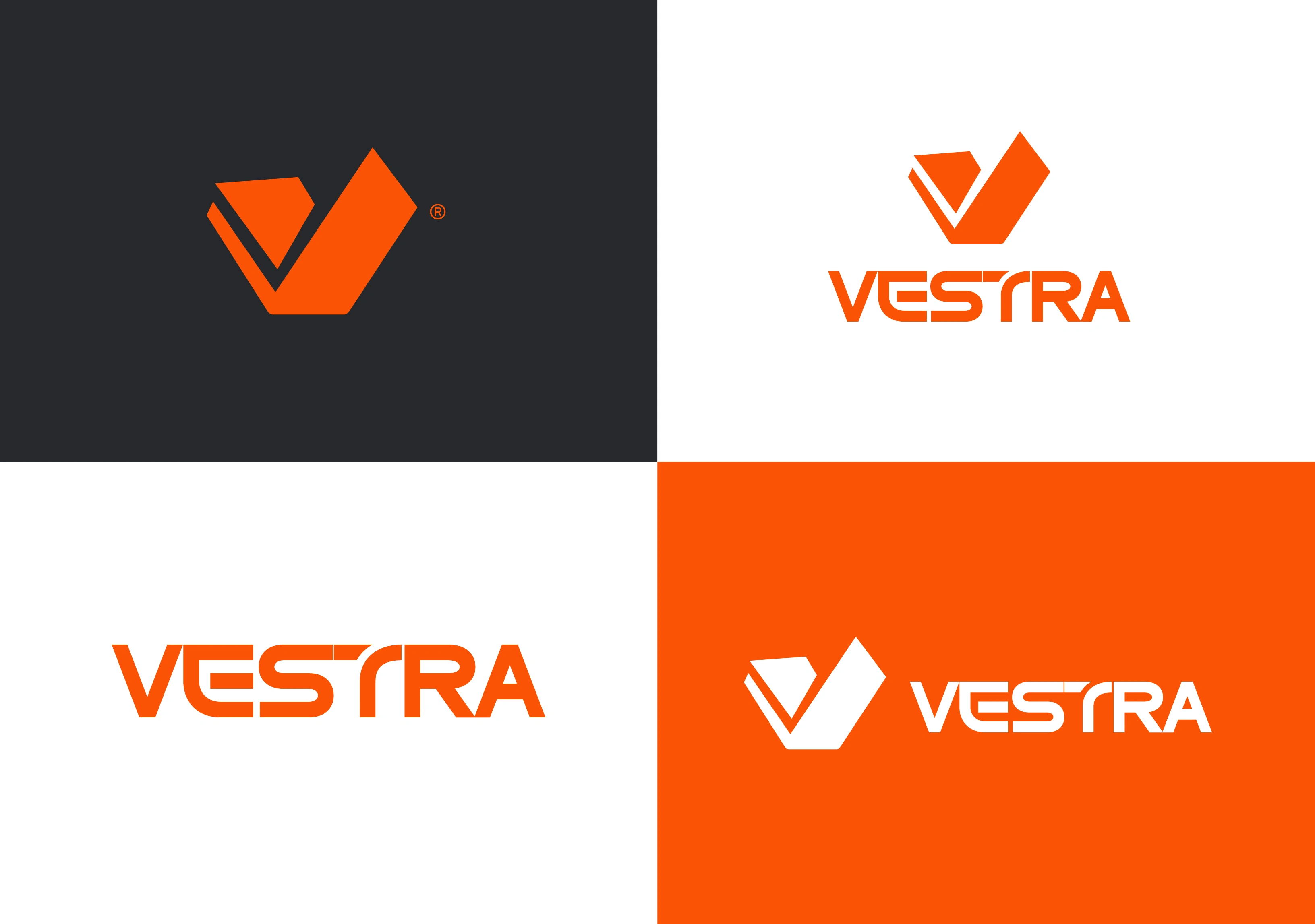
A complete identity system built around a single mark: the "V" rendered as an architectural silhouette, sharp angles, clean intersections, a shape that reads as building as much as it reads as letter. Paired with a bold, structural wordmark, the identity carries across every surface; site signage, tender covers, stationery, with the same disciplined geometry.

0 likes · 0 views · Aug 10, 2026
Vestra is a residential construction firm outside Amsterdam with nine years of solid, disciplined work. But almost no visibility. Good execution wasn't the p...

