Built with Framer
Visual Branding for an AI System
Savan Makadiya
Design Intent
The brand needed to communicate technical depth, system-level intelligence, and operational control, without relying on illustrative or literal AI metaphors. The visual language had to feel engineered, precise, and opinionated.
Visual System Direction
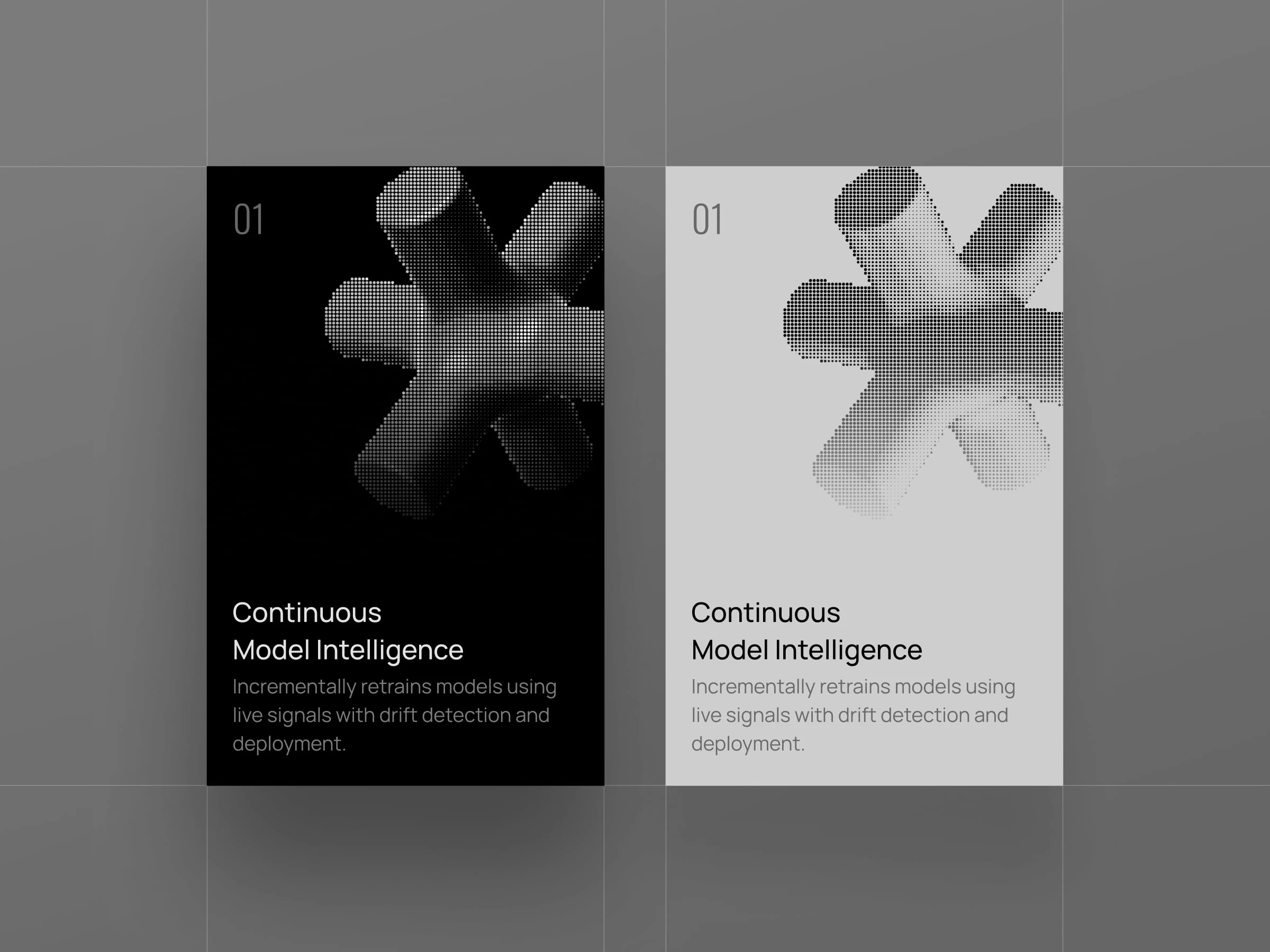
A strictly black-and-white palette was chosen to remove emotional color bias and keep focus on structure, contrast, and form. This constraint mirrors the product’s emphasis on determinism, clarity, and measurable outcomes.
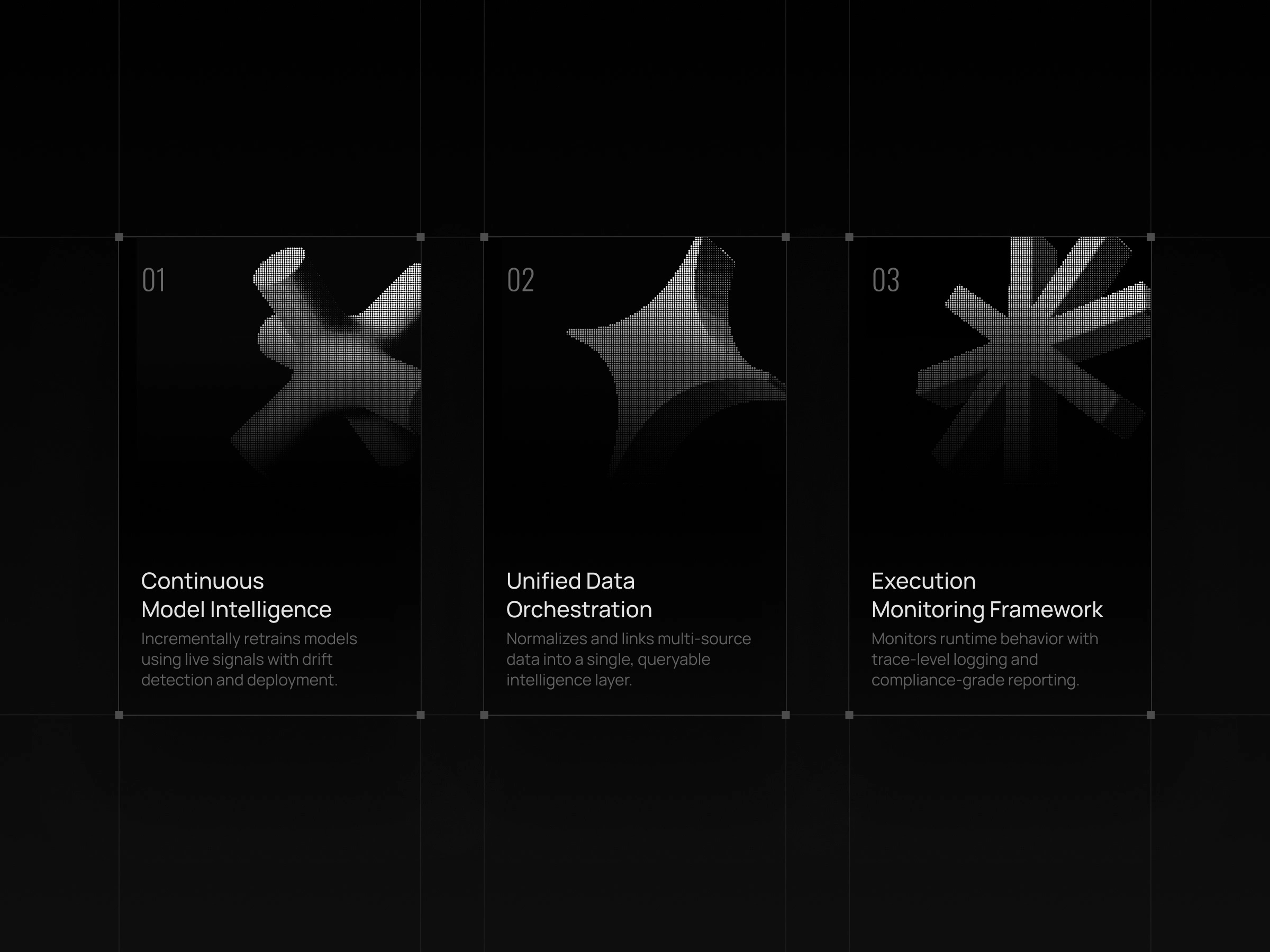
3D Form Language
Abstract 3D shapes were designed as system primitives rather than decorative elements. Each form represents modularity, composability, and layered intelligence, core characteristics of complex AI systems.
Dither as Meaning
Dithering was used as a visual metaphor for probabilistic computation. It reflects how AI systems approximate, refine, and converge on outcomes rather than producing binary results.
Contrast & Control
High contrast reinforces the idea of explicit control boundaries. There are no soft gradients or decorative transitions, only intentional states, mirroring the product’s focus on traceability and governed execution.
Outcome
The resulting identity feels technical, disciplined, and system-first. It avoids generic “AI futurism” and instead positions the product as infrastructure, built for teams that value clarity, reliability, and control.
Like this project
Posted Jan 28, 2026
A branding case study exploring how form, contrast, and dithering can represent probabilistic and controlled AI systems.
Likes
1
Views
14