Built with Framer
Financial Services Landing Page (Developer)
Final Site: https://aquamarine-design-428576.framer.app/
Fruitful, a leading financial services company, recognised the need for a modern, user-friendly website that could effectively engage their target audience and showcase their unique financial guidance services. The goal was to create a pixel-perfect clone that not only matched the aesthetic but also emulated the intricate user interactions and animations.
Navigating the intricate layout of the original website was another hurdle I had to overcome. By utilising Framer's advanced positioning tools and switching between both relative and absolute positioning, I was able to precisely align and arrange the various elements, ensuring a pixel-perfect recreation of the design.
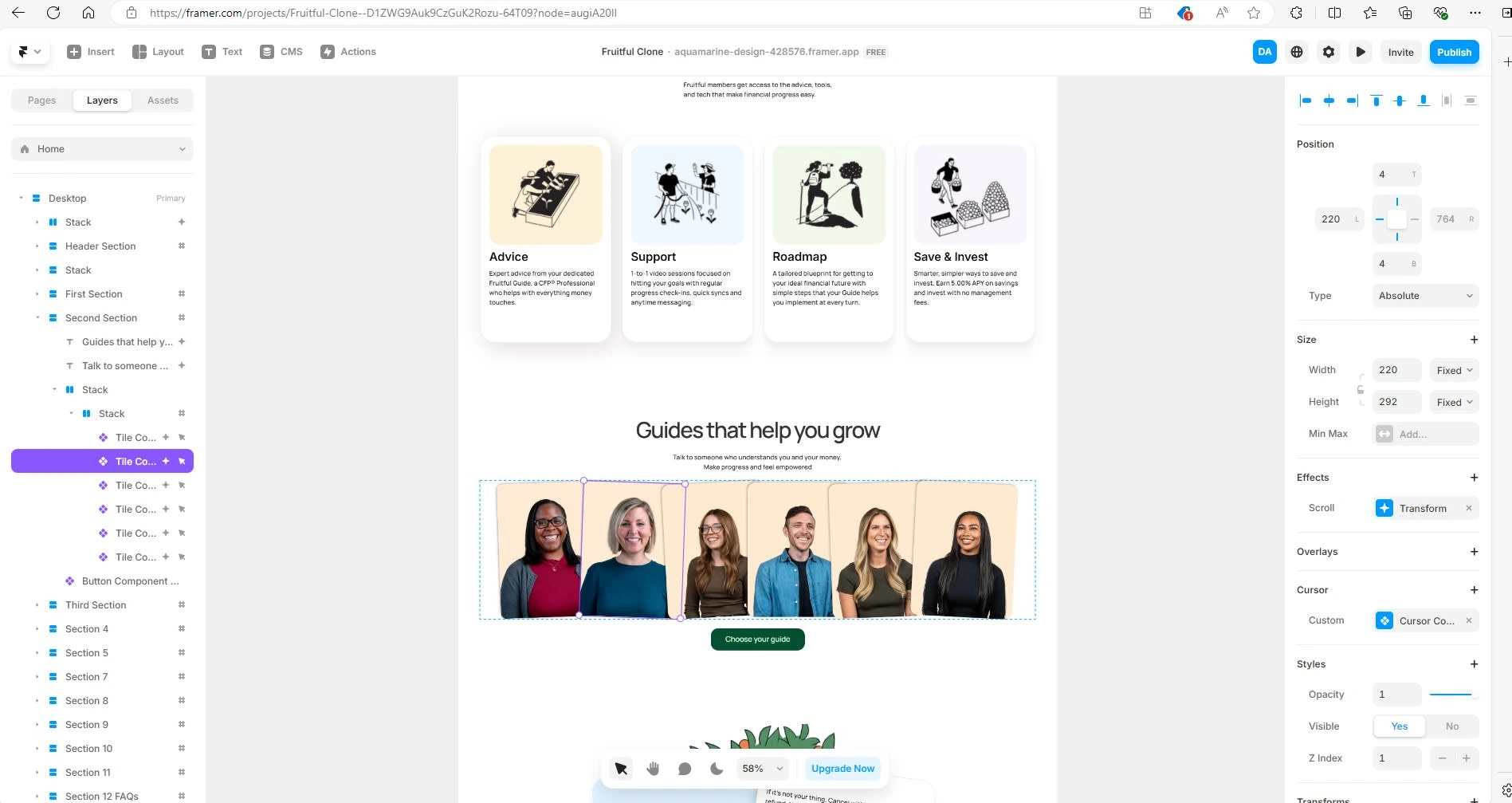
Framer- using absolute position to position an element perfectly within its container
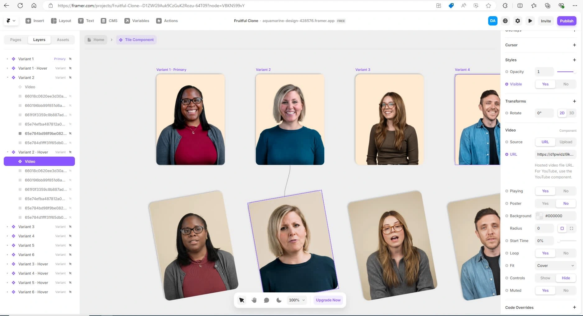
Furthermore, given that the landing page had a lot of video animation, I used explore dev tools extensively to identify and obtain both image and video assets, importing them via the url links. I then created components with variants which I could reuse in my landing page
Some of the functions where a little more challenging and limited by the platform. For example, with respect to scroll transformations, some of the transforms were not replicable. Other's however were more easily replicated.
In summary this project taught me a lot about the limitations of framer and where I would need to use my developer skills to improve the platform in particular when programming some of the animations.
Like this project
Posted Aug 14, 2024
Development of a clone of fruitful.com (an award winning financial services company) landing page using Figma for design and Framer to build.
Likes
0
Views
22

