Premium Logo Design for Supreme Build Works
Aakash Ramnani
Project Overview
Supreme Build Works is a New Zealand-based construction brand specializing in flooring, painting, fencing, and decking. Known for its clear attention to detail and a no-fuss, dependable work ethic, the brand brings a sense of clarity and care to every project— creating spaces that are built to last and easy to trust.
The goal was to design a Logo that reflects the brand's industrial strength while maintaining a clean, premium feel. The logo combines structure and simplicity—conveying reliability, confidence, and timeless professionalism.
Scope
Logo Design (Primary, Secondary, Logomark)
Typography
Color Direction
Brand Attributes
Precision
Excellence
Trust
Reliable
Approchable
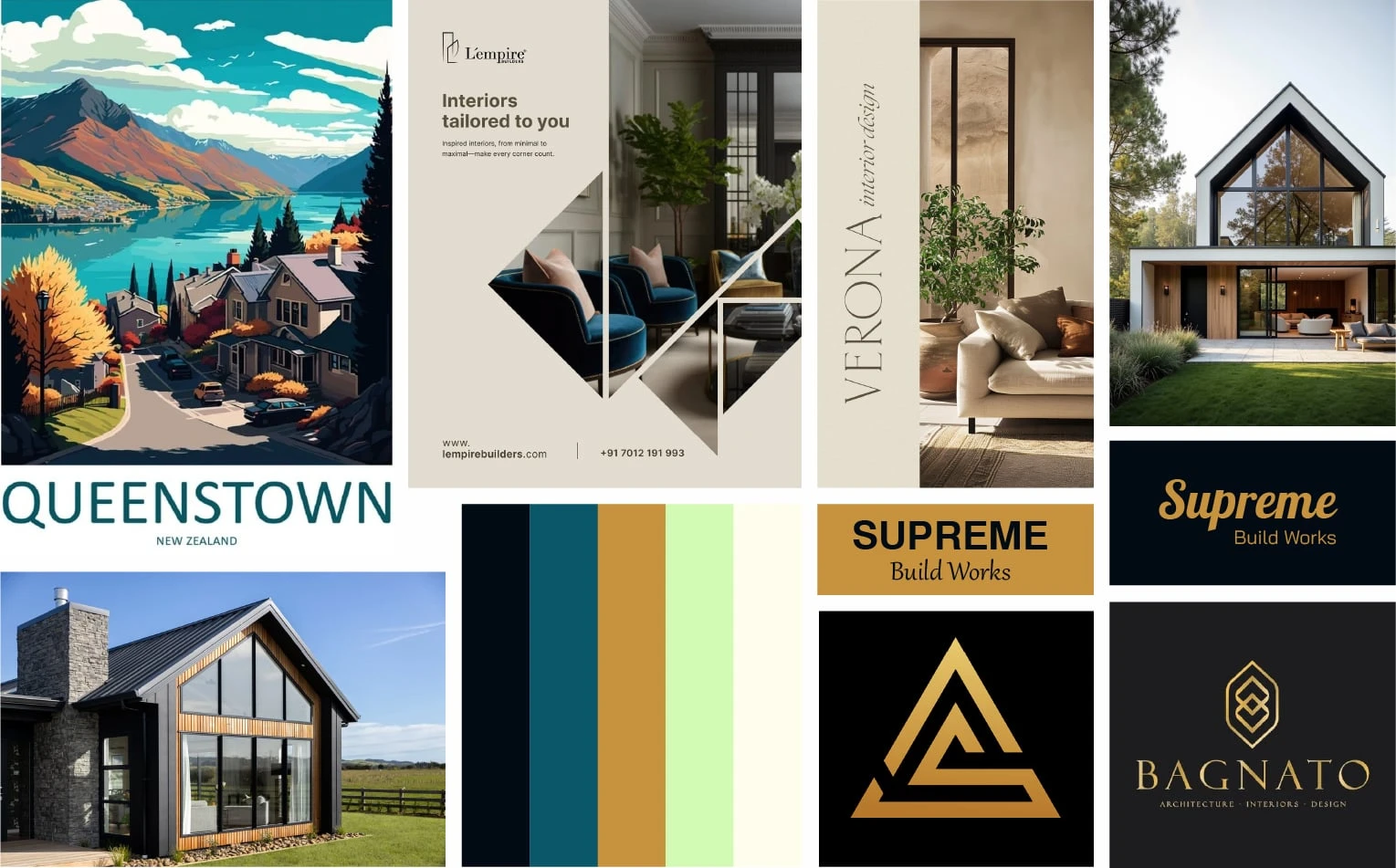
Mood board - Supreme Build Works
Logo Concept
The Supreme Build Works logo is a visual reflection of the brand’s core strengths — structure, precision, and reliability. Built from clean geometric forms, the mark subtly conveys construction foundations while maintaining a confident, modern presence. The typography complements the symbol with strong, grounded letterforms that ensure legibility and trust at any scale. The overall concept aims to strike a balance between industrial strength and approachable professionalism — aligning perfectly with the brand’s identity.
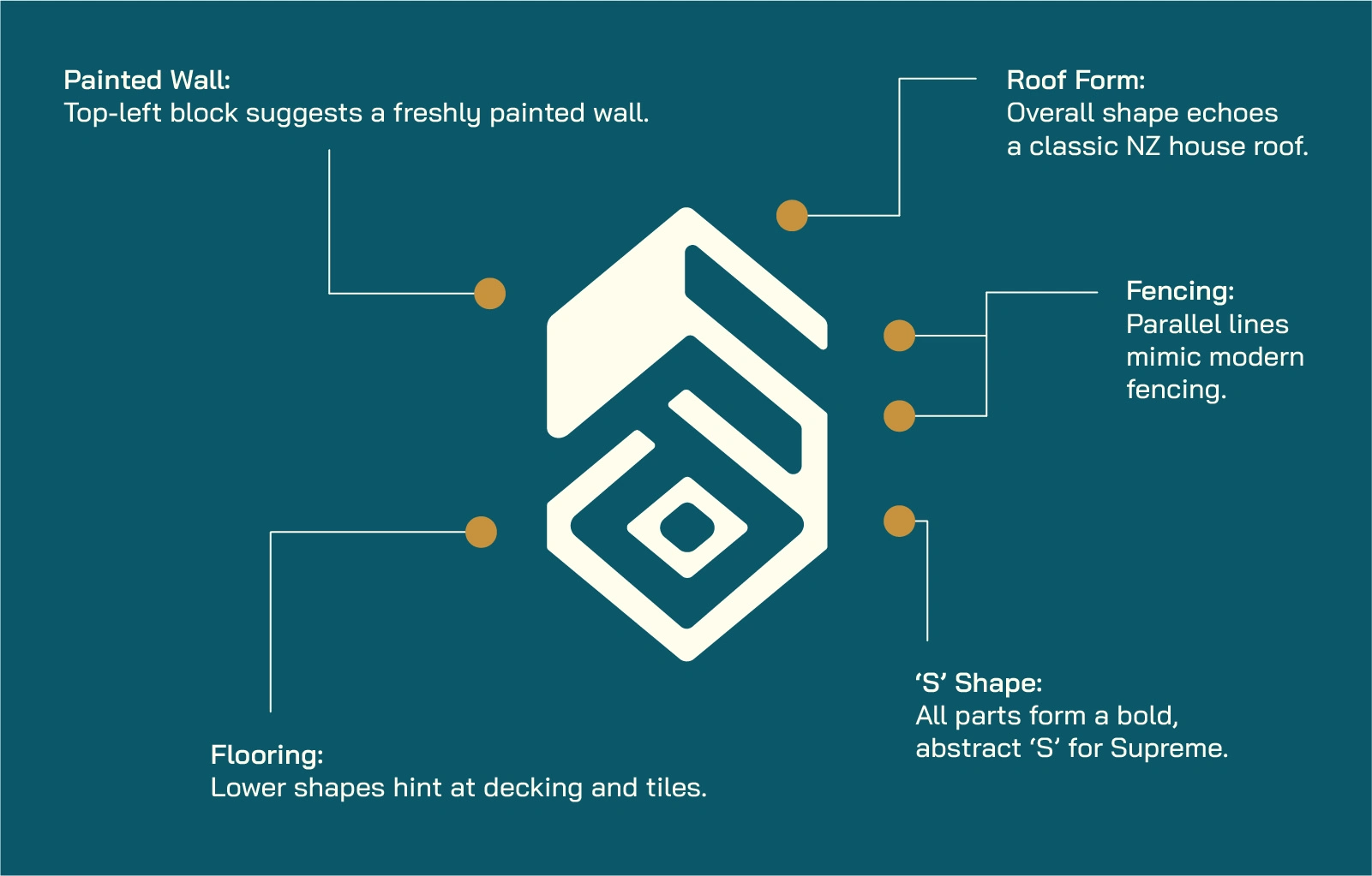
Supreme Build Works - Logo Design Concept and annotations
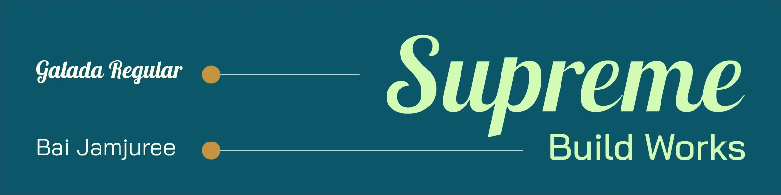
Typographic Selection
Typography plays a key role in shaping the personality of the Supreme Build Works brand. Two distinct yet complementary typefaces have been chosen to reflect the balance between professionalism and approachability.
‘Supreme’ is set in Galada, a display script typeface that adds a touch of elegance and individuality. Its fluid strokes evoke a sense of human touch and precision — aligning with the brand’s dedication to excellence and detail in every project.
‘Build Works’ is set in Bai Jamjuree, a modern, geometric sans- serif that offers clarity and balance. It ensures strong legibility across applications and brings a technical, grounded quality to the identity — reinforcing reliability and structure.
Supreme Build Works - Typography
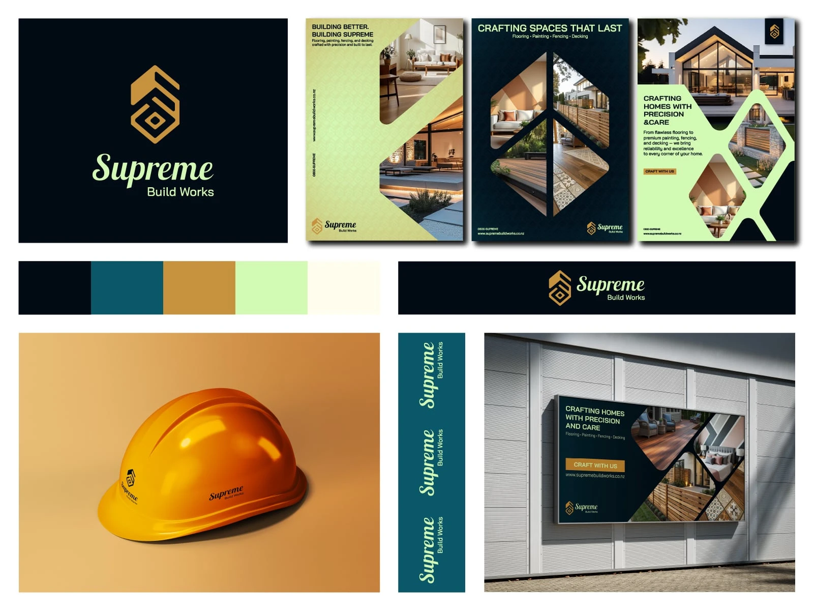
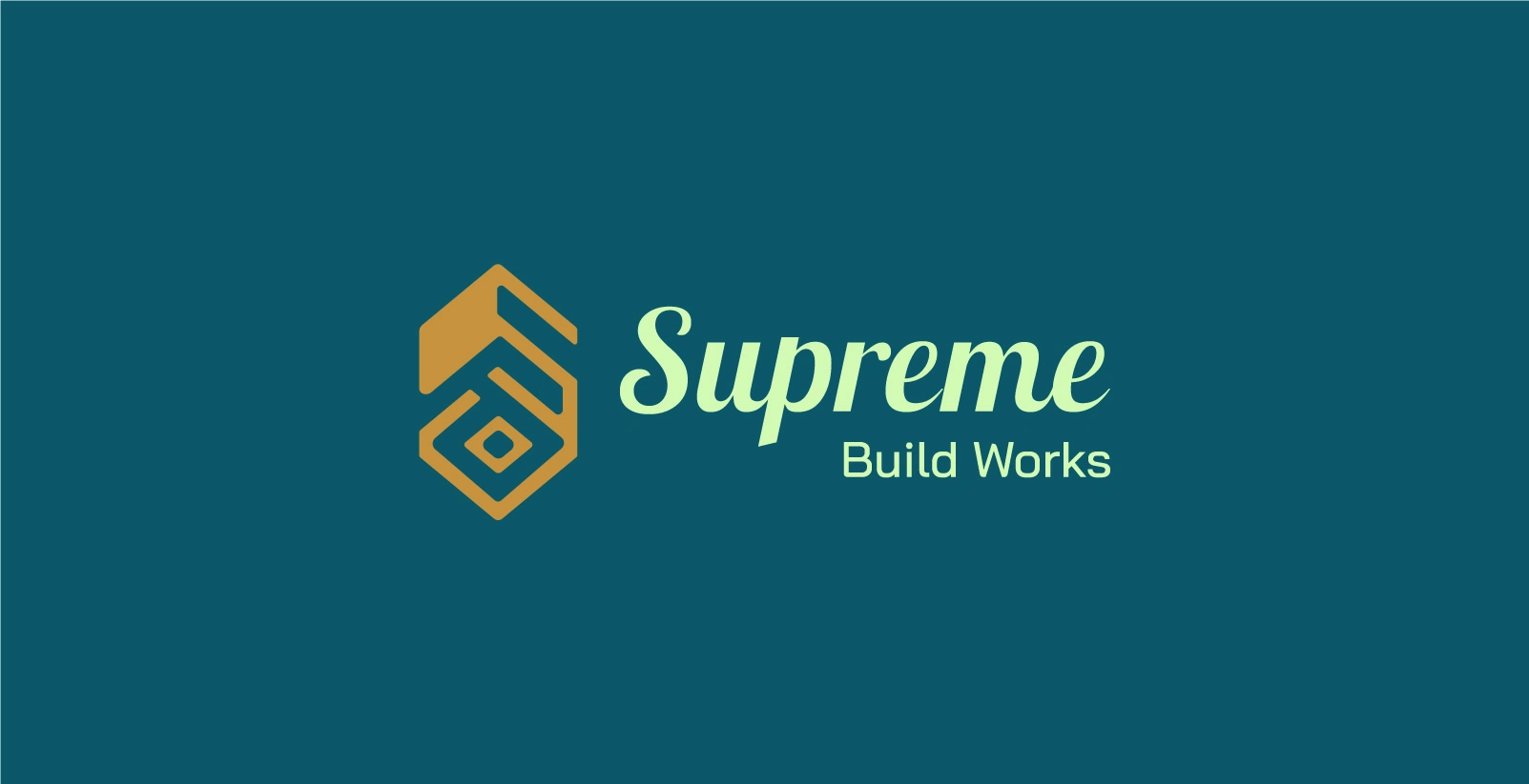
Supreme Build Works - Logo Design
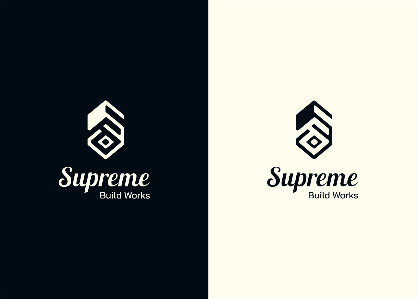
Primary Logo
Supreme Build Works - Primary Logo Design
Secondary Logo
Supreme Build Works - Secondary Logo Design
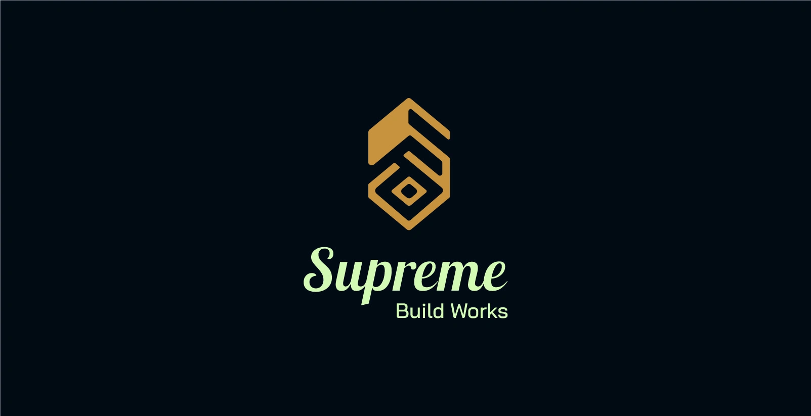
Logomark

Supreme Build Works - Logomark
Color Selection
The color palette was carefully crafted to reflect the essence of Supreme Build Works — blending bold industrial strength with a sense of trust and approachability. Each color plays a role in communicating the brand’s values:
A deep base for stability and precision
Bold accents that reflect excellence and expertise
Soft neutrals to bring warmth and approachability
A touch of fresh green to signal growth and reliability
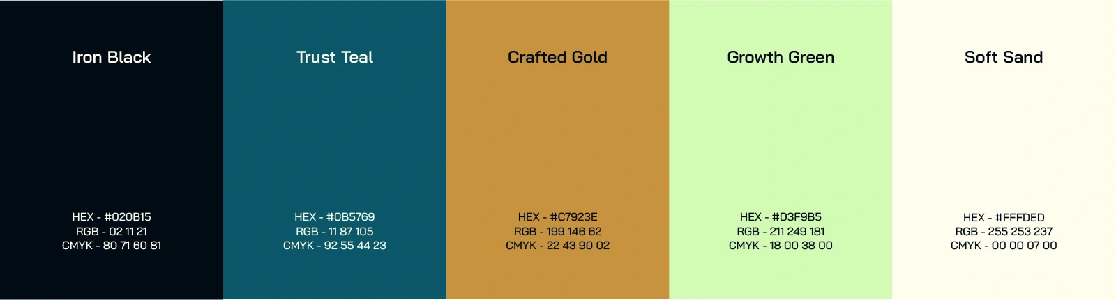
Supreme Build Works - Color Palette
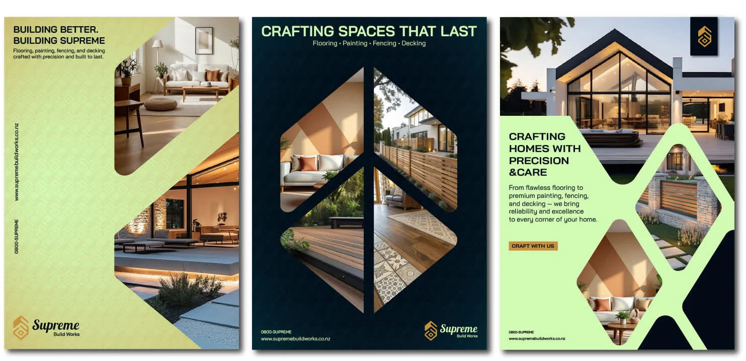
Supreme Build Works - Poster Design
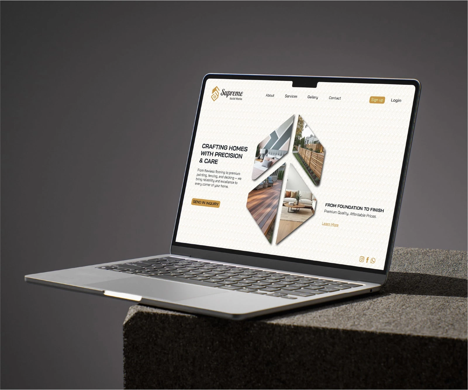
Supreme Build Works - Web Design (Hero)
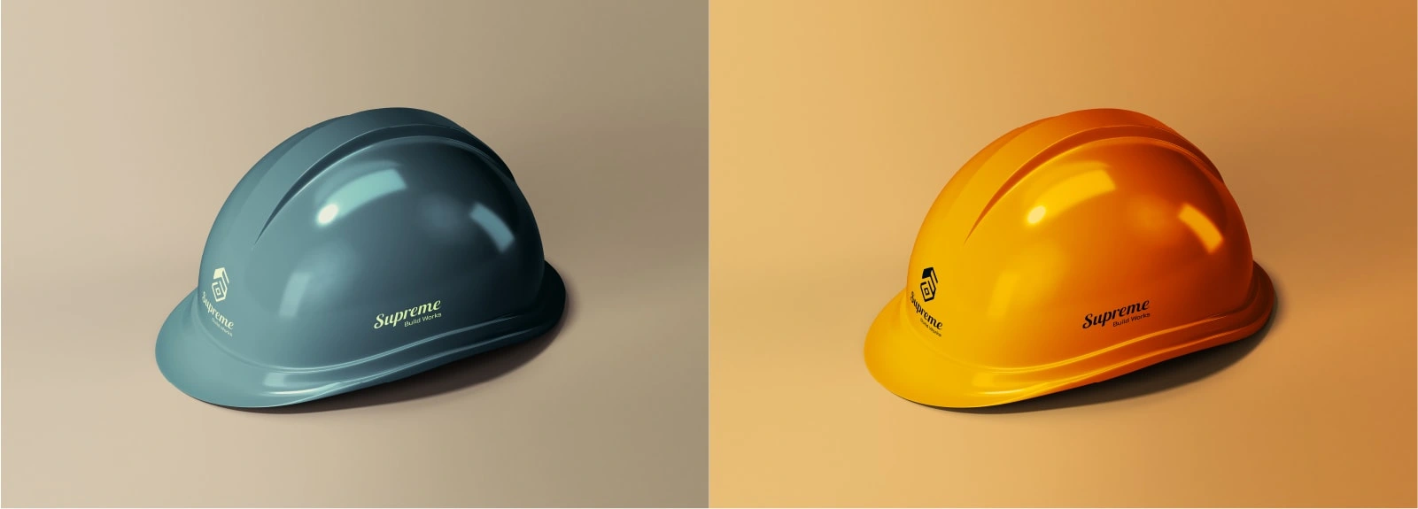
Supreme Build Works - 3d mock up
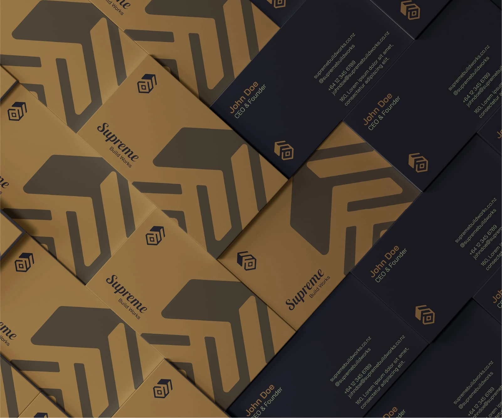
Supreme Build Works - Business card design
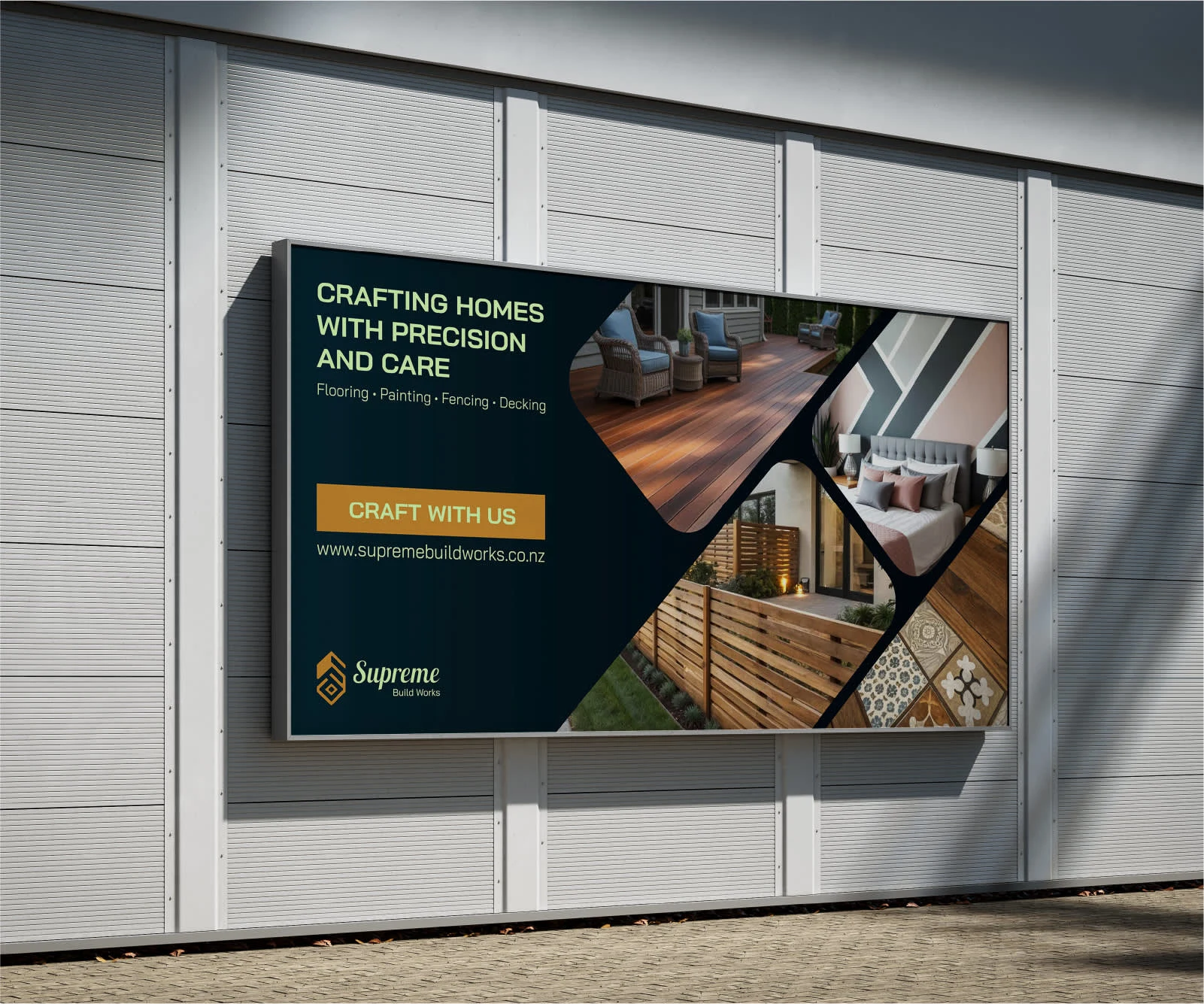
Supreme Build Works - Banner Design
Thank you for viewing the logo design for Supreme Build Works.
Designed to reflect structure, trust, and modern craftsmanship.
Let’s build something extraordinary — one detail at a time.
If you are looking to get your branding/logo done, feel free to reach out at
aakaashramnani@gmail.com
Like this project
Posted Aug 17, 2025
The logo combines structure and simplicity—conveying reliability, confidence, and timeless professionalism.