T1 Package Design and Brand Identity Design
Kevin Craft
Tier 1 Supplements: Precision, Strength, and Simplicity in Design
Creative Directors: Tatum Brandt & Christine Goodrich
Agency: Brandt Creative Co.
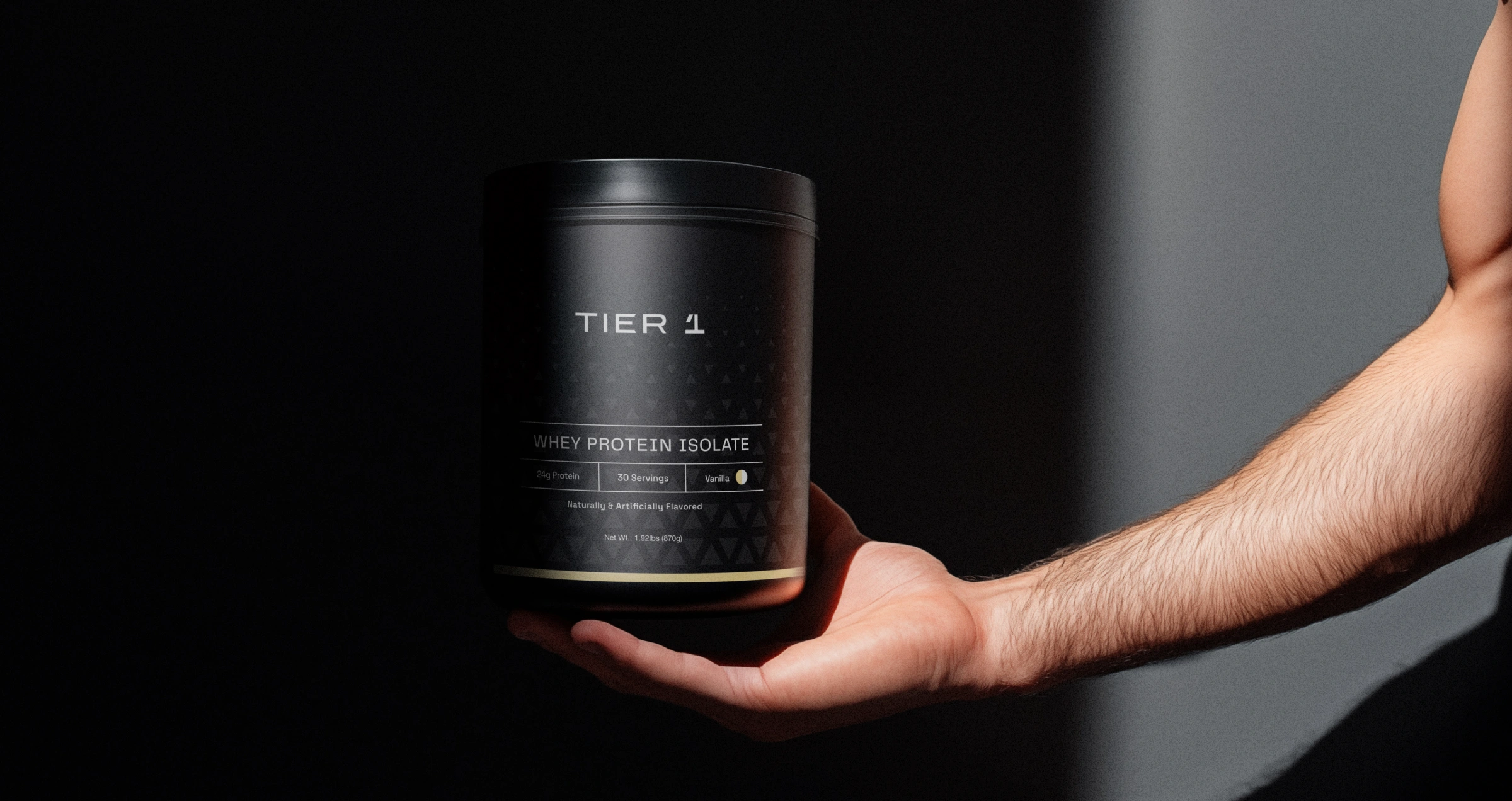
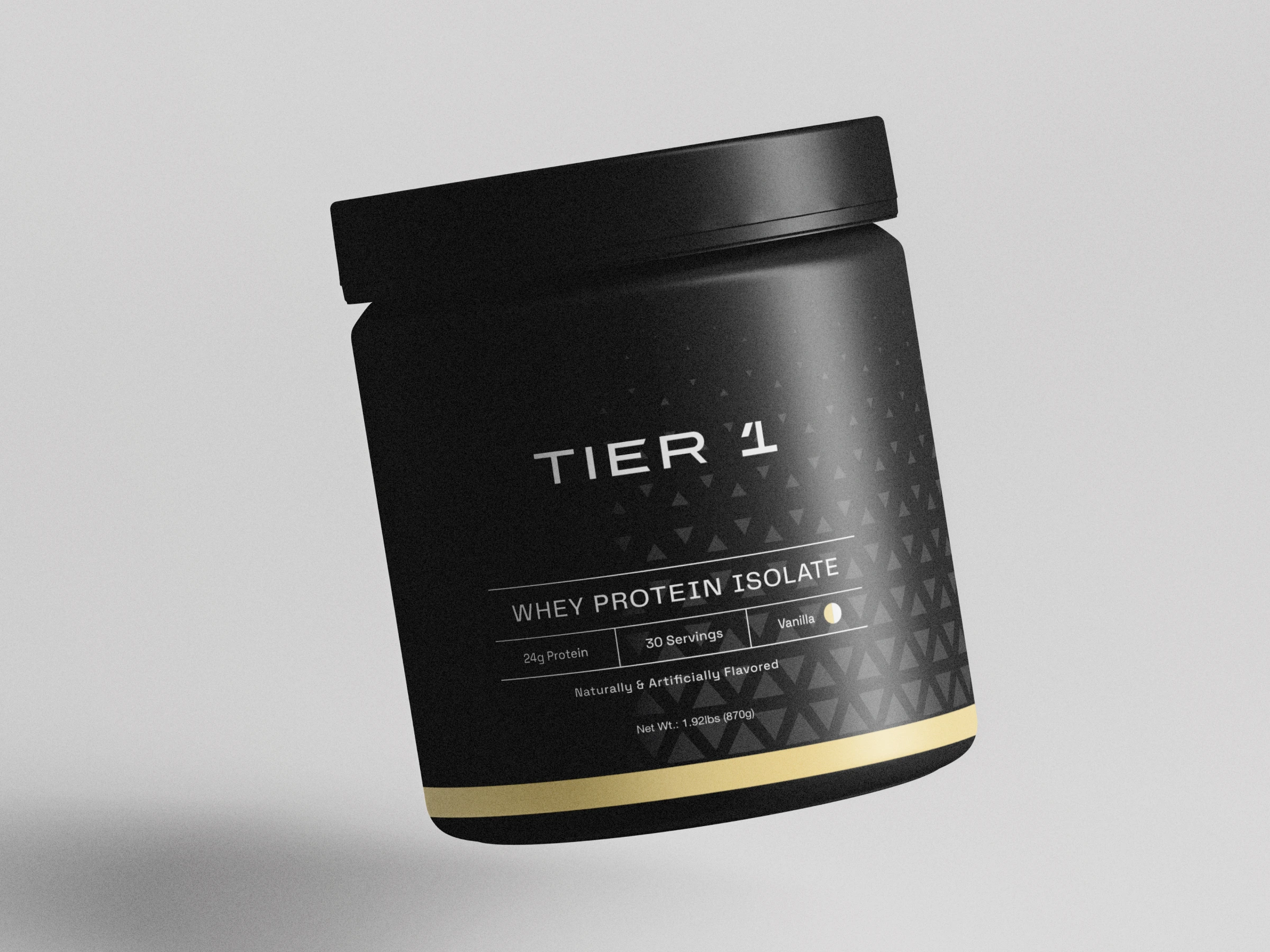
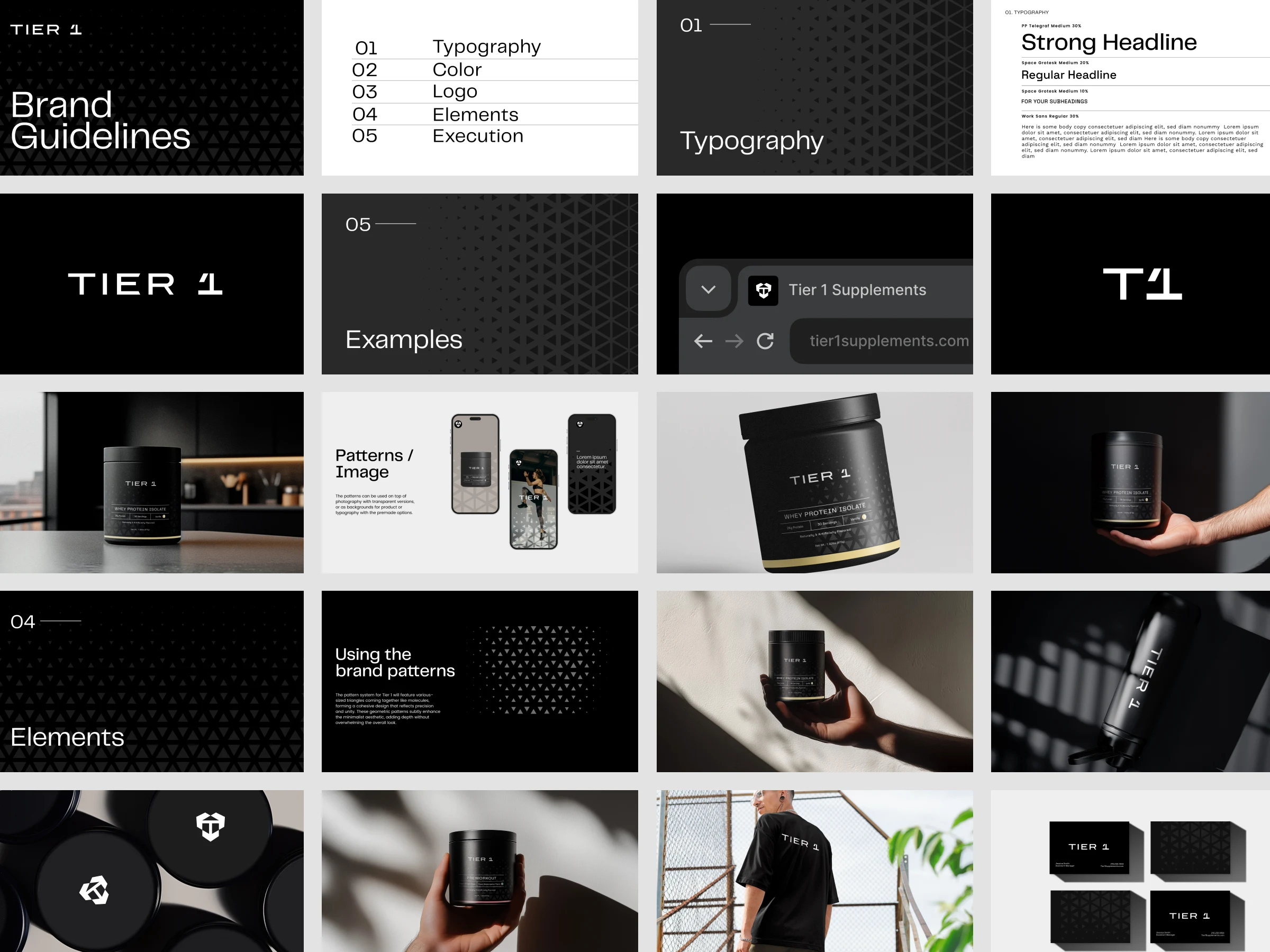
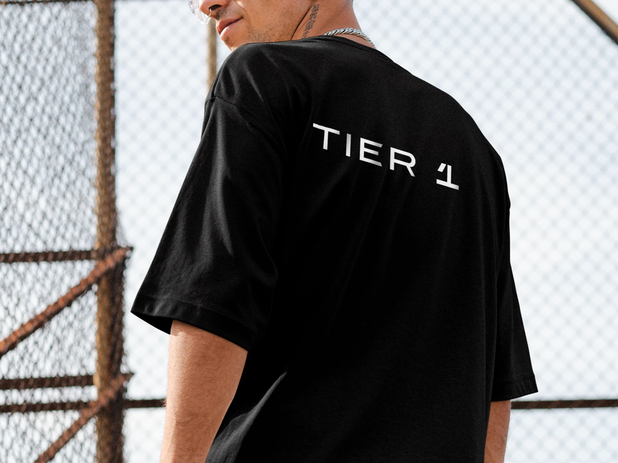
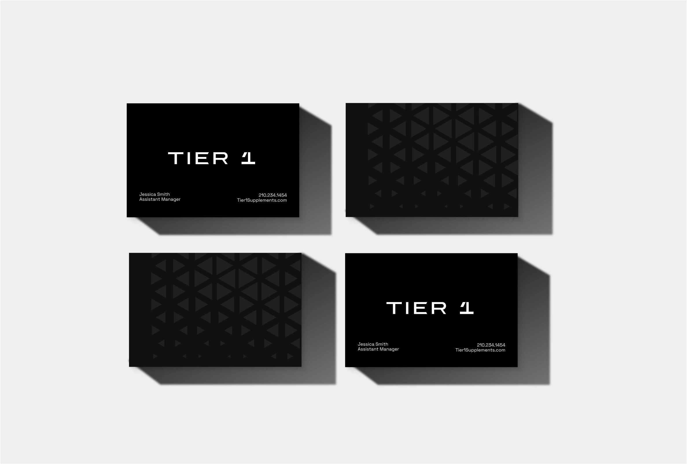
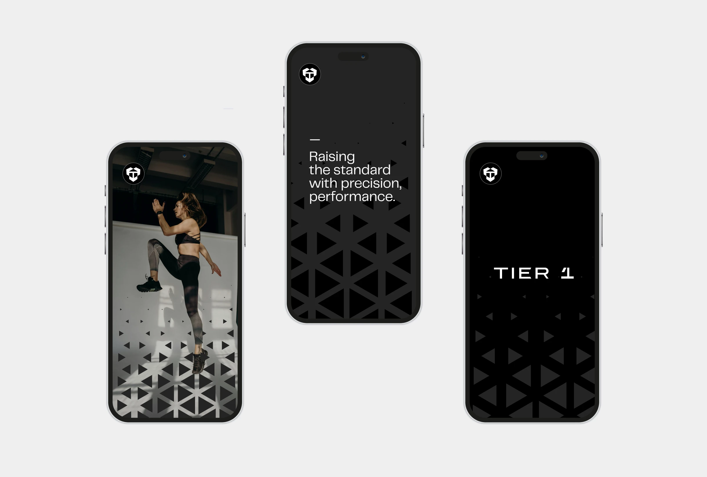
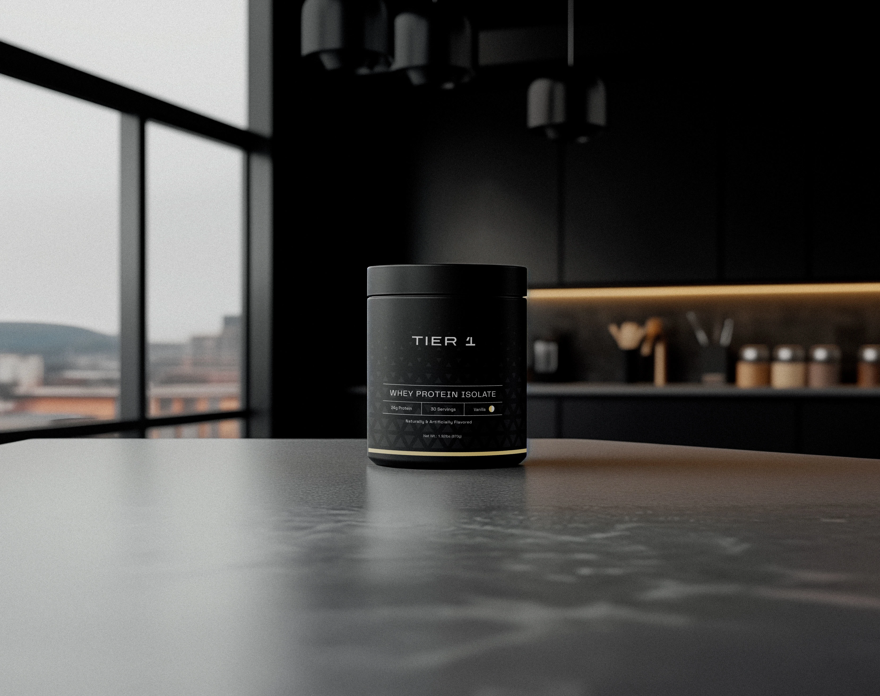
The identity and package design for Tier 1 Supplements was a collaborative effort with Brandt Creative Co., blending minimalist aesthetics with scientific precision to create a bold and modern brand presence. Tier 1 Supplements features a sleek and minimalist identity focused on precision and performance. The geometric logo symbolizes 'The Big 3,' reflecting balance and strength while ensuring instant recognition and scientific credibility.
The packaging design uses a monochromatic palette of black, white, and charcoal, accented by cyan to signal energy and innovation. Flavor variations like deep magenta and soft cream add contrast, maintaining visual clarity and sophistication.
Patterns inspired by the logo create depth and movement, symbolizing endurance and scientific rigor. These subtle gradients and overlays add visual interest while reinforcing the brand’s commitment to strength and simplicity.


#packagedesign #brandidentitydesigner #brandidentitydesign #brandidentity #visualidentity
Like this project
Posted Jun 6, 2025
The identity and package design for Tier 1 Supplements is blending minimalist aesthetics with scientific precision