THE NINTH OPC — BRAND IDENTITY DESIGN CASE STUDY
Mark Elish Nuñez
The Ninth OPC: A Sophisticated and Reliable Brand Identity – Case Study
Overview
The Ninth OPC is a company specializing in high-quality petroleum products and general merchandise. Targeting entrepreneurs, business owners, and corporate clients, the brand needed a visual identity that embodied sophistication, trust, and efficiency. Our goal was to craft an identity that positioned The Ninth OPC as a reliable industry leader while maintaining a modern and empowering aesthetic.

Role:
- Leading the creative direction and defining the brand’s visual identity.
- Facilitating the discovery session to align the brand’s goals, audience, and positioning.
- Developing the overall brand strategy, including messaging, tone, and differentiation.
- Making strategic design decisions for the logotype, typography, color palette, and brand assets to reflect the brand's values and market positioning.

Deliverables for The Ninth OPC Branding Project:
Brand Strategy & Positioning – Defining the brand’s identity, values, and market positioning.
Logo & Visual Identity System – Custom logotype, typography, and supporting design elements.
Color Palette & Brand Guidelines – A cohesive guide for consistent brand application.
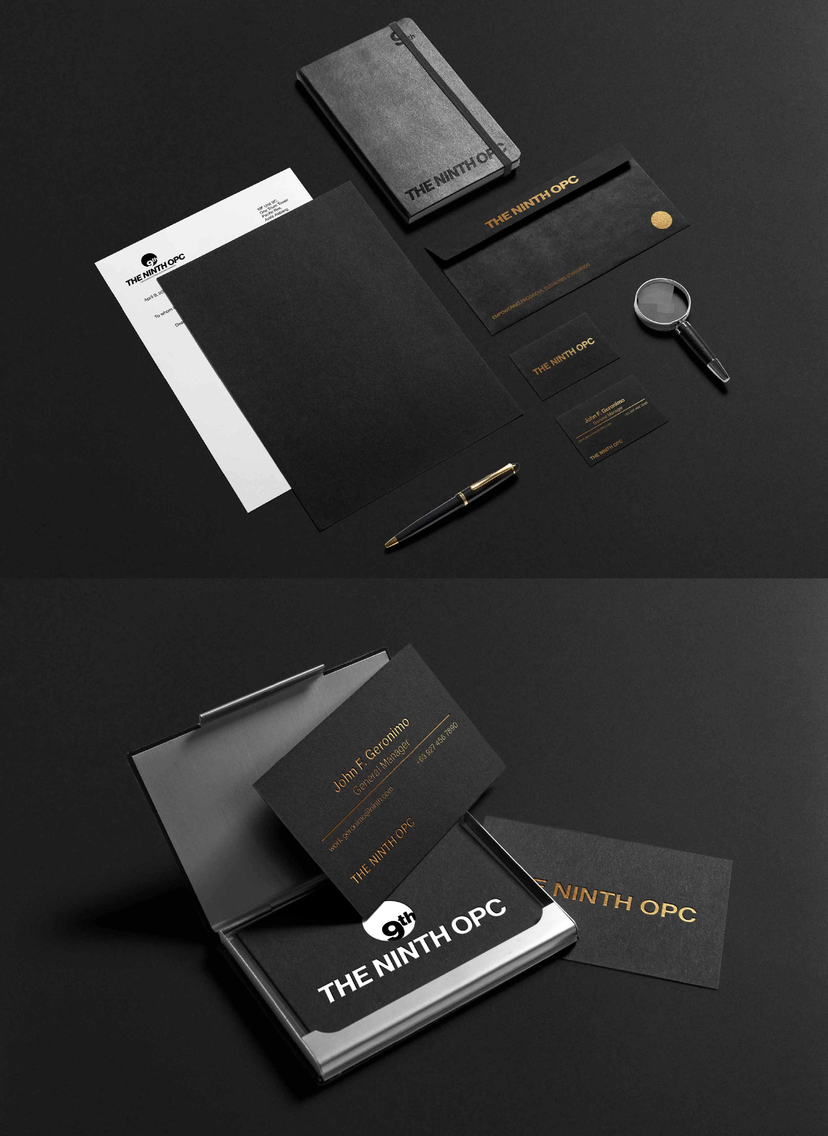
Business & Corporate Stationery – Business cards, letterheads, envelopes, and notepads.
Product Packaging Design – Bottles, cans, bags, and boxes for petroleum and general merchandise.
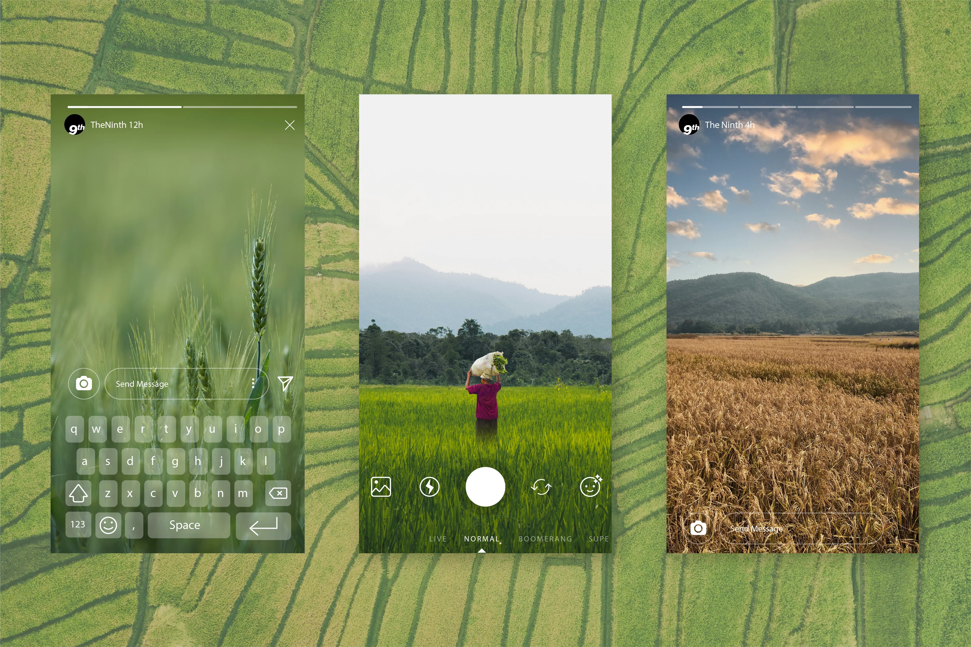
Digital Presence Design – Website UI mockups, mobile app screens, and social media assets.
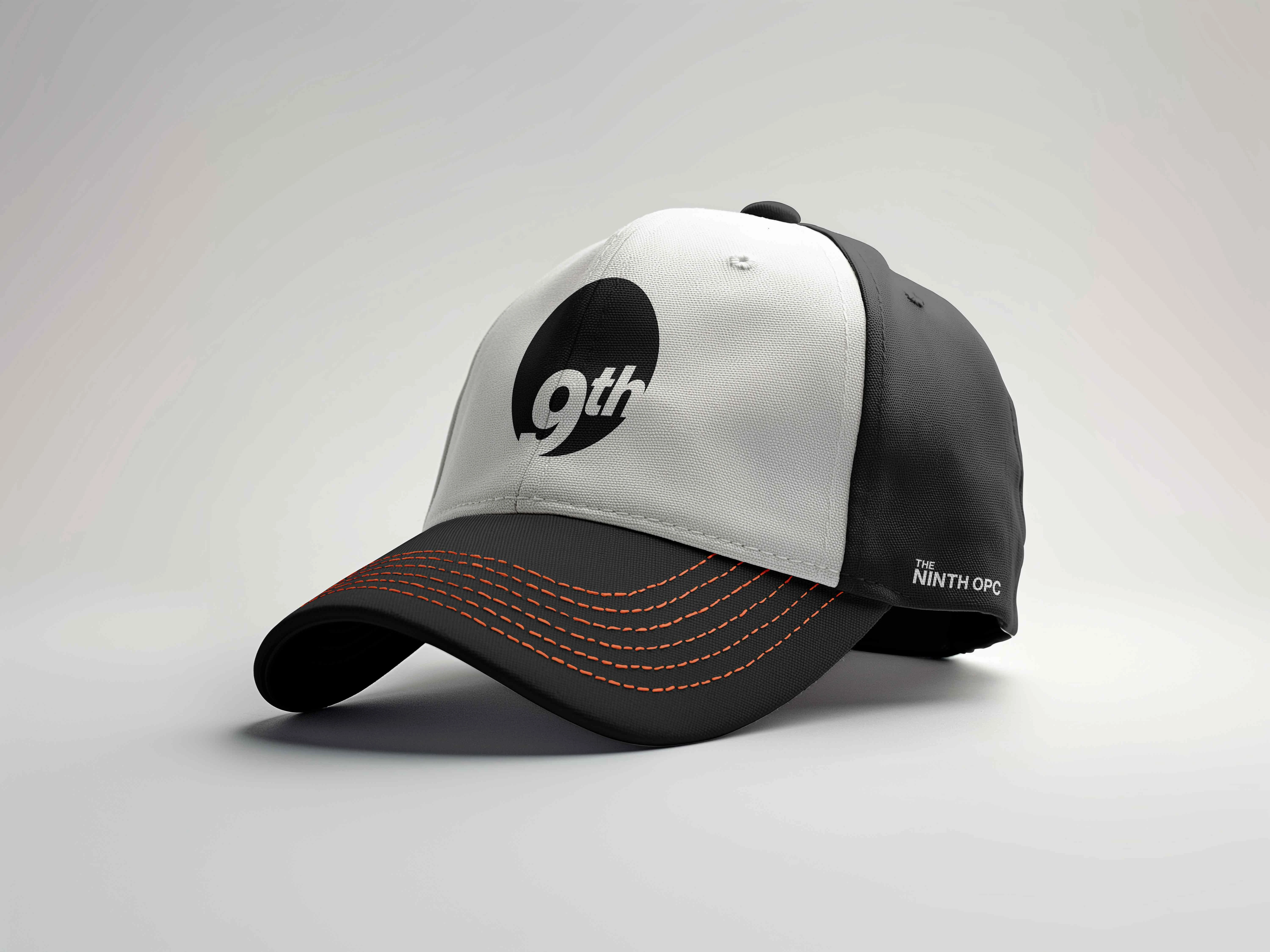
Corporate Identity & Branding – Employee uniforms, ID cards, lanyards, and company assets.
Advertising & Marketing Collateral – Billboards, posters, banners, and promotional materials.
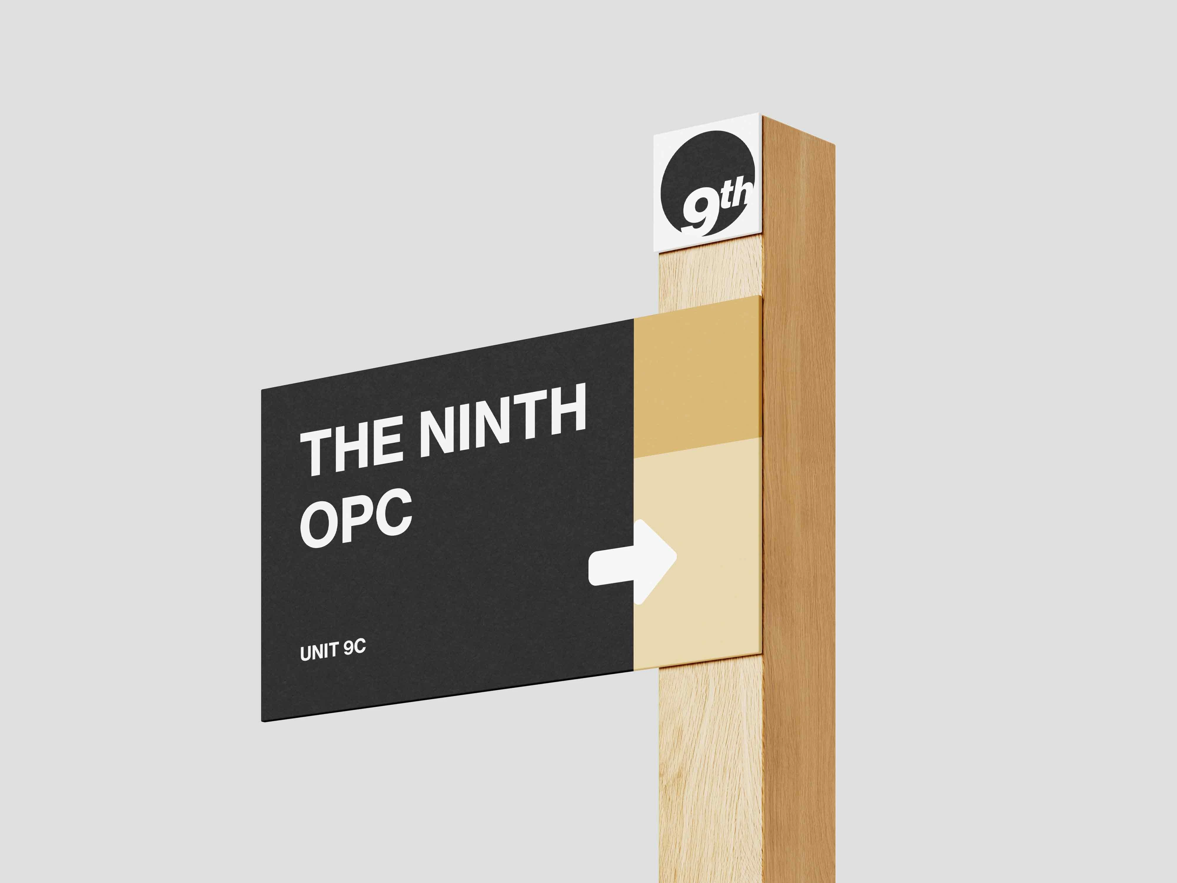
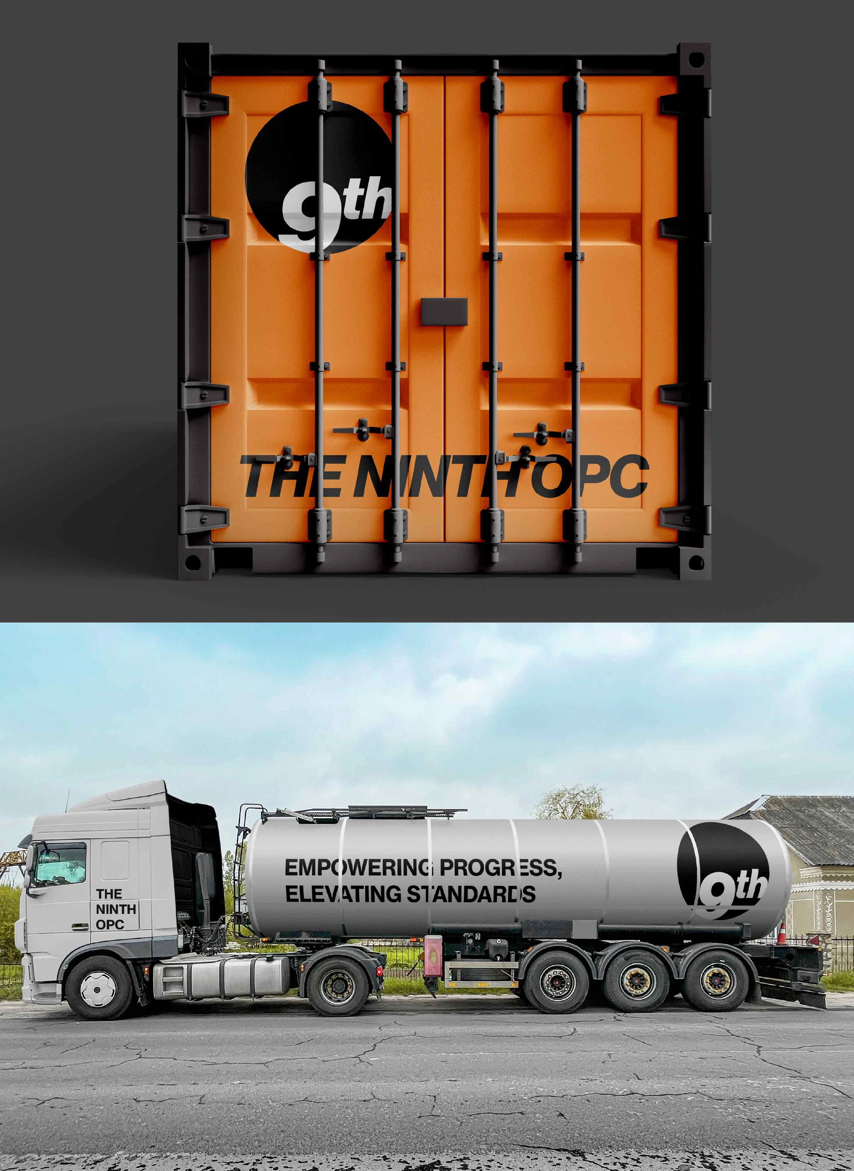
• Vehicle Branding – Delivery trucks, service vans, and company cars.
Solution
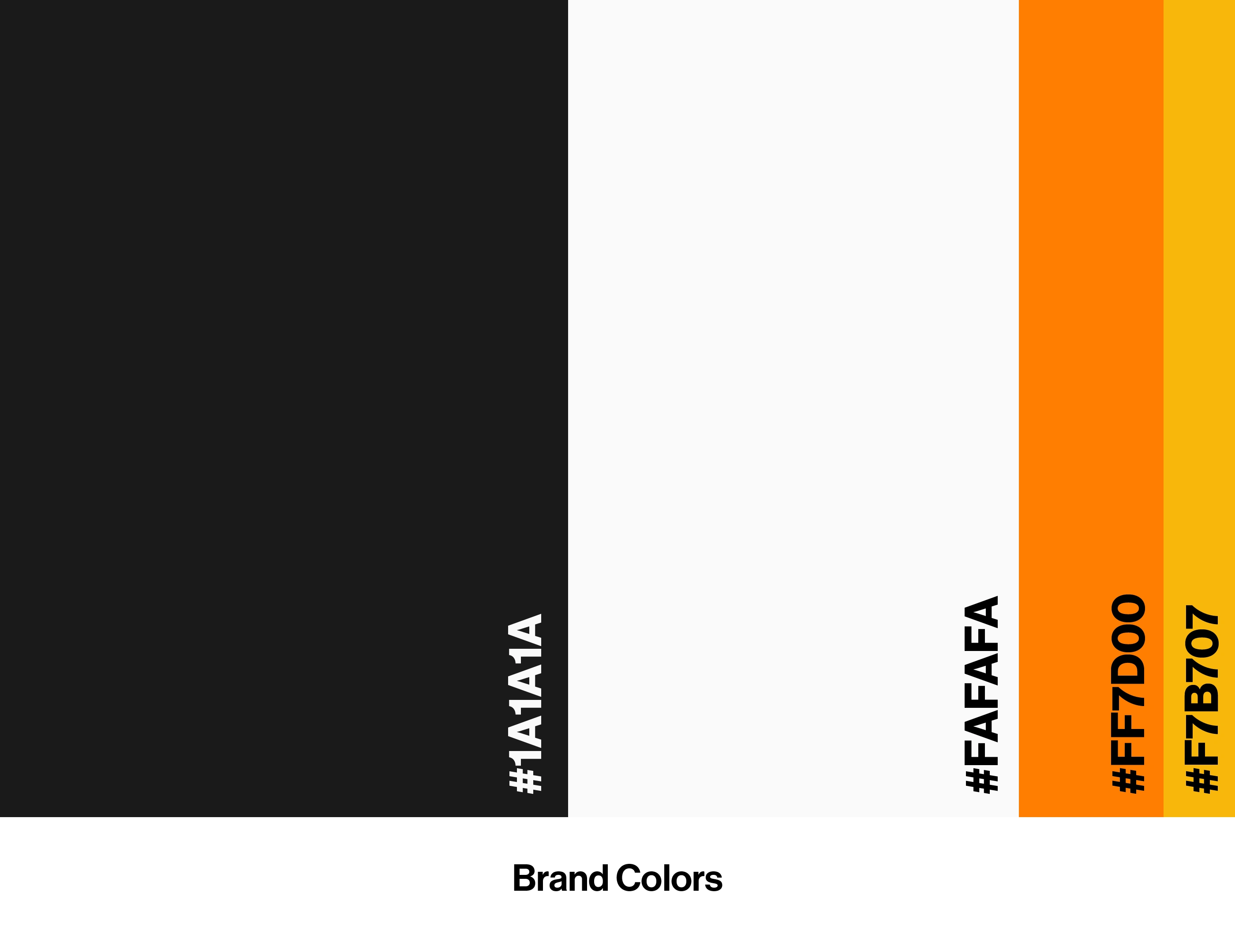
To establish a strong and sophisticated brand identity, we focused on a refined and strategic visual direction. The typography, Neue Haas Grotesk, was chosen for its clean, modern aesthetic, exuding professionalism while remaining approachable and versatile. The color palette blends minimalist neutrals and bold accents, with deep blacks, refined grays, and navy tones symbolizing strength, trust, and stability, while soft creams and a vibrant orange add warmth and innovation. The structured logotype, paired with strong typographic layouts and geometric compositions, reinforces authority and reliability. Complementing this, the brand messaging maintains a tone that is empowering, innovative, and customer-centric, solidifying The Ninth OPC’s position as a trusted industry leader.
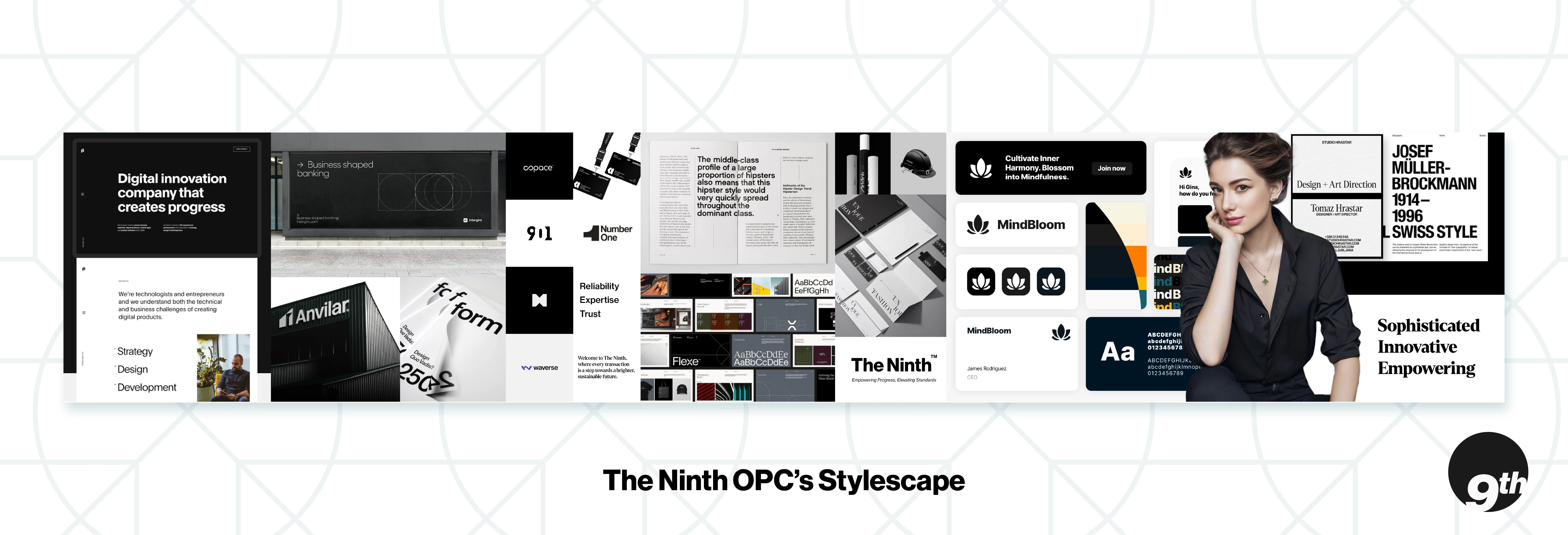
Defining the Visual Foundation Through Stylescapes
Before diving into the design execution, I developed stylescapes to establish a clear creative direction that aligns with the brand’s identity, values, and positioning. The stylescapes served as a visual roadmap, ensuring every element—typography, color, layout, and imagery—was intentional and cohesive.
Concept & Approach
The brand needed to evoke sophistication, innovation, and empowerment, while maintaining a clean, minimal, and structured aesthetic that conveys clarity and trust. The stylescape focused on the following key principles:
1. Minimalist Aesthetic for Clear & Concise Communication
• Inspired by Swiss-style typography and editorial design, the layouts embrace grids, whitespace, and strong typographic hierarchy. This ensures readability and a polished, professional feel.
• The black-and-white contrast, combined with deep neutral tones, reinforces a timeless and high-end corporate appeal.
2. Typography That Embodies Precision & Strength
• Neue Haas Grotesk was chosen as the primary typeface due to its modernist, neutral, and highly legible qualities. It exudes professionalism while maintaining an approachable and structured presence.
3. Strategic Use of Color for a Bold & Trustworthy Presence
• The palette consists of deep neutrals (black, charcoal, and navy) to establish stability and sophistication.
• Accents like warm ivory and deep orange introduce a touch of warmth and energy, symbolizing innovation and progress.
4. Refined Brand Expression Through Imagery & Layouts
• The photography direction leans toward high-contrast, editorial-style images featuring professionals, architecture, and structured compositions—reinforcing the brand’s bold yet approachable identity.
• Clean UI mockups showcase digital presence and brand application, ensuring adaptability across different touchpoints, from business collateral to online platforms.
Impact on the Final Identity
The stylescapes guided every branding decision, ensuring consistency and alignment with the brand’s mission. By anchoring the identity in clean, modern, and minimalistic design principles, the final brand identity effectively communicates clarity, trust, and innovation—three pillars that define the company’s core values.
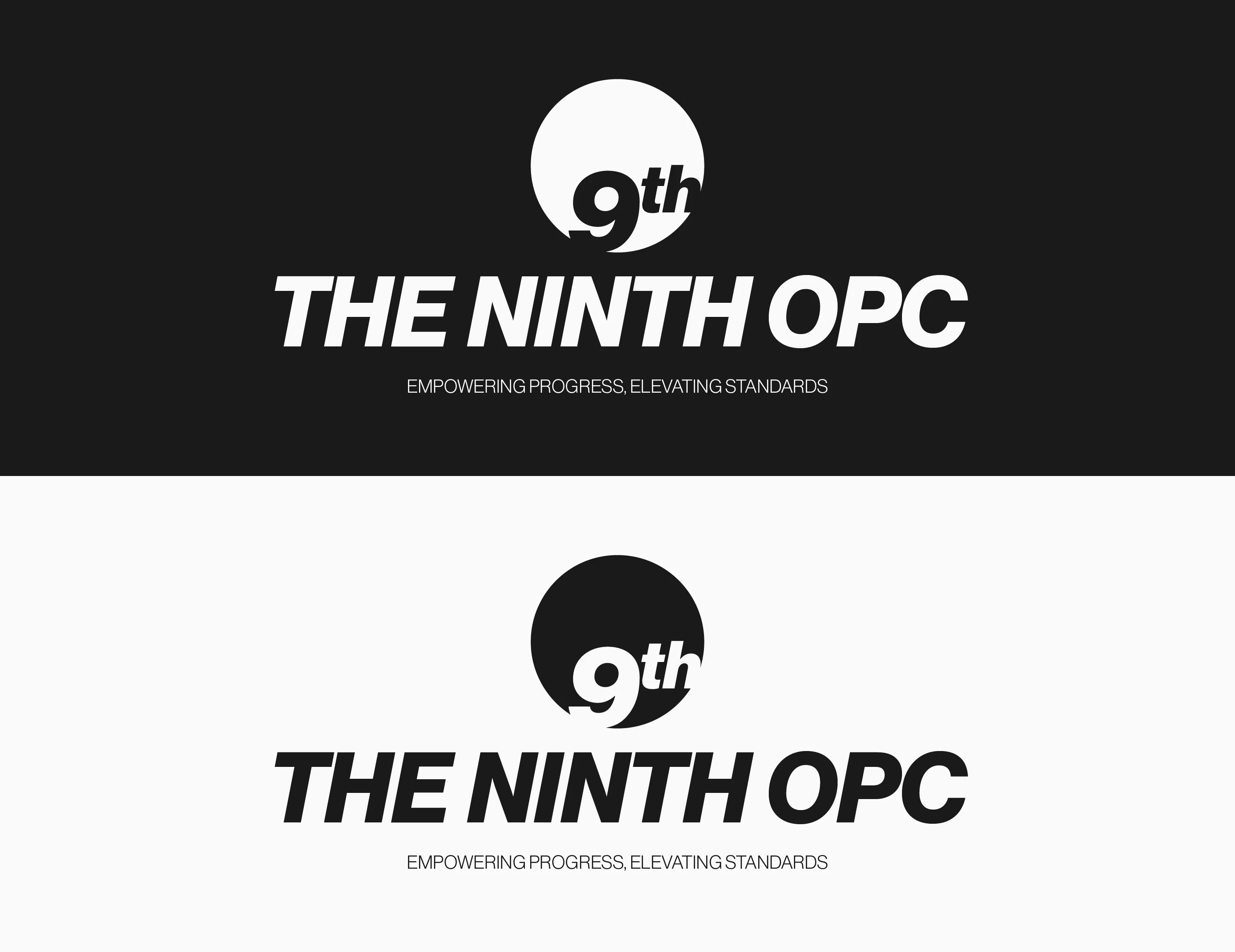
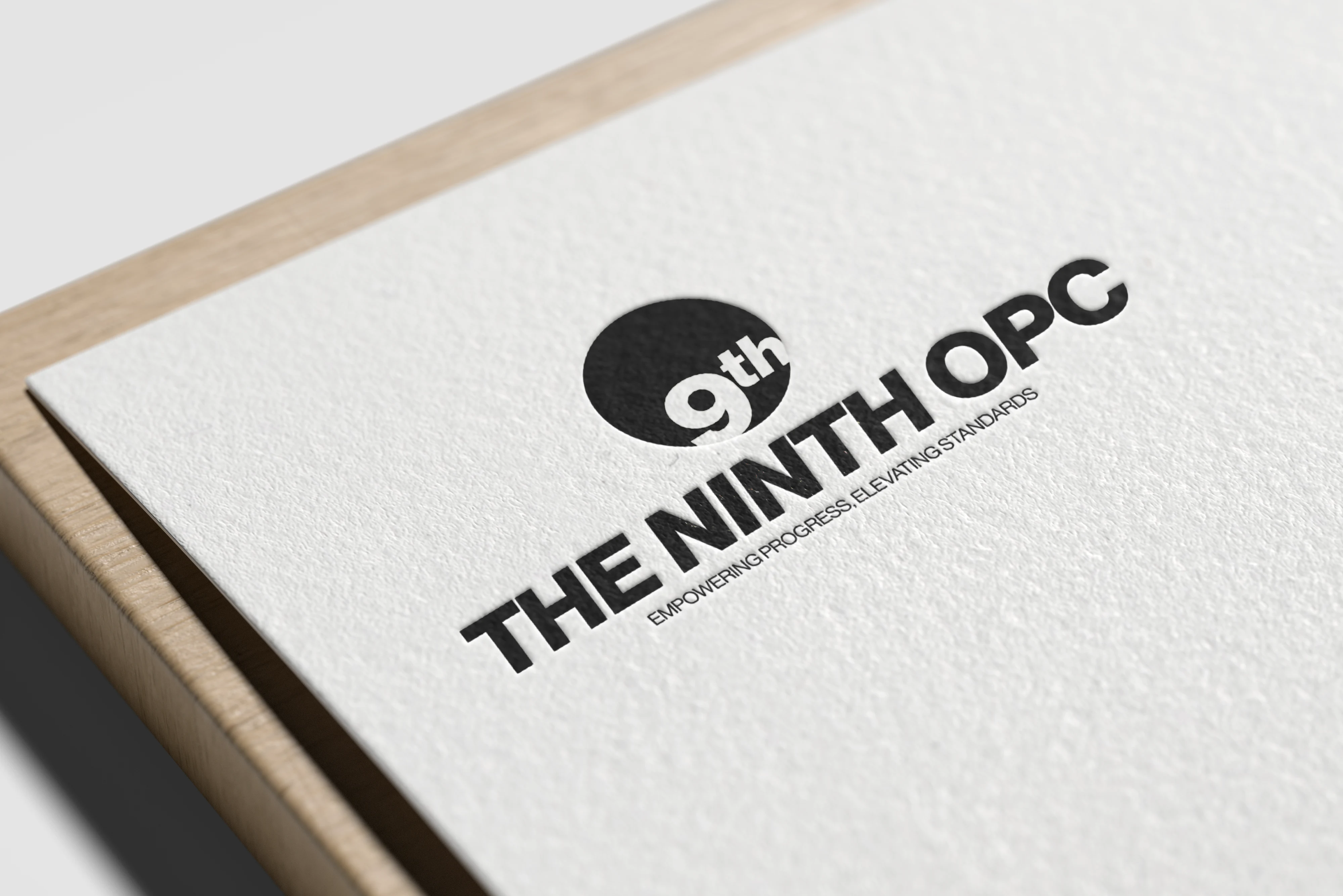
Main Logo Variation – Thought Process
For the primary logo variation of The Ninth OPC, the approach was to create a clean, modern, and highly legible design that reflects the brand’s core values of sophistication, trust, and efficiency. Neue Haas Grotesk was chosen as the foundational typeface due to its timeless Swiss-style precision, reinforcing the brand’s commitment to reliability and clarity.

The typographic lockup is structured to maintain balance and a sense of strength, with spacing and alignment carefully adjusted for a polished, professional feel. The minimalist yet bold aesthetic ensures versatility, allowing the logo to be effective across different applications—from digital platforms to large-scale signage.
The color scheme, primarily black and white, reinforces the brand’s elegance and no-nonsense approach to business, while the deep neutral tones provide subtle warmth and depth, avoiding sterility.
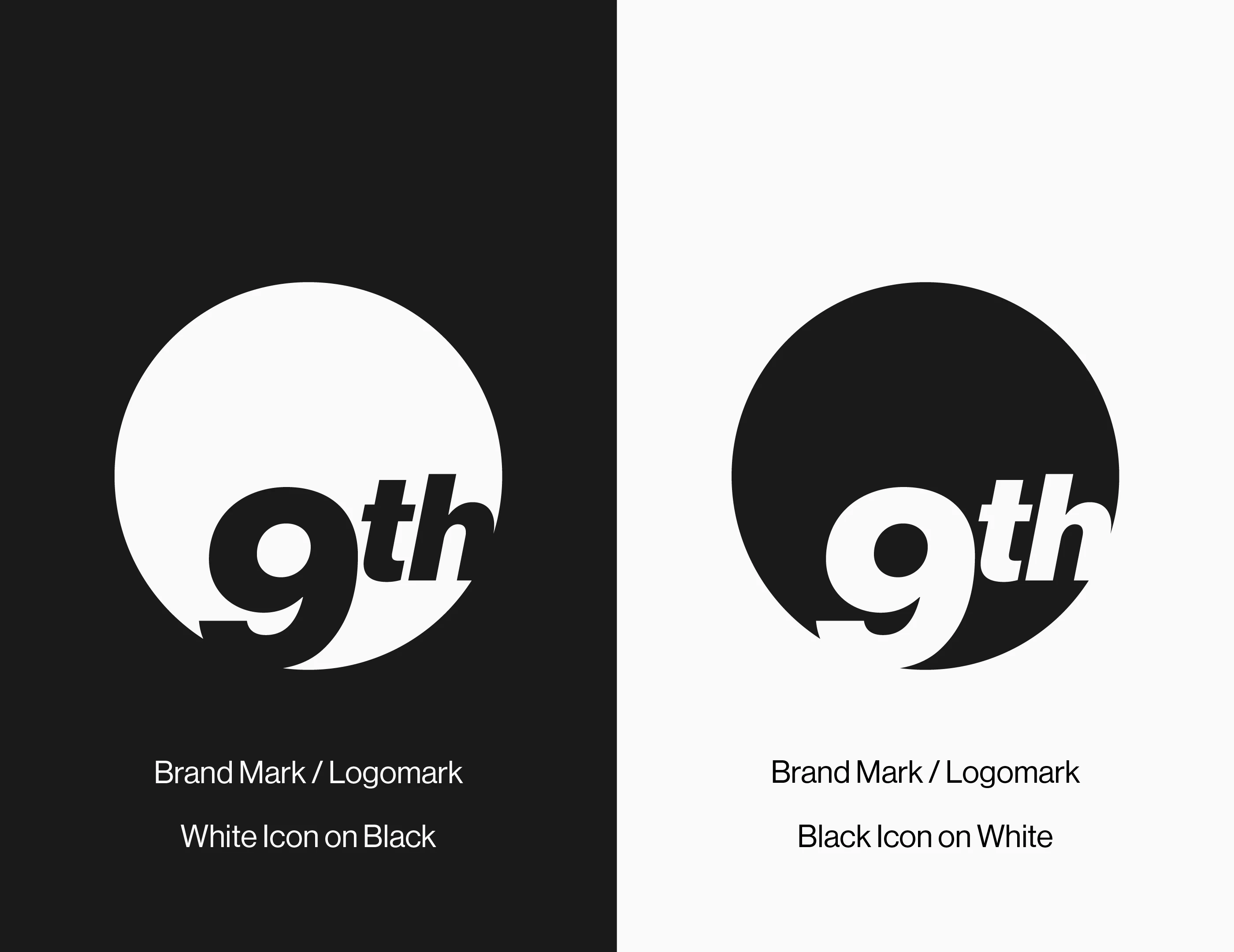
Logomark – Thought Process
The logomark was designed to serve as a distinctive yet simplified brand identifier that works seamlessly alongside the main logotype or as a standalone element. The symbol embodies The Ninth OPC’s values of innovation and dependability, maintaining a geometric and structured form that conveys stability and forward momentum.
The design likely incorporates subtle references to the brand’s industry, whether through abstract forms representing petroleum, energy, or movement. The choice of clean lines and strong, recognizable shapes ensures that the logomark remains memorable, adaptable, and impactful across different brand touchpoints.
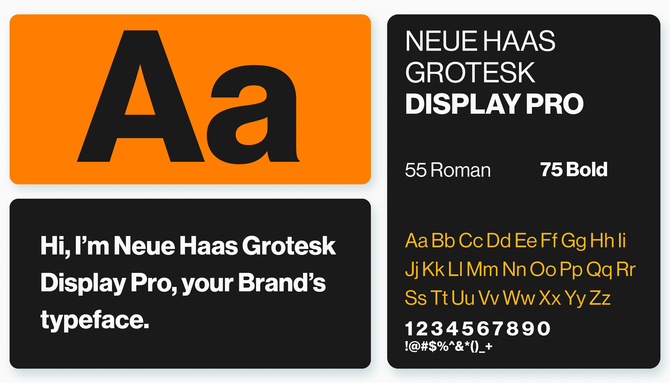
Typography
Neue Haas Grotesk was chosen as the foundation of the logotype design and primary typeface. Its modernist, clean-cut aesthetic exudes professionalism while maintaining approachability and versatility.
Logo & Visual Elements
The logotype, built on Neue Haas Grotesk, is structured and precise, reinforcing the brand’s trustworthiness. Supporting elements such as strong typographic layouts and sharp geometric compositions enhance the brand’s authoritative presence.


Outcome
The final brand identity successfully positioned The Ninth OPC as a premium and reliable provider of petroleum products and general merchandise. The sophisticated, innovative, and empowering aesthetic resonated with the company’s target market, enhancing credibility and recognition. The branding system was designed with scalability in mind, ensuring a seamless transition into future expansions, including sub-brands and franchising opportunities.

Final Thoughts
The Ninth OPC’s brand identity was built on precision, trust, and innovation—transforming its presence into a sophisticated and empowering force in the industry. From strategy to execution, every detail was crafted to reflect the brand’s commitment to excellence and reliability.
If you're looking for a strategic and compelling brand identity that sets your business apart, let’s collaborate. Get in touch and let’s bring your vision to life.
🖥️ UI/UX Portfolio: Dribbble
☕️ Support my work via Buy me a Coffee
THANK YOU SO MUCH FOR WATCHING!
Like this project
Posted Jun 9, 2025
Developed a modern, cohesive brand identity for The Ninth OPC, capturing the essence of a reliable trading company with a refined and memorable visual system.
Likes
0
Views
11
Timeline
Apr 5, 2023 - Jul 27, 2023