
Bishop: A Logo for a Vegan Drinks Shop
The Challenge:
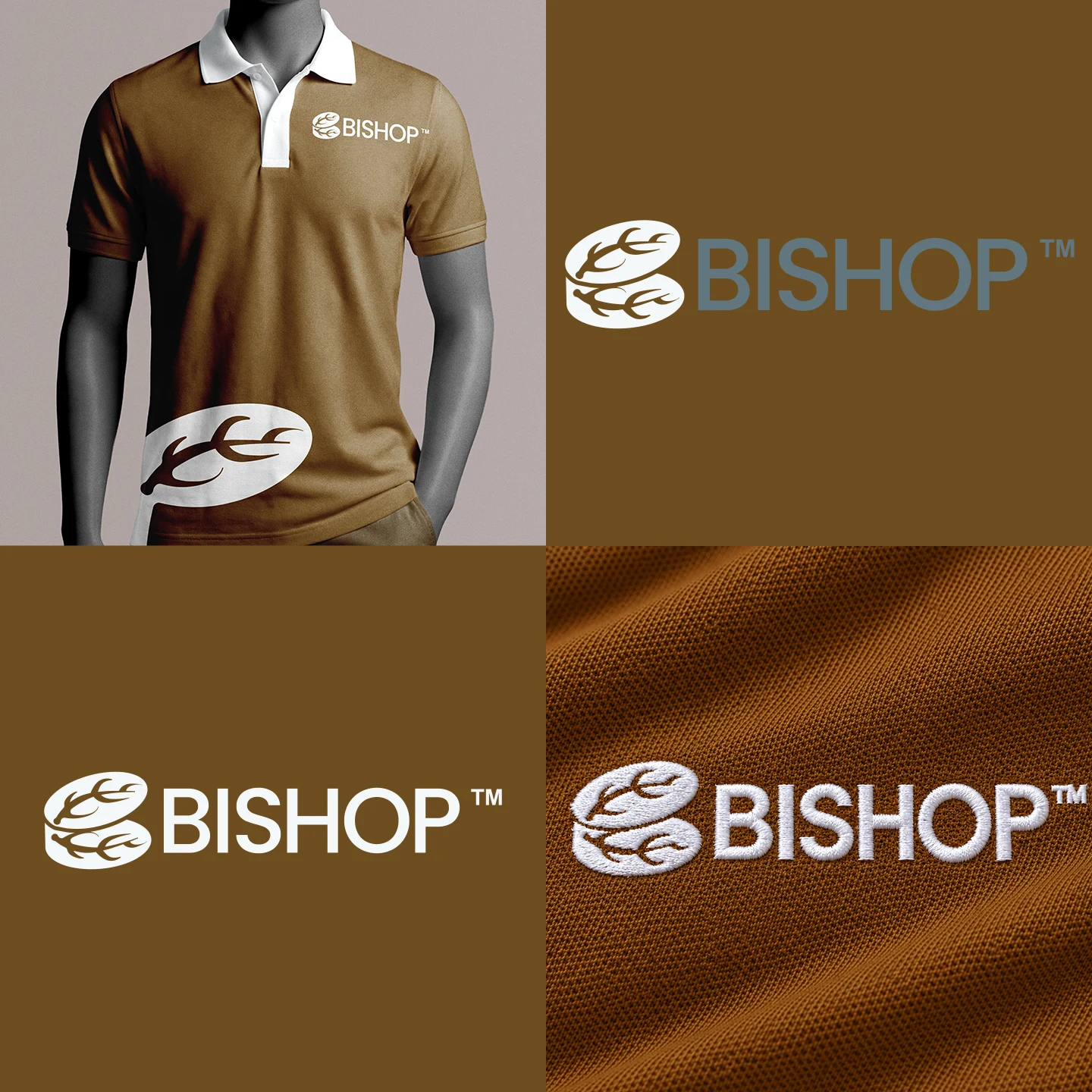
The challenge was to make a logo that would be printed on uniforms for a shop called Bishop that sells vegan drinks. The logo needed to tell people who they are and what they do. Here is what I came up with.
The Concept:
The logo pairs an emblem with a wordmark, so each half does its own job.
The emblem on the left is a rounded, layered shape with leaf and sprig details running through it. It carries the “what they do” message: natural, plant-based, and made to be sipped. The layered form also hints at stacked ingredients, which keeps it feeling fresh rather than clinical.
The wordmark on the right carries the “who they are” message. BISHOP is set in wide, bold, all-caps letters with clean geometric forms. It’s confident, easy to read, and has the authority the name suggests. Together, the emblem and wordmark say that Bishop is a trustworthy, modern brand with plants at its core.
Designed for Uniforms:
1. Since the logo would be worn every day, I built it around how it will be produced and seen:
2. Bold, simple letterforms that stay legible on a small chest placement
3. A single-color design that works for screen printing, heat transfer, and embroidery without losing detail
4. Generous spacing between the emblem and the lettering so the two don’t blur together on fabric
5. A horizontal layout that sits well on shirts, aprons, and caps
The Result:
The final logo gives Bishop an identity that is clear, memorable, and practical. Customers can tell at a glance that Bishop is a plant-based drinks brand before they’ve ordered anything.
0 likes · 0 views · Nov 17, 2026
Bishop: A Logo for a Vegan Drinks Shop The Challenge: The challenge was to make a logo that would be printed on uniforms for a shop called Bishop that sells...

