Wholemind Psychology (Web Design / Brand Identity
Link
Info
WholeMind Psychology, a boutique NYC clinic focused on premium mental health services for kids and teens, needed a rebrand. Their mission is to help youth conquer anxiety and fears to start thriving again. The practice takes a comprehensive approach - utilizing research-backed evaluations to accurately diagnose, then deploying personalized treatment plans.
When we began the strategy phase, we chose to keep the butterfly concept from the original logo icon, as it effectively represents how every child is unique with the potential to grow and evolve. However, to avoid falling into clichés and to better communicate the clinic's family-centric approach, we needed to add more depth to the metaphor. The brand identity had to resonate with both children and parents alike.
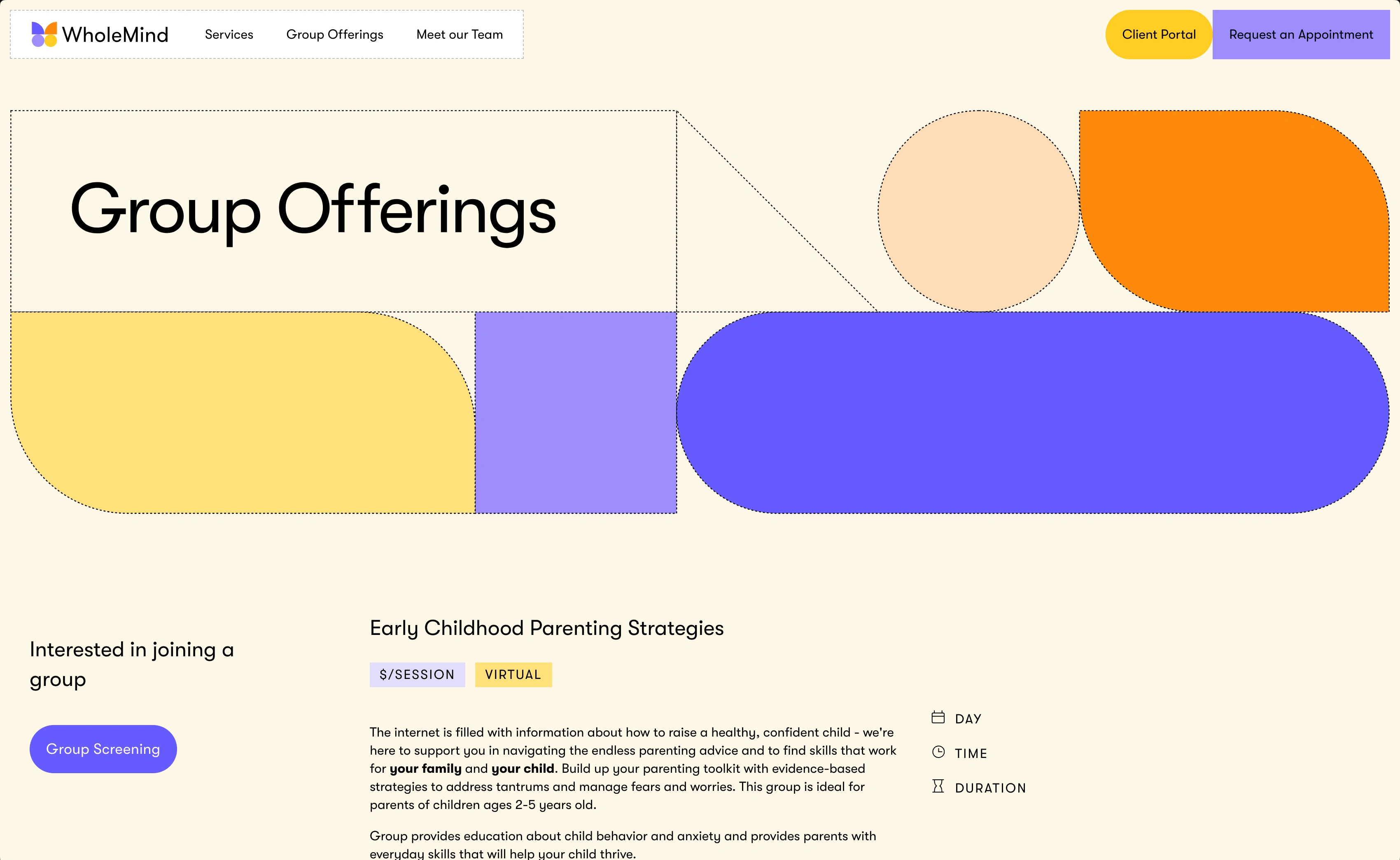
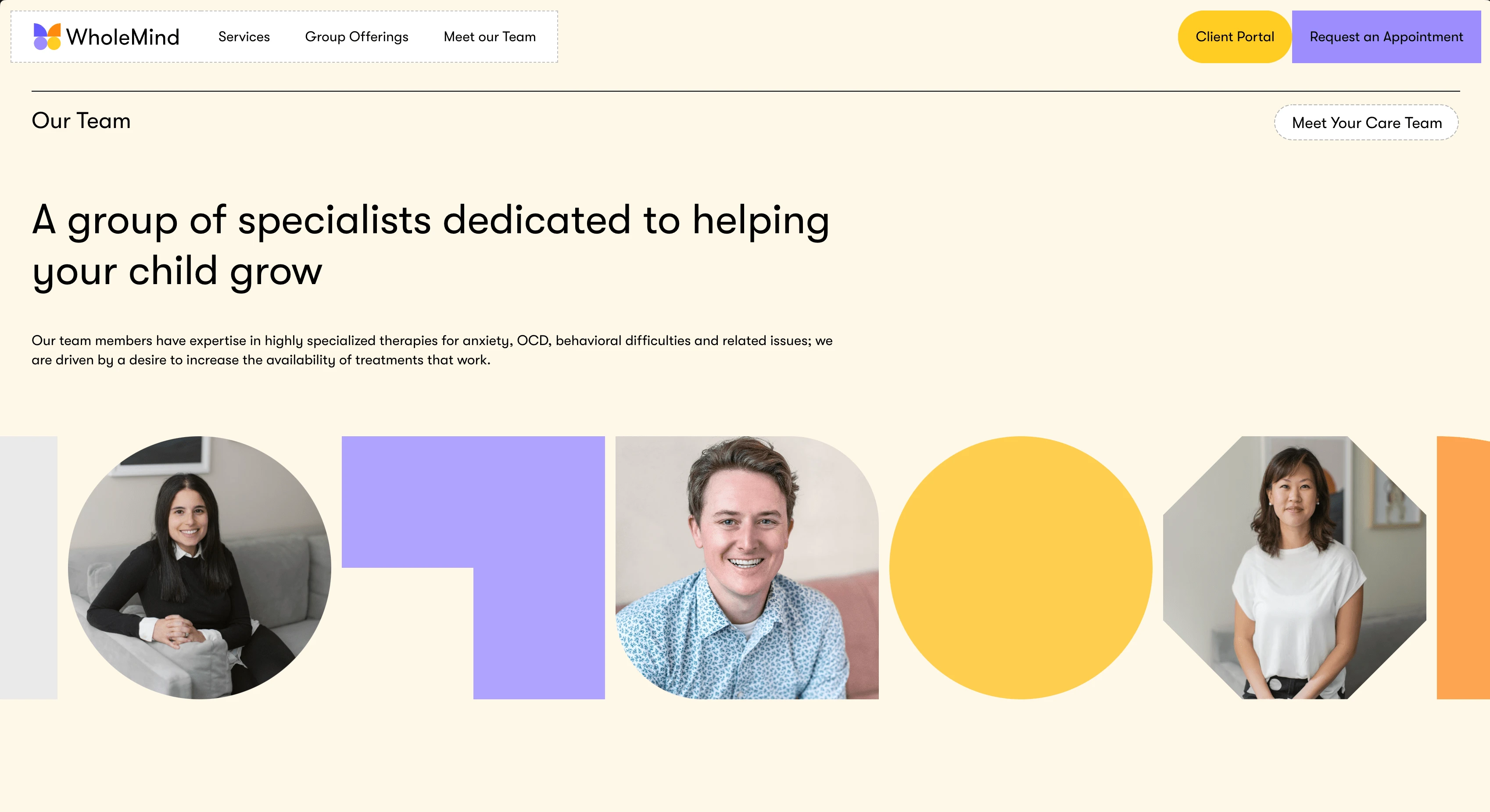
The solution was to implement a modular "building block" system within the logo and throughout the entire brand. Now the identity emphasizes the singularity of each child in a fun and engaging way that feels more modern and approachable to the entire family.
Website Hero Animation
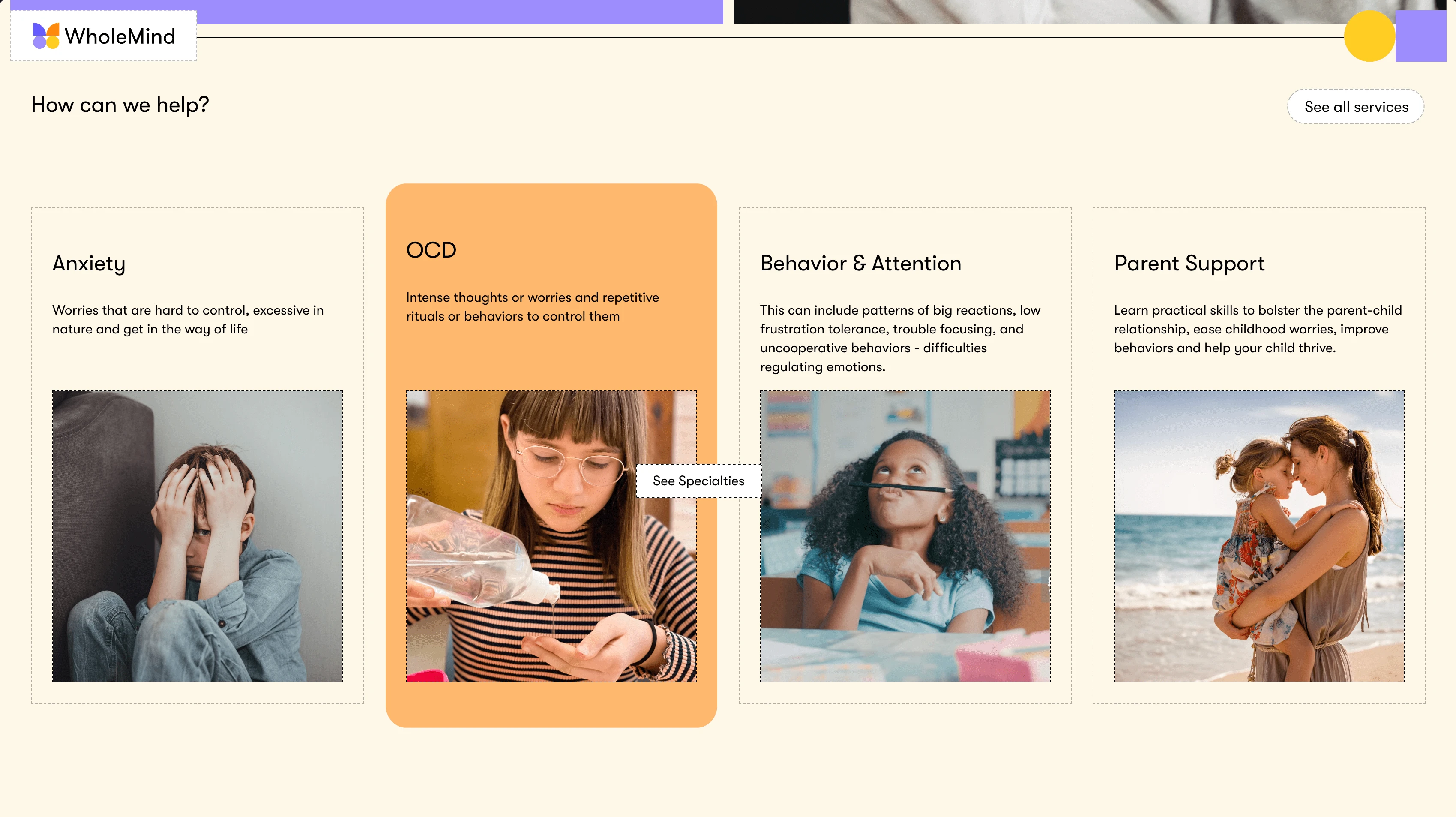
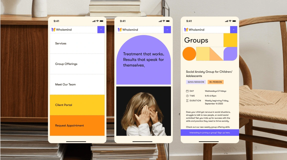
Mobile Web Design

Print Materials / Photography Style

Window Signage
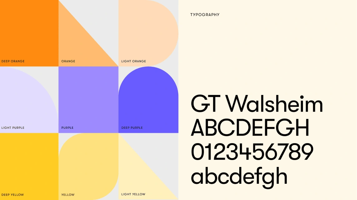
Color Palette / Typography
Like this project
Posted Jan 19, 2025
WholeMind Psychology’s rebrand and website redesign highlight each child’s uniqueness through a modular identity with a modern, family-friendly approach.

