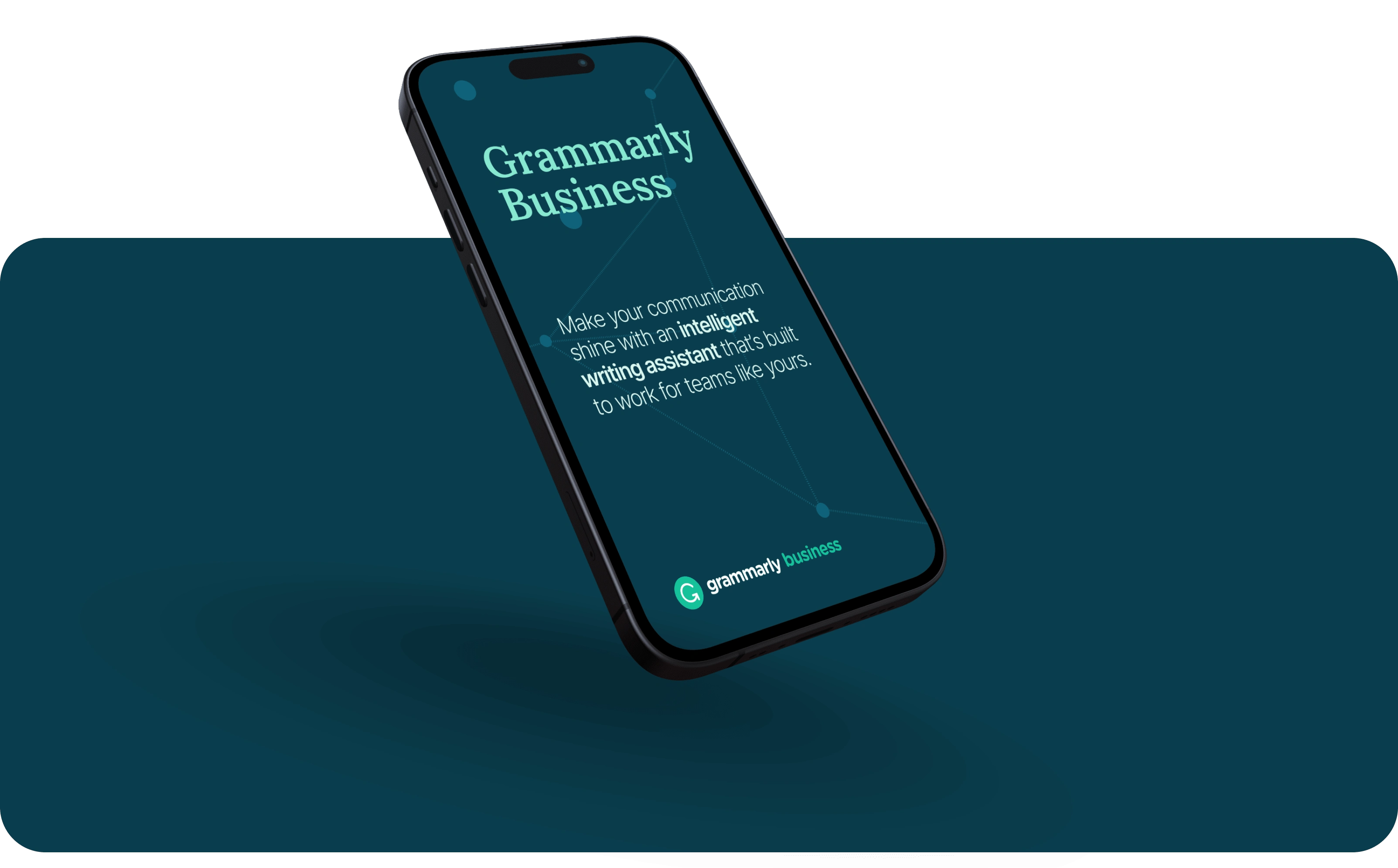
Rebranding of Grammarly Business
Design evolution of Grammarly Business to elevate the sub-brand for professionals and enterprise decision-makers.

Despite achieving successful metrics, the design for Grammarly Business fell short of expectations. GB Design is not performing at its optimal level, particularly when compared to other enterprise companies excelling in this area. This gap highlights the need for a strategic overhaul to enhance our design processes and outcomes.
Brand & Strategy: Powered by AI
This approach speaks to the capabilities of GB's advanced technology and expresses how we can empower possibilities for more effective communication in the workplace.
— Helpful
— Open
— Smart

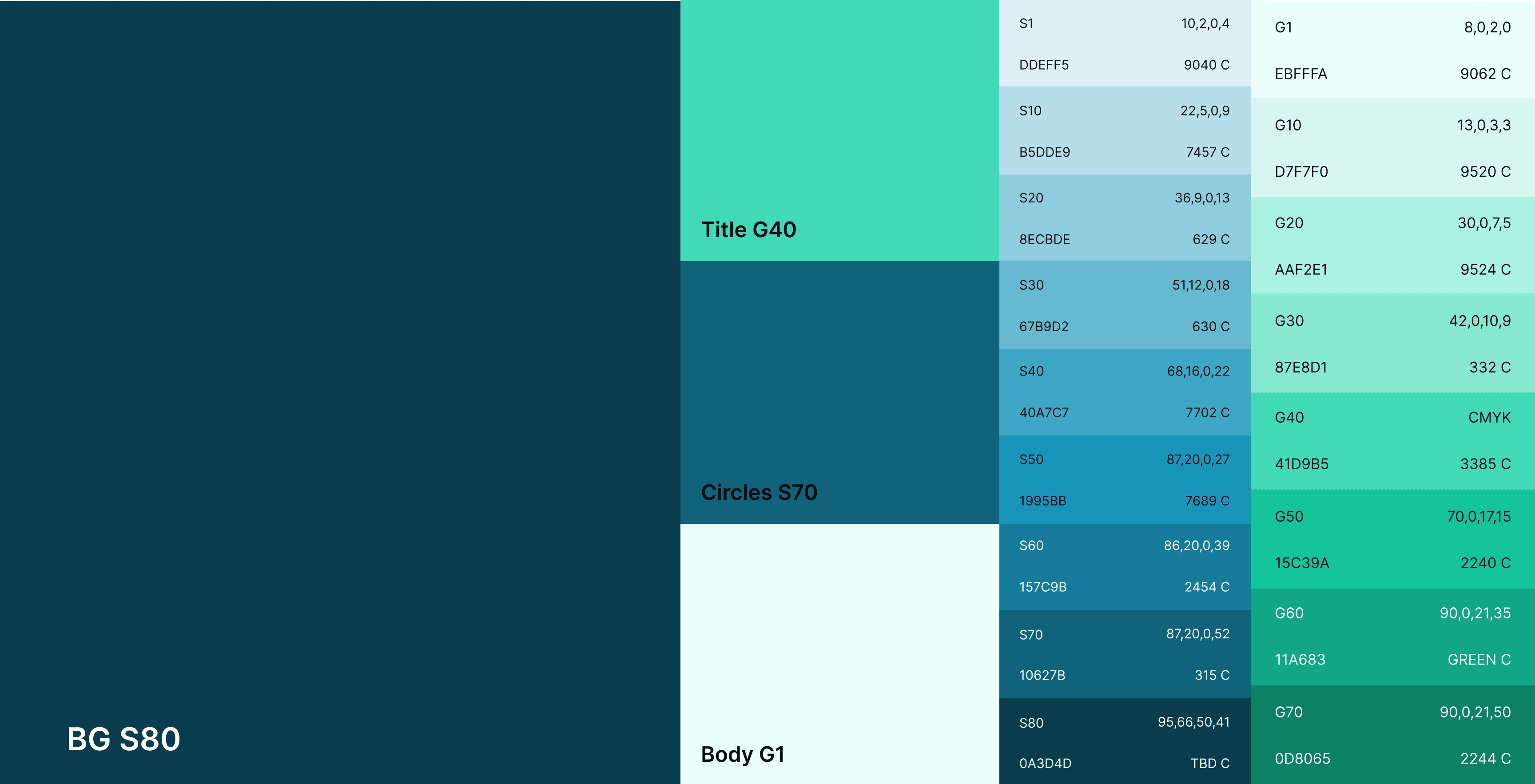
Extended color palette
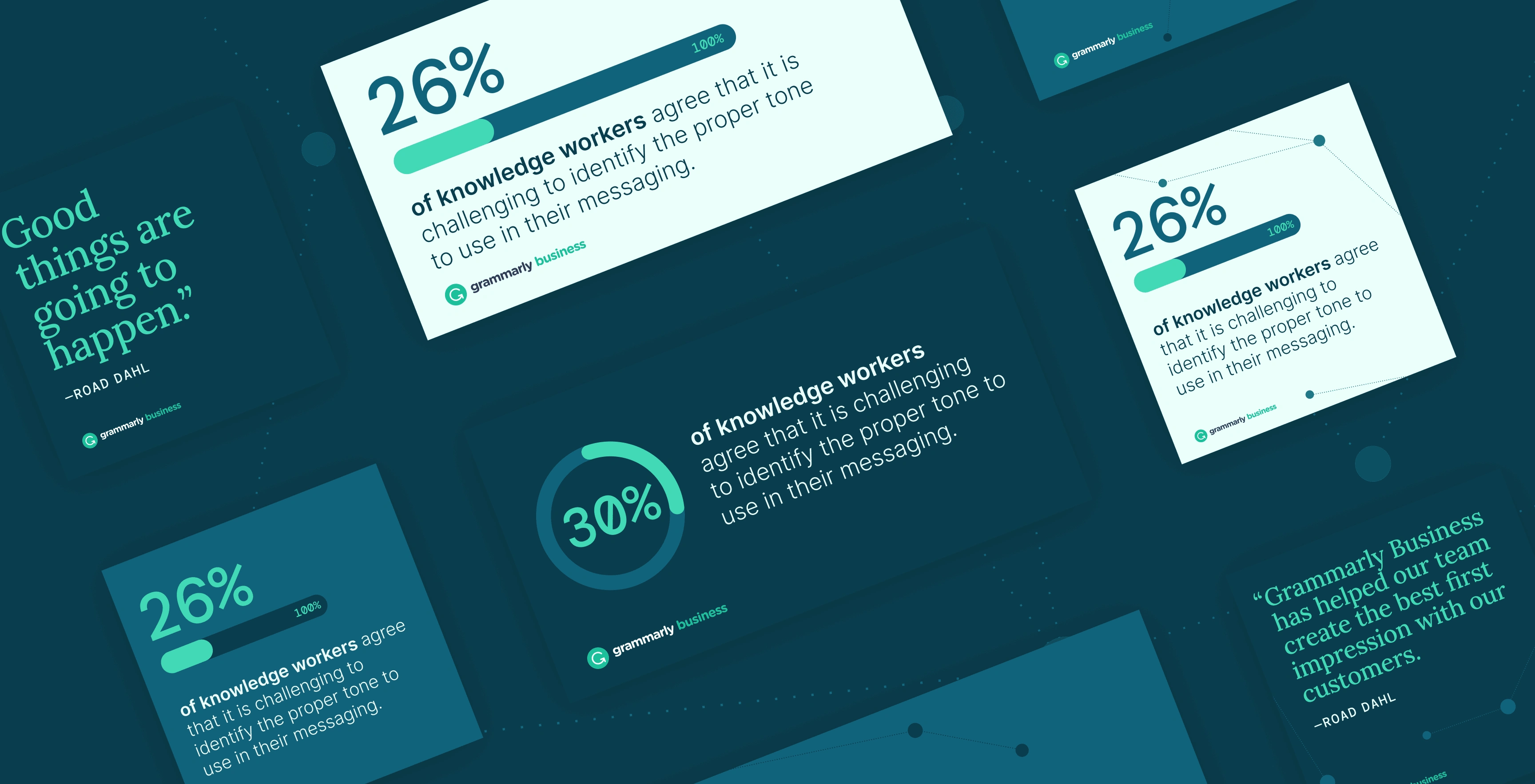
To make the color palette more tech and AI-oriented, we used vibrant green in combination with sky blue. To emphasize the stats, I chose a monospaced typeface to give it a more technological feel.
The main graphic elements were connected dots, symbolizing our interconnected world. People are connected through technology, and AI can help to enhance these connections even further.

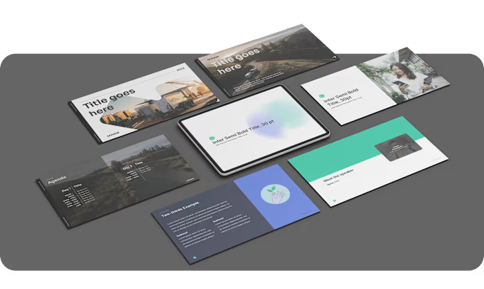
Illustrations example


Social media examples
Following a comprehensive rebranding and the implementation of a new design strategy, GB Design has experienced a substantial improvement in performance. The innovative and refined design not only rectified previous deficiencies but also positioned us as a leader in enterprise design. This strategic enhancement has been pivotal in securing new contracts and significantly increasing business awareness. Our clients have responded positively to the elevated design standards, underscoring our dedication to excellence and driving heightened interest and engagement.
Like this project
Posted Jul 20, 2024
As a Senior Lead Designer, I was responsible for the entire sub-brand redesign.
Likes
0
Views
15
Clients
Superhuman (formerly Grammarly)


