
Ozlem Karaeminogullari
Product Designer | I turn complex SaaS, dashboards & mobile




Pixels with a purpose. Fresh onboarding concepts for a health app. 🚀


Recently I've been working on a wellness app onboarding.
Here are two different directions I'm exploring. I'd love to hear your thoughts. Which one do you like more? 👇

10 voted
43%
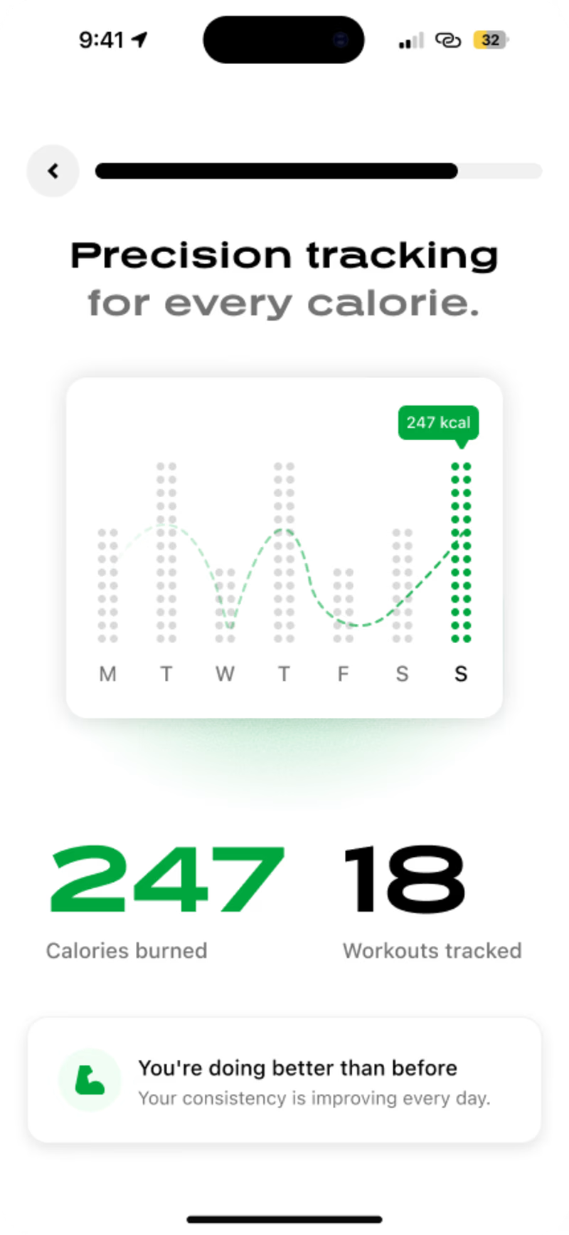
13 voted
57%
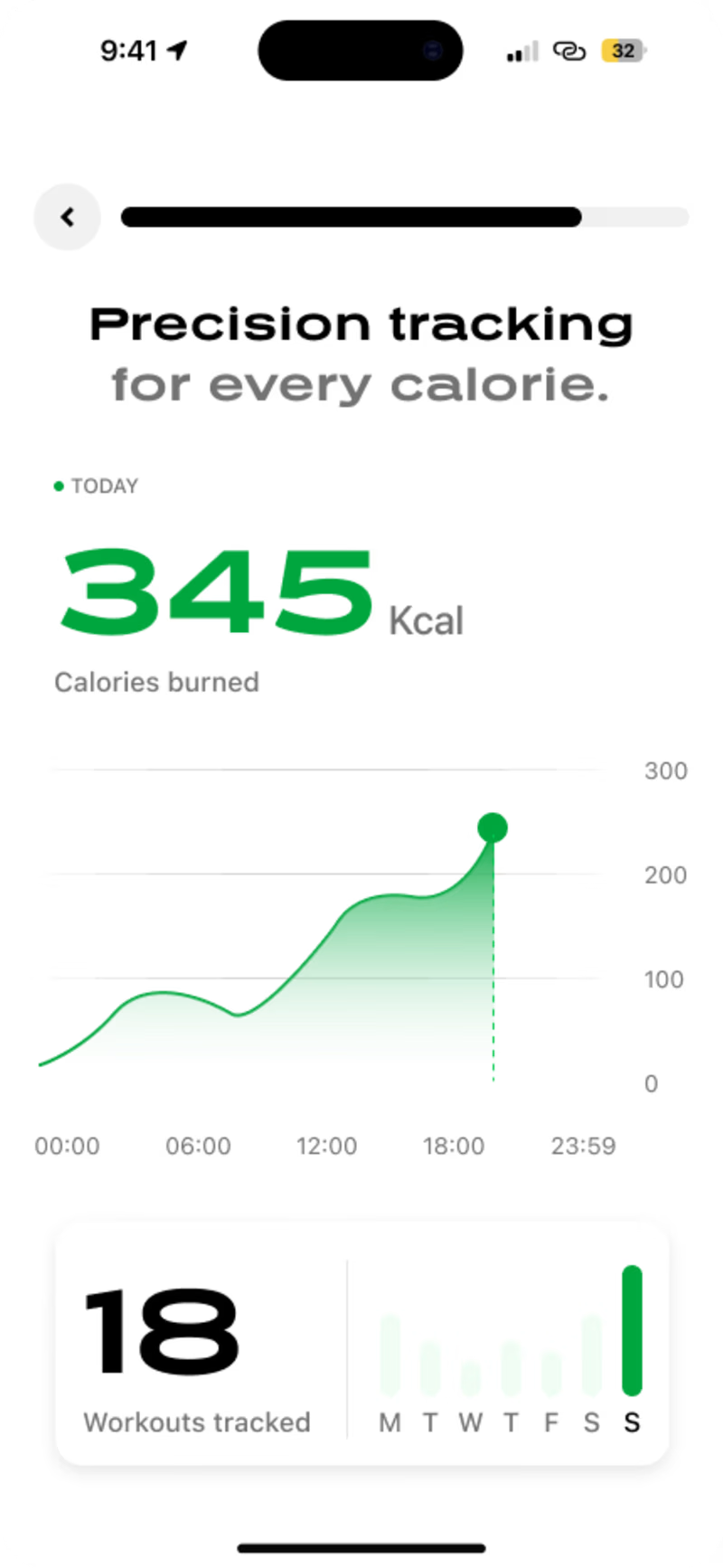
23 votes
Closed
Found this PDP design I made a while back 🥹
Back then I thought it was perfect. Now I see all the little things I'd do differently, but that excitement? Still exactly the same.
Growth isn't cringing at your old work. It's smiling at it and knowing exactly how far you've come.
old me did her best, new me knows better ✨
Excited to finally share some of my recent work for Domior, a premium travel platform built around curated stays and intentional journeys. Here are a few screens from the product.