Oluwaseyitan Lasisi
I design graphics for social media, events, businesses, etc.





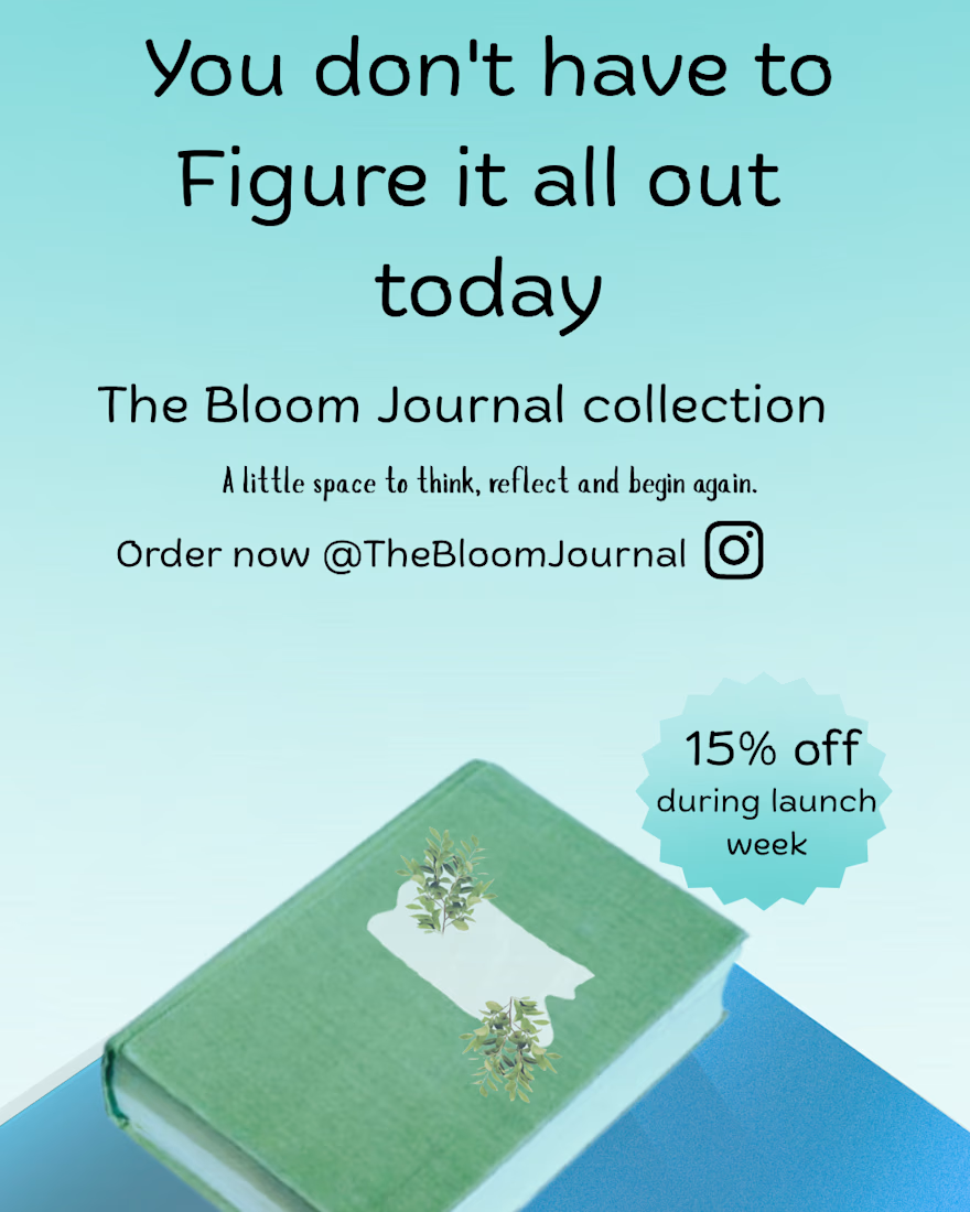
An Instagram post for a Journal business. The main core was to communicate the message "hope and comfort". I decided to make use of light shades of blue and green for it.

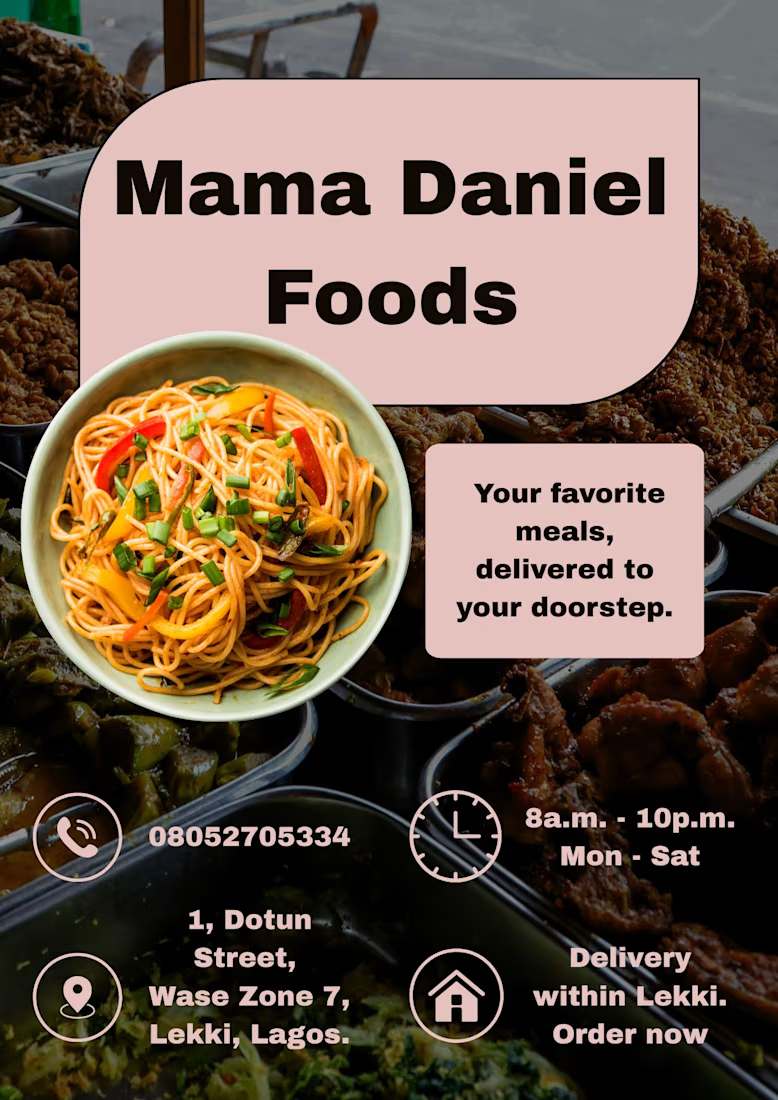
I created a practice flyer for a food delivery business. I would appreciate feedback if possible.
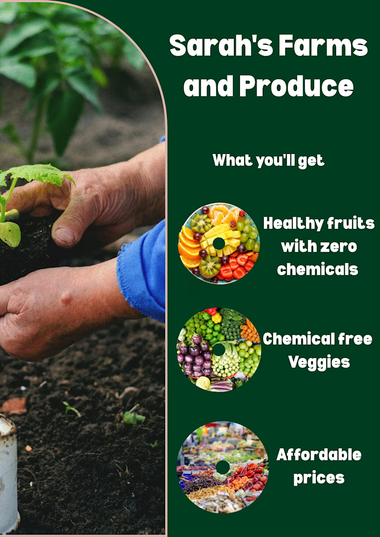
I designed a practice flyer for a farm market. I feel the wordings of the first and second circle are a bit off but I'm still working on my skills. What do you think?