Odunayo Adebanji's Work | ContraWork by Odunayo Adebanji
Odunayo Adebanji

Odunayo Adebanji

I design a high-converting landing page that helps DTC brand

Profile in progress

Odunayo is building their profile!

Cover image for The highest-converting product pages don't
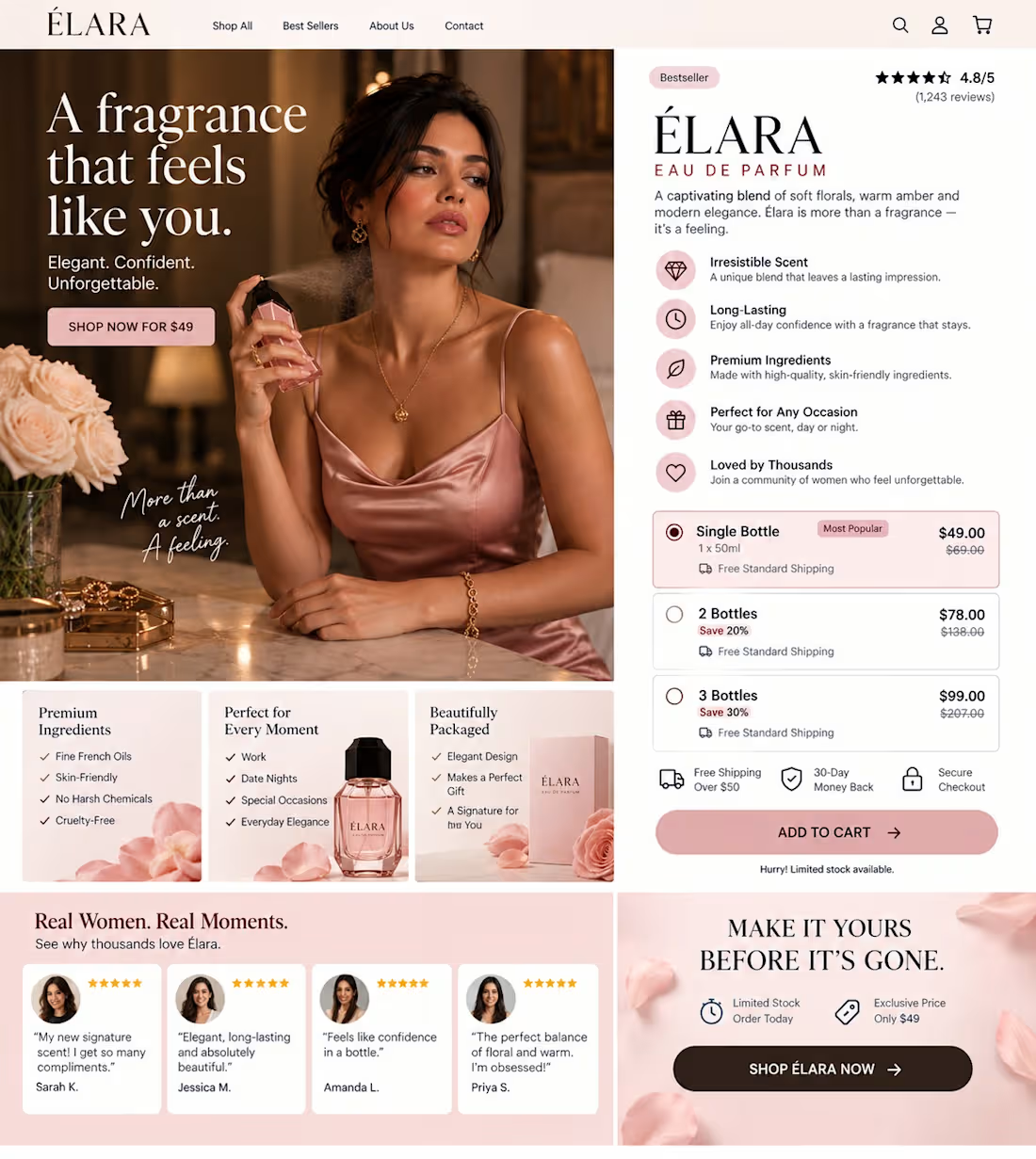
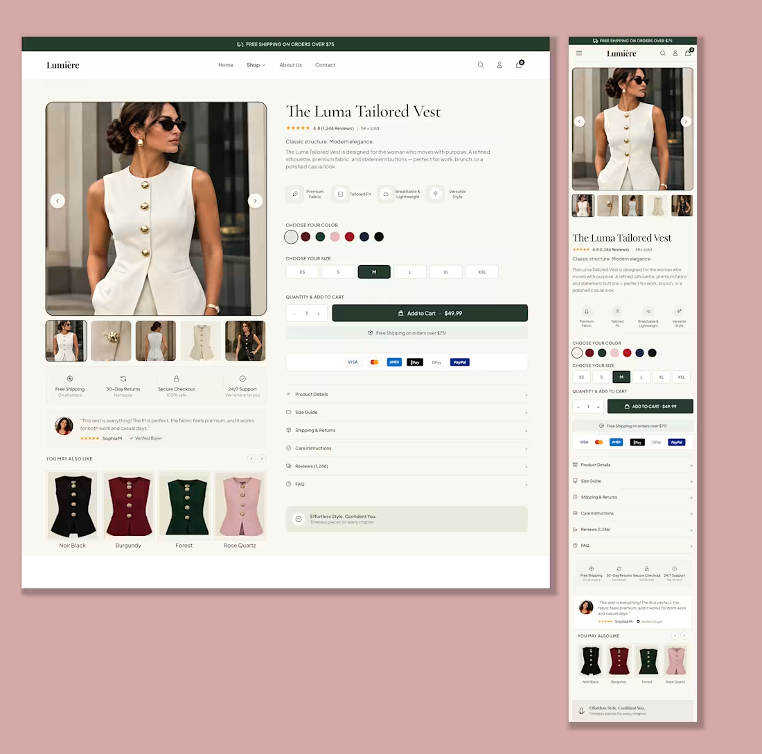
The highest-converting product pages don't convince people to buy. They remove every reason to keep thinking. By the time someone lands on your PDP, they've already shown intent. Your job isn't to overwhelm them with more information. It's to make the next decision feel effortless. Notice how this page quietly removes friction: One product. Three clear quantity options. The best-value bundle is obvious without feeling forced. Trust signals stay close to the CTA. FAQs answer objections without cluttering the page. Nothing competes for attention. Everything supports the purchase. That's what great conversion design does. It reduces mental effort until buying feels like the easiest option. Whether I'm designing in Figma or Replo, that's always the objective. What adds the most unnecessary thinking to your product pages today?
1
11
Cover image for The highest-converting product pages don't
The highest-converting product pages don't convince people to buy. They make the next decision feel effortless. Most founders optimize individual sections. The hero. The reviews. The CTA. The FAQ. But customers don't experience your page as separate sections. They experience one continuous journey. Every section should answer the question created by the previous one. The headline creates interest. Benefits justify attention. Social proof reduces skepticism. Guarantees remove risk. Then the CTA feels like the obvious next step. When one section doesn't support the next, momentum breaks—and so do conversions. That's how I approach every Shopify PDP I build: not as a design project, but as a sequence of decisions that gradually reduce uncertainty. Where do you think visitors lose momentum on your product page today?
0
20
Cover image for The fastest way to waste
The fastest way to waste a great ad is to make your product page feel like a completely different conversation. Every click comes with an expectation. Your ad promised something. Your PDP has a few seconds to confirm it. When the headline, visuals, and messaging don't immediately reinforce why someone clicked, buying intent starts to fade. High-converting product pages don't restart the conversation. They continue it. That's why I think about message continuity before layouts. Every section should strengthen the promise that earned the click in the first place. Because the easiest sale is the one where the customer never has to wonder, "Am I in the right place?" What's one thing your product page could do to better match the promise your ads make?
0
33
Cover image for Pdp hero section
Pdp hero section
1
27
Cover image for You're probably paying for clicks
You're probably paying for clicks that were already ready to buy. Then your product page talks them out of it. The biggest conversion leak isn't always your ads. It's making customers work too hard after they land. Every extra decision. Every missing answer. Every weak visual hierarchy. Creates hesitation. A high-converting PDP should make the next step feel obvious. Clear value proposition. Strong buying sequence. Trust before persuasion. One primary action. I built this Shopify product page around that principle, reducing uncertainty instead of adding more information. When customers don't have to think about what to do next, they're far more likely to buy. What's the biggest reason visitors abandon your product pages today?
1
39
Mobile view of a listicle page built with Instant.
2
58
Listicle page built with Instant
1
51
Listicle page built with instant
0
53
Landing page built with Instant
1
60
Cover image for :: Here is a simple Figma redesign that turned a dull page i...
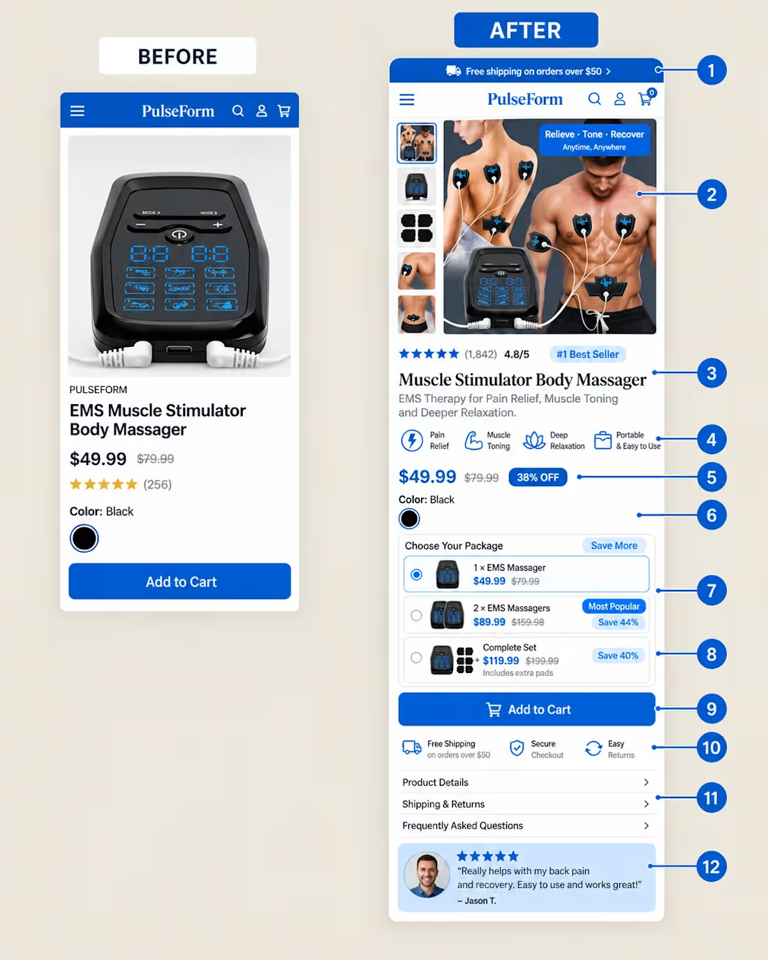
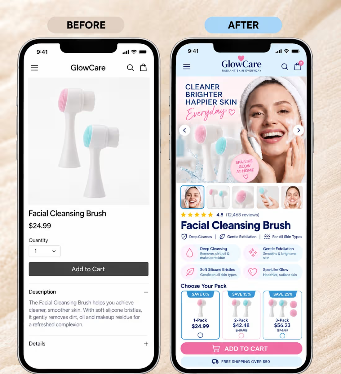
:: Here is a simple Figma redesign that turned a dull page into a conversion-focused page. If your page looks good but doesn't sell, you might need a redesign like this. I'm always available.
0
49