Odunayo Adebanji - UI Designer | ContraWork by Odunayo Adebanji
Odunayo Adebanji

Odunayo Adebanji

I design a high-converting landing page that helps DTC brand

Profile in progress

Odunayo is building their profile!

Followed by shumaila a, Ahmad S, and Nugraha
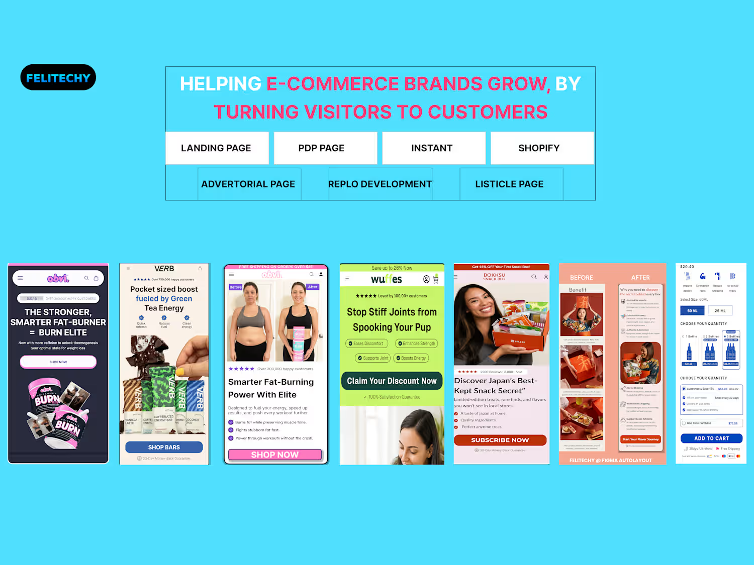
A pretty homepage can still make paid traffic work too hard. The real question is: can a first-time visitor understand the product before they start scrolling? For this GemPages build, I structured the page around that decision. The hero immediately communicates the outcome, backs it with customer proof, and shows the product in use. Then the page answers the questions that usually slow buyers down: what makes it different, how to use it, how it compares, and whether people actually like it. I also used UGC, a comparison section, clear benefit breakdowns and FAQs to reduce the amount of guesswork. Good ecommerce design isn't about adding more sections. It's about giving shoppers the right answer at the right moment.
0
6
Cover image for People don't always abandon a
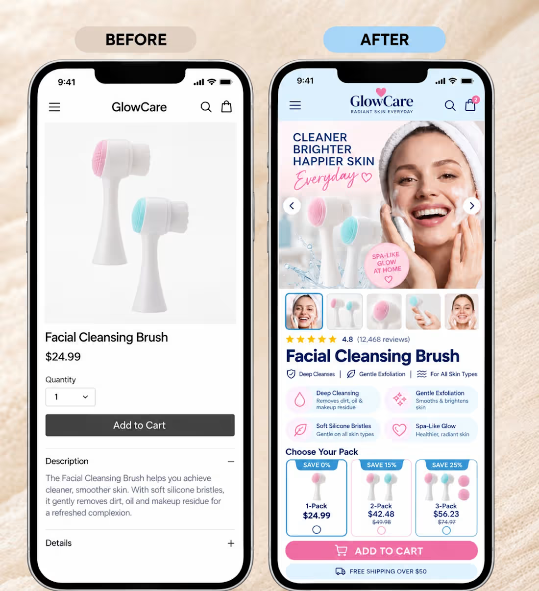
People don't always abandon a PDP because the product is too expensive. Sometimes they just don't understand which option makes sense. That was one of the things I focused on with this PDP. Instead of making the customer calculate the value themselves, the page makes the choices easier to compare: 1 bag for trying it 3 bags as the popular option 6 bags for the best value I also used the lifestyle hero to show the product in context, brought the key benefits closer to the product, and placed the guarantee and trust signals around the purchase decision. The goal wasn't to add more information. It was to make the right choice feel easier. That's an important distinction when you're paying to send traffic to a Shopify store.
0
10
Cover image for Your Add to Cart button
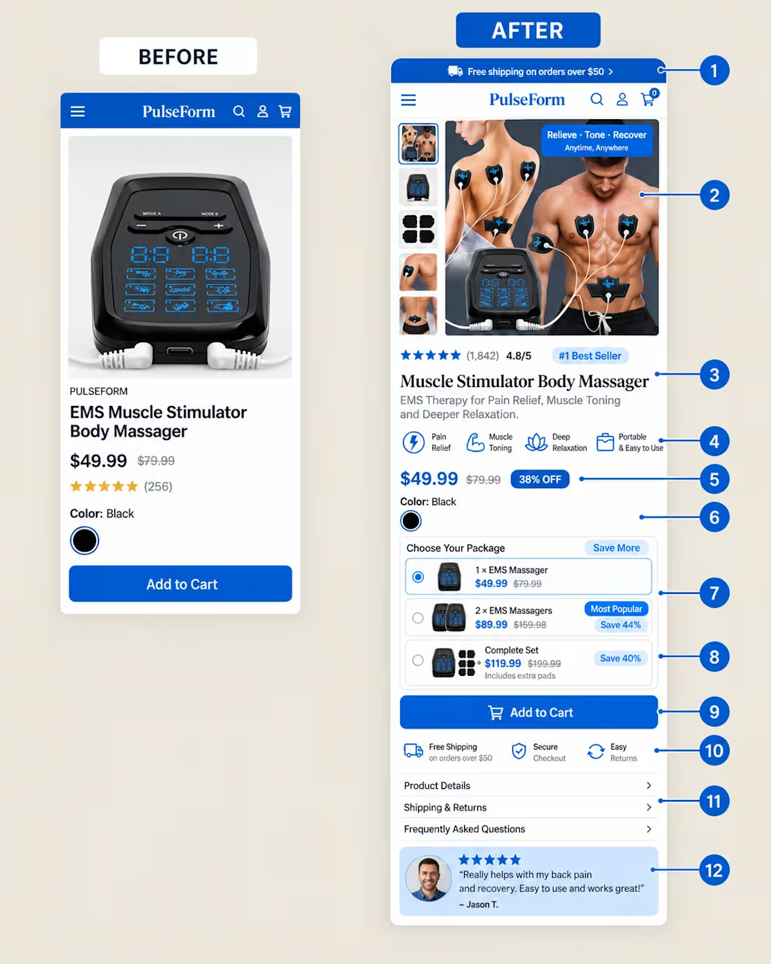
Your Add to Cart button isn't the hardest part to optimise. Getting the customer ready to click it is. A shopper landing on a PDP is quietly asking the following: Is this for me? Will it actually help? Which option should I buy? What happens if I don't like it? That’s why I built this PDP around reducing decision friction. The hero immediately communicates the product and its main benefits. The 1, 2 and 3 bottle options make the buying decision easier instead of forcing shoppers to calculate value themselves. Then subscription savings, free shipping, secure checkout and the money back guarantee remove more perceived risk before the CTA. Even the supporting sections are structured around questions customers naturally have. The goal isn't to add more information. It's to give customers fewer reasons to hesitate. What part of your Shopify PDP do you think creates the most hesitation?
1
2
13
Cover image for A product page shouldn't just
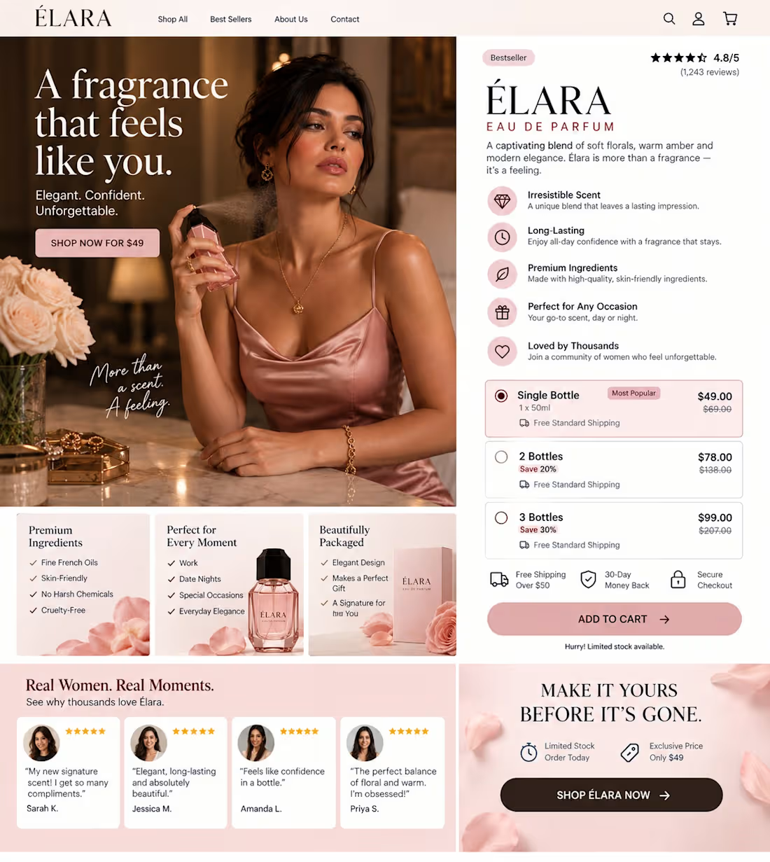
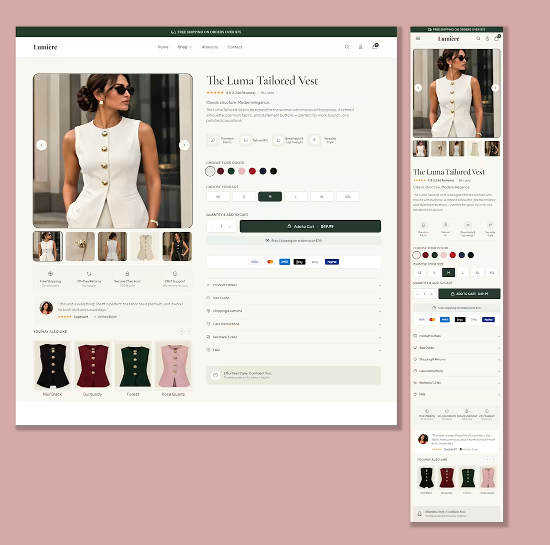
A product page shouldn't just explain the product. It should remove doubt. That was the thinking behind this Shopify PDP. Instead of making the customer figure everything out themselves, I structured the page around the questions they are already asking: “Will this actually help me?” “Which option should I buy?” “Can I trust this brand?” “What happens if I don't like it?” So I built the PDP around: A clear hero message Benefit driven product information Reviews for social proof Subscription and one time purchase options 1, 3 and 6 bottle bundles Trust signals around the buying decision Shipping and guarantee reassurance A strong, obvious CTA A mobile layout that keeps the buying journey simple Good PDPs don't just give customers more information. They give them more certainty. What's the biggest hesitation your customers have before buying?
1
2
22