
NOMAN IJAZ
Senior Product Designer | UX Designer | Enterprise SaaS
New to Contra
NOMAN is ready for their next project!

Warm tones. Organic texture. Zero noise.
Built a landing page for an AI voice product that needed to feel human — not robotic. The brief was simple: make people trust the technology before they even try it.
Earth palette + waveform visual + clean type hierarchy. That's it. That's...
A landing page that doesn't just sell a product — it builds trust before the user even scrolls.
Soft gradients, bold type, and a floating dashboard mockup that makes the product speak for itself.
Every section was designed with one goal: turn a visitor into a signup.
This wasn't...
Just wrapped up one of my favourite projects recently and I am OBSESSED with how this came together. 🔥
PropVista — a SaaS landing page designed around AI-driven workflows. The brief was simple: make it feel fast, clean, and conversion-focused without losing the human touch.
Every...
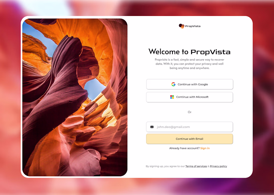
When does a login screen stop feeling like an experience? 👀
Just redesigned this authentication UI for PropVista.
Most login pages are boring, forgettable, and feel like a chore. I wanted this one to feel like an invitation — warm, clean, and trustworthy from the first second...
#uidesign #uiuxdesign #loginpage #webdesign😍
Some products don't need to speak — they just need to be felt.
HOVR was that kind of design challenge. I stripped the UI down to almost nothing — bare typography, invisible nav, pure editorial tension — and let the product carry the weight. The image bleeding across sections...