
NOMAN IJAZ
Senior Product Designer | UX Designer | Enterprise SaaS
New to Contra
NOMAN is ready for their next project!
Warm tones. Organic texture. Zero noise.
Built a landing page for an AI voice product that needed to feel human — not robotic. The brief was simple: make people trust the technology before they even try it.
Earth palette + waveform visual + clean type hierarchy. That's it. That's the whole mood.
Sometimes restraint is the loudest design choice.
Still can't stop staring at this hero. 🌾
Full case study dropping soon.
0
20
A landing page that doesn't just sell a product — it builds trust before the user even scrolls.
Soft gradients, bold type, and a floating dashboard mockup that makes the product speak for itself.
Every section was designed with one goal: turn a visitor into a signup.
This wasn't just a landing page. It was a first impression engineered to convert.
Still proud of how the hero came together. 👁️🗨️
Full case study dropping soon.
0
25
A landing page that doesn't just look good — it feels like a whole mood. Retro-futuristic, bold, and unapologetically fun. Every scroll, every section, every detail was designed to pull you into the experience.
This wasn't just UI design. It was world-building.
Still obsessed with how this one came together. 👀
Full case study dropping soon.
0
28
Just wrapped up one of my favourite projects recently and I am OBSESSED with how this came together. 🔥
PropVista — a SaaS landing page designed around AI-driven workflows. The brief was simple: make it feel fast, clean, and conversion-focused without losing the human touch.
Every section was a product decision, not just a design choice.
Still can't stop staring at it...
Full case study dropping soon. 👀
#uidesign #saas #landingpage #figma #productdesign #webdesign #uiuxdesign
0
34
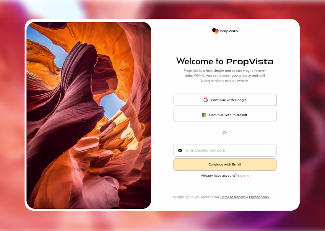
When does a login screen stop feeling like an experience? 👀
Just redesigned this authentication UI for PropVista.
Most login pages are boring, forgettable, and feel like a chore. I wanted this one to feel like an invitation — warm, clean, and trustworthy from the first second...
#uidesign #uiuxdesign #loginpage #webdesign
0
54
Some products don't need to speak — they just need to be felt.
HOVR was that kind of design challenge. I stripped the UI down to almost nothing — bare typography, invisible nav, pure editorial tension — and let the product carry the weight. The image bleeding across sections wasn't an accident. It was the whole idea.
When design gets out of the way, desire walks in. Built in Figma. Felt everywhere.
0
80
Designing for AI tools means earning trust fast — users arrive skeptical and leave either converted or gone.
For this AI voice SaaS project, I focused the entire design strategy on immediate value communication: bold headline typography, real product UI embedded directly into the hero, and social proof signals positioned exactly where doubt appears.
The light, minimal layout with organic line-work backgrounds keeps the interface feeling human despite the technical subject matter. Every section was wireframed, UX-tested, and refined in Figma before final visual execution.
0
98
This project was an exercise in designing trust — where the visual language, layout rhythm, and micro-copy all had to work together to make an AI-powered medical tool feel safe, credible, and effortless.
I handled the full design process: research, wireframing, visual system, animation direction, and high-fidelity delivery in Figma.
The dark cinematic aesthetic wasn't decorative — it was strategic, positioned to differentiate the brand in a space dominated by sterile, clinical UI patterns.
0
104
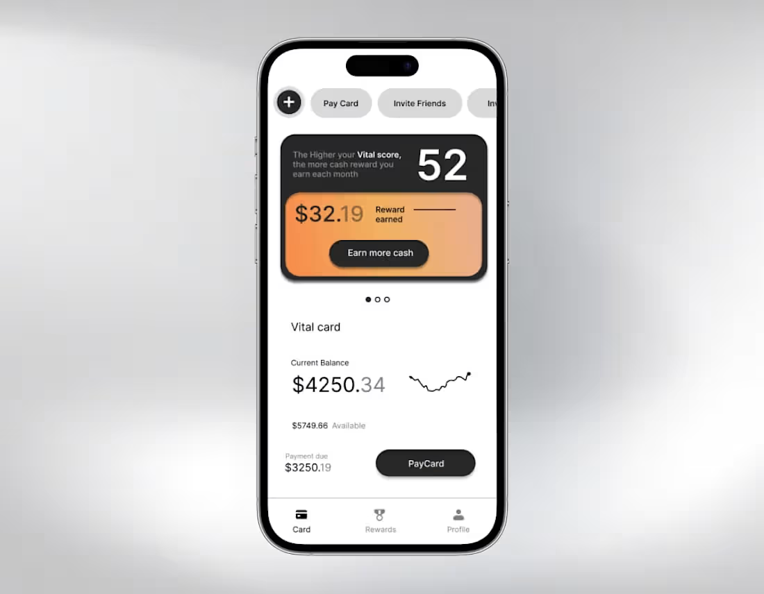
Vital Card is a reward-driven fintech product designed to make financial health feel intuitive and motivating.
The UI system is built entirely in Figma, rooted in UX research that identified how users engage with balance visibility, reward psychology, and payment urgency.
The design language — dark surfaces, warm gradient accents, and precise typographic scale — creates a premium, focused experience that reduces cognitive load while surfacing the metrics that matter most.
0
108
If AI can generate UI, flows, and ideas in seconds… what actually makes a product designer valuable today?
For this concept, I explored that shift.
PropVista is a SaaS landing page designed around AI-driven workflows—where speed, clarity, and structure matter more than decorative visuals. The focus was on turning product thinking into a clean, minimal interface that still feels purposeful and conversion-focused.
Designed in Figma with a product-first mindset—balancing usability, hierarchy, and scalability rather than just aesthetics.
0
144