
Nidhi Arora
Redesigning homepages to boost signups
Ready for work
Nidhi is ready for their next project!
Which layout tells a stronger story?
0 voted
0%
2 voted
100%
2 votes
Closed
Which flight booking experience works better?
1 voted
50%
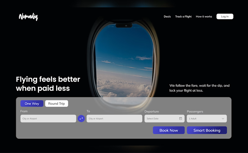
1 voted
50%
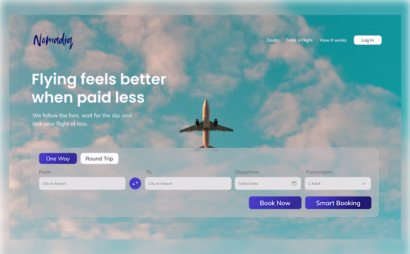
2 votes
Closed
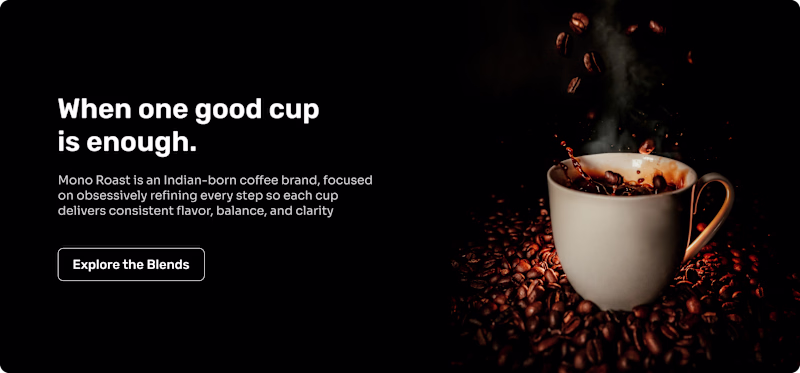
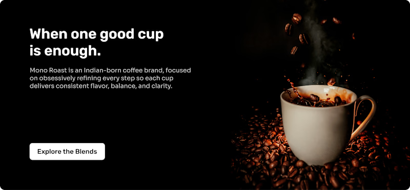
Which layout helps first-time visitors choose a product faster and click “Add to cart” more confidently?
1 voted
100%
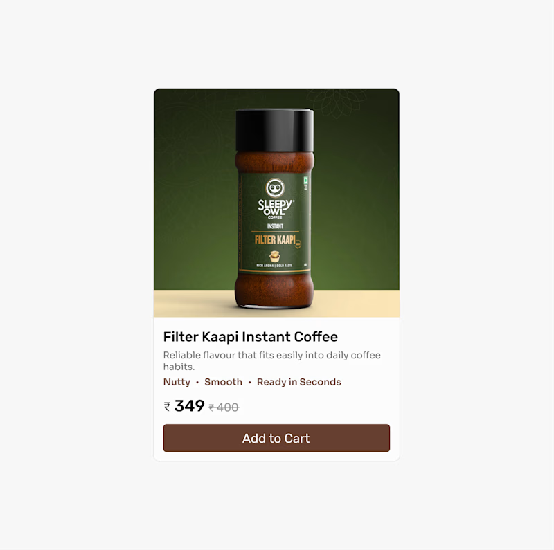
0 voted
0%
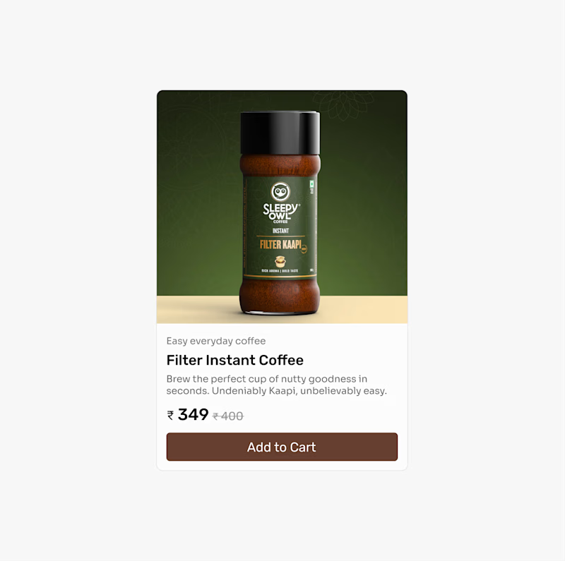
1 vote
Closed
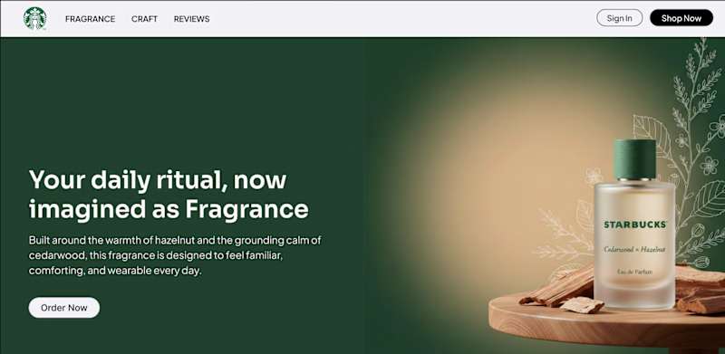
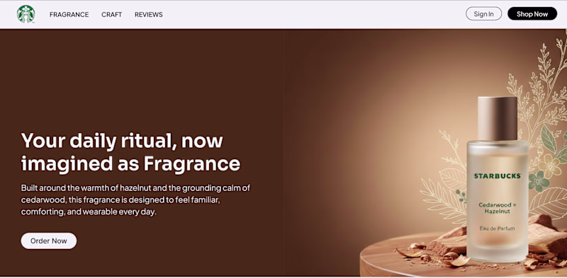
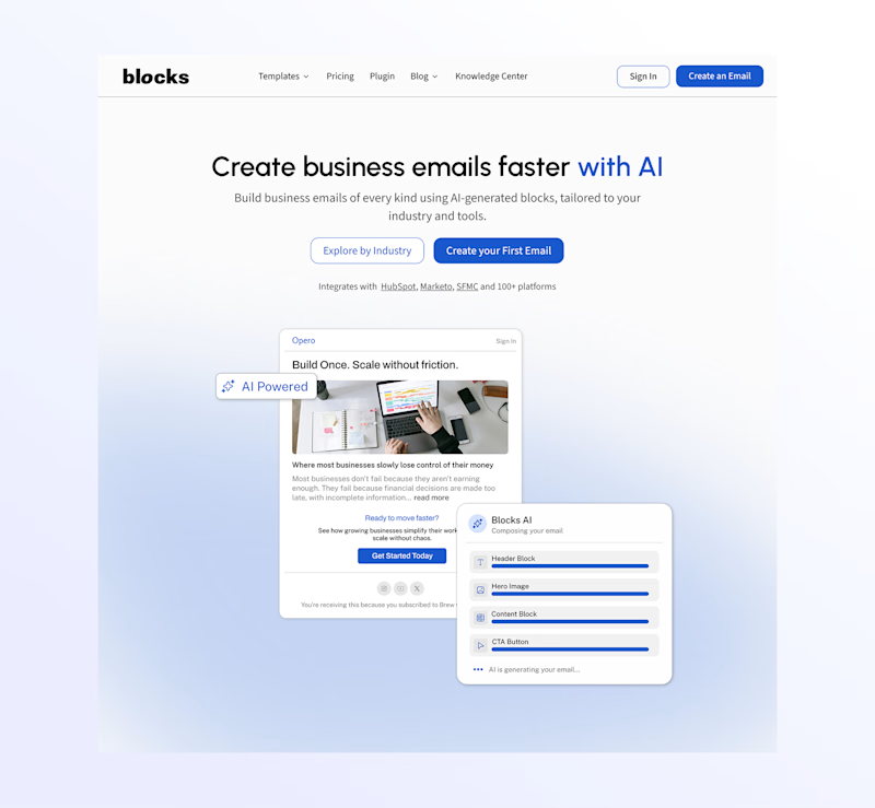
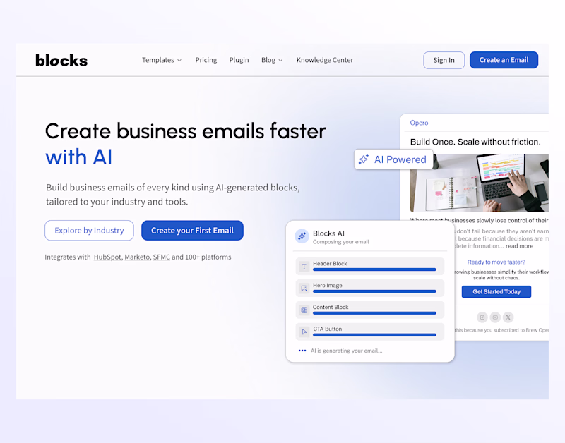
Which layout feels better for AI email generator?
2 voted
50%
2 voted
50%
4 votes
Closed