Nidhi

Nidhi Arora

Redesigning homepages to boost signups

New to Contra

Nidhi is ready for their next project!
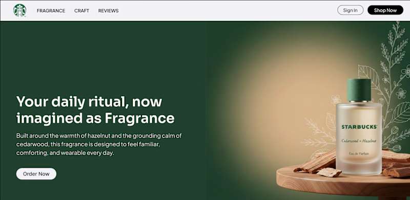
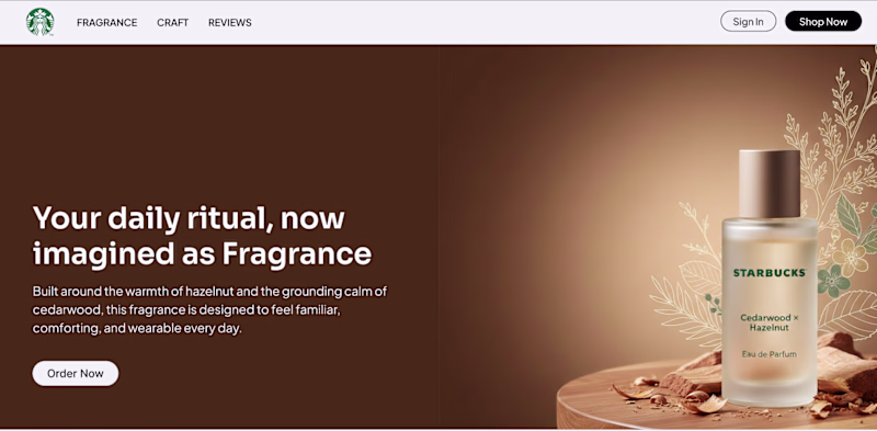
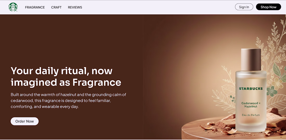
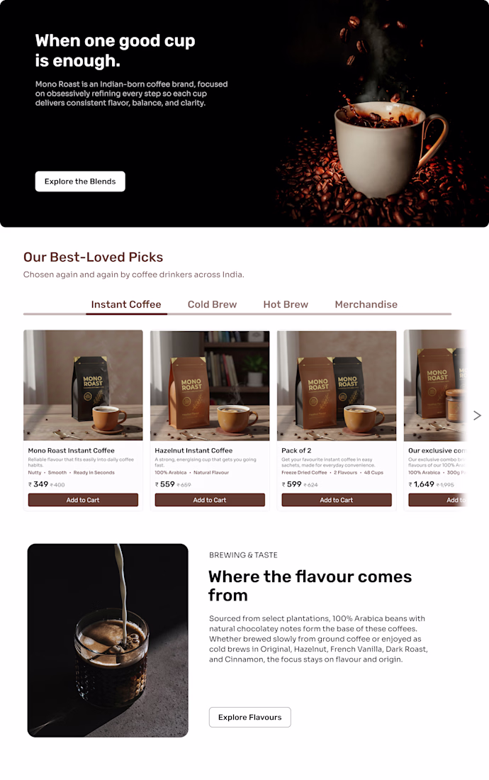
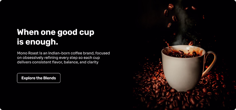
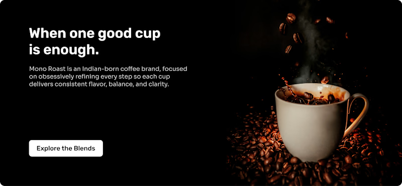
I’ve finished the full redesign for Peek.com, and here are the key shifts that changed how the site feels and functions:
1. The homepage wasn’t inspiring travel I added movement, visuals, and subtle cues that make people want to explore instead of scroll past.
2. Peek vs Peek Pro...
Post image
Post image
Post image
When I started redesigning Peek.com, I wanted the homepage to do more than just show options. I wanted it to make people feel inspired, curious, and excited to travel, while keeping everything easy to understand and act on.
- I designed cards and small tags to highlight what...
Post image
Post image
Post image
Which booking card feels right? I tested two versions of the booking card: Card A: Balanced usability and visual aesthetic Card B:Focused purely on usability and clarity Which version do you feel works better for a travel website?

1 voted

33%

Card B

2 voted

67%

Card A

3 votes

Closed

Ever thought a homepage could feel like a journey?
For Peek.com, the redesign wasn’t just about making things clear. It was about creating a space that invites you to explore, dream, and travel.
- Colors and typography that breathe life into every section
- Hero images that make...
Post image
Post image
Post image
Done with the homepage redesign for Peek.com
Earlier, Peek.com mostly directed users toward Peek Pro, the operator marketplace that’s already fully developed.
Now, Peek.com is redesigned as a marketplace for travelers, helping them discover and book experiences easily.