
pro
Nafisat Sanni - Email & Static Ads Designer
Designing Emails that converts for eCommerce & DTC Brands.


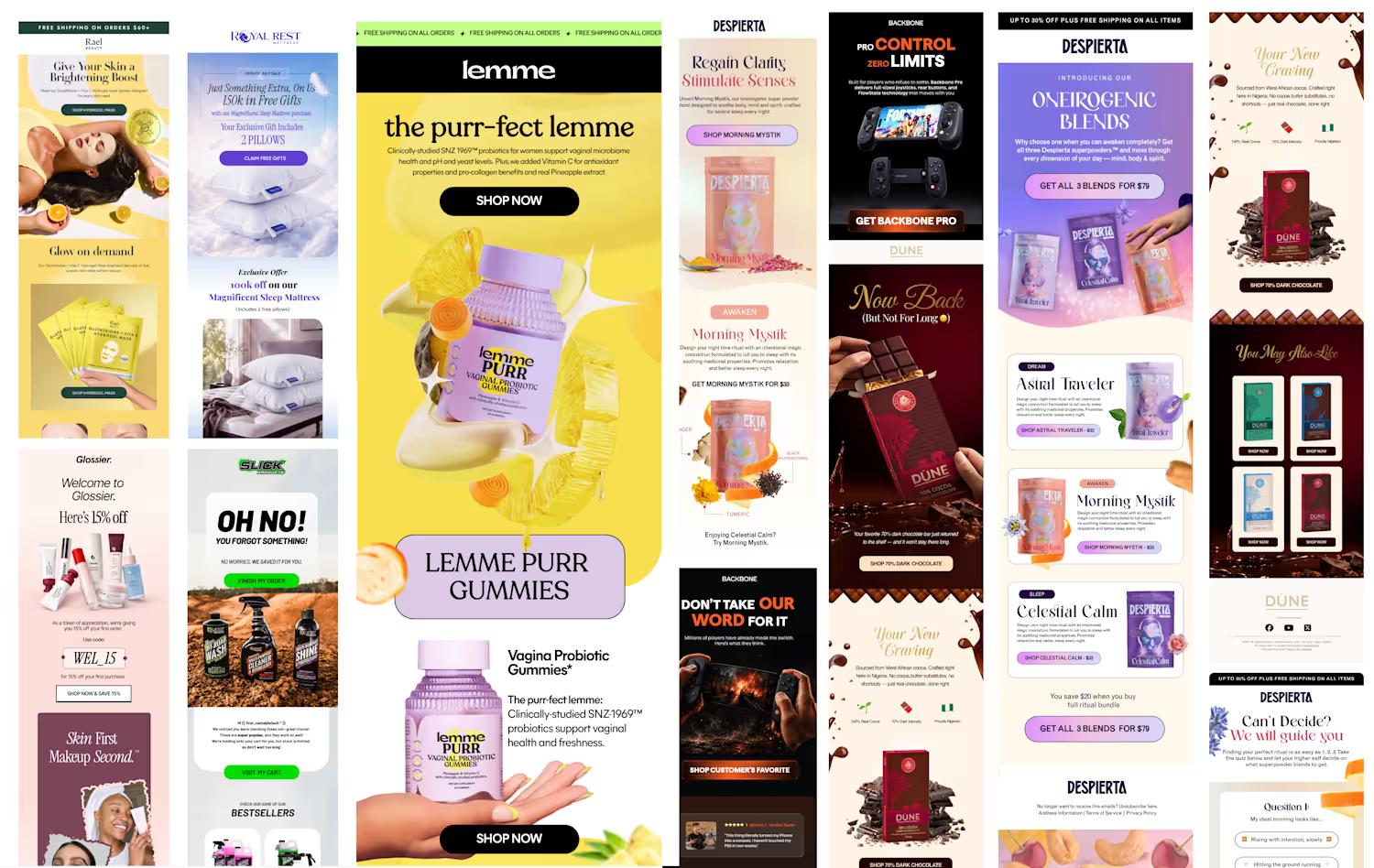
Designed this Rael Beauty email for better mobile scannability; cleaner flow, sharper hierarchy, and here's how it holds up on the screen it actually lives on.
If you're building an eCommerce/DTC brand, or you're simply interested in email design, I'd love to have you follow along.🚀.
#Emailmarketing #dtc #ecommerce #emailmarketingdesigner #staticads #emaildesigner #figma #klaviyo #d2c
1
97
Understanding how your design actually renders across devices, across email clients is what separates decorative design from email design that does a real job.
Here's a live email I designed in Figma and built directly in Klaviyo, tested & previewed in a real inbox.
2
107
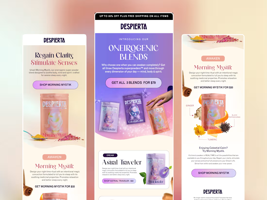
Email marketing (mock) design for Despiarta
1
9
Email marketing (mock) design for Despiarta
0
5