The network for creativity
Join 1.25M professional creatives like you
Connect with clients, get discovered, and run your business 100% commission-free
Creatives on Contra have earned over $150M and we are just getting started
Back to feedPost

Understanding how your design actually renders across devices, across email clients is what separates decorative design from email design that does a real job.
Here's a live email I designed in Figma and built directly in Klaviyo, tested & previewed in a real inbox.


The network for creativity
Join 1.25M professional creatives like you
Connect with clients, get discovered, and run your business 100% commission-free
Creatives on Contra have earned over $150M and we are just getting started







Related posts

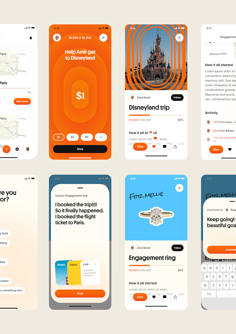
one of my favourite things about running a one-person studio is that nothing gets lost in translation.
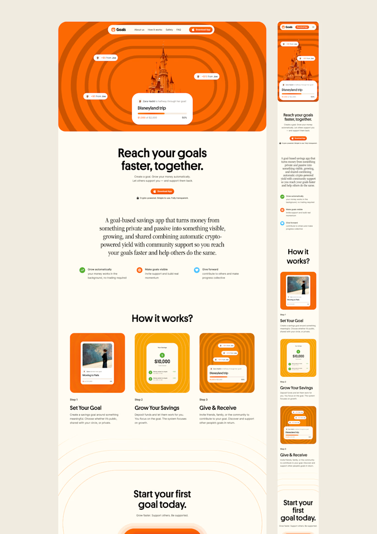
the idea behind the brand is the same idea that shapes the website and the product.
no handovers, no starting from scratch, no trying to explain the vision to someone new.
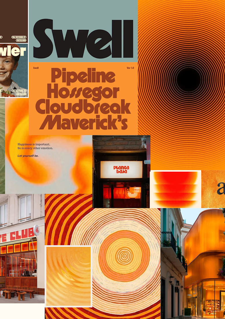
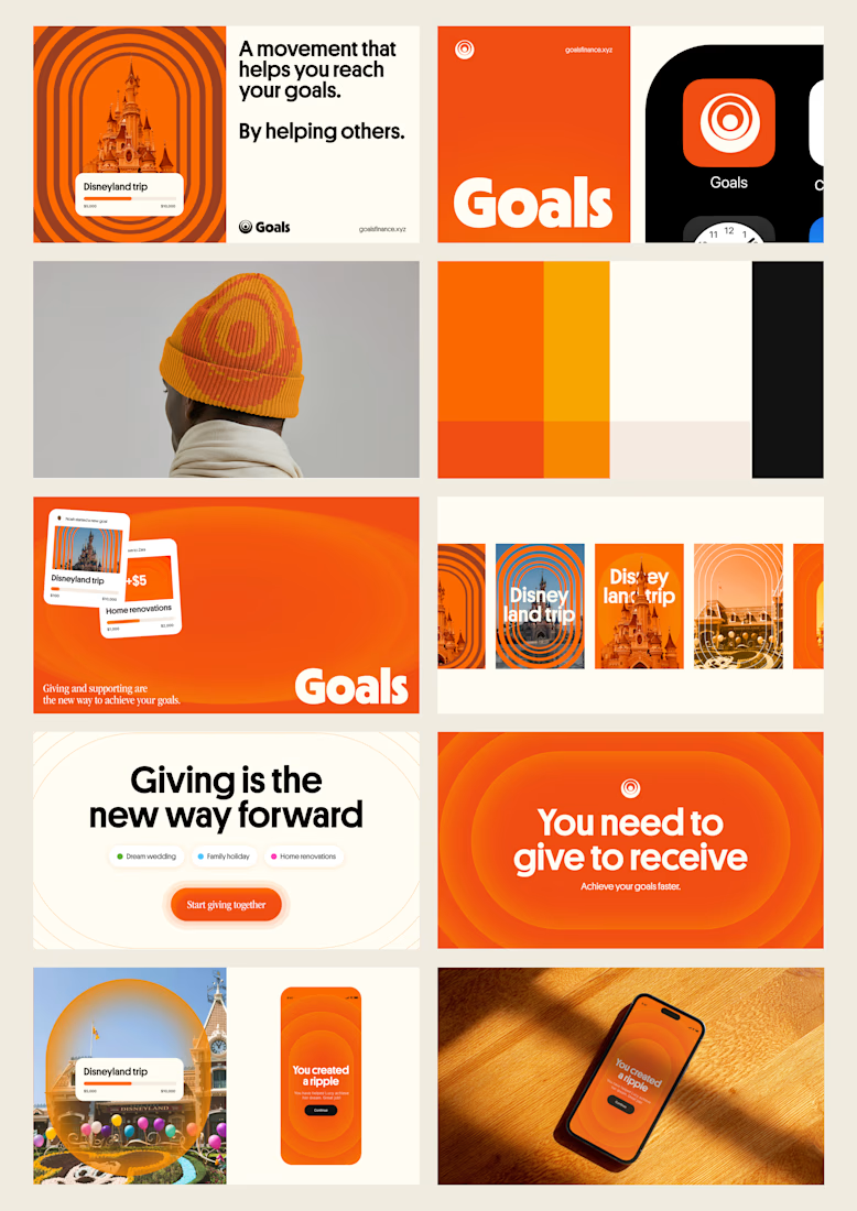
a little look at how that came together for goals, from the first moodboard to the app ↓

Love it!

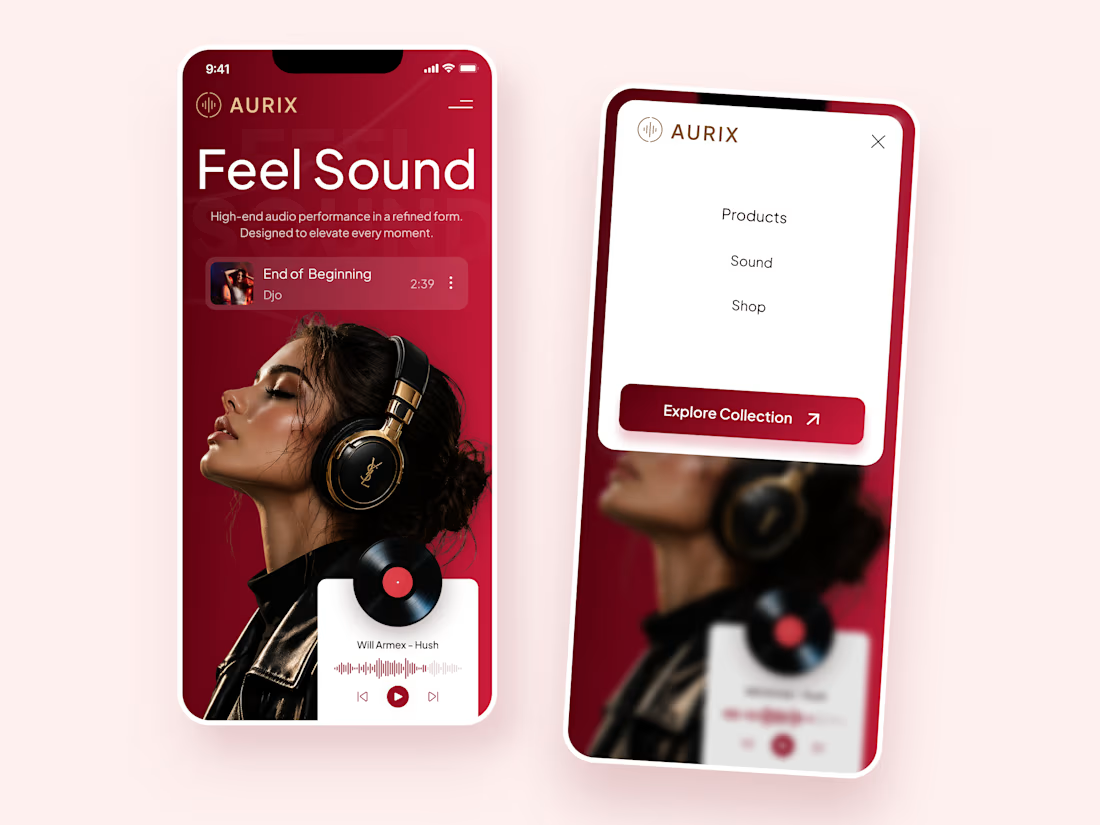
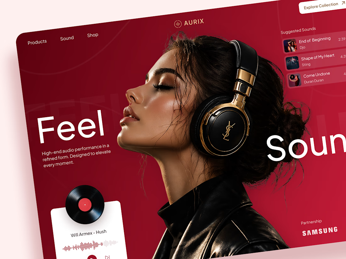
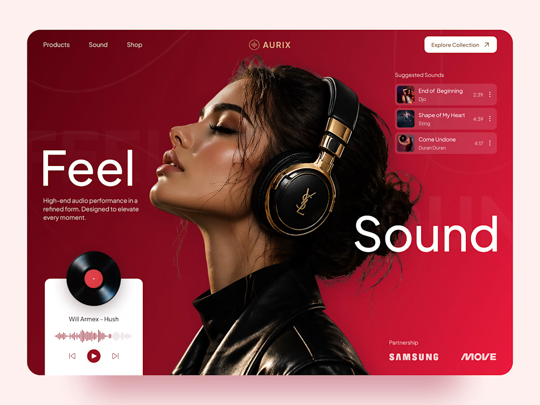
AURIX — Premium Headphones Landing Page 🎧❤️
A bold landing page concept for a premium audio brand, combining luxury headphones, music, and a strong lifestyle aesthetic
The design brings together deep red tones, elegant black and gold details, oversized typography, and immersive lifestyle imagery to create a modern, fashion-inspired experience
Special attention was given to:
• Bold lifestyle-focused hero composition
• Rich red and gold color palette
• Clean, oversized typography
• Music player and suggested tracks
• Premium product presentation
• Responsive mobile experience
• Minimal navigation and clear CTA
The result is a stylish, immersive landing page that connects premium audio with fashion, music, and everyday lifestyle ✨


Love the style!


Check it out
Just published: 0-1 design for an Energy Management System (EMS) ⚡
Designed a desktop platform monitoring wind turbines, PV parks, and battery storage across multiple sites. Keeping the interface mostly white, so green and red status indicators do the talking.
Operators managing critical infrastructure need to assess system health instantly. No visual noise, no cognitive overload. Just unmistakable state communication.


Cool work 👌