
Nabila Ferronsque
Digital Marketing Strategist | Growth, Content & Paid Media
New to Contra
Nabila is ready for their next project!
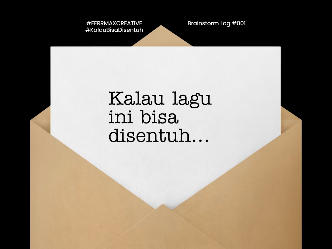
Sesi Potret is a creative merchandise concept inspired by the emotional story behind a song.
The project explores how music can be translated into something tangible, from a portrait experience and physical merchandise to packaging and a keepsake designed to carry the feeling beyond the song itself.
I developed the concept, creative direction, visual storytelling, merchandise system, and product experience, turning a personal memory into a cohesive physical brand experience.
The project includes a portrait-driven concept, apparel, accessories, keepsakes, packaging, and interactive elements designed around the idea of remembering yourself through the memories captured in a photograph.
0
9
Digital Marketing Portfolio — Strategy, Content & Growth
A curated portfolio showcasing my work across digital marketing, social media strategy, content strategy, paid acquisition, brand strategy, and creative direction.
The portfolio includes real-world brand work, paid acquisition strategy, brand development, campaign concepts, and creative projects — demonstrating how I connect strategy, creativity, and business goals to build purposeful marketing.
0
10
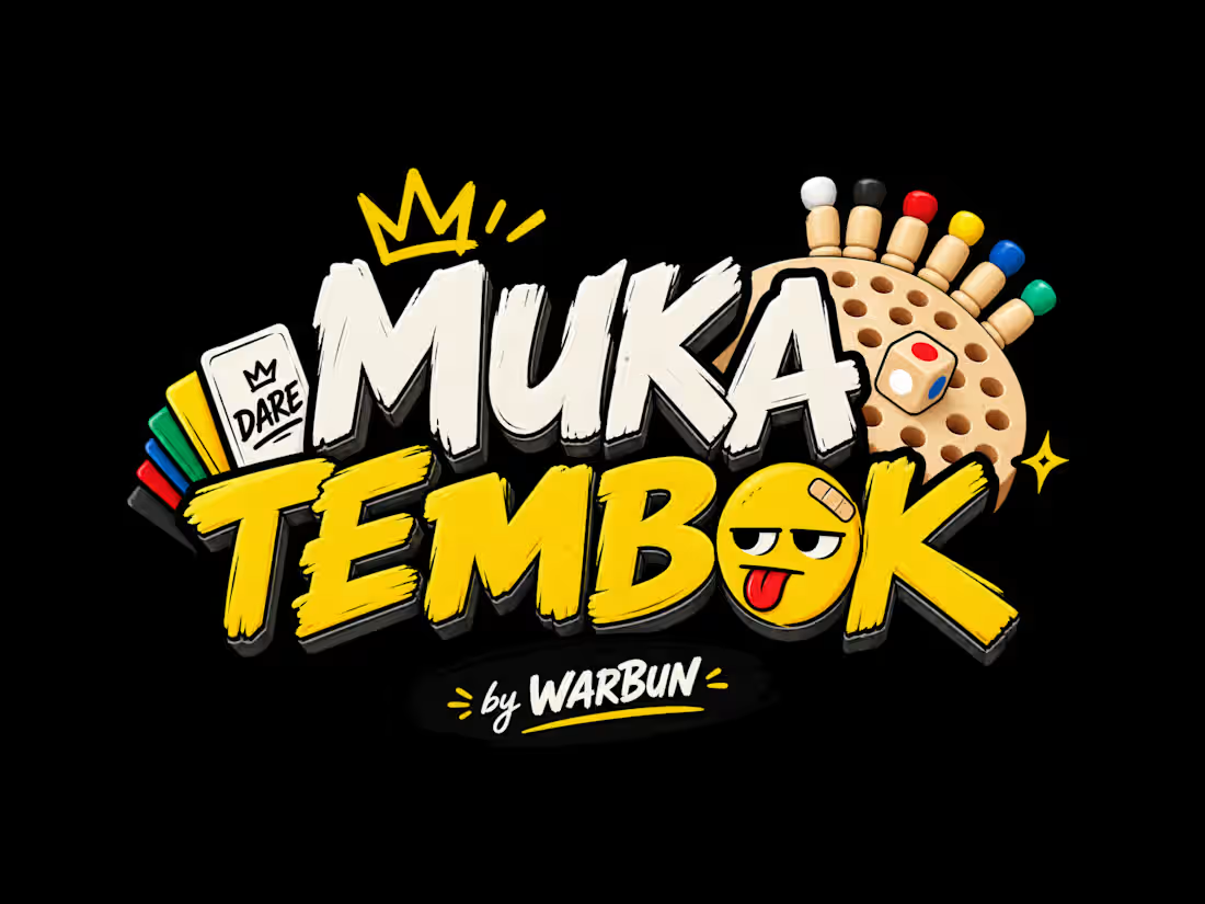
Why does a simple product need a strong personality?
I found this simple board game while casually scrolling through an e-commerce platform.
At first, it was just a game.
But I saw an opportunity to turn the concept into something with its own personality — something playful, chaotic, and instantly recognizable.
So I developed MUKA TEMBOK around one simple idea:
Your pawn decides your fate.
From there, the brand direction wasn't just about making a logo look good.
I built the visual language around the experience of playing it — the anticipation, the panic, the dare, and eventually the laughter.
That thinking shaped the logo, color system, card designs, game mechanics, packaging, and overall art direction.
The goal wasn't just to make a board game.
It was to make people feel something before they even played it.
That's how I approach branding:
Start with the WHY.
Build the personality.
Then make the visuals carry the idea.
0
44
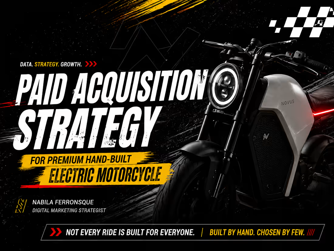
Not every click is a customer.
For a €30K+ hand-built electric motorcycle, generating more leads doesn't necessarily mean getting closer to a sale.
Why?
Because the buying journey is longer, the audience is narrower, and lead volume alone doesn't tell us whether we're reaching the right people.
So instead of optimizing for cheap leads, I built the strategy around qualified test-drive bookings and lead quality.
That decision shaped the entire acquisition system — from audience segmentation and funnel structure to Meta & Google Ads, creative direction, budget allocation, and KPI measurement.
The core principle:
QUALITY > VOLUME.
Strategy isn't about knowing what to do.
It's knowing WHY it should be done.
0
86