
Muntasir Mahmud
UX Researcher, UI Designer - Solving User Problems
Ready for work
Muntasir is ready for their next project!



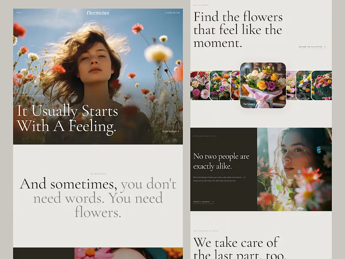
Figma to lovable by connecting MCP
One prompt. One Figma file. A working website. 👀
So, what did I actually do here?
I analyzed how AI interprets UI designs, how it understands layer names, and how naming conventions affect the generated output.
Then I structured my Figma file accordingly and gave Lovable a single prompt.
And honestly? It nailed it.
No complicated back-and-forth. Just a better-structured design and a smarter workflow.
Live preview: https://fleeswora.lovable.app/
This experiment reminded me that AI-assisted design isn’t just about writing better prompts. It’s also about preparing our designs so AI can understand them.
Designers, are you optimizing your Figma files for AI yet?
2
42
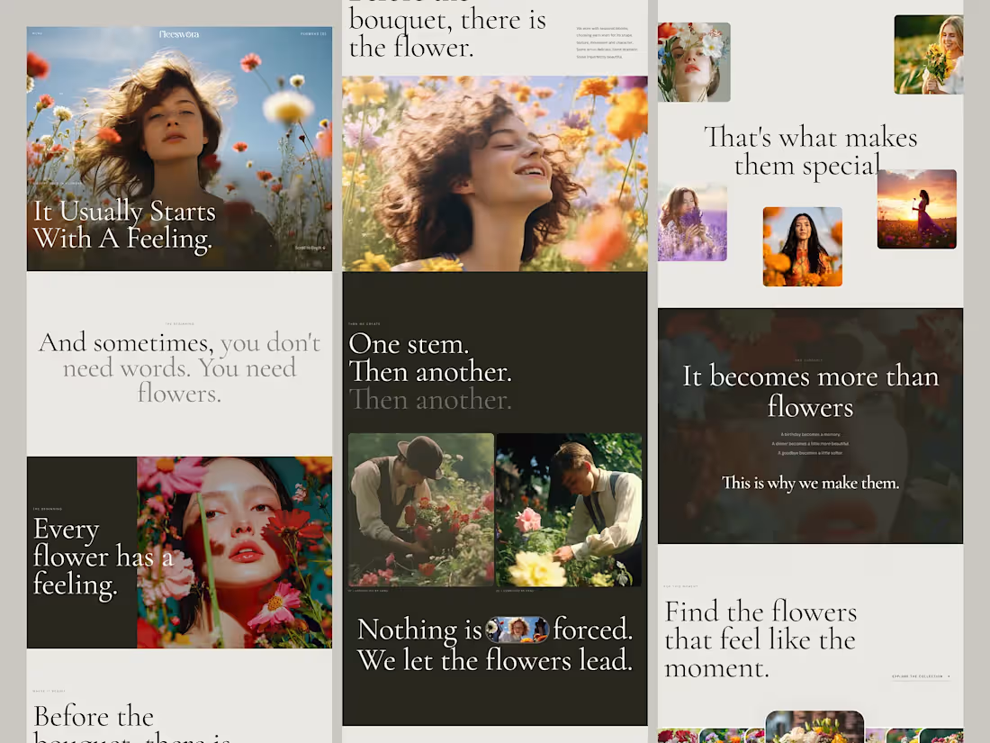
Flower shop || A Story Told in Flowers
A conceptual e-commerce experience for a modern flower brand, built around emotion, storytelling, and the personal meaning behind every bouquet.
Create a premium, editorial-style digital experience that moves beyond traditional flower shopping and connects customers with flowers through feelings, moments, and personal stories.
Problem- Most flower websites rely on traditional product grids, making the experience feel more transactional than emotional. The opportunity was to make choosing flowers feel as meaningful as the flowers themselves.
Challenge- Create a digital experience that tells a story while helping users discover flowers based on feelings, moments, and occasions—not just products.
Solution- I created a story-driven editorial website using cinematic imagery, expressive typography, and intentional layouts. The experience guides users through the story of a flower—from the first feeling to the final delivery.
2
1
54
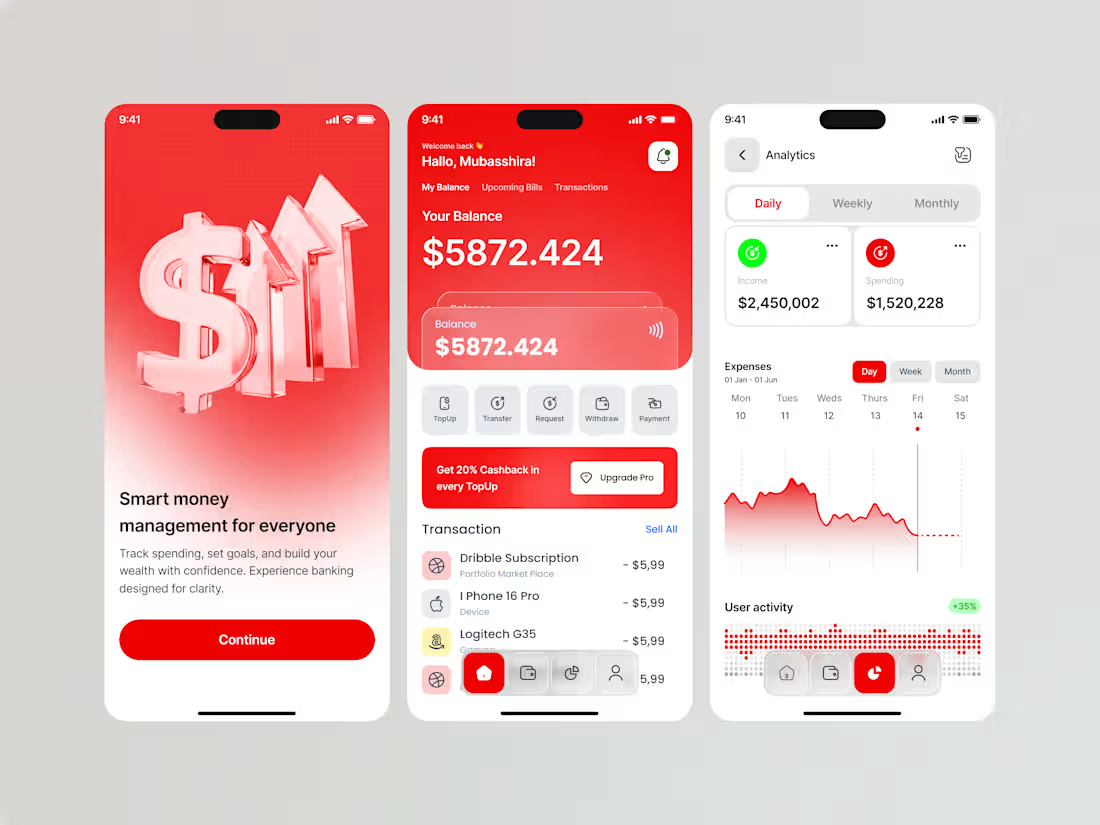
Problem Managing personal finances can feel overwhelming when balances, spending, bills, and transactions are scattered across different places. Users need a clearer way to understand where their money is going and make confident financial decisions.
Challenge The challenge was to design a modern fintech experience that makes everyday money management simple while presenting complex financial information—such as transactions, spending patterns, income, and activity—without overwhelming the user.
Solution I designed a clean, visual-first mobile banking experience focused on clarity, control, and quick actions. The dashboard brings the most important information—balance, transactions, upcoming actions, and financial shortcuts—into one place, while the analytics screen transforms spending data into easy-to-understand visual insights.
The onboarding experience uses a bold visual direction to establish the product's personality while keeping the core actions straightforward.
0
69
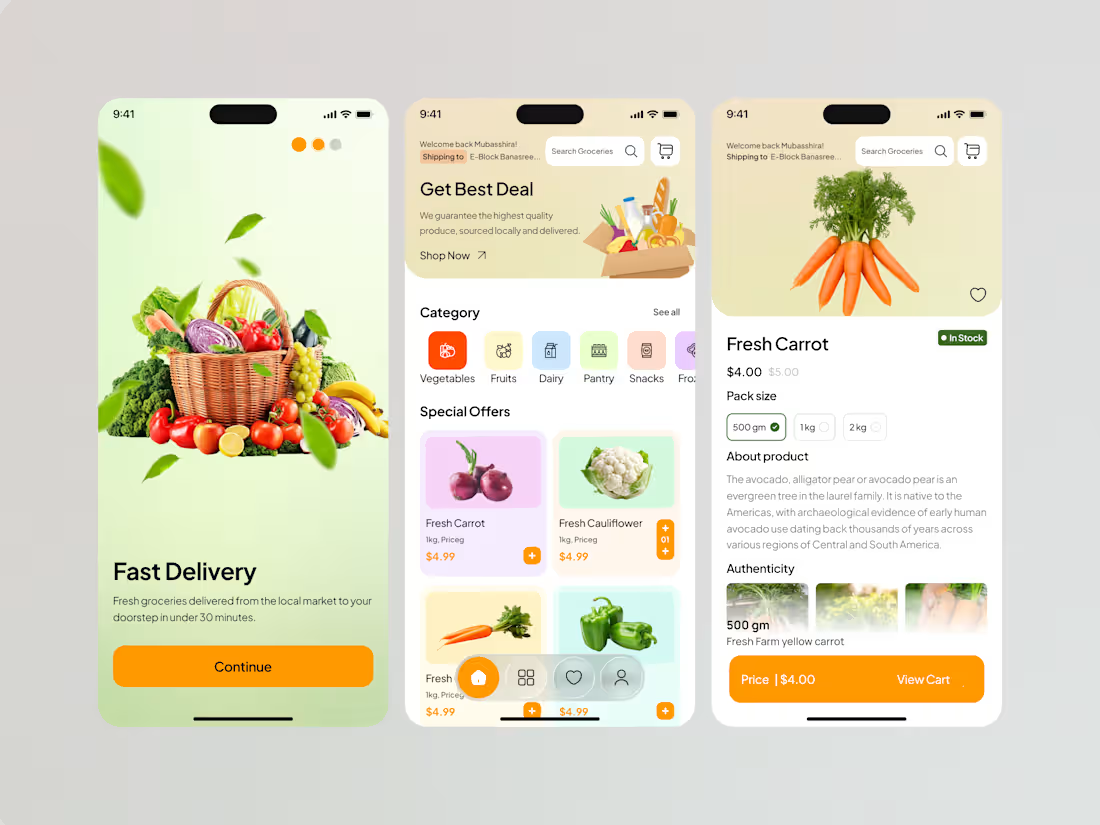
Buying groceries online can quickly become overwhelming when users have to browse through large catalogs, compare products, and navigate multiple steps before completing a purchase.
The challenge was to create a simple, fresh, and visually engaging grocery shopping experience that helps users discover products quickly while keeping essential information and purchasing actions easy to access.
I focused on creating a clean, product-first mobile experience using fresh colors, large product imagery, clear categories, and a straightforward navigation structure.
The experience was designed around three key moments: discover, explore, and purchase.
1
91