
Project Overview
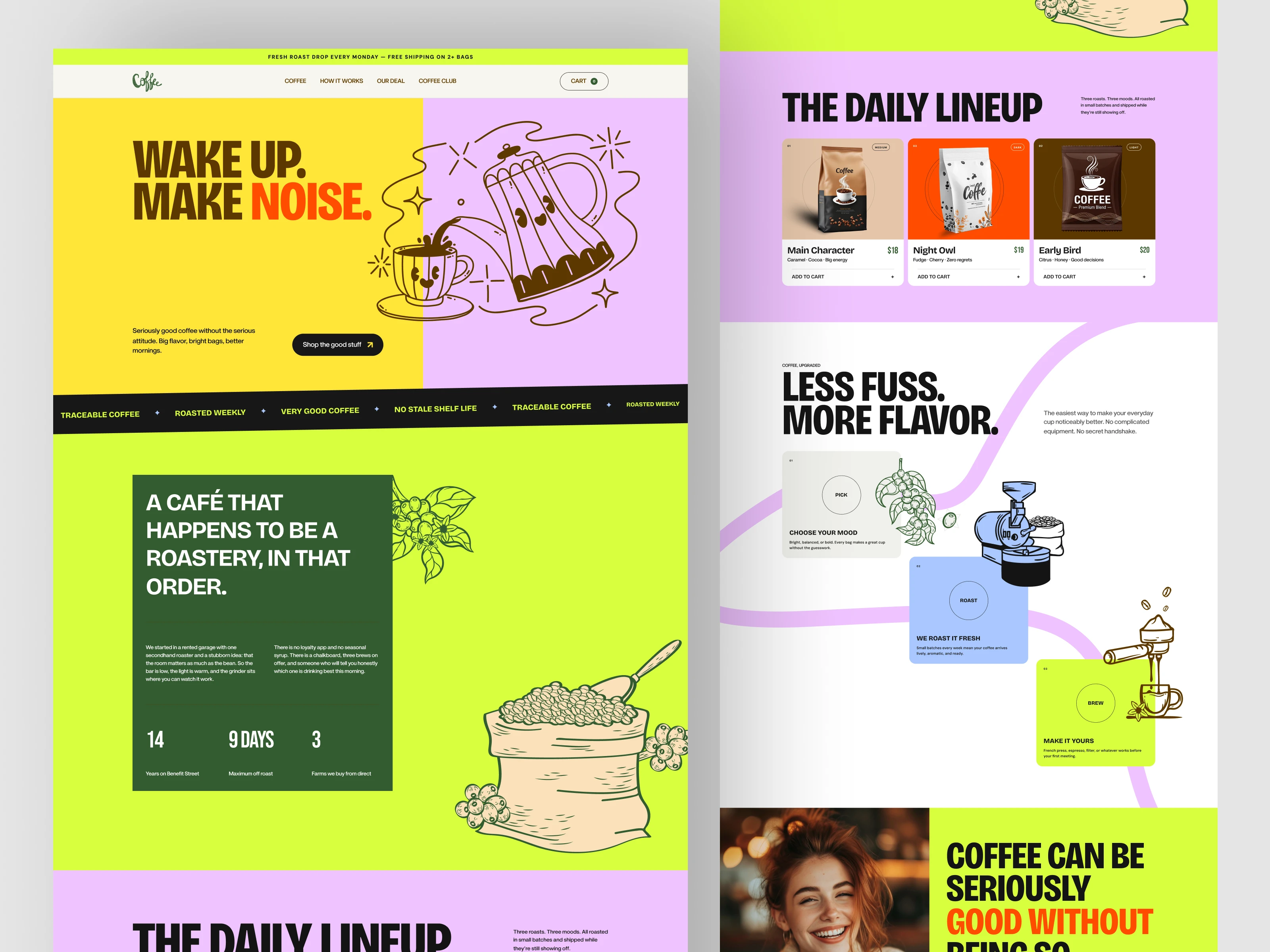
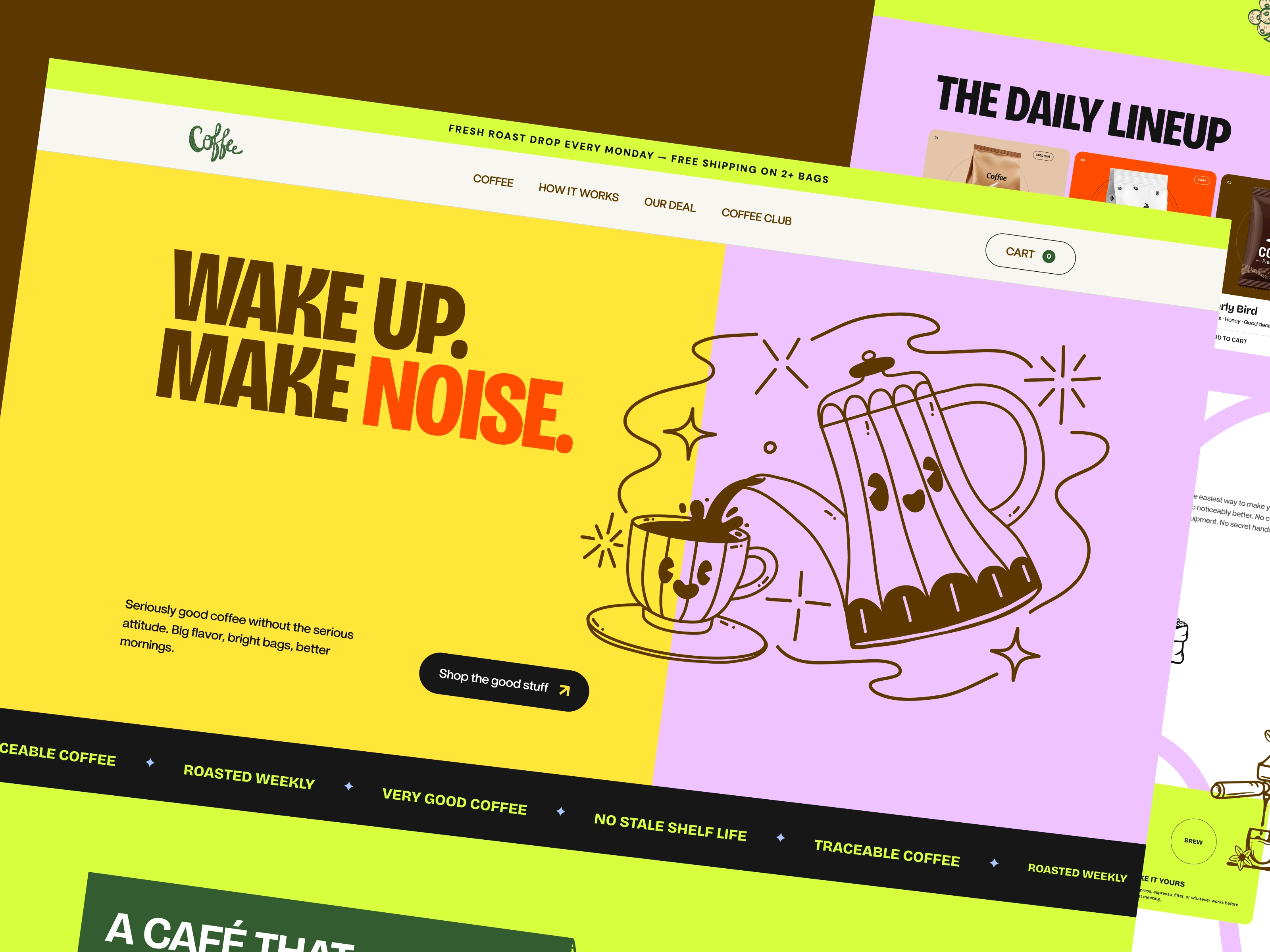
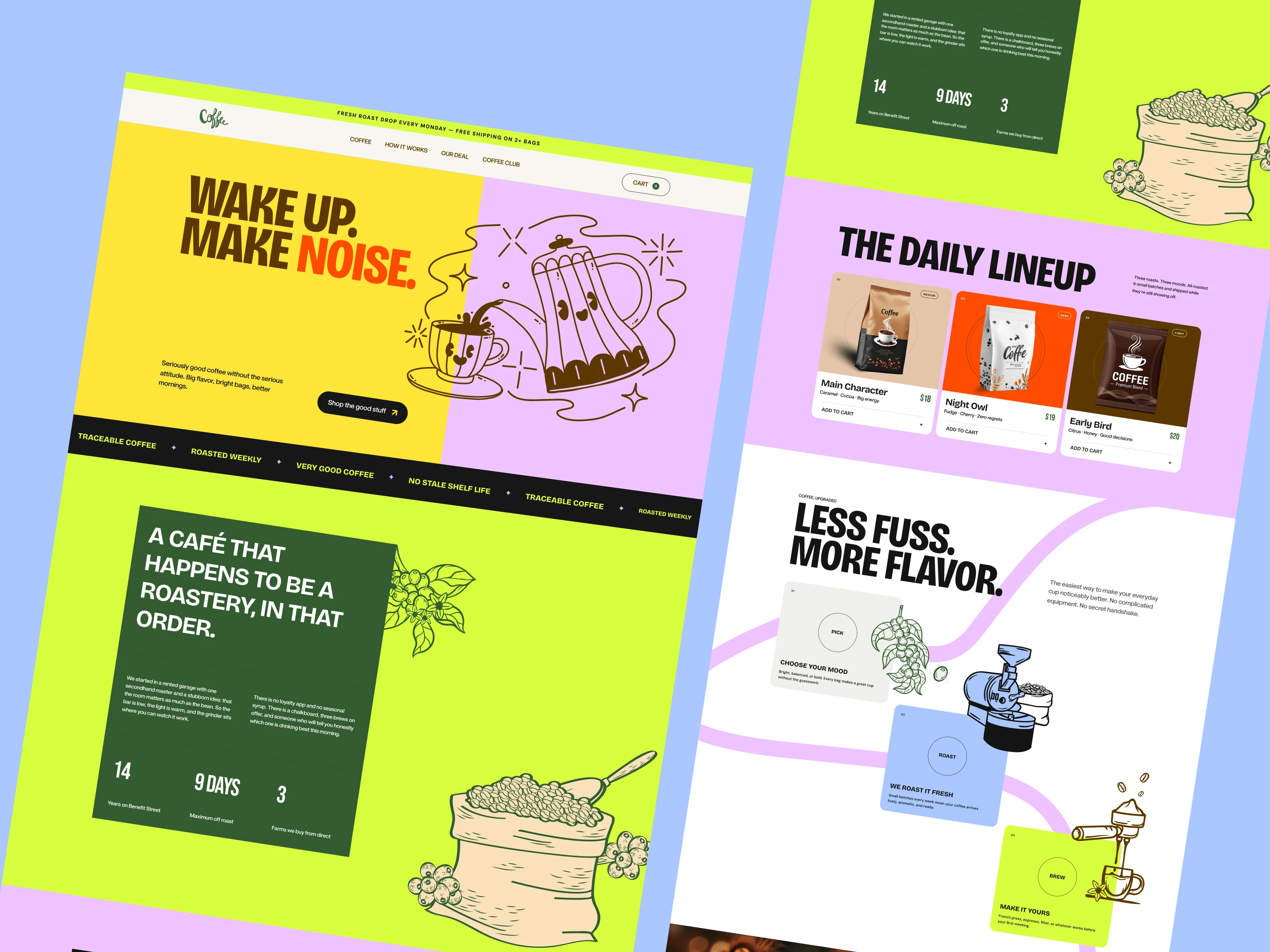
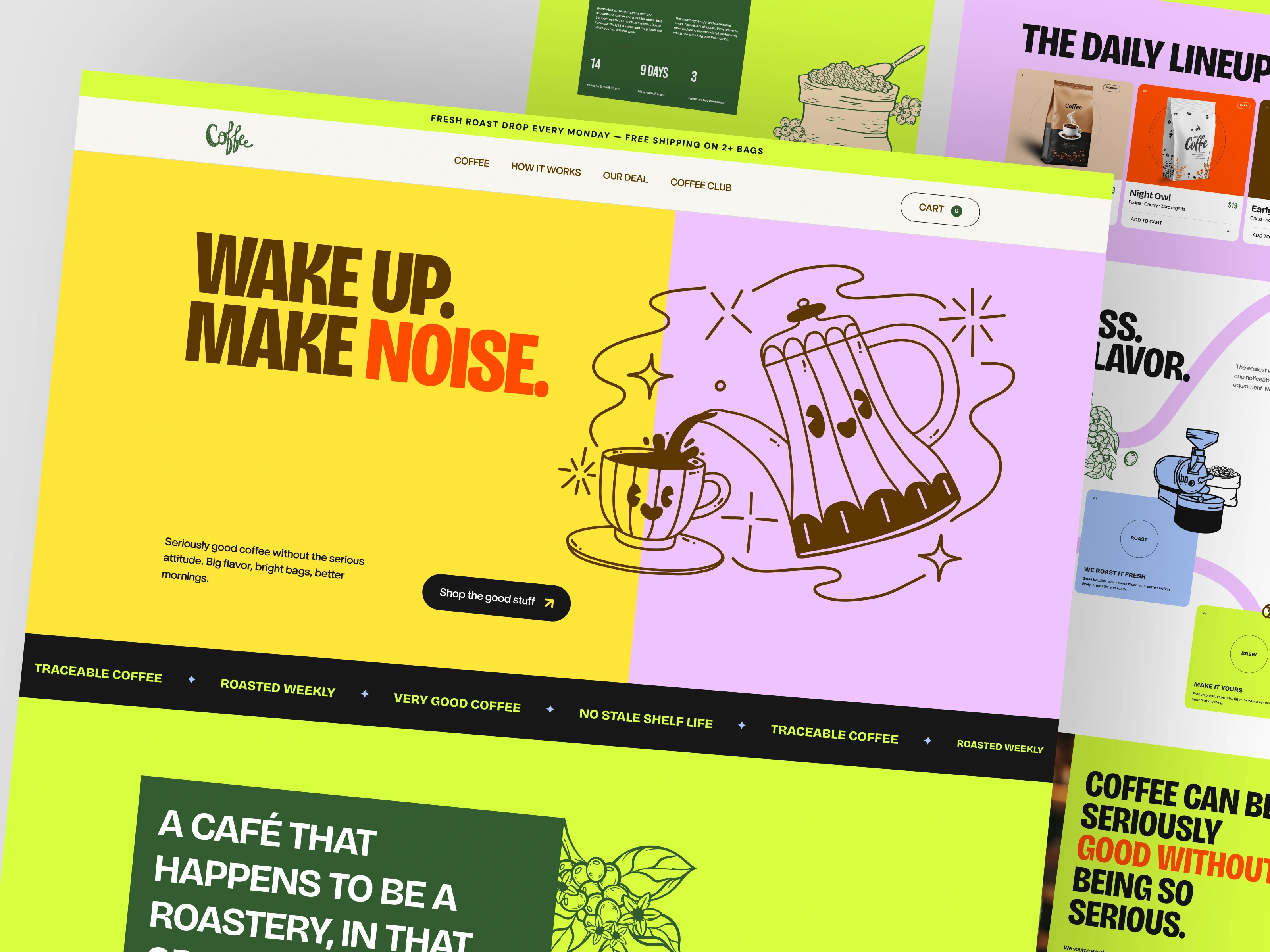
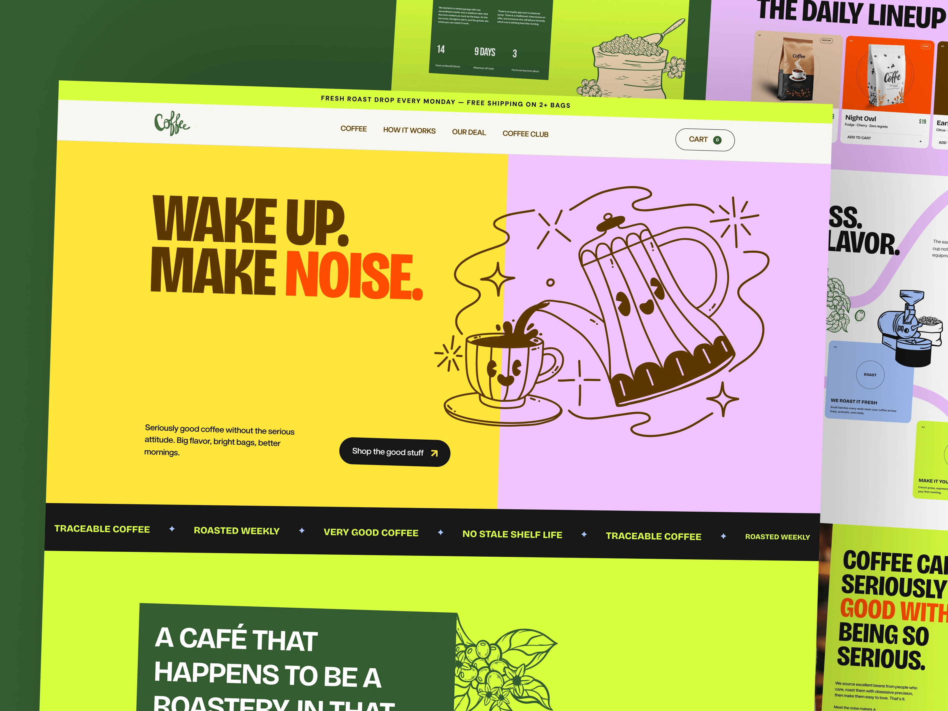
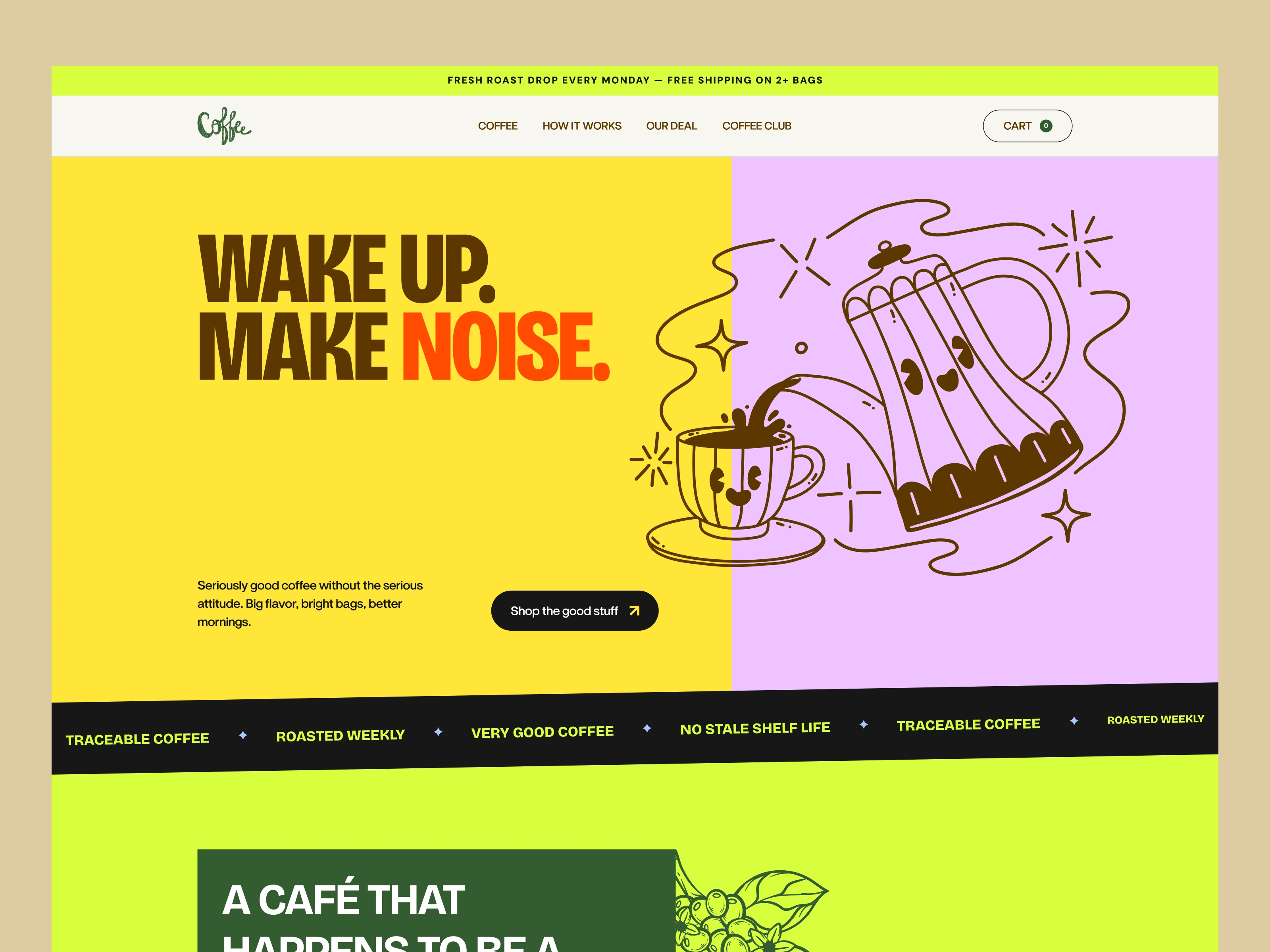
A vibrant coffee brand and e-commerce website concept built around one simple idea: great coffee doesn't have to be serious. The visual identity combines playful illustrations, expressive typography, unconventional color combinations, and bold messaging to create a memorable personality that feels energetic, approachable, and full of character.

Objective
The goal was to create a distinctive digital experience that breaks away from traditional coffee branding. Rather than relying on minimal, muted aesthetics, the concept embraces bright colors, playful storytelling, and a bold visual language to make the brand stand out while keeping the shopping experience intuitive.
Design Approach
Visual Identity: A vibrant palette of yellow, neon green, lavender, orange, and deep green establishes a recognizable brand personality.
Typography: Bold, condensed headlines paired with clean supporting typography create strong visual hierarchy.
Illustrations: Hand-drawn coffee-inspired graphics add character and reinforce the playful brand identity.
E-commerce Experience: Clear product cards, coffee collections, and straightforward shopping interactions make product discovery effortless.
Storytelling: Sections like The Daily Lineup, Less Fuss, More Flavor, and A Café That Happens to Be a Roastery bring the brand story to life.
Design Direction
Playful, expressive, energetic, and unapologetically bold — designed to make every coffee moment feel a little more exciting.
0 likes · 1 view · Nov 17, 2026
A vibrant coffee brand and e-commerce website concept built around one simple idea: great coffee doesn't have to be serious. The visual identity combines playfu
