
Mukhtar Kazi
Strategic Brand Designer specialise in brand identities
- 1
- Followers

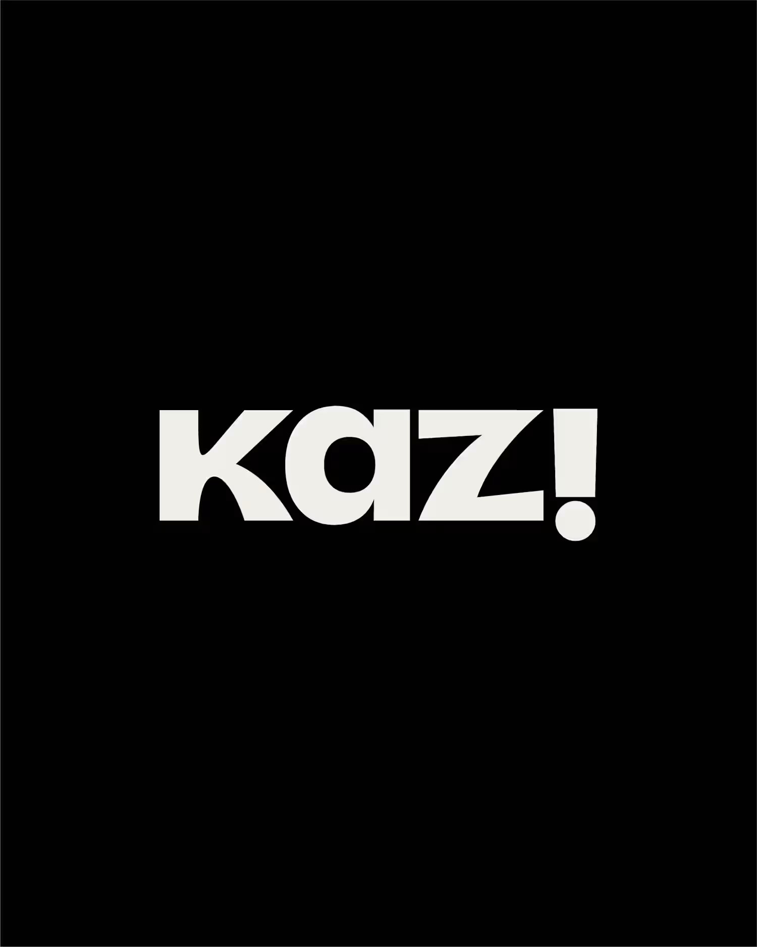
Zucha a brand built on clarity, precision, and quiet confidence.
The objective was simple: remove the unnecessary and let the identity speak with intent.
The wordmark is crafted with balanced proportions and subtle refinements, creating a presence that feels modern yet timeless. Every curve and cut is deliberate not decorative.
In line with the brand philosophy, the visual system leans on minimal elements, allowing space, typography, and structure to do the work. No noise, just clarity.
Typography plays a key role a refined primary typeface paired with a functional secondary font ensures both elegance and adaptability across platforms.
The overall identity is designed to be flexible yet consistent, making Zucha instantly recognizable in every interaction.
~
P.S If your audience needs effort to understand your brand, your identity isn’t working — it’s confusing.
0
13
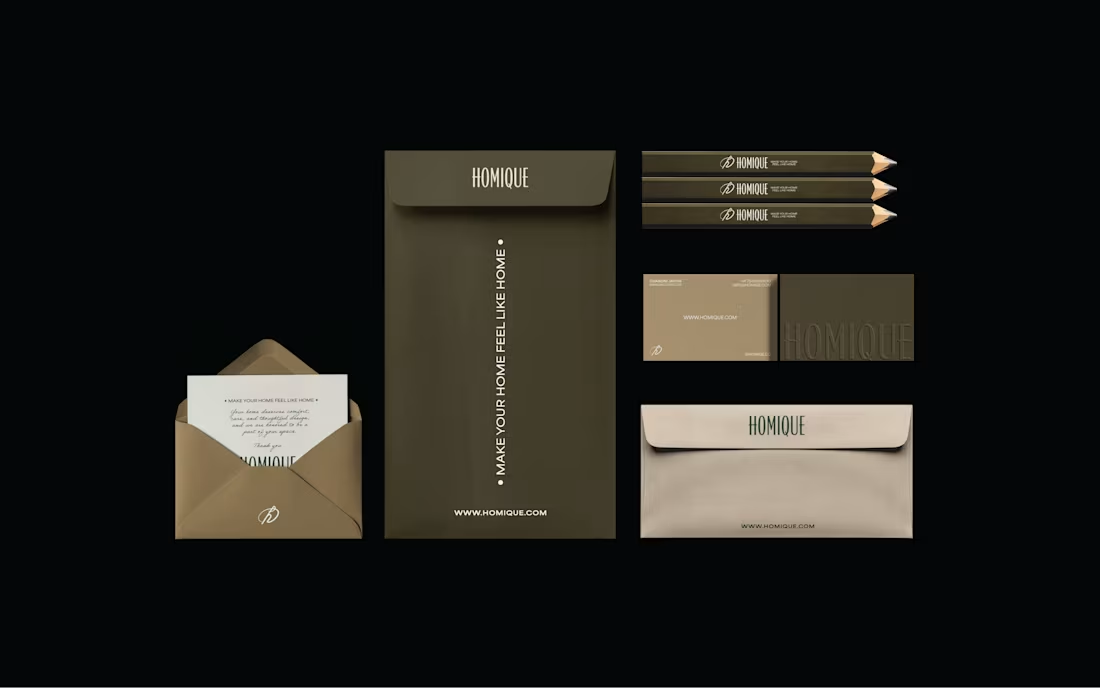
Your brand can quickly start to feel pieced together when decisions are made without a clear direction. Small changes here and there may solve short-term needs, but over time they weaken the overall identity.
This case study for Homiqe explores the importance of building a clear identity system — one that helps a brand remain intentional, consistent, and recognizable.
Homiqe is a brand focused on modern living and thoughtful home solutions. The goal was to create a visual identity that reflects simplicity, comfort, and a sense of belonging.
The direction centered on a clean, structured wordmark paired with a minimal symbol. The design language emphasizes balance, clarity, and modern aesthetics, aligning with the brand’s idea of creating smarter and more refined living spaces.
By developing a consistent identity system, the brand gains flexibility across packaging, digital platforms, and communication while maintaining a unified visual voice.
0
13
Do your brand visuals actually speak to your audience?
Or are they just “looking good” without saying anything meaningful?
If your visuals aren’t aligned with your audience, your brand won’t feel memorable it’ll just exist.
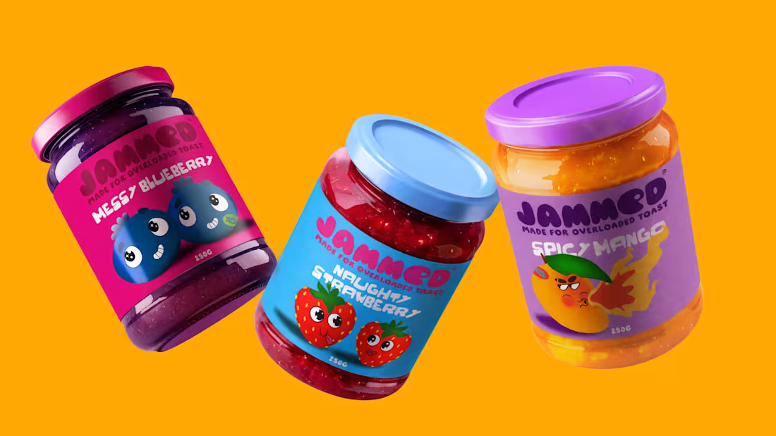
Here’s how I approached this for Jammed 🍓
• Aesthetic
Jammed is built for a younger, playful audience that enjoys bold, indulgent food experiences.
The visual direction is vibrant, glossy, and slightly messy capturing the fun of jam spilling, spreading, and being enjoyed.
• Colors
The palette is rich and high-contrast inspired by real fruit tones.
Deep berry blues, juicy reds, and bold backgrounds are used to make the product feel fresh, appetizing , and impossible to ignore.
• Typography
The type is clean but expressive allowing the visuals to stay dominant while still feeling modern and approachable.
• Brand Assets
The core visual idea revolves around flow and spread.
Jam isn’t static it drips, stretches, and moves. These elements become part of the brand language.
• Photography
Instead of clean, perfect product shots, the focus is on action jam spilling, bread being bitten, textures in motion.
This makes the experience feel real, sensory, and engaging.
~
When your brand visuals are built around how your audience feels, not just how things look, that’s when it starts to connect.
Full case study:
https://lnkd.in/ddkeBPDp
(https://lnkd.in/ddkeBPDp)#Branding (https://www.linkedin.com/search/results/all/?keywords=%23branding&origin=HASH_TAG_FROM_FEED) #PackagingDesign (https://www.linkedin.com/search/results/all/?keywords=%23packagingdesign&origin=HASH_TAG_FROM_FEED) #CreativeDirection (https://www.linkedin.com/search/results/all/?keywords=%23creativedirection&origin=HASH_TAG_FROM_FEED) #FoodBranding (https://www.linkedin.com/search/results/all/?keywords=%23foodbranding&origin=HASH_TAG_FROM_FEED) #VisualIdentity (https://www.linkedin.com/search/results/all/?keywords=%23visualidentity&origin=HASH_TAG_FROM_FEED) #CaseStudy (https://www.linkedin.com/search/results/all/?keywords=%23casestudy&origin=HASH_TAG_FROM_FEED)
0
22
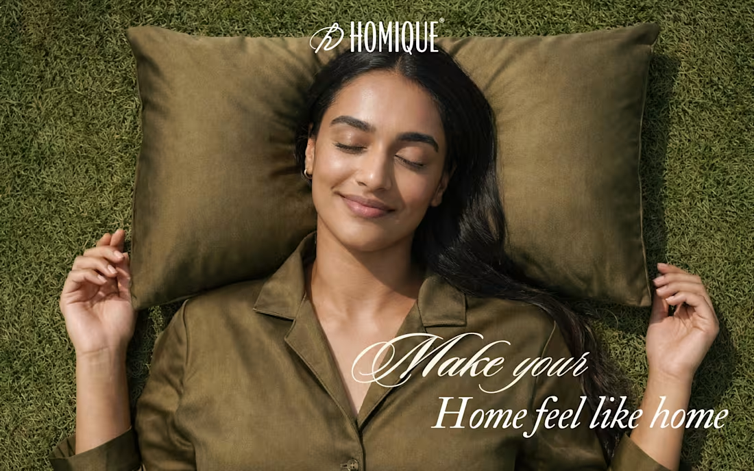
HOMIQE Branding Project
0
0