Abdulateef Muideen
Graphic designer, WordPress expert
Ready for work
Abdulateef is ready for their next project!
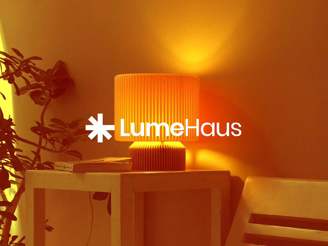
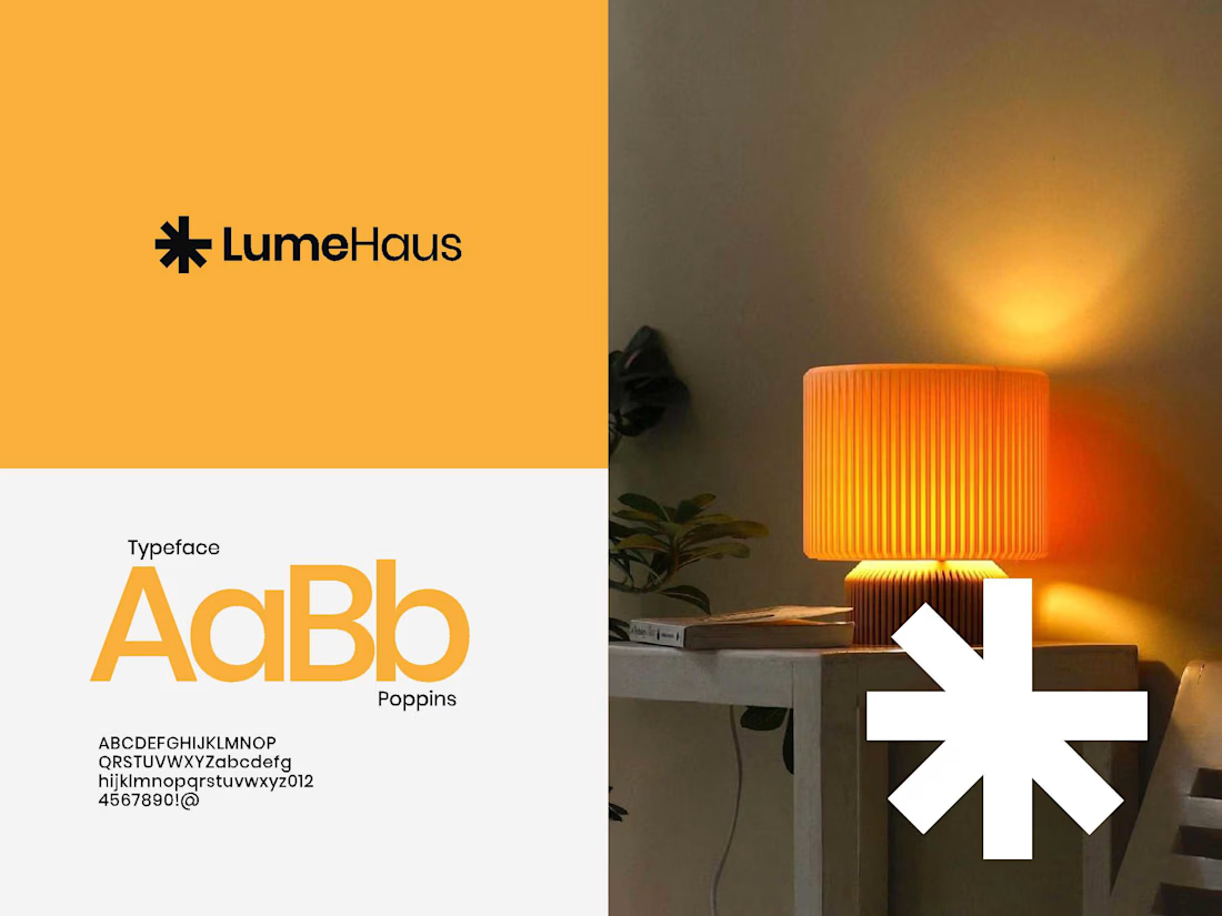
Not all light reveals — some defines.
LumeHaus was built on that idea.
Every fixture, every glow, every reflection is design in motion — crafted to shape emotion, not just visibility.
The brand identity mirrors that philosophy: warm precision, architectural calm, and a whisper of...
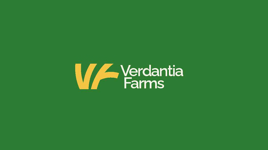
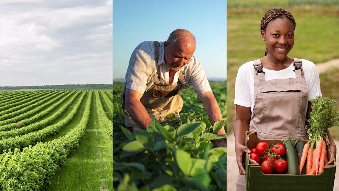
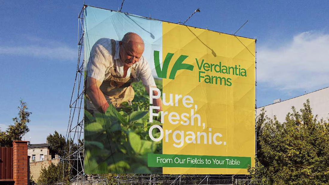
Some brands need a voice. Verdantia already had one, soft winds, green fields, and the quiet rhythm of growth.
My task was to translate that calm power into a visual identity that feels alive.
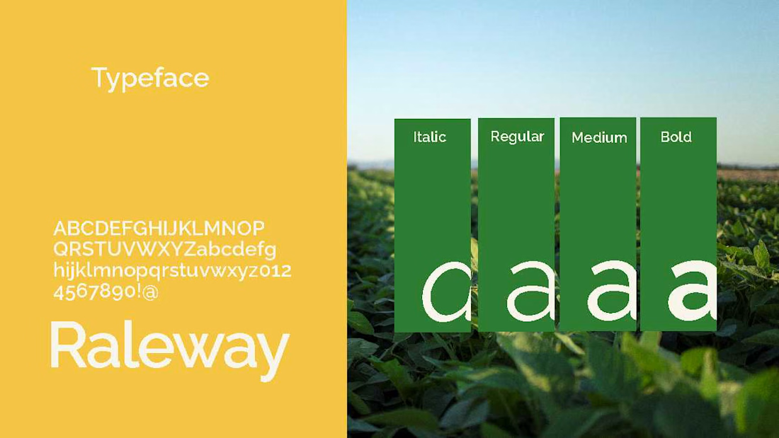
From the lush tones of green to the grounded typography, every element was designed to...
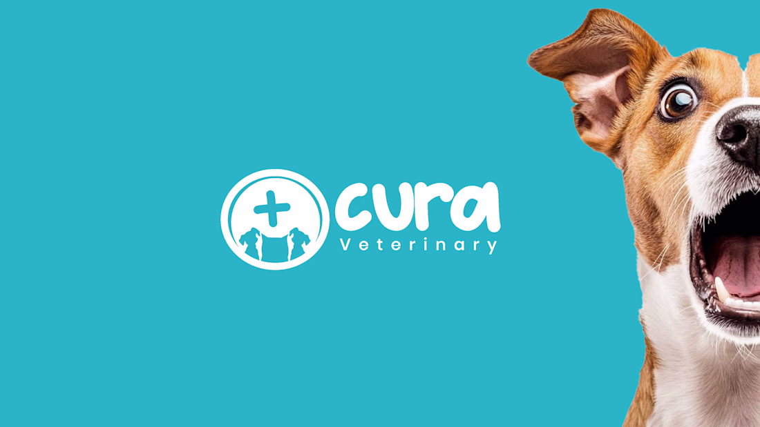
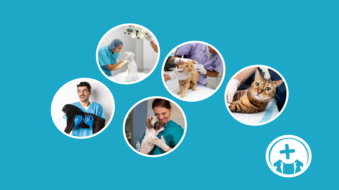
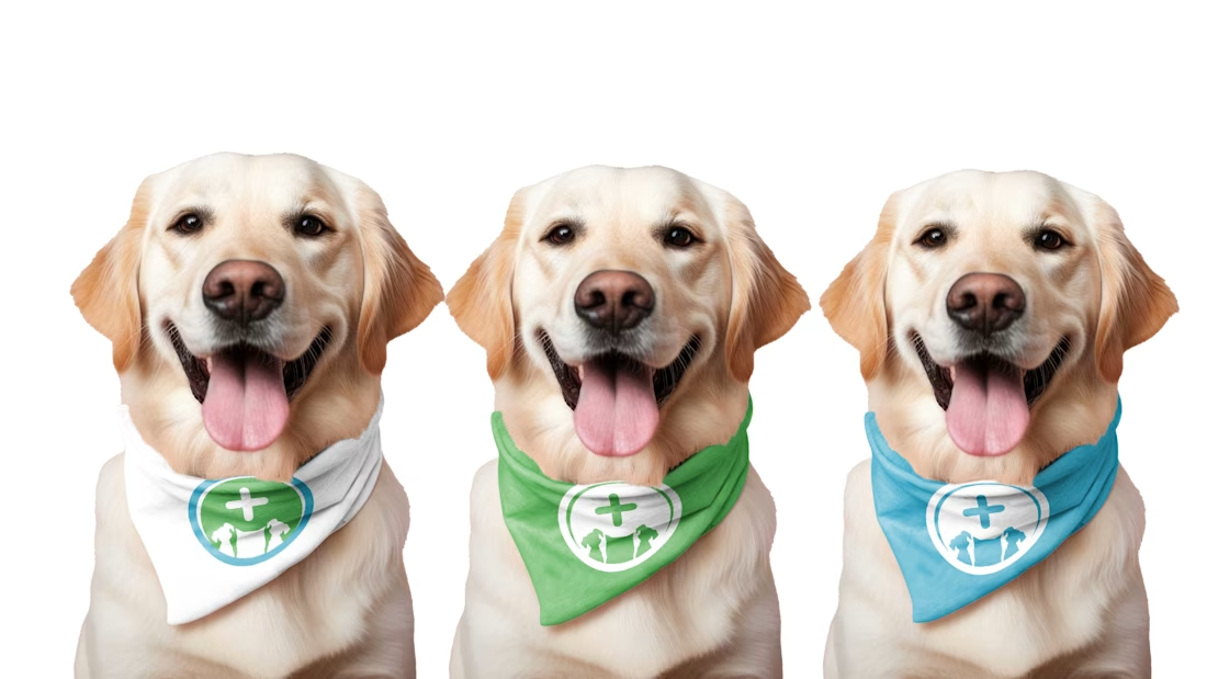
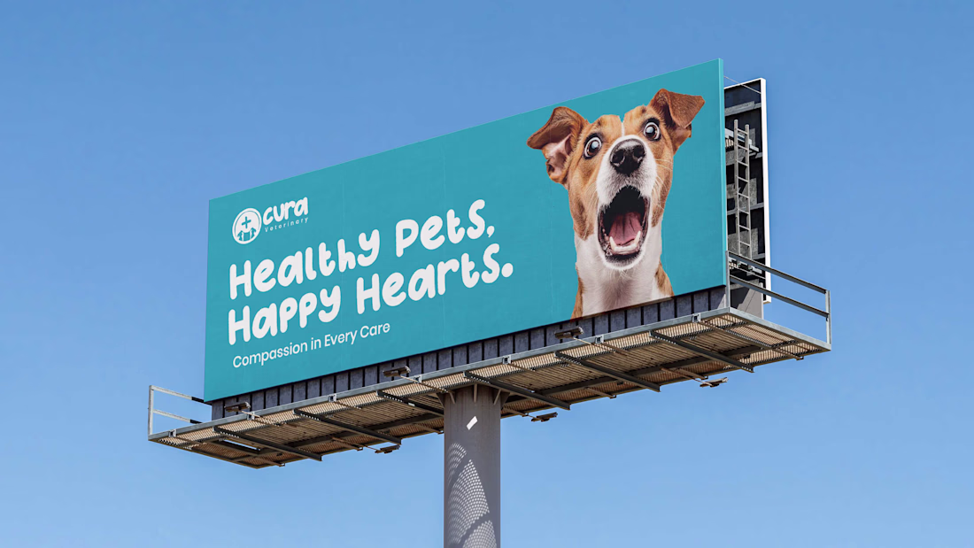
Cura Veterinary — Designing the Language of Care
Some brands speak through words.
Cura speaks through warmth, trust, and a wagging tail.
The challenge? To design a visual identity that feels like empathy in motion, where a single mark could comfort a pet owner before a doctor even...
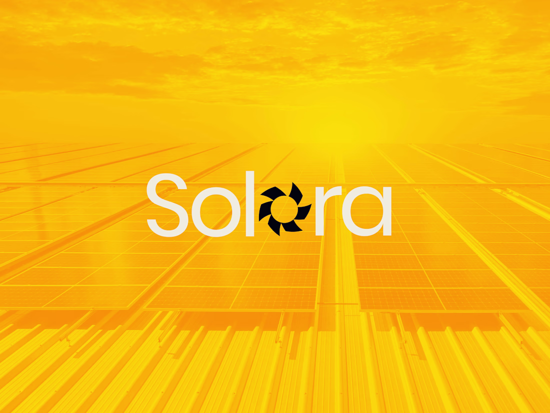
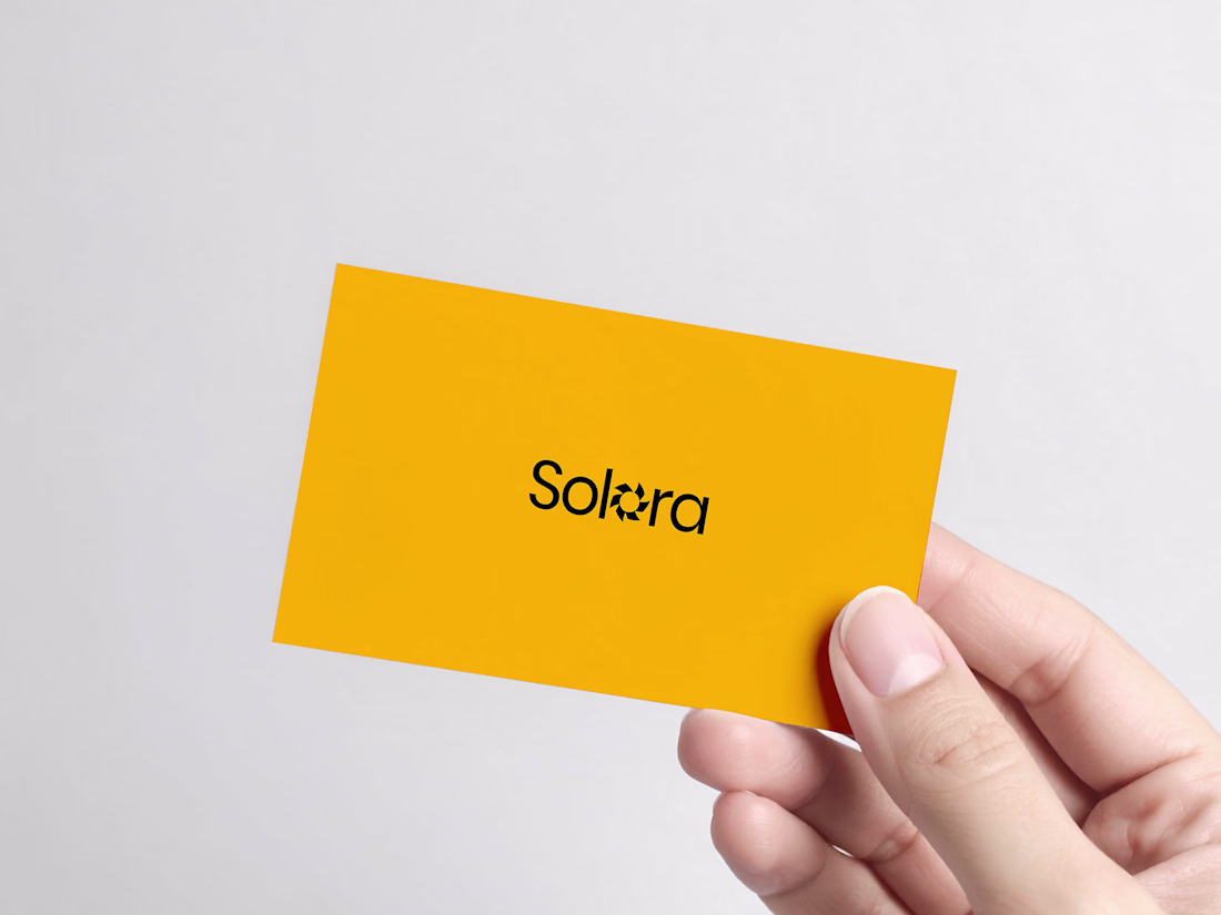
Some brands are built.
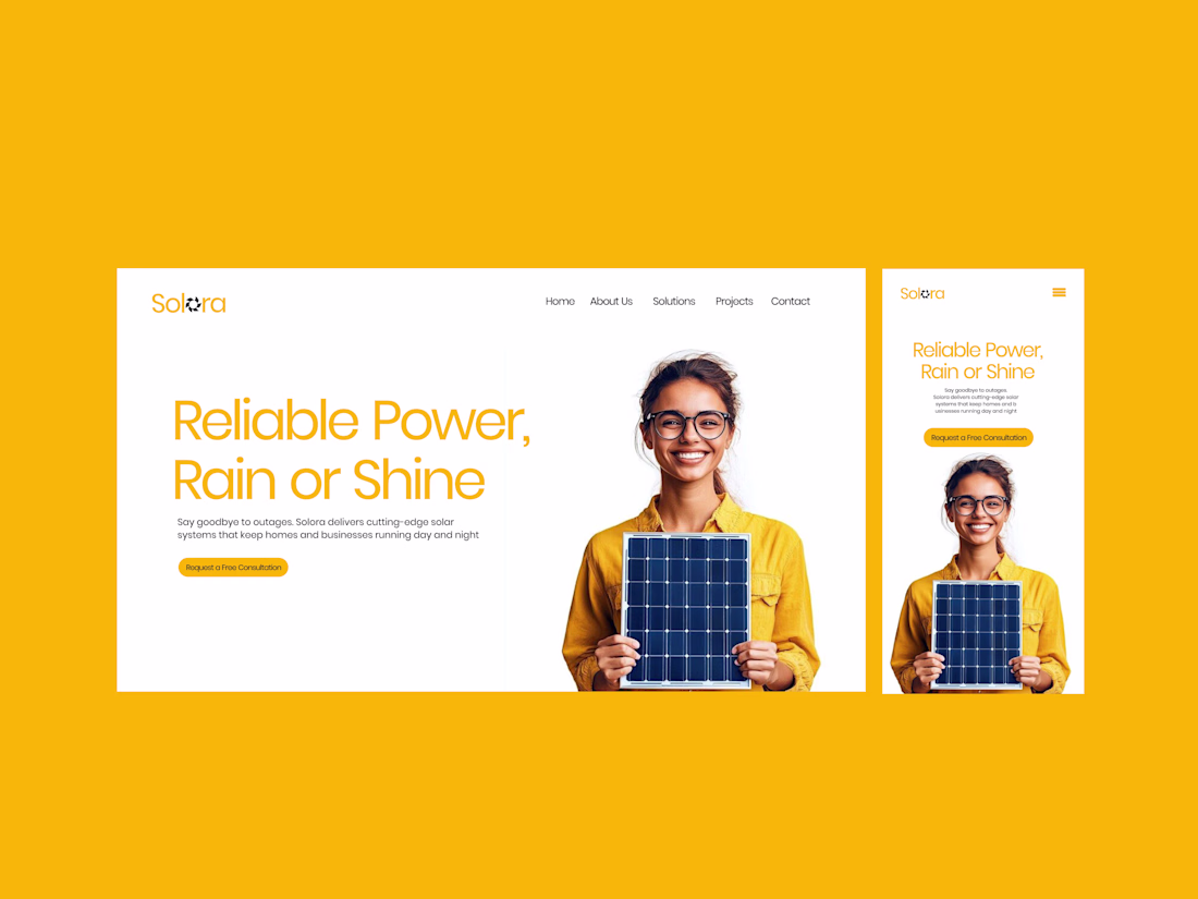
Solora was revealed.
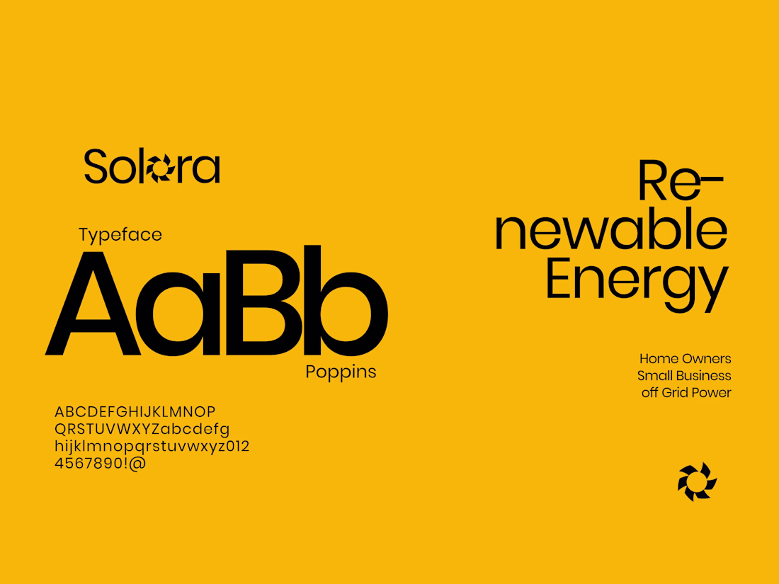
I wanted the identity to feel like sunlight slipping through fabric, gentle, deliberate, and impossible to ignore.
The mark carries stillness, the color hums warmth, and the typography moves like confidence in motion.
Solora isn’t about...