
Abdulateef Muideen
Graphic designer, WordPress expert
Ready for work
Abdulateef is ready for their next project!
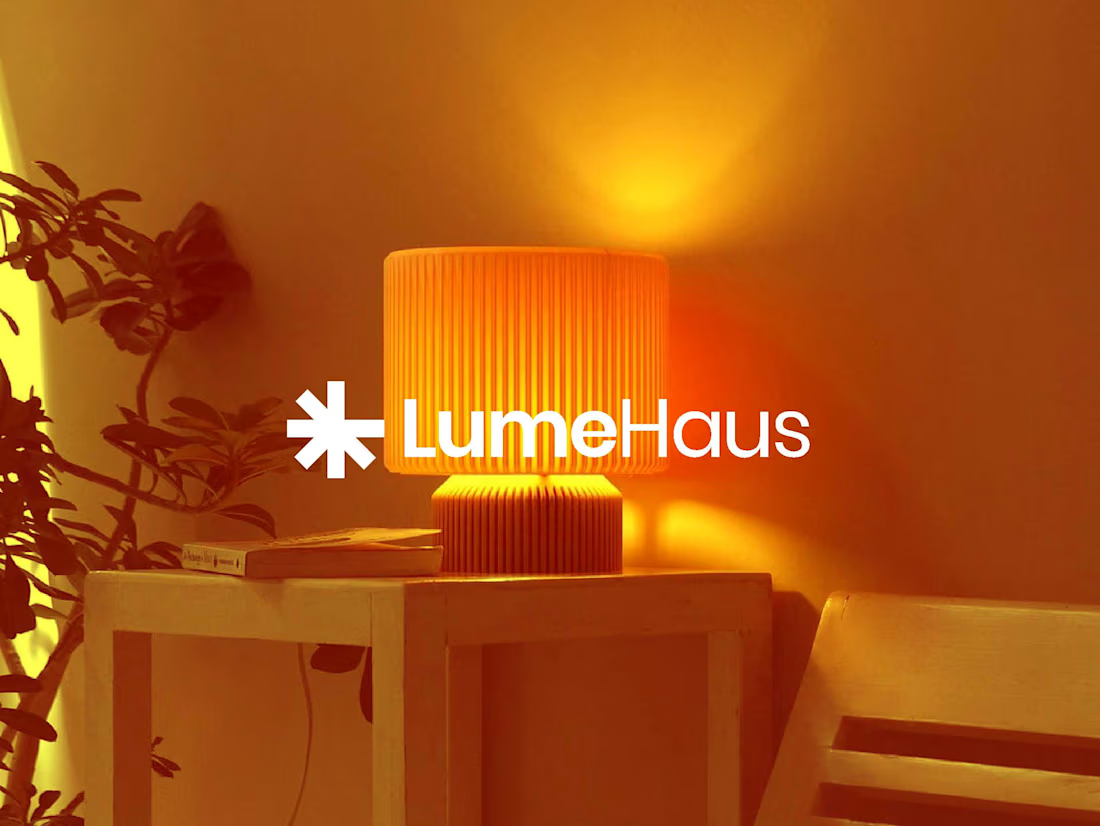
Not all light reveals — some defines.
LumeHaus was built on that idea.
Every fixture, every glow, every reflection is design in motion — crafted to shape emotion, not just visibility.
The brand identity mirrors that philosophy: warm precision, architectural calm, and a whisper of luxury that lingers.
Because when light becomes art, space becomes story.
Brand Identity Design | LumeHaus
For brands that deserve to shine — quietly.
5
36
Some brands need a voice. Verdantia already had one, soft winds, green fields, and the quiet rhythm of growth.
My task was to translate that calm power into a visual identity that feels alive.
From the lush tones of green to the grounded typography, every element was designed to reflect abundance, purity, and harmony with nature.
This is not just farming, it’s nature, designed with intention
3
3
71
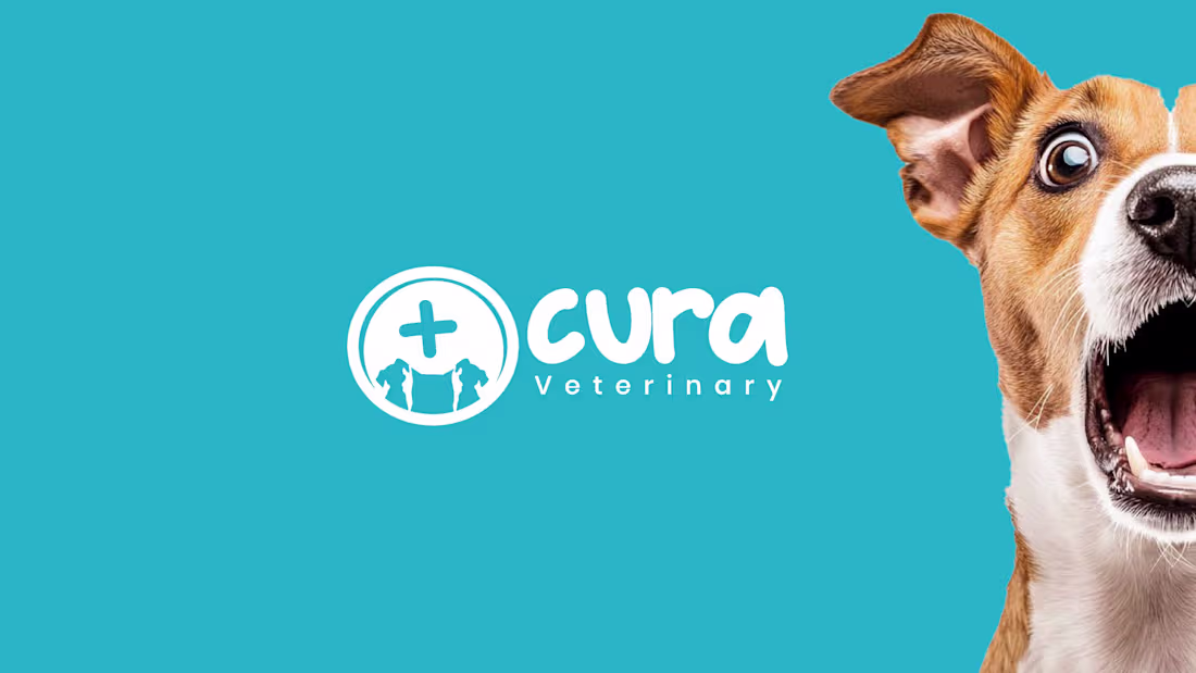
Cura Veterinary — Designing the Language of Care
Some brands speak through words.
Cura speaks through warmth, trust, and a wagging tail.
The challenge? To design a visual identity that feels like empathy in motion, where a single mark could comfort a pet owner before a doctor even says hello.
The playful lettering, clinical cross, and calm blue backdrop tell a quiet story: science can have a soul.
Because at Cura, care isn’t sterile, it’s sincere.
#BrandDesign #VisualIdentity #VeterinaryBranding #LogoDesign #DesignStrategy #ModernBrandIdentity #DesignThatFeels
2
2
57
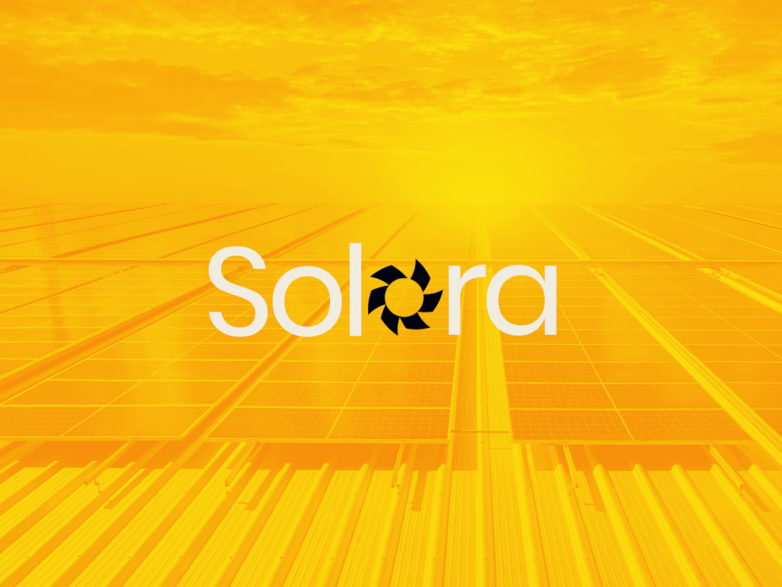
Some brands are built.
Solora was revealed.
I wanted the identity to feel like sunlight slipping through fabric, gentle, deliberate, and impossible to ignore.
The mark carries stillness, the color hums warmth, and the typography moves like confidence in motion.
Solora isn’t about appearance; it’s about presence.
A reminder that elegance doesn’t perform, it exists.
2
1
44
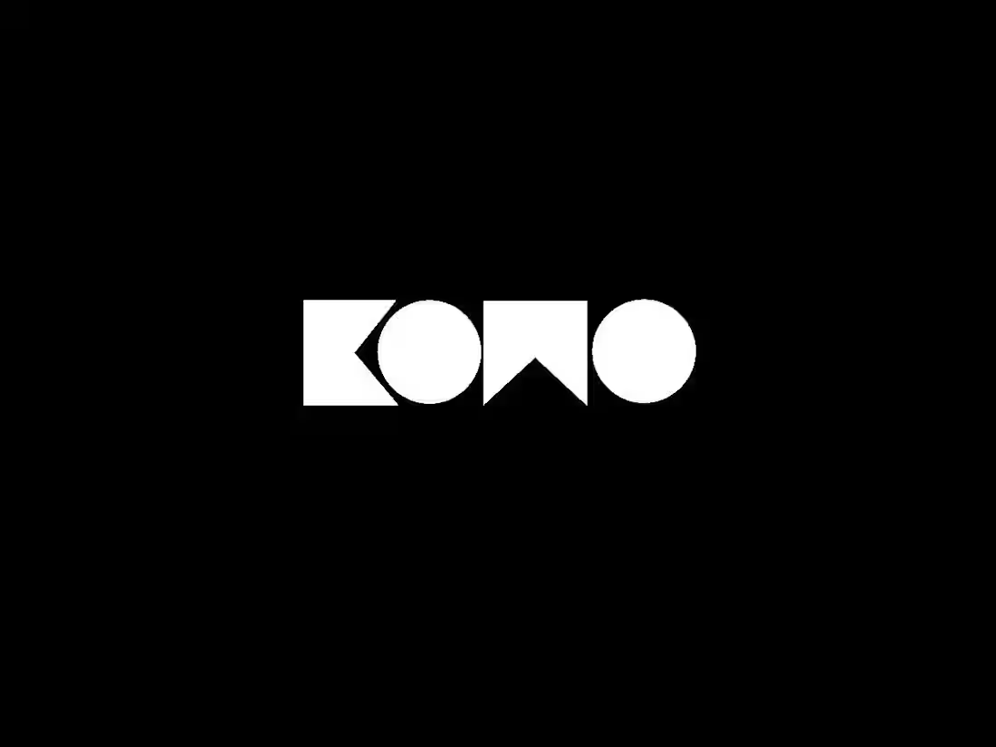
KOMO — The Language of Effortless Luxury
Luxury isn’t loud. It whispers.
KOMO was built around that belief, a brand that speaks in refined simplicity, where every curve, color, and space carries quiet confidence.
The identity blends minimal geometry with modern elegance, capturing the essence of sophistication without excess.
It’s more than a logo — it’s a statement of taste, precision, and timeless style.
Because true luxury doesn’t need to convince you.
It simply feels right.
Brand Identity Design | KOMO
Designing confidence for the modern wardrobe.
1
2
66