pro
Darshan Patel
Website Designer & Developer | 3,800+ Projects Since 2020
- 5.0
- Rating
- 17
- Followers




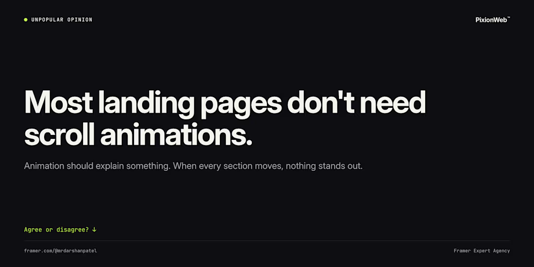
Unpopular opinion: most landing pages don't need scroll animations.
Animation should explain something: how a product works, what changed, where to look next. When every section fades in, nothing stands out and the page feels slower.
My rule: start with zero animation, then add it...

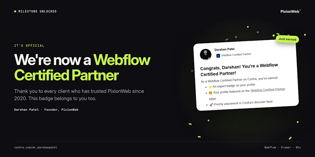
Milestone unlocked 🎉
PixionWeb is now a Webflow Certified Partner on Contra.
Since 2020, we've built websites for founders, service brands and agencies, and every one of those projects led here. Thank you to every client who trusted us along the way. This badge is yours too.
...

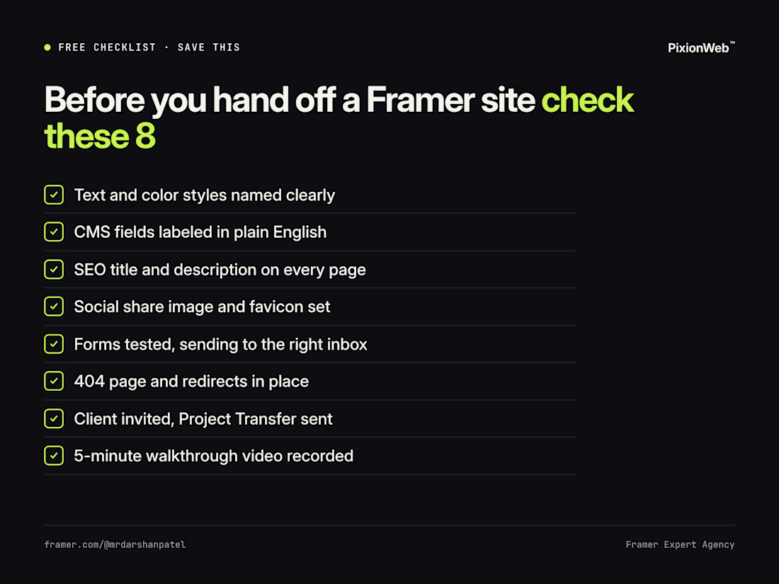
Free checklist: what we check before handing a Framer site to a client ✅
The 8 items are in the image. The one people skip most: a 5-minute walkthrough video. It saves a week of "how do I change this?" emails.
Save it for your next handoff. What would you add? 👇
#Framer #WebDesign
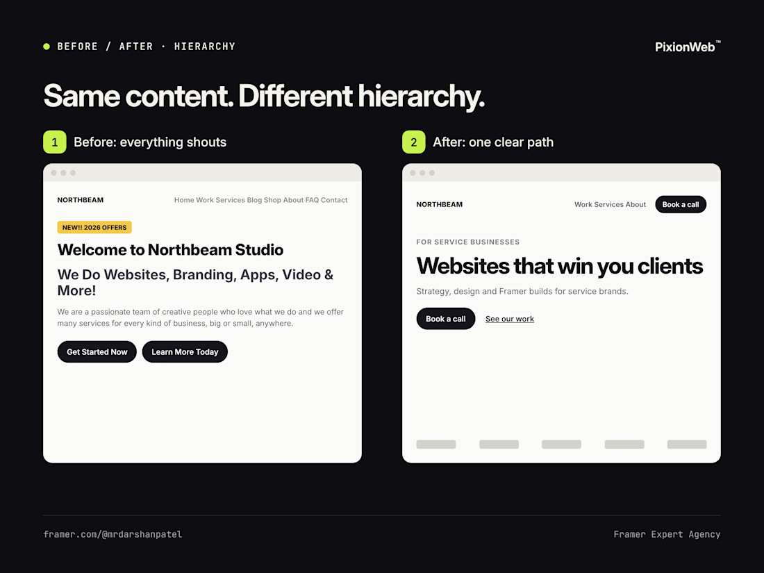
Same content. Different hierarchy. 👀
Before: competing headlines, two buttons of equal weight, no proof.
After: one headline, one primary button, a quiet secondary link, and proof right below.
Nothing new was written. We only decided what matters most.
What's the first change you...
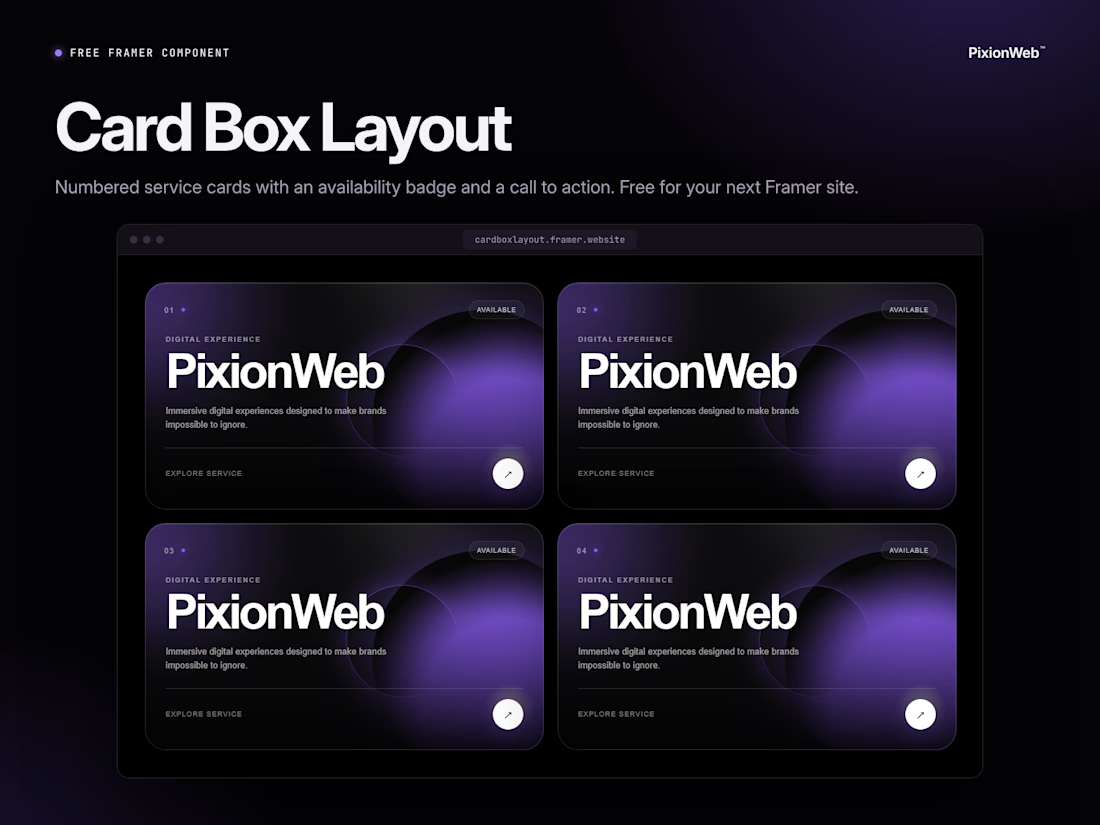
Free Framer component: Card Box Layout 🎁
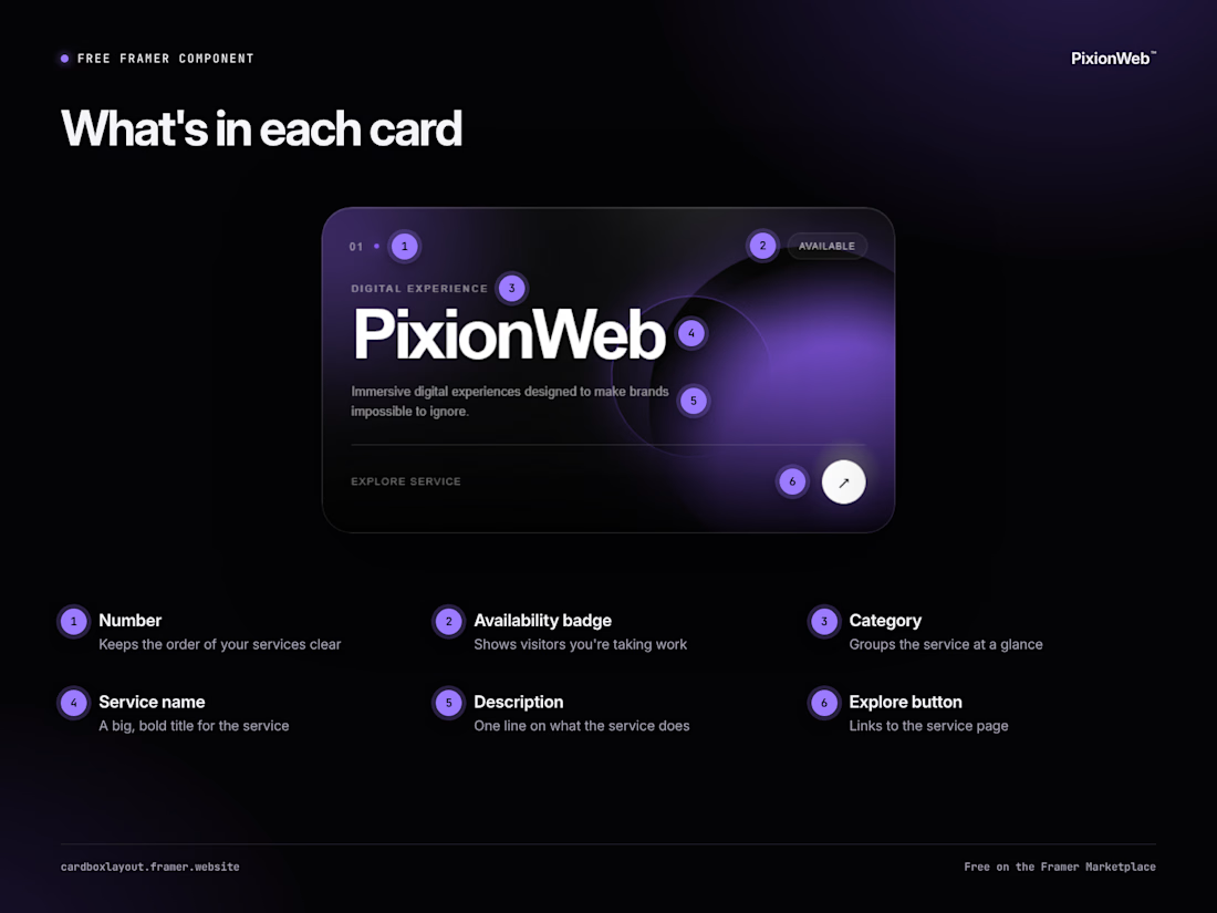
A services section has one job: help visitors pick the right service fast. Card Box Layout gives each service a numbered card with an availability badge, a one-line description and an Explore button.
Live preview: