The network for creativity
Join 1.25M professional creatives like you
Connect with clients, get discovered, and run your business 100% commission-free
Creatives on Contra have earned over $150M and we are just getting started
Back to feedPost

Unpopular opinion: most landing pages don't need scroll animations.
Animation should explain something: how a product works, what changed, where to look next. When every section fades in, nothing stands out and the page feels slower.
My rule: start with zero animation, then add it only where it earns its place.
Agree or disagree? 👇



Agree with this one. When every section fades in, the one animation that actually explains the product gets lost in the noise.
Agree. Starting with zero animation and adding it only where it explains something is the right default, and it keeps performance in check too.
The network for creativity
Join 1.25M professional creatives like you
Connect with clients, get discovered, and run your business 100% commission-free
Creatives on Contra have earned over $150M and we are just getting started

Related posts

My first Framer template is officially LIVE on the Marketplace! 🎉Finally, the wait is over!
Check it out: https://www.framer.com/marketplace/templates/elsewheree/
Meet ElseWhere, an editorial travel website crafted with immersive visuals, thoughtful interactions, and plenty of little details.
This one has been a journey of its own. Excited to finally share it with everyone!



Nocturne is now on Framer 🌙
A sleep-app template where one night plays out as you scroll: dusk to dawn in three acts, with the sky, the clock and the widgets changing as you go.
Native Framer layers, a CMS, code components with properties and five skills for Framer's agent.
Get it on the Framer Marketplace, $59:
https://www.framer.com/marketplace/templates/nocturne-app/

Nice!

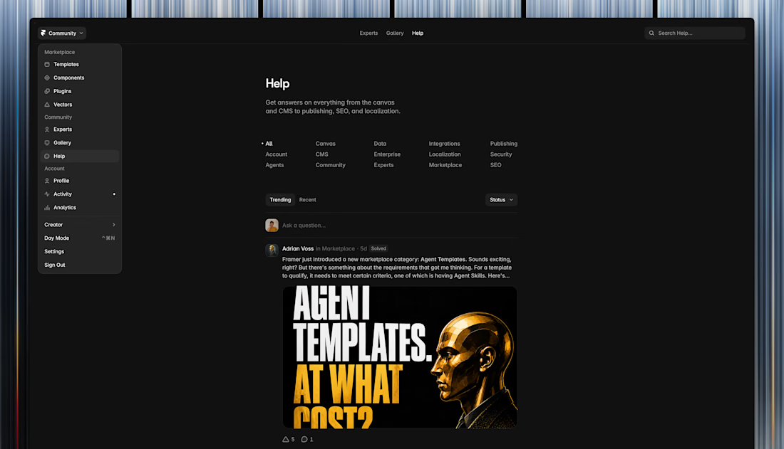
The old Feed is now replaced by the Help page in the Framer Community so you can ask relevant questions, start a discussion and be part of an active community.
All the content is still being moderated by the team.

What happens to the old posts?