
Abdullahi Usman
Elite Logo & Brand Identity Designer


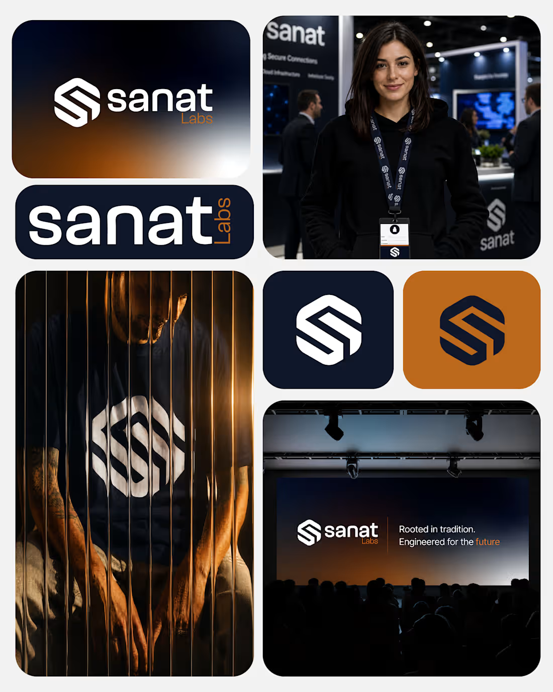
When most people think of a brand, the first thing that comes to mind is the mark. But a logo is just the tip of the iceberg; it’s the signature, not the entire conversation.
For this recent project, the goal wasn't just to design something visually striking. It was to build a cohesive visual system that can scale across every touchpoint.
A strong identity doesn’t just look good on a screen; it solves business problems, builds trust, and creates an unforgettable user experience.
Swipe through to see the breakdown of the visual system in action. 👇
0
52
I’ve been exploring how to present brand systems in a more structured, modern way. For Flip Side, I created this bento grid animation to showcase how the mascot, wordmark, and color system work together in a digital space.
When branding for high-energy food markets, the digital presentation needs to be just as punchy as the physical packaging.
2
2
140

I recently completed the visual identity for Flip Side, a street burger brand targeting the US and European markets. For this project, the goal was to marry the high-energy vibe of modern street food with a nostalgic, character-driven aesthetic.
The Strategy:
Market Positioning: Leveraged a "rubber-hose" mascot style to create instant brand recognition and approachability in a competitive urban landscape.
The System: Implemented a strict 60-30-10 color rule using a palette of Golden Yellow (#F0A116), Red (#E5192D), and Dark Brown (#442D17) to ensure consistency across every touchpoint—from burger wraps to staff apparel.
Scalability: Designed a versatile pattern system that works as well on a snack box as it does on a digital menu.
Deliverables: Brand Strategy, Mascot Illustration, Pattern Design, and Packaging Systems.
Looking to launch or rebrand? I’m currently accepting new projects here on Contra. Let’s build something memorable.
#BrandIdentity #LogoDesign #MascotDesign #PackagingDesign #ContraIndependents #StreetFoodBranding #GraphicDesign
1
80

Precision-built for the Atlantic. I recently wrapped up the visual identity for 64° West, a hydration brand that rejects the "friendly" UI of traditional sports drinks in favor of Industrial Minimalism.
The Trilogy:
Atlantic Blue (The Origin)
Coral Crush (The Peak)
Driftwood Botanical (The Recovery)
This project was about more than just a logo; it was about building a "Monolith Manual" for a brand that feels heavy, stable, and elite.
Check out the full case study on my profile.
2
3
111