
MN LOKESH
I am a Creative Director helping other brands.
New to Contra
MN is building their profile!

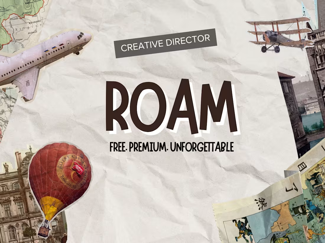
Brand Identity Direction — ROAM — Premium Travel Platform
Complete brand direction for ROAM — a premium Indian travel experience platform. Covers brand personality, color direction, typography direction and complete visual world.
1
11
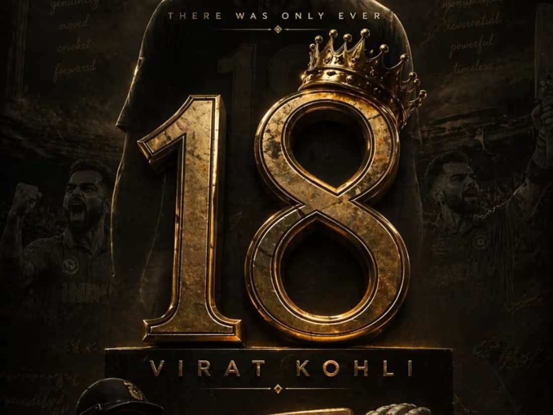
VIRAT: Visualizing the Fire and Focus of a Legend
This tribute poster for Virat Kohli explores the duality of high-performance sports: the intense, burning passion and the cold, surgical focus required at the highest level. By juxtaposing molten, volcanic elements with a sharp, monochromatic portrait, the design communicates a "throne of fire" aesthetic. The visual direction ensures that the energy of the crowd and the heat of the game are felt through the textures, bringing the initial conceptual sketch into a high-impact, cinematic reality.
When an experienced designer studies these sketches and attempts to bring them to life through design, the outcome can be truly remarkable. I also have a well-defined vision for directing designers to produce outstanding results.
1
26
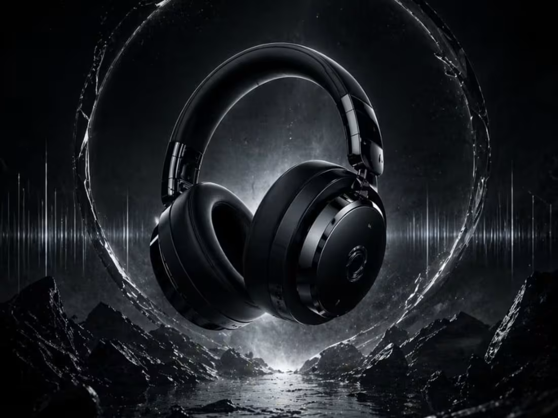
OBSIDIAN: Defining the Future of Premium Audio Design
This project showcases the visual identity for OBSIDIAN, a high-end headphone brand built on a "zero-noise" philosophy. The design emphasizes a sleek, monochromatic aesthetic with deep matte textures, capturing the feeling of total immersion. By directing the transition from the initial pencil concept to this polished, high-fidelity execution, the visual highlights a perfect balance between industrial strength and luxury comfort.
When an experienced designer studies these sketches and attempts to bring them to life through design, the outcome can be truly remarkable. I also have a well-defined vision for directing designers to produce outstanding results.
1
31
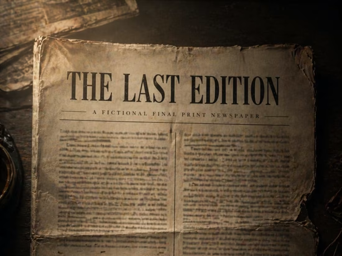
LAST EDITION: A Visual Study on Legacy and the Passage of Time
This final project, LAST EDITION, serves as a powerful meditation on history meeting the future. By placing a detailed, classical figure in front of a sprawling, light-drenched metropolis, the design explores the weight of what we leave behind. The composition relies on heavy atmospheric lighting and a sense of "historical permanence" to anchor the viewer, ensuring the transition from the initial concept sketch to the final execution feels epic and final.
When an experienced designer studies these sketches and attempts to bring them to life through design, the outcome can be truly remarkable. I also have a well-defined vision for directing designers to produce outstanding results.
1
37
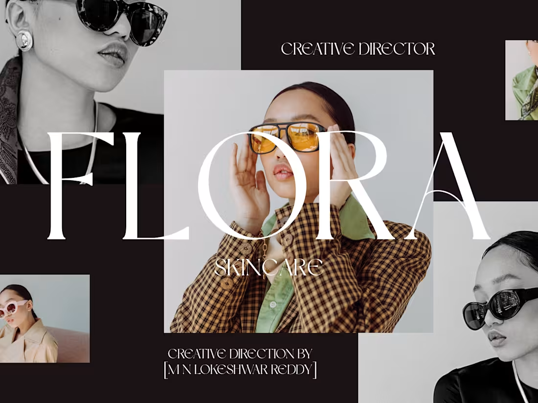
FLORA — Luxury Indian Organic Skincare Brand Direction
Complete brand direction for FLORA — a luxury Indian organic skincare brand. Covers brand personality, color direction, typography direction and complete visual world.
1
43
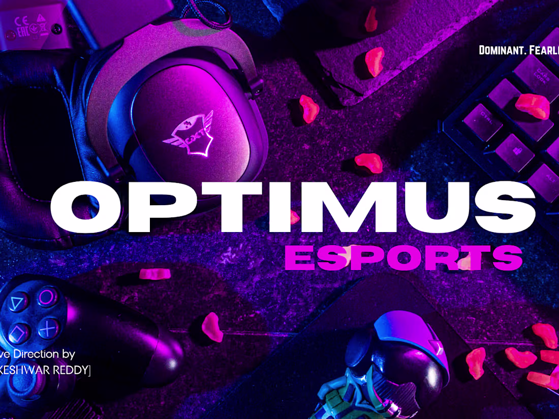
OPTIMUS — Luxury Indian Esports Brand Direction
Complete brand direction for OPTIMUS — a luxury Indian esports brand built for elite gaming athletes. Covers brand personality, color direction, typography direction and complete visual world.
1
42

APEX School of Business — Premium Indian Business School Brand Direction
APEX School of Business is a premium Indian business school built for visionary students who refuse to settle for ordinary futures. Not just a business school. A launchpad for the leaders who will build tomorrow. Deep midnight navy, pure brilliant white, rich warm gold, strong confident serif typography. Where visionary students become unstoppable leaders. Creative Direction by [M N LOKESHWAR REDDY]
1
42
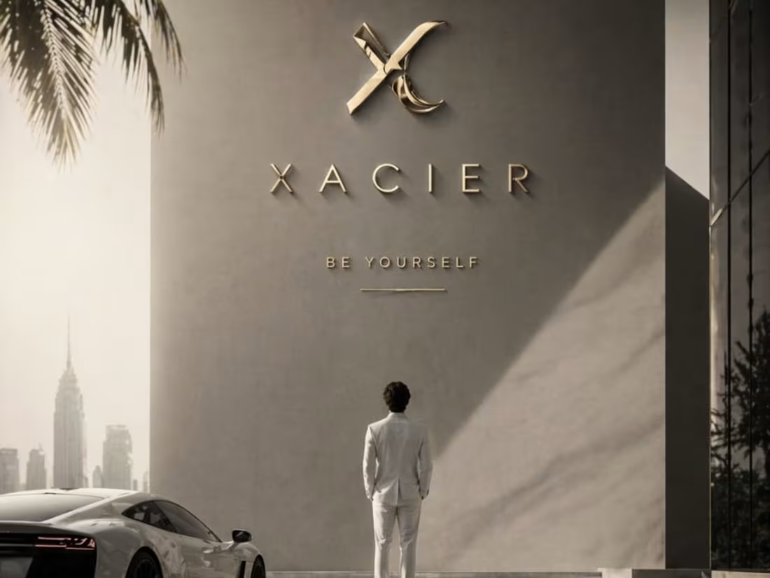
XACIER: Visualizing the Future of High-Performance Automotive Design
This automotive promotional poster for XACIER focuses on the raw power and sleek aerodynamics of a next-generation supercar. By utilizing a dark, moody atmosphere with focused lighting on the vehicle's sharp edges, the design communicates speed even in a standstill. The transition from the "breakthrough" sketch to this high-fidelity execution ensures that the brand's identity—focused on innovation and precision—is at the forefront.
When an experienced designer studies these sketches and attempts to bring them to life through design, the outcome can be truly remarkable. I also have a well-defined vision for directing designers to produce outstanding results.
1
52
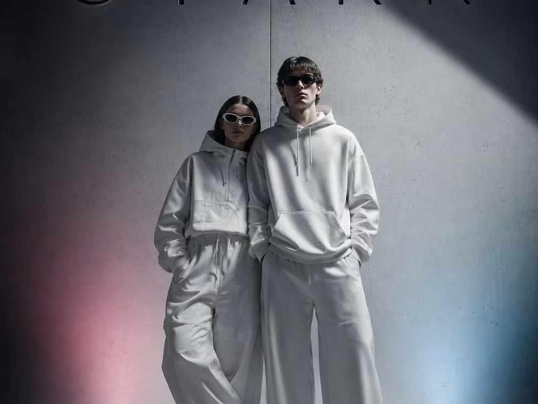
STARK: Industrial Minimalism and the Power of Contrast
This interior design and branding concept for STARK focuses on the tension between brutalist industrial elements and modern comfort. By pairing raw concrete textures with a singular, high-saturation orange accent, the visual creates a space that feels both disciplined and inviting. The transition from a simple layout sketch to this high-fidelity, light-drenched execution highlights a "zero-noise" philosophy where every object is intentional and every shadow is part of the narrative.
When an experienced designer studies these sketches and attempts to bring them to life through design, the outcome can be truly remarkable. I also have a well-defined vision for directing designers to produce outstanding results.
1
49
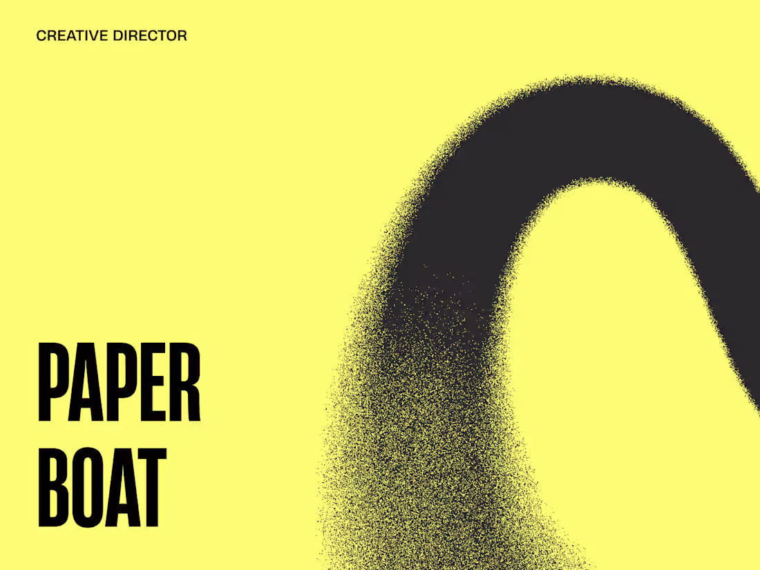
Paper Boat — Social Media Visual Direction
Paper Boat has one of India's most beloved brand identities. But their social media is not living up to that identity. This social media visual direction concept explores how every Paper Boat post could transport you back to a specific childhood moment instantly. Warm golden photography, amber nostalgic tones, simple minimal typography. Every post should feel like finding an old photograph in a drawer you forgot existed. Creative Direction by [M N LOKESHWAR REDDY].
1
47
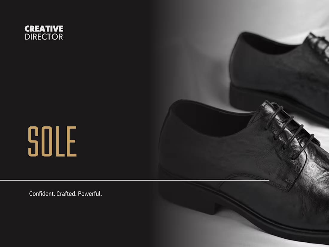
SOLE — Premium Indian Luxury Footwear Brand Direction
Complete brand direction for SOLE — a premium Indian luxury footwear brand built for confident entrepreneurs and business class individuals.
1
50
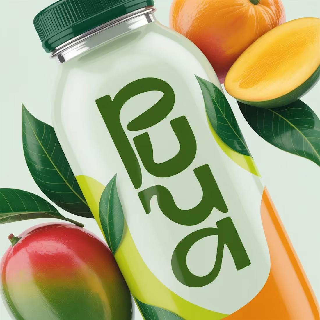
Brand Moodboard — PURA — Premium Indian Juice Brand
PURA is a premium Indian juice brand built on one simple promise — pure natural refreshment for everyone who values what goes into their body. Not a soda. Not a sports drink. Just pure fresh premium juice. Fresh tropical green, clean bright white, warm sunshine orange. Pure. Fresh. Alive. Creative Direction by M N LOKESHWAR REDDY.
1
52
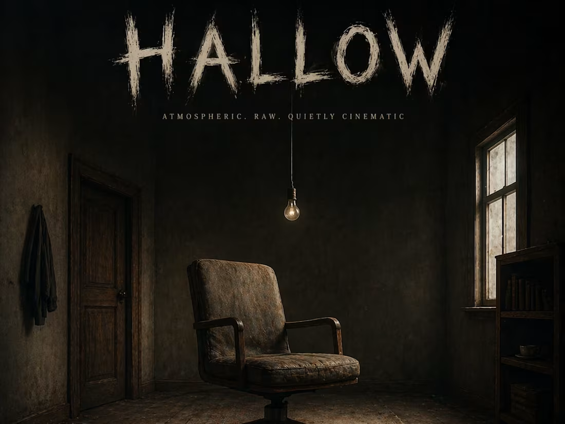
HALLOW: Atmospheric Visual Direction for Indie Alternative Music
This album cover concept for HALLOW captures a raw, cinematic stillness. Set within a dark, wooden interior, the composition focuses on a single light source and a solitary chair to evoke a sense of isolation and depth. By directing the transition from a ghosted font concept to this high-fidelity, moody environment, the visual perfectly mirrors the soulful and alternative nature of the music it represents.
When an experienced designer studies these sketches and attempts to bring them to life through design, the outcome can be truly remarkable. I also have a well-defined vision for directing designers to produce outstanding results.
1
50
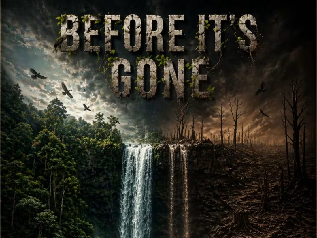
BEFORE IT’S GONE: A Visual Call for Climate Urgency
This environmental awareness campaign poster serves as a deeply human plea for climate action. By utilizing a large-scale split composition, the design contrasts a thriving, ancient forest against the harsh reality of deforestation and drought. Every detail, from the shifting water quality to the fading textures in the title, was directed to evoke a sense of inevitable loss and immediate responsibility. The final result is an urgent, high-impact piece that challenges the viewer to consider the legacy we are leaving behind.
When an experienced designer studies these sketches and attempts to bring them to life through design, the outcome can be truly remarkable. I also have a well-defined vision for directing designers to produce outstanding results.
1
44
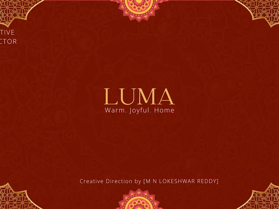
Brand Identity Direction — LUMA — Premium Home Decor
Complete brand direction for LUMA — a premium Indian home decor brand. Covers brand personality, color direction, visual world and AI concept visuals.
1
59

Brand Moodboard — JEEVA — Modern Indian Nutrition
JEEVA means life. A modern Indian nutrition brand that feels like a warm helpful friend giving you health guidance — never a clinical doctor giving you orders. Fresh leaf green, warm sunshine yellow, friendly rounded typography. Creative Direction by [M N LOKESHWAR REDDY]." Tags — nutrition branding, wellness brand, Indian health brand, moodboard, creative direction, brand identity
1
58

VOID: The Essence of Ultra-Minimalist Luxury Skincare
This project defines the visual identity for VOID, a luxury skincare brand rooted in the belief that "less is the most expensive thing in the world." The design features a matte black bottle sitting on a marble shelf against a clean white background, creating a cold and mysterious editorial aesthetic. By using specific lighting and blur effects to highlight the product, the final execution eliminates labels and trends to focus purely on a sharp, premium presence.
When an experienced designer studies these sketches and attempts to bring them to life through design, the outcome can be truly remarkable. I also have a well-defined vision for directing designers to produce outstanding results.
1
55
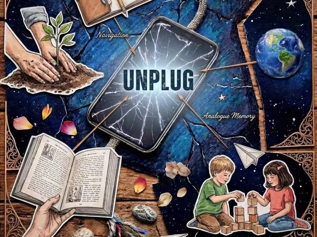
UNPLUG: A Digital Detox Visual Narrative
This social media campaign poster is designed to act as a "digital billboard" that stops viewers mid-scroll. Centered around a shattered screen and a disconnecting wire, the composition illustrates the beauty of life beyond screen time. By integrating "moments" like craftsmanship, navigation, and tactile play, the design promotes a quietly proactive and culturally aware lifestyle. The transition from the "broken piece" sketch to this rich, multi-layered visual ensures the message of disconnecting to reconnect is both powerful and clear.
When an experienced designer studies these sketches and attempts to bring them to life through design, the outcome can be truly remarkable. I also have a well-defined vision for directing designers to produce outstanding results.
1
52

SECOND WIND: Capturing the Raw Grit of Athletic Resilience
This campaign for SECOND WIND, a performance running shoe brand, focuses on bravery and the honest struggle of the athlete. By emphasizing the "breathless" moment of perseverance through a gritty, triumphant aesthetic, the design moves beyond traditional sports marketing to tell a story of endurance. Every element—from the sweat-drenched textures to the strategic color gradients—was directed to ensure the final execution remained true to the original, high-stakes concept.
When an experienced designer studies these sketches and attempts to bring them to life through design, the outcome can be truly remarkable. I also have a well-defined vision for directing designers to produce outstanding results.
1
51
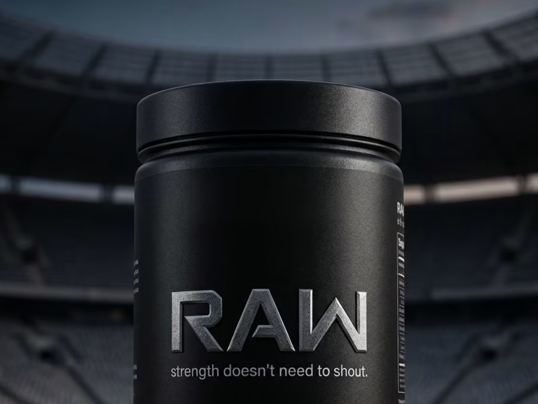
RAW: Premium Minimalism in Sports Nutrition Packaging
This project features the packaging design for RAW, a protein supplement brand built on the philosophy that "strength doesn't need to shout." The visual direction focuses on zero excess and a disciplined, sharp aesthetic. By placing the cylindrical tub in a vast stadium setting, the design communicates a "no audience, just work" mentality, transitioning a simple pencil concept into a confident, high-end brand identity.
When an experienced designer studies these sketches and attempts to bring them to life through design, the outcome can be truly remarkable. I also have a well-defined vision for directing designers to produce outstanding results.
1
48
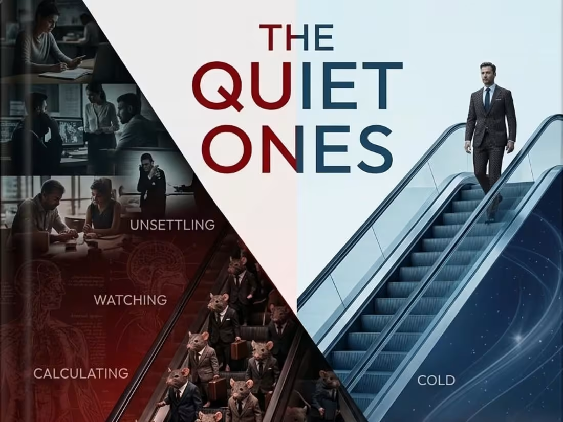
THE QUIET ONES: A Psychological Thriller Visual Concept
This book cover design explores the unsettling themes of a psychological thriller through a striking, divided composition. By juxtaposing the "louder ones"—represented by a corporate rat race—against the "quieter ones" and a confident figure rising above, the visual creates a cold, deeply intriguing atmosphere. The use of color gradients and symbolic imagery was meticulously directed from the initial pencil concept to ensure a high-impact, narrative-driven result.
When an experienced designer studies these sketches and attempts to bring them to life through design, the outcome can be truly remarkable. I also have a well-defined vision for directing designers to produce outstanding results.
1
38
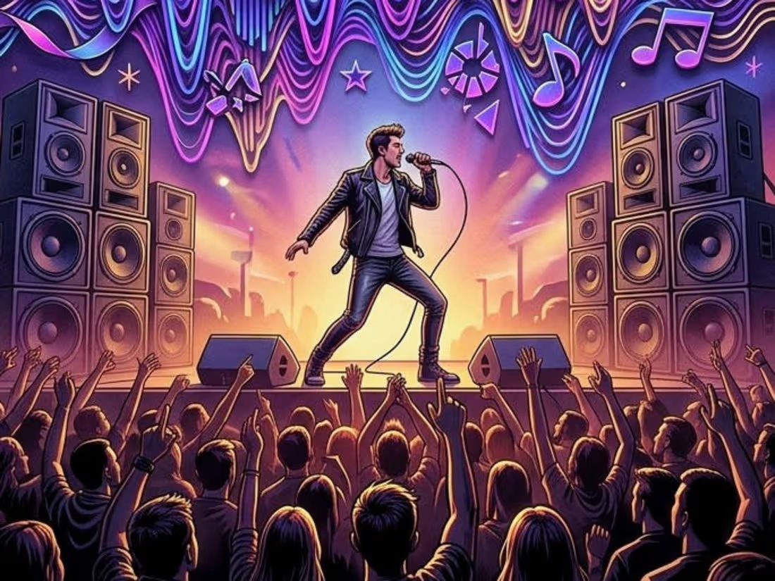
FREQUENCY: Visualizing the Energy of Underground Music
This poster design captures the raw, unapologetic pulse of an underground music festival. By centering the composition on distorted horizontal sound waves and high-energy silhouettes, the visual directs the viewer to "lose themselves in sound." The transition from manual concept to this vibrant, neon execution emphasizes the intensity of the event.
When an experienced designer studies these sketches and attempts to bring them to life through design, the outcome can be truly remarkable. I also have a well-defined vision for directing designers to produce outstanding results.
2
51
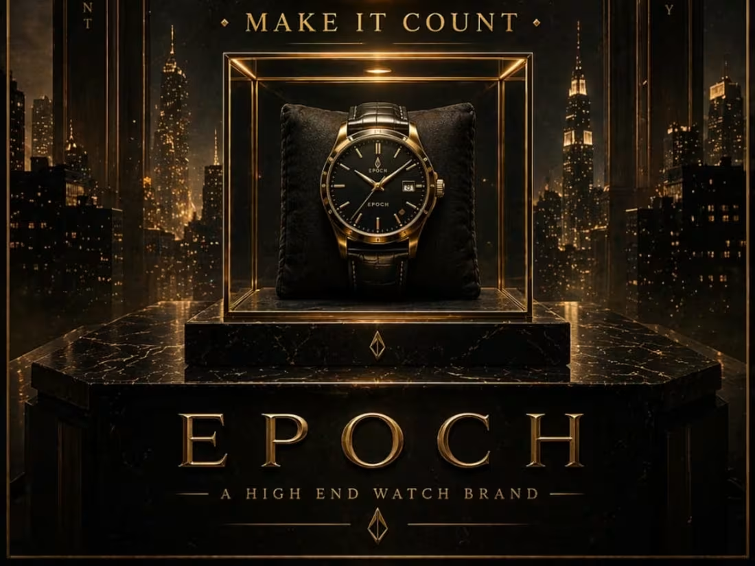
EPOCH: Directing Luxury through Urgency and Elegance
This project showcases the visual identity for EPOCH, a high-end watch brand centered on the philosophy of making every second count. By transitioning from detailed hand-drawn sketches to final digital execution, I’ve captured a sense of "heavy permanence" and inevitable time.
When an experienced designer studies these sketches and attempts to bring them to life through design, the outcome can be truly remarkable. I also have a well-defined vision for directing designers to produce outstanding results.
2
42
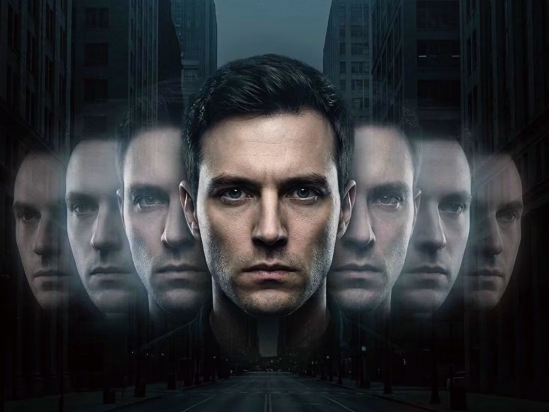
ECHO — Every Choice Leaves a Ghost
A psychological sci-fi poster visualizing identity, repetition, and the haunting weight of choices through layered echoes of the self. If a designer looks to do this, the results are mind-blowing—and I have a vision for directing designers to create truly great design.
1
42

CTRL — Who’s Really in Control?
1
42
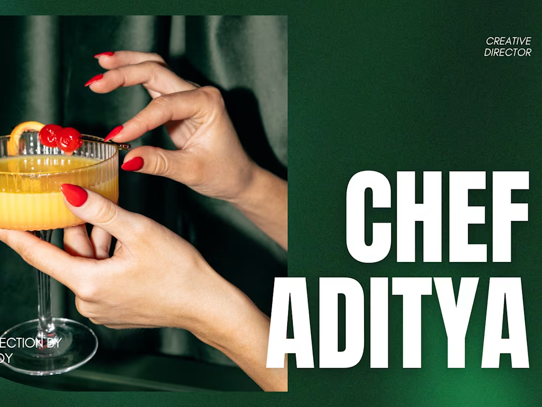
Personal Brand Direction — Chef Aditya — Young Indian Chef
1
48
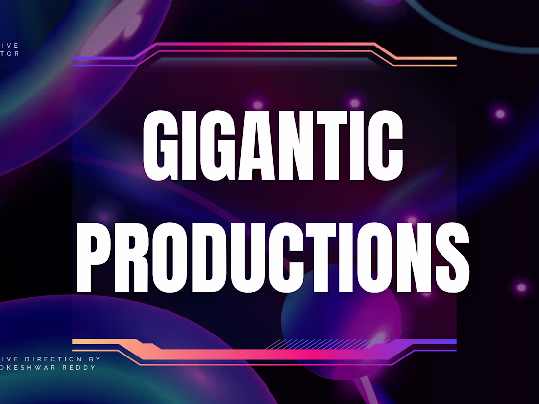
Creative Director - Brand Identity Direction — GIGANTIC PRODUCTIONS — Luxury Film Studio
1
54
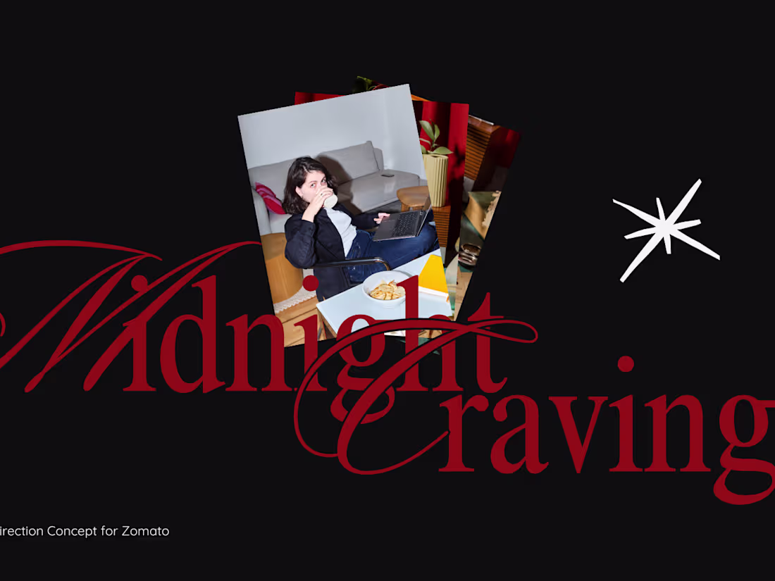
Campaign Direction Concept — Zomato Midnight Cravings
1
59
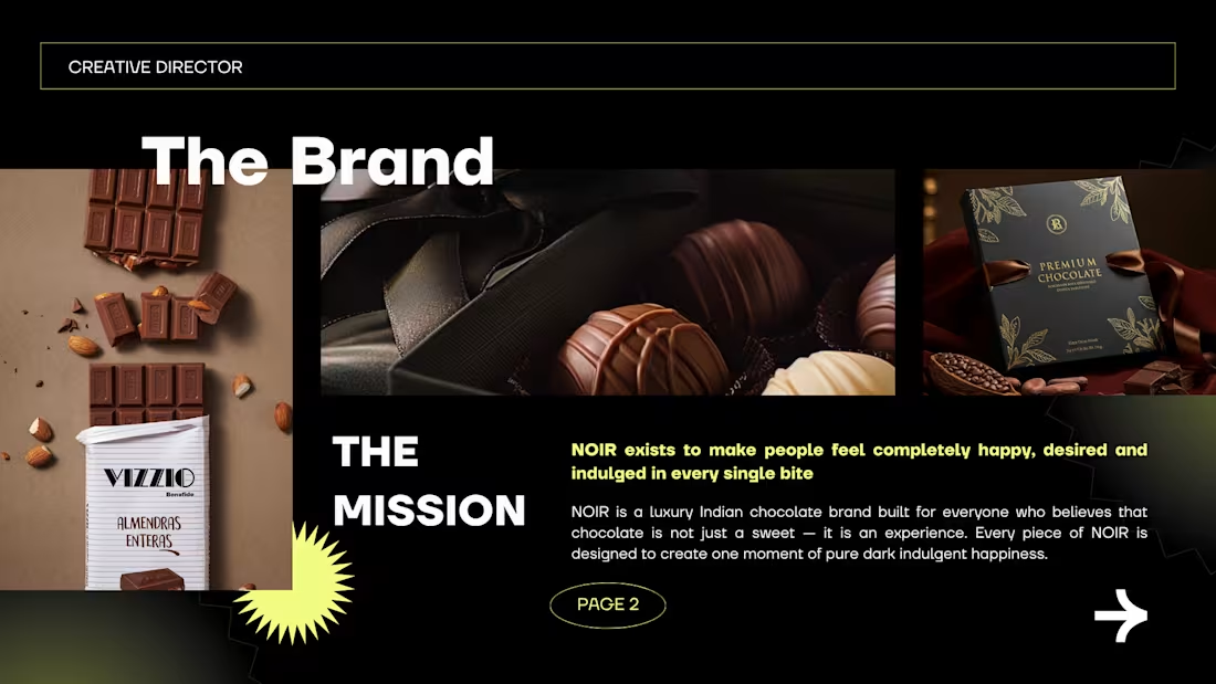
Brand Identity Direction — NOIR — Luxury Chocolate Brand
1
69
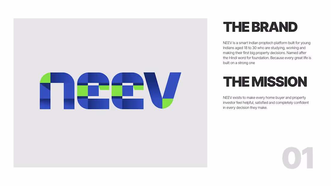
Brand Identity Direction — NEEV — Smart Indian Proptech Platform
1
72
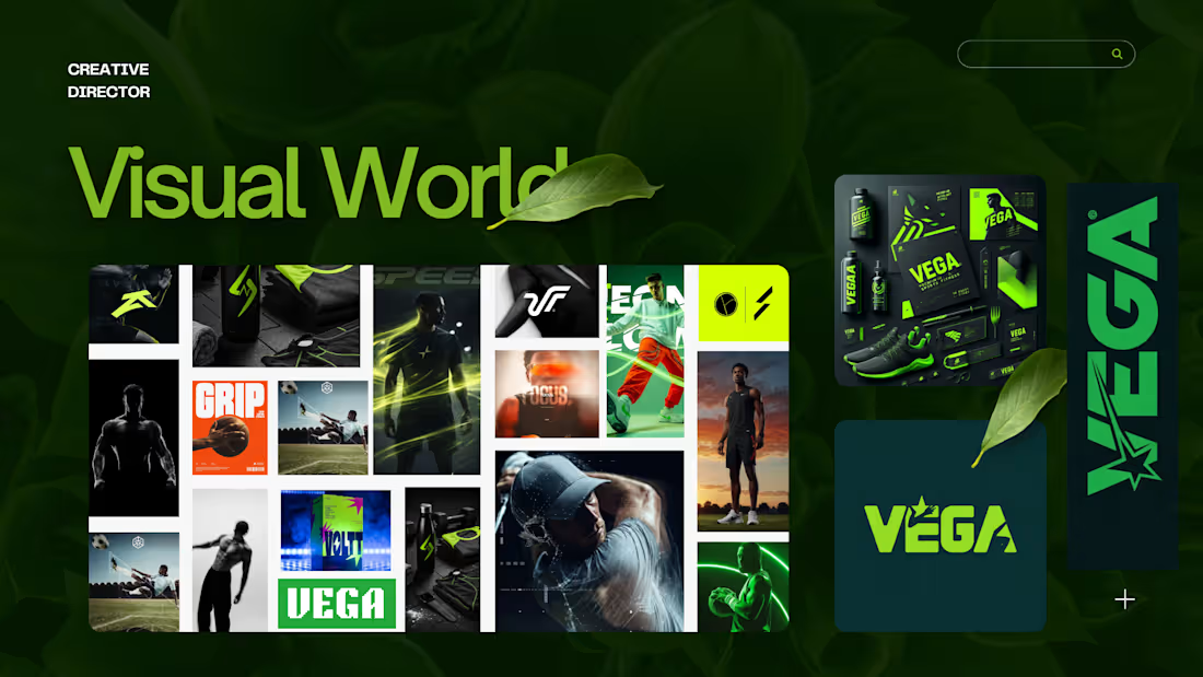
Brand Identity Direction — VEGA — Premium Indian Sports Brand
1
79
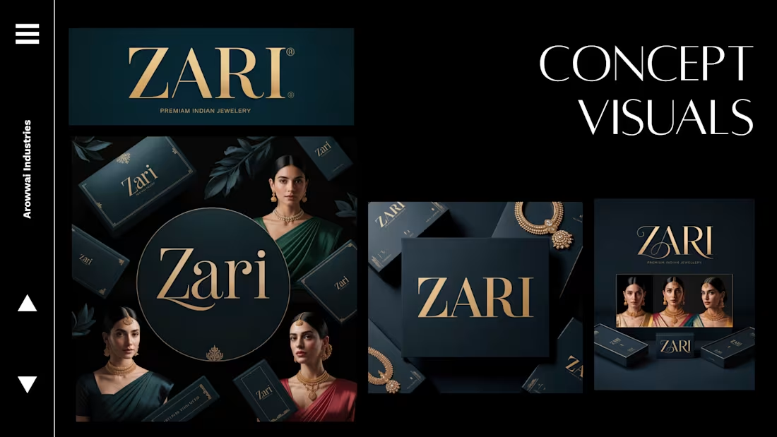
Brand Identity Direction — ZARI — Premium Indian Jewellery
1
79
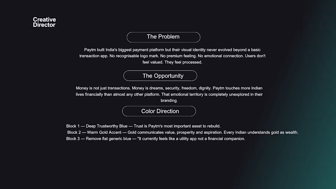
Brand Redesign Concept — Paytm — Indian Fintech
Complete brand redesign concept for Paytm. Covers logo direction, color direction, typography direction and complete visual world. From transaction app to trusted financial companion
1
63
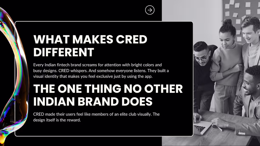
Logo Direction Study — CRED — Gold Standard of Indian Brand Identity
1
62

The Concept-to-Execution Series | Creative Director
1
63
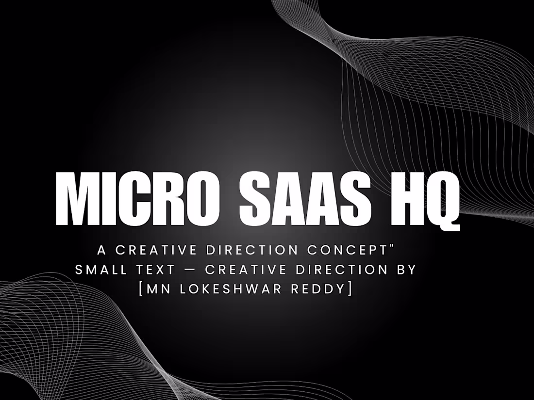
Brand Direction Concept — Micro SaaS HQ — SaaS Startup
1
73
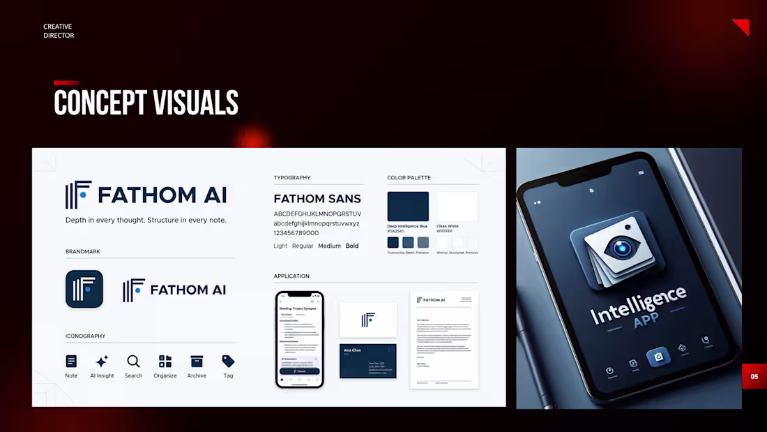
Brand Direction Concept — Fathom 3.0 — AI Startup
1
77
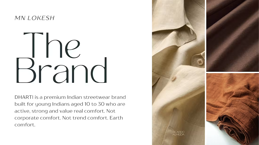
Brand Identity Direction — DHARTI — Premium Indian Streetwear
1
83
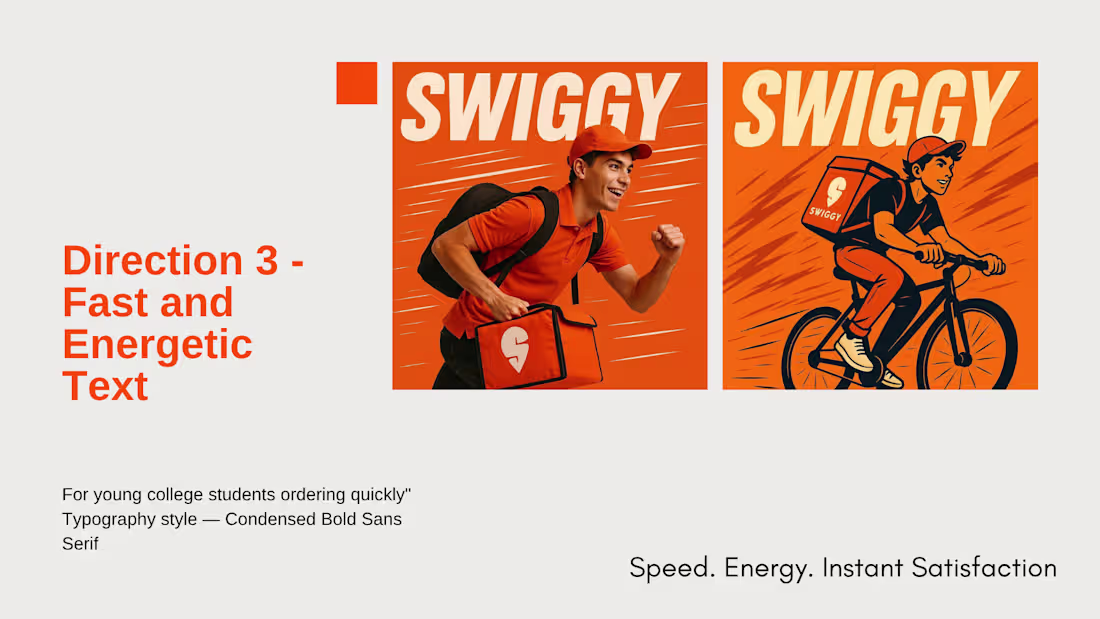
Swiggy — Typography Direction Study — 4 Directions
1
94
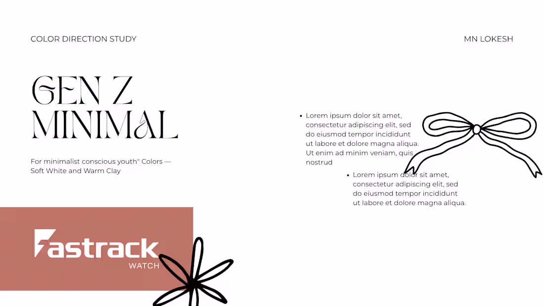
Fastrack — Color Direction Study — 4 Directions
1
100
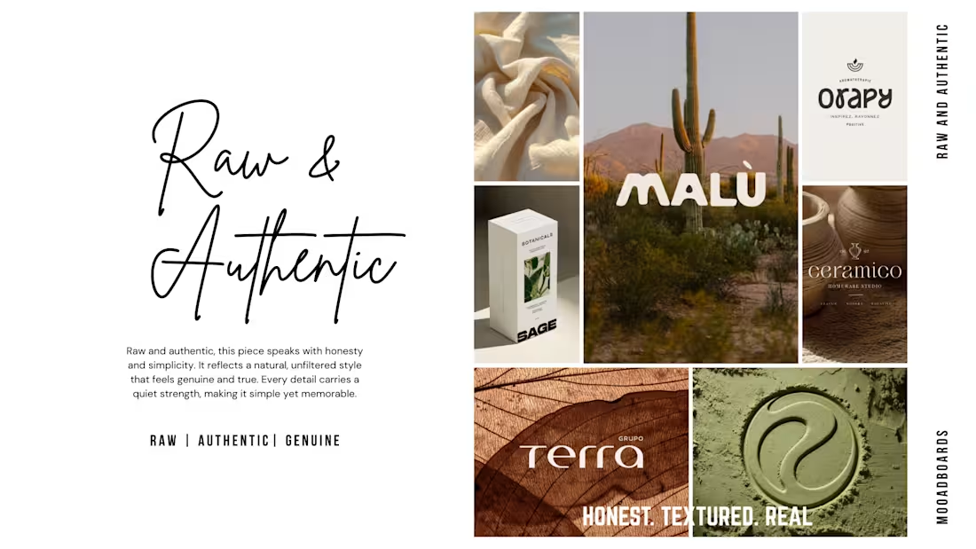
other 2 moodboards you can checkout
1
99
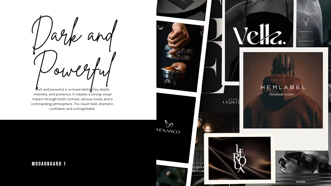
Moodboard Series — 5 Visual Worlds — Creative Direction by me
1
92
This project highlights the evolution of an idea, beginning with a raw pencil storyboard (as seen in the initial sketch) that mapped out the core composition
1
96
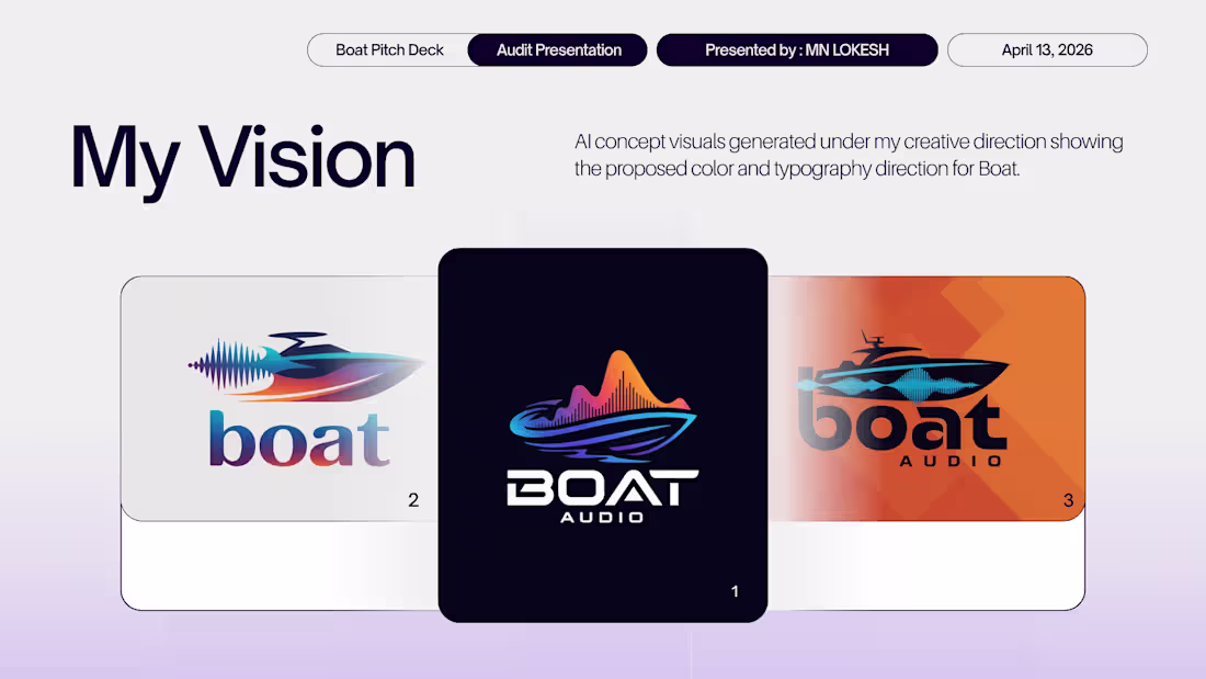
My redisigned logos for Boat brand as a view of a Creative Director.
1
106
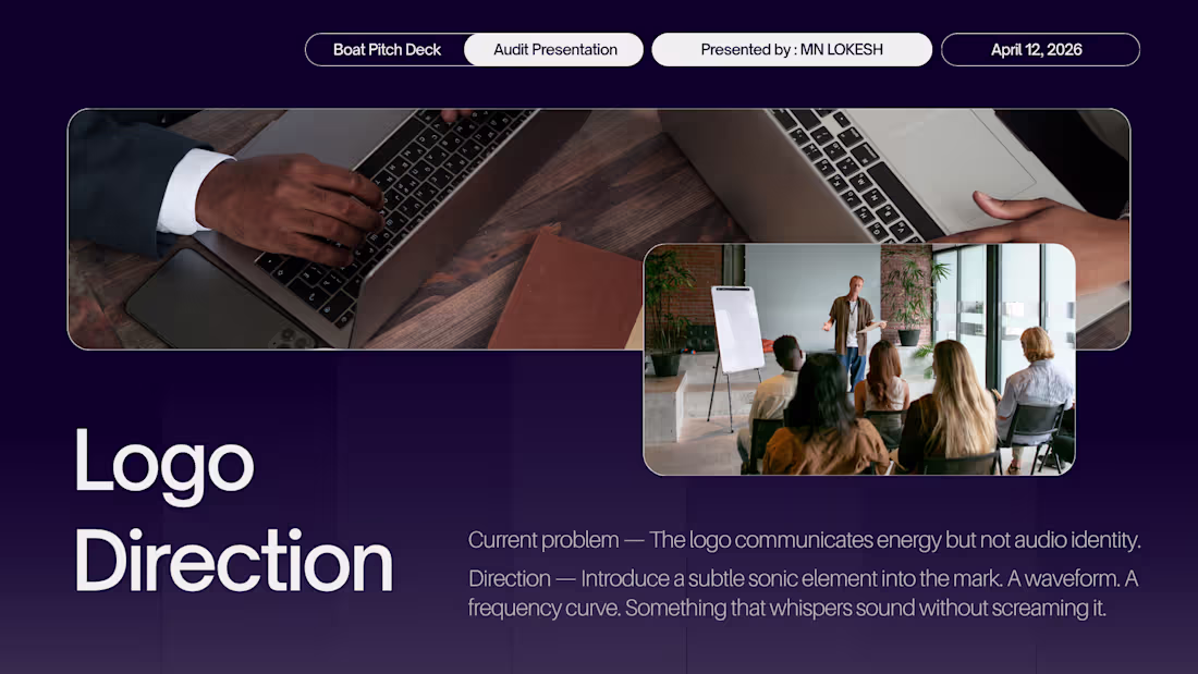
Brand Audit — Boat — Color Direction
Boat sells sound but looks silent. Here is the color direction that fixes that.
1
94
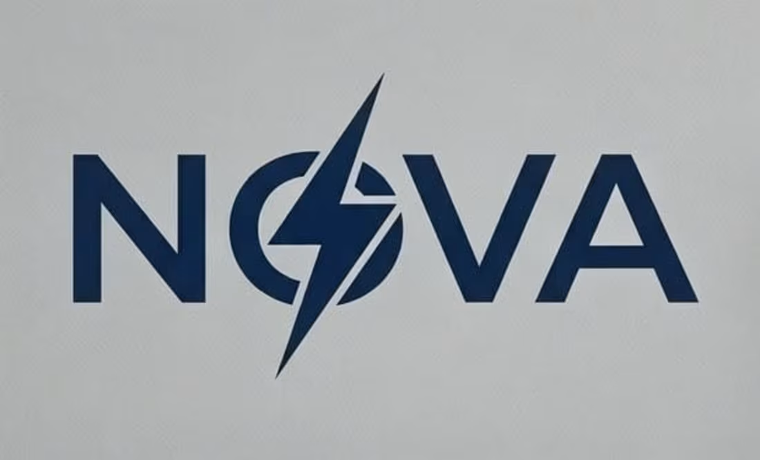
Visual Identity & Logo Systems for Tech Startups: The NOVA Case Study
1
96
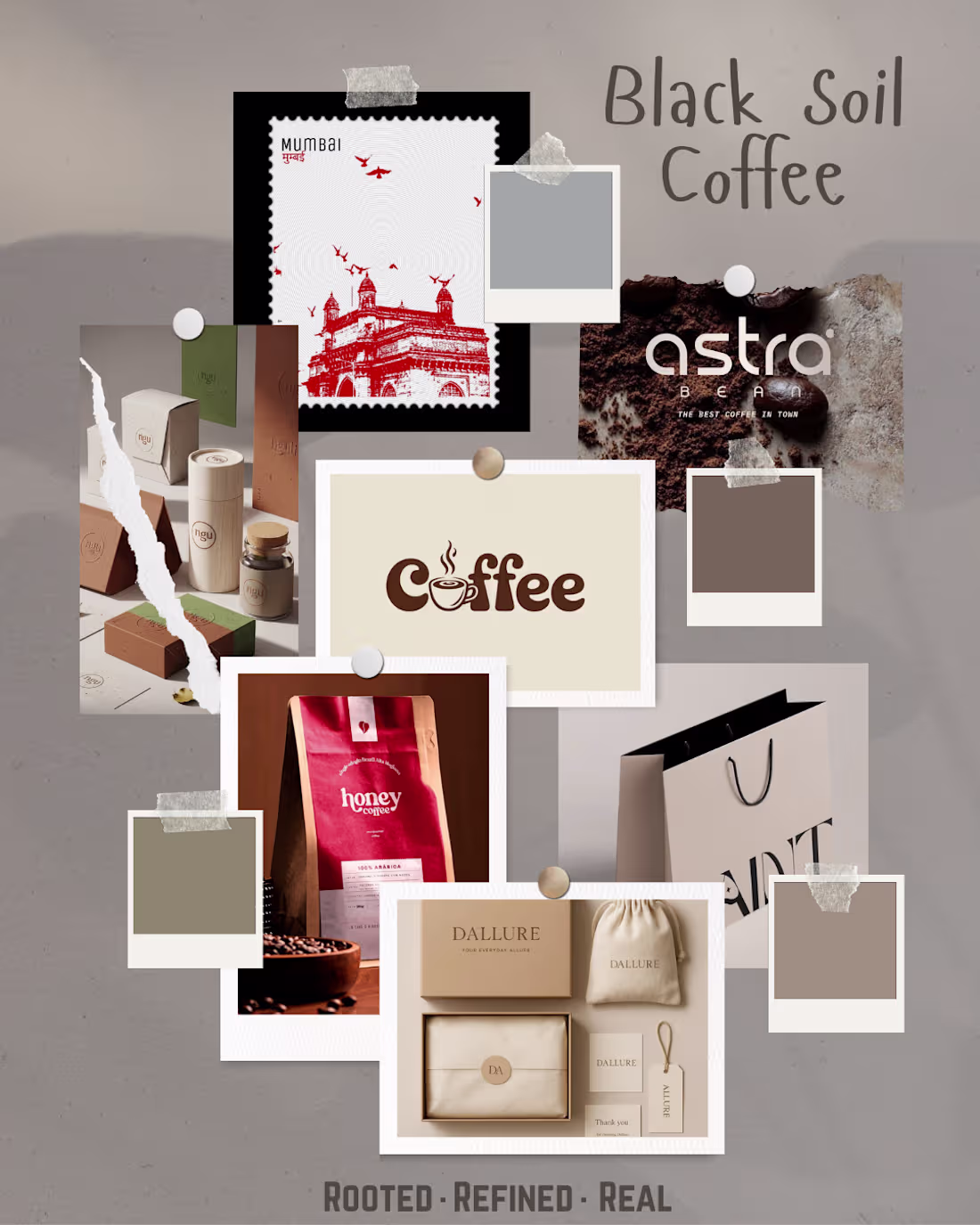
Brand Direction Concept — Black Soil Coffee
1
84