MN LOKESH
I am a Creative Director helping brands in their craft.
New to Contra
MN is building their profile!

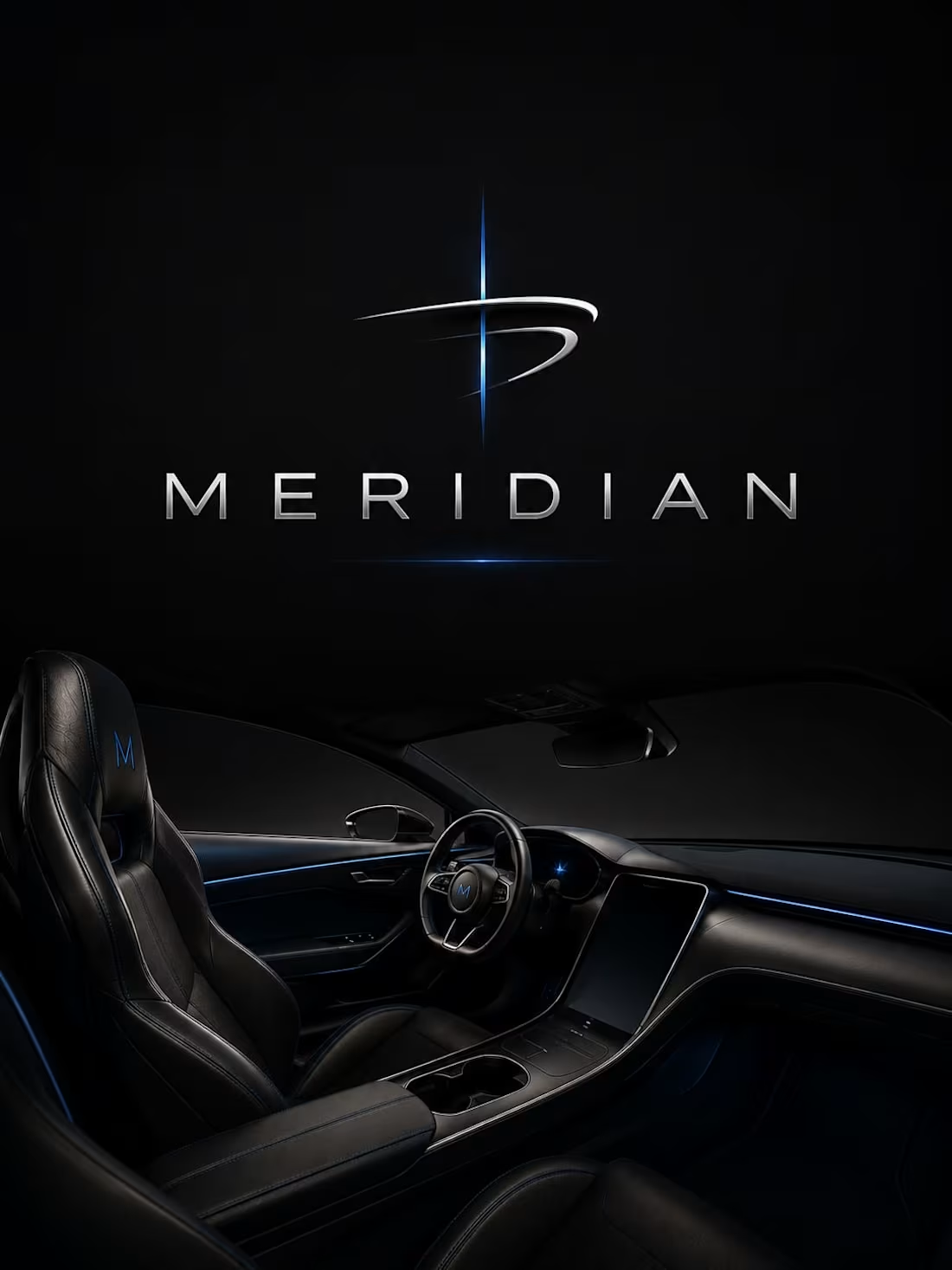
MERIDIAN RESERVE — Limited-Edition Whiskey Packaging System
MERIDIAN RESERVE is 118 hand-numbered bottles — the final unrepeatable release from a century-old distillery before the warehouse closes forever.
The visual direction lives in dark walnut, ebony, aged brass, smoked glass, and archival paper — a place ending, and an object being made permanent from it.
Deep amber whiskey-gold backlit and glowing, paired with vivid burgundy wax seals — rich, alive, never flattened by faded-vintage filter.
Every frame layers hero object with tools, documents, materials, and environment — density and archival reverence working together.
This is how you preserve a place inside a bottle.
M N LOKESHWAR REDDY, Creative Director
1
1
15
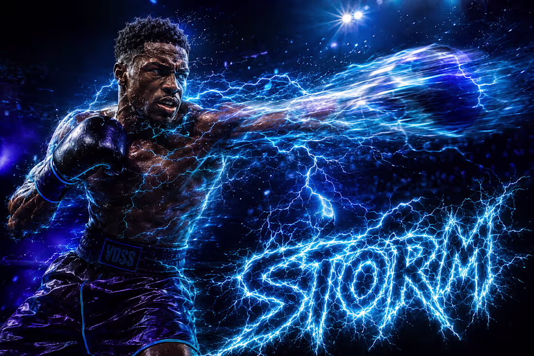
STORM & STONE — Championship Boxing Poster Series
STORM & STONE is a maximalist championship boxing poster series built around one collision — the most electric mind in boxing against its most immovable body.
Jaylen "Storm" Voss carries electric-cyan light arcing beneath his skin. Marcus "Stone" Kade carries molten orange-red cracking through volcanic rock flesh. Neither is a lighting effect — both are physically-behaving elements embedded in real skin and muscle.
Typography is built from the same material as each fighter — "STORM" in branching lightning strokes, "STONE" in glowing magma-veined obsidian.
Full saturation. Full scale. Nothing muted. Nothing apologetic.
M N LOKESHWAR REDDY, Creative Director
1
1
35
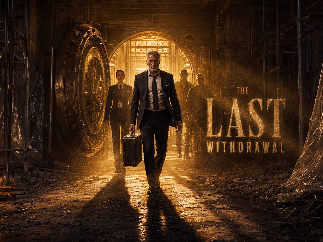
The Last Withdrawal — Heist Thriller Film Visual Direction
The Last Withdrawal is an elegant adult heist-thriller built on one double meaning — a vault's final operating day, and a crew's unspoken final job. Every frame carries both readings simultaneously without stating either.
The visual world stages a collision between century-old craftsmanship — aged brass, oxidized copper, worn marble — and encroaching demolition — raw concrete, exposed rebar, halogen work-light.
Two temperatures, two eras, one frame. The vault door is the film's true main character.
This is tension through competence and patience. Never explosions.
M N LOKESHWAR REDDY, Creative Director
1
1
25
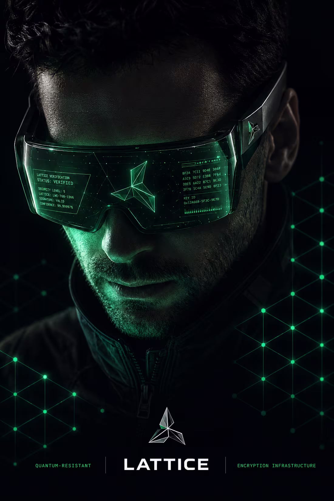
LATTICE — Quantum-Resistant Encryption Infrastructure Brand Direction
LATTICE is the encryption infrastructure built for a threat that hasn't arrived yet — and won't be a surprise when it does.
The visual direction lives in Obsidian Black, Verified Emerald, Platinum White, Slate Titanium, and Cold Steel — precise, structural, unshaken.
Verified Emerald never fills — it only glows, catches light, and illuminates like a signal inside the dark.
The logo is three interlocking rhomboid facets sharing one central vertex — real lattice-cryptography geometry, not decoration.
This is what post-quantum security looks like before the threat is visible.
M N LOKESHWAR REDDY, Creative Director
1
2
57
Modern Gadget Advertising Campaign — 18-Product Cinematic Ad Direction
One disciplined system. Eighteen completely different products. Zero repetition.
This campaign demonstrates that studio-level ad-craft can flex across radically different materials, environments, and product geometries while holding a single confident visual language throughout.
Every frame carries the full zone system — headline, callouts, hero product, environment, annotation lines, CTA, and description — working together at once, never simplified, never compromised.
Each frame reads more ambitious than the one before it. The campaign escalates. It doesn't plateau.
This is what range under discipline looks like.
M N LOKESHWAR REDDY, Creative Director
1
1
50
RIOTCAST — Underground Streetwear & Music Culture Brand Direction
RIOTCAST is built for the ones who found their scene through a flyer, a burned CD, or a friend's group chat — not an algorithm.
The visual direction runs on Riot Black, Concrete White, Signal Green, and Riot Red — raw, interference-laced, DIY energy built with real construction discipline.
The logo is a single graffiti tag executed in one continuous gesture — hand-made mark against mechanical grotesk, a frequency not a name.
The Skip runs through everything — a paint-gap pulled from the logo itself, a signature of static across every touchpoint.
This is streetwear that still has signal.
M N LOKESHWAR REDDY, Creative Director
1
1
59
VELLUM — Generative AI Design Platform Brand Direction
VELLUM is the only generative design platform built for people who already have taste — not for people trying to buy it.
The visual direction lives in Boundary Black, Deep Violet, Hot Magenta, Ember Orange, and Parchment Ochre — two worlds with a permanent line between them.
The logo is a geometric seal bisected by one hand-torn diagonal — human imperfection cutting through computational precision, the concept made visible.
Two typographic voices, two motif systems, two worlds that never blend outside the defined boundary.
This is what authorship looks like inside a generative platform.
M N LOKESHWAR REDDY, Creative Director
1
3
64
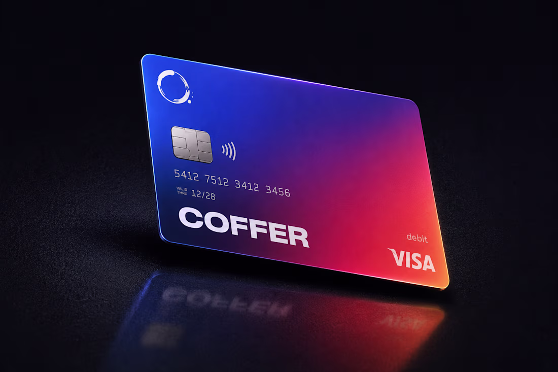
COFFER — Digital Banking Brand Direction for Independent Creators
COFFER is the financial infrastructure built for people whose paycheck was never guaranteed to begin with.
One connected system for invoicing, tax, and real-time income — built by people who've lived the freelance rollercoaster themselves.
The visual direction runs on Indigo Base, Coffer Blue, Ember Coral, and Amber Flare — with the signature gradient wrap as the core visual identity engine.
The logo is an irregular coffee-stain ring — imperfect, asymmetric, human — a financial brand willing to look like the people it's built for.
Confident. Warm. Unbanklike.
M N LOKESHWAR REDDY, Creative Director
4
3
108
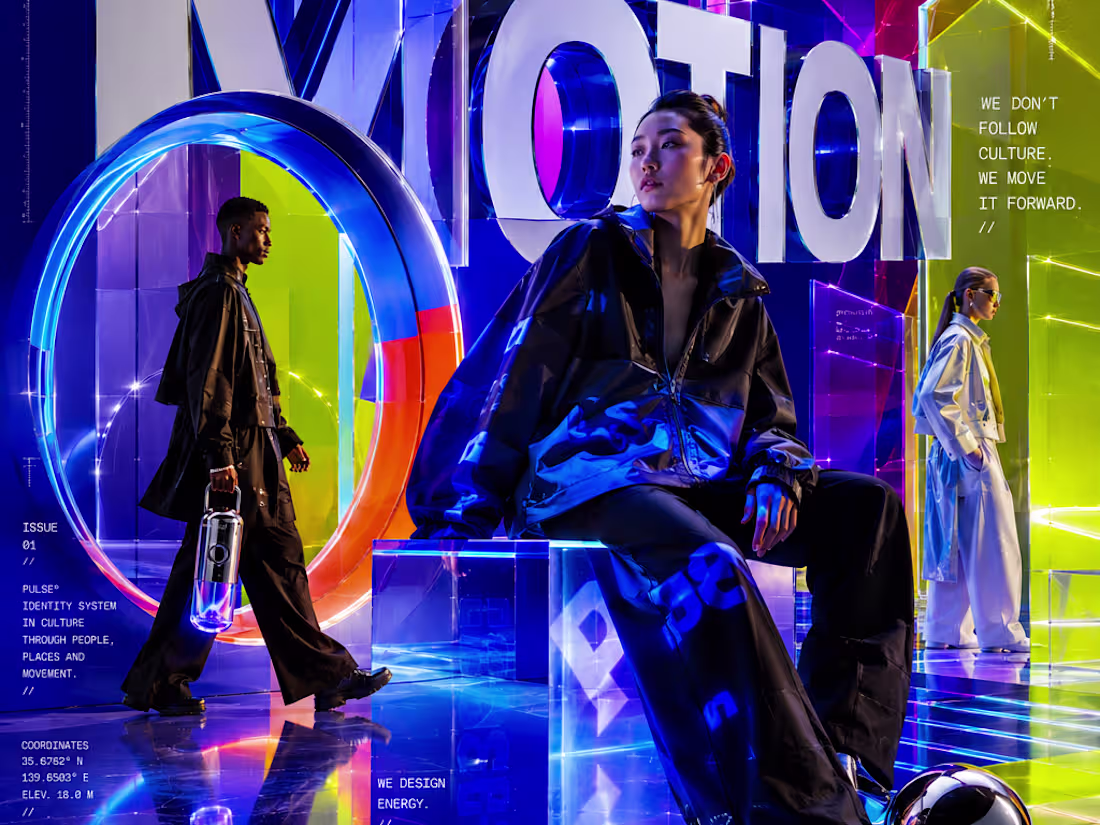
PULSE° — Energy You Can See
PULSE° designs energy, not products — a new category of collectible objects where light, color, and interaction become emotional experience.
The visual direction runs on electric blue, acid lime, hyper violet, digital magenta, and neon orange — bold, graphic, alive.
Materials amplify light itself — mirror chrome, liquid acrylic, holographic film, LED glass.
Typography never sits still — it wraps, breaks, and becomes the composition.
This is what energy looks like when it takes form.
M N LOKESHWAR REDDY, Creative Director
1
1
72
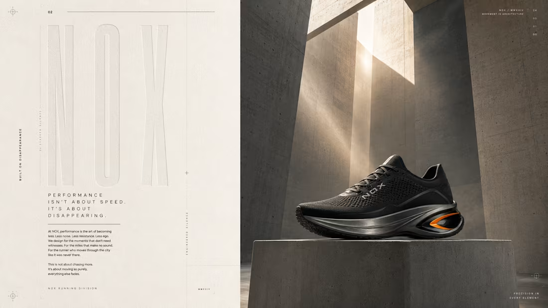
NOX — Performance Running Footwear Brand Direction
NOX is built on disappearance — run until the city disappears.
Not a shoe brand. A movement system built around the flow state, where breath, body, and city dissolve into one.
The visual direction lives in matte black, concrete grey, titanium silver, off white, neon orange, and soft smoke — monumental, architectural, cinematic.
Typography is ultra condensed with massive tracking — type that becomes architecture.
The feeling is the hero. Nothing else.
This is performance as disappearance.
M N LOKESHWAR REDDY, Creative Director
1
1
68
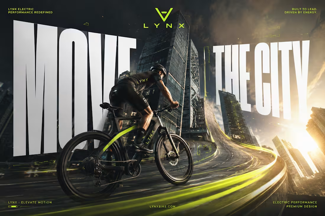
LYNX — Premium Electric Bicycle Brand Direction
LYNX is built on one idea — the city moves with you.
This isn't a bicycle company; it's the feeling of the city reshaping around the rider.
The visual direction lives in electric lime, graphite black, white, chrome silver, and deep asphalt grey — hyper-realistic CGI meeting commercial precision.
Typography is huge, extra bold, compressed — filling the frame, never quiet.
Every frame moves like a Nike campaign with Porsche discipline.
This is what riding as a superpower looks like.
M N LOKESHWAR REDDY, Creative Director
1
1
94
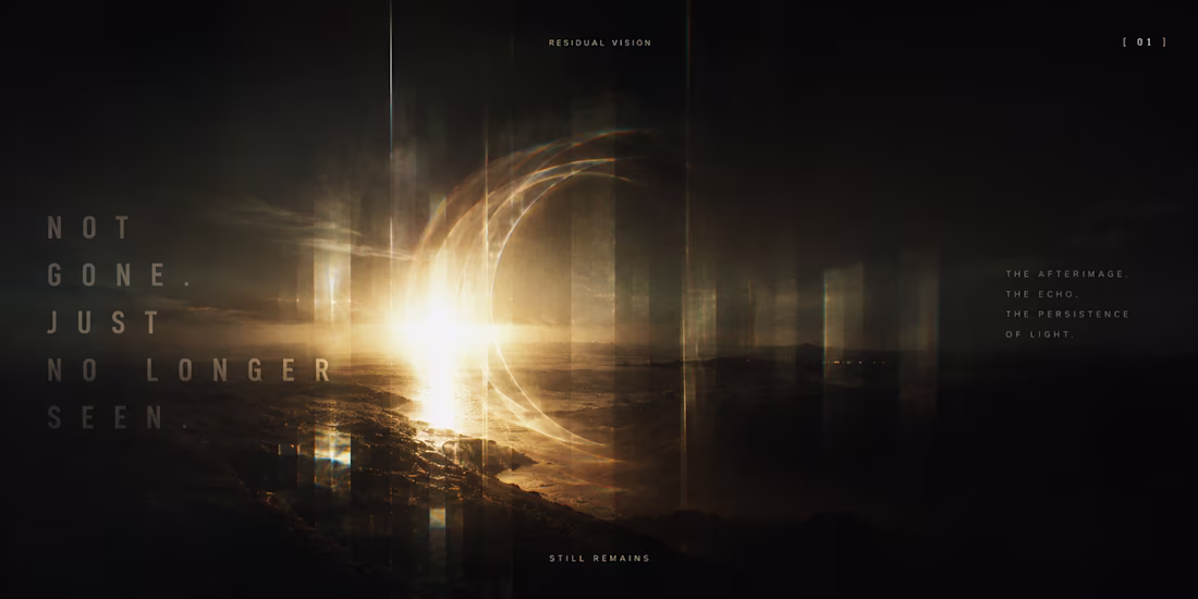
AFTERIMAGE — A Visual Memory Exploration
AFTERIMAGE is not a company, a product, or a service — it's an exploration of residual vision.
The world is built on what stays after the light is gone — ghost forms, light trails, negative space, persistence.
No obvious references. No obvious packaging. No obvious logo.
A territory nobody owns, built from how memory holds onto light.
This is what it looks like when you close your eyes and it's still there.
M N LOKESHWAR REDDY, Creative Director
1
51
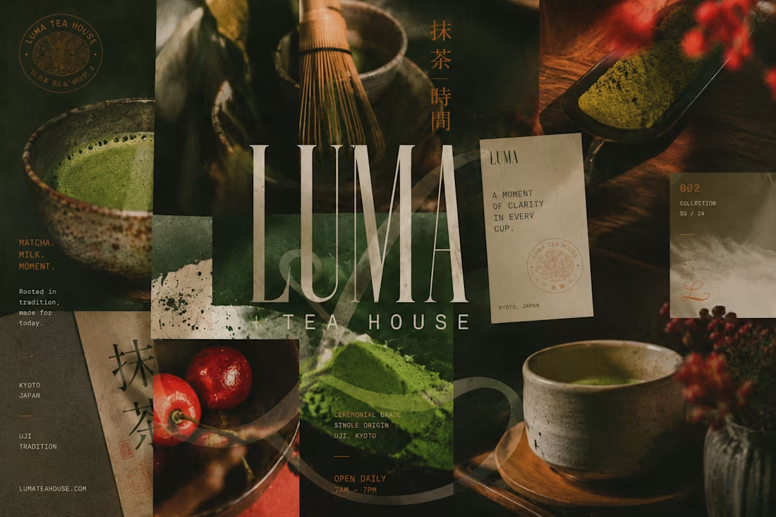
LUMA — Specialty Matcha & Tea House Brand Direction
LUMA is a contemporary tea culture brand built on one idea — slow down beautifully.
The visual direction lives in deep matcha green, cream white, burnt orange, cherry red, and warm brown — warm, young, alive.
Typography pairs a large condensed serif with an expressive grotesk — editorial and textural.
Photography is flash-lit, grainy, imperfect — caught moments, never staged.
This is what modern tea culture looks like.
M N LOKESHWAR REDDY, Creative Director
1
1
62
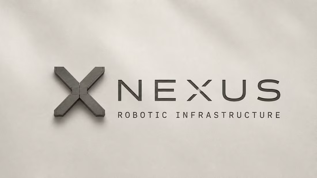
NEXUS — Robotics Infrastructure Brand Direction
NEXUS builds autonomous robotic systems for warehouses, ports, factories, and logistics — precision in motion.
The visual direction lives in bone white, graphite, signal orange, and steel grey — intelligent, engineered, modular.
Typography is Suisse Int'l style paired with technical mono — quiet, precise, systems-driven.
Every frame holds engineered calm.
This is what infrastructure built to move the world looks like.
M N LOKESHWAR REDDY, Creative Director
1
1
53
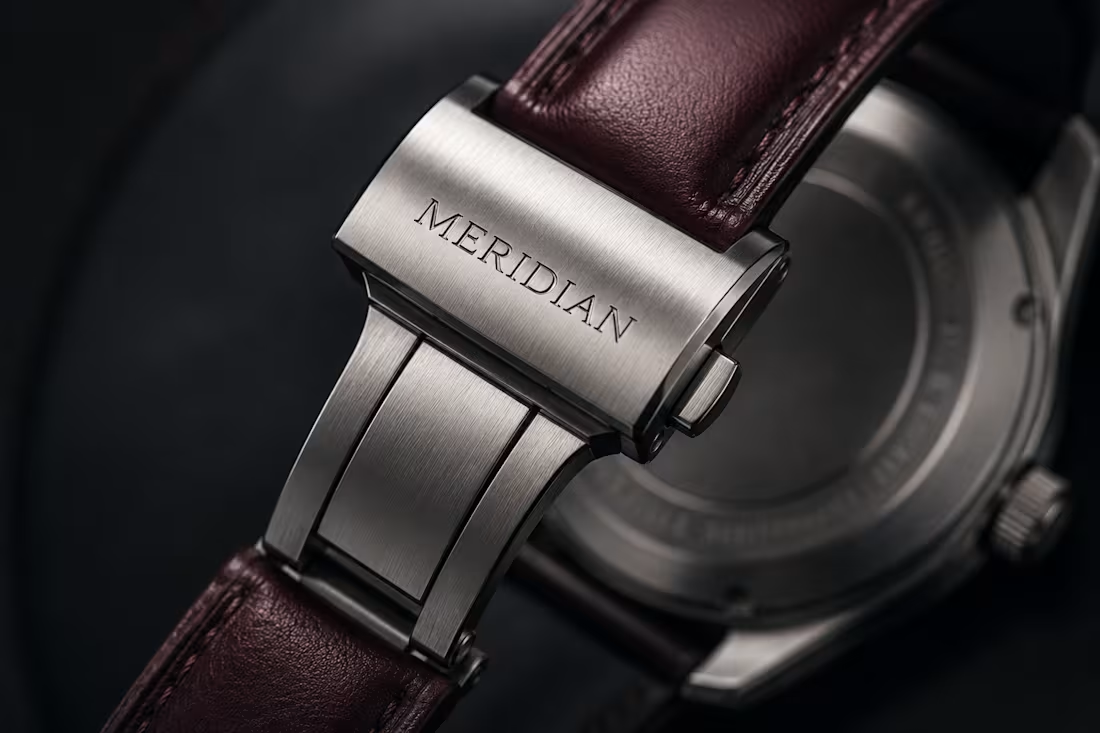
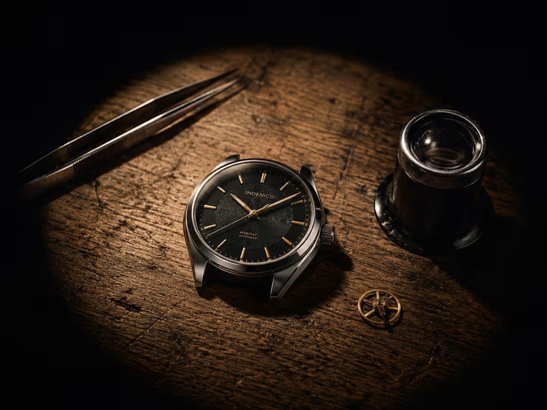
AI Creative Direction for Watchmaking Brand
MERIDIAN is watchmaking built on one belief — time, kept well.
The visual direction lives in ivory, midnight black, brushed steel, and deep burgundy — precise, enduring, understated.
Typography is transitional serif paired with grotesk sans — editorial, restrained, timeless.
Every frame holds quiet confidence in its craft.
This is what time deserves to look like.
M N LOKESHWAR REDDY, Creative Director
1
1
43
MONO — High-End Audio Brand Direction
MONO is high-end audio built on one principle — hear what matters.
The visual direction lives in soft black, warm white, brushed aluminum, and deep walnut — precise, quiet, intelligent.
Typography is Swiss neo-grotesk paired with technical serif — calm refined, architectural.
Every frame holds restraint as its own kind of statement.
This is what timeless sound design looks like.
M N LOKESHWAR REDDY, Creative Director
1
1
36
NORTHLINE — Premium Outdoor Equipment Brand Direction
NORTHLINE is premium outdoor equipment built for the distance.
The visual direction lives in slate grey, forest green, bone white, and burnt orange — enduring, functional, honest.
Typography is neo-grotesk and technical mono — engineered, timeless, never decorative.
Every frame holds quiet confidence.
This is what gear built to last looks like.
M N LOKESHWAR REDDY, Creative Director
1
2
56
TAILS — Premium Pet Care Brand Direction
TAILS is premium pet care built on one truth — because they're family, too.
The visual direction lives in warm white, olive green, clay beige, and charcoal — calm, honest, and grounded.
Typography is rounded and friendly, never childish, always contemporary.
Every frame holds warmth without performance.
This is what everyday trust looks like.
M N LOKESHWAR REDDY, Creative Director
1
1
49
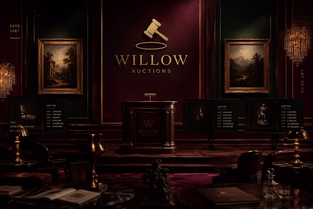
Williow — High End Premium Global Auction Brand Direction
Williow is a global auction house built for those who bid on the extraordinary.
The visual direction moves in deep burgundy and dark emerald — the weight of old money, the confidence of real power.
Every frame carries the tension of a room where everything is worth something.
Bold. Strong. Unapologetically premium.
This is what high-stakes auction identity looks like.
M N LOKESHWAR REDDY, Creative Director
1
1
44
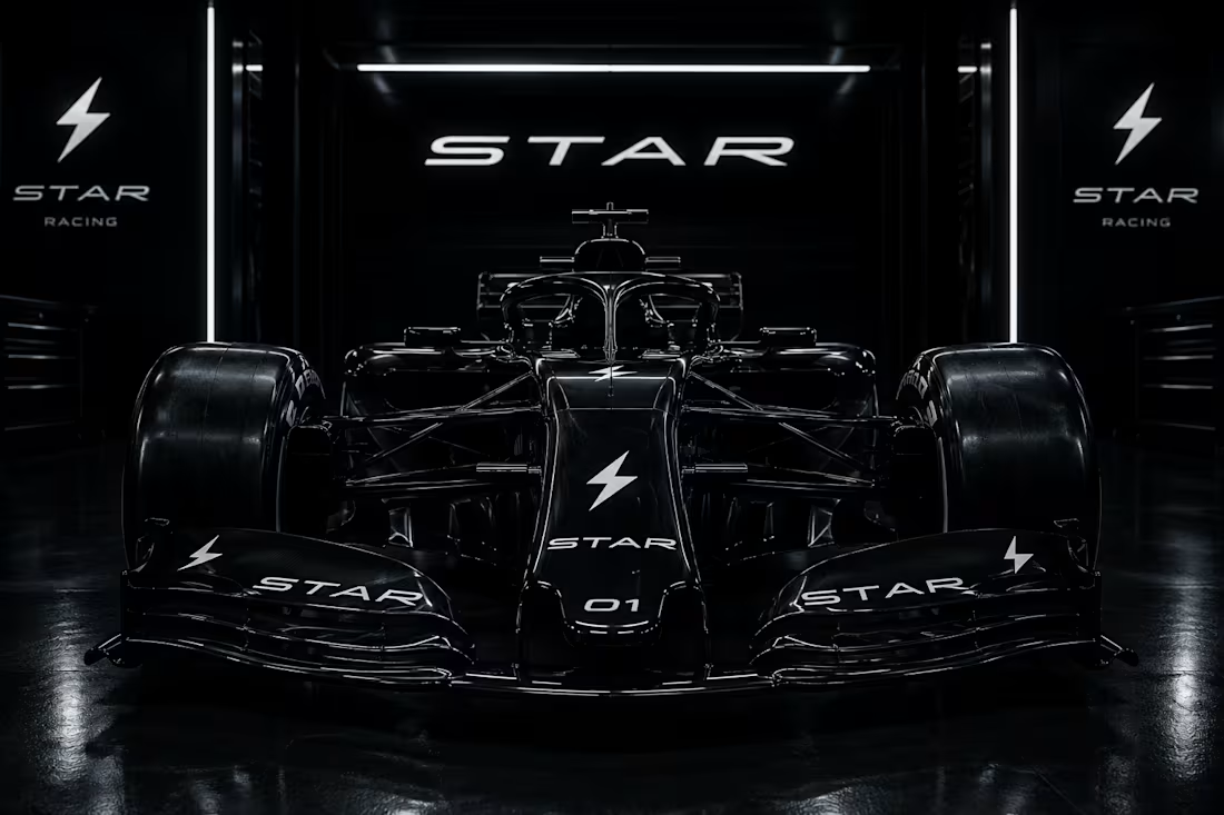
Star — Formula 1 Racing Team Brand Direction
Star is a Formula 1 team built on speed, technology, and confidence.
The visual direction moves in carbon black and electric white — precision stripped to its core.
Typography carries the weight of real F1 DNA with its own distinct mark.
Nothing hesitates. Nothing slows.
This is what racing identity looks like at the highest level.
M N LOKESHWAR REDDY, Creative Director
1
1
49
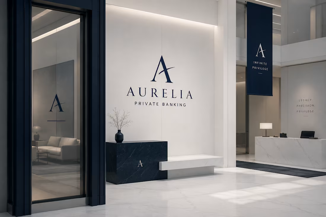
Aurelia — Ultra High Net Worth Private Banking Brand Direction
Aurelia is private banking built for those who have already arrived.
The visual direction moves in pure white and deep blue — silence and depth in the same breath.Nothing performs. Nothing announces.
Every frame holds the weight of generational wealth without saying a word.
This is what financial authority looks like at its highest level.M N LOKESHWAR REDDY, Creative Director
1
1
61
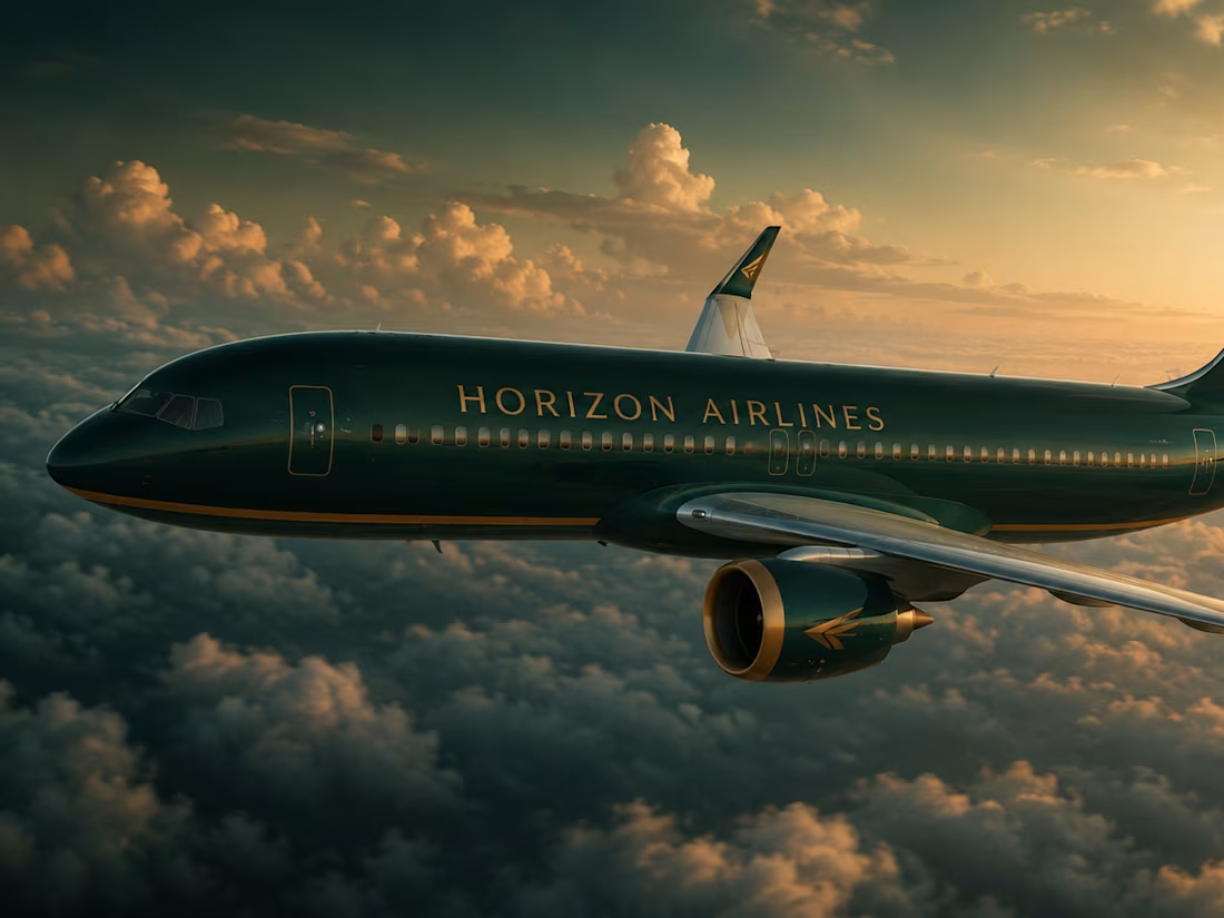
Horizon Airlines — Premium Luxury Airline Brand Direction
Horizon Airlines is built on three commitments — premium, organic, and safe.
The visual direction moves in deep green and warm orange — grounded and alive at the same time.Typography carries the authority of classic aviation with a quiet distinction of its own.Every frame holds the weight of luxury without noise.This is what modern premium air travel looks like.
M N LOKESHWAR REDDY, Creative Director
1
1
47

Lishy — Clean Organic Soap Brand Direction
Lishy is a lemon soap brand. The direction is clean, soft, and organic — rooted in warm yellow and gentle orange tones pulled from the fruit itself. Typography is playful with a quiet richness underneath. The visual world feels natural, handcrafted, and honest. No noise. No excess. Just warmth and intention in every frame.
M N LOKESHWAR REDDY, Creative Director
1
1
45

CREMO — Skincare Brand Identity
Cremo is a skincare brand direction project built around a palette of blush pink, cool blue, and orange — a combination that communicates both care and confidence. The visual system is designed to feel premium without distance, clinical without coldness. Every touchpoint — from packaging to campaign — holds the same luminous, skin-close atmosphere. Delivered as a complete creative direction by M N LOKESHWAR REDDY, Creative Director.
1
1
54
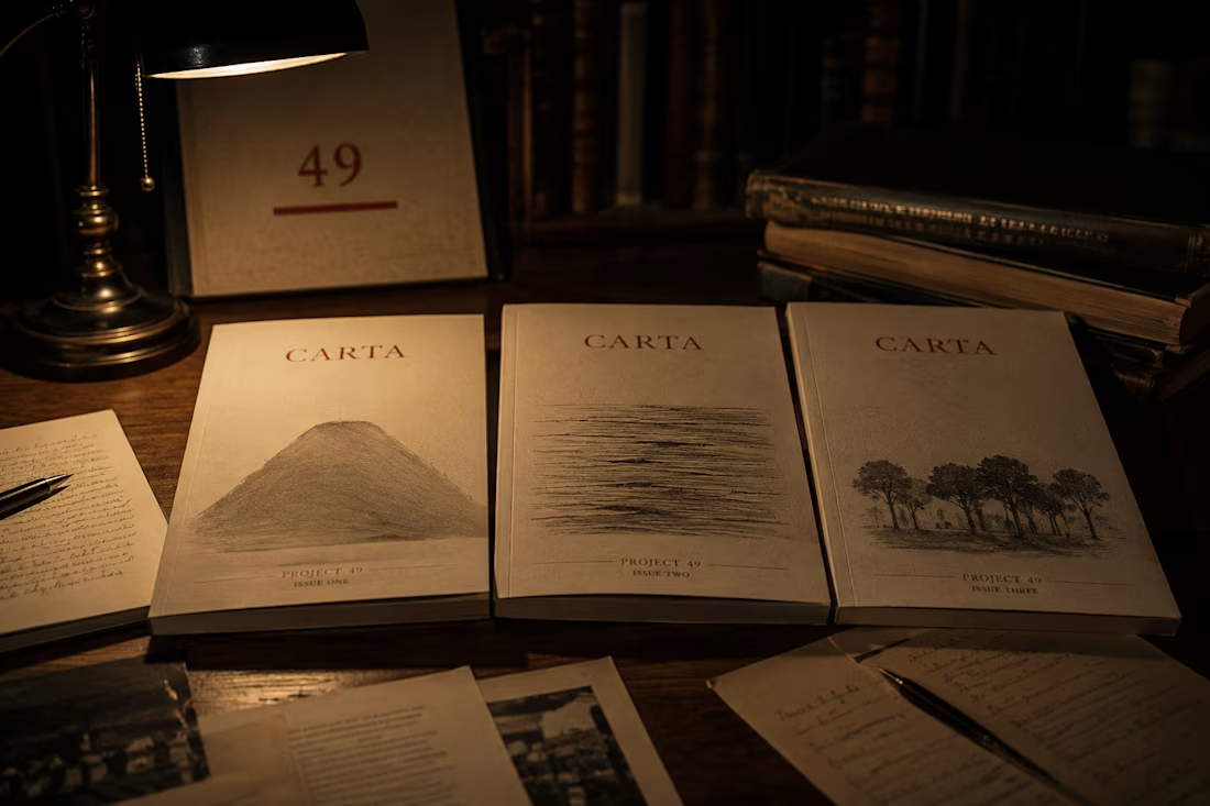
CARTA — Editorial Direction
CARTA is a premium annual investigative publication. One theme. Three hundred pages. No advertising. Released on the winter solstice. The 2026 edition: What Remains.
The brief introduces a Publication Architecture section — seven specifications from cover direction to distribution model — alongside a three-column editorial identity layout, full-width pull quote breaks, and a rule-boxed prompt. The document is designed like the publication it directs.
Creative Direction — M N LOKESHWAR REDDY
1
2
66
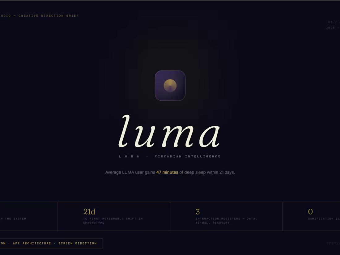
LUMA — UI / App Direction
LUMA is a precision circadian intelligence platform. Not a sleep tracker — a chronobiology system that tells you what to do, not what happened.
Six screen directions: morning protocol, chronotype dashboard, sleep window, architecture view, weekly intelligence report, biological profile. One rule across all of them: one primary action per screen, used in the dark, by people who are half-asleep. The UI must never ask them to think.
Creative Direction — M N LOKESHWAR REDDY
2
2
49
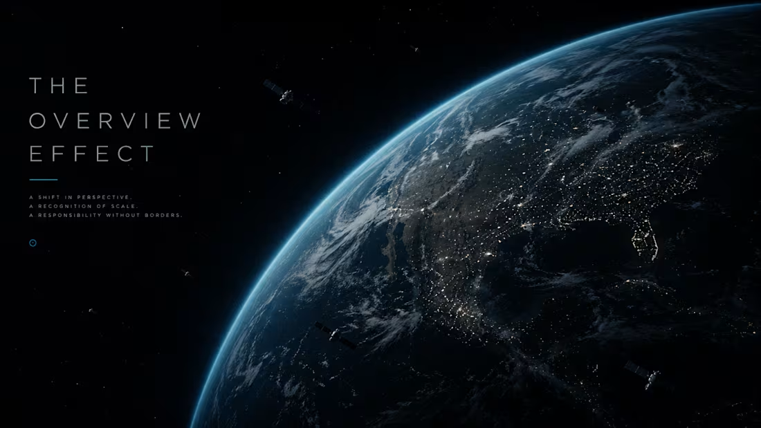
ORION — Campaign Direction
ORION is a private space experience brand. The campaign: The Overview Effect — the documented psychological shift reported by virtually every astronaut who has seen Earth from outside it.
Four executions directed: a full-black OOH billboard with nothing but the campaign line, a 90-second silent film of one face at the window, a longform digital archive of passenger testimony, and a full-page letter in the FT Weekend written from the window to the self on the ground.
Creative Direction — M N LOKESHWAR REDDY
1
1
58
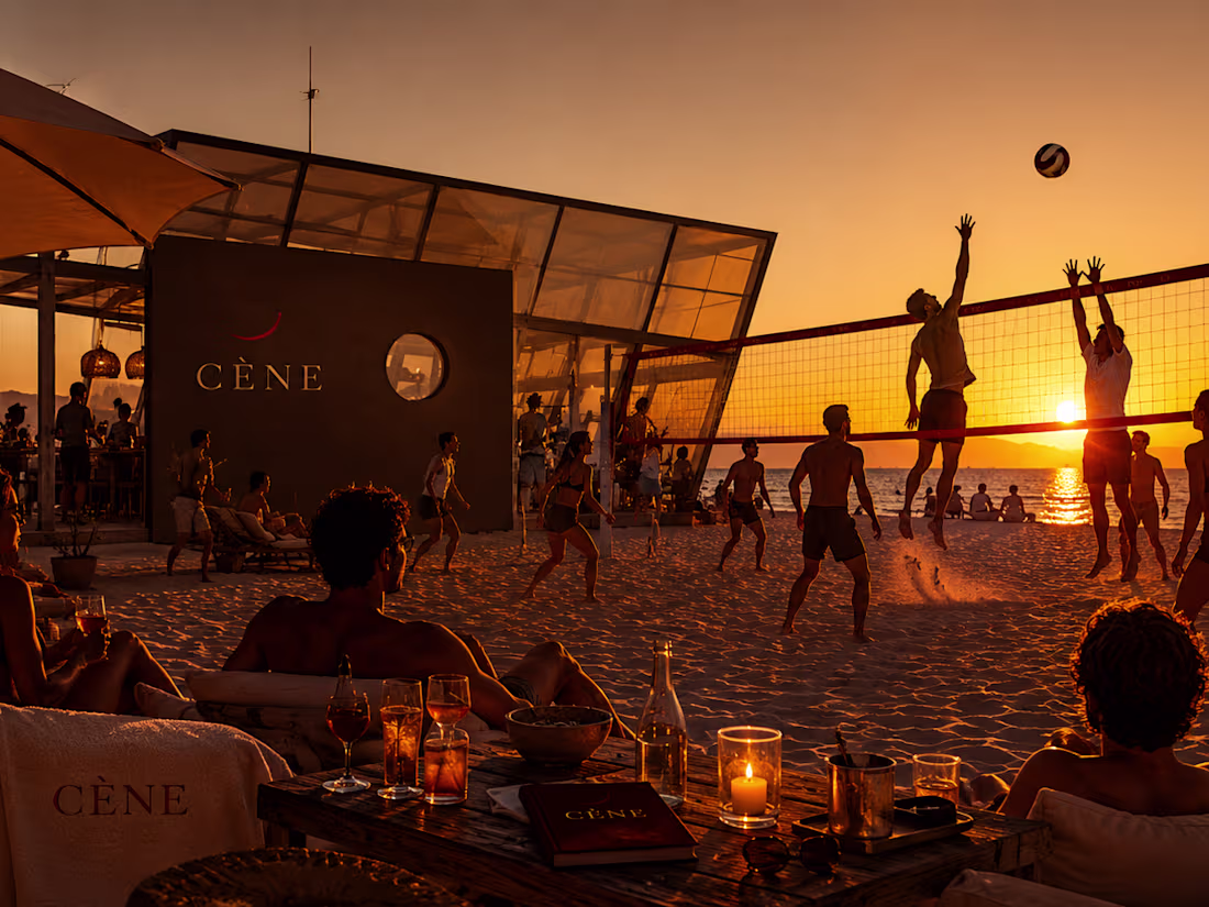
CÈNE — Web Direction
CÈNE is a private, invitation-only cultural platform. Access to private collections, closed artist talks, unreleased work. The web experience is the entire brand.
Five page directions — access gate, member dashboard, collection view, programme, and member profile. Each designed with one rule: the platform is completely invisible to the public and complete for its members. The UI is as quiet as the content deserves.
Creative Direction — M N LOKESHWAR REDDY
1
1
58
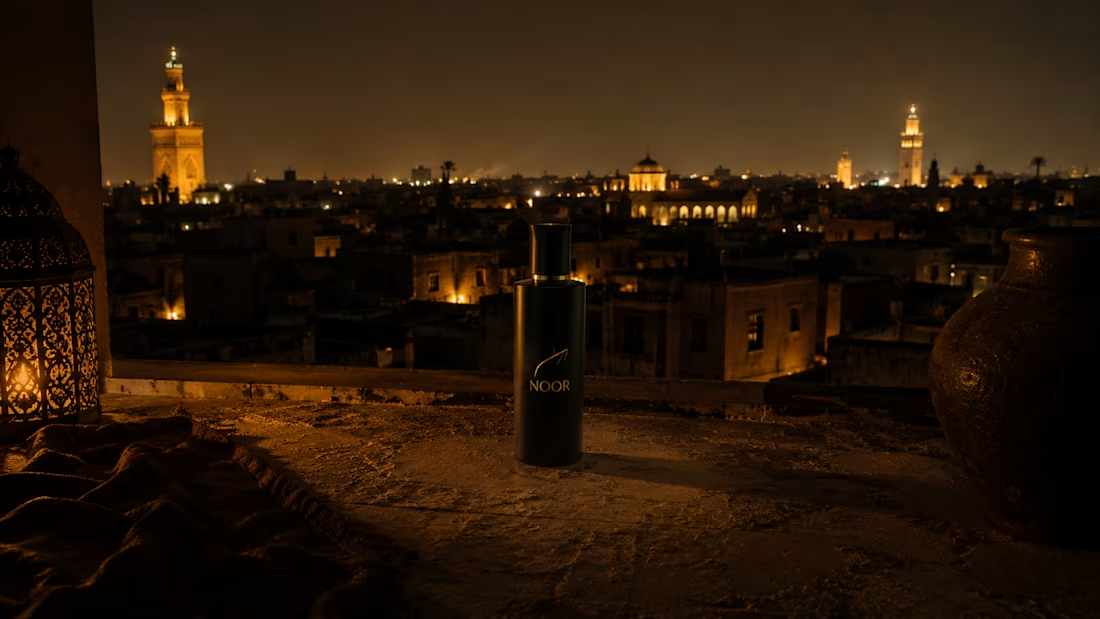
NOOR — Logo System Direction
NOOR (نور) is a luxury Middle Eastern fragrance house built at the intersection of ancient trade route ingredients — Hindi oud, Kashmiri saffron, Turkish pre-dawn rose — and complete contemporary confidence. The logo system brief had one mandate: the mark must feel ancient and inevitable simultaneously. As if it was always the correct mark, and the designer merely found it.
The mark originates in the Arabic letterform ن (Nun) — first letter of نور. A single horizontal stroke, a curved vessel beneath it, a singular point of light above. Line. Cup. Light. The complete philosophy of the brand in one geometry. The system covers six variants across seven specifications: primary lock-up, horizontal lock-up, symbol-only, monogram — all with a non-negotiable rule that the symbol on packaging is never printed flat. Blind-embossed, foil, debossed, etched. The mark arrives as physical sensation before visual recognition.
The brief introduces a Logo System Specification section — seven entries from mark concept to application standards — alongside a statement-rhythm identity layout, 4-column brand world grid, dramatic single-column visual bible, and a centered manifesto prompt. The document is midnight and gold, candlelit, nocturnal.
Creative Direction — M N LOKESHWAR REDDY
1
1
56
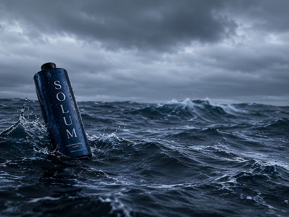
SOLUM — Packaging Direction
SOLUM is an Icelandic volcanic mineral water drawn from a single-source aquifer 330 metres beneath the Reykjanes Peninsula — filtered through volcanic basalt for 4,600 years. The packaging brief had one rule: the bottle must carry the weight of geological time.
The physical direction: a basalt column in glass form. Dark mineral-grey heavy-walled borosilicate. Matte black aluminium cap. No applied label — only debossed geological data. Secondary packaging in raw volcanic stone powder and unbleached linen. The typography reads like a mineral assay certificate: SOLUM, 330m, 4,600yr, pH 8.4, 4.1°C. Nothing decorative. Only what the product earns.
The brief introduces a Packaging Specification section — seven physical object directions from form to retail presence — alongside a geological strata identity layout, full running-prose brand world, and a three-column visual bible. The document is as cold, flat, and precise as the Reykjanes Peninsula in January.
Creative Direction — M N LOKESHWAR REDDY
1
1
51

KIRU — Brand Identity Direction
KIRU (切る) is a Japanese master bladesmith brand. One artisan. Sakai, Japan. Sixty blades per year, maximum. Three weeks per blade, minimum. The edge is the philosophy.
The visual world lives inside the forge at 5 AM — carbon ceiling, ember at 900°C as the only light source, everything else in deep shadow. The hamon line as compositional anchor. Hands at the hammer, never a face. The quench — steel into water, three seconds of hiss, then silence. The finished blade at rest under cold north-facing light: every visual decision in this world is physical evidence of a physical thing.
The brief itself breaks from every previous structure — vertical split cover with live data on the right, manifesto identity flow with label-body rhythm at variable scale, alternating forge-accented brand world strips, asymmetric bento bible, and a forge-chamber prompt section with a 60px ember panel. Design escalation locked in.
Creative Direction — M N LOKESHWAR REDDY
1
1
54
KŌYA — Brand Identity Direction
KŌYA (孤野) is a luxury designed-solitude brand — five permanent wilderness structures built for complete disappearance. Hokkaido in January. Old-growth Yakushima cedar. Kyoto mountain ridge. Icelandic geothermal valley. Patagonian steppe. Not a hotel. Not a retreat. A precisely designed interruption of everything.
The visual world is built on one rule: wilderness occupies 60–70% of every frame. The structure is always small. The human, when present, is smaller. Cold void forest at 4 AM. A single warm light inside a timber and glass box while everything ancient and vast presses against the outside. The most expensive nothing available.
The brief itself abandons the grid — horizontal strips for the brand world, editorial columns for identity, a manifesto chamber for the atmosphere lock. Every section a different spatial logic. The document is the disappearance.
Creative Direction — M N LOKESHWAR REDDY
1
1
53

Turning Idea into Posters
When an experienced designer studies these sketches and attempts to bring them to life through design, the outcome can be truly remarkable. I also have a well-defined vision for directing designers to produce outstanding results.
M N LOKESHWAR REDDY
Creative Director
1
42
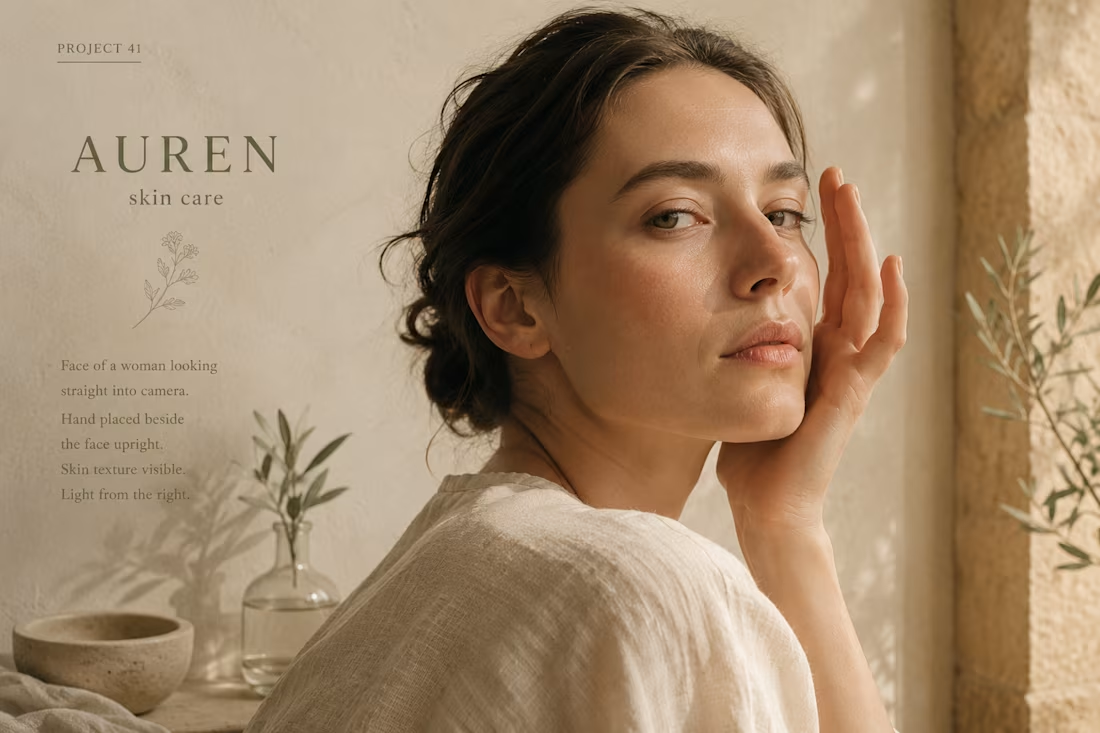
AUREN — Brand Identity Direction
AUREN is a luxury botanical skincare house built at the intersection of French terroir and Japanese ritual precision. Cold-pressed single-origin botanicals from Provence. Small-batch formulation. Every product aged twenty-one days before sealing. The visual world lives at 6 AM in September — horizontal morning light through old farmhouse glass, amber oil in a hand-filled dropper, worn pale wood, raw linen, complete stillness.
The brief demanded its opposite of every luxury skincare cliché — no studio light, no marble, no aspirational staging. A woman present with herself in morning light. The product as a tool that has been used for years, not arranged for display. Luminous restraint. The beauty of things that took time.
Creative Direction — M N LOKESHWAR REDDY
1
1
47
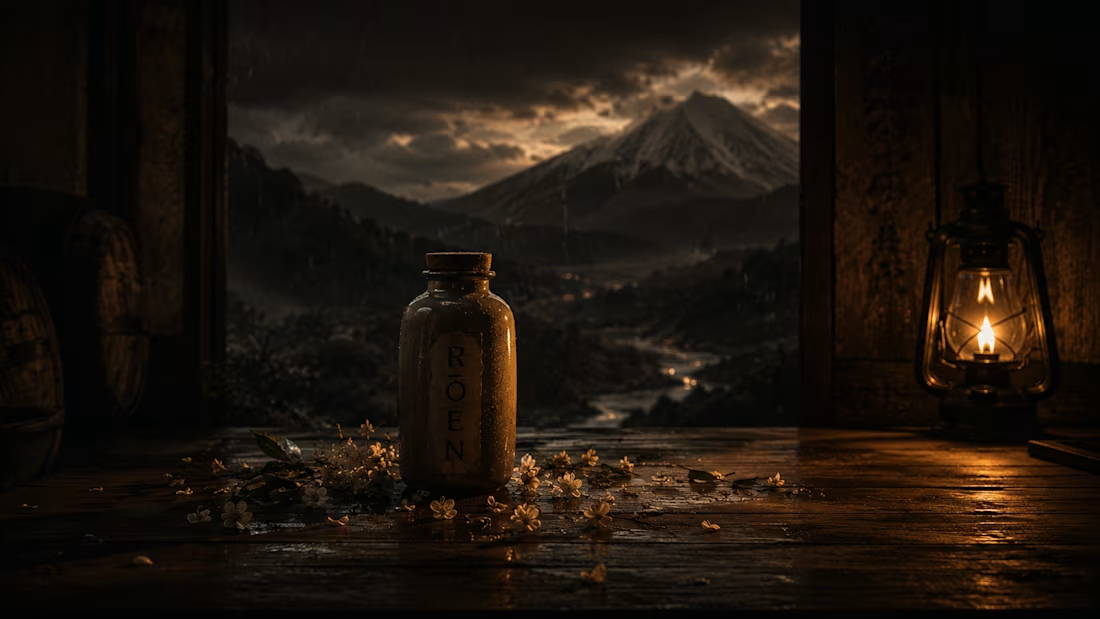
RŌEN — Brand Identity Direction
RŌEN (老縁) is a Japanese single-malt whisky distilled in Scotland and aged in Mizunara oak for twelve years on the Hokkaido coast. The brand world lives in stone barrel warehouses in January — deep cold dark, a single amber lantern, the sound of oak contracting at night. No warmth that was not earned by fire and time.
Every frame built around one tension: Scotland's violence and Japan's restraint occupying the same bottle. The visual language is low-key, Rembrandt-adjacent — void black ground, amber gold as the only warm tone, cold cream type. Composition rule: two thirds of every frame belongs to darkness.
This is not whisky lifestyle. This is twelve years of certainty made visible.
Creative Direction — M N LOKESHWAR REDDY
3
3
117
VELUN — Brand Identity Direction
VELUN is a precision performance supplement brand built for elite operators. Not gym culture. Not mass wellness. The man who is already performing at the edge of human output — the founder training at 5 AM, the surgeon on his third shift, the operator who treats his body with the same seriousness as his craft.
The visual world lives at 3 AM. Brutalist concrete. Single-source raking light. Deep shadow occupying 70% of every frame. A black pharmaceutical vial as protagonist. No fill light. No warmth. No lifestyle clichés. Every frame composed as if it cost $80,000 to produce.
This is not supplement branding. This is what happens when you strip the noise and build a brand that belongs in the same room as the tools of the trade.
Creative Direction — M N LOKESHWAR REDDY
1
1
62
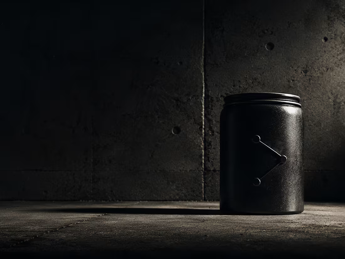
SŌKEN — Strategic Intelligence Logo Direction
SŌKEN is a boutique strategic intelligence consultancy built for sovereign wealth funds, family offices, and board-level decision makers who cannot afford to be wrong. The identity had to carry the weight of that silence — the kind of institutional authority that doesn't announce itself.
The logomark is a compass sightline bisecting a horizon: a circle interrupted by a horizontal axis, with a vertical ascender rising above it. The geometry is pure — mathematically derived on a 12-unit grid, proportioned for minimum reproduction at 12mm. The symbol does not symbolize intelligence. It demonstrates it.
The color world is four: Admiralty navy, Archive bone, Instrument brass, and Inference mid-navy. Together they read like classified documents that have aged with intention. The typography pairs Cormorant Garamond's editorial weight with IBM Plex Mono's coordinate precision — the two voices this brand speaks in.
Every application — letterhead, business card, wax seal, envelope, monogram — was directed to feel like it already existed in 1987 in a building without a sign. No gradients. No decoration. No noise. Just the mark, the material, and the light.
Atmosphere Lock: 4×5 large format film · Single overhead drafting lamp at 15° · Hiroshi Sugimoto + Rut Blees Luxemburg · Admiralty navy bleeding into all shadows.
M N LOKESHWAR REDDY, Creative Director.
1
1
81
Turning sketches into posters.
When an experienced designer studies these sketches and attempts to bring them to life through design, the outcome can be truly remarkable. I also have a well-defined vision for directing designers to produce outstanding results.
1
60

KŌSEI — Medical Technology Campaign Direction
KŌSEI is a Tokyo-founded precision surgical instrument company built for the twelve finest microsurgeons in the world. The campaign — The Geometry of Certainty — positions the instruments themselves as the visual protagonists. No operating theatre. No clinical white. No reassuring doctor imagery. Only the object, isolated in anechoic void, lit by a single jeweller's lamp at 18 degrees, photographed the way a master watchmaker photographs a tourbillon cage.
The Atmosphere Lock: hard collimated single-source light, 4×5 large format transparency film, Nick Knight's material revelation and Albert Watson's void portraiture locked across all five AI frames. The brand palette — anechoic near-black, cyanotype depth blue, surgical steel, titanium mist — bleeds into every shadow and highlight.
The four HTML frames operate as four separate structural universes: a diagonal-cut manifesto page, a technical specification broadsheet on aged paper stock, a diagonal color system with SVG annotation lines, and a five-panel editorial campaign sequence. Every text element readable. Every decision earned.
Campaign direction for a brand where the margin of error is measured in microns.
M N LOKESHWAR REDDY, Creative Director.
1
2
96
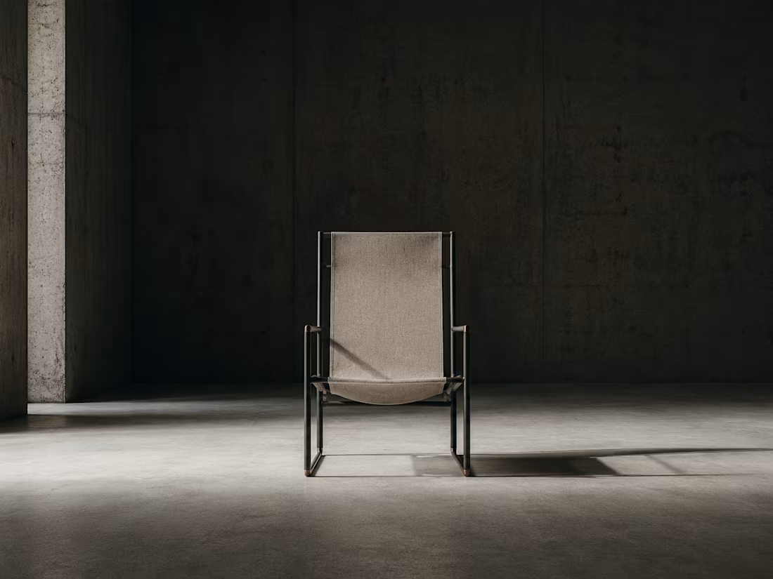
SĒVRA — Object Design Studio Brand Direction
SĒVRA is an independent furniture and object design studio founded on a single principle: engineering is not the means to design — it is the aesthetic. Every piece is a resolved structural argument. The chair as load-bearing proposition. The table as horizontal plane elevated to ritual. The shelf as the grammar of collected life.
The brand direction is built for the person who arrives in an empty room and begins drawing lines. The visual world lives in the pre-dawn window — that forty minutes before sunrise when surfaces reveal their true temperature. Raking 12-degree lateral tungsten light describes each object's structural geometry through shadow rather than illumination.
The object speaks first. The architecture of the room and the architecture of the object resolve the same argument.
M N LOKESHWAR REDDY, Creative Director.
1
1
68

VOSS — Autonomous Aerial Logistics UI / Web Direction
The ground is finished. Every road in every city reaches capacity before dawn. The logistics industry has been solving a ground problem with ground solutions for sixty years. VOSS is the answer that was always above us — the operating system of managed urban airspace.
This UI/Web Direction project builds the complete digital language of VOSS: an autonomous drone logistics platform managing 247 active units, 1,847 daily missions, at 99.97% success rate. The visual world is mission-critical precision — midnight navy (#0A0E1A) infrastructure against electric cyan (#00D4FF) telemetry, with payload amber (#F5A623) marking the single moment of resolution.
Atmosphere Lock: anechoic dark-field lighting, hard 15° directional source, Nick Knight material precision and Nadav Kander monumental scale. Absolute digital clarity throughout — zero grain, blue-shifted chromatic aberration at frame edges.
Four HTML+CSS frames deliver distinct structural universes: a live radar command interface, an operational fleet telemetry dashboard with animated city grid visualization, a full-bleed typographic manifesto with diagonal panel architecture, and an annotated technical specification document with measurement system. Every frame is a different compositional language. Every data point is readable. Nothing is uncertain here.
M N LOKESHWAR REDDY, Creative Director.
1
1
77
ŌROS — Alpine Fine Dining Brand Direction
ŌROS is a geological fine dining concept built at 2,400 metres elevation — a tasting menu restaurant carved into a high Alpine ridge, accessible only by funicular, operating on a single argument: altitude is an ingredient. The brief demanded a visual world that felt extracted from the earth rather than designed for it. Topographic survey language, raking single-source amber light, elevation annotation systems, and a four-colour palette drawn entirely from rock, copper oxidation, cartographic ink, and glacial light.
The brand direction locked two photographers as visual DNA — Gregory Crewdson for his theatrical void architecture, Albert Watson for material-level surface precision. Every AI frame follows a single 4×5 large-format film treatment with compositional discipline: subject occupying 30% maximum, geological environment commanding the rest.
The HTML frames operate as independent design objects — a topographic identity system, an elevation survey specimen sheet, a full menu architecture in editorial three-column layout, and a brand materials annotation grid rendered like a geological cross-section. Each frame structurally unlike the last.
ŌROS does not announce luxury. It is luxury through extreme restraint. A coordinate. A number. A depth.
M N LOKESHWAR REDDY, Creative Director.
1
2
85
KERN — Natural Pigment & Ink — Packaging Direction
KERN is an artisan natural pigment and ink studio that extracts colour from specific coordinates on the earth. Iron oxide laterite from Karnataka. Vine charcoal from Tuscany. Fermented indigo from Rajasthan. Each product carries the GPS origin of its raw material on its label — because provenance is the product.
The Packaging Direction for KERN begins with the Atmosphere Lock: single overhead jeweller's lamp at 5600K, hard falloff, zero ambient fill. Every AI frame references Karl Blossfeldt's forensic botanical exactness and Irving Penn's still-life discipline on grey seamless. 4×5 large format film scan quality throughout — micro-grain, halation at specular points, deep tonal separation.
The packaging system spans four formats — 30ml ink vial, 50ml pigment jar, 150ml primary bottle, 6×10ml travel kit tin — all in amber glass and charcoal board, labelled in Cormorant Garamond Light and Space Mono. The brand mark is a botanical seed cross-section: six vascular lines radiating from an inner kernel ellipse to an outer circle. A specimen slide and an aperture at the same moment.
HTML+CSS frames build an architectural blueprint system, a forensic eight-pigment colour chart with full Latin classification and origin coordinates, a diagonal-split label deconstruction grid, an editorial broadsheet manifesto, a three-colorway botanical repeat pattern, and a complete symbol construction document. Every frame is a different structural universe.
M N LOKESHWAR REDDY, Creative Director.
1
2
68
KAEL — Independent Game Studio Brand Direction
KAEL is a brand direction for an independent game development studio building narrative-first worlds — slow games, patient games, games that do not explain themselves. The studio makes worlds the way certain filmmakers make films: with a specific silence, a specific colour of dusk, a specific way a door sounds when it closes in a room you will never leave.
The visual world is anchored by four colours: Void Slate, Verdigris Depth, Bone Light, and Loam — a palette that references wet stone, aged copper, and the light that arrives before the sun does. All five AI frames were directed under a locked atmosphere: pre-dawn diffuse light, 4×5 large format wet-plate texture, the compositional precision of Gregory Crewdson's theatrical dioramas, and Roger Deakins' atmospheric depth technique.
No subject occupies more than 20% of any frame. The remaining 80% is void, atmosphere, and distance — the brand's primary visual elements. KAEL does not make loud games. KAEL makes games that sit quietly in a room until you walk in.
Typography is Cormorant Garamond at 300 weight paired with DM Mono for system elements — type that feels found, not set.
M N LOKESHWAR REDDY, Creative Director.
1
1
66
FOVEA — Optical Eyewear Logo Direction
FOVEA is named for the fovea centralis — the 1.5mm pit at the center of the human retina responsible for all acute vision. A precision optical studio, not an eyewear brand. The identity system was built entirely from this anatomical truth: that the instrument through which you see the world deserves to be the most considered object you carry.
The mark is a precision optical symbol — the measurement reticle geometry of a lens aperture with four bracket-corner marks and a central fovea point at the diamond. Not designed — derived. Every proportion traces back to two measurements: the lens circle and the anatomical fovea. The wordmark is set in Cormorant Garamond Light, tracked to the extreme, because a frame that thin deserves type that thin.
Atmosphere Lock applied across all AI frames: single-source jeweller's lamp at 12 degrees, 4×5 large format film precision, Karl Blossfeldt botanical specimen rigor and Albert Watson's command of void. The color world is near-monochromatic — Optic Void, Titanium Datum, Ground State — with one spectral break violet that appears only where light physics demands it.
Nine frames. Three AI image directions. Six technical system frames. The mark at every scale from 240px environmental signage to 28px minimum permitted use. The brand in application — card, letterhead, stationery — on a designer's surface at pre-dawn.
M N LOKESHWAR REDDY, Creative Director.
1
1
63
LYRA — Spatial Audio Technology Brand Direction
Sound is not received. It is located. LYRA is a spatial audio technology company built for the world's most demanding listening environments — cinematic post-production, concert hall acoustic modeling, neuro-rehabilitation therapy, and military-grade simulation. They do not make hardware. They build the invisible spatial engine that makes sound behave like physics.
The brand direction establishes a world of anechoic precision: Baskerville serif carrying scientific data, IBM Plex Mono rendering every measurement as readable truth, Frequency Blue (#1A6EFF) deployed as a single absolute accent — never gradient, always signal. The Atmosphere Lock is total: Wolfgang Tillmans' scientific objecthood meeting Albert Watson's hard single-source light, ISO 50 absolute digital precision, subjects isolated in pressurized bone-white voids.
HTML frames span four structural universes — a three-panel frequency identity system, a diagonal-cut spatial coordinate manifesto, a full-bleed waveform architecture dashboard, and an editorial broadsheet with waveform cut through 420px serif letterforms via SVG clip-path. Every decision earns its presence. Sound has a shape.
M N LOKESHWAR REDDY, Creative Director.
1
1
78

ALTUS — Luxury Commercial Spaceflight Campaign Direction
ALTUS is a commission-only private spaceflight brand built for those who understand the difference between travelling somewhere and crossing a threshold. This project is a full campaign direction — THE ASCENT PROTOCOL — a documentation of the ritual, the data, and the atmosphere of departure from the Kármán line upward. The campaign direction establishes a visual world of absolute bilateral symmetry, clinical Phase One precision, and two distinct lighting environments: the surgical fluorescent preparation room and the unfiltered solar radiation of above-atmosphere. Every frame falls on one side of the boundary or the other. The boundary is the Kármán line, and it appears in every image.
M N LOKESHWAR REDDY
Creative Director.
1
1
70
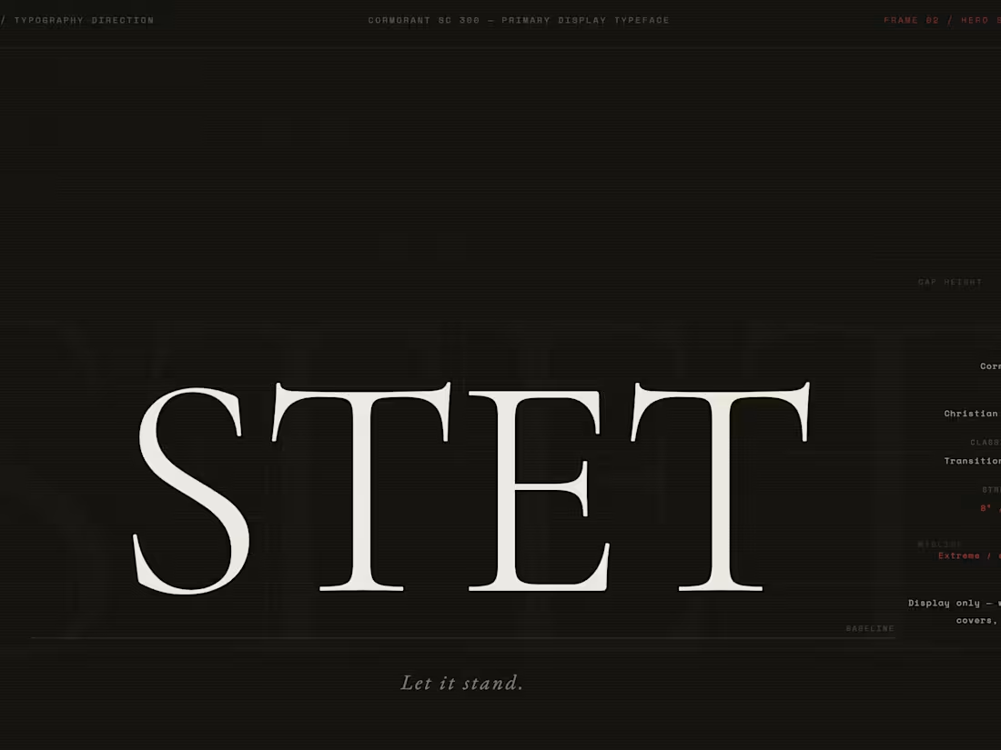
STET — Independent Literary Publishing Typography Direction
STET is a typography direction for an independent literary press whose name is its entire editorial philosophy: the proofreader's mark that means let it stand. Ignore the correction. Restore the original. The brand asks: what if a publishing house had no visual identity except its type?
The answer required three typefaces chosen with the precision of a compositor selecting from a case: Cormorant SC 300 for display — extreme contrast, editorial authority, the architecture of a book cover before illustration existed. EB Garamond for the body — old-style warmth, the type that disappears into text and lets the words do the work. Space Mono for all metadata — the monospaced grid of the compositor's table, objective and precise.
The Atmosphere Lock across the AI frame: Ilford HP5+ large format, Irving Penn's formal precision with printed matter, Rinko Kawauchi's intimacy with the page. A single raking lamp at 40° from the upper left — the only light that reveals letterpress impression in paper, making the type physically present rather than merely visible.
Typography is the press's only visual argument. It is enough.
M N LOKESHWAR REDDY, Creative Director.
1
1
89
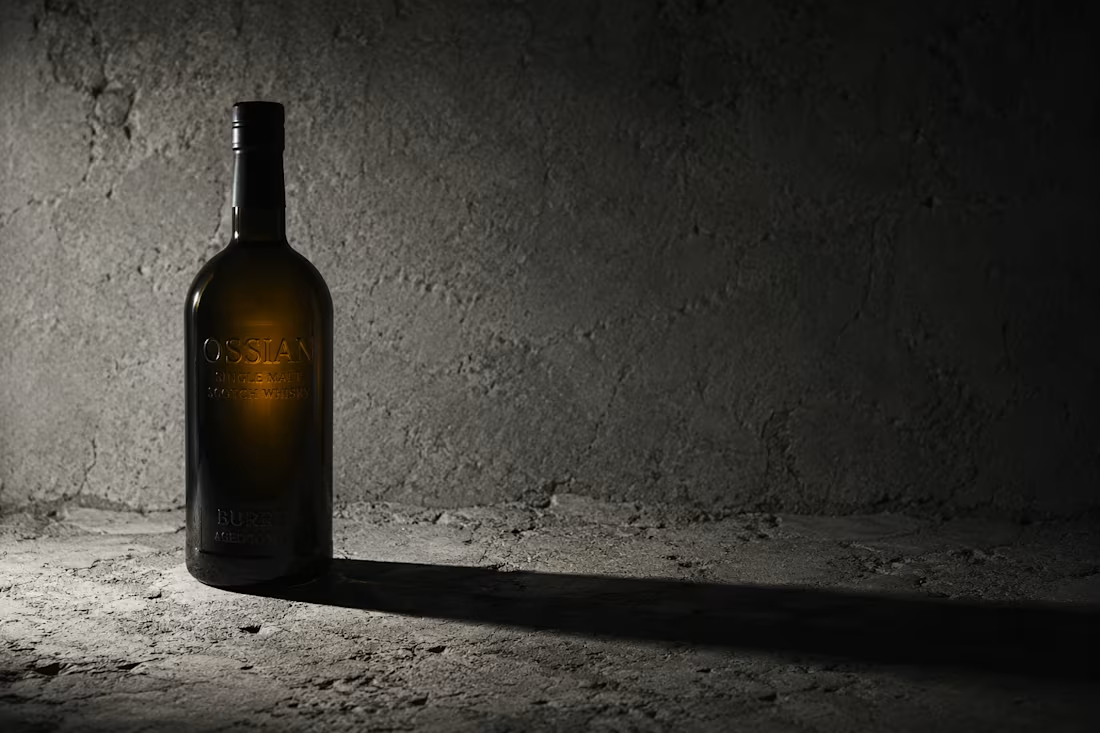
OSSIAN — Independent Craft Distillery Brand Application Direction
OSSIAN is a single malt Irish whiskey brand built on a single premise: that the best whiskey is an argument the earth makes about time. Distilled at the edge of the Burren in County Clare — a lunar limestone landscape of extraordinary geological character — every element of the brand is drawn directly from material fact. The name invokes Ossian, the legendary Irish bard who remembered the world before it changed.
The visual language abandons all whiskey category conventions: no amber warmth, no heritage cosplay, no crest. Instead, OSSIAN operates in the aesthetic register of geological field surveys, scientific specimen documentation, and 4×5 large format photography. The palette — Burren Dark, Field Survey Grey, Heirloom Amber, Archive Linen — is extracted directly from limestone at 4PM in October.
Brand applications span label architecture (letterpress-printed on 140gsm cotton rag), delivery vehicle livery, and a complete stationery system rendered in the precision language of academic documentation. Every surface carries only what it needs to. The amber stripe — appearing once on every touchpoint — is the only concession to warmth. Everything else is stone.
Atmosphere Lock: raking 12-degree directional light throughout. Josef Sudek + Edward Weston. 4×5 Ilford FP4 Plus. Cormorant Garamond + IBM Plex Mono.
M N LOKESHWAR REDDY, Creative Director.
1
1
78
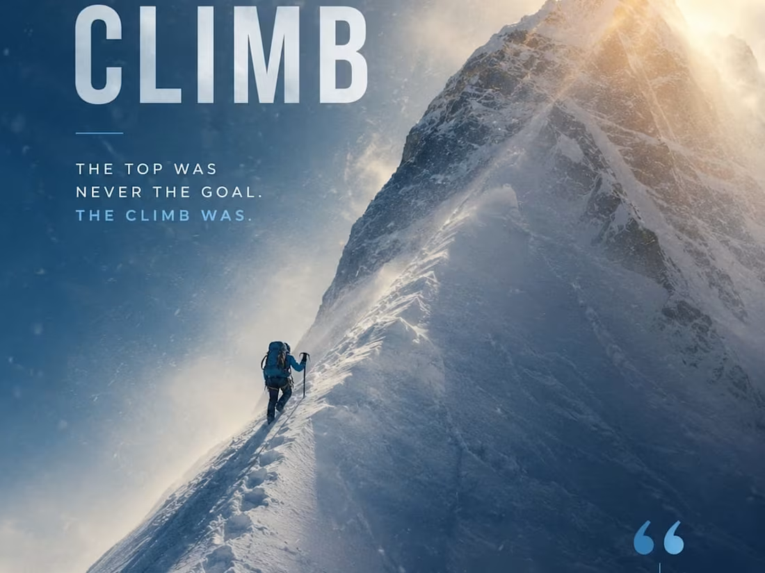
THE CLIMB - Motivational Poster
When an experienced designer studies these sketches and attempts to bring them to life through design, the outcome can be truly remarkable. I also have a well-defined vision for directing designers to produce outstanding results.
2
77
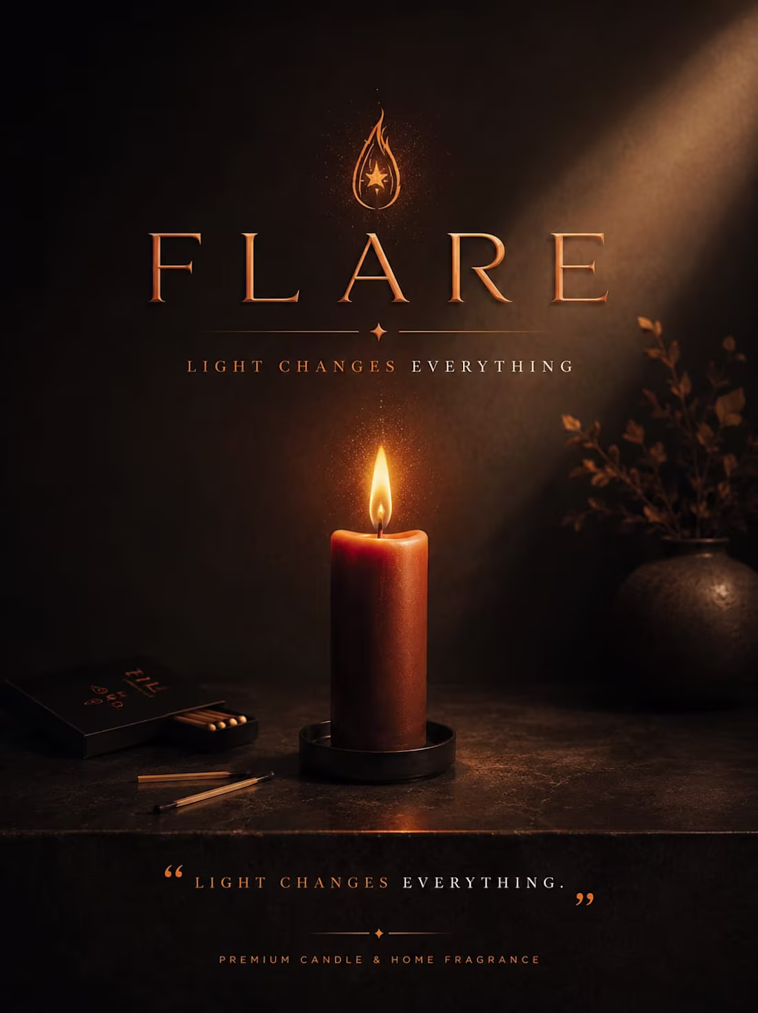
FLARE - Brand Identity
When an experienced designer studies these sketches and attempts to bring them to life through design, the outcome can be truly remarkable. I also have a well-defined vision for directing designers to produce outstanding results.
1
61
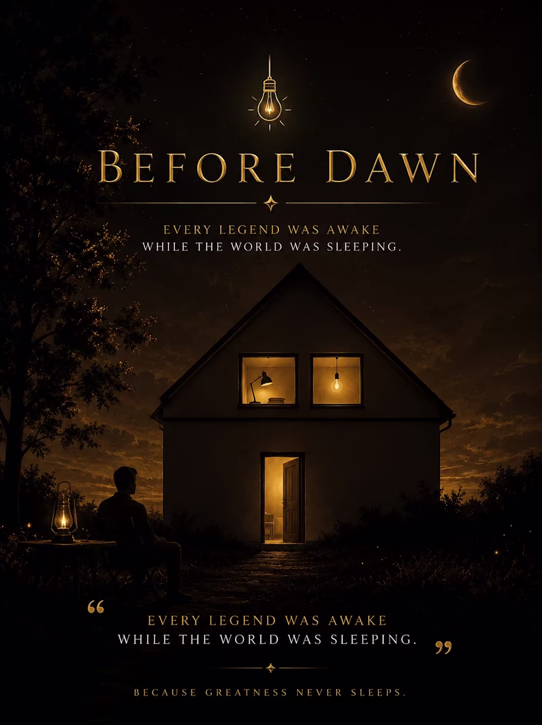
BEFORE DAWN - Motivational Poster
When an experienced designer studies these sketches and attempts to bring them to life through design, the outcome can be truly remarkable. I also have a well-defined vision for directing designers to produce outstanding results.
1
59
OSSŌ — Artisan Charcuterie Brand Application Direction
OSSŌ is an artisan nose-to-tail charcuterie house built for the chef who already knows why it matters. The brand direction began with a single conviction: the animal deserves to be known completely — not only its loin and its ribs, but its marrow, its cheeks, its rendered fat. This project is Brand Application Direction — every surface the brand touches, designed with the same severity as the product itself.
The visual world is anatomical illustration meeting Italian charcuterie tradition: bone-white, tallow amber, charcoal marrow, and one accent of oxidized blood-brick used once per composition, never twice. The Atmosphere Lock is built on expired Kodak Ektachrome 100 grain, hard raking tungsten at 12 degrees, and the isolation philosophy of Irving Penn's still life work combined with Andrea Wyner's European market grain.
Applications include butcher paper wraps, wax-sealed parcels, cold chain delivery boxes, chef coat embroidery, ceramic weight labels, a physical hang tag with letterpress weight numerals, and a cut chart that functions simultaneously as packaging and poster.
Every cut is a decision. Every cure is a philosophy. Every bone is kept.
M N LOKESHWAR REDDY, Creative Director.
1
2
83
VĒLA — Luxury Ocean Charter UI / Web Direction
VĒLA is a commission-only private ocean charter brand built for those who understand that travel and voyage are different words with different weights. This project is a complete UI and web direction — the visual language, interface architecture, and digital brand system for a brand that does not advertise. It corresponds.
The web direction explores how a brand of this character occupies digital space: not loudly, not persuasively, but with the quiet authority of someone who has already crossed the Atlantic twice and is not trying to impress you. The above-the-fold direction uses pre-dawn atmosphere as its visual key — abyssal navy, binnacle brass, and salt flat white. The typography system pairs Cormorant Garamond's ligature elegance with the functional precision of Space Mono for coordinates and data.
The voyage commission interface proposes a booking experience built around selection and commitment, not conversion. The manifesto frame uses editorial broadsheet architecture to carry the brand's founding declaration. The digital brand language system documents the complete UI grammar — buttons, form states, navigation, data cards, icons, radius system, and color scale.
Atmosphere Lock: Kodak Portra 800 pushed one stop. Pre-dawn nautical twilight. Massimo Vitali + Ernst Haas visual DNA. Horizon at 70%.
M N LOKESHWAR REDDY, Creative Director.
1
1
72
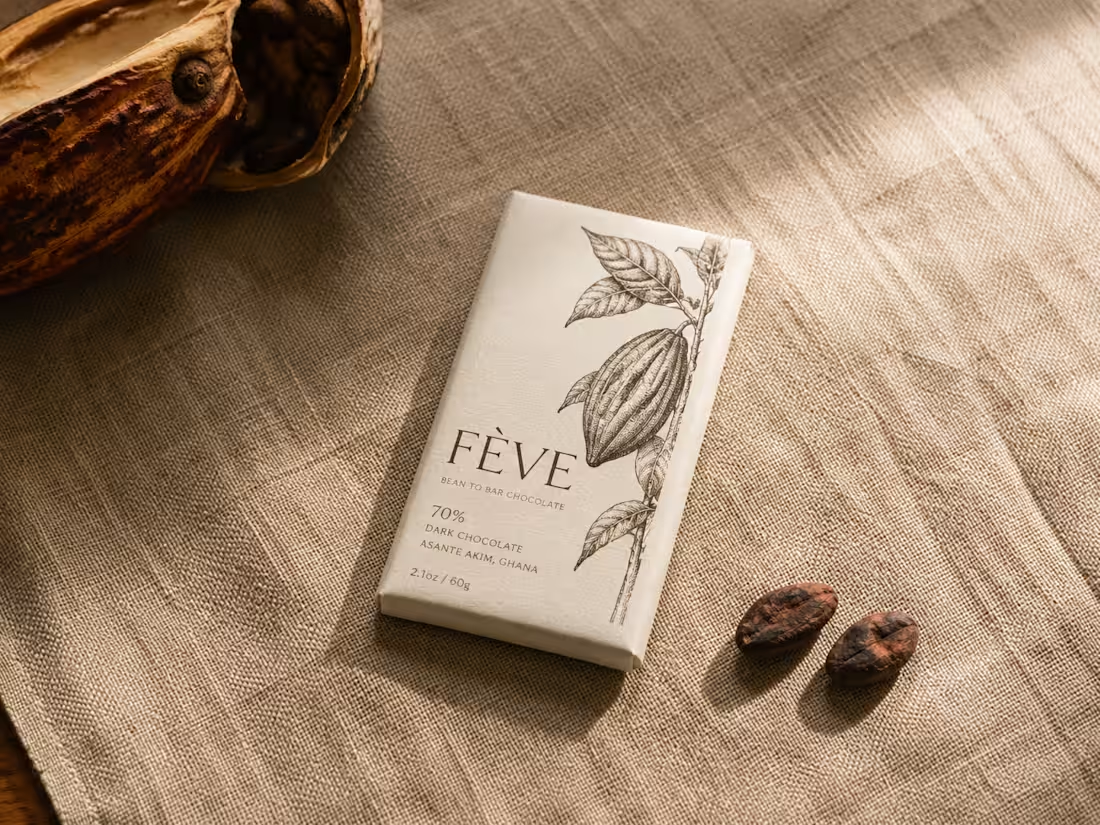
FÈVE — Artisan Chocolate Packaging Direction
FÈVE is a packaging direction for a bean-to-bar chocolate brand built on a single refusal: to blend. One farm. One fermentation. One bar. The brief required packaging that could hold that integrity without performing it — design that is honest rather than clever.
The mark is a botanical illustration of the cacao pod, drawn with the precision of an 18th-century natural history atlas. It is not decorative. It is a species record. The plant earns the shelf before the wordmark speaks.
The Atmosphere Lock across all five AI frames: Kodak Portra 400 in medium format, diffuse window light from the upper right, Karl Blossfeldt's specimen dignity married to Wolfgang Tillmans' material intimacy. The packaging materials — uncoated 300gsm ivory paper, two-colour offset in Pod brown and Coppice amber — are chosen because they age like the product they contain. They accumulate time honestly.
The color world runs on four tones extracted directly from the pod's lifecycle: Ferment black for the transformation, Pod brown for the fruit's exterior, Coppice amber for the dried and processed, Ivory for the pulp that started everything.
M N LOKESHWAR REDDY, Creative Director.
1
2
93
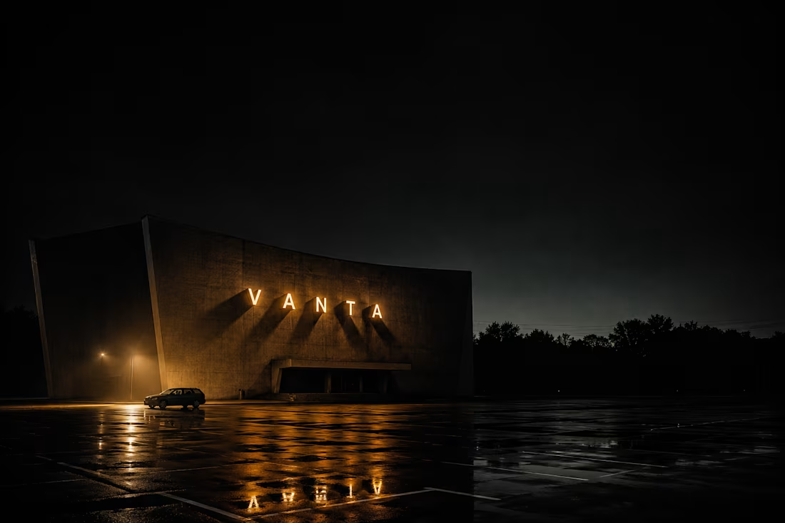
VANTA — Independent Cinema Logo Direction
VANTA is a logo direction for an independent cinema production house built on a single principle: that film is the most direct route into real experience. The brief demanded a mark that felt inevitable — as though it had always existed and only needed to be uncovered.
The mark is a circle intersected by a single diagonal slash at exactly 67.5°. The circle is the reel, the lens, the iris. The slash is the aperture blade, the projector beam, the cut between frames. Together they describe cinema in its most irreducible geometry. No decoration earns its place here. Only the essential.
The Atmosphere Lock across all AI frames — a single tungsten source at 3,200K from the upper left, Kodak 5219 pushed one stop, Roger Deakins' chiaroscuro discipline married to Hiroshi Sugimoto's architectural stillness — creates a visual world that makes the identity feel as though it was found in a projection room rather than designed in a studio.
The color world runs on four tones: Vantablack for silence, Bone for the screen before the film, Projection amber for the moment the light hits the dust, and Reel grey for the seriousness of the work being done.
M N LOKESHWAR REDDY, Creative Director.
1
1
54
ZERO: The Gravity of Absolute Void
When an experienced designer studies these sketches and attempts to bring them to life through design, the outcome can be truly remarkable. I also have a well-defined vision for directing designers to produce outstanding results.
1
44
SEEN: The Anatomy of Sudden Impact
When an experienced designer studies these sketches and attempts to bring them to life through design, the outcome can be truly remarkable. I also have a well-defined vision for directing designers to produce outstanding results.
1
35
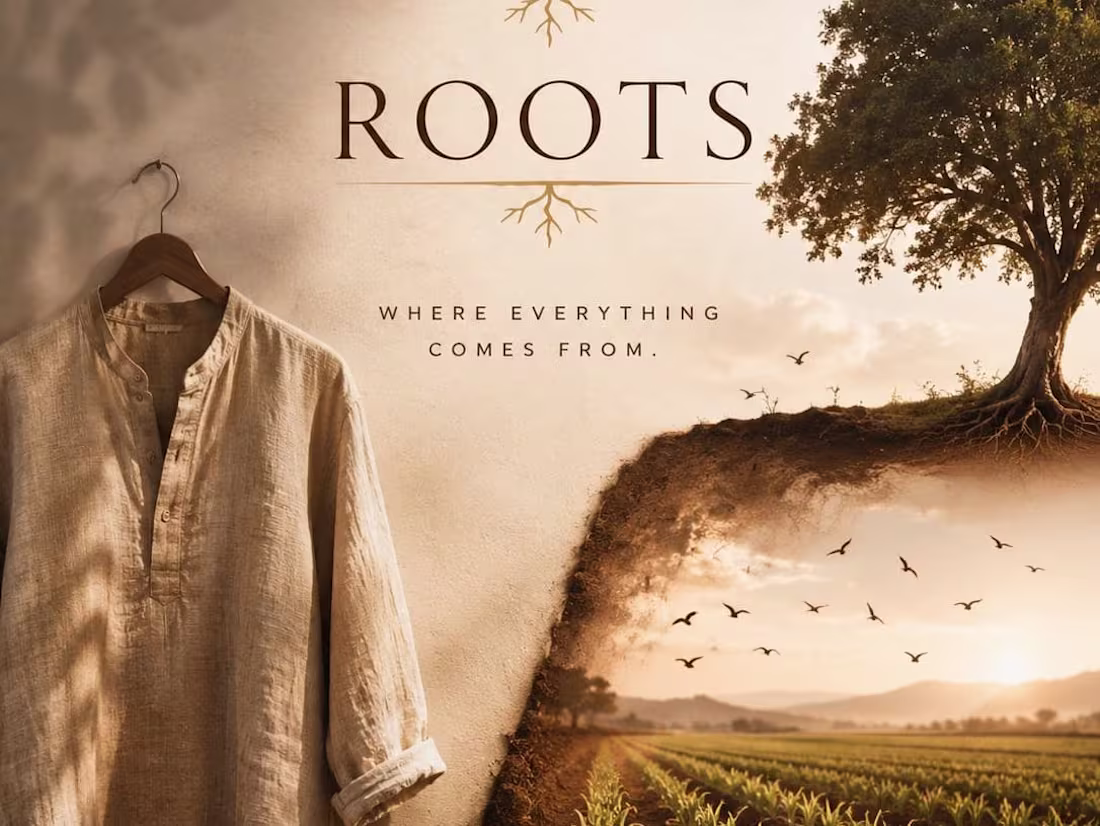
ROOTS: The Raw Texture of Earth
When an experienced designer studies these sketches and attempts to bring them to life through design, the outcome can be truly remarkable. I also have a well-defined vision for directing designers to produce outstanding results.
1
30
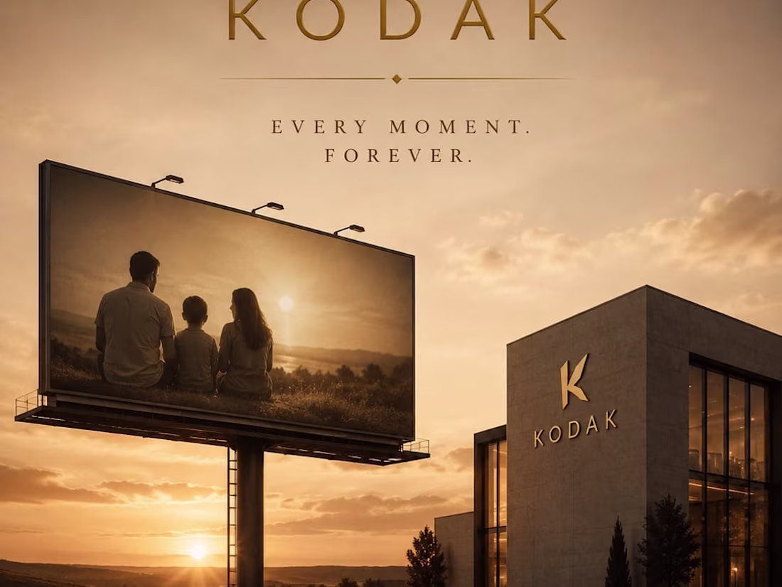
KODAK: The Architecture of Nostalgic Light
When an experienced designer studies these sketches and attempts to bring them to life through design, the outcome can be truly remarkable. I also have a well-defined vision for directing designers to produce outstanding results.
1
35
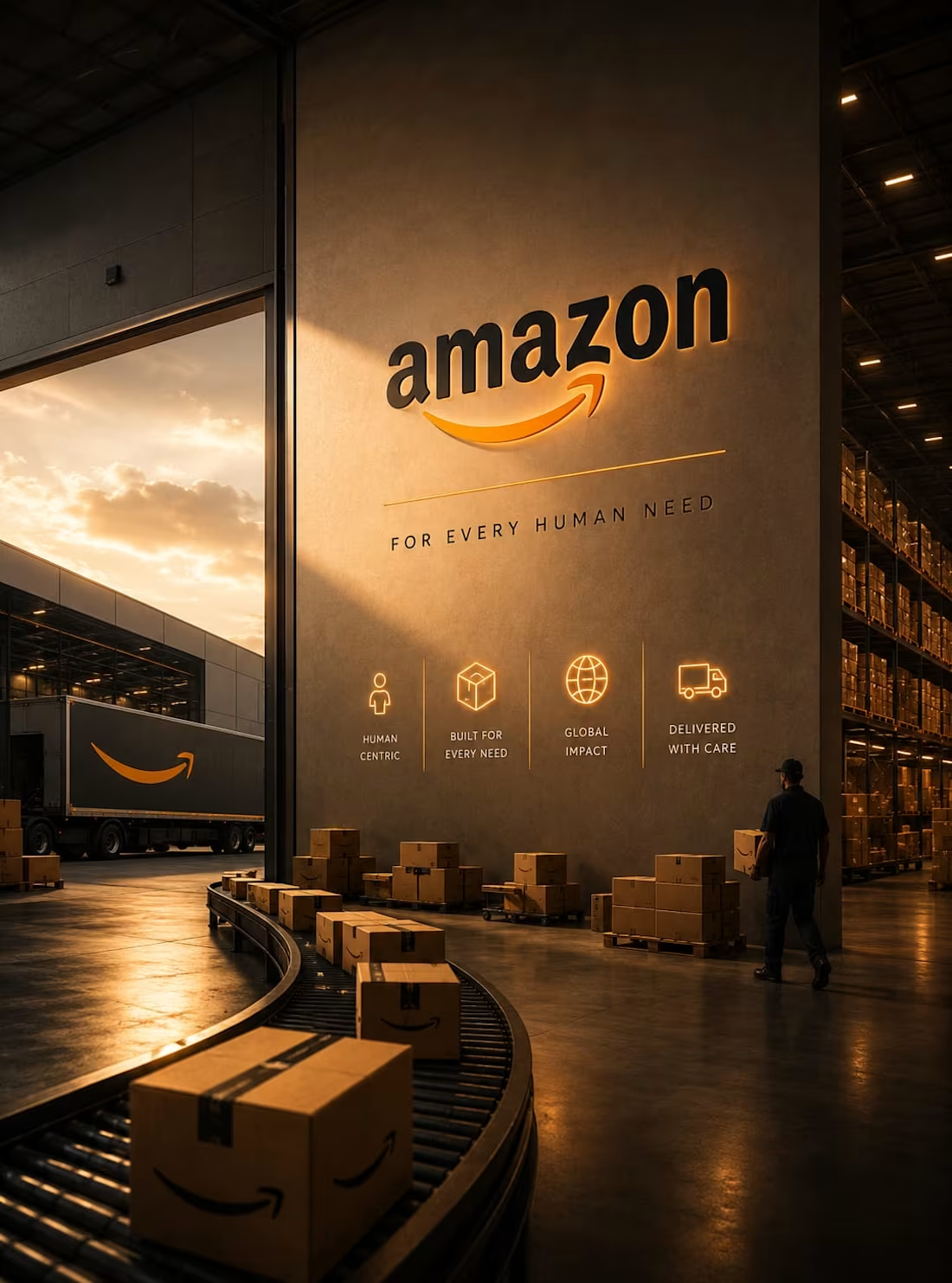
AMAZON: The Architecture of Primal Wilderness
When an experienced designer studies these sketches and attempts to bring them to life through design, the outcome can be truly remarkable. I also have a well-defined vision for directing designers to produce outstanding results.
1
25
MŌRA — Boutique Wellness Retreat Brand Direction
The opposite of burnout is not rest. It is meaning. MŌRA is a boutique wellness retreat brand for the person who has tried every optimization and finally understood that the landscape itself is the therapist. No cold plunges. No protocols. No schedule that cannot be missed. Just the specific quality of silence that exists when you are far enough from the city that your nervous system finally believes you have left. This project delivers complete brand direction built entirely from the pre-dawn visual language of the natural world — every frame shot in the hour between 4:45am and first light. The CSS of Frame 2 renders a misty landscape entirely in code. Frame 4 is a mandala colour system. Frame 6 is a printed retreat welcome letter. Frame 8 is a cinematic letterboxed film title card. Dawn Mist. Sacred Indigo. Temple Gold. Bark Brown. Shot on expired 35mm. The valley has been doing this work for millions of years without any of the vocabulary we use to describe it.
M N LOKESHWAR REDDY, Creative Director.
1
1
45
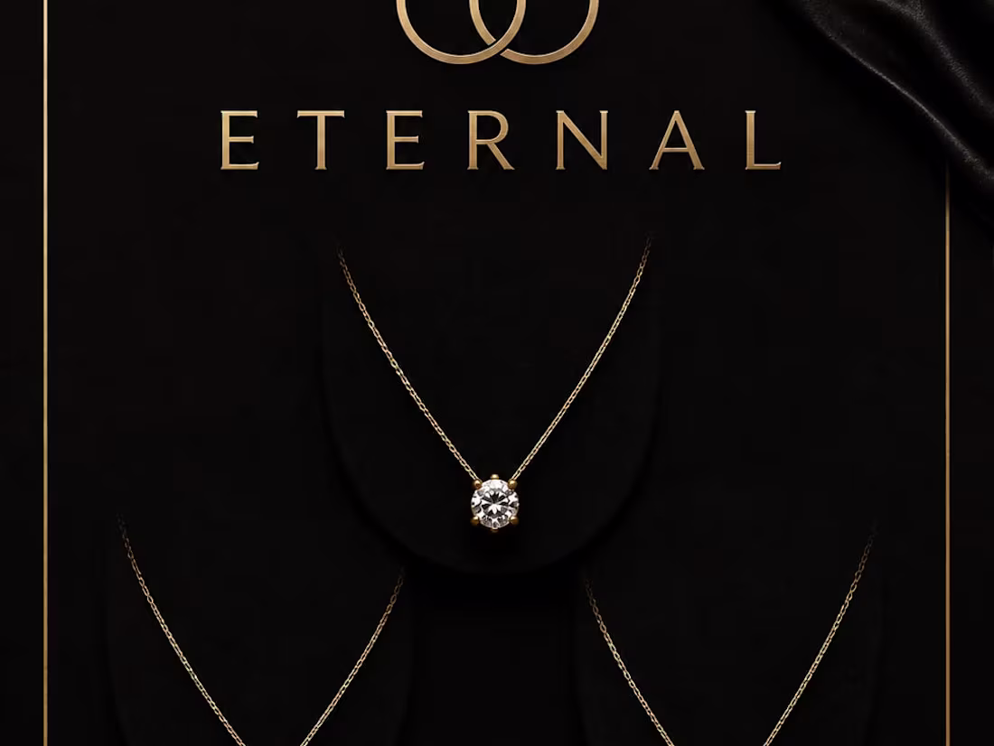
ETERNAL: The Architecture of Timeless Heritage
When an experienced designer studies these sketches and attempts to bring them to life through design, the outcome can be truly remarkable. I also have a well-defined vision for directing designers to produce outstanding results.
1
40
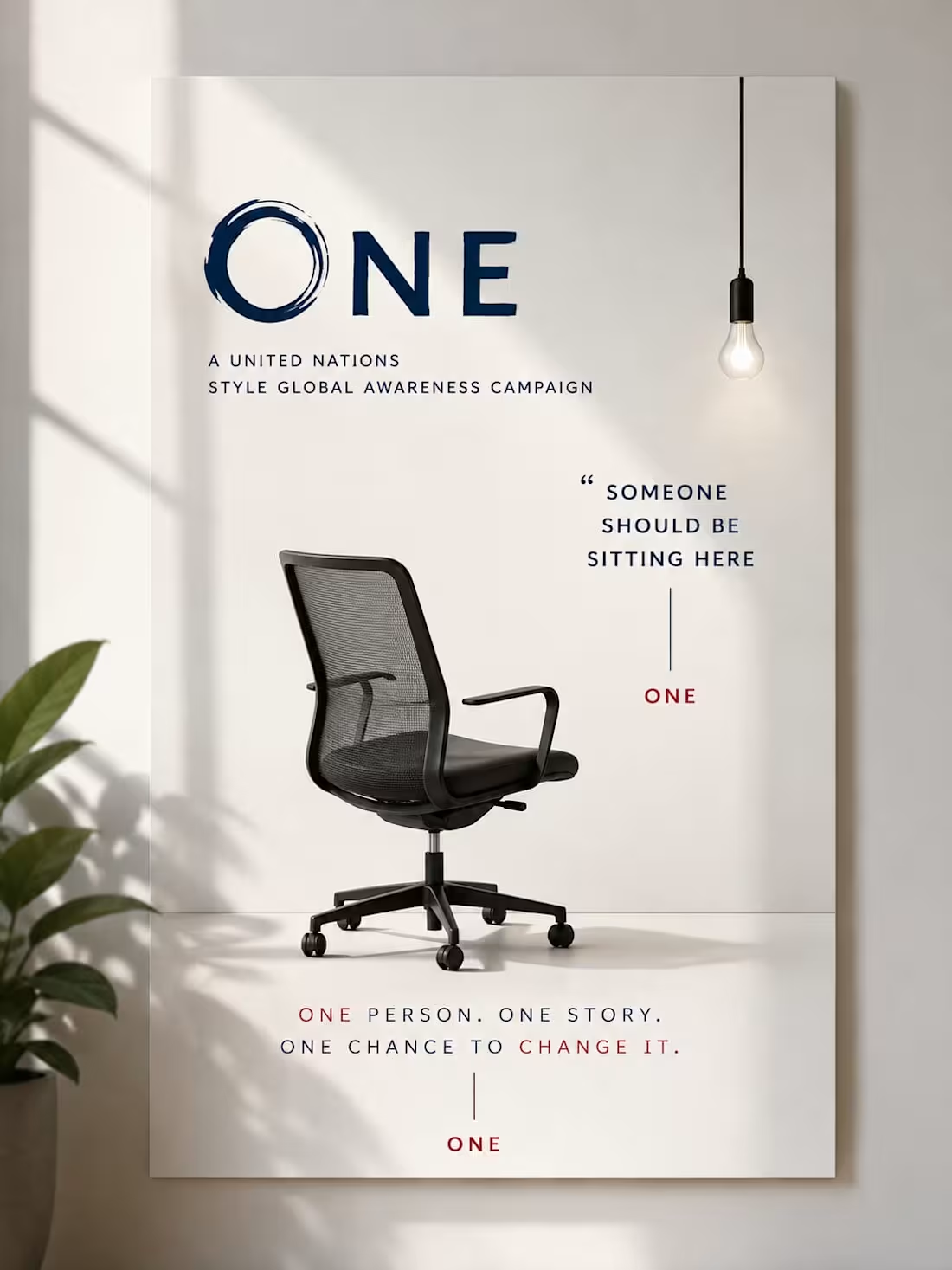
ONE: The Architecture of Self-Awareness
When an experienced designer studies these sketches and attempts to bring them to life through design, the outcome can be truly remarkable. I also have a well-defined vision for directing designers to produce outstanding results.
1
26
TERRA — Premium Circular Fashion Campaign Direction
You don't own this garment. You borrowed it from the planet and agreed to give it back. TERRA is a premium circular fashion brand that treats every garment as a loan from the earth — made from material that existed before and will exist again. This is a Campaign Direction project: On Loan From Earth. Every frame places garments in the natural environments that produced them — a linen shirt in a morning field, a wool coat on a cliff edge, a cotton dress ankle-deep in a river. The visual world is shot on 35mm Kodak Portra 400 with Anders Petersen's raw documentary intimacy and Wolfgang Tillmans's treatment of garments as environmental objects rather than fashion objects. Field Linen. Soil Brown. Living Moss. Mineral White. The palette is pulled entirely from the ground. Every HTML frame has a structurally unique layout — diagonal linen band, geological strata, broadsheet editorial, material hang tag. The return is not the end. It is the beginning of the next garment.
M N LOKESHWAR REDDY, Creative Director.
1
2
47
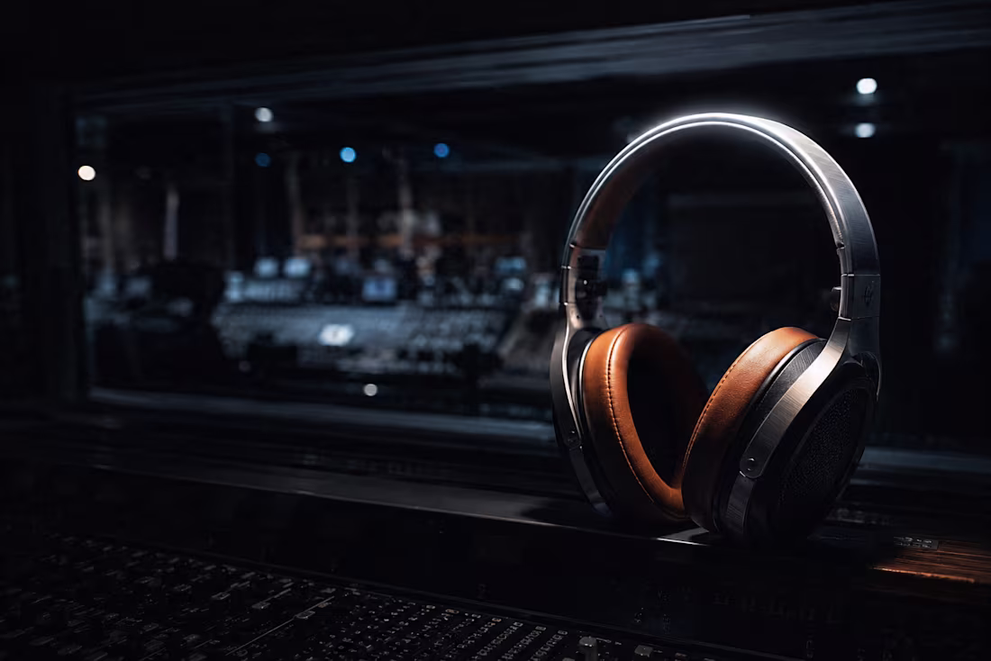
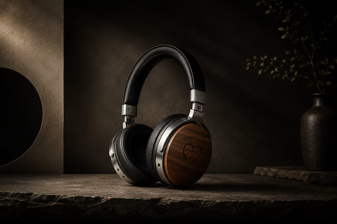
FREQUENZ — Ultra-Premium Hi-Fi Headphone Brand Direction
You haven't heard your music yet. You've only heard what your headphones could manage. FREQUENZ is an ultra-premium hi-fi headphone brand for the listener who knows the difference between hearing music and experiencing it. Hand-tuned drivers matched within 0.5dB. Medical-grade lambskin cushions. Forged aluminium construction. Full frequency response from 5Hz to 40kHz. This project delivers complete brand direction built entirely from the visual language of sound — frequency waves structure every composition, oscilloscope geometry becomes the grid, and the precise moment a sine wave crosses zero is the brand's primary motif. Studio Black. Frequency Wave. Chrome Silver. Lambskin Amber. Every HTML frame has a completely different compositional approach: diagonal wave split, full-bleed vertical panels, oscilloscope poster, magazine spread. The signal is everything.
M N LOKESHWAR REDDY, Creative Director.
1
1
45
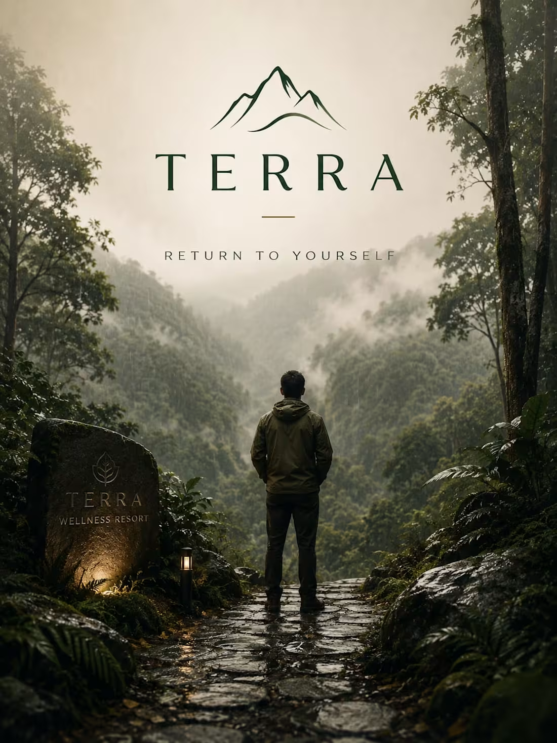
TERRA: The Architecture of Grounded Luxury
When an experienced designer studies these sketches and attempts to bring them to life through design, the outcome can be truly remarkable. I also have a well-defined vision for directing designers to produce outstanding results.
1
44
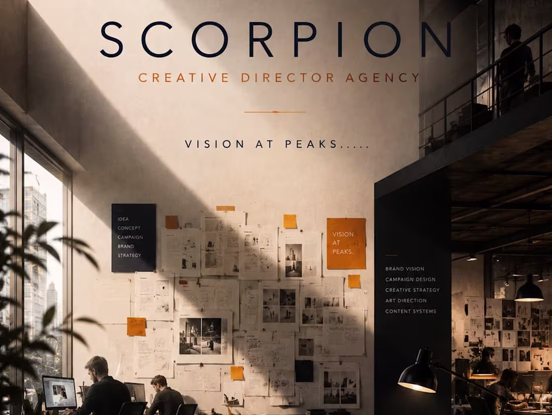
SCORPION: The Architecture of Lethal Strategy
When an experienced designer studies these sketches and attempts to bring them to life through design, the outcome can be truly remarkable. I also have a well-defined vision for directing designers to produce outstanding results.
1
35
MIND: The Architecture of Infinite Cognition
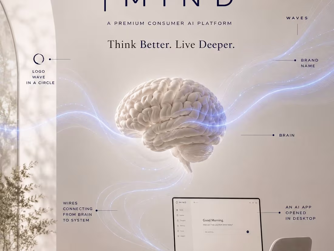
This brand campaign for MIND, an advanced artificial intelligence platform, operates on the core belief: "Thought without boundaries." Utilizing a vast, high-contrast digital dark landscape illuminated by a glowing blue glass neural hub, the layout treats complex machine intelligence as an imposing, beautifully structured monument. The transition from your layout sketch—which precisely mapped out the central floating brain architecture, the network nodes, and the commanding 'MIND' typography—into this cinematic execution underscores a technology brand built to redefine the horizons of human and machine potential.
When an experienced designer studies these sketches and attempts to bring them to life through design, the outcome can be truly remarkable. I also have a well-defined vision for directing designers to produce outstanding results.
1
41
CADENCE — Premium Indian Mechanical Watch Brand Direction
Choosing a mechanical watch is a philosophical act. In a world where your phone tells the time in one millisecond, choosing to carry a small machine that requires wind, maintenance, and patience is a decision about what kind of relationship you want with the objects in your life. CADENCE is the Indian mechanical watch brand built for that decision. Not Swiss nostalgia. Not affordable luxury performing above its station. Just a watch engineered to be worn for forty years by someone who found that relationship more honest than a battery. This project delivers complete brand direction: visual world architecture, colour language, typography system, and full campaign imagery — every cinematic frame atmosphere-locked under a single jeweller's lamp. Watchmaker's Black. Lumed Ivory. Polished Steel. Movement Gold. The dial is a landscape. The movement is architecture. The choice is philosophical.
M N LOKESHWAR REDDY, Creative Director.
1
1
58
MERIDIAN: The Architecture of Pure Horizon
This brand campaign for MERIDIAN, an elite electric luxury automotive brand, is anchored by the philosophy: "The world is yours to cross." Utilizing a deep, dark terrain contrasted with a minimalist white typography layout and a sweeping, warm golden sunset horizon, the composition frames the vehicle as the ultimate instrument of quiet freedom. The transition from your layout sketch—which perfectly mapped out the mountain peaks, the dramatic cliffside placement, and the precise side profile of the car—into this high-fidelity, cinematic execution underscores a brand built for those who command the horizon.
When an experienced designer studies these sketches and attempts to bring them to life through design, the outcome can be truly remarkable. I also have a well-defined vision for directing designers to produce outstanding results.
1
55
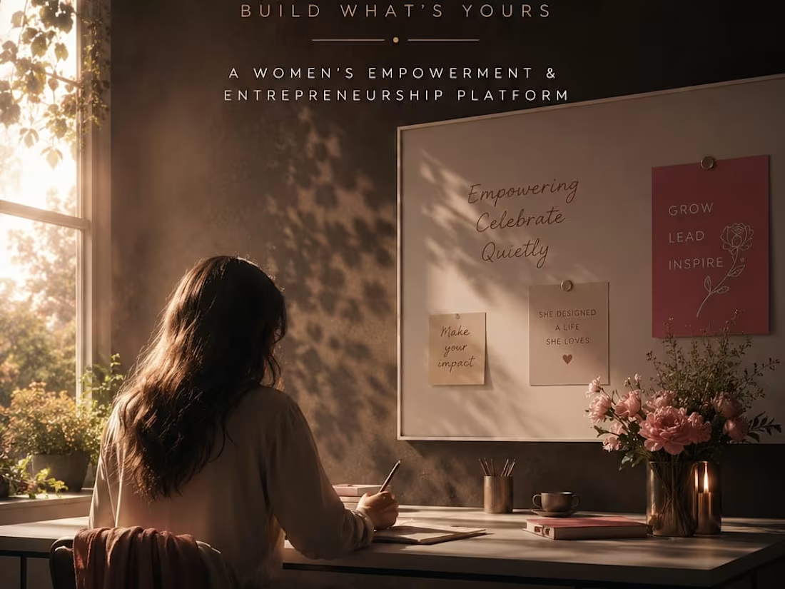
BLOOM: The Architecture of Unapologetic Growth
This brand identity and campaign for BLOOM, a premium women empowerment initiative, centers on the philosophy: "Growth is not silent." Utilizing a deep midnight black backdrop contrasted with premium soft-cream typography and a striking, multi-layered crimson floral integration, the composition balances soft grace with undeniable inner strength. The transition from your initial layout—mapping out the clean female silhouette profile, the flowing botanical details, and the commanding 'BLOOM' wordmark—into this high-fidelity, cinematic execution underscores a movement built to elevate, honor, and empower the collective female voice.
When an experienced designer studies these sketches and attempts to bring them to life through design, the outcome can be truly remarkable. I also have a well-defined vision for directing designers to produce outstanding results.
1
46
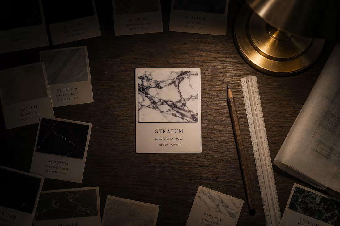
STRATUM — Premium Architectural Stone Brand Application Direction
STRATUM does not manufacture stone. The earth does that over a million years. STRATUM finds it, cuts it, and places it exactly where it needs to be. This is a Brand Application Direction project — the most real form of brand direction. Not what the brand looks like on a screen. What it looks like when it exists in the world: on a delivery truck carrying a million years of geological time, on a craftsman's hard hat, in a stone specification document at 11pm on an architect's desk, on the sample card that wins the project. The visual world is built from the same material as the product — CSS-generated geological veining runs through every frame. Every HTML frame simulates the letterpress quality of ink pressed into stone. Raking light reveals texture in both the photography and the design. Veined Marble. Slate Ink. Seam Gold. Quarry Dust. The earth made it. We reveal it.
M N LOKESHWAR REDDY, Creative Director.
1
1
50
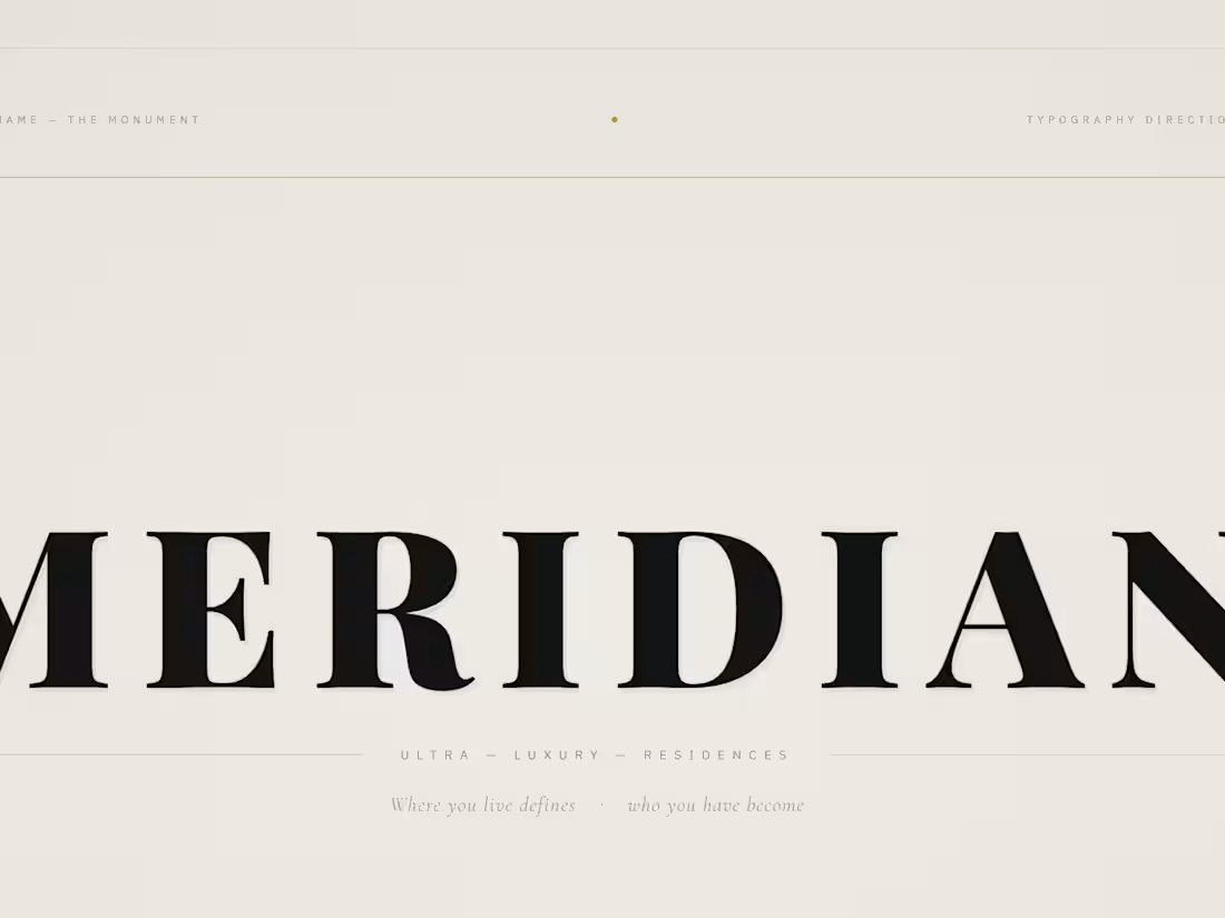
MERIDIAN — Ultra-Luxury Real Estate Typography Direction
Typography Direction is the most demanding form of brand direction. No photography. No atmospheric images to carry the weight. Only letterforms, space, hierarchy, tension, and the conviction that the right typeface in the right position says more than any photograph of marble or skyline. MERIDIAN is an ultra-luxury residential real estate developer that does not sell apartments. It sells the permanent fact of arrival. This project delivers complete typography direction — letterform anatomy dissected, scale hierarchy from monument to whisper, the Swiss 12-column grid system made visible, three typeface voices documented and demonstrated, and the brand applied across letterhead, lobby plaque, and business card. Playfair Display. Cormorant Garamond. IBM Plex Sans. Three voices. One position. The type is the building.
M N LOKESHWAR REDDY, Creative Director.
1
1
51
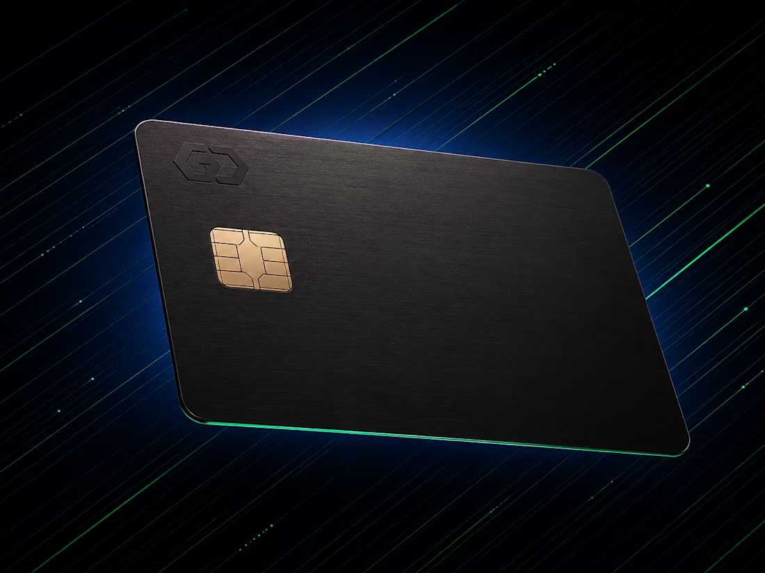
AXON — Premium Neobank UI Direction
AXON is built for the person who finds current banking interfaces an insult to their intelligence. Not a bank that feels friendly. A bank that feels fast. The visual direction lives entirely in the language of digital precision — terminal interfaces, live data streams, the physical card as a material object in a world that has forgotten what physical objects feel like. This is a complete UI Direction project: above-the-fold visual world, card design direction, dashboard energy, and data visualization language — every frame atmosphere-locked from the first to the last. System Black. Signal Green. Deep Navy. Chrome White. Every number is a decision. Every pixel is a commitment. Zero tolerance for friction. The screen is the product.
M N LOKESHWAR REDDY, Creative Director.
1
1
52
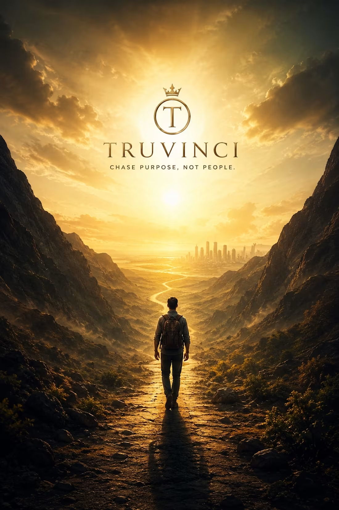
TRUVINCI: The Architecture of Written Truth
This brand identity and poster campaign for TRUVINCI, a premium editorial and quote brand, anchors itself on the core philosophy: "If it doesn't challenge you, it doesn't change you." Utilizing an monolithic pure black backdrop contrasted with a sharp, blinding orange light portal, the layout treats profound statements as physical monuments. The seamless translation from concept to this high-contrast, cinematic execution showcases a brand built to give words weight, structure, and undeniable human resonance.
When an experienced designer studies these sketches and attempts to bring them to life through design, the outcome can be truly remarkable. I also have a well-defined vision for directing designers to produce outstanding results.
1
49
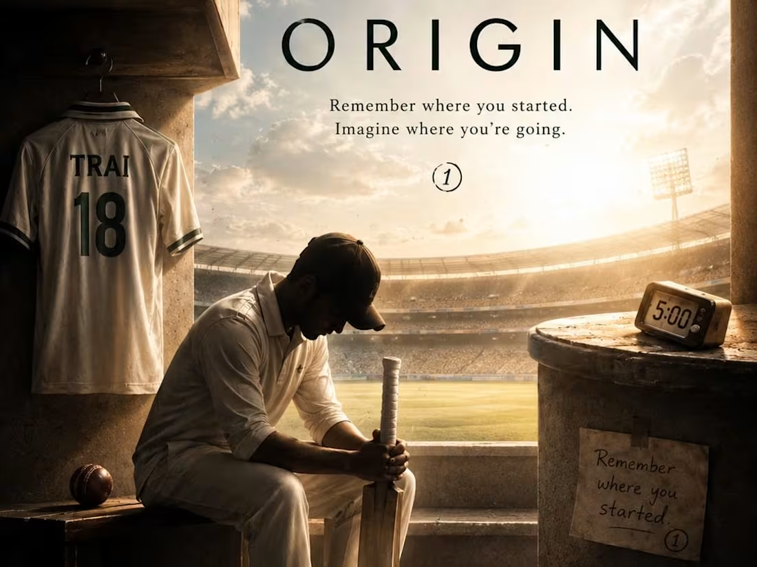
ORIGIN: The Chemistry of Dominance
This brand campaign for ORIGIN, a premium performance sports brand, anchors itself on the ruthless philosophy: "Greatness isn't given, it's taken." Utilizing a deep, textured black backdrop shattered by a sharp crimson vector glow and raw, metallic architecture, the design elevates athletic movement into high-art engineering. The transition from your initial layout—mapping out the soaring basketball player, the exact hoop orientation, and the bold 'ORIGIN' typographic system—into this high-fidelity, high-octane execution showcases a sportswear brand built for relentless competitive dominance.
When an experienced designer studies these sketches and attempts to bring them to life through design, the outcome can be truly remarkable. I also have a well-defined vision for directing designers to produce outstanding results.
1
46
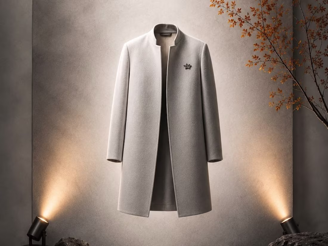
VOID: The Presence of Absence
This brand campaign for VOID Season 2 is a study in impossibly minimal elegance. Built on the philosophy of "presence without noise," the design utilizes a pure white backdrop contrasted by deep-set stone textures and precise lighting to elevate a single floating light-grey coat. The transition from your initial layout—detailing the specific floor lights, the 'VOID' wordmark placement, and the coat's signature crown badge—into this cinematic execution showcases a revolutionary luxury cloth brand defined by sophisticated void-space and structured silence.
When an experienced designer studies these sketches and attempts to bring them to life through design, the outcome can be truly remarkable. I also have a well-defined vision for directing designers to produce outstanding results.
1
39

VITAL: The Science of Human Longevity
This brand identity for VITAL, a premium health and medical care provider, operates on the core principle: "Precision is care." Utilizing a pristine white clinic background contrasted with an authoritative deep crimson branding and a glowing pulse wave accent, the design visualizes cutting-edge healthcare. The transition from your layout sketch—meticulously detailing the heart health pulse line, a central medicine bottle, and laboratory test tubes—into this high-fidelity, cinematic medical layout highlights a brand engineered for trust, data accuracy, and elite vitality.
When an experienced designer studies these sketches and attempts to bring them to life through design, the outcome can be truly remarkable. I also have a well-defined vision for directing designers to produce outstanding results.
1
36
KŌDO — Premium Travel Lifestyle Brand Direction
KŌDO means the path one travels. A premium travel lifestyle brand built for the person for whom travel stopped being an event and became a state of being. This is not luggage. It is the complete visual language of a life in motion — in airport lounges at 6am, on bullet trains between cities, in every transit space that becomes temporarily yours. The visual world lives in pre-dawn airport architecture, motion-blurred terminal corridors, the temperature split of cool fluorescent against warm transit amber wayfinding, and the specific quiet of departure halls before the crowds arrive. Every frame shares one atmosphere: ISO 6400 digital grain, hard diagonal compositional energy, Julius Shulman architectural precision meeting Wolfgang Tillmans intimacy in transit. Jet Graphite. Transit Amber. Titanium. Void White. The journey is where you feel most yourself.
M N LOKESHWAR REDDY, Creative Director.
1
1
46
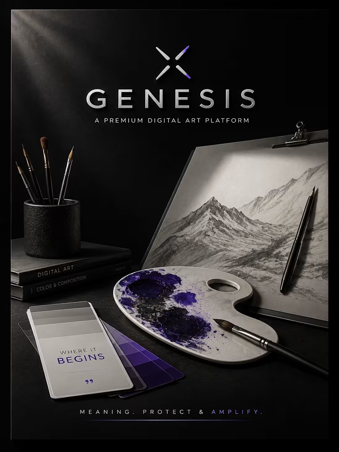
GENESIS: The Architecture of Original Creation
This brand campaign for GENESIS, a premium contemporary art and design studio, centers on the philosophy: "Every creation begins with a single element." Utilizing a dark, expansive ocean backdrop paired with a clean white geometric mark and a surreal, glowing celestial crack, the design builds an environment of profound curiosity. The transition from your layout sketch—meticulously detailing the vast sea horizon, the massive central stone structure, the solitary onlooker, and floating cosmic debris—into this cinematic execution underscores a brand built around epic storytelling and raw, imaginative power.
When an experienced designer studies these sketches and attempts to bring them to life through design, the outcome can be truly remarkable. I also have a well-defined vision for directing designers to produce outstanding results.
1
41
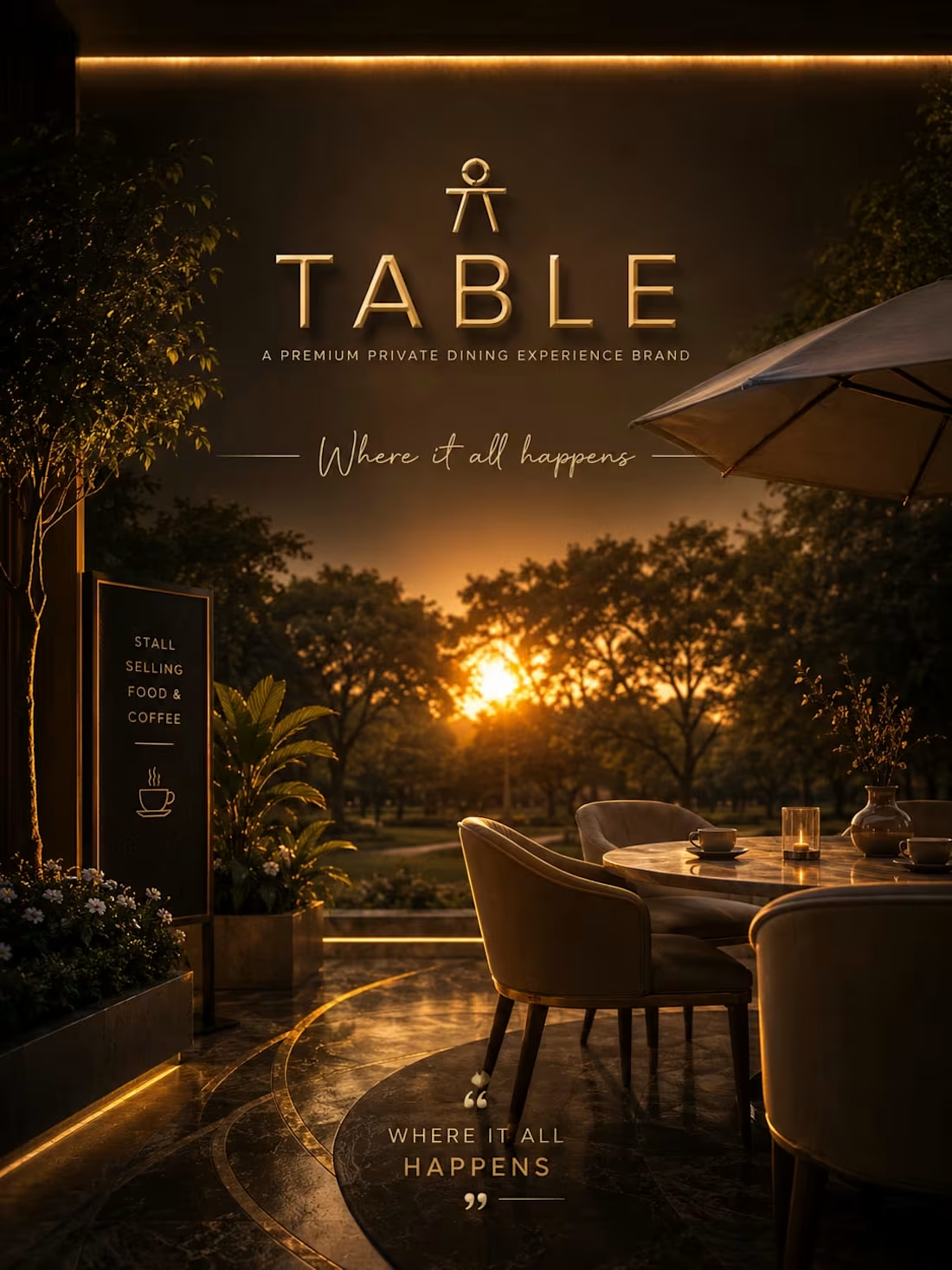
TABLE: The Art of Slow Dining
This brand identity for TABLE, a premium fine-dining concept, centers on the philosophy: "Taste the time." Utilizing a deep, intimate background contrasted with clean white minimalist branding and a soft, golden illumination accent, the design crafts an atmosphere of quiet luxury. The transition from your layout sketch—meticulously detailing the single plate setting, floating natural elements, and structural mood lines—into this high-fidelity, cinematic restaurant environment underscores a brand dedicated to culinary precision and sensory presence.
When an experienced designer studies these sketches and attempts to bring them to life through design, the outcome can be truly remarkable. I also have a well-defined vision for directing designers to produce outstanding results.
1
32
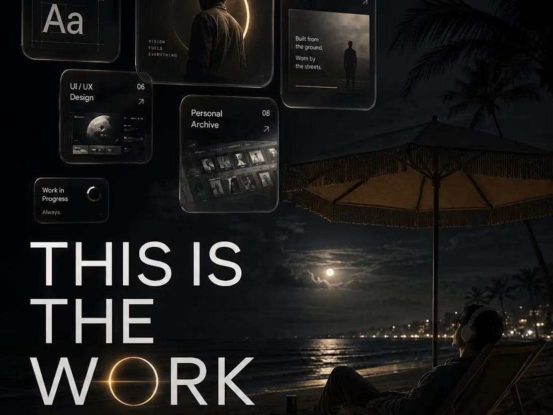
MANIFESTO: The Personal Brand of Creative Direction
This personal brand identity focuses on the pinnacle of visual strategy: setting the vision and letting the elements fall into place. Utilizing a dramatic, high-contrast sky background paired with minimalist typography and floating layout cards, the design visualizes the ultimate workflow of an art director. The transition from your initial layout sketch—mapping yourself relaxing on a beach while the heavy creative heavy lifting floats effortlessly above—into this high-fidelity, cinematic execution showcases an elite brand built on deep intuition, strategic silence, and absolute visual dominance.
When an experienced designer studies these sketches and attempts to bring them to life through design, the outcome can be truly remarkable. I also have a well-defined vision for directing designers to produce outstanding results.
1
24
LUMIS — Premium Biohacking Wellness Packaging Direction
LUMIS is precision biohacking for the professional who treats their body the way an engineer treats a system — not with hope, but with data, compounds, and rigorous protocol. This is a packaging direction project: the complete visual and material language for a range of six formulations, from Sleep Architecture to Cognitive Bandwidth. Matte obsidian glass vials. Precision-machined platinum caps. Clinical white environments. Hairline-embossed product codes. Every container is an argument that what's inside is different from everything else on the shelf. The Atmosphere Lock runs through every single frame — Albert Watson clinical product precision, zero grain, absolute digital edges, Precision Blue appearing only where light refracts through the glass. Obsidian Core. Precision Blue. Platinum Interface. Clinical White. The packaging is the product before the product.
M N LOKESHWAR REDDY, Creative Director.
1
2
70
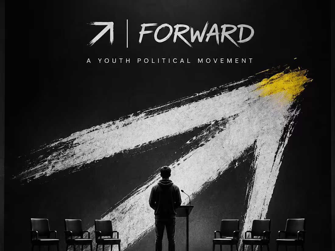
FORWARD: Driving the Momentum of Youth Civic Action
This brand campaign for FORWARD, a youth political movement, anchors itself on the core message: "The time is now." Utilizing a bold black background paired with a stark white painted arrow mark and a single urgent yellow accent tip, the design channels the raw energy of a grassroots mobilization. The transition from your initial layout—mapping out a leader speaking to people in a huge open area—into this high-contrast, cinematic rally execution underscores a contemporary movement built to propel collective voices forward.
When an experienced designer studies these sketches and attempts to bring them to life through design, the outcome can be truly remarkable. I also have a well-defined vision for directing designers to produce outstanding results.
1
35
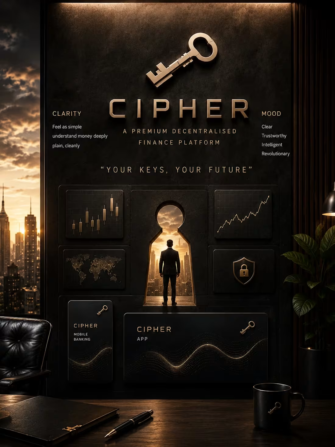
CIPHER: The Architecture of Decentralized Wealth
This brand identity for CIPHER, a premium Web3 and cryptocurrency finance platform, operates on the core principle: "Your keys, your future." Utilizing a deep charcoal background paired with premium gold accents, the design prioritizes absolute clarity to help users understand money deeply. The transition from your initial sketch—mapping out wall-mounted market graphs, floating crypto keys, and mobile banking applications—into this high-fidelity executive room environment showcases a revolutionary financial platform engineered for a secure, sophisticated digital future.
When an experienced designer studies these sketches and attempts to bring them to life through design, the outcome can be truly remarkable. I also have a well-defined vision for directing designers to produce outstanding results.
1
44
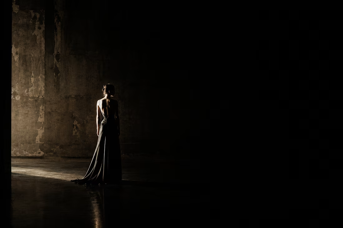
NŌIR — Ultra-Luxury Couture Fashion House Brand Direction
NŌIR is not a fashion brand. It is a position. Built for the woman who has stopped performing femininity and started inhabiting it. Every garment is a decision. Every silhouette is an argument. Every fabric is chosen because nothing easier would be honest. The visual world lives entirely in the language of architecture and light — a single hard sidelight at 90 degrees, absolute black in 80% of every frame, and Blanc Cassé as the only warmth that is permitted. This project delivers complete brand direction: visual world architecture, colour system, typography, and full campaign imagery — every frame atmosphere-locked from the first to the last. Paolo Roversi reverence and Juergen Teller honesty. 8x10 long exposure film quality throughout. Absolute Void. Midnight Ink. Oxidised Silver. Blanc Cassé. The palette is a philosophy. She inhabits it.
M N LOKESHWAR REDDY, Creative Director.
1
1
67
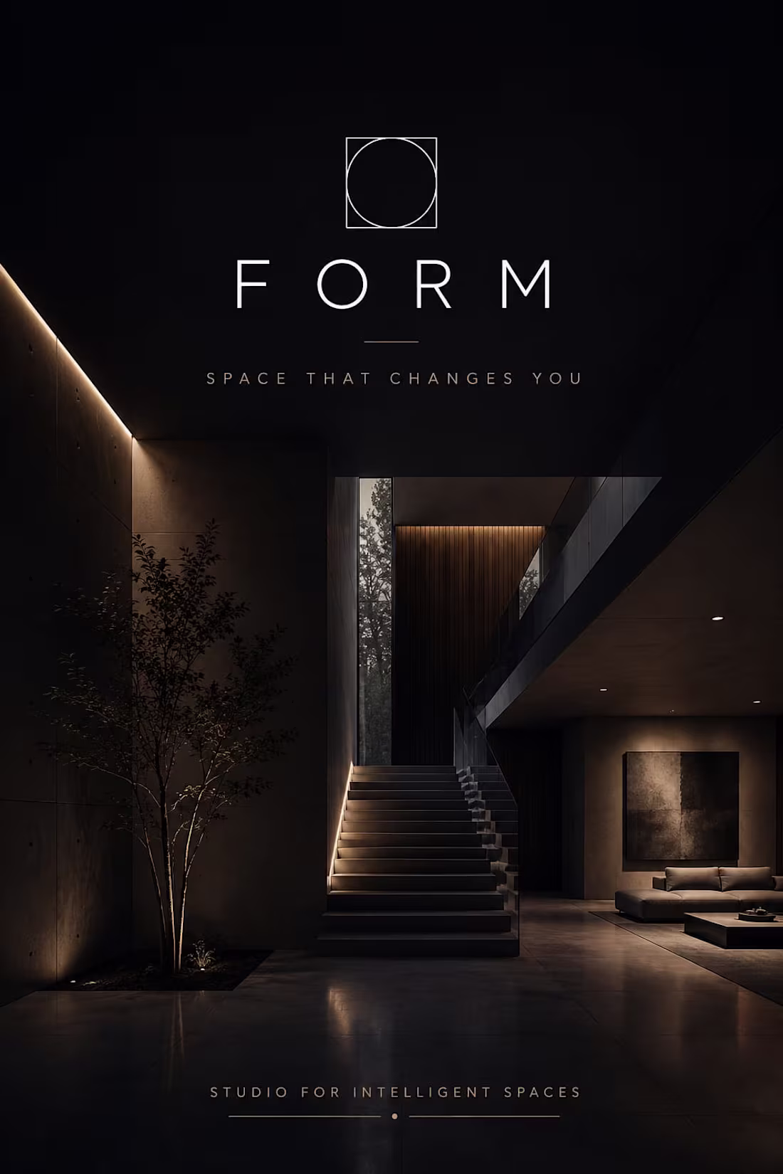
FORM: Studio for Intelligent Spaces
This brand identity for FORM, a premium architecture studio, centers on the core philosophy: "Space that changes you." Utilizing a high-contrast composition with warm concrete grey lighting and deep graphite tones, the design maps a revolutionary approach to structural layout. The transition from your initial interior sketch—detailing the rising steps, the clean circle-in-square logo, and the lounge seating—to this cinematic execution highlights a studio built on standing differently and thinking differently about spatial design.
When an experienced designer studies these sketches and attempts to bring them to life through design, the outcome can be truly remarkable. I also have a well-defined vision for directing designers to produce outstanding results.
1
50
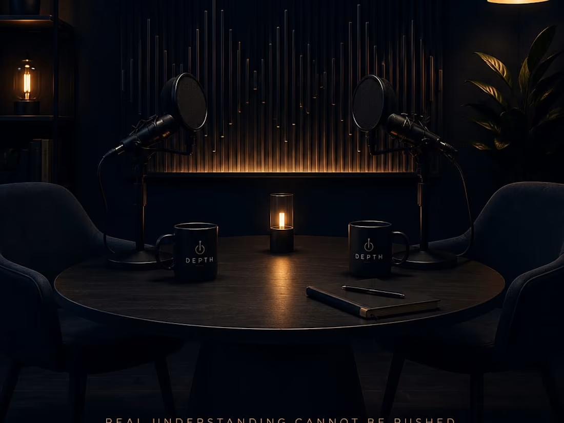
DEPTH: The Architecture of Long-Form Conversation
This brand identity for DEPTH, a premium long-form interview podcast, is built on the belief that "real understanding cannot be rushed." Utilizing an intimate deep navy backdrop accented by a clean white depth mark and a warm amber discovery circle, the design establishes an environment optimized for meaningful dialogue. The transition from your layout sketch—which mapped out the central table, opposing interview chairs, sound-capturing microphones, and ambient studio lamps—into this hyper-polished, cinematic execution underscores a media brand dedicated to going further in.
When an experienced designer studies these sketches and attempts to bring them to life through design, the outcome can be truly remarkable. I also have a well-defined vision for directing designers to produce outstanding results.
1
49
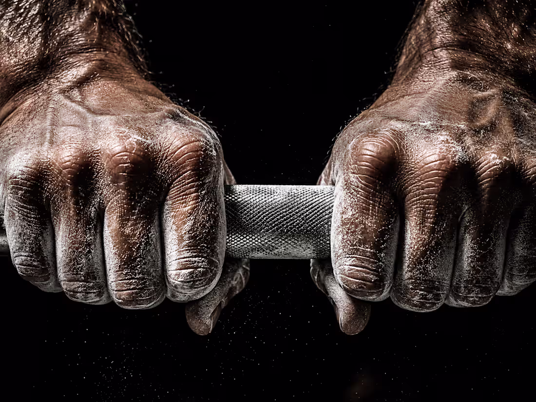
FORGED — Premium Sports Nutrition Campaign Direction
FORGED is the first Indian sports nutrition brand with the visual language of a global performance house. This is not a brand direction project. This is a full campaign direction — "MADE, NOT BORN." A three-phase campaign that documents the transformation, not the result. Before the body changes, the decision changes. Before the decision, there is a moment. Every frame lives in that moment — the darkness before the first rep, the breath between sets, the bead of sweat that falls before everything begins. Industrial gym at 4am. Single overhead hard light. Iron, chalk, and earned skin. Every cinematic frame began as a hand-drawn composition sketch before AI brought the world to life. Iron Void. Cold Iron. Earned Skin. Forge Fire. No rep was wasted. No frame was either.
M N LOKESHWAR REDDY, Creative Director.
1
1
72
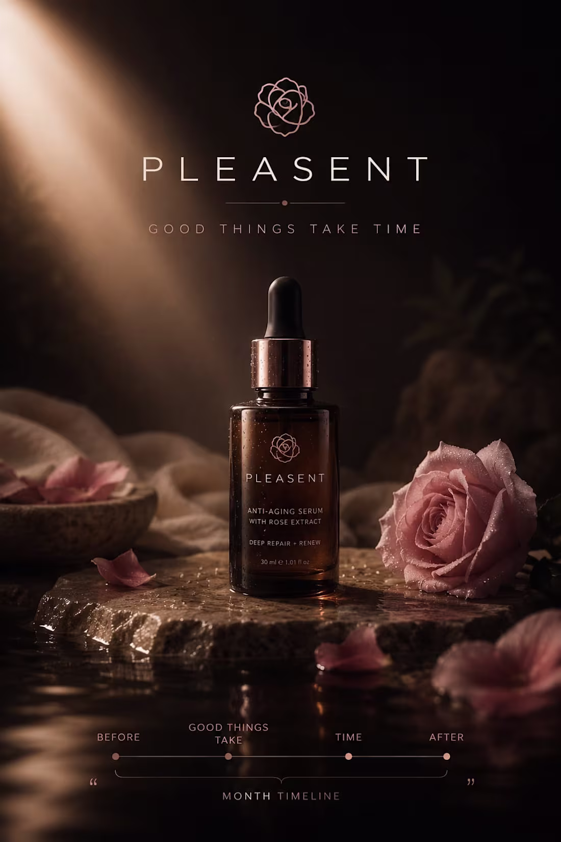
PLEASENT: The Patience of Skincare
This brand campaign for PLEASENT, a premium anti-aging skincare line, operates on the core philosophy: "Good things take time." Utilizing a soft ivory background against rich rose-brown tones and a "blush pink half-bloom" accent, the design visualizes quiet power and natural renewal. The transition from your layout sketch—which mapped out floating petals, the specific "PLEASENT" typography, and a detailed results timeline—into this high-fidelity lifestyle execution showcases a brand built on honest, long-term efficacy and deep, natural restoration.
When an experienced designer studies these sketches and attempts to bring them to life through design, the outcome can be truly remarkable. I also have a well-defined vision for directing designers to produce outstanding results.
1
45
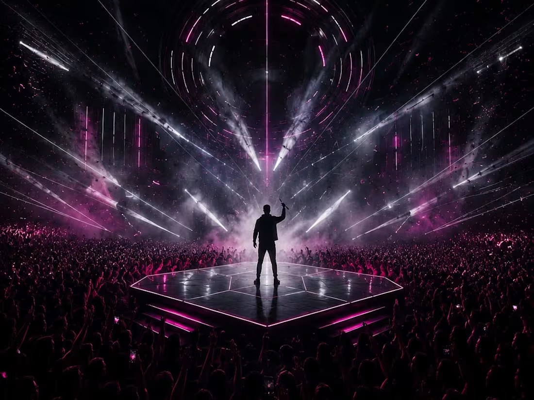
PULSE: The Architecture of Electric Collective Immersive
This brand campaign for PULSE, a premium electronic music festival, captures the fleeting nature of live sound under the tagline: "Feel it before it fades." Utilizing a pure black background exploded by a stark white wordmark and a deep magenta pulse laser accent, the design visualizes the "held breath" of live performance. The transition from your layout sketch—detailing the elevated stage podium, the jacketed artist with a microphone, and fans absorbing the music vibe—to this high-fidelity, high-energy execution establishes a powerful, culturally electric event identity.
When an experienced designer studies these sketches and attempts to bring them to life through design, the outcome can be truly remarkable. I also have a well-defined vision for directing designers to produce outstanding results.
1
2
61
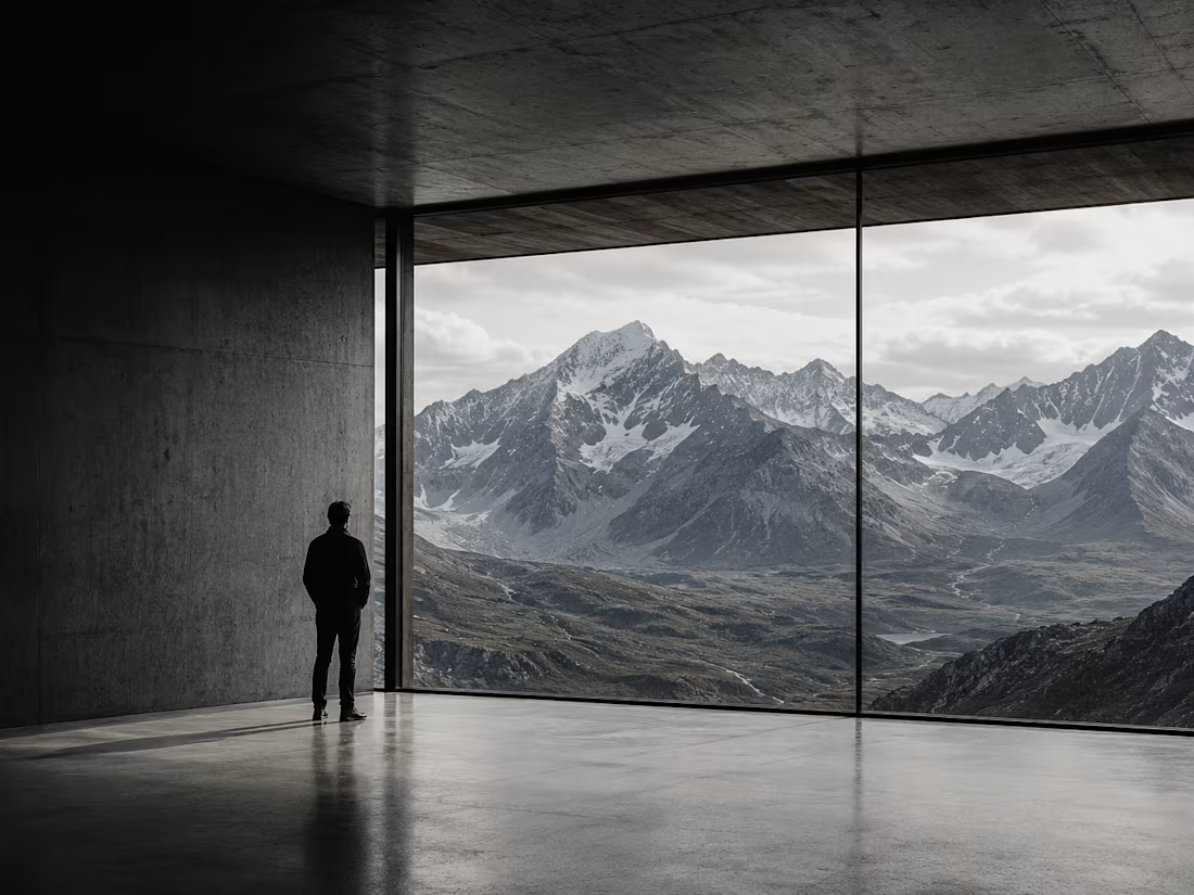
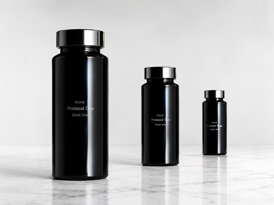
RŌHE — Ultra-Premium Residential Architecture Brand Direction
RŌHE doesn't design homes. It designs the precise relationship between a human being and the land beneath them. Every project begins with one question: what does this family need the earth to say to them every morning? The visual world is built from the materials of the work itself — raw concrete, aged timber, volcanic rock, mountain sky. Hard directional light with no fill. Deep honest shadow. Architecture that converses with landscape rather than interrupting it. This project delivers complete brand direction: visual world architecture, color language, typography system, and cinematic campaign imagery — every frame sharing one atmosphere: 4x5 film character, Julius Shulman architectural precision, Iwan Baan landscape scale. Deep Shadow. Aged Timber. Raw Concrete. Mountain Sky.
M N LOKESHWAR REDDY, Creative Director.
1
1
71
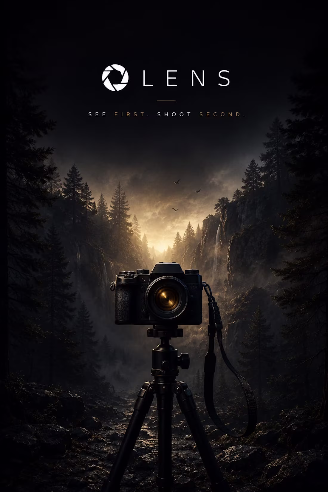
LENS: The Art of Visual Intelligence
This tech product campaign for LENS, a premium AI camera app, centers on the philosophy: "See first. Shoot second." Utilizing a deep black background, a clean white shutter circle mark, and a single sharp amber accent, the design grounds creative technology within a raw natural landscape. The transition from your initial layout—mapping out the camera body, tripod setup, strap, and surrounding trees—to this high-fidelity, cinematic execution presents a brand built for deeply creative and observant visual storytellers.
When an experienced designer studies these sketches and attempts to bring them to life through design, the outcome can be truly remarkable. I also have a well-defined vision for directing designers to produce outstanding results.
1
41
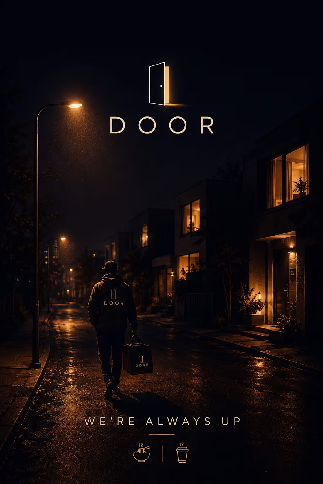
DOOR: The Aesthetic of Midnight Reliability
This brand identity for DOOR, a premium late-night food delivery service, anchors itself on the tagline: "We're always up." Utilizing a deep midnight navy background paired with a glowing amber door mark and soft cream typography, the design masterfully translates your "night at 2am" concept. The transition from your initial sketch—mapping out the street light, delivery agent, houses, and food icons—to this cinematic, comforting execution emphasizes a reliable service operating quietly while the rest of the world sleeps.
When an experienced designer studies these sketches and attempts to bring them to life through design, the outcome can be truly remarkable. I also have a well-defined vision for directing designers to produce outstanding results.
1
39
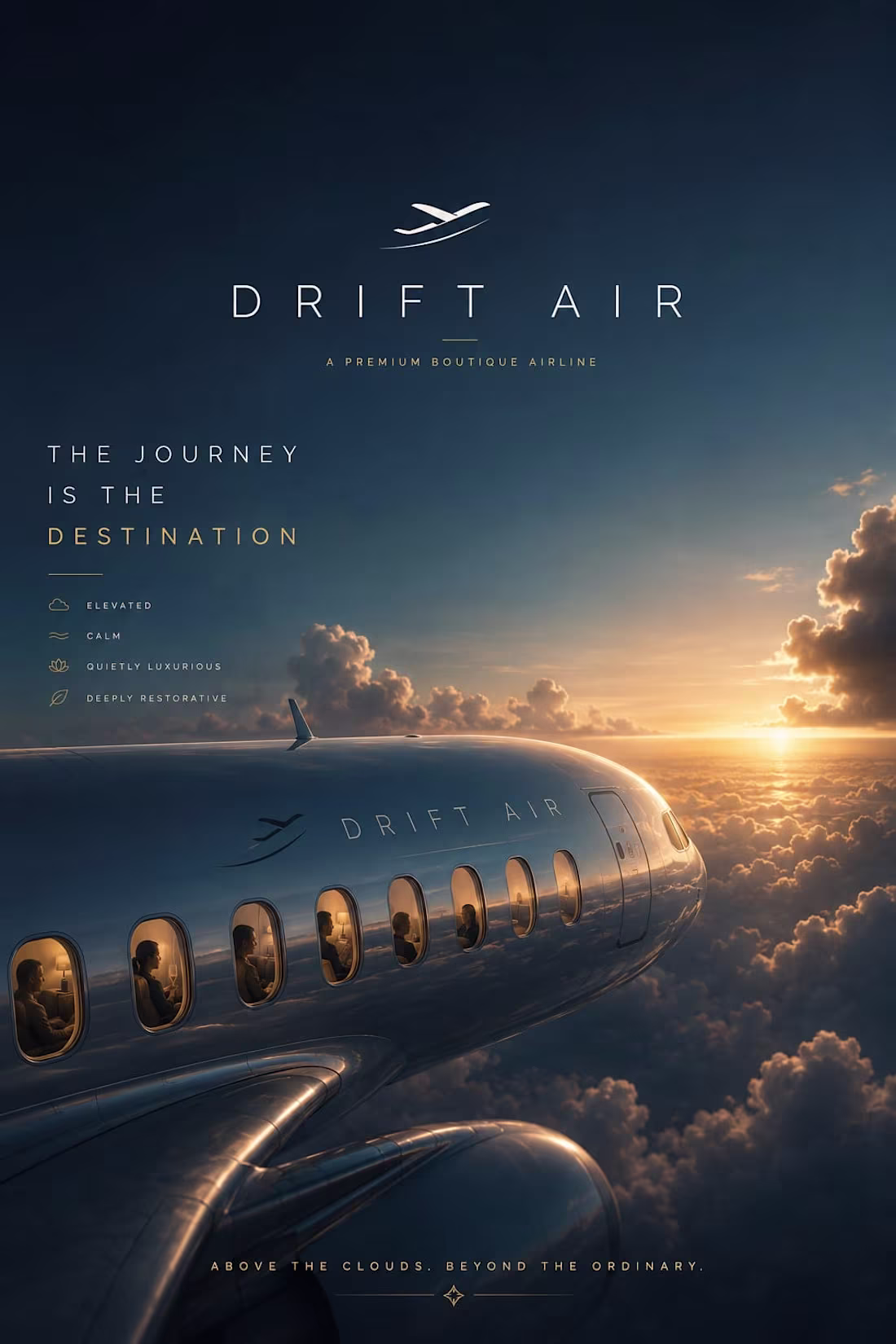
DRIFT AIR: Elevating the Transit Experience
This brand identity for DRIFT AIR, a premium boutique airline, centers on the philosophy: "The journey is the destination." Utilizing a deep sky blue backdrop contrasted with a clean white logo and a golden horizon glow, the design establishes a deeply restorative and calm atmosphere. The transition from your initial layout—mapping out the airplane windows, passenger silhouettes, and floating clouds—to this hyper-polished, cinematic execution presents a brand built around sophisticated, peaceful travel.
When an experienced designer studies these sketches and attempts to bring them to life through design, the outcome can be truly remarkable. I also have a well-defined vision for directing designers to produce outstanding results.
1
40

THĒA — Premium Rare Tea Brand Direction
The rarest teas on earth have never had a brand worthy of them. Until now. THĒA is built for first flush Darjeeling picked at 5am, white silver needle from Fujian grown in mist, and aged pu-erh compressed into stone discs cellared for decades. This is the first brand to treat rare tea the way the world treats rare wine — with provenance, ceremony, and complete reverence. This project delivers full brand direction: visual world architecture, color language, typography system, and cinematic campaign imagery. Every frame shares one atmosphere — Kodak Portra 400 grain, gold dawn light from the left, Gregory Crewdson stillness and Annie Leibovitz warmth. Ancient Garden. Oxidised Gold. Dawn Mist. Moss Stone. The garden and the cup are the same world.
M N LOKESHWAR REDDY, Creative Director.
1
1
65
MANIFESTO 50: The Creative Director’s Declaration
This personal manifesto marks the 50th conceptual poster, translating a full body of work into a unified declaration of "Intelligent, Collective Dominance". Utilizing graduating typographic weights and a luxurious gold signature accent, the design bridges your established "Silence is Strategy" aesthetic with a "Yours Forever" personal commitment. The transition from your initial layout—mapping floating screens and a moments of relaxation—to this sophisticated, multi-layered execution highlights your ability to build purposeful, complex visions from simple concepts.
1
42
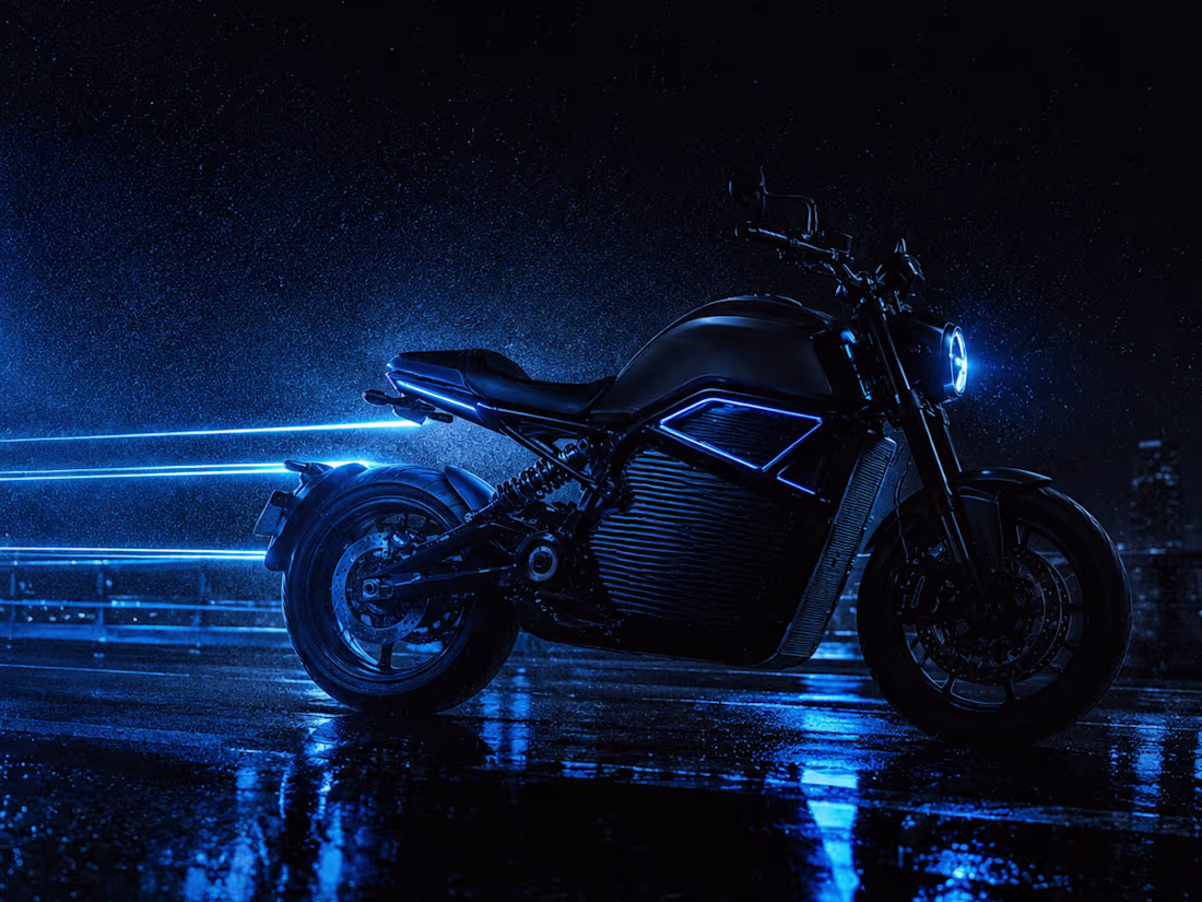
VAEL — Premium Electric Motorcycle Brand Direction
VAEL is built on one conviction — silence is the new power. No combustion. No exhaust. No noise. Just 0 to 100 in 2.8 seconds and the sound of your own heartbeat. The visual world lives entirely in the city at 3am — rain-soaked highways, electric blue light trails cutting through absolute darkness, chrome reflecting neon on wet asphalt. Every single frame in this project shares one atmosphere: pitch black dominates 80%, electric cobalt blue bleeds into every shadow, and a single hard backlight is the only warmth that exists. Brand direction, color world, typography system, and full campaign imagery — every cinematic frame began as a hand-drawn composition sketch before AI image generation built the world. This is not a vehicle campaign. This is an electric manifesto.
M N LOKESHWAR REDDY, Creative Director.
1
1
64
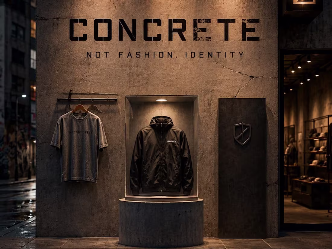
CONCRETE: Architecture of Urban Street Culture
This brand campaign for CONCRETE operates on the core philosophy: "Not fashion. Identity." Utilizing a raw concrete grey backdrop, heavy black stencil typography, and a sharp white crack line aesthetic, the design grounds the clothing line directly into the pavement. The transition from your initial sketch—mapping out hanging apparel, a shield symbol, and a display podium—to this cinematic, rain-slicked street execution highlights an uncompromising brand built from the ground up and worn by the streets.
When an experienced designer studies these sketches and attempts to bring them to life through design, the outcome can be truly remarkable. I also have a well-defined vision for directing designers to produce outstanding results.
1
53
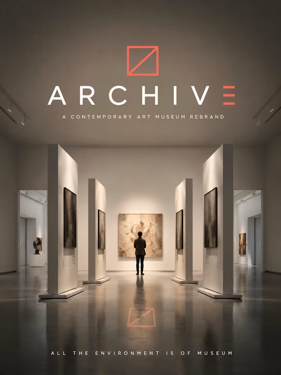
ARCHIVE: Reimagining the Contemporary Gallery Space
This brand campaign for ARCHIVE, a contemporary art museum, operates on the principle that "reaction is the entire point". Utilizing a clean white backdrop accented by a bold square mark and a deep vermillion red diagonal line, the design establishes an environment that is structural, bold, and immersive. The transition from your layout sketch—mapping out angled frames to direct the viewer’s perspective—into this high-fidelity gallery space showcases a cultural institution designed to captivate the modern art enthusiast.
When an experienced designer studies these sketches and attempts to bring them to life through design, the outcome can be truly remarkable. I also have a well-defined vision for directing designers to produce outstanding results.
1
44
KŌVA — Premium Modular Furniture Logo Direction
KŌVA is a premium modular home furniture brand built on one idea — furniture that thinks with you. This project is a pure logo direction study: the development of a geometric K mark where a deliberate gap in the letterform represents the modular connection point — the space where pieces lock together. The mark began as a rough hand-sketched concept showing the composition, the gap, and the angle logic before AI rendered the final geometric form. From mark construction and grid logic to color variations, scale rules, and brand applications — this is the complete identity system for a brand that builds furniture the way it looks: with engineering precision and no wasted element.
M N LOKESHWAR REDDY, Creative Director.
1
1
69
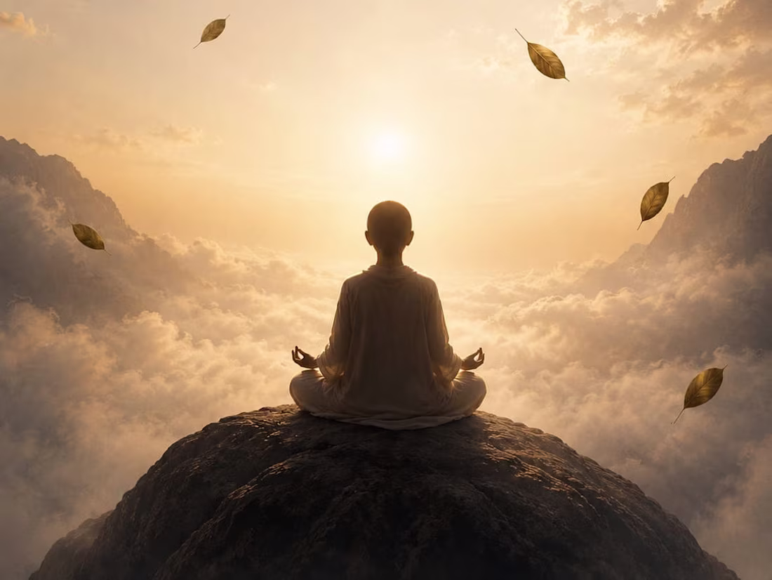
STILL: Redefining Silence in a Noisy World
This brand identity for STILL focuses on the mantra "Do less. Be More." By utilizing a high-altitude, cloud-filled environment and golden atmospheric light, the design communicates absolute silence in empty space. The transition from your initial layout—detailing the floating leaves, blurred clouds, and the deep charcoal dot logo—to this high-fidelity execution highlights a brand dedicated to the art of being present and the power of finding stillness amidst life's movement.
When an experienced designer studies these sketches and attempts to bring them to life through design, the outcome can be truly remarkable. I also have a well-defined vision for directing designers to produce outstanding results.
1
71
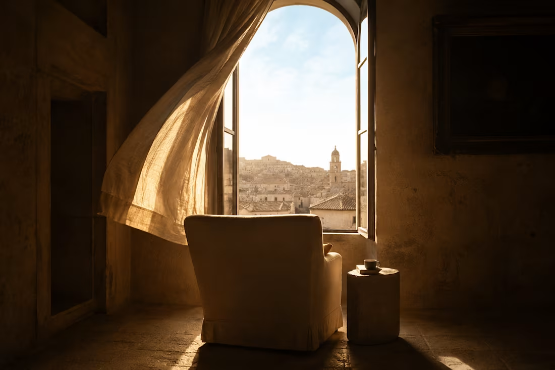
SANCTUM — Ultra-Luxury Boutique Hotel Brand Direction
SANCTUM is not a hotel. It is a deliberate withdrawal from the world — for the person who has seen everything and now needs to feel something again. Twelve rooms maximum. Converted palaces, centuries-old estates, clifftop structures that feel like they grew from the rock beneath them. No lobby music. No printed itineraries. The staff know your name before you arrive. This project delivers complete brand direction: visual world architecture, color language, typography system, and full campaign imagery. Every cinematic frame began as a hand-drawn composition sketch before AI image generation built the world. Ancient Stone. Candlelit Gold. Linen Morning. Worn Terracotta. A world built from centuries of material and rendered in candlelight. You have seen every hotel. This is not a hotel.
M N LOKESHWAR REDDY, Creative Director.
2
3
133
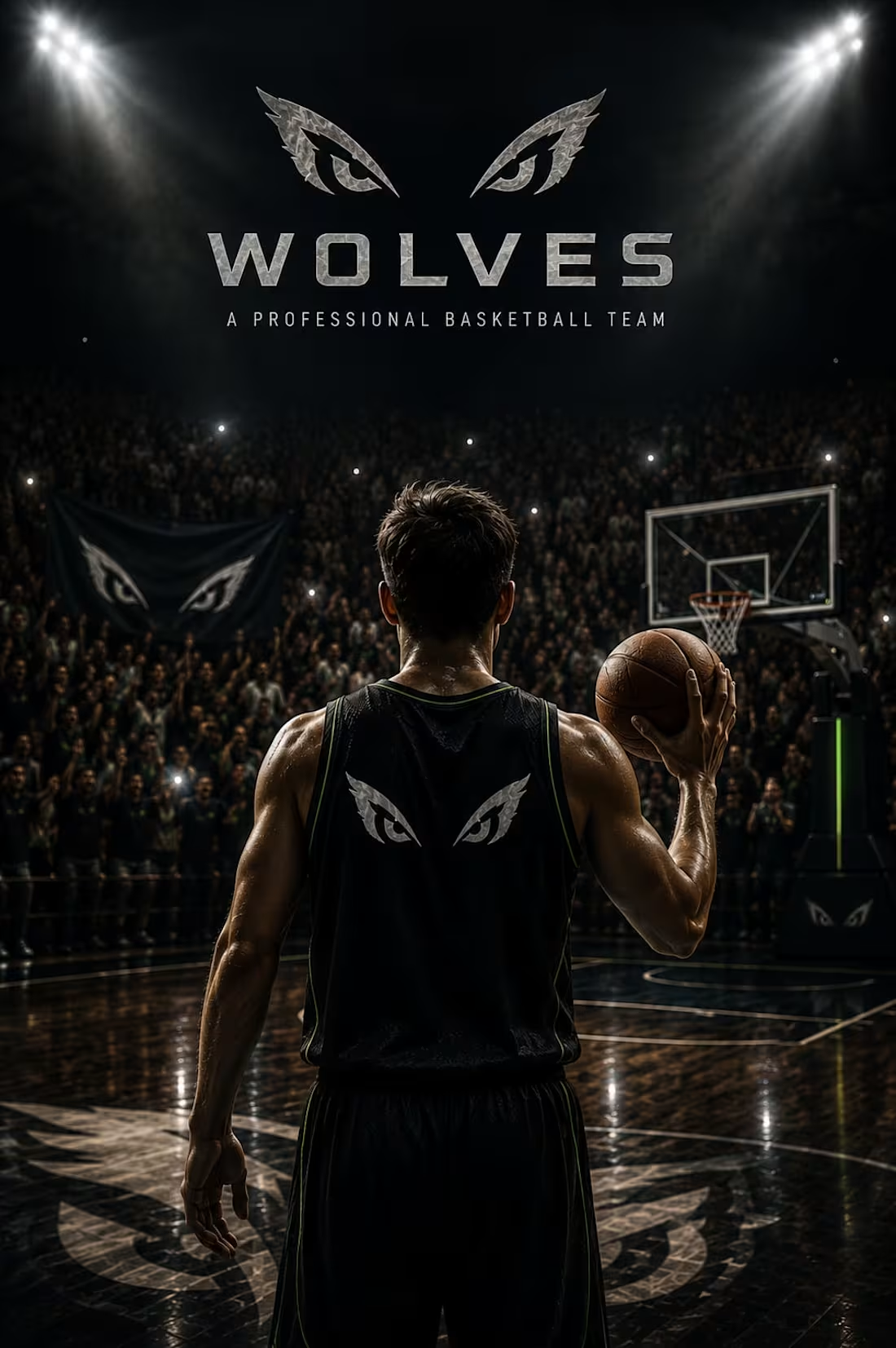
WOLVES: The Strategy of Silence
This rebrand for the WOLVES professional basketball team focuses on an intimidating, elite athletic presence. By utilizing a deep midnight black background with sharp silver and electric green accents, the design translates your "basketball environment" layout into a high-stakes arena. The transition from your initial sketch—detailing the "wolves eyes" logo on the player's back and the crowd in the stadium—to this high-fidelity execution highlights a brand that values precision and collective strength.
When an experienced designer studies these sketches and attempts to bring them to life through design, the outcome can be truly remarkable. I also have a well-defined vision for directing designers to produce outstanding results.
1
74
ANCHOR: Supporting the Rise of Homeless Youth
This brand identity for ANCHOR focuses on dignity and strength for youth in transition. Utilizing a deep ocean blue backdrop and a warm sunrise orange accent, the design translates the "Hold on. Rise Up" mantra into a cinematic visual. The transition from your initial layout—featuring the anchor logo with two hands and a collection box filled with hopes—to this high-fidelity execution highlights an organization dedicated to providing a solid foundation for those looking to rise.
When an experienced designer studies these sketches and attempts to bring them to life through design, the outcome can be truly remarkable. I also have a well-defined vision for directing designers to produce outstanding results.
1
68
DUSK — Luxury Fine Jewelry Brand Direction
DUSK is built for the hour between. Not day, not night — the exact moment the sky holds both. A luxury fine jewelry brand for the woman who doesn't need an occasion. Not bridal. Not investment. Not a gift waiting to happen. DUSK is the quiet recognition that she has earned this — for no reason other than she has. The visual world pulls from deep indigo twilight skies, rose gold catching the last warmth of a fading sun, velvet surfaces, and celestial geometry. This project delivers complete brand direction: visual world architecture, color language, typography system, and full campaign imagery. Every cinematic frame began as a hand-drawn composition sketch before AI image generation built the world. Twilight Vault. Dusk Rose Gold. Starlight Pearl. Deep Amethyst. You don't need an occasion. You are the occasion.
M N LOKESHWAR REDDY, Creative Director.
1
1
80
WONDER: The Architecture of Pure Imagination
This brand campaign for WONDER focuses on a "warm" environment where children can "Imagine Everything". By utilizing deep midnight blue and soft golden accents, the design translates your "house environment" layout into a cinematic experience. The transition from your initial sketch—mapping out the bed, mat, and child at play—to this high-fidelity execution highlights a brand that nurtures wonder in simple moments.
When an experienced designer studies these sketches and attempts to bring them to life through design, the outcome can be truly remarkable. I also have a well-defined vision for directing designers to produce outstanding results.
1
79
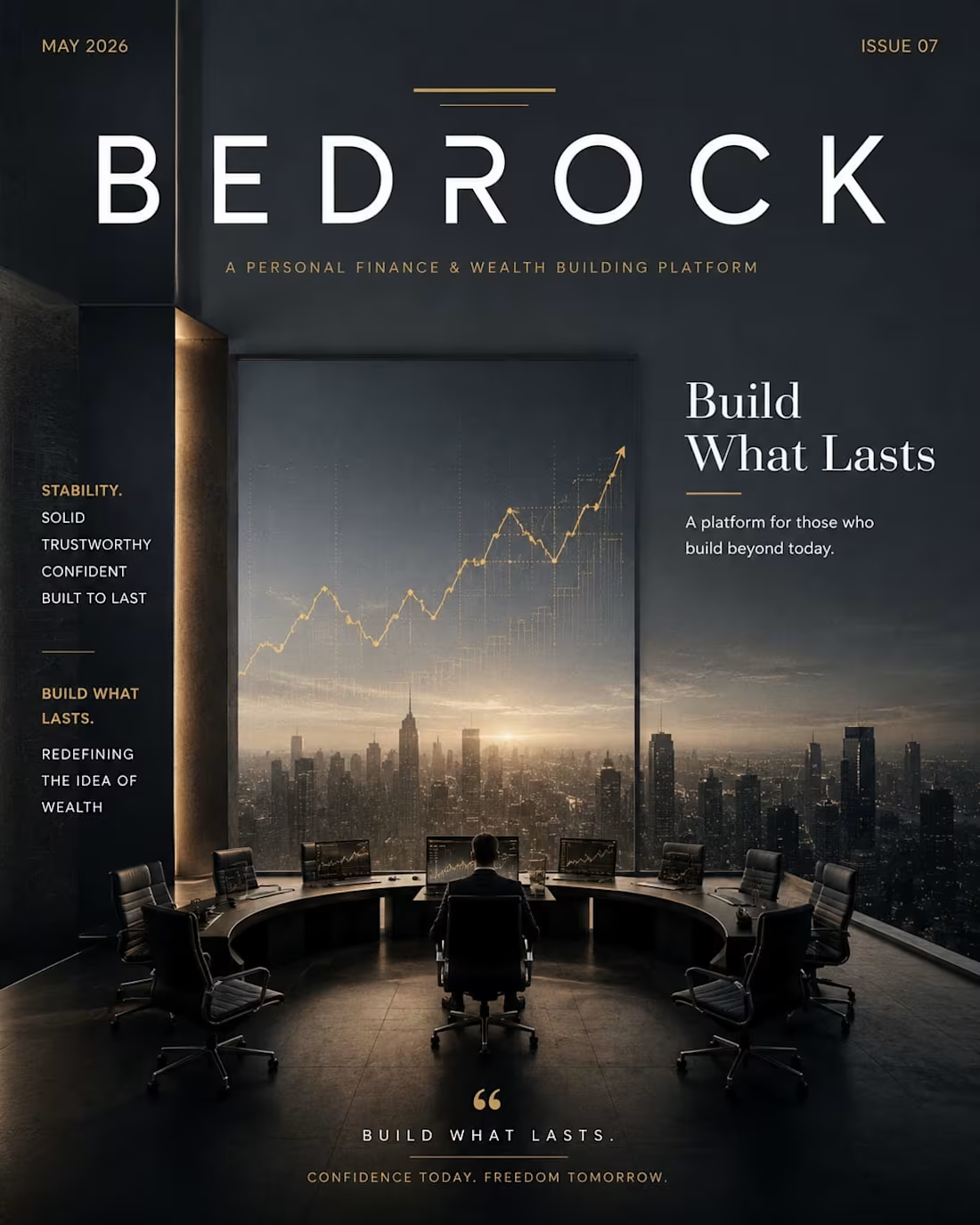
BEDROCK: Redefining the Architecture of Wealth
This brand identity for BEDROCK, a personal finance and wealth-building platform, centers on the core values of stability and long-term growth. By utilizing a "deep slate grey" background paired with clean white typography and a "solid gold" accent layer, the design translates the "Build What Lasts" mantra into a premium visual experience. The transition from your initial layout—mapping out computers, chairs, and market trends—to this high-fidelity execution emphasizes a brand built for those who value confidence today and freedom tomorrow.
When an experienced designer studies these sketches and attempts to bring them to life through design, the outcome can be truly remarkable. I also have a well-defined vision for directing designers to produce outstanding results.
2
56
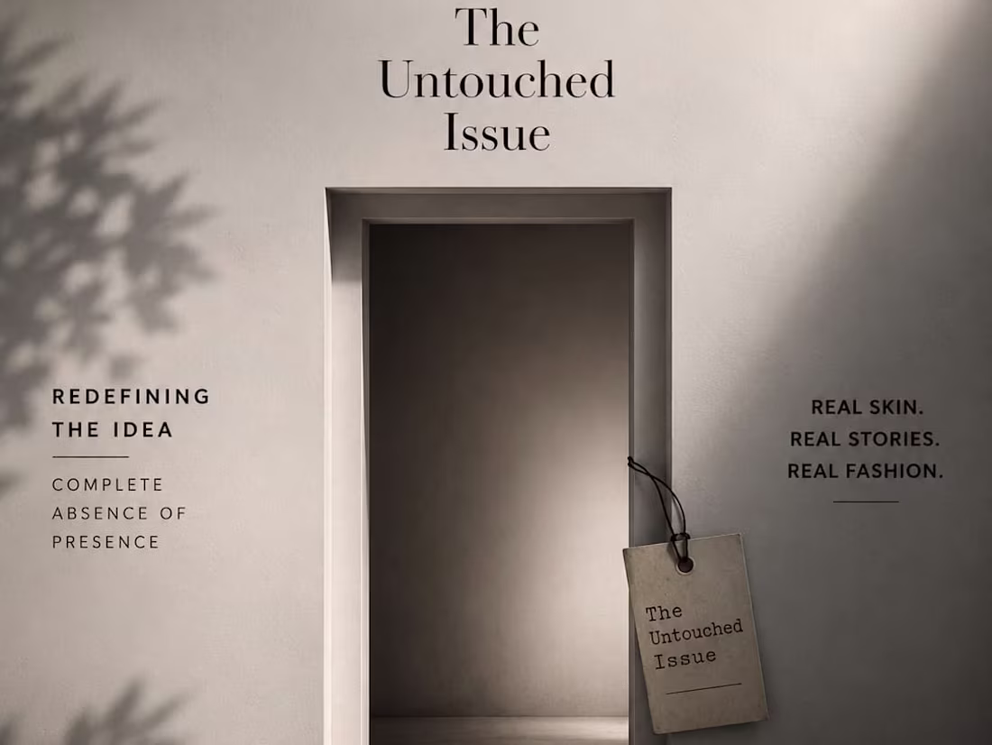
RAW: Redefining the Aesthetic of Truth
This brand identity for a high-end fashion magazine focuses on a "complete absence of pretence". By utilizing a stark white background with a bold black masthead and raw skin-tone accents, the design emphasizes real stories and real skin over traditional retouched perfection. The transition from the conceptual "Untouched Issue" sketch to these cinematic executions highlights a magazine that is bold, honest, and intentionally unfiltered.
When an experienced designer studies these sketches and attempts to bring them to life through design, the outcome can be truly remarkable. I also have a well-defined vision for directing designers to produce outstanding results.
1
50
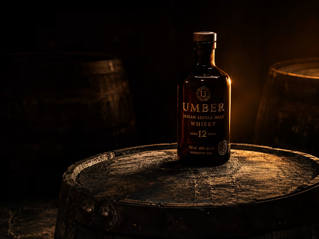
UMBER — Luxury Aged Indian Single Malt Whisky Brand Direction
UMBER is built on a single conviction — India doesn't need to borrow from Scotland. The Deccan plateau, the monsoon climate, the volcanic black soil, and the copper stills running at 3am have always been enough. UMBER is the proof. This project delivers complete brand direction for a luxury aged Indian single malt: visual world architecture, color language, typography system, and full campaign imagery. Every cinematic frame began as a hand-drawn composition sketch before AI image generation brought the world to life. Charred Oak. Copper Still. Harvest Amber. Candlelight. A visual world built entirely from the materials of craft — warm, dark, earned, and unapologetically Indian.
M N LOKESHWAR REDDY, Creative Director.
1
2
82

VELD — Premium Performance Menswear Brand Direction
VELD is built for the man who moves through the world with intention. Not athleisure. Not streetwear. Not a logo. Technical precision dressed in restraint — garments that work harder than they look. The brand's visual world pulls from Nordic pine forests at 5am, mist over still water, and concrete architecture with living moss. This project delivers complete brand direction: visual world architecture, color language, typography system, and full campaign imagery. Every cinematic frame began as a hand-drawn composition sketch before AI image generation brought the world to life. Pine Midnight. Aged Brass. Field Mist. Living Moss. A world built in discipline and rendered in forest light. Performance is not what you wear. It is what you do.
M N LOKESHWAR REDDY, Creative Director.
1
1
65

SŌLO — Single-Origin Artisan Coffee Brand Direction
SŌLO is built on a single discipline: provenance. In a market saturated with blends, subscription gimmicks, and wellness coffee theatre, SŌLO asks one question — where did this actually come from? The brand is built for the person who wants to know the soil, the altitude, and the hands. One farm. One farmer. One story in every cup. This project covers complete brand direction: visual world architecture, color language, typography system, and full campaign imagery. Every cinematic frame began as a hand-drawn sketch before AI image generation brought the world to life. The visual world is raw, warm, and earned — worn wood, terracotta earth, steamed cream, and the near-darkness of a 5am harvest. Provenance as luxury. Traceability as identity.
M N LOKESHWAR REDDY, Creative Director.
1
2
92
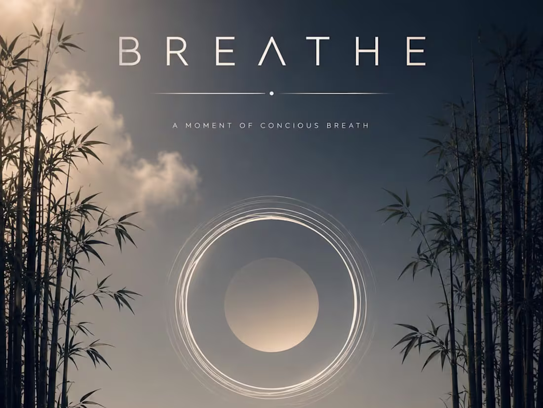
BREATHE: Visualizing the Rhythm of Conscious Awareness
This mental health brand campaign for BREATHE focuses on the simple, transformative power of a single moment of conscious breath. By utilizing a soft, sky-blue background and deep navy typography, the design translates the "In. Out. Again." mantra into a grounding visual experience. The transition from your initial layout—featuring bamboo trees, grass, and a perfect circle—to this high-fidelity execution emphasizes a campaign that is both deeply human and empowering, offering a peaceful sanctuary in a high-stress world.
When an experienced designer studies these sketches and attempts to bring them to life through design, the outcome can be truly remarkable. I also have a well-defined vision for directing designers to produce outstanding results.
2
73
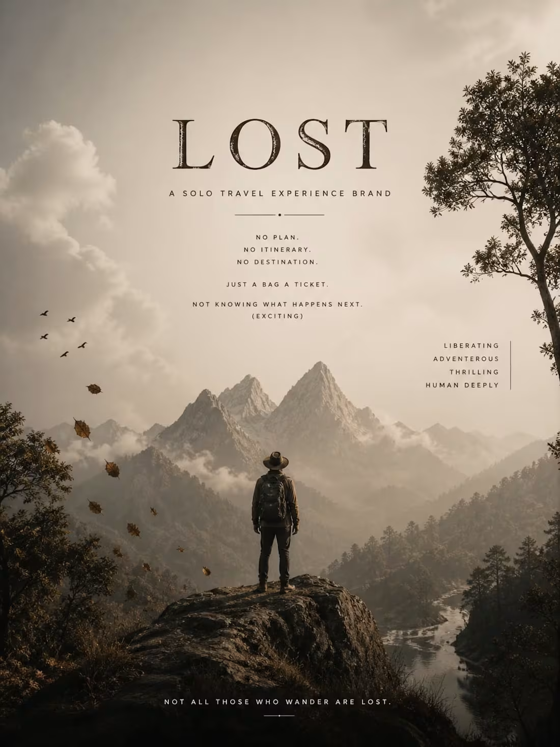
LOST: The Art of Unplanned Discovery
This travel campaign for LOST, a solo travel experience brand, focuses on the thrill of the unknown. By using an "aged cream" color palette and cinematic imagery of vast, mist-covered mountains, the design translates the "No plan. No itinerary." philosophy into a powerful visual narrative. The transition from your initial layout—featuring falling leaves, flying birds, and flowing water—to this high-fidelity execution emphasizes a deeply human connection to nature and the excitement of not knowing what happens next.
When an experienced designer studies these sketches and attempts to bring them to life through design, the outcome can be truly remarkable. I also have a well-defined vision for directing designers to produce outstanding results.
1
66
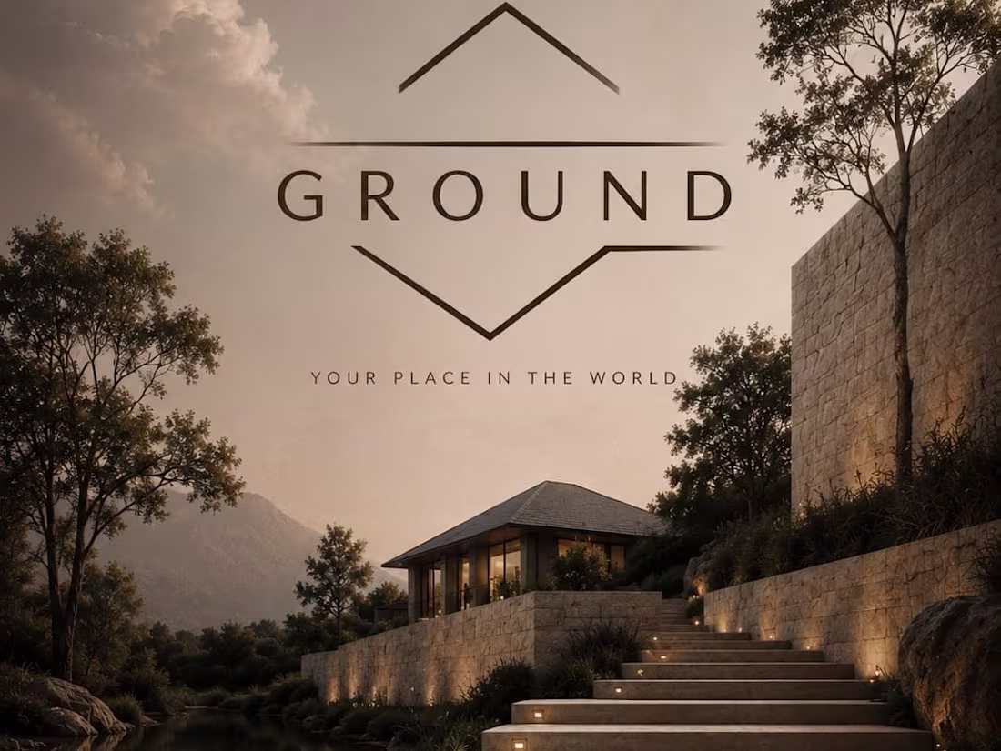
GROUND: Establishing Permanence in Luxury Real Estate
This brand identity for GROUND, a premium property development firm, focuses on the concept of being "rooted" in one's own sanctuary. By utilizing a "warm stone" palette of beige and deep earth browns, the design evokes a sense of quiet power and longevity. The transition from your initial layout sketch—complete with clouds, trees, and architectural steps—to this cinematic execution highlights a brand promise that offers more than just a building; it provides a definitive "place in the world."
When an experienced designer studies these sketches and attempts to bring them to life through design, the outcome can be truly remarkable. I also have a well-defined vision for directing designers to produce outstanding results.
1
58
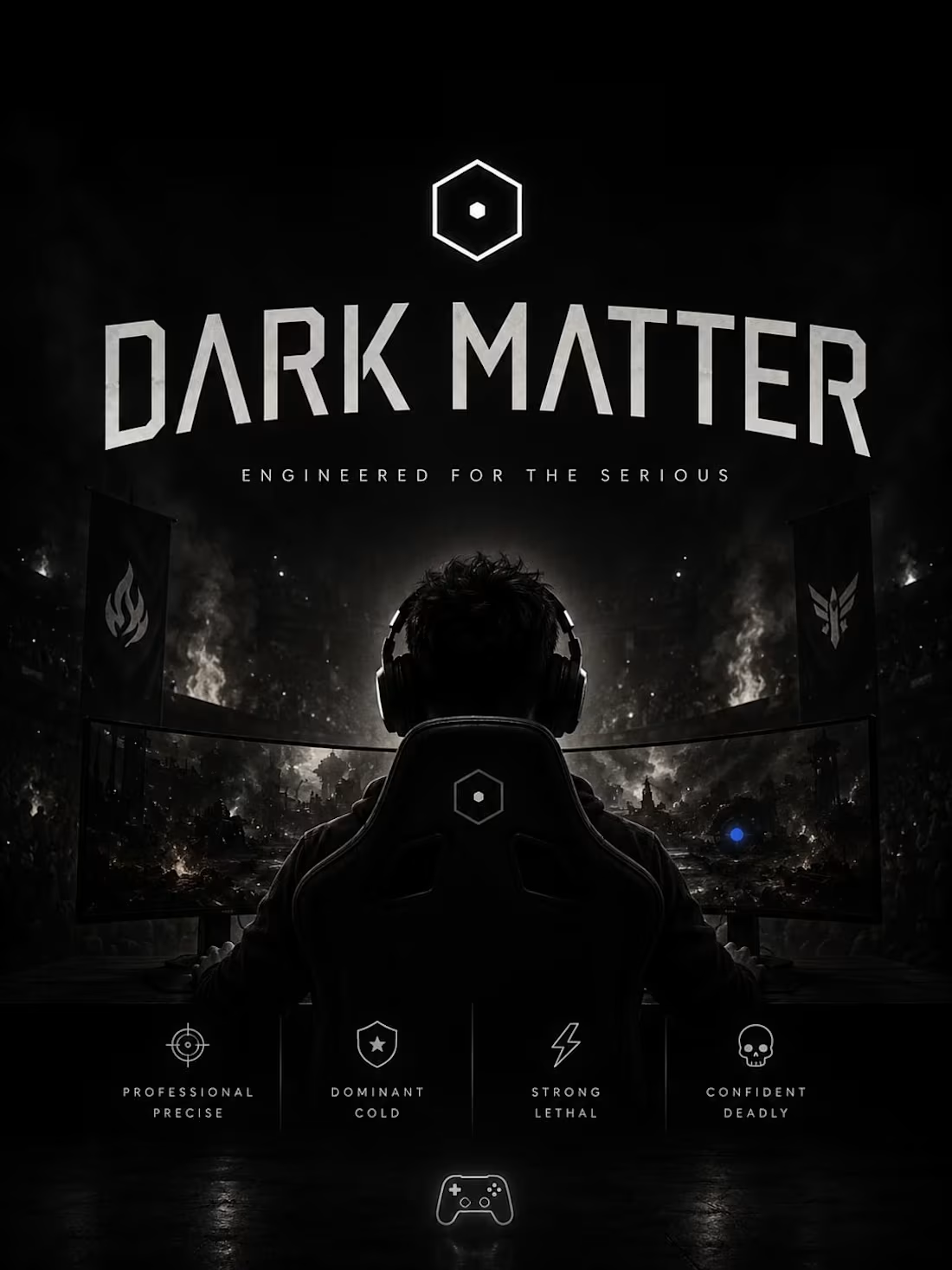
DARK MATTER: Engineering the Future of Competitive Play
This brand identity for DARK MATTER, a premium gaming peripheral brand, explores the intersection of high-performance engineering and raw competitive energy. By utilizing a pure black background accented with a stark white hexagon mark and an electric blue dot, the design captures the "cold, precise" nature of elite esports. The transition from your initial "esports arena" layout to these cinematic executions emphasizes a brand built for those who take gaming seriously, where technology and human skill fuse into a single, unstoppable force.
When an experienced designer studies these sketches and attempts to bring them to life through design, the outcome can be truly remarkable. I also have a well-defined vision for directing designers to produce outstanding results.
1
67
NEVA — Luxury Minimal Skincare Brand Direction
NEVA is a luxury skincare brand built on one discipline — subtraction. In a market that equates complexity with efficacy, NEVA removes everything the skin does not need. Three products. No ingredient list longer than ten items. No packaging noise. No claims. The visual world follows the same logic: bleached stone, morning light, architectural silence, and generous negative space. This project delivers complete brand direction — visual world architecture, color language, typography system, and full campaign imagery. Every cinematic frame began as a hand-drawn composition sketch before AI image generation brought the world to life. That gap between sketch and output is the methodology.
M N LOKESHWAR REDDY, Creative Director.
1
1
77
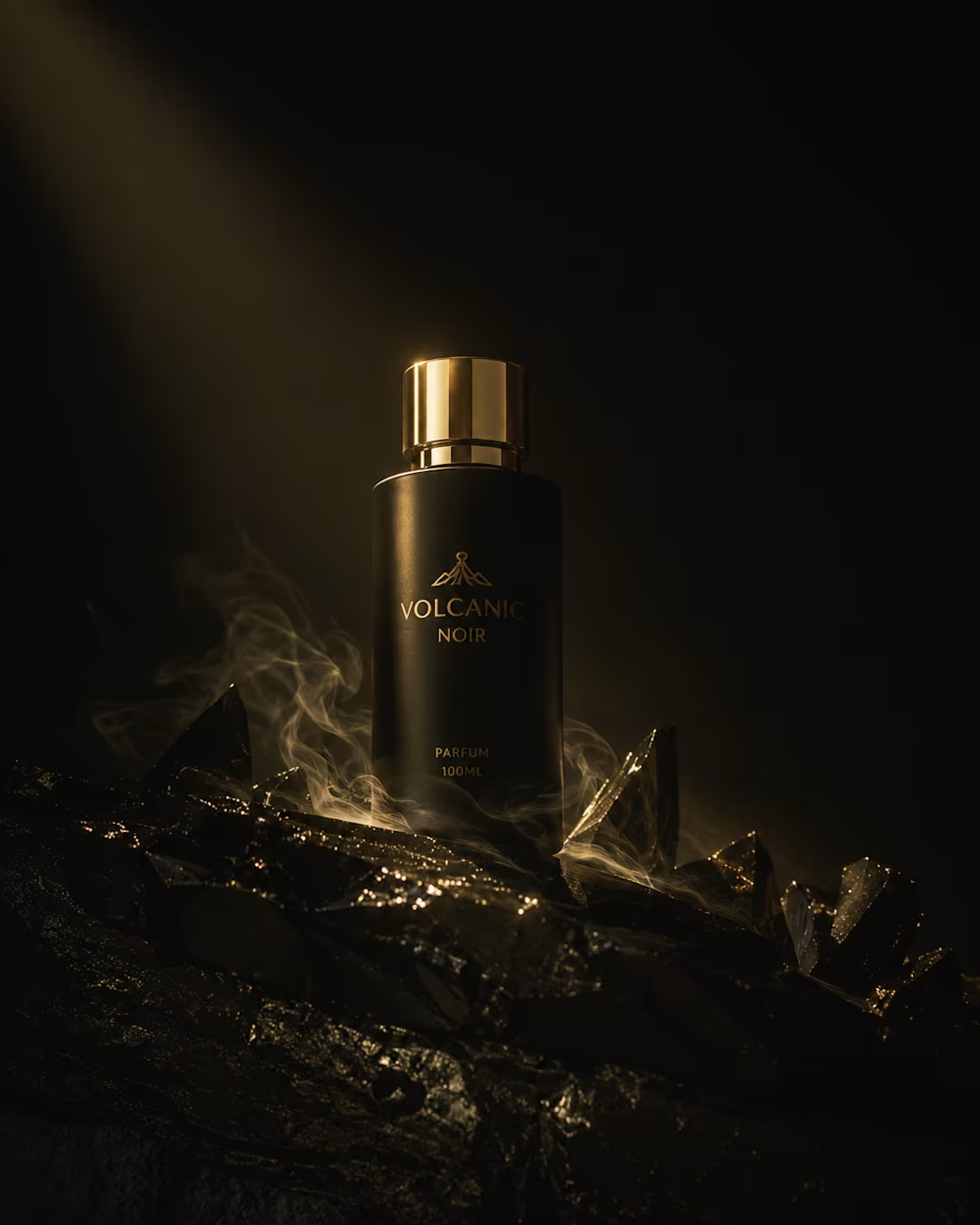
MAVRA — Luxury Fragrance Brand Direction
MAVRA is a luxury men's fragrance built on a single truth — power does not announce itself. This project covers complete brand direction: visual world architecture, color language, typography system, and full campaign imagery. Every cinematic frame began as a hand-sketched composition — element placement, atmosphere, light direction — before being realized through AI image generation. The sketch-to-output gap is the methodology. The direction is the product. Color world: Void, Dominion Gold, Shadow Architecture, Bone Light. Typography: Cormorant Garamond meets Montserrat Light. A world built in restraint and rendered in darkness.
M N LOKESHWAR REDDY, Creative Director.
2
5
174
Brand Identity Direction — CHRONICLE — Digital Publishing Platform
Complete brand direction for CHRONICLE — a premium Indian digital publishing platform built for intellectually curious Indians.
1
118
Brand Audit — MYNTRA — Indian Fashion Platform
Complete brand audit and creative direction for Myntra covering fashion credibility, identity evolution and youth culture connection direction.
1
119
Brand Identity Direction — PULSE FITNESS — Fitness Tech Platform
Complete brand direction for PULSE FITNESS — a premium Indian fitness tech platform built for health conscious Indians.
1
114
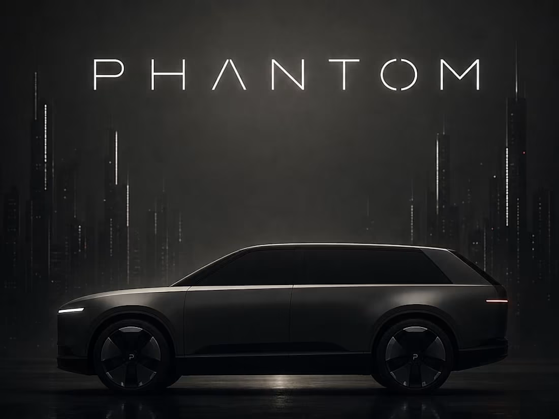
PHANTOM: The Architecture of Silent Power
This automotive brand campaign for PHANTOM redefines the luxury electric vehicle space through a lens of minimalist sophistication. By utilizing a "dark on dark" aesthetic with a deep grey gradient and sharp white typography, the design communicates an air of exclusive authority. The transition from the hand-drawn "future city" layout to this hyper-polished execution emphasizes a brand that doesn't need to shout to be heard, leaning into the bold confidence of its tagline: "Already know. It’s the best."
When an experienced designer studies these sketches and attempts to bring them to life through design, the outcome can be truly remarkable. I also have a well-defined vision for directing designers to produce outstanding results.
1
107

SPARK: Reimagining the Future of Intellectual Discovery
This educational brand identity for SPARK centers on the idea that curiosity is the catalyst for all growth. By combining a bright, energetic palette with clean charcoal typography, the design translates the "Stay Curious, Always" mantra into a visual experience that feels both professional and un-corporate. The transition from the "bulb and book" layout sketch to this high-fidelity execution highlights a platform dedicated to those with an unquenchable need to understand the world more deeply.
When an experienced designer studies these sketches and attempts to bring them to life through design, the outcome can be truly remarkable. I also have a well-defined vision for directing designers to produce outstanding results.
1
109
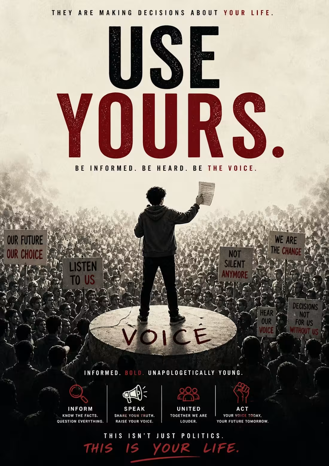
VOICE: Empowering the Next Generation of Civic Action
This political awareness campaign, VOICE, is designed to bridge the gap between individual identity and collective political power. By utilizing high-contrast, cinematic photography and bold, textured typography, the design translates the "large scale" energy of a grassroots movement into a clear, urgent call to action. The transition from the "faded distance" crowd sketch to this immersive, detailed execution emphasizes the campaign's core message: that decisions about your life are being made right now, and your voice is the only tool powerful enough to change the narrative.
When an experienced designer studies these sketches and attempts to bring them to life through design, the outcome can be truly remarkable. I also have a well-defined vision for directing designers to produce outstanding results.
1
118
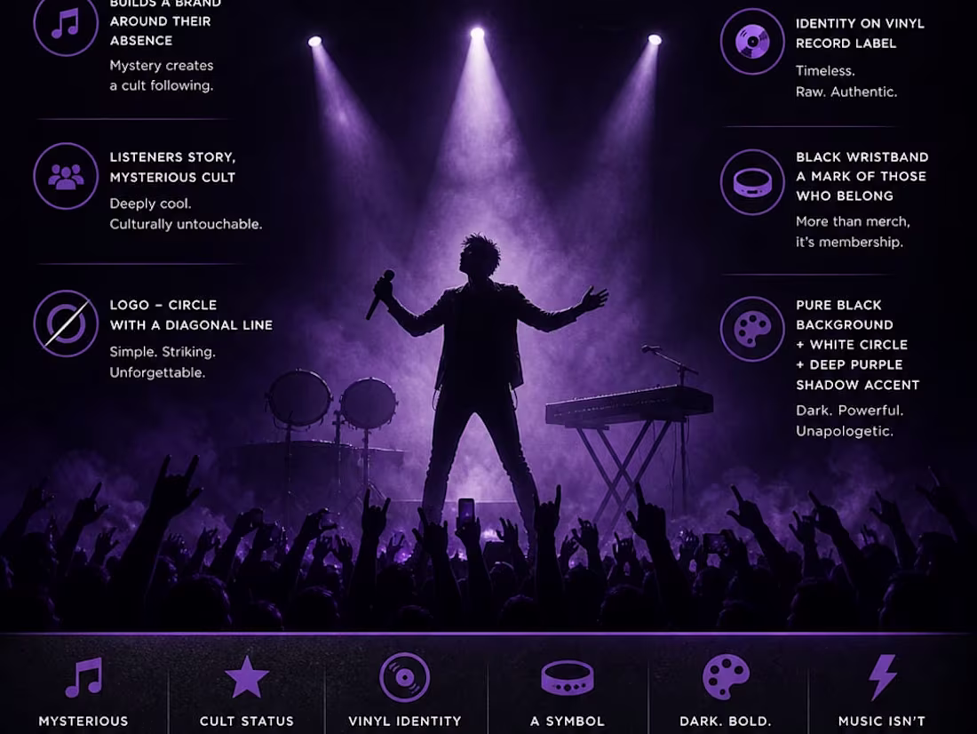
SHADOW: Visualizing the Identity and Mystery of a Solo Artist
This brand identity and concert campaign for SHADOW explores the power of absence and mystery in music. By centering the visual on a dark silhouette against a pure black background with deep purple accents, the design creates a "cult following" atmosphere where the artist is felt rather than seen. The transition from the "huge light" and stage layout sketch to this cinematic, high-contrast execution emphasizes that for this brand, music isn't just entertainment—it becomes a shared identity for those who belong in the shadows.
When an experienced designer studies these sketches and attempts to bring them to life through design, the outcome can be truly remarkable. I also have a well-defined vision for directing designers to produce outstanding results.
1
113
Brand Audit — AMAZON INDIA — Global Platform Indian Identity
Complete brand audit and creative direction for Amazon India covering cultural identity, warmth direction and festive visual language evolution.
1
93
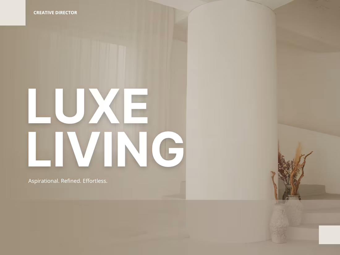
Brand Identity Direction — LUXE LIVING — Interior Design Platform
Complete brand direction for LUXE LIVING — a premium Indian interior design platform built for affluent homeowners.
1
65
Brand Identity Direction — CIPHER — Cryptocurrency Exchange
Complete brand direction for CIPHER — a premium Indian cryptocurrency exchange built for serious investors and crypto enthusiasts.
1
68
Brand Audit — FLIPKART — Indian E-Commerce Platform
Complete brand audit and creative direction for Flipkart covering identity consistency, premium positioning and emotional connection direction.
1
74
Brand Identity Direction — TERRA — Sustainable Fashion Brand
Complete brand direction for TERRA — a premium Indian sustainable fashion brand built for conscious consumers.
1
58

Campaign Direction — SWIGGY — Every Craving Has A Story
Complete campaign direction for Swiggy built around the emotional truth behind every food order.
1
68
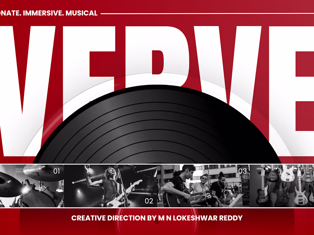
Brand Identity Direction — VERVE — Music Streaming Platform
Complete brand direction for VERVE — a premium Indian music streaming platform built for passionate music lovers.
1
50
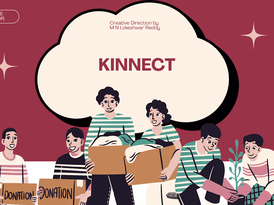
Brand Identity Direction — KINNECT — Social Connection App
Complete brand direction for KINNECT — a premium Indian social connection app built for young Indians craving real human connection.
1
55
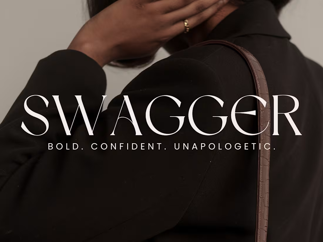
Personal Brand Direction — SWAGGER — Men's Fashion Influencer
Complete personal brand direction for SWAGGER — a young Indian men's fashion and lifestyle influencer targeting urban Indian men aged 18 to 30.
1
96
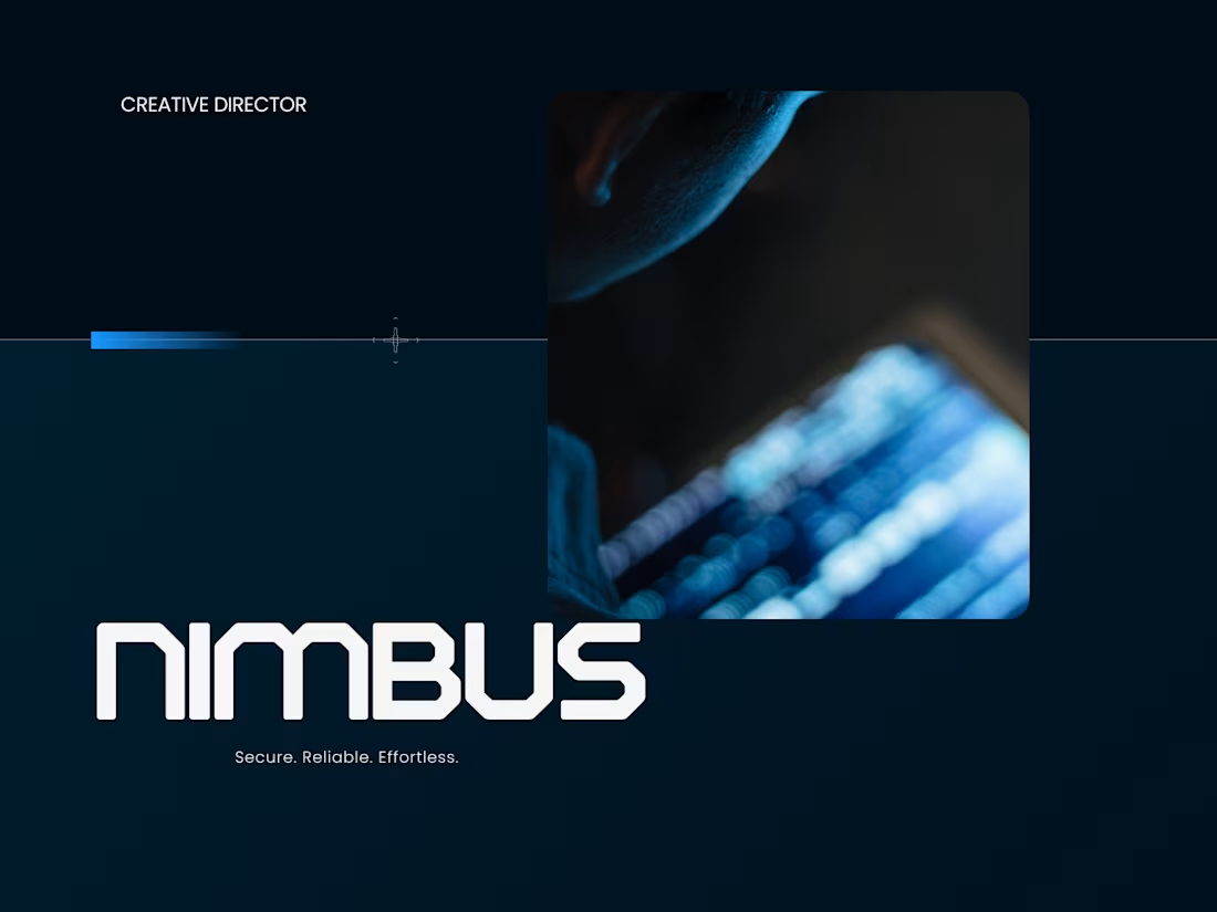
NIMBUS — Premium Indian Cloud Storage Platform Brand Direction
Complete brand direction for NIMBUS — a premium Indian cloud storage platform built for professionals and businesses demanding complete data security.
1
82
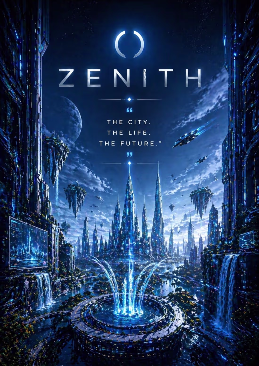
ZENITH: A Vision of Verticality in the Megacity of Tomorrow
This conceptual poster, ZENITH, explores the architectural evolution of a post-terrestrial future. By utilizing a multi-layered composition of suspended skyscrapers and bioluminescent transit veins, the design visualizes a world that has grown upward rather than outward. The transition from the "floating city" layout sketch to this hyper-detailed, atmospheric execution emphasizes the contrast between cold industrial metal and the vibrant energy of a living, breathing metropolis at the peak of human technological advancement.
When an experienced designer studies these sketches and attempts to bring them to life through design, the outcome can be truly remarkable. I also have a well-defined vision for directing designers to produce outstanding results.
1
94
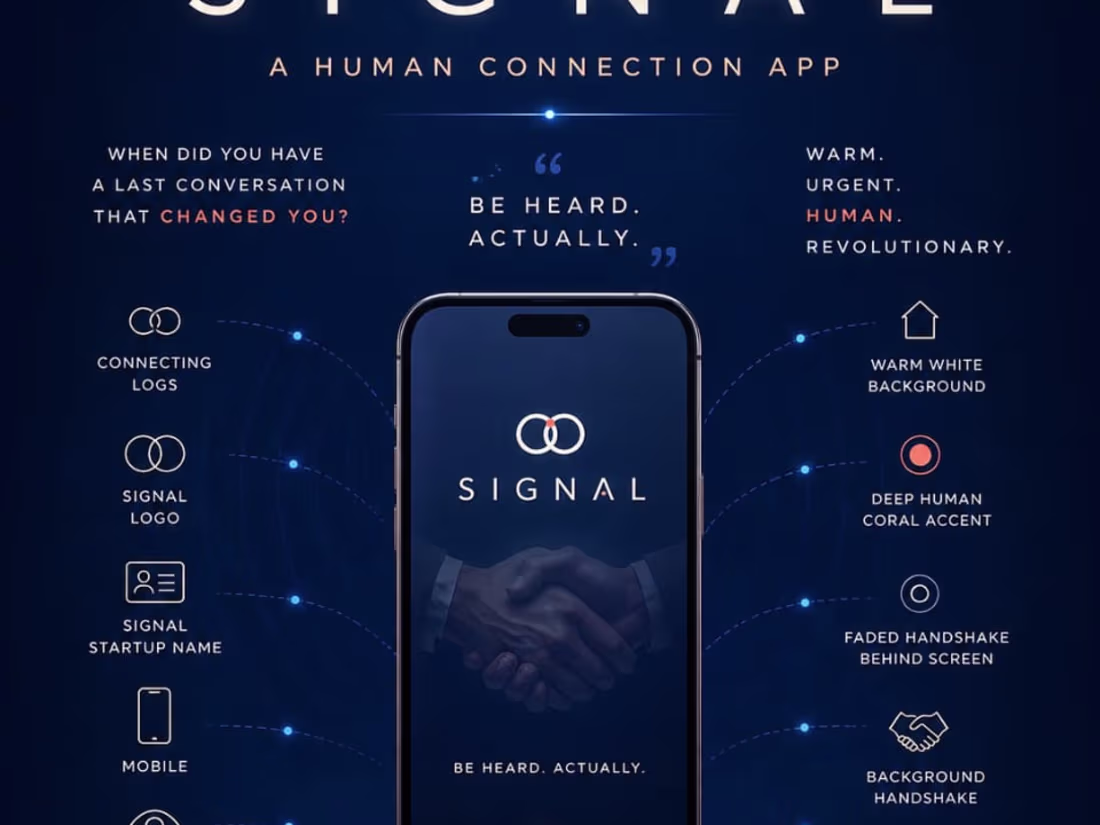
SIGNAL: Visualizing the Invisible Threads of Human Connection
This campaign for SIGNAL, a human-connection app, focuses on the energy and "frequency" shared between people. By utilizing a dark, minimalist backdrop with vibrant, light-streak pathways, the design illustrates how digital interactions translate into real-world sparks. The transition from the "energy bridge" sketch to this cinematic, high-fidelity execution highlights a brand identity that values depth, movement, and the seamless transmission of human emotion in a modern world.
When an experienced designer studies these sketches and attempts to bring them to life through design, the outcome can be truly remarkable. I also have a well-defined vision for directing designers to produce outstanding results.
1
82
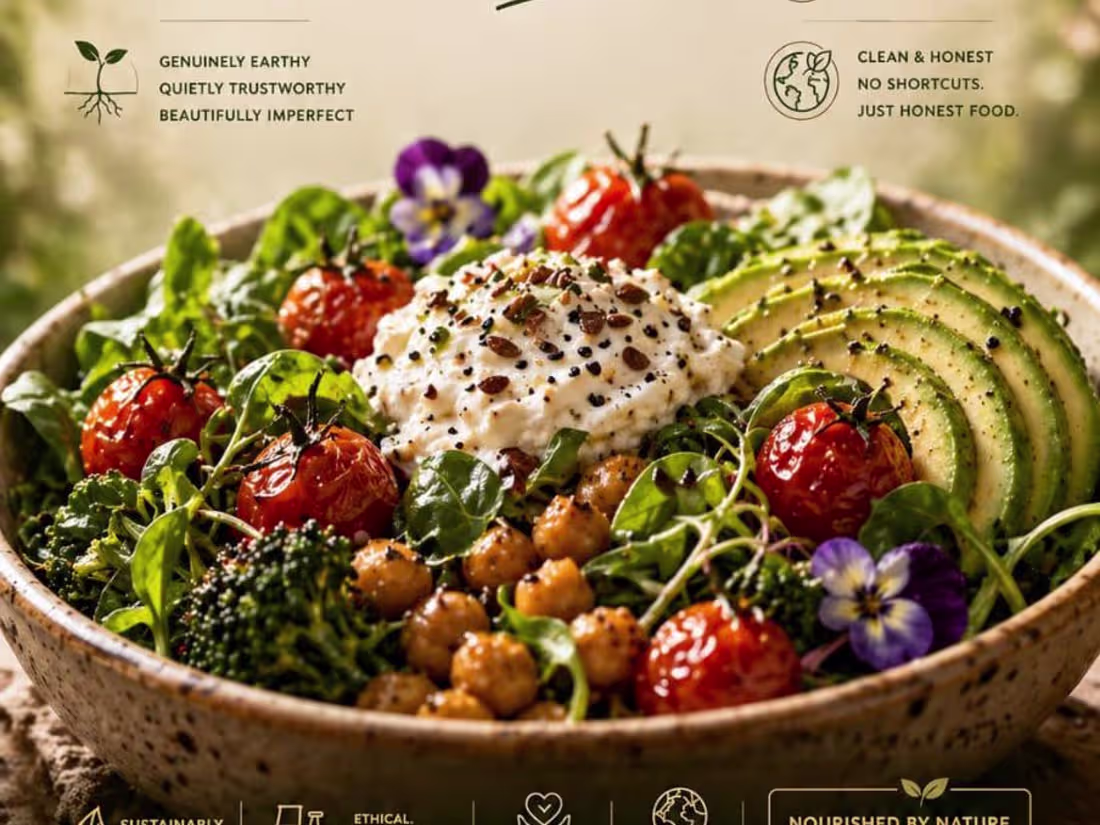
ROOTED: A Concept for Organic Fine Dining and Architectural Harmony
This restaurant branding and interior concept for ROOTED explores the literal intersection of nature and nourishment. By designing a high-end dining environment around a central, living tree, the visual creates a sanctuary that feels grounded and timeless. The transition from the "tree-in-center" layout sketch to this high-fidelity, sun-drenched execution highlights a commitment to raw materials, soft lighting, and an atmosphere where the environment is as vital as the menu itself.
When an experienced designer studies these sketches and attempts to bring them to life through design, the outcome can be truly remarkable. I also have a well-defined vision for directing designers to produce outstanding results.
1
72
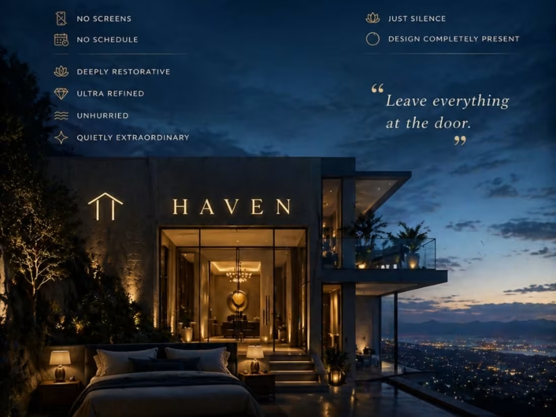
HAVEN: Redefining the Modern Urban Sanctuary
This interior and lifestyle campaign for HAVEN focuses on the intersection of minimalist luxury and city living. By positioning a plush, cloud-like bed against a sharp, geometric flat and a panoramic skyline, the design creates a visual narrative of stillness within the chaos. The transition from the "bed with a view" layout sketch to this high-fidelity, sun-drenched execution emphasizes the importance of a personal retreat, where the architecture serves as a frame for rest and clarity.
When an experienced designer studies these sketches and attempts to bring them to life through design, the outcome can be truly remarkable. I also have a well-defined vision for directing designers to produce outstanding results.
1
69
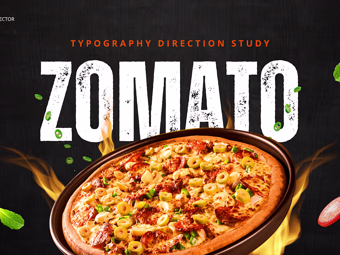
Typography Direction Study — ZOMATO — Food Delivery Platform
Complete typography direction study for Zomato. 4 typography directions each speaking to a different food lover in a completely different voice.
1
80
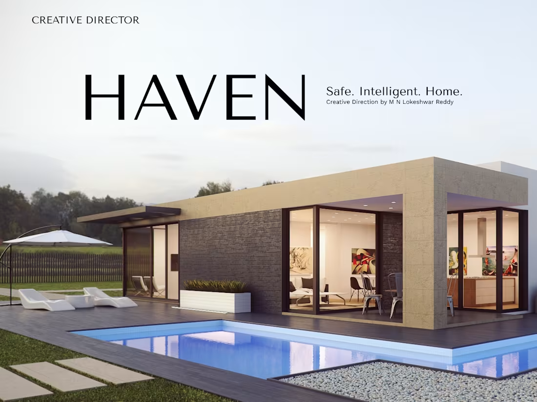
Brand Identity Direction — HAVEN — Smart Home Platform
Complete brand direction for HAVEN — a premium Indian smart home platform built for tech savvy homeowners.
1
68
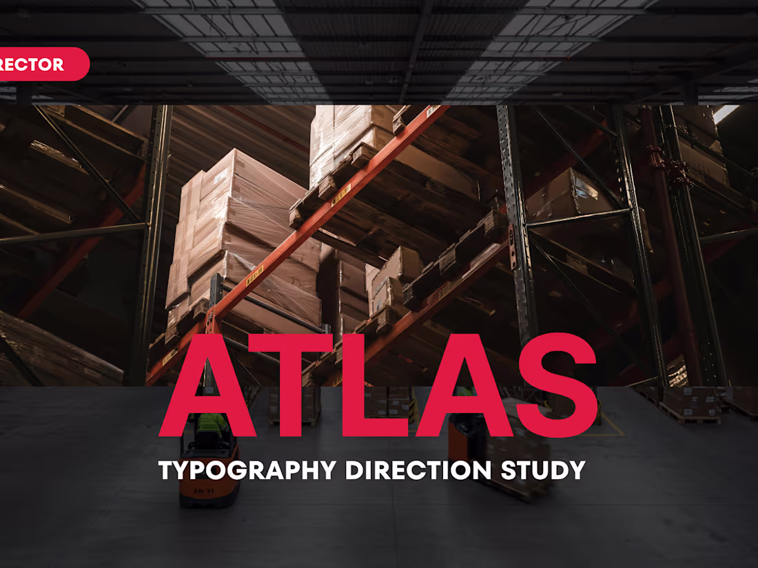
Typography Direction Study — ATLAS — Global Logistics Brand
Complete typography direction study for ATLAS — a premium Indian global logistics brand. 4 typography directions each speaking to a different audience in a completely different voice.
1
71
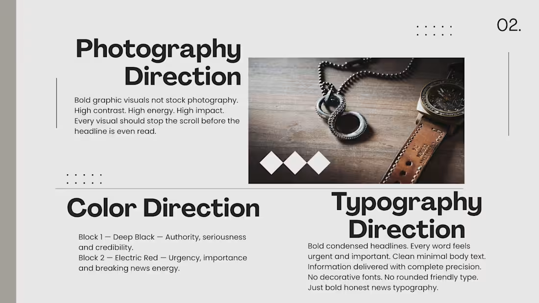
Social Media Visual Direction — PULSE — Indian News Platform
Complete social media visual direction for PULSE — a modern Indian news platform targeting young Indians.
1
78
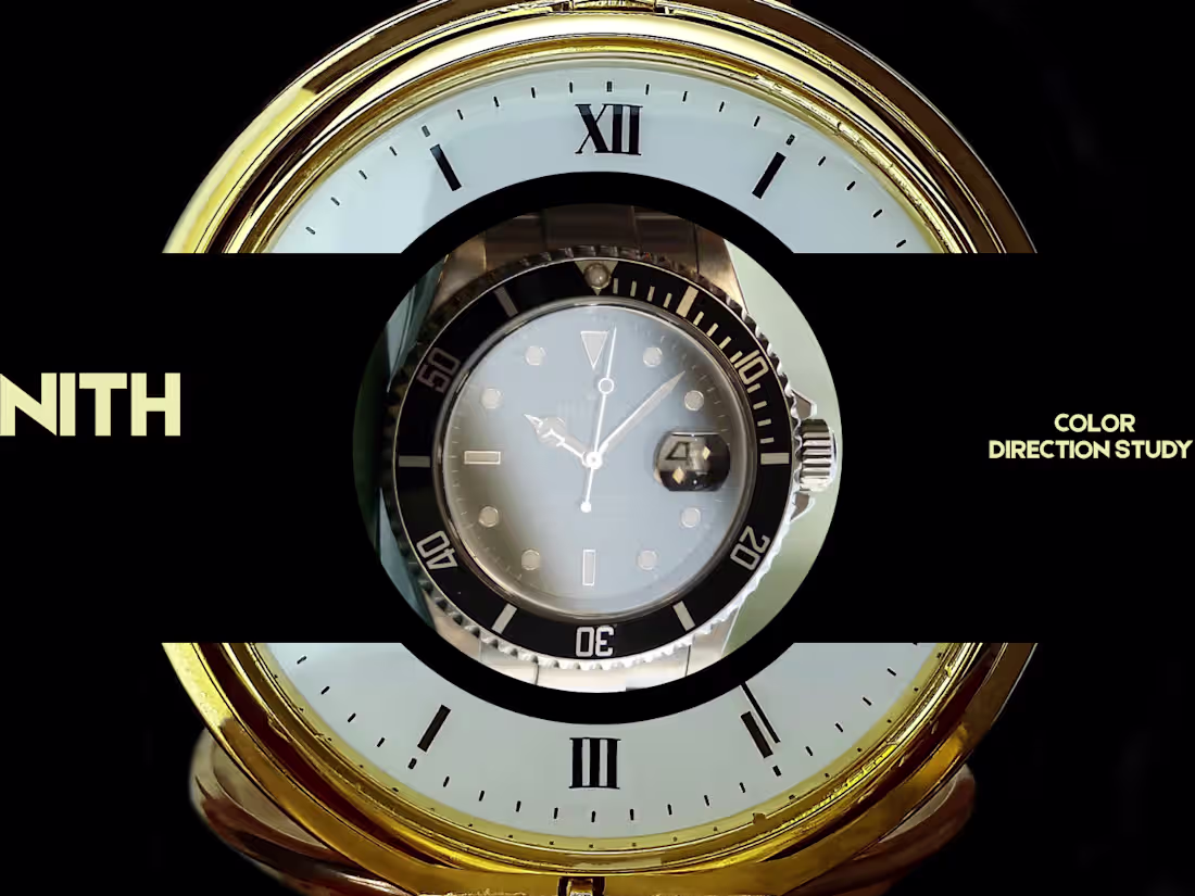
Color Direction Study — ZENITH — Luxury Watch Brand
Complete color direction study for ZENITH — a premium Indian luxury watch brand. 4 color directions each targeting a different luxury audience and communicating a different feeling.
2
65
Brand Audit — CROMA — Indian Electronics Retail
Complete brand audit and creative direction for CROMA covering identity, color, typography and complete visual world evolution.
1
61
Brand Identity Direction — FORGE — Manufacturing Tech
Complete brand direction for FORGE — a premium Indian manufacturing technology brand helping factories modernise with AI.
1
58
Color Direction Study — FORGE — Manufacturing Tech
Complete color direction study for FORGE — a premium Indian manufacturing tech brand. 4 directions covering industrial power, clean future, premium authority and bold Indian identity.
1
74
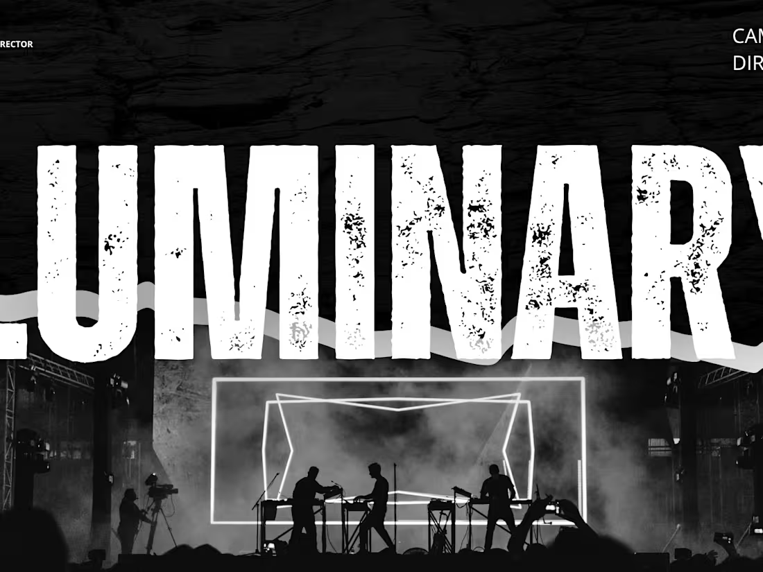
Campaign Direction — LUMINARY — EdTech Platform
Complete campaign direction for LUMINARY — a premium Indian edtech platform campaign built around career transformation and light.
1
84
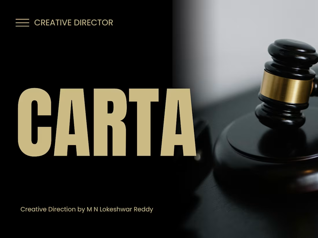
CARTA — Premium Indian Legal Tech Platform Brand Direction
Complete brand direction for CARTA — a premium Indian legal tech platform connecting people with trusted legal professionals.
1
67
IRON: Visualizing the Raw Power and Discipline of the Grind
This high-impact gym campaign for IRON focuses on the monumental weight of physical transformation. By utilizing a dark, industrial aesthetic with glowing embers and massive, oversized weights, the design turns standard gym equipment into epic monoliths of discipline. The transition from the "giant dumbbells" sketch to this cinematic, high-contrast execution ensures that the grit and heat of the workout are felt instantly, positioning the brand as the ultimate destination for those who embrace the struggle.
When an experienced designer studies these sketches and attempts to bring them to life through design, the outcome can be truly remarkable. I also have a well-defined vision for directing designers to produce outstanding results.
1
76
CHAPTER: Visualizing the Infinite Journey of Literature
This book campaign poster, CHAPTER, serves as a metaphor for the transformative power of reading. By utilizing a surreal, large-scale composition where a staircase rises directly from the written word toward a celestial portal, the design illustrates how every book is an doorway to a new world. The transition from the "stairs to the sky" sketch to this cinematic, light-filled execution emphasizes a sense of wonder and intellectual adventure, positioning the act of reading as the ultimate journey.
When an experienced designer studies these sketches and attempts to bring them to life through design, the outcome can be truly remarkable. I also have a well-defined vision for directing designers to produce outstanding results.
1
70
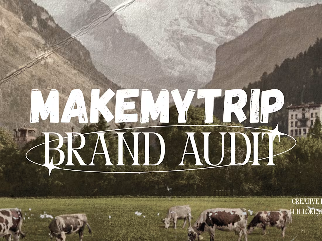
Brand Audit — MakeMyTrip — Indian Travel Platform
Complete brand audit and creative direction for MakeMyTrip covering logo, color, typography and complete visual world evolution.
1
66
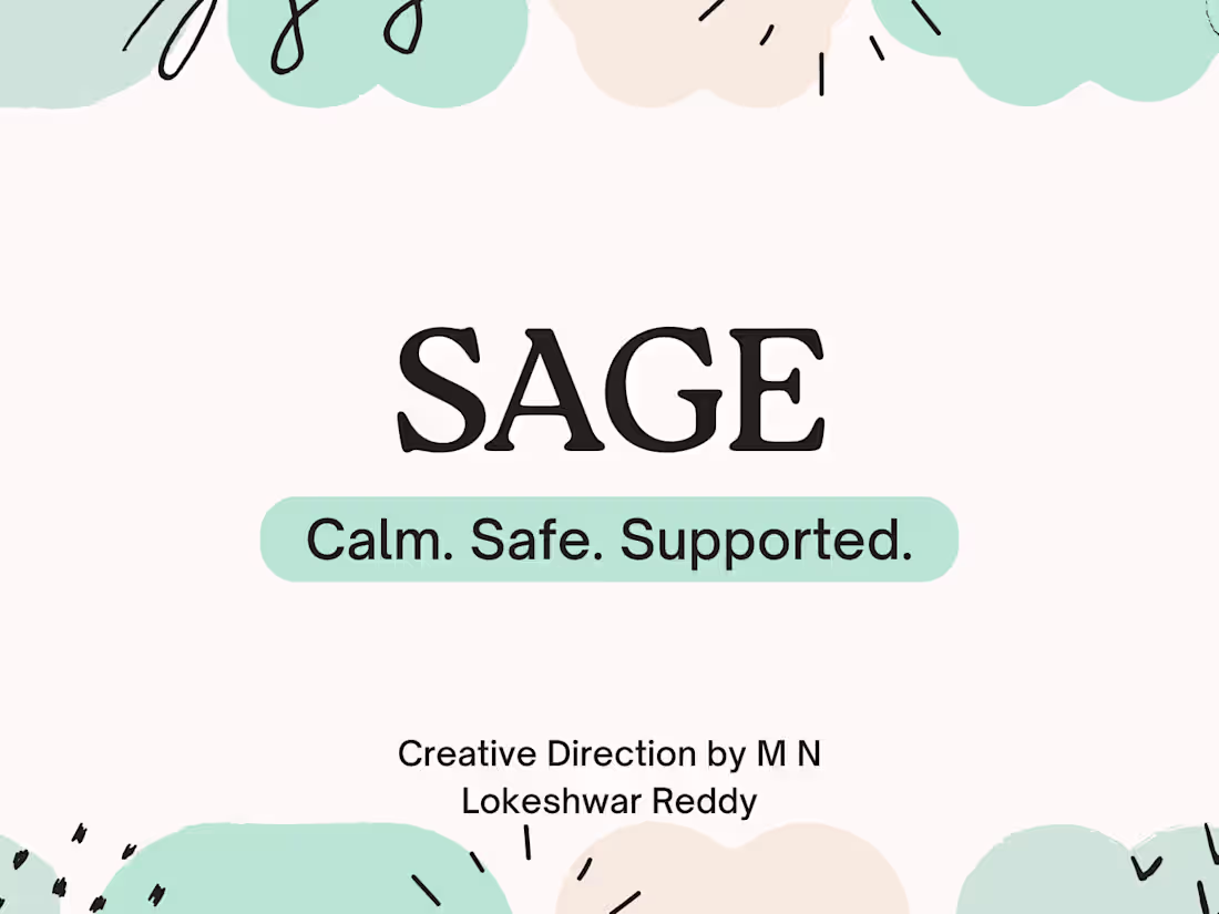
Brand Identity Direction — SAGE — Mental Wellness App
Complete brand direction for SAGE — a modern Indian mental wellness app built for stressed urban professionals.
1
65
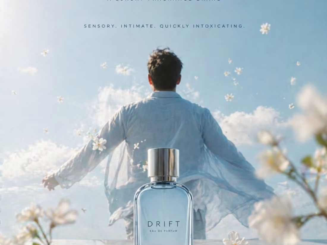
DRIFT: A Fragrance Concept for the High-Octane Lifestyle
This branding project for DRIFT reimagines the adrenaline of the racetrack as a luxury masculine fragrance. The visual direction focuses on the "moment of friction," using the billowing smoke and tire-burn of a precision drift as a metaphor for the scent’s bold and fleeting nature. By transitioning from a high-action automotive sketch to a sophisticated, smoke-infused product reveal, the design targets a demographic that values speed, precision, and raw power.
When an experienced designer studies these sketches and attempts to bring them to life through design, the outcome can be truly remarkable. I also have a well-defined vision for directing designers to produce outstanding results.
1
68
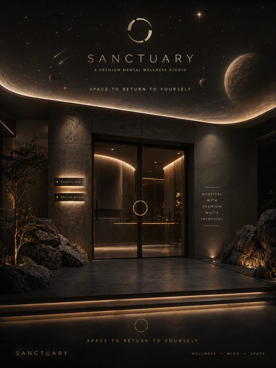
SANCTUARY: Visualizing the Harmony of Home and Nature
This architectural branding concept, SANCTUARY, explores the emotional connection between human living spaces and the natural world. By utilizing a "leaf-shaped" house silhouette to frame a family moment, the design communicates a message of sustainable peace and organic safety. The transition from the pencil layout to this vibrant, sun-drenched execution highlights a "nature-first" philosophy, where the environment doesn't just surround the home—it defines it.
When an experienced designer studies these sketches and attempts to bring them to life through design, the outcome can be truly remarkable. I also have a well-defined vision for directing designers to produce outstanding results.
1
79
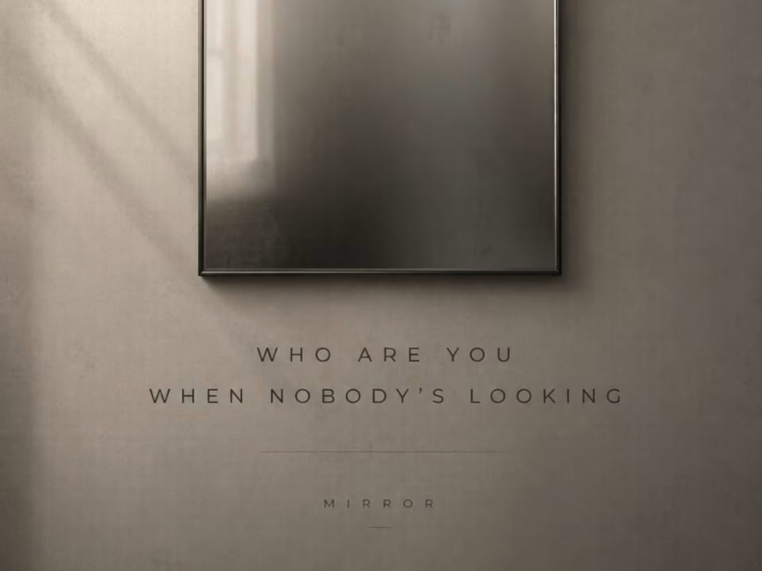
MIRROR: A Minimalist Exploration of Self and Perspective
This conceptual poster, MIRROR, utilizes a clean, architectural layout to explore the boundaries of perception. By positioning a central figure stepping through a frame into an infinite gradient, the design visualizes the act of self-discovery and moving beyond the surface. The transition from the "broken portal" sketch to this polished, high-contrast execution emphasizes a sophisticated use of negative space and precise human element placement to create a quiet yet profound narrative.
When an experienced designer studies these sketches and attempts to bring them to life through design, the outcome can be truly remarkable. I also have a well-defined vision for directing designers to produce outstanding results.
1
67
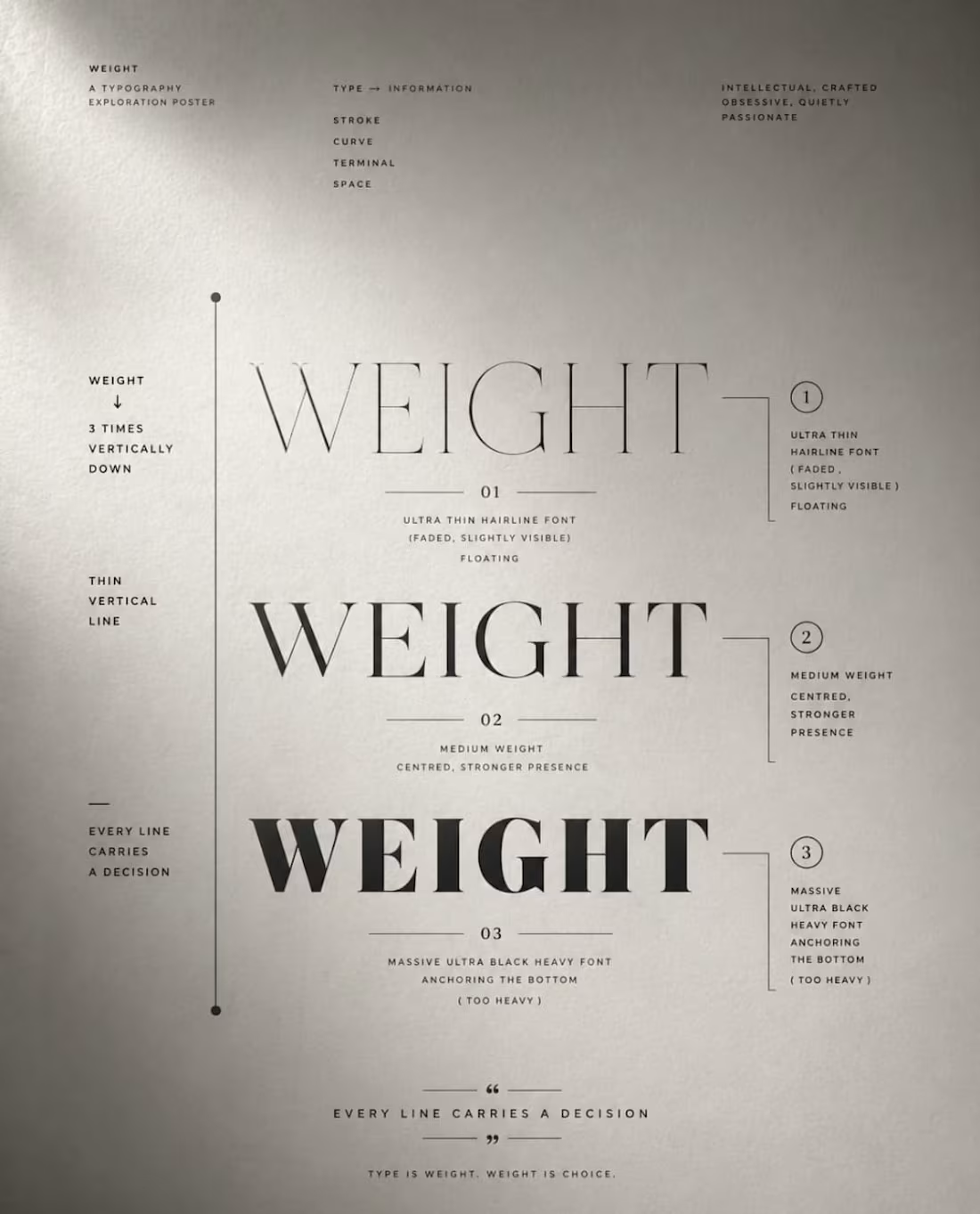
WEIGHT: A Study in Heavy Typography and Narrative Layout
This typographic poster uses scale and texture to physically manifest the concept of "Weight." By treating the letters as architectural elements that press down on the composition, the design turns the word itself into the primary storyteller. The transition from the pencil layout to this final execution highlights a bold, disciplined use of space, where the typography isn't just text, but a structural force.
When an experienced designer studies these sketches and attempts to bring them to life through design, the outcome can be truly remarkable. I also have a well-defined vision for directing designers to produce outstanding results.
1
70
Brand Identity Direction — LUXE MOTORS — Premium Indian EV Brand
Complete brand direction for LUXE MOTORS — a premium Indian electric vehicle brand built for successful professionals.
1
70
Brand Identity Direction — SPICE ROUTE
Complete brand direction for SPICE ROUTE — a premium Indian diaspora grocery platform delivering authentic Indian ingredients globally.
1
66
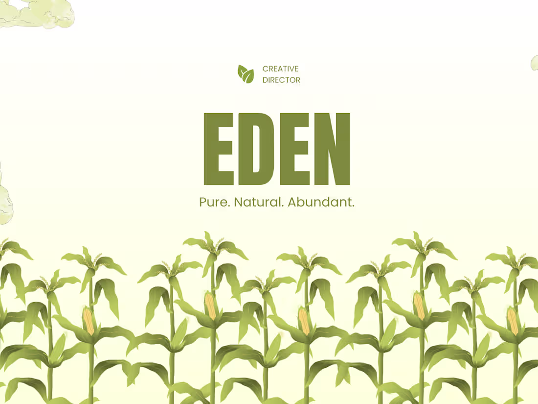
Brand Identity Direction — EDEN — Premium Organic Farming Platform
Complete brand direction for EDEN — a premium Indian organic farming platform connecting health conscious consumers directly with farmers.
1
63
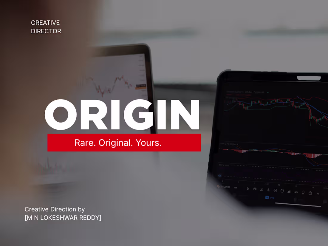
Brand Identity Direction — ORIGIN — Luxury NFT Marketplace
Complete brand direction for ORIGIN — a luxury Indian NFT marketplace built for serious collectors and creators demanding global exposure.
2
98

Brand Identity Direction — CAPITAL — Luxury Investment App
Complete brand direction for CAPITAL — a luxury Indian investment app built for serious investors and working professionals.
2
75
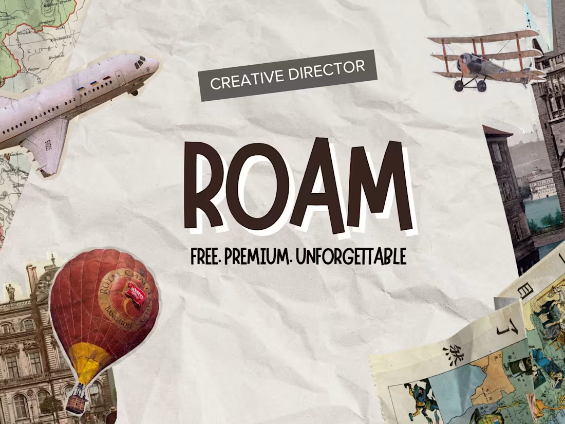
Brand Identity Direction — ROAM — Premium Travel Platform
Complete brand direction for ROAM — a premium Indian travel experience platform. Covers brand personality, color direction, typography direction and complete visual world.
2
91
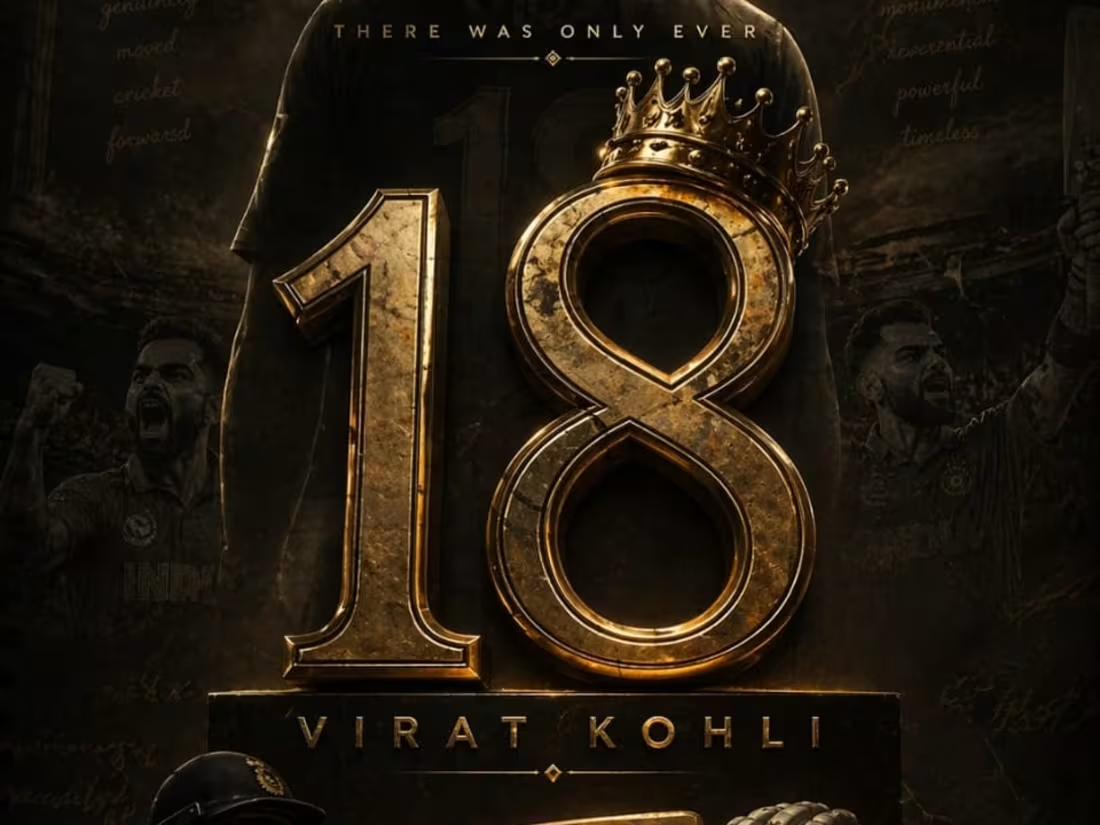
VIRAT: Visualizing the Fire and Focus of a Legend
This tribute poster for Virat Kohli explores the duality of high-performance sports: the intense, burning passion and the cold, surgical focus required at the highest level. By juxtaposing molten, volcanic elements with a sharp, monochromatic portrait, the design communicates a "throne of fire" aesthetic. The visual direction ensures that the energy of the crowd and the heat of the game are felt through the textures, bringing the initial conceptual sketch into a high-impact, cinematic reality.
When an experienced designer studies these sketches and attempts to bring them to life through design, the outcome can be truly remarkable. I also have a well-defined vision for directing designers to produce outstanding results.
1
89
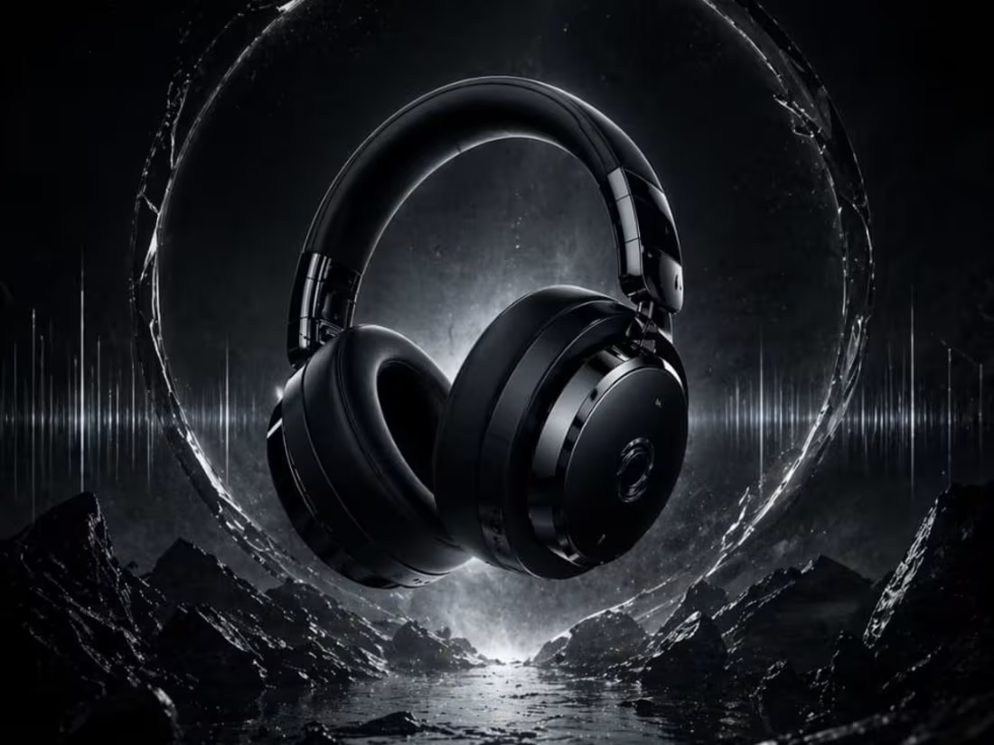
OBSIDIAN: Defining the Future of Premium Audio Design
This project showcases the visual identity for OBSIDIAN, a high-end headphone brand built on a "zero-noise" philosophy. The design emphasizes a sleek, monochromatic aesthetic with deep matte textures, capturing the feeling of total immersion. By directing the transition from the initial pencil concept to this polished, high-fidelity execution, the visual highlights a perfect balance between industrial strength and luxury comfort.
When an experienced designer studies these sketches and attempts to bring them to life through design, the outcome can be truly remarkable. I also have a well-defined vision for directing designers to produce outstanding results.
1
94
LAST EDITION: A Visual Study on Legacy and the Passage of Time
This final project, LAST EDITION, serves as a powerful meditation on history meeting the future. By placing a detailed, classical figure in front of a sprawling, light-drenched metropolis, the design explores the weight of what we leave behind. The composition relies on heavy atmospheric lighting and a sense of "historical permanence" to anchor the viewer, ensuring the transition from the initial concept sketch to the final execution feels epic and final.
When an experienced designer studies these sketches and attempts to bring them to life through design, the outcome can be truly remarkable. I also have a well-defined vision for directing designers to produce outstanding results.
1
81
FLORA — Luxury Indian Organic Skincare Brand Direction
Complete brand direction for FLORA — a luxury Indian organic skincare brand. Covers brand personality, color direction, typography direction and complete visual world.
1
86
OPTIMUS — Luxury Indian Esports Brand Direction
Complete brand direction for OPTIMUS — a luxury Indian esports brand built for elite gaming athletes. Covers brand personality, color direction, typography direction and complete visual world.
1
85

APEX School of Business — Premium Indian Business School Brand Direction
APEX School of Business is a premium Indian business school built for visionary students who refuse to settle for ordinary futures. Not just a business school. A launchpad for the leaders who will build tomorrow. Deep midnight navy, pure brilliant white, rich warm gold, strong confident serif typography. Where visionary students become unstoppable leaders. Creative Direction by [M N LOKESHWAR REDDY]
1
80
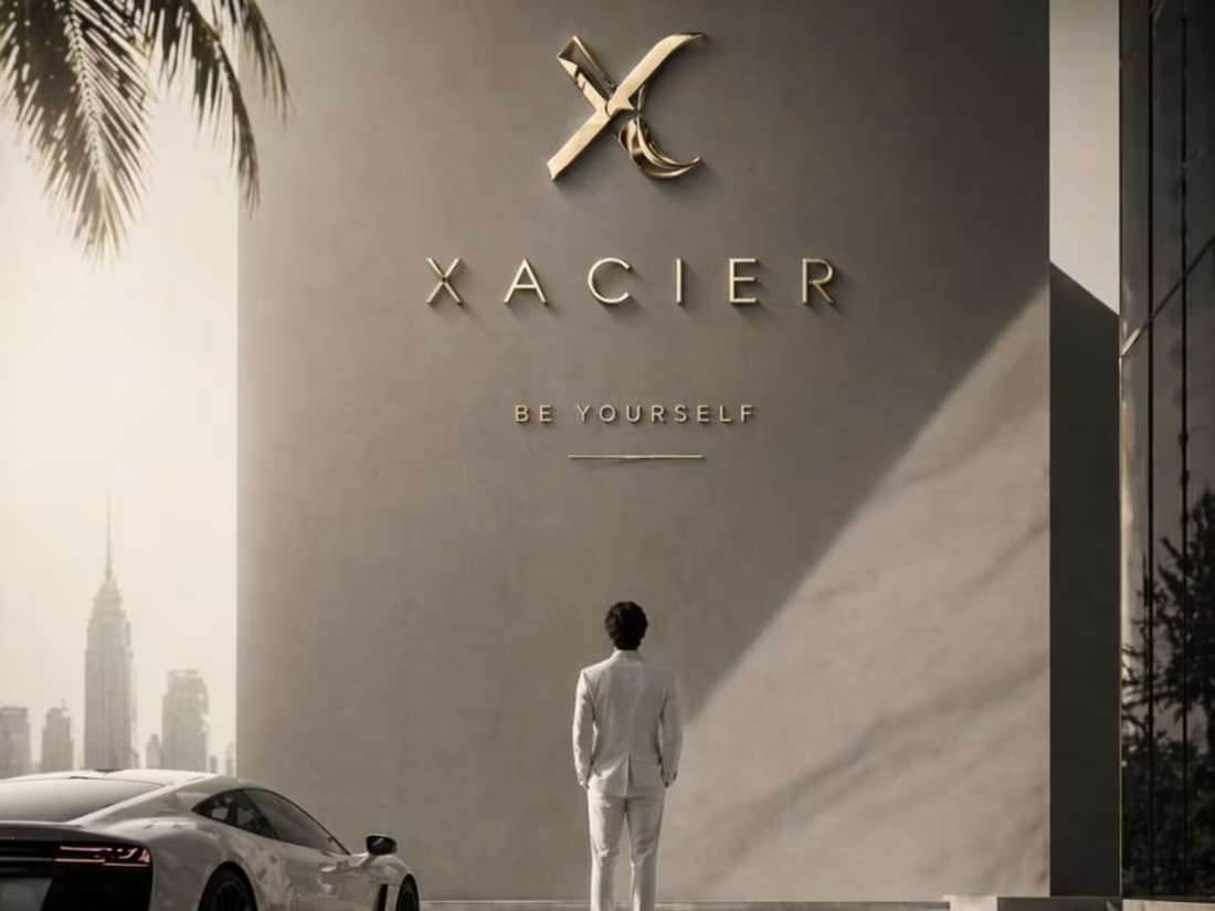
XACIER: Visualizing the Future of High-Performance Automotive Design
This automotive promotional poster for XACIER focuses on the raw power and sleek aerodynamics of a next-generation supercar. By utilizing a dark, moody atmosphere with focused lighting on the vehicle's sharp edges, the design communicates speed even in a standstill. The transition from the "breakthrough" sketch to this high-fidelity execution ensures that the brand's identity—focused on innovation and precision—is at the forefront.
When an experienced designer studies these sketches and attempts to bring them to life through design, the outcome can be truly remarkable. I also have a well-defined vision for directing designers to produce outstanding results.
1
81
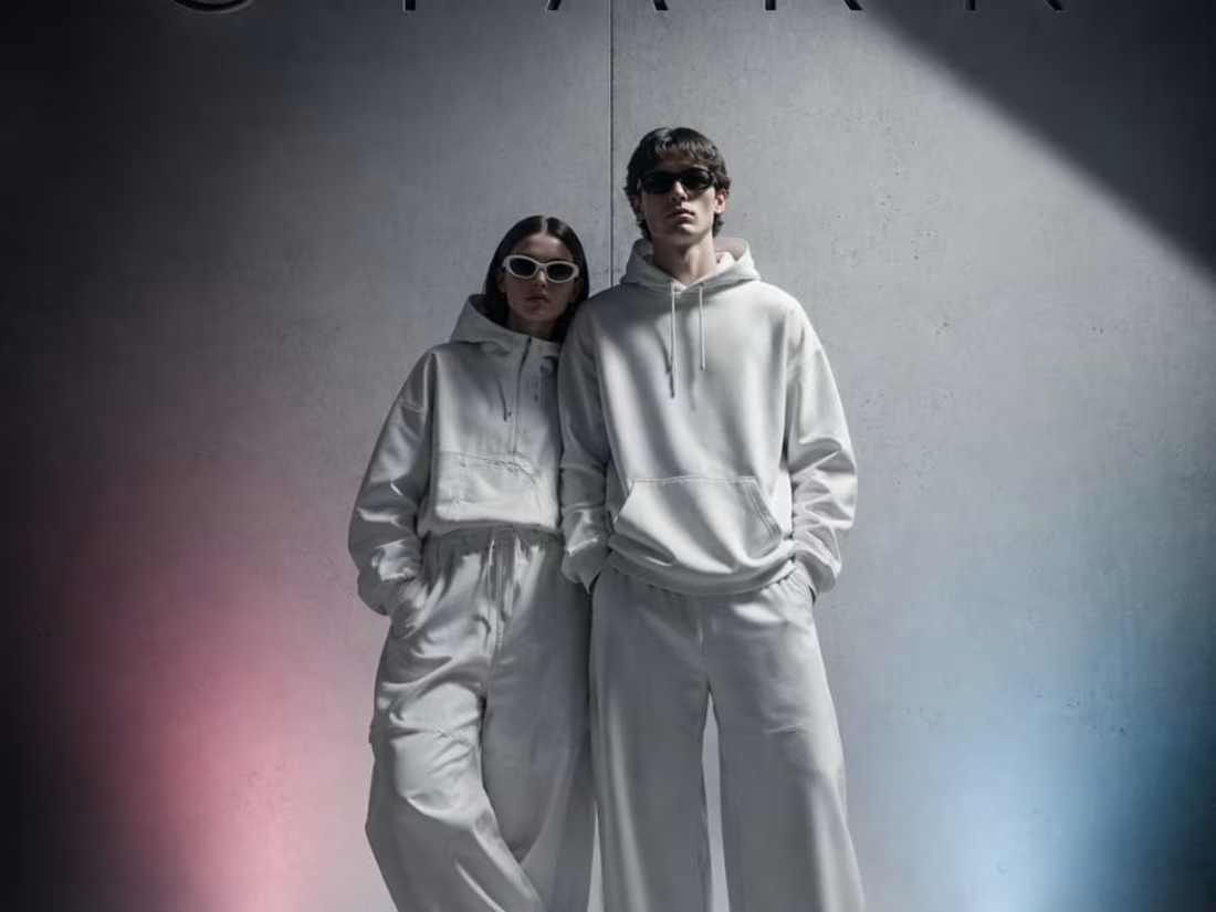
STARK: Industrial Minimalism and the Power of Contrast
This interior design and branding concept for STARK focuses on the tension between brutalist industrial elements and modern comfort. By pairing raw concrete textures with a singular, high-saturation orange accent, the visual creates a space that feels both disciplined and inviting. The transition from a simple layout sketch to this high-fidelity, light-drenched execution highlights a "zero-noise" philosophy where every object is intentional and every shadow is part of the narrative.
When an experienced designer studies these sketches and attempts to bring them to life through design, the outcome can be truly remarkable. I also have a well-defined vision for directing designers to produce outstanding results.
2
96
Paper Boat — Social Media Visual Direction
Paper Boat has one of India's most beloved brand identities. But their social media is not living up to that identity. This social media visual direction concept explores how every Paper Boat post could transport you back to a specific childhood moment instantly. Warm golden photography, amber nostalgic tones, simple minimal typography. Every post should feel like finding an old photograph in a drawer you forgot existed. Creative Direction by [M N LOKESHWAR REDDY].
1
69
SOLE — Premium Indian Luxury Footwear Brand Direction
Complete brand direction for SOLE — a premium Indian luxury footwear brand built for confident entrepreneurs and business class individuals.
1
71
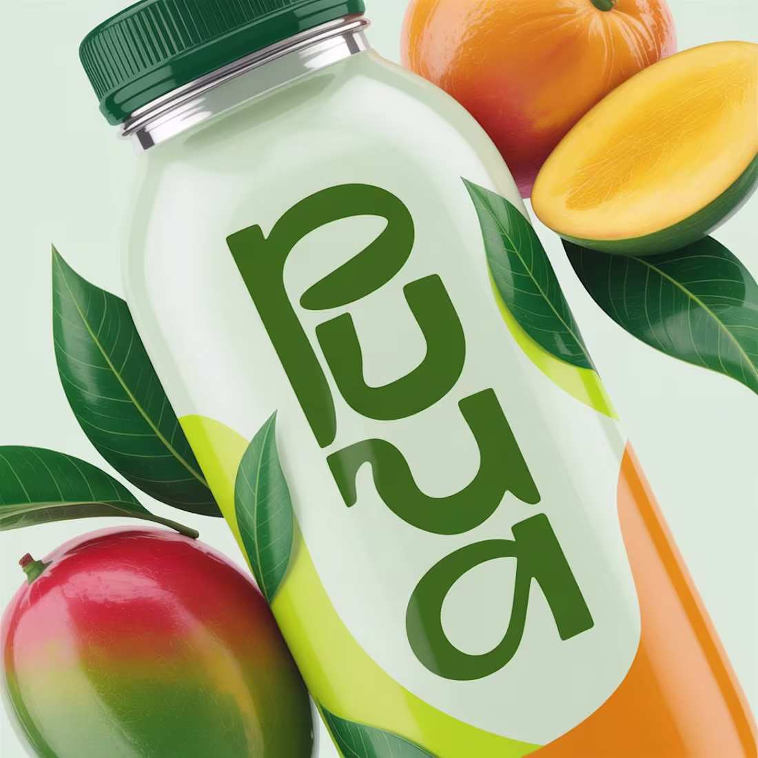
Brand Moodboard — PURA — Premium Indian Juice Brand
PURA is a premium Indian juice brand built on one simple promise — pure natural refreshment for everyone who values what goes into their body. Not a soda. Not a sports drink. Just pure fresh premium juice. Fresh tropical green, clean bright white, warm sunshine orange. Pure. Fresh. Alive. Creative Direction by M N LOKESHWAR REDDY.
1
95
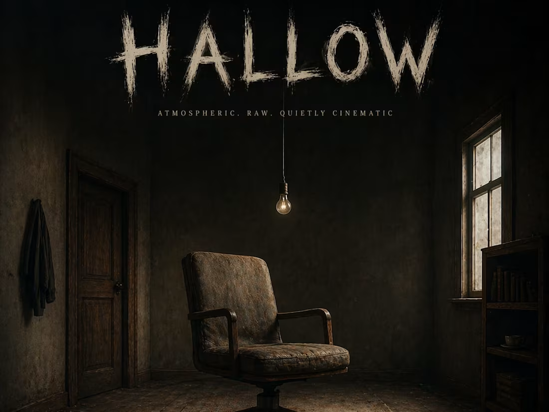
HALLOW: Atmospheric Visual Direction for Indie Alternative Music
This album cover concept for HALLOW captures a raw, cinematic stillness. Set within a dark, wooden interior, the composition focuses on a single light source and a solitary chair to evoke a sense of isolation and depth. By directing the transition from a ghosted font concept to this high-fidelity, moody environment, the visual perfectly mirrors the soulful and alternative nature of the music it represents.
When an experienced designer studies these sketches and attempts to bring them to life through design, the outcome can be truly remarkable. I also have a well-defined vision for directing designers to produce outstanding results.
1
72
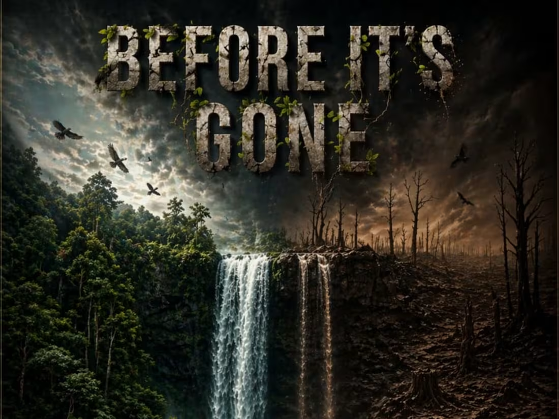
BEFORE IT’S GONE: A Visual Call for Climate Urgency
This environmental awareness campaign poster serves as a deeply human plea for climate action. By utilizing a large-scale split composition, the design contrasts a thriving, ancient forest against the harsh reality of deforestation and drought. Every detail, from the shifting water quality to the fading textures in the title, was directed to evoke a sense of inevitable loss and immediate responsibility. The final result is an urgent, high-impact piece that challenges the viewer to consider the legacy we are leaving behind.
When an experienced designer studies these sketches and attempts to bring them to life through design, the outcome can be truly remarkable. I also have a well-defined vision for directing designers to produce outstanding results.
1
70
Brand Identity Direction — LUMA — Premium Home Decor
Complete brand direction for LUMA — a premium Indian home decor brand. Covers brand personality, color direction, visual world and AI concept visuals.
1
78

Brand Moodboard — JEEVA — Modern Indian Nutrition
JEEVA means life. A modern Indian nutrition brand that feels like a warm helpful friend giving you health guidance — never a clinical doctor giving you orders. Fresh leaf green, warm sunshine yellow, friendly rounded typography. Creative Direction by [M N LOKESHWAR REDDY]." Tags — nutrition branding, wellness brand, Indian health brand, moodboard, creative direction, brand identity
1
84

VOID: The Essence of Ultra-Minimalist Luxury Skincare
This project defines the visual identity for VOID, a luxury skincare brand rooted in the belief that "less is the most expensive thing in the world." The design features a matte black bottle sitting on a marble shelf against a clean white background, creating a cold and mysterious editorial aesthetic. By using specific lighting and blur effects to highlight the product, the final execution eliminates labels and trends to focus purely on a sharp, premium presence.
When an experienced designer studies these sketches and attempts to bring them to life through design, the outcome can be truly remarkable. I also have a well-defined vision for directing designers to produce outstanding results.
1
74
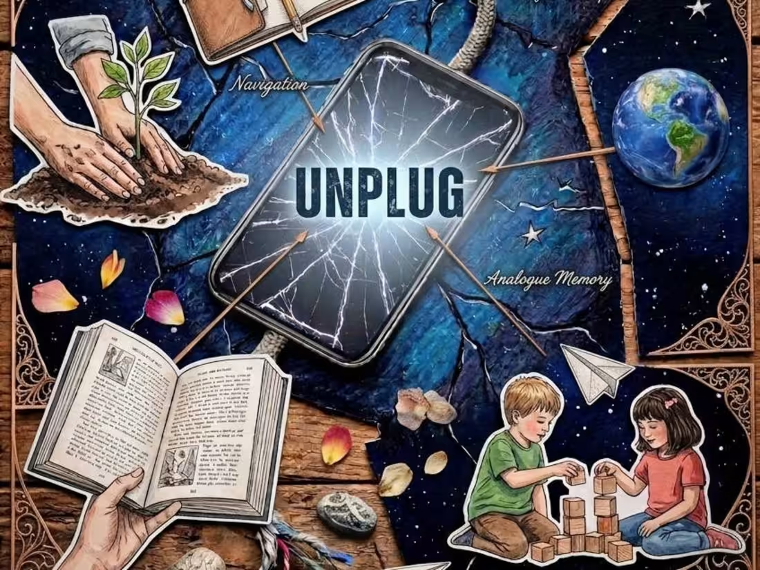
UNPLUG: A Digital Detox Visual Narrative
This social media campaign poster is designed to act as a "digital billboard" that stops viewers mid-scroll. Centered around a shattered screen and a disconnecting wire, the composition illustrates the beauty of life beyond screen time. By integrating "moments" like craftsmanship, navigation, and tactile play, the design promotes a quietly proactive and culturally aware lifestyle. The transition from the "broken piece" sketch to this rich, multi-layered visual ensures the message of disconnecting to reconnect is both powerful and clear.
When an experienced designer studies these sketches and attempts to bring them to life through design, the outcome can be truly remarkable. I also have a well-defined vision for directing designers to produce outstanding results.
1
69

SECOND WIND: Capturing the Raw Grit of Athletic Resilience
This campaign for SECOND WIND, a performance running shoe brand, focuses on bravery and the honest struggle of the athlete. By emphasizing the "breathless" moment of perseverance through a gritty, triumphant aesthetic, the design moves beyond traditional sports marketing to tell a story of endurance. Every element—from the sweat-drenched textures to the strategic color gradients—was directed to ensure the final execution remained true to the original, high-stakes concept.
When an experienced designer studies these sketches and attempts to bring them to life through design, the outcome can be truly remarkable. I also have a well-defined vision for directing designers to produce outstanding results.
1
67
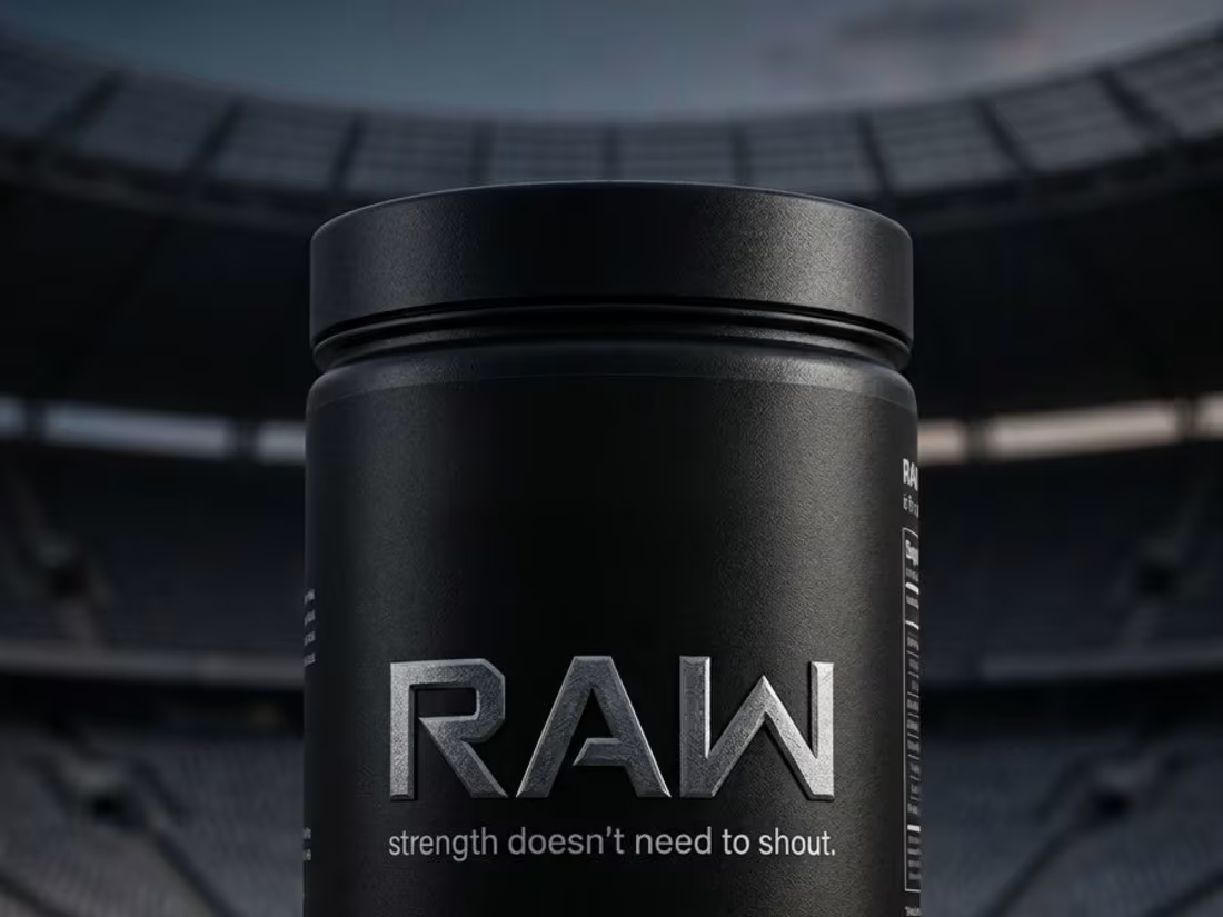
RAW: Premium Minimalism in Sports Nutrition Packaging
This project features the packaging design for RAW, a protein supplement brand built on the philosophy that "strength doesn't need to shout." The visual direction focuses on zero excess and a disciplined, sharp aesthetic. By placing the cylindrical tub in a vast stadium setting, the design communicates a "no audience, just work" mentality, transitioning a simple pencil concept into a confident, high-end brand identity.
When an experienced designer studies these sketches and attempts to bring them to life through design, the outcome can be truly remarkable. I also have a well-defined vision for directing designers to produce outstanding results.
1
72
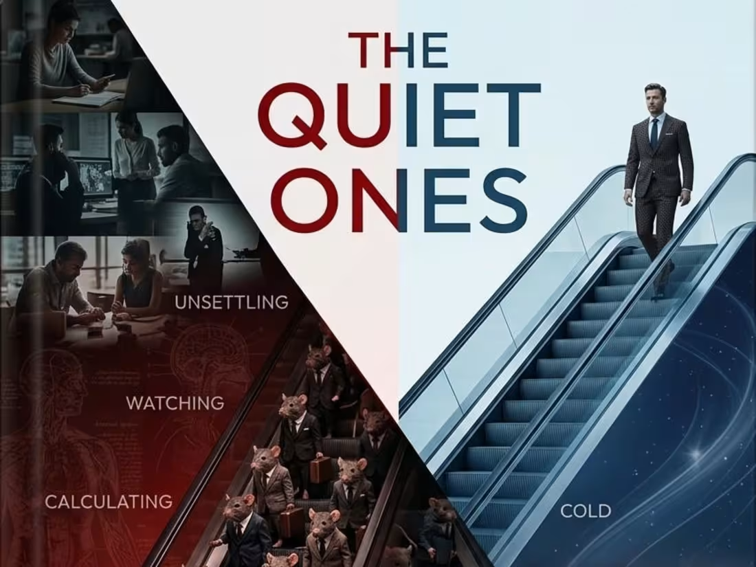
THE QUIET ONES: A Psychological Thriller Visual Concept
This book cover design explores the unsettling themes of a psychological thriller through a striking, divided composition. By juxtaposing the "louder ones"—represented by a corporate rat race—against the "quieter ones" and a confident figure rising above, the visual creates a cold, deeply intriguing atmosphere. The use of color gradients and symbolic imagery was meticulously directed from the initial pencil concept to ensure a high-impact, narrative-driven result.
When an experienced designer studies these sketches and attempts to bring them to life through design, the outcome can be truly remarkable. I also have a well-defined vision for directing designers to produce outstanding results.
2
66
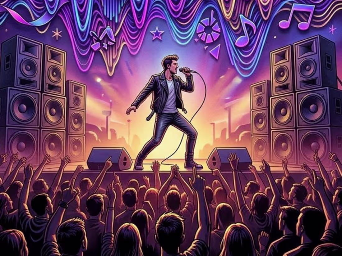
FREQUENCY: Visualizing the Energy of Underground Music
This poster design captures the raw, unapologetic pulse of an underground music festival. By centering the composition on distorted horizontal sound waves and high-energy silhouettes, the visual directs the viewer to "lose themselves in sound." The transition from manual concept to this vibrant, neon execution emphasizes the intensity of the event.
When an experienced designer studies these sketches and attempts to bring them to life through design, the outcome can be truly remarkable. I also have a well-defined vision for directing designers to produce outstanding results.
2
70
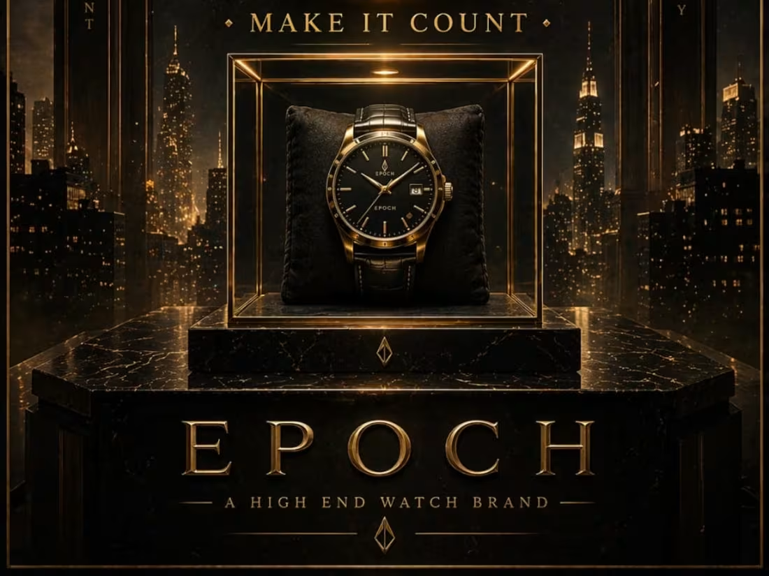
EPOCH: Directing Luxury through Urgency and Elegance
This project showcases the visual identity for EPOCH, a high-end watch brand centered on the philosophy of making every second count. By transitioning from detailed hand-drawn sketches to final digital execution, I’ve captured a sense of "heavy permanence" and inevitable time.
When an experienced designer studies these sketches and attempts to bring them to life through design, the outcome can be truly remarkable. I also have a well-defined vision for directing designers to produce outstanding results.
2
60
ECHO — Every Choice Leaves a Ghost
A psychological sci-fi poster visualizing identity, repetition, and the haunting weight of choices through layered echoes of the self. If a designer looks to do this, the results are mind-blowing—and I have a vision for directing designers to create truly great design.
1
57

CTRL — Who’s Really in Control?
1
57
Personal Brand Direction — Chef Aditya — Young Indian Chef
1
75
Creative Director - Brand Identity Direction — GIGANTIC PRODUCTIONS — Luxury Film Studio
1
71
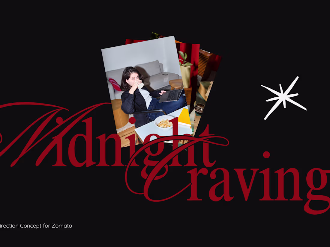
Campaign Direction Concept — Zomato Midnight Cravings
1
74
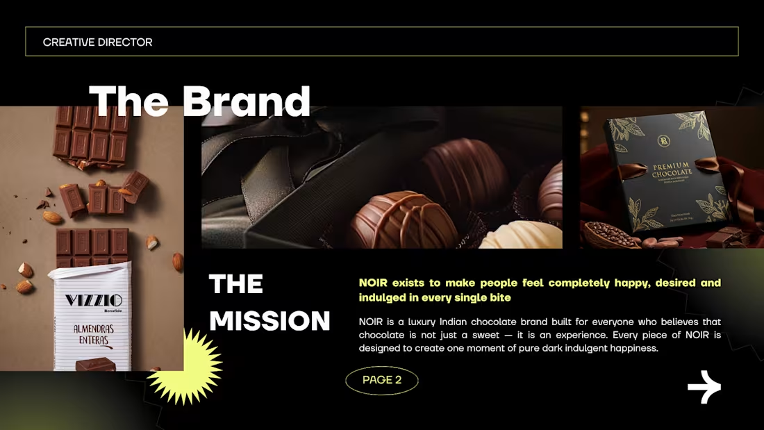
Brand Identity Direction — NOIR — Luxury Chocolate Brand
1
84
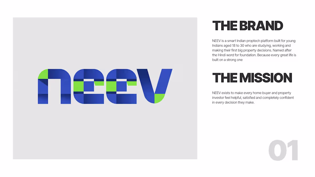
Brand Identity Direction — NEEV — Smart Indian Proptech Platform
1
87
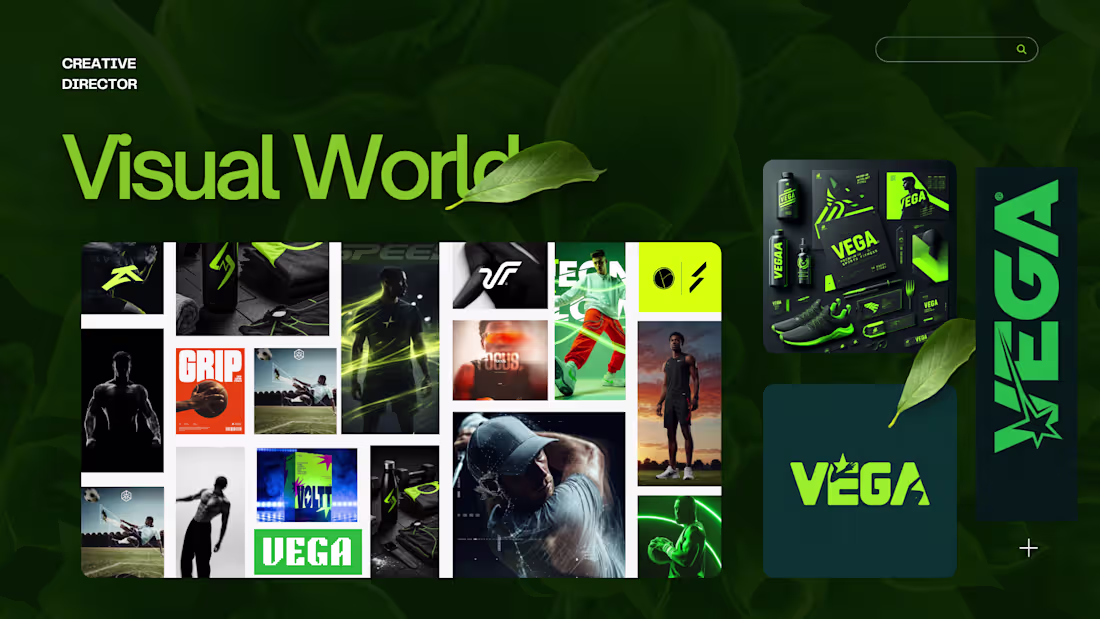
Brand Identity Direction — VEGA — Premium Indian Sports Brand
1
94
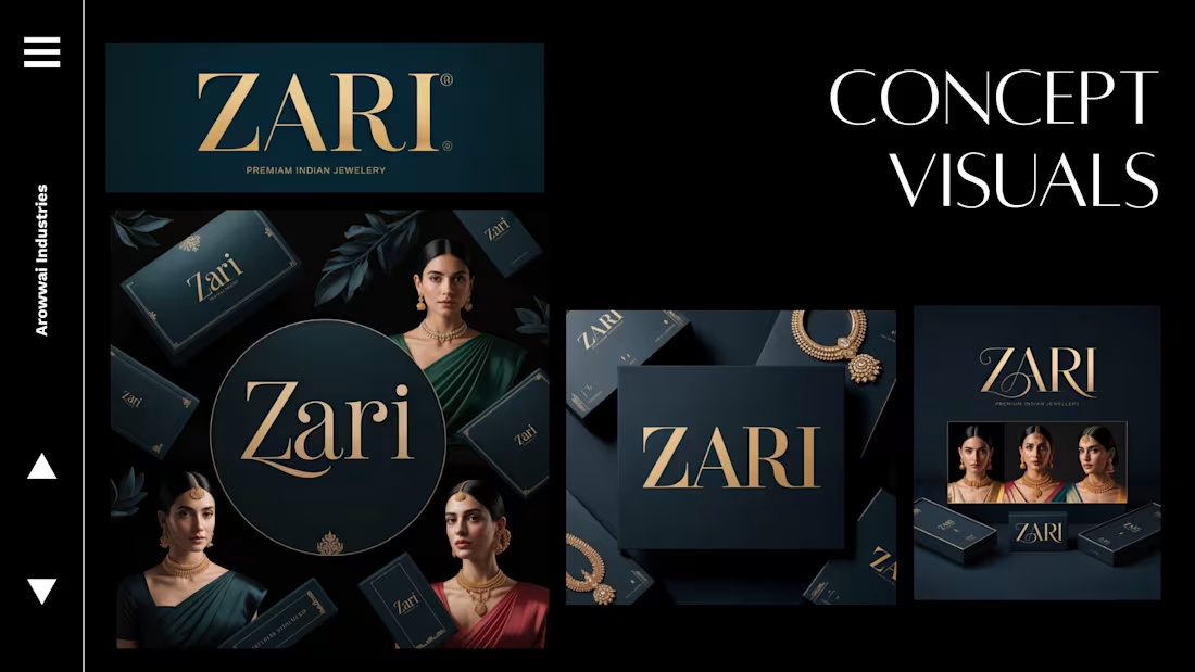
Brand Identity Direction — ZARI — Premium Indian Jewellery
1
95
Brand Redesign Concept — Paytm — Indian Fintech
Complete brand redesign concept for Paytm. Covers logo direction, color direction, typography direction and complete visual world. From transaction app to trusted financial companion
1
78
Logo Direction Study — CRED — Gold Standard of Indian Brand Identity
1
76
The Concept-to-Execution Series | Creative Director
1
79
Brand Direction Concept — Micro SaaS HQ — SaaS Startup
1
88
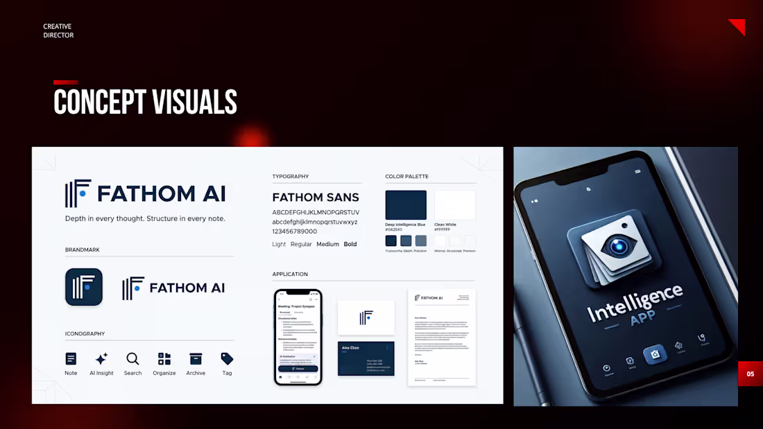
Brand Direction Concept — Fathom 3.0 — AI Startup
1
99