
Pro
Mir Ashfaque
UX Expert | In-house Figma, Framer, Webflow & WP team.
- 5.00
- Rating
- 134
- Followers
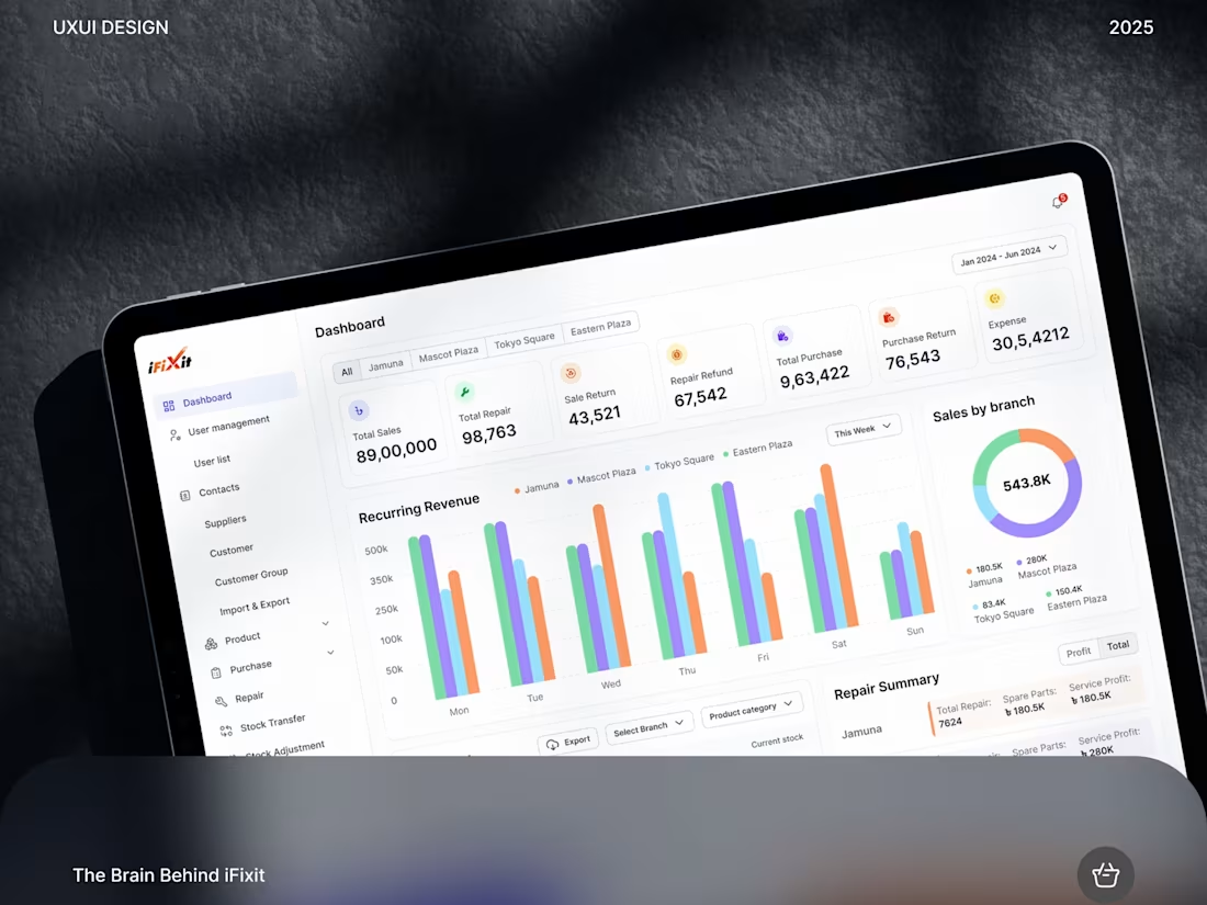
iFixit Centralized Admin Panel Design | SaaS Dashboard
2
3
Trading Platform Color Strategy: A UX Reassessment
The design choice of traditional red (negative) and green (positive) on trading charts is a critical UX flaw.
This color scheme introduces unnecessary psychological stress and emotional bias. Furthermore, for sophisticated strategies like futures trading, a downward market move (painted 'red') is often a profitable event - the color assignment is semantically misleading.
The Design Solution: Embrace Customization.
Professional traders mitigate this flaw by customizing their UIs (often using neutral, blue/white, or dark themes). The optimal color scheme is one that is emotionally sterile, reducing eye strain and removing subconscious triggers so the user can focus purely on data visualization, patterns, and strategy execution.
7
8
234
Freshi - E-commerce Website & Mobile App Design
2
4
Telmora: Revolutionizing Medical Appointment Booking
4
22

CargoPulse Mobile App & Web Design | Logistics | UIUX
3
7
Telmora Medical Mobile App & Web Design
2
9

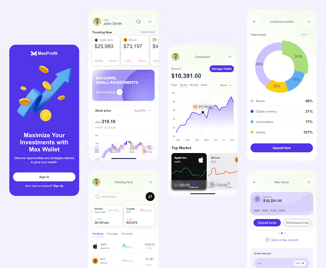
MaxProfit - Fintech Landing Page Design
2
10