pro
Masuder Rahaman
Helping founders & Brands become impossible to forget
- $25k+
- Earned
- 2x
- Hired
- 5.0
- Rating
- 22
- Followers


Bowery Clinic is built on a simple promise Health, Built to Last.
The identity had to feel trustworthy and human, not clinical. We paired a mark of two overlapping squares with a deep forest green palette, a confident Georgia serif and warm, sunlit photography. The tone is...

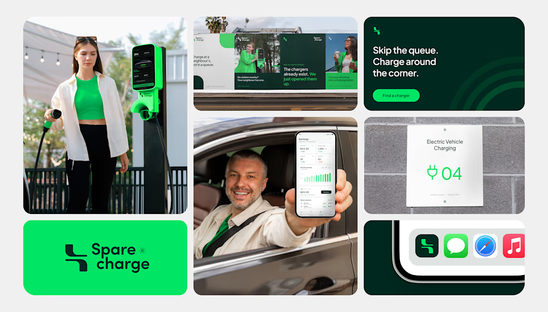
Spare Charge turns a neighbour’s driveway into a charging station.
The identity had to make a new idea feel simple and trustworthy. We built it around a plug inspired monogram a bold green and deep forest palette and a friendly voice skip the queue. Charge around the corner. It...


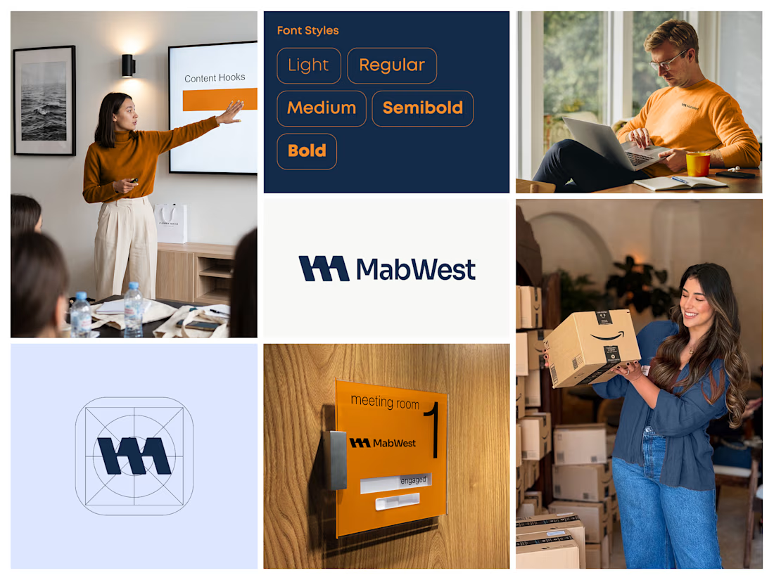
MabWest needed an identity that feels confident, modern and easy to work with.
We built it around a bold geometric monogram on a precise icon grid, a deep navy and warm orange palette and a clean sans serif in five weights. The system scales from app icon to office signage to...
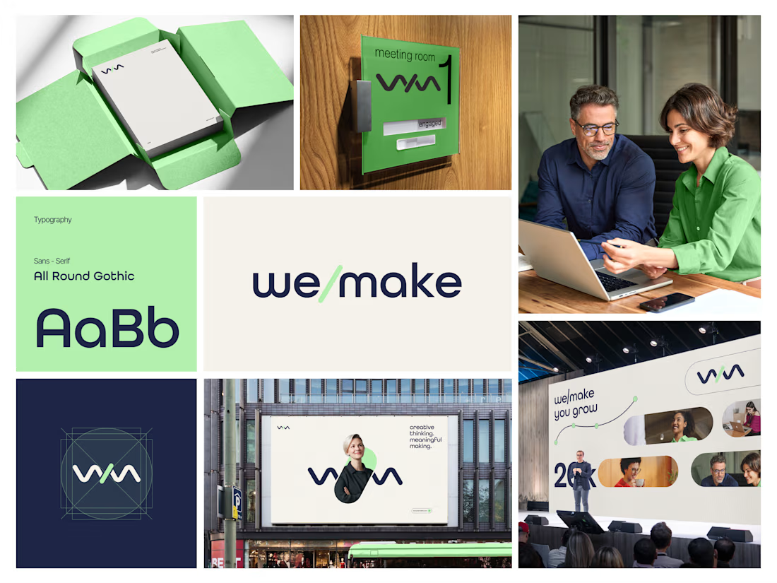
Most rebrands start with a mood board. This one started with a punctuation mark.
For we make the slash in the name became the logo, the monogram, the layout tool and even the campaign line: "we make you grow."
When one small idea can carry a whole brand, every new touchpoint...
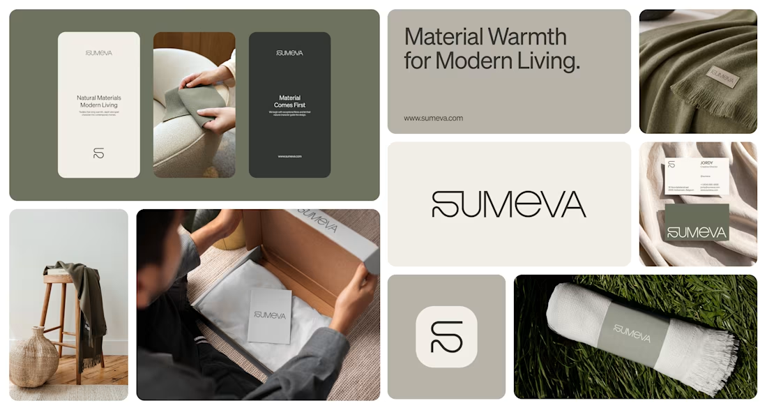
Sumeva is a modern textile brand built on one idea: material comes first.
We designed a warm, minimal identity to match a monogram and wordmark drawn with one continuous line like a thread, an earthy olive and stone palette, and a quiet system that carries from woven labels to...