
pro
Manuel Dieguez
Crafting brand systems & digital experiences.
- 1x
- Hired
- 5.00
- Rating
- 61
- Followers
Built BRICK Socials in Webflow + Relume. Webflow keeps things solid, Relume makes wireframing and development x100 faster.
Using this combo yet, or still doing it the looooong way?
1
34
404
Built NoBrands' website in Webflow + Spline. Remixed and adapted a Spline interaction (shout out to the original creator) for their hero: a 3D hand that follows your mouse.
The H1 reads "Branding and web design that follows your vision." So the interaction does exactly what the copy promises.
That's the point. Interaction as messaging.
Is it too obvious or does it do the trick?
1
26
303
At the beginning of the year I built ZuBerlin (https://zuberlin.city/)'s landing page and honestly, the parallax animation is doing the heavy lifting.
They wanted to show immersion through a screen. So I layered up this Berlin skyline in Figma which then translated perfectly to Framer. Each layer revealing something new about the event while creating this real sense of depth and adding visual info without having to type the words.
It's not just a cool effect. It IS the experience.
Engagement went through the roof. People actually stuck around.
:)
15
239
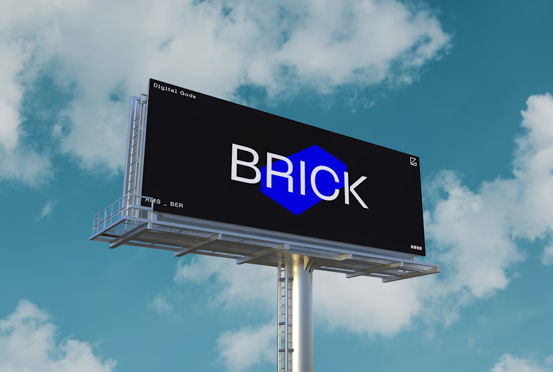
Building BRICK Agency (https://contra.com/p/EZeQ7mYr-brick-agency-or-creative-agency-brand-overhaul?r=manueldieguez)taught me that a strong brand identity isn't about looking cool—it's about thinking consistently.
We were doing traditional design, web work, and social strategy simultaneously. The temptation was obvious: try to be everything. Instead, we built a system flexible enough to hold multiple services without feeling scattered. Bold forms, vibrant palette, clear point of view.
The real test? When BRICK Socials (https://contra.com/p/kWovqkOF-brick-socials?r=manueldieguez) branched out, the system held. Same DNA, different application.
That's when you know it actually works.
Do you plan ahead or adapt as you go?
1
19
233
Built this landing page in Framer for a German AI payroll platform using something I call "human-first storytelling."
The challenge? Payroll professionals are naturally skeptical of AI. They don't want to feel replaced, they want to feel empowered.
So instead of leading with tech specs, I started with their daily struggles. Then showed how AI actually solves them through an interactive bento grid that lets visitors explore features at their own pace.
The storytelling flows from pain points to solutions, making complex AI feel approachable while still showcasing all the technical capabilities.
What's your take? Does this storytelling approach make AI feel more trustworthy for traditionally conservative industries?
1
21
223
Gonna be real—Contra turned me into one of those people who checks their profile stats way too often.
But honestly? Best kind of obsession. Their gamified experience made me actually care about portfolio quality in a way that years of "I should update this" never did. And it got me comfortable sharing process work and posting publicly, which I'd been weirdly anxious about forever.
There's something about a platform that makes improvement feel like progress instead of homework.
Super grateful for what you've built 🙏
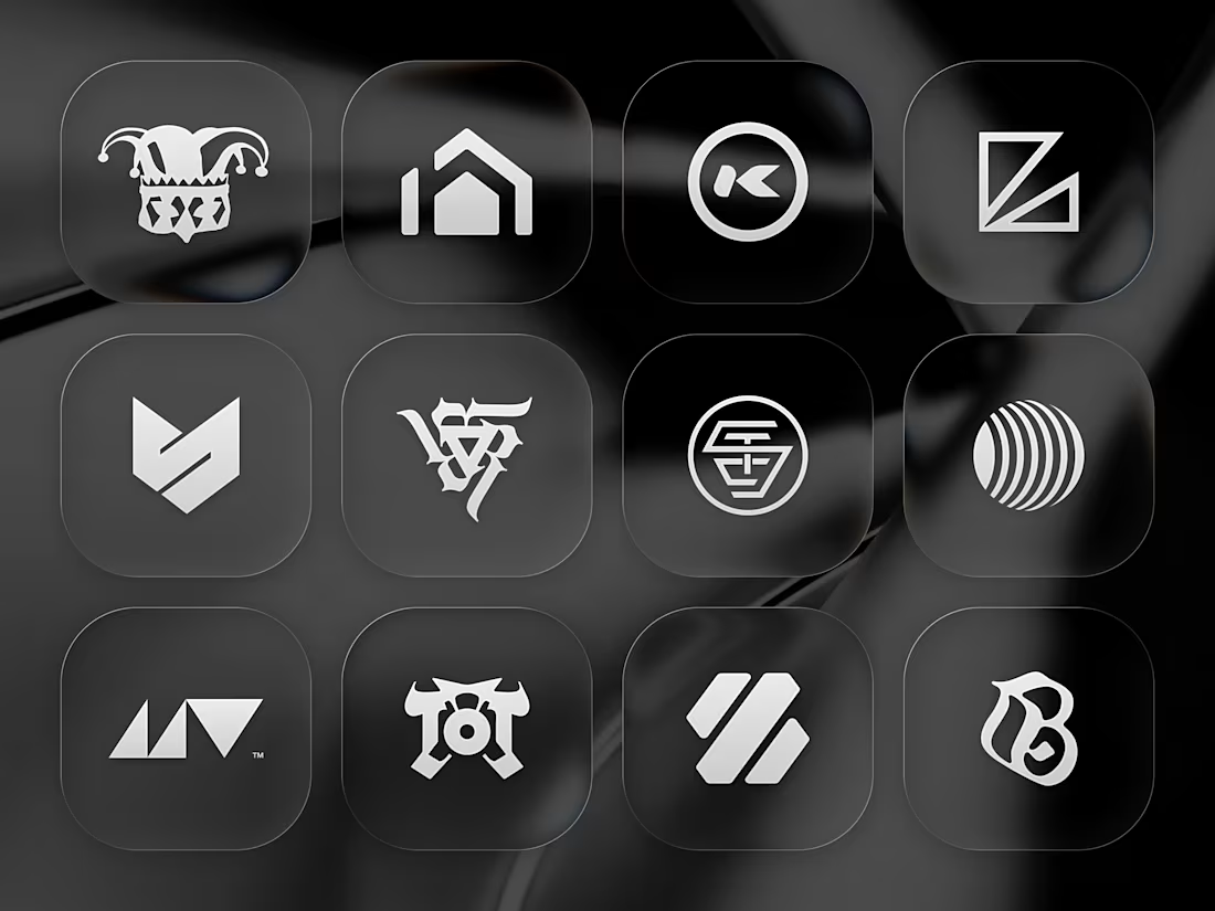
That being said, here's a mashup of some logos I designed these past years (with the new glass effect ya'll hate ✨)
31
156
956
When building landing pages for SaaS products, I always start with one question: what's the single most important thing visitors need to understand?
For this Webflow build, it was showing how the product works without overwhelming people with features. Clean interactions, deliberate pacing, and letting the demo do the talking.
The trickiest part? Making complex tech feel approachable while still looking professional.
What's your approach when you need to explain something technical to a non-technical audience? 🤓
1
15
170
1
2
22
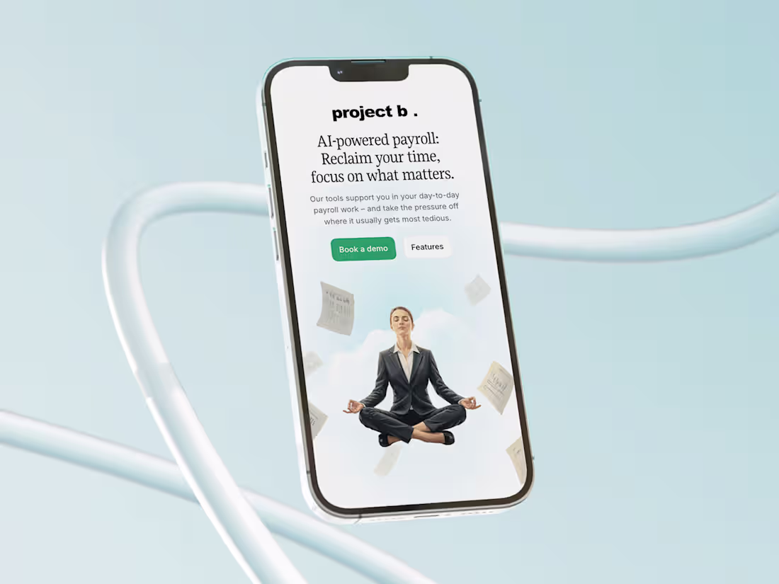
Project B. | AI-powered payroll platform
2
24
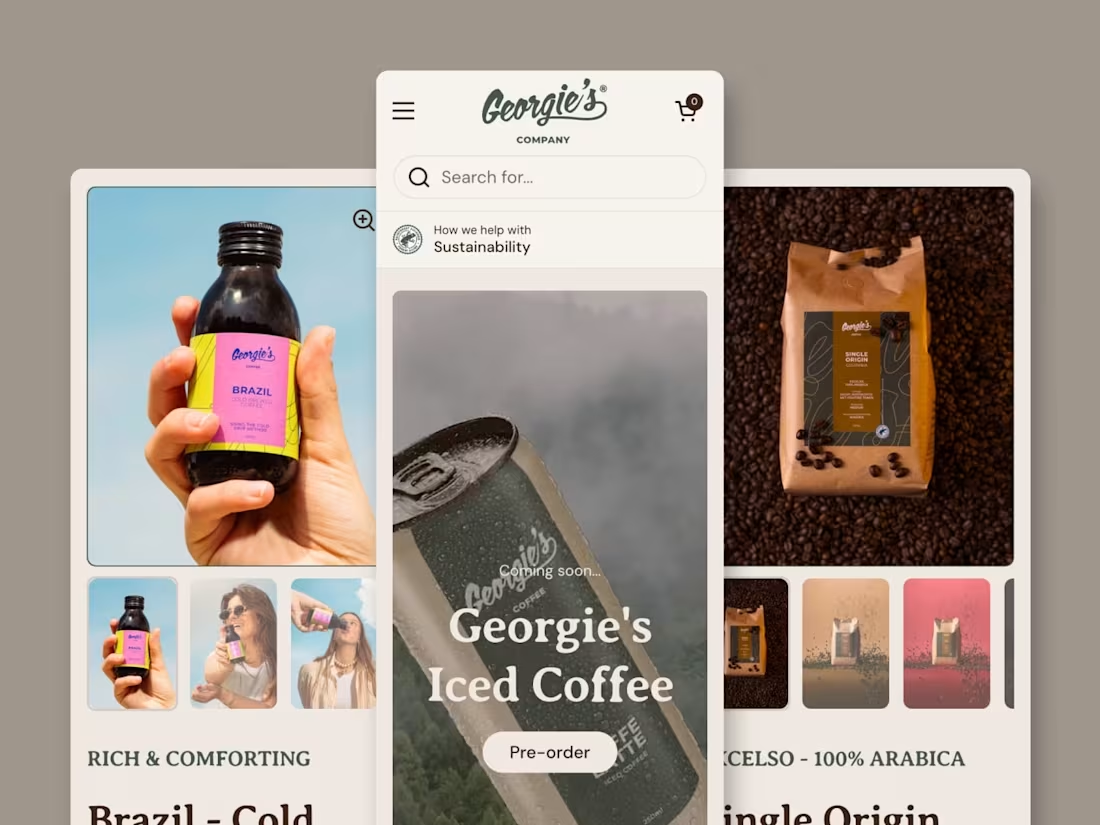
Georgie's Company | Specialty coffee retailer from Netherlands
2
28
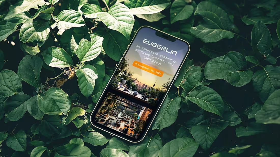
ZuBerlin 2025
6
87
1
9
66
BRICK Agency | Creative Agency Brand Overhaul
10
65
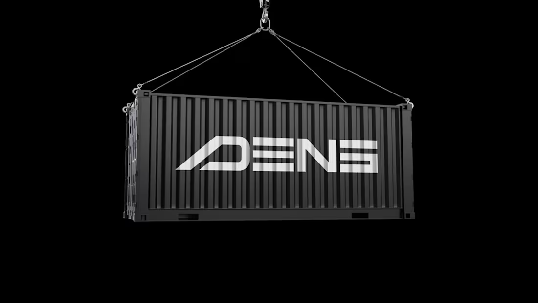
DENS | Powering the future with innovative energy solutions
2
16
1
2
8
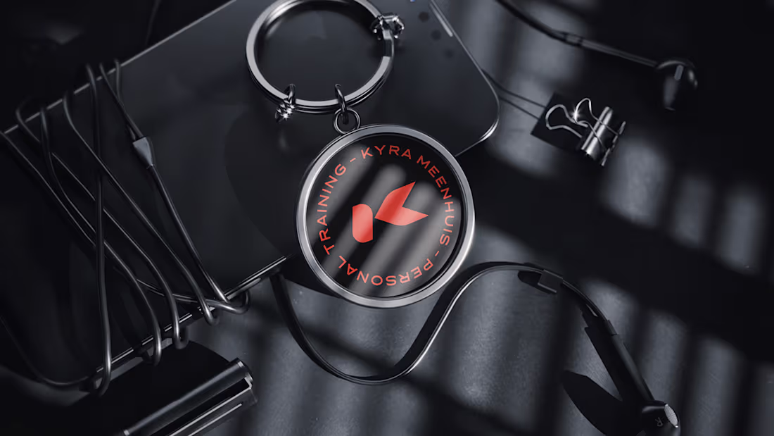
Kyra Meenhuis PT
2
9
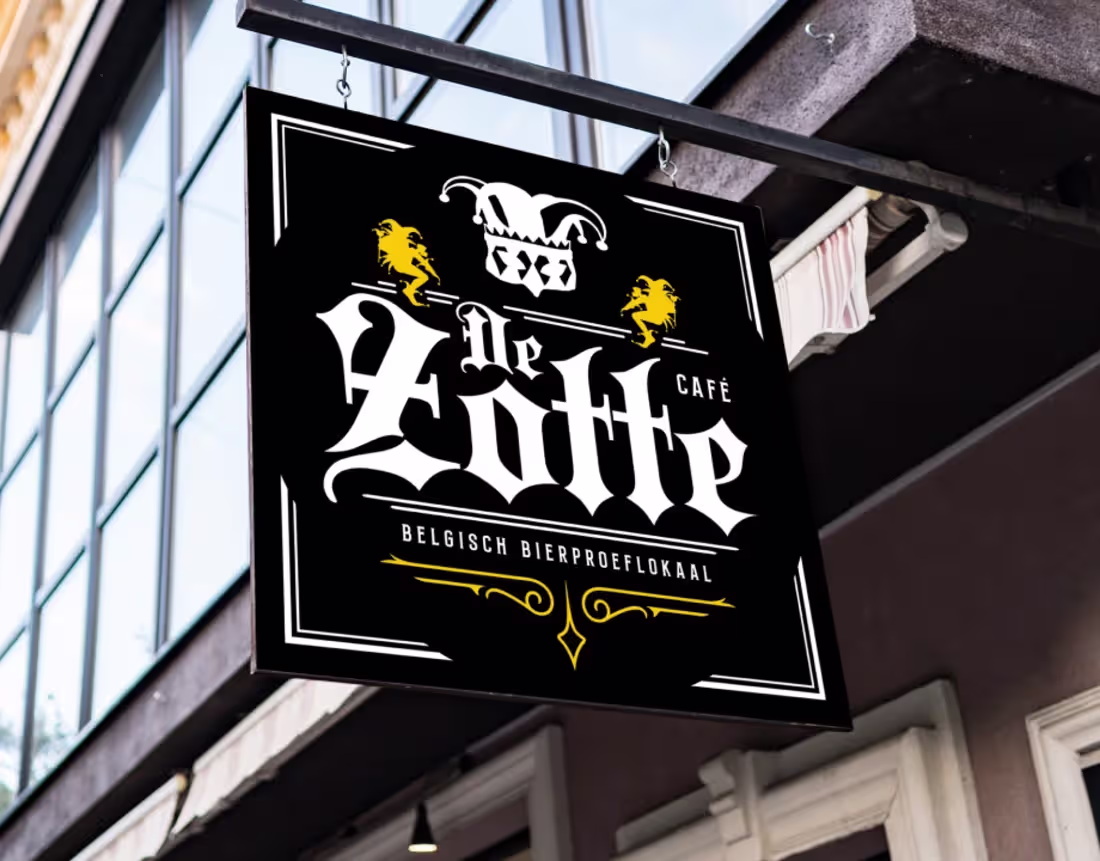
DeZotte | Crafting a Belgian Beer Experience in Amsterdam
2
17
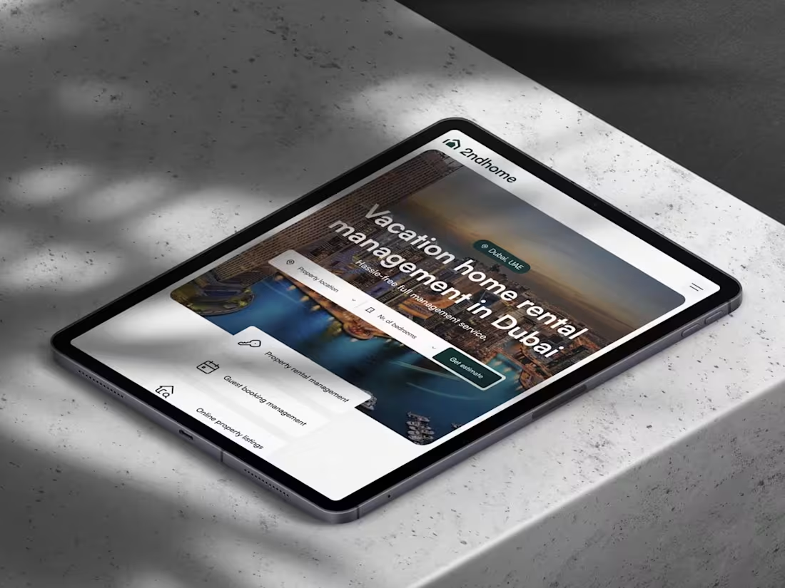
2ndhome | Transforming Home Rental Management in Dubai
2
9
Magnetic Vision | A Digital Transformation
7
27
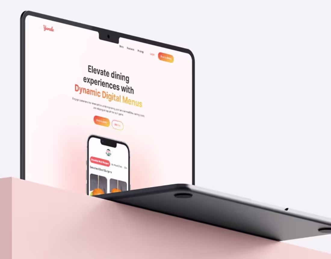
Yumzle | Revolutionizing Digital Restaurant Menus
1
8
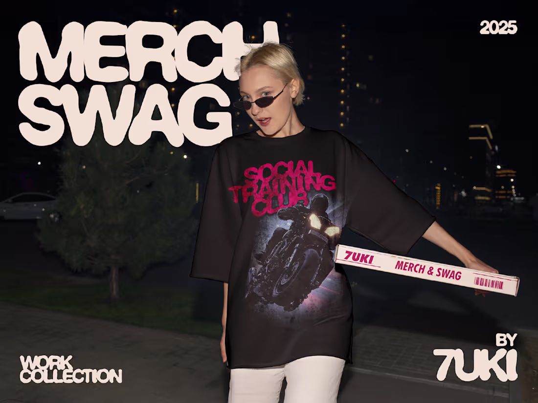
Social Training Club
1
10
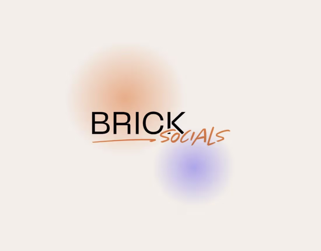
BRICK Socials
1
13
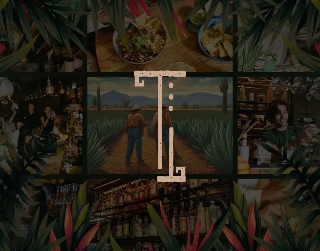
Tacos & Tequila
1
12
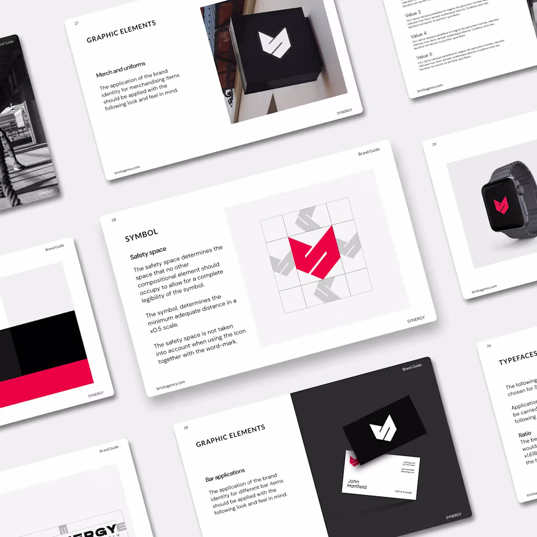
SYNERGY | Elevating gym experiences through digital integration
1
10
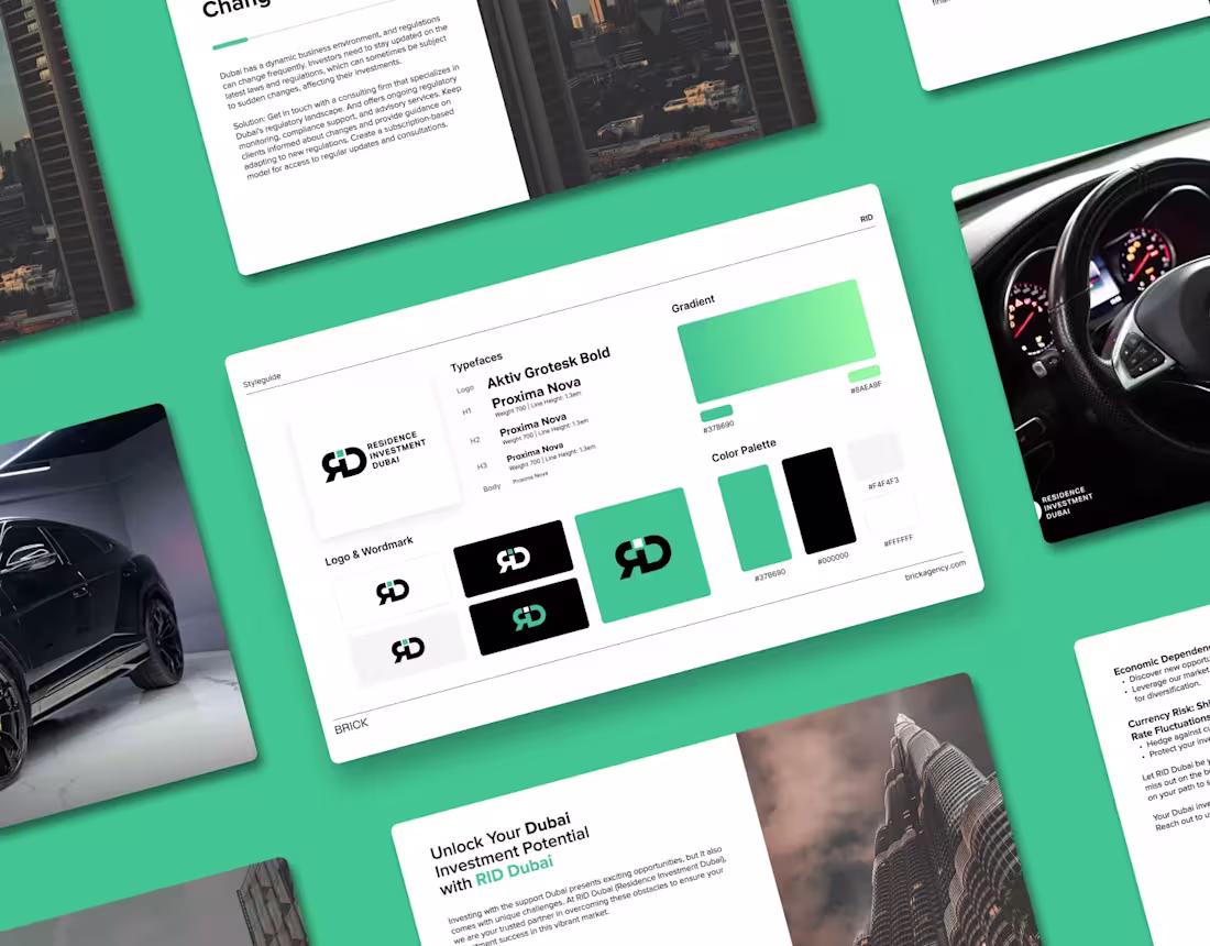
RID | Smart Real Estate Investments and Relocation in Dubai
1
8
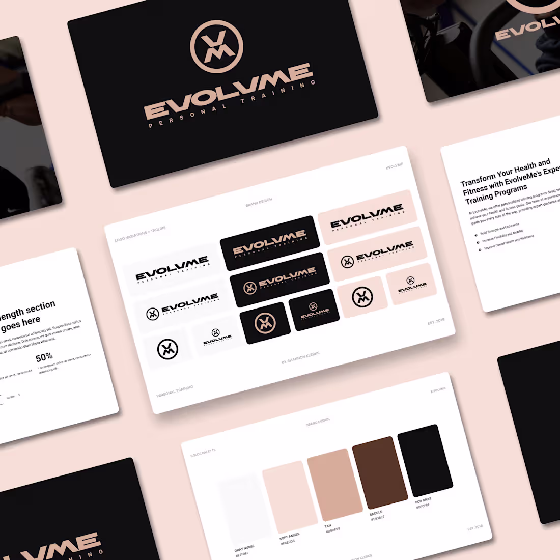
EVOLVME | Full-body Workout Training and Coaching
1
9
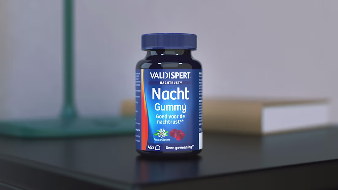
Valdispert | E-commerce Optimization
0
11
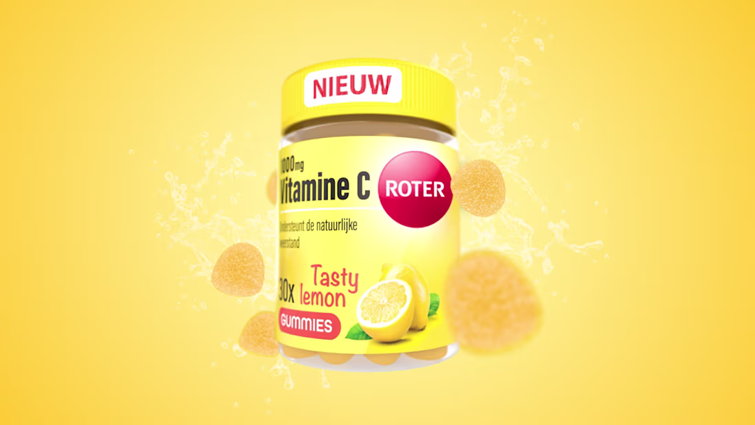
Roter | E-commerce Visual Optimization
0
10
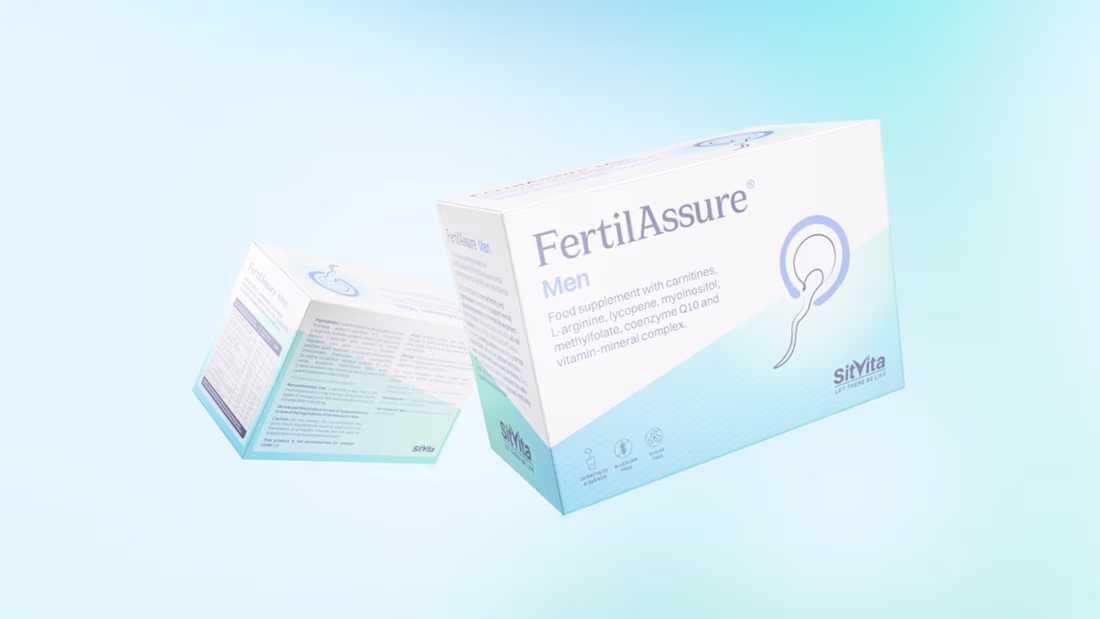
SitVita | Brand and Product Packaging Development
0
10