Lucas

Lucas Ojo

Landing Page Dev Replo & Instant

Ready for work

Lucas is ready for their next project!

Listicle pages are underrated.
They educate, entertain, and pre-sell all before the visitor even hits “Buy.”
Here’s one I just designed in Figma
If you’re running paid traffic, you need one of these for your store. Send me a DM today!
Post image
Hero section Before & After redesign for KNOWELL brand
Clearer message, stronger emotion, and a CTA that converts, all while keeping the brand’s calm, nurturing vibe.
Small tweaks, big difference.
What do you think of this redesign?
Post image
If your ads are bringing traffic but not conversions, try a Listicle page.
It bridges the gap between curiosity and purchase.
It educates and guides visitors to a confident "yes".
Want to explore how this could work for your brand? Send a DM.
Post image
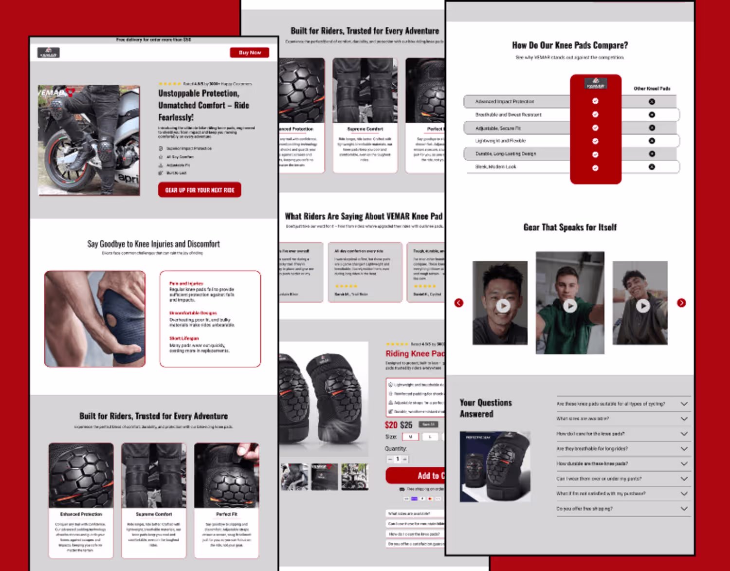
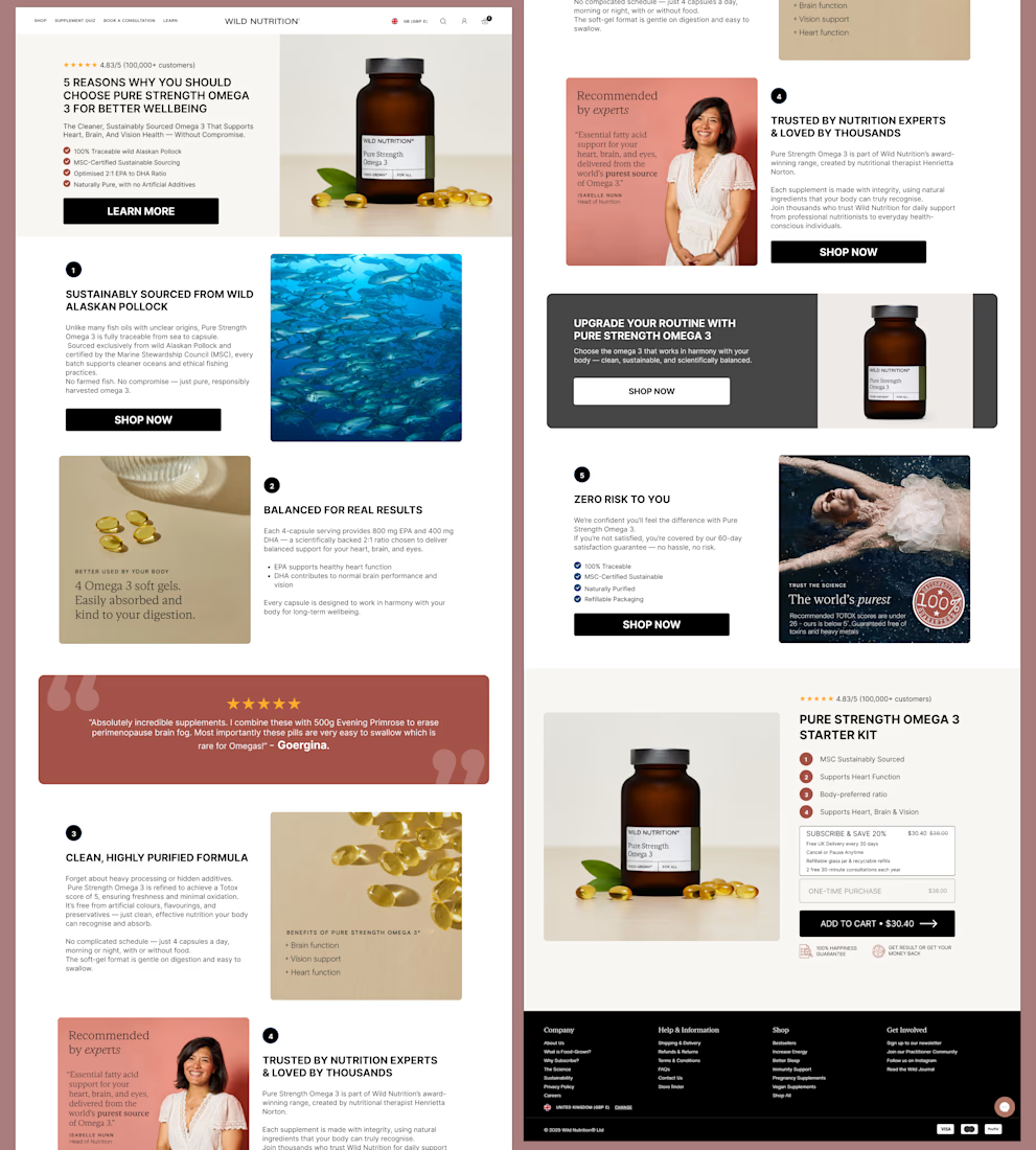
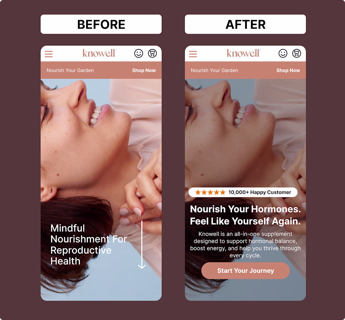
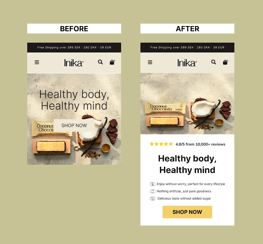
Just wrapped up a clean mobile product section design.
Focused on clarity, easy navigation, and conversion.
Subtle colors, clear CTAs, and simple UX make all the difference.
Post image
Before vs After
A simple hero redesign with big impact:
Added reviews
Highlighted benefits
Clearer CTA
Small tweaks → more trust, more clicks, more sales.
Which one change do you think drives the most impact?
Post image