
Lucas Ojo
Landing Page Dev Replo & Instant
Ready for work
Lucas is ready for their next project!
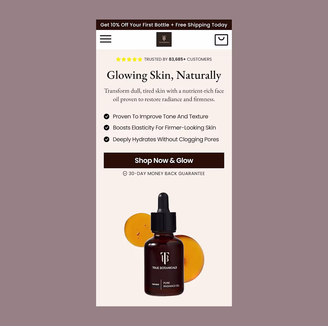
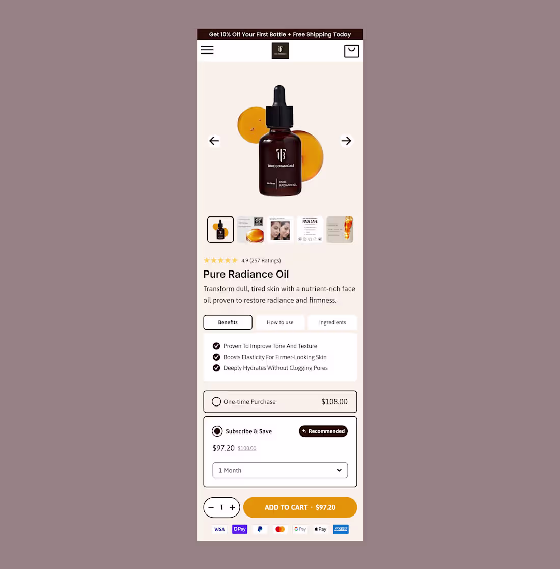
Design that converts.
For this True Botanicals hero section, I focused on:
-Clear hierarchy
-Benefit-driven copy
-Visuals that sell without shouting
Great design isn’t just about looking good, it’s about driving action.
Need a Landing page that converts? Let’s connect.
0
47
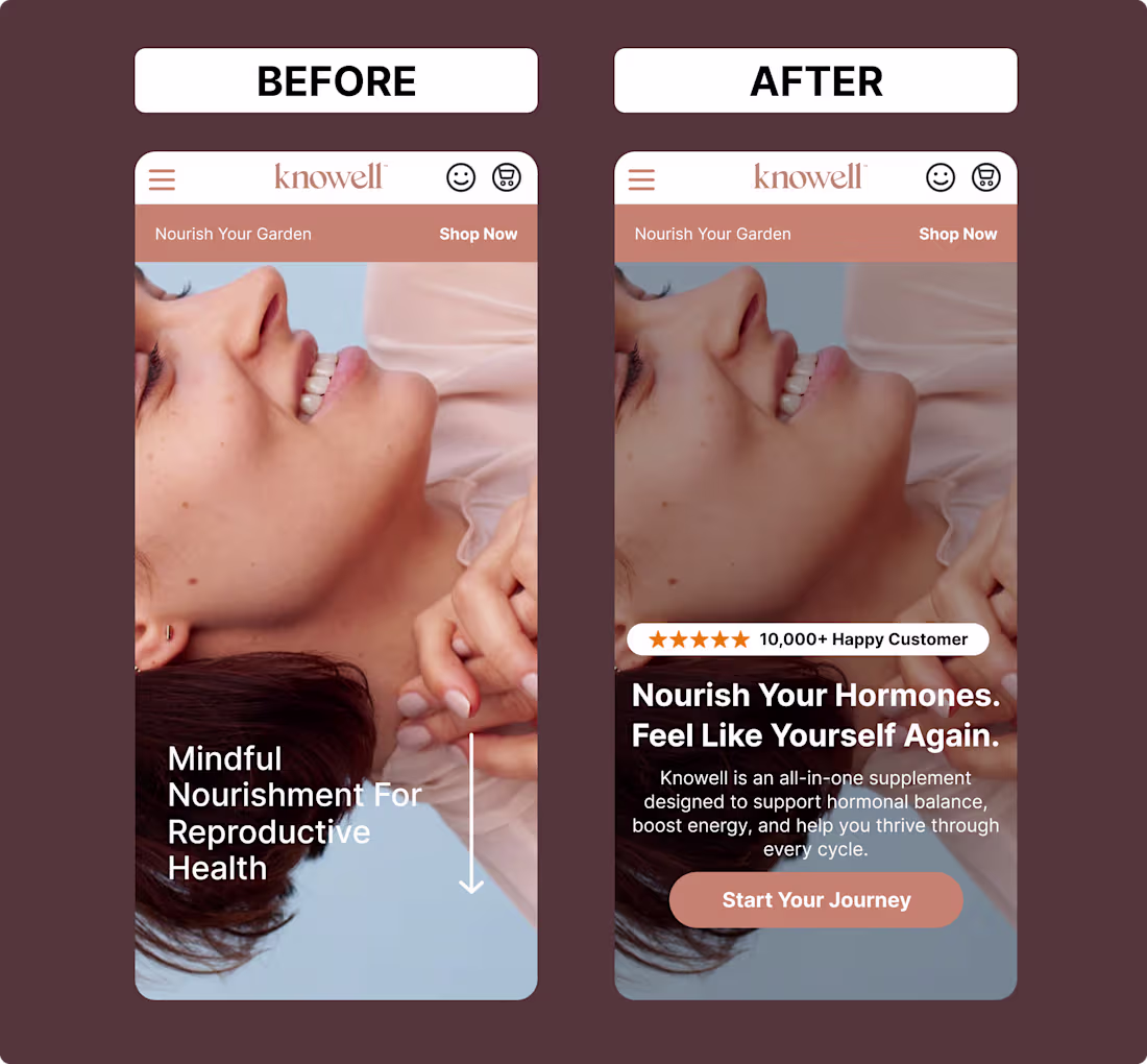
Hero section Before & After redesign for KNOWELL brand
Clearer message, stronger emotion, and a CTA that converts, all while keeping the brand’s calm, nurturing vibe.
Small tweaks, big difference.
What do you think of this redesign?
2
1
58
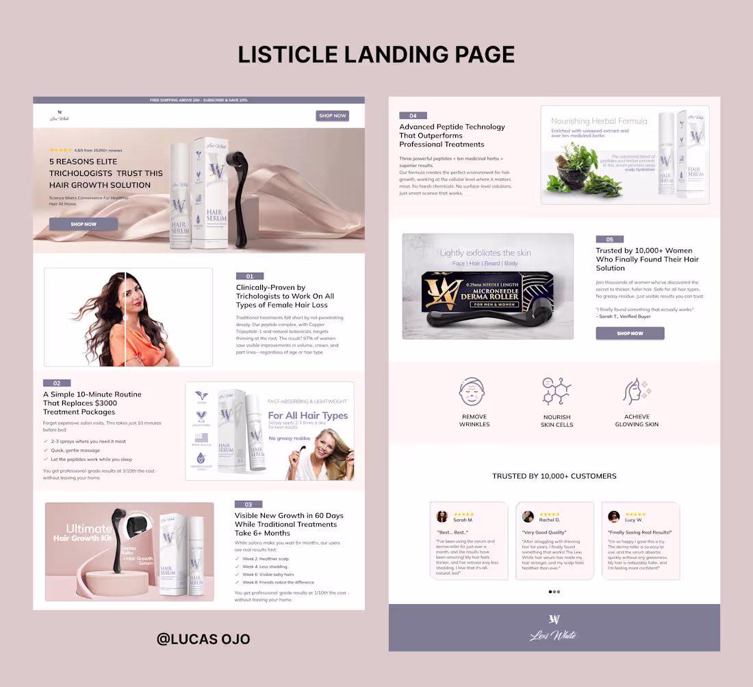
If your ads are bringing traffic but not conversions, try a Listicle page.
It bridges the gap between curiosity and purchase.
It educates and guides visitors to a confident "yes".
Want to explore how this could work for your brand? Send a DM.
2
59
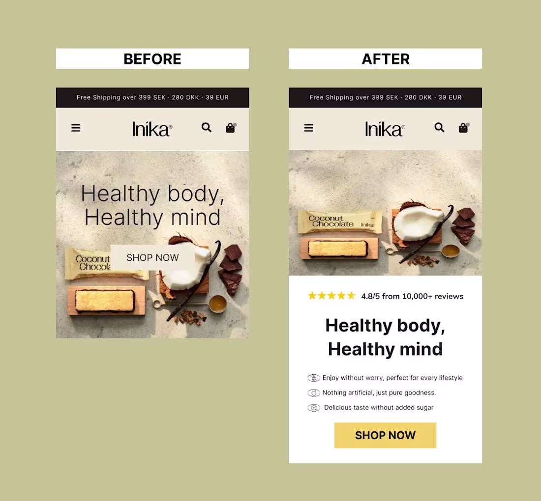
Before vs After
A simple hero redesign with big impact:
Added reviews
Highlighted benefits
Clearer CTA
Small tweaks → more trust, more clicks, more sales.
Which one change do you think drives the most impact?
1
2
59
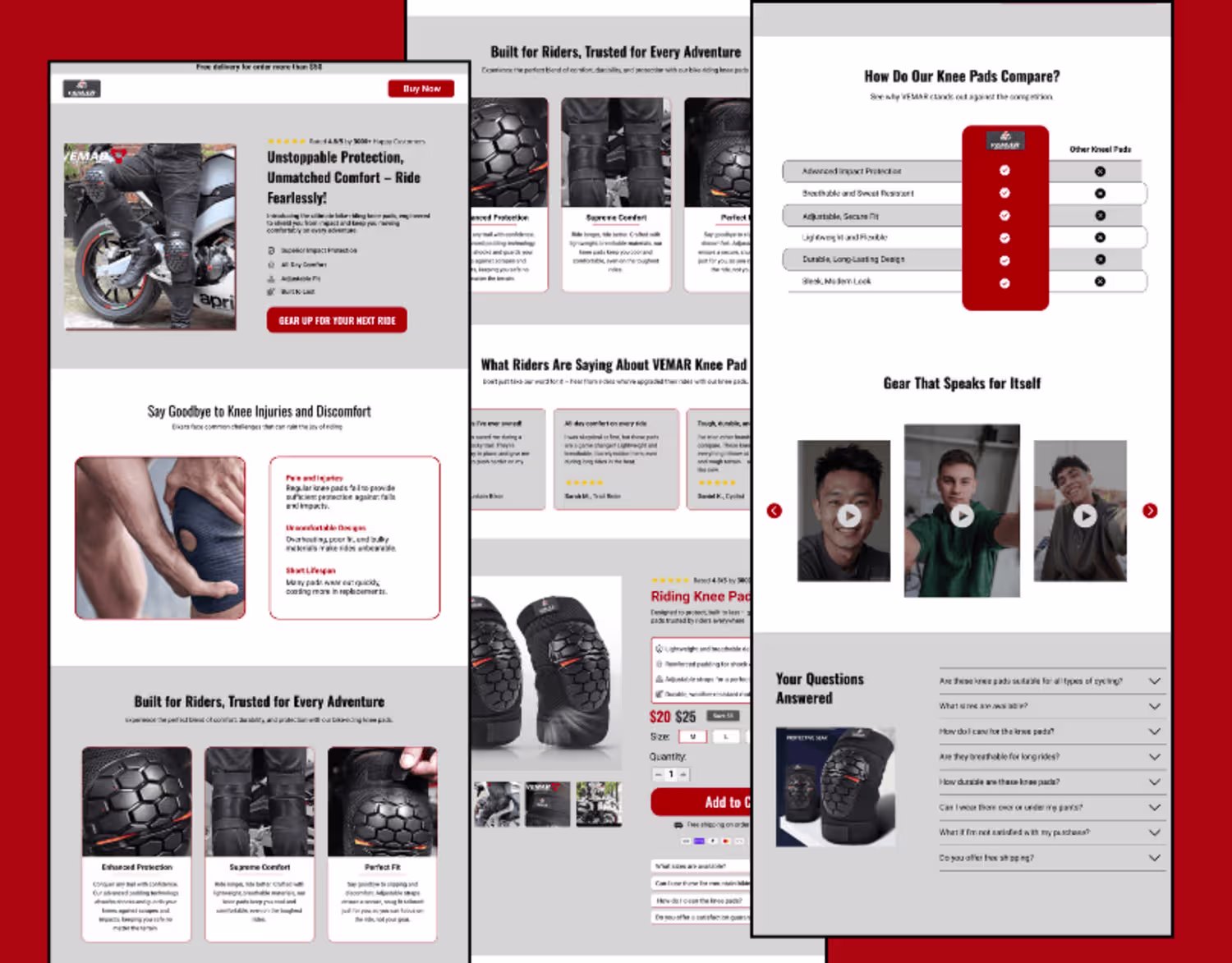
Just wrapped up a clean mobile product section design.
Focused on clarity, easy navigation, and conversion.
Subtle colors, clear CTAs, and simple UX make all the difference.
3
2
52
Oura Ring Landing Page Design and Development
1
3
Figma to Framer
1
4

Conversion-driven Landing page designed on Figma
0
1