
pro
lion create
I strategically craft for your brand.
- 5
- Followers


Camille Whitmore is a therapist for artists and creative minds. She works with Expressive Arts Therapy, an approach that uses the act of creating (painting, gesture, writing, sound) as a way into what emotion keeps hidden. For those who live by their sensitivity, art is not a hobby, it is a language. And through that language, Camille guides each person back to themselves.
And why the swallow? Because the swallow is the bird that always returns. No matter how far it flies, it finds its way home. That is exactly what happens here: art takes you far, inward, toward what was hidden, and brings you back to yourself. The flight is the transformation. The return is the healing.
#expressivearts #arttherapy #forartists #creativemind #creativeprocess #selfdiscovery #artheals #emotionalwellbeing #sensitivesoul #artistlife
1
1
33
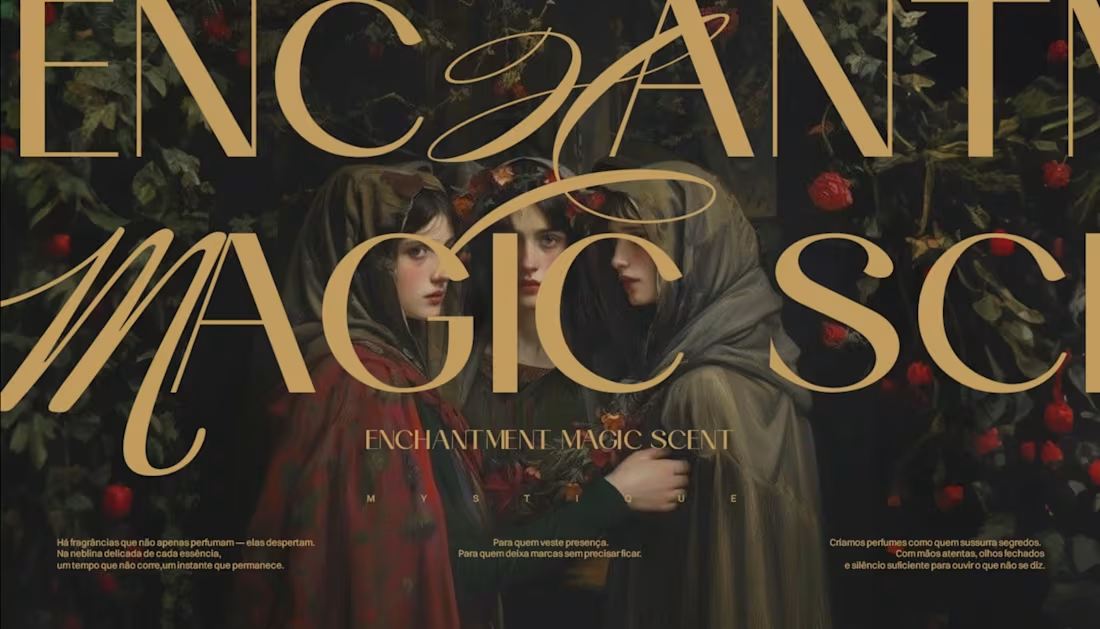
The challenge behind MYSTIQUE was creating a visual identity that could express mystery without sacrificing sophistication.
Mystery is often associated with darkness, secrecy, and the unknown. But our intention was to explore something more subtle: the relationship between curiosity, beauty, and the desire to discover what isn't immediately revealed.
We approached this identity through a careful study of visual symbolism, typography, and composition. Every element needed to communicate a sense of exclusivity while preserving an almost timeless, enigmatic atmosphere.
The botanical illustrations introduce an organic contrast to the structured typography, while the deep green and golden tones reinforce the perception of elegance, depth, and refinement.
One of the most important decisions was understanding that mystery doesn't need to be visually complicated. Sometimes, the most sophisticated way to create intrigue is knowing exactly what to reveal and what to leave unsaid.
Rather than relying on excessive ornamentation, we explored the balance between detail and restraint, allowing the identity to communicate through its own visual language.
MYSTIQUE was developed around this principle: a strong identity doesn't always need to explain itself entirely. Sometimes, its greatest strength lies in what it makes us feel before we fully understand it.
#BrandIdentity #Branding #ArtDirection #VisualIdentity #AdobeIllustrator
1
24
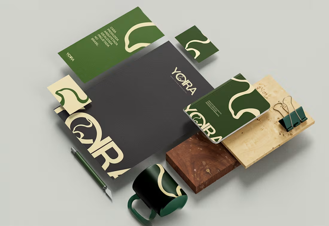
The main challenge in building this visual identity was making the name versatile, working both as Yara and as Yora. Due to external factors, an architecture studio requested that the name visually create this sense of questioning in the audience’s mind—a resource that strengthens the brand in the subconscious of the ideal client.
We made it clear that this feeling of doubt when reading the brand is not a mistake, but rather a deliberate and highly important choice. It is an unusual case within our strategic methodology: out of ten brands developed, only one follows this path. This decision involved in-depth analysis of the brand’s essence and went through nearly three months of testing before we arrived at the final solution, which today is not only validated but also widely admired.
4
30
230
I worked on the process and artistic direction of this website, which needed to follow the aesthetic of its visual identity, also developed by me.
1
79