
Latisha Compton
Graphic Designer | Branding, Print & UI
- 1
- Followers

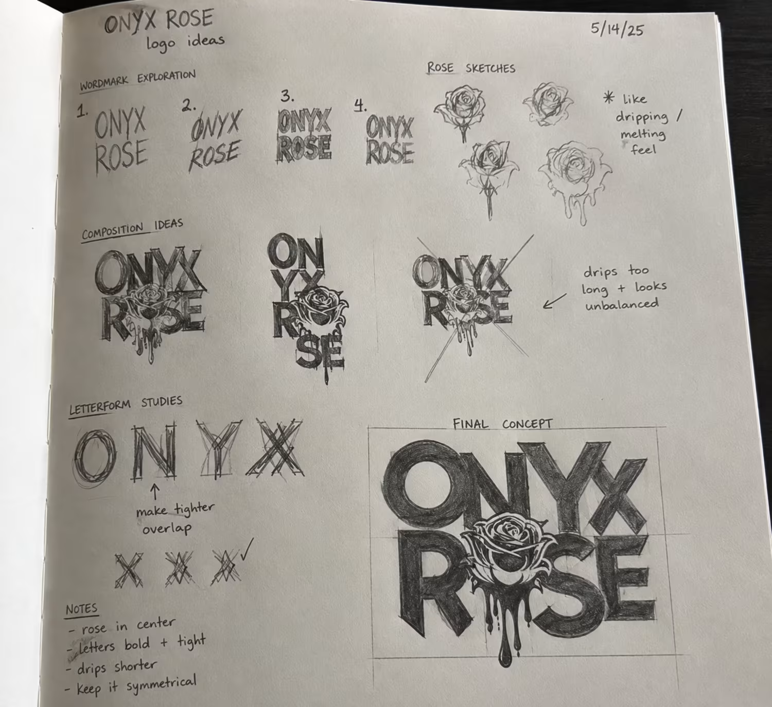
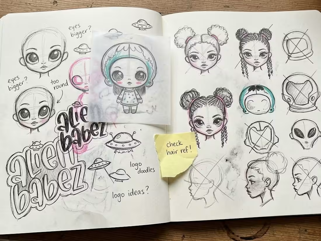
Alien Babez is an original character and lifestyle concept I created around individuality, imagination, and the idea that girls should never feel pressured to look or be like everyone else. The characters were designed to celebrate difference, whimsy, self-expression, and taking up space.
I developed the Alien Babez logo and character world, then expanded the concept into a collectible product system including dolls, packaging, stationery, backpacks, stickers, accessories, and back-to-school merchandise. The goal was to create something playful enough for younger girls while still feeling visually strong and collectible for teens and young adults.
At the center of the brand is a simple idea: for girls who were never meant to match.
My role: Creative Direction, Character Design, Brand Identity, Illustration, Product Concept, Packaging Direction, and Merchandise Design.
0
56
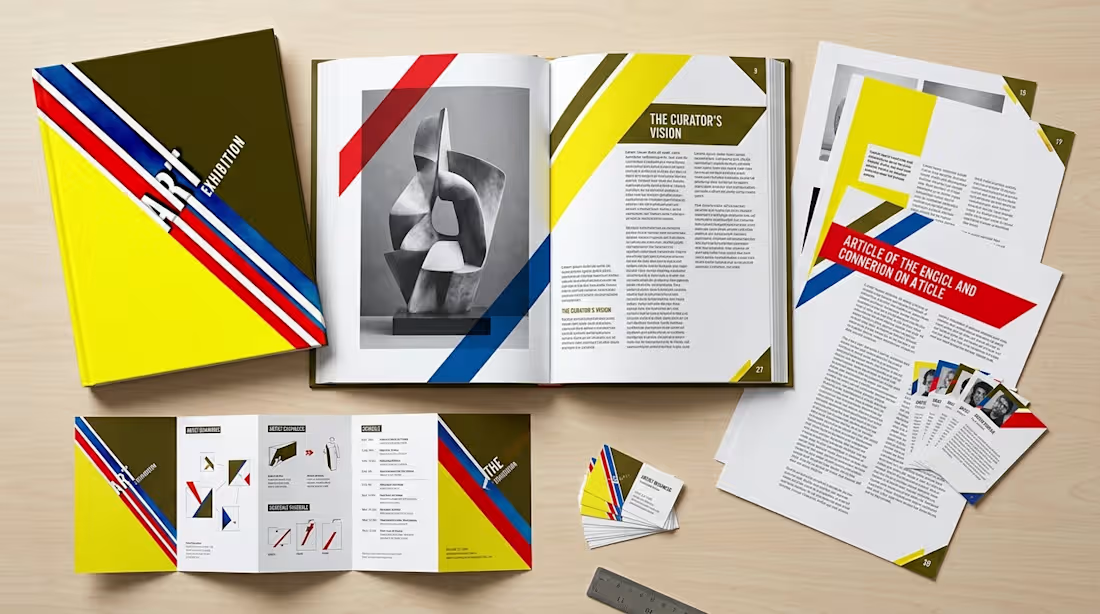
ART Exhibition began as a bold visual identity built around movement, contrast, and strong geometric composition. I developed the original design using diagonal color bands, dimensional typography, and a high-impact palette to create something that felt contemporary, artistic, and immediately recognizable.
I later expanded the concept into a broader exhibition system to show how the identity could work across posters, tickets, brochures, editorial spreads, and multi-page publications. The focus was on maintaining a consistent visual language while adapting the system for both image-led and content-heavy layouts.
My role: Art Direction, Graphic Design, Editorial Design, Typography, Print Design, and Visual Identity.
The expanded applications are conceptual mockups developed from my original design to demonstrate how the system could scale across a full exhibition campaign.
0
63
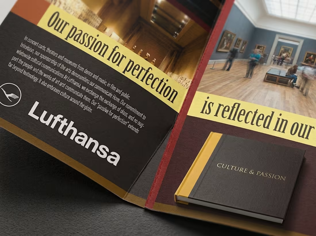
This project began as a print campaign exploring the connection between travel, culture, and the arts. I developed the visual direction around bold photography, strong editorial typography, and a warm, museum-inspired color palette.
To show how the concept could extend into a larger publication system, I expanded the original design language into brochures, editorial spreads, and multi-page layouts. The focus was on creating clear hierarchy, maintaining consistency across different page types, and balancing image-heavy moments with more content-dense sections.
My role included art direction, layout design, typography, print design, and developing the broader editorial system.
Original campaign design by me. Additional publication mockups were created to demonstrate how the visual system could scale across longer-form print and editorial applications.
0
65
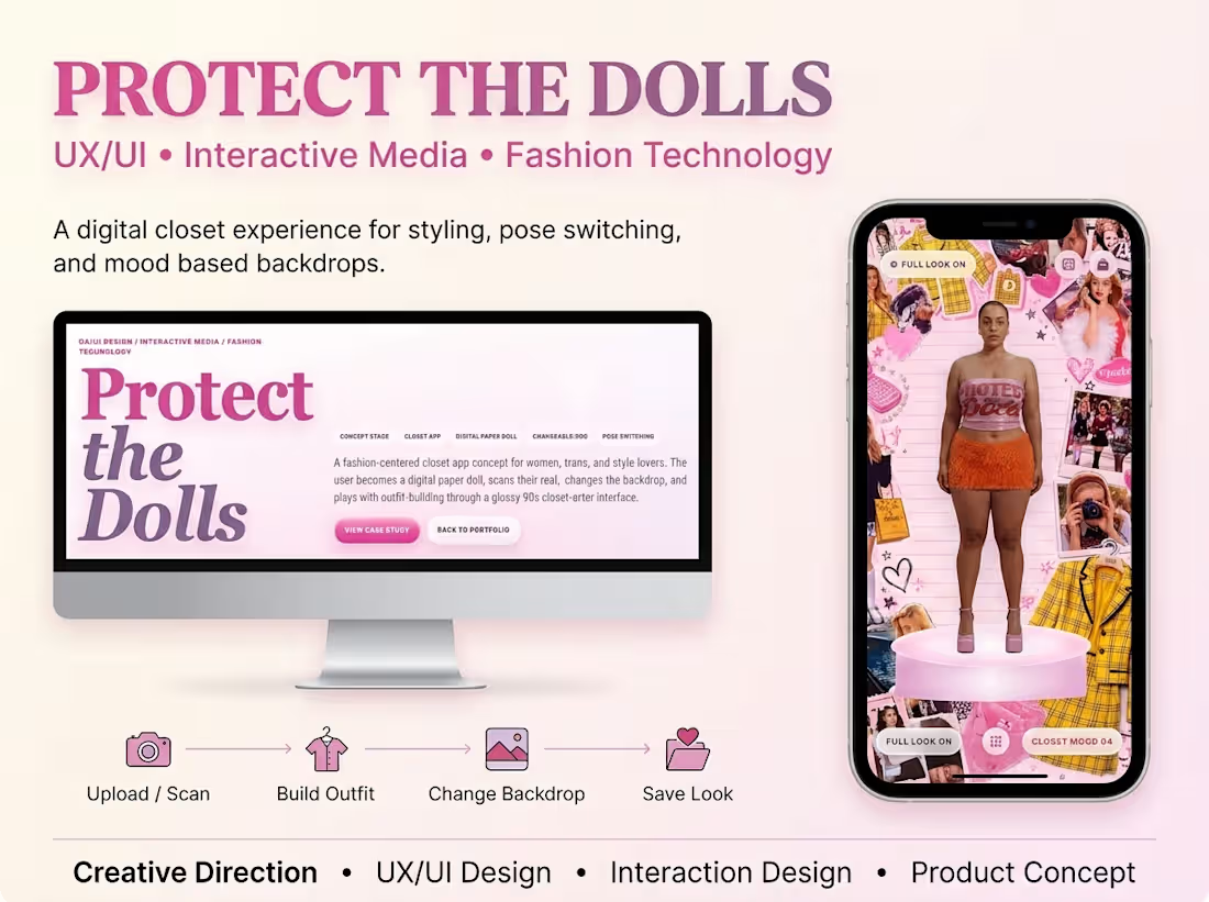
Protect the Dolls — Interactive Digital Closet App
0
6