The network for creativity
Join 1.25M professional creatives like you
Connect with clients, get discovered, and run your business 100% commission-free
Creatives on Contra have earned over $150M and we are just getting started
Back to feedPost

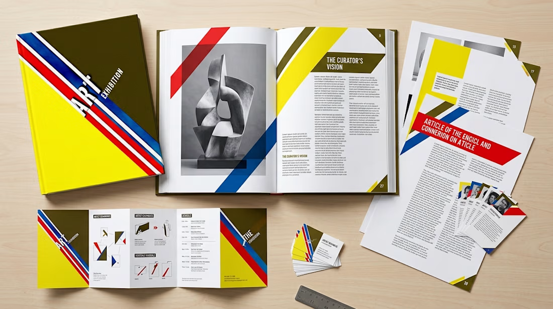
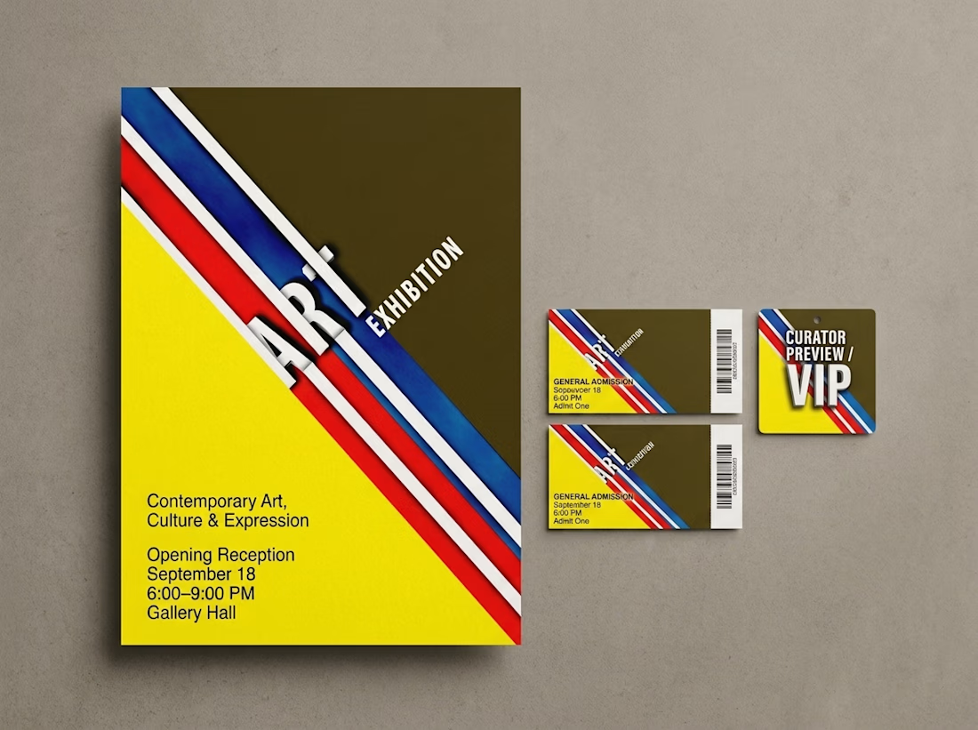
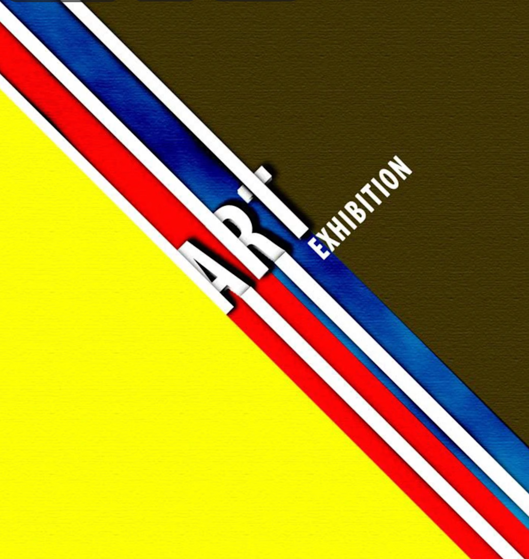
ART Exhibition began as a bold visual identity built around movement, contrast, and strong geometric composition. I developed the original design using diagonal color bands, dimensional typography, and a high-impact palette to create something that felt contemporary, artistic, and immediately recognizable.
I later expanded the concept into a broader exhibition system to show how the identity could work across posters, tickets, brochures, editorial spreads, and multi-page publications. The focus was on maintaining a consistent visual language while adapting the system for both image-led and content-heavy layouts.
My role: Art Direction, Graphic Design, Editorial Design, Typography, Print Design, and Visual Identity.
The expanded applications are conceptual mockups developed from my original design to demonstrate how the system could scale across a full exhibition campaign.


The network for creativity
Join 1.25M professional creatives like you
Connect with clients, get discovered, and run your business 100% commission-free
Creatives on Contra have earned over $150M and we are just getting started





Related posts

Doppel — Threat Graph
Making complex cybersecurity concepts clear through motion.
For the Doppel Threat Graph product film, I contributed to the visual development and animation. The product connects digital threats across multiple channels, revealing how individual signals form part of a coordinated attack campaign.
The challenge was to translate this technical functionality into a clear visual narrative—showing why the connections between threats matter and how they help reveal the bigger picture.
My work covered storyboard and motion exploration, animation, and scene refinement throughout the feedback process. The focus was on introducing information progressively and guiding attention toward the relationships central to the product’s value.
The result is an animated product film that introduces Doppel Threat Graph and makes its core functionality easier to understand. The project demonstrates how motion design can bring clarity to a complex software product.
Services: Storyboard Exploration · Motion · Animation


That's unbelievable great job 🎉🎉🔥🔥

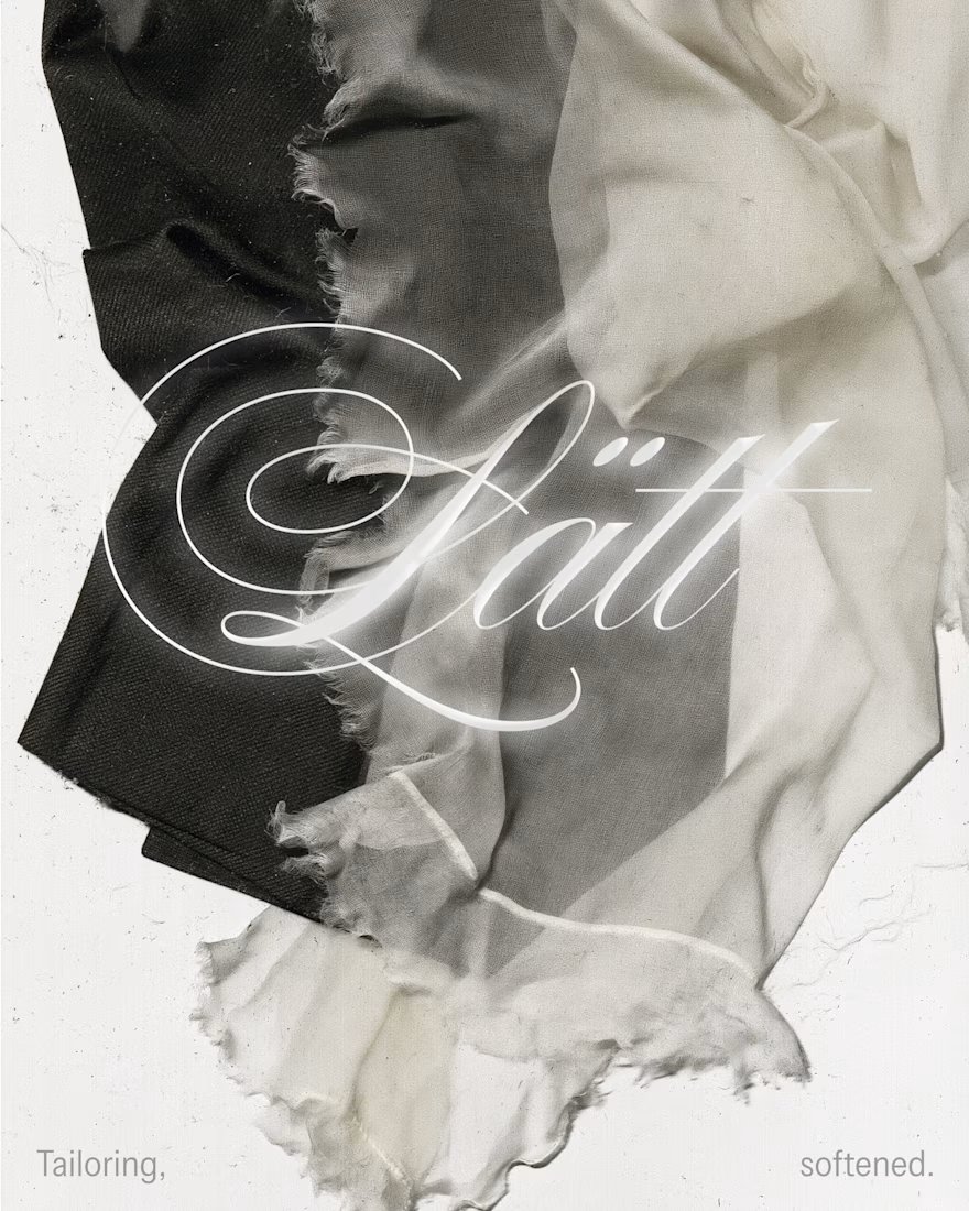
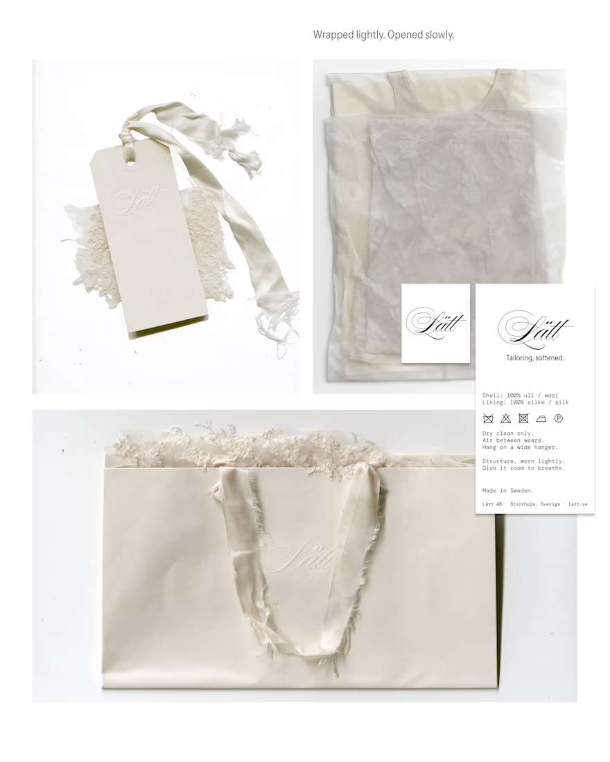
My entry for the Designer Briefs: a brand identity and label system for Lätt, a Stockholm label bringing a light, romantic touch to modern tailoring. Silk, sheer knits and suiting made to be worn lightly.
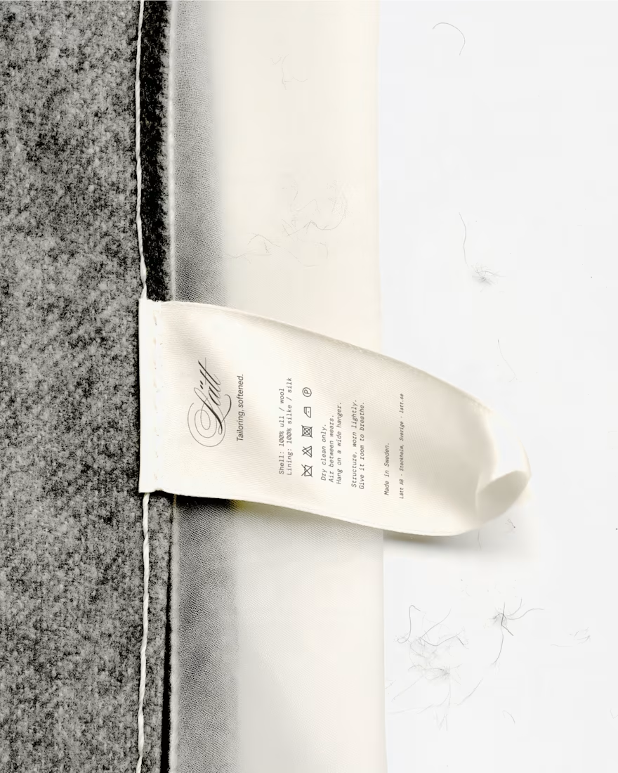
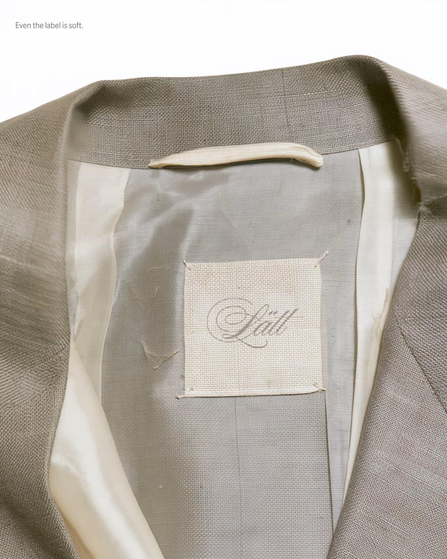
The idea is "Tailoring, softened," and it runs through every touchpoint. A script wordmark is embossed blind into the hang tag and the shopping bag. A woven neck label is sewn loosely into the lining, and a satin care tag carries bilingual Swedish/English care instructions in a typewriter-style mono. Packaging is tissue, lace and frayed silk ribbon: "Wrapped lightly. Opened slowly." The visual world is built from fabric scans and phone snapshots, so it feels tactile and real.
I loved this project so much, what do you think? I would love to hear the feedback of the community!


Love this!

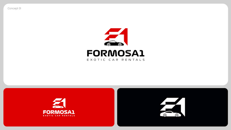
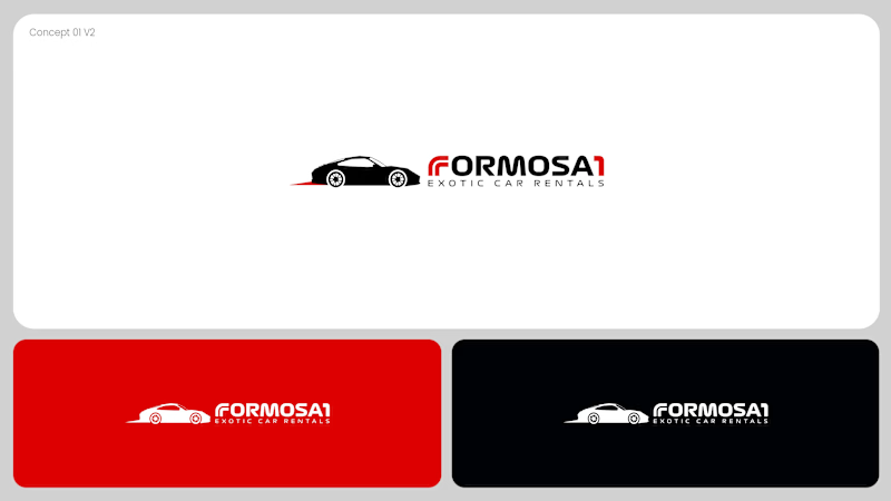
Two logo concepts for Formosa1 Exotic Car Rentals. Which one wins?
A: bold geometric F1 monogram, car tucked inside the mark. Strong and iconic.
B: car silhouette leads, red wordmark with a speed streak. Fast and clean.
Drop your vote 👇
17 voted
53%
15 voted
47%
32 votes
Closed
Both are great but I feel that was something special in the bottom one that's why I choose it❤️❤️